
As more and more interactivity is called for on the Web, forms are becoming an increasingly important part of modern web applications. Forms allow users to interact with systems, enabling them to do everything from registering feedback to booking complicated travel itineraries. As such, forms can be as simple as an e-mail address and a message field, or they can be hugely complex, spanning multiple pages. Form layout has traditionally been done using tables; however, in this chapter, you will learn that even complicated forms can be laid out using CSS.
Tables are slowly regaining their rightful position purely as a way of displaying tabular data, rather than a means of laying out pages. As well as needing to capture user data, web applications increasingly need to display this data in a usable and an easy-to-understand format. Form and data table design have been relatively neglected in favor of higher-profile areas of design. However, good information and interaction design can make or break a modern web application.
In this chapter, you will learn about
Creating attractive and accessible data tables
Creating simple and complicated form layouts
Styling various form elements
Providing accessible form feedback
Many developers realize the pitfalls of table-based design and avoid using layout tables wherever possible. A small group of individuals have gone a step further and attempted to ditch tables altogether, re-creating things like calendar layouts in pure CSS. Well-meaning as this strategy is, calendars, by their nature, are table-based content. After all, they're basically just rows of weeks and columns of days. As such, there is still a place for the use of tables on the Web.
Even relatively simple data tables can be hard to read if they contain more than a few rows and columns. Without separation between data cells, information blurs together, resulting in a jumbled and confusing layout (see Figure 7-1).

Conversely, tables with a lot of whitespace can also be very difficult to read, as columns and cells start to lose their visual association with each other. This is particularly problematic when you're trying to follow rows of information on tables with very large column spacing, such as the one in Figure 7-2. If you are not careful, it is easy to accidentally stray into the wrong row when moving between columns. This is most noticeable in the middle of the table where the hard edge of the top and bottom of the table provide less of a visual anchor.

By contrast, a few minutes spent designing your data tables can greatly improve their comprehension and the speed at which information can be retrieved. For instance, the dates in Figure 7-3 have been given breathing room with a small amount of vertical and horizontal padding. They have also been highlighted with a subtle beveled effect, making them look clickable. The main column headings have been distinguished from the data through subtly different background colors, the use of a bottom border, and typographic treatment. The result is an easy-to-use calendar widget.

If data tables can be difficult for sighted users, imagine how complicated and frustrating they must be for people using assistive technologies such as screen readers. Fortunately, the HTML specification includes a number of elements and attributes intended to increase the accessibility of data tables for these devices. Not all of these elements are currently supported by screen readers, but it is definitely good practice to use them where possible.
The first of these elements is a table caption, which basically acts as a heading for the table. Although this is not a required element, it is always a good idea to use a caption wherever possible. In this example, I'm using the caption to show users which month they are looking at. Another useful addition is a table summary. The summary attribute can be applied to the table tag and is used to describe the content of the table. Much like an image's alt text, the summary should effectively summarize the data in the table, and a well-written summary may alleviate the need to read the contents of the table.
<table class="cal" summary="A calendar style date picker">
<caption>
<a href="cal.php?month=dec08" rel="prev"><</a> January 2008  <a href="cal.php?month=feb09" rel="next">></a>
</caption>
</table>
<a href="cal.php?month=feb09" rel="next">></a>
</caption>
</table>Using thead, tfoot, and tbody allows you to break tables up into logical sections. For instance, you can place all of your column headings inside the thead element, providing you with a means of separately styling that particular area. If you choose to use a thead or tfoot element, you must use at least one tbody element. You can only use one thead and tfoot element in a table, but you can use multiple tbody elements to help break complicated tables into more manageable chunks.
Row and column headings should be marked up as th rather than td, although if something is both a heading and data it should be left as a td. Table headings can be given a scope attribute of row or col to define whether they are row or column headings. They can also be given a value of rowgroup or colgroup if they relate to more than one row or column.
<thead>
  <tr>
    <th scope="col">Sun</th>
<th scope="col">Mon</th>
<th scope="col">Tue</th>
<th scope="col">Wed</th>
<th scope="col">Tur</th>
<th scope="col">Fri</th>
<th scope="col">Sat</th>
</tr>
</thead>While the tr element allows developers to apply styles to whole rows, it is much more difficult to apply a style to an entire column. To get around this problem, the W3C introduced the colgroup and col elements. A Colgroup is used to define and group one or more columns using the col element. Unfortunately, not many browsers support the styling of col and colgroup elements.
<colgroup> <col id="sun" /> <col id="mon" /> <col id="tue" /> <col id="wed" /> <col id="thur" /> <col id="fri" /> <col id="sat" /> </colgroup>
Putting all of these HTML elements and attributes together, you can create the basic outline for the calendar table shown in Figure 7-3.
<table class="cal" summary="A calendar style date picker">
<caption>
<a href="#" rel="prev"><</a> January 2008 <a href="#" rel="next">></a>
</caption>
<colgroup>
<col id="sun" />
<col id="mon" />
<col id="tue" />
<col id="wed" />
<col id="thur" />
<col id="fri" />
<col id="sat" />
</colgroup>
<thead>
<tr>
<th scope="col">Sun</th>
<th scope="col">Mon</th>
    <th scope="col">Tue</th>
    <th scope="col">Wed</th>
    <th scope="col">Tur</th>
    <th scope="col">Fri</th>
    <th scope="col">Sat</th>
  </tr>
</thead>
<tbody>
<tr>
<td class="null">30</td>
< td class="null">31</td>
<td><a href="#">1</a></td>
<td><a href="#">2</a></td>
<td><a href="#">3</a></td>
<td><a href="#">4</a></td><td><a href="#">5</a></td>
</tr>
<tr>
<td><a href="#">6</a></td>
<td><a href="#">7</a></td>
<td class="selected"><a href="#">8</a></td>
<td><a href="#">9</a></td>
<td><a href="#">10</a></td>
<td><a href="#">11</a></td>
<td><a href="#">12</a></td>
</tr>
...
</tbody>
</table>The CSS specification has two table border models: separate and collapsed. In the separate model, borders are placed around individual cells, whereas in the collapsed model, cells share borders. Most browsers default to the separate model, but the collapsed model is usually of more use. As such, one of the first things you would normally do is set the border-collapse property of your table to collapse. However, for the purposes of this demonstration, I want to keep the double borders in order to create a beveled effect. As such, I start by setting the border-collapse property to separate. Then, for stylistic reasons, I'm going to center all the text in the table and remove the default padding and margin.
table.cal {
  border-collapse: seperate;
  border-spacing: 0;
  text-align: center;
  color: #333;
}


.cal th, .cal td {
  margin: 0;
  padding: 0;
}
CSS has a border-spacing property that allows you to control the spacing between cells. Unfortunately, IE 7 and below do not understand this property, so you need to fall back on the old but reliable cellspacing attribute. This attribute is, strictly speaking, presentational in nature. However, it is still valid HTML and is the only means of controlling cell spacing in IE 6 and 7.
<table cellspacing="0" class="cal" summary="A calendar style date picker">
The groundwork has been set, so it is now time to start adding the visual style. To make the table caption look a little more like a regular heading, you can increase the font size and make it bold. You can also give the caption some breathing room by applying vertical padding.
.cal caption {
  font-size:1.25em;
  padding-top: 0.692em;
  padding-bottom: 0.692em;
  background-color: #d4dde6;
}
To position the previous and next links on either side of the current month, give them some horizontal margin and then float them left and right respectively. You can then give them a more prominent hit area by applying some padding. To style these links, I've decided to use the attribute selector to target their rel attributes. However, if you wanted to support older browsers, you could add a class to each link instead. Once you've positioned these links, you can style them any way you like. In this example, I'm simply going to change the links' background color when a user hovers over them.
.cal caption [rel="prev"] {
  float: left;
  margin-left: 0.2em;
}


.cal caption [rel="next"] {
  float: right;
  margin-right: 0.2em;
}
.cal caption a:link,
.cal caption a:visited {
text-decoration: none;
color: #333;
padding: 0 0.2em;
}
.cal caption a:hover,
.cal caption a:active,
.cal caption a:focus {
background-color: #6d8ab7;
}To distinguish the initial row of table headings, I'm going to give them a slightly lighter background than the rest of the table, along with a subtle underline. I'm also going to make the text slightly smaller than the rest of the form.
.cal thead th {
  background-color: #d4dde6;
  border-bottom: 1px solid #a9bacb;
  font-size:0.875em;
}
By default, I want the text in the body of the table to be grayed out, indicating that it can't be selected. You'll notice that I've also given the text a subtle text shadow.
.cal tbody {
  color: #a4a4a4;
  text-shadow: 1px 1px 1px white;
  background-color: #d0d9e2;
}
To give the table cells a beveled effect, you need to set slightly different colors on each side; lighter colors on the top and left, darker ones on the bottom and right. You then need to style the anchor links. In this case, I'm setting them all to block and applying padding to create a button like hit area. I'm also going to embolden the fonts and give them a slightly darker background.
.cal tbody td {
  border-top: 1px solid #e0e0e1;
  border-right: 1px solid #9f9fa1;
  border-bottom: 1px solid #acacad;
  border-left: 1px solid #dfdfe0;
}


.cal tbody a {
  display: block;
  text-decoration: none;
  color: #333;
  background-color: #c0c8d2;
  font-weight: bold;
  padding: 0.385em 0.692em 0.308em 0.692em;
}
Last, I'm going to set a hover state for the anchor links. Previously selected dates will also inherit this style through the inclusion of a selected class. In this case, I'm going to make the links turn white on a blue background and give them a subtle text shadow.
.cal tbody a:hover,
.cal tbody a:focus,
.cal tbody a:active,
.cal tbody .selected a:link,
.cal tbody .selected a:visited,
.cal tbody .selected a:hover,
.cal tbody .selected a:focus,
.cal tbody .selected a:active {
  background-color: #6d8ab7;
  color: white;
  text-shadow: 1px 1px 2px #22456b;
}
You'll notice that the dates still retain their beveled appearance when hovered over. If you want give the appearance that the dates have been depressed, change the color of the cell borders so the top and left borders are darker, while the bottom and right borders are lighter. Be aware that, because this style is using a hover pseudo selector on a nonanchor element, it won't display in IE 6. If you need this technique to work in IE 6, you'll want to add borders to the links instead.
.cal tbody td:hover,
.cal tbody td.selected {
  border-top: 1px solid #2a3647;
  border-right: 1px solid #465977;
  border-bottom: 1px solid #576e92;
  border-left: 1px solid #466080;
}
And there you have it, a beautifully styled calendar picker similar to the one in Figure 7-3.
Short and relatively simple forms are easiest to fill in when the form labels appear vertically above their associated form elements. Users can simply move down the form step by step, reading each label and completing the following form element. This method works best on short forms collecting relatively simple and predictable information such as contact details (see Figure 7-4).

HTML provides a number of useful elements that can help add structure and meaning to a form. The first one of these is the fieldset element. A Fieldset is used for grouping related blocks of information. In Figure 7-4, two fieldsets are being used: one for the contact details and one for the comments. Most user agents apply a thin border around fieldsets, which can be turned off by setting the border property to none.
To identify the purpose of each fieldset, you can use a legend element. Legends act a little like a fieldset's heading, usually appearing vertically centered with the top of the fieldset and indented a little to the right. Unfortunately, legends are notoriously difficult to style because of the inconsistent way browsers place them. Some browsers, like Firefox and Safari, use padding to create a small indent. However, other browsers, such as Opera and IE, have large default indents that are not controllable using padding, margins, or even positioning. As such, if you choose to use legends, you will have to accept a certain amount of variation between browsers.
The label element is an extremely important one, as it can help add structure and increase the usability and accessibility of your forms. As the name suggests, this element is used to add a meaningful and descriptive label to each form element. In many browsers, clicking the label element will cause the associated form element to gain focus. The real benefit of using labels is to increase form usability for people using assistive devices. If a form uses labels, screen readers will correctly associate a form element with its label. Without labels, the screen reader will have to "guess" which text relates to which form element, sometimes getting it wrong. Screen reader users can also bring up a list of all the labels in a form, allowing users to audibly scan through the form in much the same way as you would visually scan through them.
Associating a label with a form control is very easy and can be done in one of two ways: either implicitly by nesting the form element inside the label element:
<label>email <input name="email" type="text"/><label>
or explicitly by setting the for attribute of the label equal to the id name of the associated form element:
<label for="email">email<label>
<input name="email" id="email" type="text"/>
You will notice that this input, and all the form controls in this chapter, contain both a name and an id attribute. The id attribute is required to create the association between the form input and the label, while the name is required so that the form data can be sent back to the server. The id and name don't have to be the same, although I prefer to keep them identical when possible, for the sake of consistency.
Labels associated with form controls using the for attribute don't need to be near those controls in the source code; they could be in a completely different part of the document. However, from a structural point of view, separating form controls from their labels isn't wise and should be avoided wherever possible.
Using these three structural elements, you can start laying out your form by marking up the contents of the first fieldset. The unstyled form is shown in Figure 7-5.
<fieldset>
  <legend>Your Contact Details</legend>
  <div>
    <label for="author">Name:</label>
    <input name="author" id="author" type="text" />
  </div>
  <div>
    <label for="email">Email Address:</label>
    <input name="email" id="email" type="text" />
  </div>
  <div>
    <label for="url">Web Address:</label>
    <input name="url" id="url" type="text" />
  </div>
</fieldset>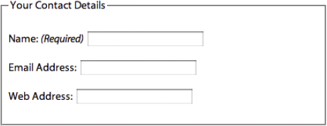
First, you will need to set the general styles for the fieldset and legend elements. The fieldsets must be vertically separated using margins, and the contents can be given breathing space using padding. To highlight the fieldsets, you can give them a light background with a slightly darker, 1-pixel border. Try not to make the background too dark, though, as this can add too much visual weight to the form, making it more difficult to comprehend. Making the legends bold can also help break up the information and make it easier to digest.
fieldset {
  margin: 1em 0;
  padding: 1em;
border : 1px solid #ccc;
background: #f8f8f8;
}
legend {
font-weight: bold;
}Positioning the labels so they appear vertically above the form elements is actually very simple. A label is an inline element by default. However, setting its display property to block will cause it to generate its own block box, forcing the input elements onto the line below. The width of text input boxes varies from browser to browser, so for consistency, you should explicitly set the width of your text input boxes. In this example, I am using ems to create a more scalable form layout.
label {
  display: block;
  cursor: pointer;
}


input {
  width: 20em;
}
Changing the cursor style of the label to pointer is a good idea here, as it shows that the labels can be interacted with.
This layout works equally well for other form elements such as text areas:
<fieldset>
  <legend>Comments</legend>
   <div>
    <label for="text">Message: </label>
    <textarea name="text" id="text">
    </textarea>
</div> </fieldset>
The dimensions of text areas also vary across browsers, so it is a good idea to explicitly set their width and height as well. In this instance, I'm setting a width of 100 percent so it is effectively defined by its parent element. Setting widths in this way is a good idea, as it makes your layouts more flexible and independent.
textarea {
width: 100%;
height: 10em;
}Unlike text areas and text inputs, radio buttons and check boxes need to be handled differently. Rather than having their labels above them, these elements usually have their labels to the right of them. When stacked vertically, all the elements are left aligned, creating a nice solid vertical and making them easier to select (see Figure 7-6).

Earlier in this example, the width of the text boxes was defined by applying a width to the input element. However, the input element covers other form widgets such as check boxes, radio buttons, and submit buttons, as well as the more common text input box. As such, by setting the input element to be 20 ems wide, all of the input elements will be 20 ems.
One way around this problem is to use the attribute selector to target particular types of form element. So instead of setting all the inputs to 20 ems, you could specifically target text inputs:
input[type="text"] {
width: 20em;
}Unfortunately, the attribute selector is only supported on more modern browsers and does not work in IE 6 and below. Until the attribute selector is more widely supported, the best way to distinguish between input elements is to give them a class.
For instance, you could give radio buttons a class name of radio:
<fieldset> <legend>Remember Me</legend> <div> <label for="remember-yes"><input id="remember-yes" class="radio"name="remember" type="radio" value="yes" />Yes</label> </div> <div> <label for="remember-no"><input id="remember-no" class="radio"name="remember" type="radio" value="no" checked="checked" />No</label> </div> </fieldset>
You could then override the previously set input width by setting the width of radio buttons to auto. The same can be done for check boxes and submit buttons:
input.radio, input.checkbox, input.submit {
width: auto;
}Notice how I've wrapped the labels around the form elements on this occasion. If you remember, I previously set all the labels in this form to behave as block level elements, forcing their associated form controls onto a separate line. Obviously, I don't want this to happen with radio button labels, so wrapping the labels around the form controls prevents this.
The last thing you need to do is add a little bit of right margin to the radio buttons, in order to provide so spacing between the labels.
#remember-me .radio {
margin-right: 1em;
}The layout is now complete, but you can incorporate a few nice additions for more advanced browsers. For instance, you could help users easily anchor themselves to the form field they are filling in by changing the element's background color when it receives focus:
Input[type="text"]:focus, textarea:focus {
background: #ffc;
}You can also harmonize the look of the text field and text area elements by giving them custom borders. This is particularly useful for Firefox, which renders the bottom and right borders on these elements as white, causing them to lose definition when on a white background (see Figure 7-7).
Figure 7.7. The bottom and right borders of text inputs and text areas in Firefox are white, causing them to lose definition on white backgrounds
In this example, an attribute selector is used to target the text inputs as this style is mostly for the benefit of Firefox, which understands this selector.
input[type="text"], textarea {
border-top: 2px solid #999;
border-left: 2px solid #999;
border-bottom: 1px solid #ccc;
border-right: 1px solid #ccc;
}In this example, we're not using any password fields. However, if you were creating a generic form style for your entire site, you would need to include [type="password"] in the previous two examples as well.
Many forms contain fields that must be filled in. You can indicate these required fields by placing styled text, or an asterisk, next to them. Because this information is emphasizing the field's required status, the most appropriate element for this information is an em or strong element:
<div> <label for="author">Name:<em class="required">(required)</em>/label> <input name="author" id="author" type="text" /> </div>
You can then style this information however you want. In this example I'm reducing the font size and making the text red:
.required {
font-size: 0.75em;
color:#760000;
}And there you have it: a simple yet attractive-looking form layout using pure CSS.
For longer and more complicated forms, vertical space starts to become an issue, as does the ease of scanning. To improve scanning and reduce the amount of vertical space used, it makes sense to position the labels and form elements horizontally, rather than vertically above one another. Creating a form such as the one in Figure 7-8 is actually very simple and uses almost exactly the same code as the previous example.

The only difference between this and the previous example is that, instead of setting the label to be a block-level element, you float the labels left instead. You also need to give the label a width so that all of the form elements line up nicely:
label {
float: left;
width: 10em;
cursor: pointer;
}If the form labels are likely to wrap onto multiple lines, it would be a sensible idea to clear the container divs as well. This will prevent them from interfering with the next set of labels and ruining your carefully crafted layout.
form div {
clear: left;
}Forms are rarely as simple as the one in Figure 7-8, and you will often need to create exceptions to your basic form styling rules to handle things such as multiple form widgets on a single line or columns of check boxes or radio buttons (see Figure 7-9). The next couple of sections will explain how to handle these types of exceptions.

As you learned in the previous examples, form labels are important for the accessibility of your forms. However, there are situations when you may not want to display a label for every element. For instance, in Figure 7-9 you can see a group of form elements for collecting date information. In this situation, visually displaying each label would be overkill, as it would split the date of birth up into three separate entities rather than being perceived as a single entity. However, while you may not want to display the labels, it is still important that the labels appear in the source code and are available to screen readers.
<div>
<label for="dateOfBirth">Date of Birth:</label>
<input name="dateOfBirth" id="dateOfBirth" type="text" />
<label id="monthOfBirthLabel" for="monthOfBirth">
Month of Birth:</label>
<select name="monthOfBirth" id="monthOfBirth">
<option value="1">January</option>
<option value="2">February</option>
<option value="3">March</option>
</select>
<label id="yearOfBirthLabel" for="yearOfBirth">Year of Birth:</label>
<input name="yearOfBirth" id="yearOfBirth" type="text" />
</div>To create this layout, you first need to hide the "month of birth" and "year of birth" labels. Setting the labels' display property to none would stop the labels from displaying, but it would also prevent many screen readers from accessing them. Instead, you can position the labels off screen using a large negative text indent. In the generic form style we created earlier, labels have been given a set width. To prevent the labels from affecting the layout, the width needs to be zeroed down for these labels as well:
#monthOfBirthLabel, #yearOfBirthLabel {
text-indent: −1000em;
width: 0;
}The various form controls can then be sized individually and given margins to control their horizontal spacing:
input#dateOfBirth {
width: 3em;
margin-right: 0.5em;
}select#monthOfBirth {
width: 10em;
margin-right: 0.5em;
}
input#yearOfBirth {
width: 5em;
}Creating a two-column layout for large groups of check boxes or radio buttons is a little more involved. Labels only work for individual elements, not groups of elements. Ideally, we would wrap the whole group in a fieldset and use the legend to act like a label for the group. Unfortunately, due to the inconsistent way browsers handle the positioning of legends, this is not currently a practical solution. So until the browsers offer more consistent support, the best option is to use a heading element instead.
To create the column effect, the check boxes are split into two sets, and each set is wrapped in a div with a class of col. These elements are then grouped together by wrapping them in a fieldset with a descriptive ID:
<fieldset id="favoriteColor">
<h2>Favorite Color:</h2>
<div class="col">
<div>
<label><input class="checkbox" id="red" name="red" type="checkbox"
value="red" />red</label>
...
</div>
</div>
<div class="col">
<div>
<label><input class="checkbox" id="orange" name="orange"
type="checkbox" value="orange" />orange</label>
</div>
...
</div>
</fieldset>Because a generic fieldset style has already been created, the first thing you need to do is override those styles, zeroing down the padding and margin, removing the borders and setting the background color to be transparent:
fieldset#favoriteColor {
  margin: 0;
  padding: 0;
  border: none;
  background: transparent;
}
The heading is going to act like a label, so it needs to be floated left and given a width of 10 ems like the other labels. The headline also needs to look like a label, so the font weight needs to be set to normal, and the font size needs to be reduced.
#favoriteColor h2 {
  width: 10em;
  float: left;
  font-size: 1em;
  font-weight: normal;
}
The two-column layout can then be created by giving the divs a width and floating them left. However, as all of the divs in this form have been cleared by default, we need to override that declaration by using clear:none.
#favoriteColor .col {
  width: 8em;
  float: left;
clear: none;
}
All the labels in this form have been floated left and set to be 10 ems wide. However, the labels for the check boxes do not need to be floated, so we should override that declaration here.
#favoriteColor label {
float: none;
}
And there you have a relatively complex form layout. The basic form style takes care of the general layout, and exceptions can be handled on an individual basis by overriding these styles.
Forms are a great way of adding interactivity to your site and for posting data back to the server. In order to activate the form, you therefore need some kind of button control. Normally, people use an input element with the type value set to submit. Input buttons are the most common way of submitting data to the server, but they are not without problems, not least the fact that you can't target them with just an element selector. You could target them with an attribute selector, but this isn't supported by older version of Internet Explorer, so your only option is to target them directly with an ID or class selector. So instead of using an input element, why not use the button element?
The button element has been gaining in popularity of late but is still relatively unknown and underutilized. This is a shame as button elements give you a great deal of flexibility. For a start, you can wrap button tags around an image and that image becomes your control (see Figure 7-10).
<div>
<button type="submit">
<img src="/img/button.png" alt="Book Now" />
</button>
</div>

As buttons have some default styling, you will want to turn this off.
button {
  border: none;
  background: none;
  cursor: pointer;
}
Many operating systems, like OS X, prevent authors from changing the style of their input buttons, preferring to keep consistency throughout the operating system. However, the button element doesn't suffer from these constraints. As such, it is possible to create fairly advanced button styles purely using CSS. For instance, say you started with this simple submit button.
<p>
<button type="submit">Book Now »</button>
</p>
You could start by giving the button some explicit dimensions and a colored border. You could then round the corners off using border-radius and apply a nice text shadow. Last, you could apply a gradient background, either by using an image or possibly even using Webkit-specific gradients. The result would look something like Figure 7-11.
button.two {
  width: 200px;
  height: 50px;
  border: 1px solid #989898;
   -moz-border-radius: 6px;
   -webkit-border-radius: 6px;
   border-radius: 6px;
   background: url(/img/button-bg.png) #c5e063 bottom left repeat-x;
  -moz-box-shadow: 2px 2px 2px #ccc;
  -webkit-box-shadow: 2px 2px 2px #ccc;
  box-shadow: 2px 2px 2px #ccc;
   color: #fff;
   font-size: 26px;
font-weight: bold; text-shadow: 1px 1px 1px #666; }

The main limitation with button elements is the way IE 6 and, to a lesser extent, IE 7 handle their submission. Rather than submitting the contents of the value attribute, as other browsers do, IE 6 and IE 7 submit the contents of the element. Furthermore, if you have multiple buttons on a page, IE 6 will submit the contents of all the buttons, rather than just the one that was clicked. As such, if you wanted to use more than one button per page, you need to make sure that they all have the same function, as you won't be able to tell which one had been activated in older version of Internet Explorer.
Forms will usually require some type of feedback message to highlight fields that have been missed or incorrectly filled in. This is usually done by adding an error message next to the appropriate field (see Figure 7-12).
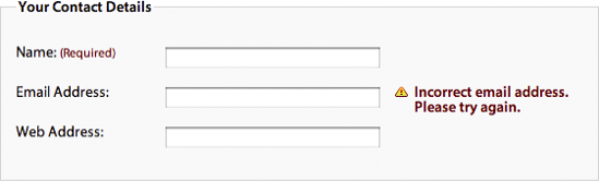
To produce this effect, you could wrap your feedback text in a em and place it after the text input in the source code. However, for everything to line up correctly, both the em and the preceding input would need to be floated. This will have an effect on the behavior of the enclosing paragraph, which in turn will have an effect on the whole layout. Furthermore, many screen readers will ignore text between form elements, unless they are enclosed in a label. To avoid these problems, the best approach is to include the error message text inside the form label, and then position it using CSS:
<div> <label for="email">Email Address: <em class="feedback">Incorrect email address. Please try again.</em> </label> <input name="email" id="email" type="text" /> </div>
To position the feedback em, you first need to set the position of all of the paragraphs in the form to relative, thereby setting up a new positioning context. You can then position the feedback em absolutely, so it appears to the right of the text input. We know that the labels are 10 ems wide and the text boxes are 20 ems wide, so we can set the left position of the feedback span to be 30 ems.
form div {
  position: relative;
}


form .feedback {
  position: absolute;
left: 30em;
  right :0;
  top: 0.5em;
}
Rather annoyingly, IE 6 and below incorrectly set the width of the feedback em to be the minimum width possible. To get around this problem, you need to set an explicit width for this browser. One way to use conditional comments as detailed in Chapter 8:
form .feedback{
  width: 10em;
}
You can then apply whatever styling you want to your feedback messages. In this case, I have made the text bold red and have applied a warning image to the left side of the message:
form div {
  position: relative;
}


.feedback {
  position: absolute;
left: 30em;
  right :0;
  top: 0.5em;
  font-weight: bold;
  color: #760000;
  padding-left: 18px;
  background: url(/img/error.png) no-repeat left top;
}
You could also use this technique to provide positive feedback or advice on how to fill out particular parts of the form.
In this chapter, you have learned how different form layouts can work in different situations. You can now lay out complicated forms using CSS, without harming a single table in the process. You have learned how tables should be used—for data rather than layout—and have learned that data table design can be fun.
In the next chapter, you will use everything you have learned so far to start building CSS-based layouts.