“Some days are yellow.
Some are blue.
On different days I’m different too.”
–Dr. Seuss, My Many Colored Days
CHAPTER 4
BLOCKING, BLENDING, AND BOUNCING
A very important aspect of applying color theory is learning to shape, place, and direct light. For example, in a scenario using two lights of different colors, the distance between the lights, the ratio of their outputs, and their position in relation to the subject will determine whether the colors remain separated or blend together. In this chapter, we will go into three unique ways to handle colored light: blocking, blending, and bouncing.
COLOR BLOCKING
Color blocking is a term often used in fashion design. It refers to the use of (typically highly saturated) “blocks” of colors on a garment or in an ensemble. It’s also a perfect term to describe the lighting technique where multiple different-colored lights are used on a subject and the colors remain unblended.
In Figure 4.1, I am using two softboxes in close proximity to Dani, the model. One is positioned low, aiming up; the other is positioned high, aiming down. This setup is often referred to as clamshell lighting. Because the lights are spaced several feet apart (one light above the other), and within a few feet of Dani, there isn’t enough space for the lights to overlap and blend their colors. If she were to back up 5 feet, the colors of the lights would overlap, combining to create a blended, slightly green color.
This technique involves under lighting a subject, which will not work for every subject. Under lighting in general is really hard to pull off in a flattering way. It helps if the subject has a strong jawline, like Dani. When the technique is done right, you get a vibrant beauty image with a fantastic duotone catch light in the subject’s eyes, like the yellow and blue squares seen in Figure 4.2 (or the orange and cyan seen in the chapter intro photo).

Figure 4.1 The setup. My lights are placed close to the model, and several feet apart (in this scenario, one light is placed above the other) to prevent the colors from overlapping and creating new, blended colors. Photo by Christopher Hill.
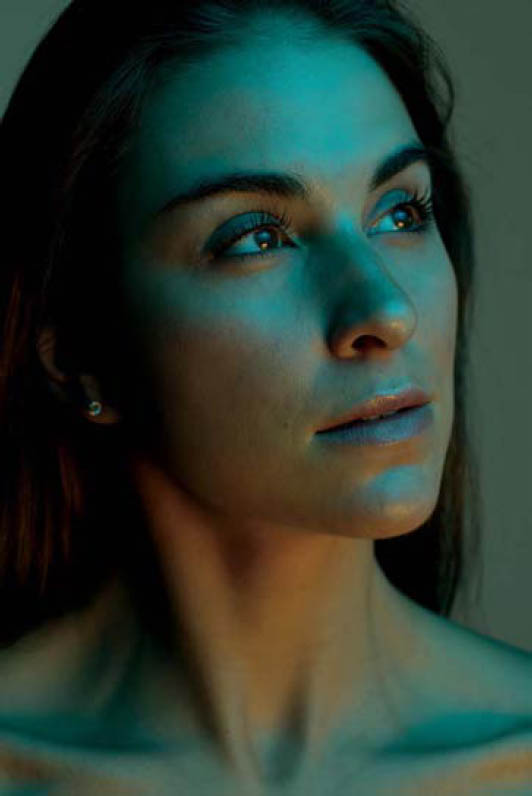
Figure 4.2 The RAW file. Note the duotone catchlight in the subject’s eyes.
The next element to consider in color blocking is color combination. Though it’s not necessary to adhere to strict color-theory guidelines (such as always using complementary colors), I find it’s best to pair a cool color with a warm color to help move the viewer’s eye through the image. Depending on which colors you select and the density of the gels, you may have two lights with vastly different outputs. My cyan-gelled light, for example, needed to be four times brighter than my yellow-gelled light to achieve a balanced output (Figure 4.3). I haven’t found a hard-and-fast rule for determining equivalent light outputs for different color combinations, so you’ll have to rely on trial and error. Once again, lighting in layers will help you quickly get equivalent outputs for each colored light.
Later in Lightroom, I enriched the yellow part of the image to make it warmer and a better complement to the cyan. As you can see in Figure 4.4a, I started by making a radial adjustment, which raised the exposure in the top-left part of the image. I also increased the white level, which added a nice bump in contrast (Figure 4.4b). Make sure not to adjust this setting too far or you’ll quickly lose color saturation and detail in your highlights.

Figure 4.3 The lighting diagram. The cyan gel I used in this scenario was more dense than the yellow gel, so I had to set the output of the cyan-gelled flash four times brighter than the output of the yellow-gelled flash to achieve a balanced image.
Next, I warmed up the image by making a series of tone curve adjustments. In the red channel, I raised the top part of the curve after first making an anchor point to the left of it to prevent red from increasing over the entire image (Figure 4.3c). In the green channel, I lowered the bottom side of the curve to add magenta to the shadows (Figure 4.4d). Finally, in the blue channel, I raised the bottom part of the curve to add blue to the shadows (Figure 4.4e). I finished by tweaking the colors in the Camera Calibration panel to taste (Figure 4.4f). In the final image, Figure 4.5, the colors remain distinct and Dani’s eyes are filled with colored catchlights.

Figure 4.4 The Lightroom settings. I used the individual tone curves to warm up the yellow part of the image to make it better complement the cyan part of the image.

Figure 4.5 The final shot. The cyan and yellow remain distinct, and Dani’s eyes are filled with sparkly, colored catchlights.
This clamshell setup can be done with a number of color combinations. For example, in Figure 4.6, I had the top light ungelled and the bottom light gelled blue.
A clamshell setup isn’t the only way to color block. In Figure 4.7, I have a blue-gelled softbox on the left and a red-gelled softbox on the right, as well as a green-gelled “hard” light (meaning no light modifiers) in the middle—all within 2–3 feet of my model, Shelby. As we covered in chapter 1, we know that red, green, and blue overlap to create colorless light, according to the additive color theory model. However, since we color blocked instead of blended, the colors stay distinct.

Figure 4.6 This shot uses an ungelled top light and a blue-gelled bottom light.
I set up the three lights, one color at a time, with each light on its own channel. I positioned the subject and lights about 7–10 feet from a white sweep in order to allow some of the green light to spill onto the background. I made sure that the blue and red lights were positioned in such a way that they didn’t light the background, ensuring that the background would remain green. With each gelled light on its own channel, I switched between them to make sure I’d achieve a proper exposure with each color; Figure 4.8a shows the red light, Figure 4.8b shows the blue light, and Figure 4.8c shows the green light. Once each color was properly exposed, I activated all three light channels and proceeded with my shoot (Figure 4.9).

Figure 4.7 I have three lights, gelled red, blue, and green, placed within 2–3 feet of Shelby, to color-block the light. The close proximity of the subject and the lights to the white sweep allows for some of the green light to illuminate the background.

Figure 4.8a-c By building up my colors in layers, I ensure that the colors don’t overlap and blend too much.

Figure 4.9 The red, green, and blue lights remain distinct and separate on the model.
COLOR BLENDING
With the lights placed close to the subject, the colors stay separated; however, by backing the lights far enough away from the subject that the light spread is even across the frame, you can blend two opposite-colored lights, creating a balanced image with colorful accents.
Figure 4.10 was lit with two lights: one light was gelled yellow and the other was gelled blue. By selecting a color and its opposite (or a color close to it), and by balancing the light output from each light to even out the differences in tone, I was able to create a balanced image, complete with colorful shadows. To achieve the image in Figure 4.11, I used the opposite colors magenta and green. Note the position of the two lights (Figure 4.12), set about 10 feet from the subject, one on either side of the room. This setup was used to create both images. Due to space restraints, the light on the right was bounced into a nearby white wall in order to create a large, soft light source to match the soft light on the left. In order to balance out the two colors, the magenta light had to be set to an output four times lower than the green light.

Figure 4.10 This image was lit with two lights: one gelled yellow and one gelled blue.

Figure 4.11 This image was lit with two lights: one gelled magenta and one gelled green.

Figure 4.12 The setup. Due to a space constraint, I fired the green-gelled light into a nearby white wall to get a large, soft light source.
In another recent shoot, I photographed fashion designer Jessica Daly’s new collection. Her designs are exciting, youthful, while often monochromatic. Though I shot most of her collection with a neutral light source (in traditional look-book style), I saved a bit of time at the end of the shoot to play with color. I knew that adding some color accents to the image would give the otherwise near-monochromatic images some energy.
When blending two different colors of light, building your light in layers won’t do much to help you in terms of exposing correctly. But it can still help you ensure proper light placement, which is important because you want to be sure that each light covers the whole scene. That said, when it comes to getting a balance between the lights, you’ll need to take a test shot using both lights to see if either output needs to be adjusted.
In Figure 4.13, you can see that the magenta light is overpowering the green light. In Figure 4.14, you can see that I over adjusted the green light, resulting in another unbalanced image. In Figure 4.15, I got the lights properly balanced, but now it’s obvious that the subject and the lights are placed too close to the background, resulting in multiple shadows on the paper sweep. Once I moved the lights and model about 5 feet forward, I had a file that I could work with (Figure 4.16).

Figure 4.13 In this shot, the magenta light output was too high.

Figure 4.14 In this shot, the green light output was too high.

Figure 4.15 Though the colors are now balanced, the model is too close to the background, resulting in multiple shadows.

Figure 4.16 The RAW file. The colors are now balanced and the background shadows have been minimized.
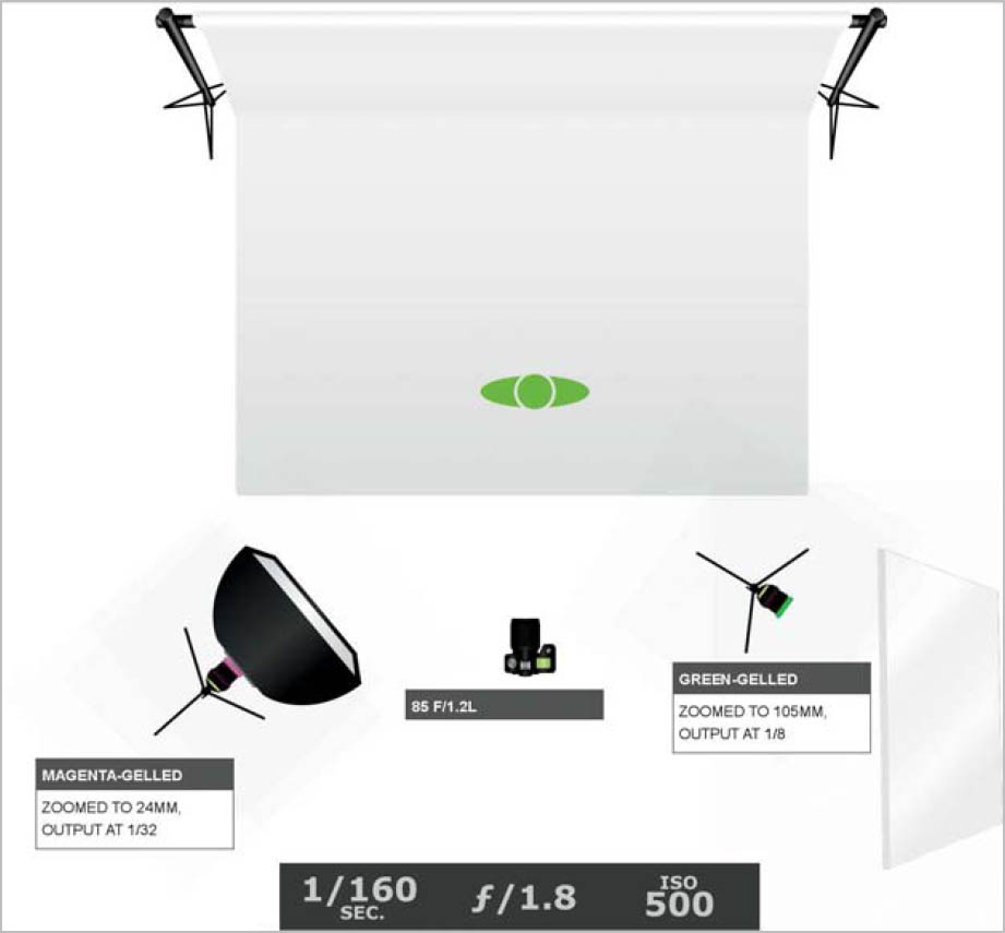
Figure 4.17 The lighting diagram. I shot at a shallow depth of field to ensure the background went out of focus. I also zoomed my green-gelled flash in to 105mm to maximize the bounced light.
Note the camera settings in Figure 4.17. I shot at f/1.8 so the background would be out of focus. Since there was still a bit of green light spilling onto the background, I wanted to make sure that you wouldn’t be able to see any backdrop texture. Also, note that the green-gelled light, which is being fired into the white wall, is zoomed in to 105mm to get more out of the bounced light.
In post-processing this image, my goal in Lightroom was to get as close to a visually accurate white balance as possible. That meant warming up the green and cooling off the magenta. As you can see in Figure 4.18a-e, my biggest adjustments, not surprisingly, were done in the red and green tone curves. I started with a radial adjustment (Figure 4.18a), and then moved on to adjusting the various color channels. By making relatively dramatic S-curves in both color channels (Figures 4.18b and 4.18c), I was able to further balance the magenta and green hues in the image. Lowering the left part of the curve in the green channel adds magenta to the shadow areas, while pushing the highlight portion of the curve upward results in more green highlights in the image. The same can be said of the red channel, which adds red and cyan to the image. I also lowered the highlight point in the blue curve to add yellow to the image (Figure 4.18d). I finished up my color grading in the camera calibration panel (Figure 4.18e).
Now my photo of Jessica’s collection has colorful accents without losing the integrity of the neutral-colored garment (Figure 4.19).
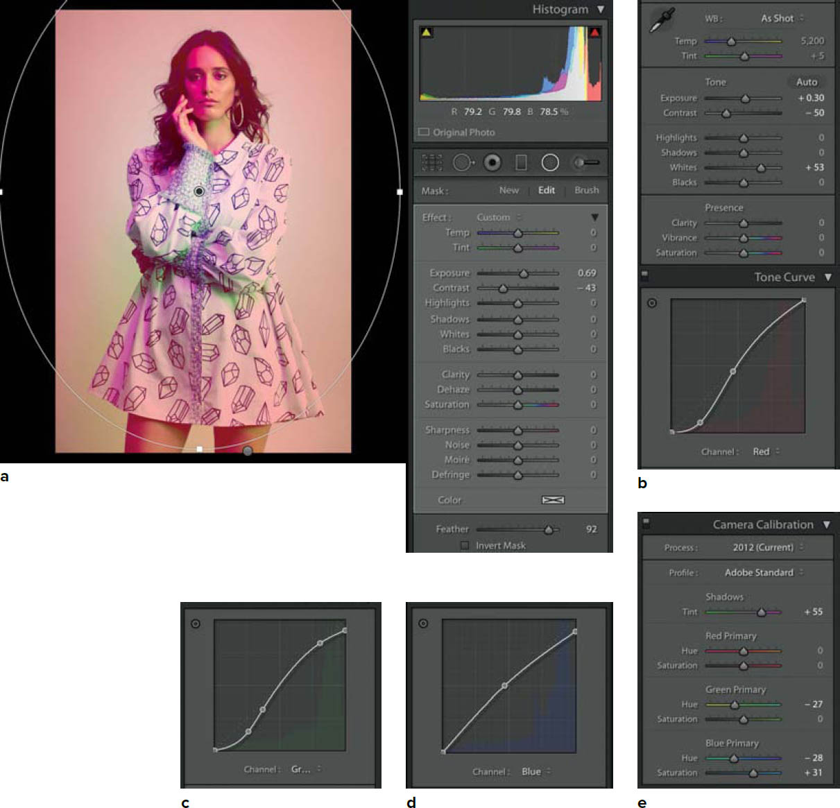
Figure 4.18a-e The Lightroom settings. I made my largest adjustments in the green and red tone curves.

Figure 4.19 The final shot. Now Jessica’s garment is accented with pops of color without losing the integrity of the actual design.
COLOR BOUNCING
This next scenario is a tough one to pull off, as there is a thin margin for error. However, when done properly, you can turn one light into two light sources of varying quality and color.
You can see my setup in Figure 4.20. I have a roll of red paper positioned about 3 feet from my model. I have my light positioned about 3 feet above her head and aiming at a diagonal. My light is gelled yellow and fitted with a snoot to keep the light focused into a tight beam. It really is a game of inches. I want the light to hit the red paper at her eye-level, creating a red light source that reflects back on her. This will serve as the main light. I also want a bit of the direct, yellow light to spill onto her head and shoulders on its way to the red paper, to make a different-colored accent light.
To shape my light into a focused strip (to minimize light spill), I used a light modifier of my own construction, since I have yet to find an equivalent modifier on the market. In Figure 4.21a, you can see that I assembled a rectangular black box out of foam board and gaffer tape. This snoot is 6 inches long (the longer the length of the snoot, the more focused the light will be) with two 1-inch barn doors over the open end that can be taped into the desired position (Figure 4.21b). The snoot is measured to fit the flash head snugly. The best part about this DIY modifier is that it folds flat to easily fit in my camera bag (Figure 4.21c).

Figure 4.20 The setup. A snooted, yellow-gelled flash is positioned to fire above my subject, who is seated in front of a roll of red paper acting as a reflector fill.

Figure 4.21a I made this 6-inch DIY snoot with barn doors out of black foam board.

Figure 4.21b The snoot fits snugly over the flash and the barn doors can be taped into the desired position.

Figure 4.21c The snoot folds flat to fit easily in my camera bag.
I selected this vibrant red paper as a bounce surface because the color is bright enough to reflect a good amount of light onto the subject (darker tones absorb light rather than reflect it), but bold enough that it won’t be easily washed out by the yellow light. I chose yellow for my light because it’s such a versatile color. It’s a bright tone (which I need for bouncing) that can easily be cooled down or warmed up with a quick white balance shift. Yellow and red are also far enough from each other on the color wheel that achieving a balanced composition was fairly easy, (Figure 4.22).

Figure 4.22 The final shot. Though red and yellow combine to create orange, the reflected light off the backdrop was red enough to create the duotone look of this image.

Figure 4.23 This setup is the same as the previous except the light is ungelled and unmodified.
One scenario in which this technique comes in handy is when you’re dealing with lighting a reflective surface, like sunglasses, for example. In Figure 4.23, my subject, Rachel, is wearing red sunglasses and a red shirt and is positioned in front of the same red backdrop. The only difference is that, in this setup, the light is ungelled and unmodified. The backdrop will not only once again provide a soft, red light source for my subject, but it will fill in the reflection in her sunglasses.
Again, light position is critical. If the light is aimed too far to the right, some of the light spills onto her face, creating harsh shadows (Figure 4.24). To remedy this, I aimed it the other way, more toward the white backdrop behind her. Now the light is separating her from the backdrop and illuminating her sunglasses (Figure 4.25). The funny thing is that I liked the yellow/red combo from the previous setup so much that I decided to turn up the ungelled light yellow in Lightroom by lowering the highlights in the blue tone curve (Figure 4.26). Now all Rachel needs is a strawberry lemonade to go with the colors in Figure 4.27.
In the next chapter, we will explore continuous light options, including how to balance them with window light.

Figure 4.24 If the light is positioned too far to one side, the light can spill onto the subject’s face, creating harsh shadows.

Figure 4.25 With the light correctly positioned, Rachel is separated from the background and her sunglasses are filled with soft, red light.

Figure 4.26 I preferred the look of yellow and red, so I added yellow tones by lowering the highlight point in the blue tone curve.
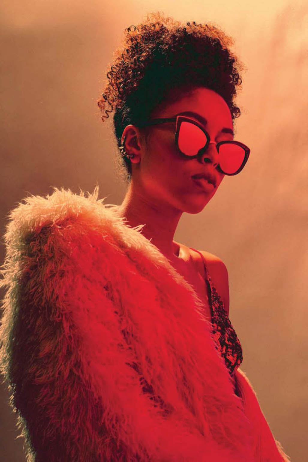
Figure 4.27 Now all Rachel needs is a strawberry lemonade to match the colors in this shot.