
Chapter 7
Data Visualization with Reports and Dashboards
In Chapter 5, “Data Analysis and Statistics,” you learned about various techniques for analyzing data. In Chapter 6, “Data Analytics Tools,” you explored a selection of software packages and programming languages that facilitate analysis. While the analytical process aims to derive insights from data, it is crucial to communicate those insights to the appropriate people at the right time. As raw data evolves into usable information, reports and dashboards are essential tools for sharing the results of analytical work.
Every day, businesses rely on data to inform decisions. While it is desirable to have beautiful, visually appealing reports and dashboards, the essence of visualizing data is to tell a story, giving the appropriate information to the right people at the right time. If a report or dashboard fails to facilitate effective communications, it will diminish the organizational impact of the analysis behind the visualization.
This chapter will develop an understanding of considerations to think through when translating business requirements into a visualization. We will first understand why it is vital to understand the business needs before creating visualizations. We will then explore design considerations to keep in mind when creating reports and dashboards. We will then explore considerations that influence dashboard development methods and the process to build a dashboard.
There are a wide variety of visualizations from which to choose. In this chapter, you will learn about several different types of visualization and the considerations for their use. Finally, we will compare and contrast different types of reports, always keeping in mind the needs of the business and the objective to communicate clearly and efficiently.
Understanding Business Requirements
Reports and dashboards both summarize data for end users, but they distribute those summaries in different ways. A report is a static electronic or physical document that reflects information at a given point in time. On the other hand, a dashboard is an interactive visualization that encourages people to explore data dynamically. Both reports and dashboards are ideal tools for visualizing data content.
The most important thing to define when developing a report or dashboard is answering the question, “Who is the audience?” For example, a custodial supervisor might want to track the remaining cleaning products’ daily levels to inform restocking decisions. Alternatively, a chief executive officer (CEO) may wish to understand revenue by brand and global region. You shouldn't begin creating a report or dashboard until you clearly understand who your audience is and how they will use the product.
Once you clearly understand the audience and their needs, you can turn your attention to identifying the data sources that will satisfy the requirements of your audience. For instance, you may need to combine data across multiple subject areas. For example, if you are working with corporate executives, you may need to combine data from various divisions within the organization. Sourcing this data can be a challenge, as when a corporation grows inorganically through acquisition, it can end up with multiple redundant systems to accomplish a single business objective. As an analyst, your job is to ensure that you have access to the appropriate data sources.
As you identify data sources, you'll need to consider how old the data can be while satisfying the needs of your audience. Suppose you are working with the chief financial officer (CFO) of a consumer products company to develop a historical report on corporate sales revenue for the past five fiscal years. In that case, you don't need real-time sales information and can instead focus on obtaining high-quality historical data. It is most likely that views within a data warehouse or data mart, as described in Chapter 3, “Databases and Data Acquisition,” would serve as the data source for this type of report, as Figure 7.1 illustrates.

FIGURE 7.1 Historical reporting
As you consider the needs of the CFO, you will want to think through the parameters of the report and how that affects data sources and report design. Report parameters let you define data range limits for the data elements in your report. For instance, even if you think the CFO will want to see six years of historical sales, you'll want to avoid limiting the report to a specified number of years. Instead of restricting the report generation process, accommodate the ability to filter data by date range. Filtering data in this manner provides you with more flexibility down the road if the CFO later decides that they want to see 10 years of sales data.
In most reports, you'll want to filter by more than one parameter. For example, suppose the CFO wants to share eyecare-related sales data with the person who leads the eyecare division. In that case, you would want to enable the ability to filter the data by content so that the eyecare leader only sees the section of the report that is relevant to their operations.
Alternatively, suppose you are working with a regional sales manager in the dental division who wants to understand the progress of their staff against their sales goal. In this scenario, you need to ask the sales manager how frequently they need the report updated. That frequency may change depending on the time of year. For example, the sales manager may only check this report every month for much of the year. However, as the end of a fiscal quarter approaches, they may want to see updates weekly, daily, hourly, or in real time. In this case, you want to design your report to accommodate when they need updates most frequently, which influences your data source. To satisfy the need for real-time data, you use the transactional system for recording dental sales instead of relying on older data from a data warehouse, as shown in Figure 7.2.

FIGURE 7.2 Real-time reporting
Once you identify who needs what data and when they need it, you can focus on how people access the report. If people will access the report digitally, one way to solve the distribution challenge is with a pull approach. With a pull approach, you publish a report to a known location, like a web page, and let people know the frequency and timing of when the report updates. With this approach, people can go to the website when they want to use the report.
Alternatively, you could implement a push approach. With a push approach, the report is automatically sent to the appropriate people as it becomes available. When designing a push approach, you need to think through distribution considerations. For example, a report may prove to be too large to distribute via email. In that case, you could use a blended distribution approach. With a blended approach, you store the report centrally and let people know when the report has been updated and is ready for use. With the blended approach, you inform people that the report is available while maintaining central control of the report itself.
If you go with a push or blended approach for informing people about the readiness of a given report, be sure to think through the maintenance of the distribution list of people to notify. With all organizations, people rotate in and out of roles. As people transition out of a position, you want to ensure that they no longer receive notifications about reports that are no longer relevant to their job role. On the other hand, as a new person joins the organization, you need to get that person the reports they require to be effective in their role.
However, suppose you are creating a printed report that will be distributed physically to its recipients. In this case, the distribution challenge is entirely different. If the recipients are within your organization, you can use existing distribution channels to distribute the printed report. However, if the recipients are in other locations across the country, you need to ensure that you have the appropriate mailing address for each recipient. You also need to ensure you have enough lead time to send the report through the mail. Alternatively, you could speed up distribution by paying more for overnight delivery.
Understanding Report Design Elements
Whenever you give people a tool, it should be approachable and easy to use. When creating a report or a dashboard, you can use existing design principles as guideposts. These design principles, known as the “five Cs” of creating visualizations, will help ensure that your reports and dashboards communicate clearly and efficiently. When thinking visually, the five Cs are control, correctness, clarity, consistency, and concentration.
Control has to do with how you focus the attention of your audience. When someone encounters a dashboard for the first time, one of your goals is to deliver the pertinent information quickly. For instance, if there is a place where people can adjust parameters and have the dashboard respond, use visual highlights to focus attention on this capability.
Correctness makes sure that your information is accurate and that there are no spelling mistakes. Pay close attention to correctness when using corporate names and logos. For example, Procter & Gamble is a large consumer goods corporation. Misspelling the company name as “Proctor & Gamble” is embarrassing as it displays a lack of correctness.
Clarity refers to selecting the right visualization tool for communicating your message, making sure the visualization is easy to interpret and visually crisp and uses fonts and sizes that are easy to read. For example, consider Figure 7.3, which uses an ornate font. While the diagram conveys the same information as Figure 7.2, the font compromises clarity and makes it hard to read.

FIGURE 7.3 Poor font choice
Consistency refers to using the same design and documentation elements throughout your report or dashboard to give your visualization a cohesive and complete feel. Using the same font, page layout, and web page design are all techniques for ensuring consistency.
Concentration refers to using visuals to focus your audience's attention on the most relevant information without overwhelming them with details. Concentration, along with clarity and control, helps you focus your audience by reducing clutter and removing unnecessary details. Use a layout that increases concentration, and remove distracting visual elements from charts. For example, suppose you are creating a report that summarizes quarterly sales performance. To improve concentration, only show the necessary summary statistics instead of including the raw daily sales data.
Report Cover Page
When developing a printed report, keep in mind that the first thing people see is the cover page. Since the cover page is the first thing a person sees, it is vital that it sets expectations about the observations and insights the reader will find within. Effective cover pages have a concise title that describes the contents of the report. Ideally, a cover page will also communicate a significant insight from the report itself. As the saying goes, you never get a second chance to make a good first impression. In that vein, a cover page has to entice a person into turning the page and diving into the report. Figure 7.4 shows the cover page for the 2020 Porsche AG Annual Report. It incorporates product imagery with text on the right detailing what the reader can expect to find within.

FIGURE 7.4 Porsche AG Annual Report cover page
Source: Copyrighted by Dr. Ing. h. c. F. Porsche AG.
Accompanying the title page should be clear instructions on how to use the report. For example, if the report analyzes five years’ worth of data, the range of years should stand out on the cover. Excluding the range of years demonstrates a lack of clarity and control.
Executive Summary
Following a report's cover page is an executive summary. The executive summary provides an overview of the report's contents. When crafting an executive summary, you should begin with the end in mind, summarizing crucial observations and insights. With time an executive's most precious resource, the summary needs to convey the big ideas, while the body of the report details the analysis that led to those ideas. Figure 7.5 illustrates a compelling executive summary taken from the 2020 Porsche AG Annual Report.

FIGURE 7.5 Porsche AG Annual Report executive summary
Source: Copyrighted by Dr. Ing. h. c. F. Porsche AG.
Design Elements
When developing a report or dashboard, you need to incorporate design elements into your thinking. Color schemes, page layout, font size and style, charts, and corporate standards are among the many design elements you should consider. These considerations apply if you are enhancing an existing report or creating a new dashboard.
Color Schemes
A color scheme is a limited selection of colors you use when creating a report or a dashboard. The first decision to make is whether you need to use a monochromatic color palette or have the flexibility to use more than one color. A monochromatic palette limits you to working with shades of a single color, as shown in Figure 7.6. One use case where a black monochromatic palette is an appropriate choice is creating physical reports. For example, suppose you are designing a less formal printed report for frequent, high-volume distribution. Given the distribution needs, printing in full color could be prohibitively expensive. When distributing electronically, consider whether the recipient has access to a color printer.

FIGURE 7.6 Black monochromatic color palette
If you have the luxury of working with more than one color, selecting a complementary color palette is a sound choice. A complementary palette starts with two contrasting colors. Examples of complementary colors are red and green, orange and blue, and yellow and purple. Suppose you are creating a corporate annual report for broad distribution. This kind of report has a high impact and annual distribution, making the cost of color printing insignificant. Whether you are working in monochrome or multiple colors, ensure that the font color contrasts with the background color to ensure readability.
Layouts
The layout of a report or dashboard determines the arrangement of its component parts. It is crucial to consider approachability when thinking about the design. When developing the layout for a report, begin with a summary before diving into the supporting detail. For a long, multipage report, use a table of contents so that the reader can efficiently navigate to a topic of interest, as well as headings for sections and subsections.
Use brief paragraphs and bullet points to focus the reader's attention. Ensure parallel construction when developing bullet points. Parallel construction is when all bullet points use the same form and have the same style and approximate length. Figure 7.7 shows nonparallel construction, where the second bullet point has a different format than the other three. Figure 7.8 fixes the construction issue by changing the phrasing of the second bullet point.

FIGURE 7.7 Nonparallel construction

FIGURE 7.8 Parallel construction
Fonts
When choosing a font style, pick one that is easy for people to read by avoiding ornate fonts. After excluding ornate options, you need to decide between a serif or sans serif font style. In typography, a serif is a finishing detail for each letter in a typeface. A serif font style includes serifs, whereas a sans serif font style does not. Consider the capital T at the start of each sentence in Figure 7.9. For all the sans serif font styles, the horizontal component of the capital T is a straight line. On the other hand, all serif style fonts have a finishing flourish at either end of the horizontal line.
Studies show that using a serif font instead of a sans serif font makes text easier to read. Times New Roman, Garamond, and Courier New are all examples of serif fonts, while Helvetica, Arial, and Geneva do not have serifs. Spend some time studying all the letters in Figure 7.9 to compare these popular fonts and see the stylistic difference for each serif and sans serif letter.
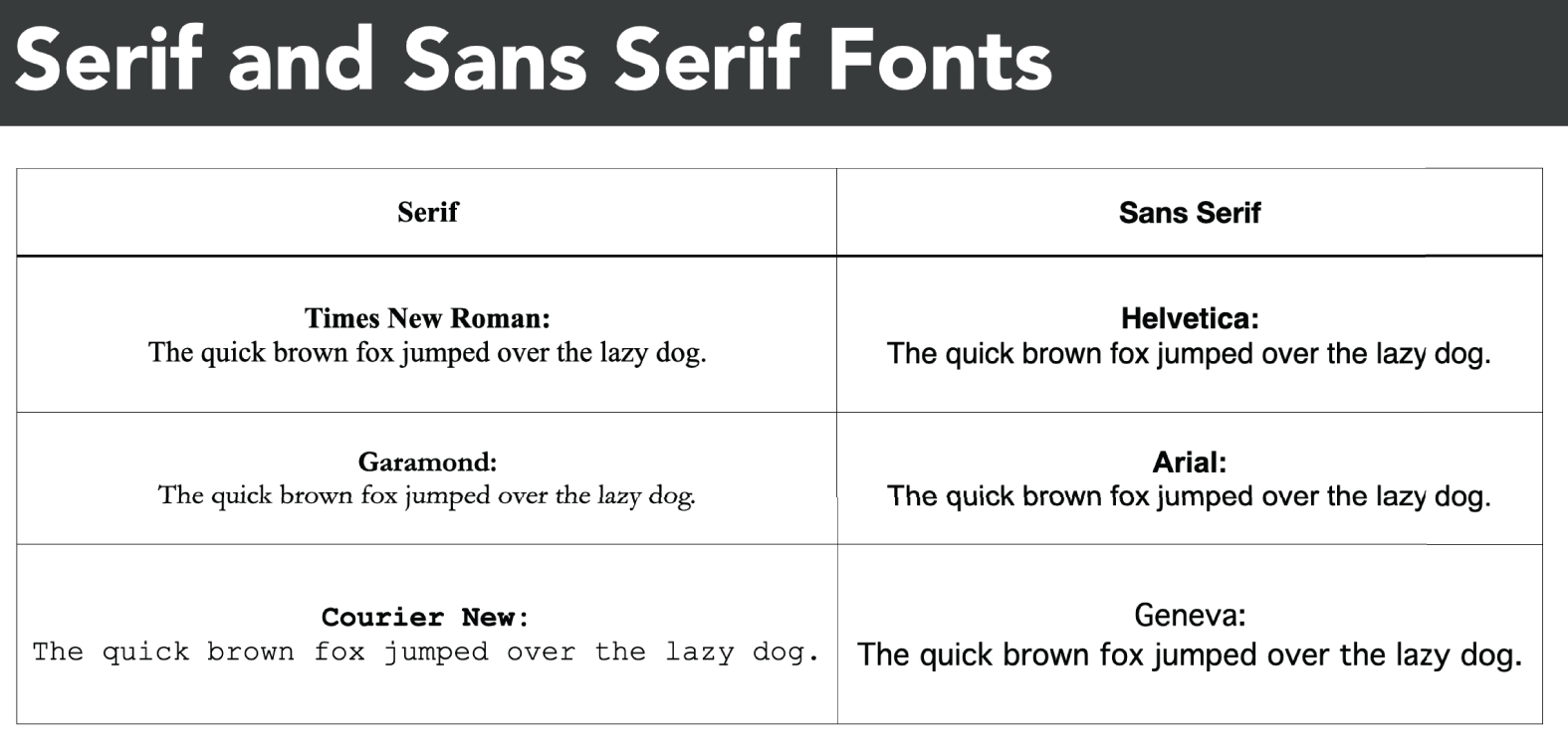
FIGURE 7.9 Serif and sans serif fonts
After selecting a font style, determine the appropriate font size for your title, table of contents, headings, subheadings, and body text. You measure font sizes in points, with each point representing 1/72 of an inch. Start with your body text when determining font sizes. The body text makes up most of what a person reads, so you want to make sure you don't pick a font size that is too small. It is common for body text to range between 12 and 14 points. After selecting a font size for your body text, use progressively larger sizes for subheadings, headings, and titles. Figure 7.10 illustrates a sample style guide that specifies layout elements and their font size.

FIGURE 7.10 Sample layout elements and font sizes
Remember that selecting an appropriate font size is crucial for printed reports, as the size becomes fixed during printing. However, font size is less critical when distributing electronically, as recipients may adjust the overall font size on a computer, tablet, or mobile device.
Graphics
Using graphics to present summary information is a practical choice, whether creating a report or developing a dashboard. As the saying goes, a picture is worth a thousand words, and visually conveying information with charts helps focus your audience's attention. Think through the key chart elements when designing charts, including the chart's title, labels, and legends.
When developing a chart, make sure you specify a chart title. A chart title uses a large font size and concise wording to clearly describe what the chart depicts. If necessary, you can use a subtitle to supplement your title with additional information to add clarity.
When using a chart, be sure to use labels appropriately. In a chart with an x-axis and a y-axis, a label describes what each axis represents. Consider Figure 7.11, which shows how a vehicle's engine displacement on the x-axis relates to its highway efficiency in miles per gallon on the y-axis. If the axes did not have labels and the title was missing, a person wouldn't know what information the chart conveys.

FIGURE 7.11 Sample chart
When a chart shows multiple categories, use a legend to help the reader distinguish between categories. For example, consider Figure 7.12, which shows Ford's and Volkswagen's corporate average highway fuel economy in miles per gallon. The legend indicates that the data in the chart for Ford uses circles, whereas the data for Volkswagen uses triangles.

FIGURE 7.12 Sample chart with legend
Corporate Reporting Standards
When developing any type of visualization, be mindful of any existing corporate reporting standards. For instance, your organization may have a style guide for reporting. A style guide is a set of standards that drives consistency in communication. As a means of enforcing structure and consistency, style guides define the use of a variety of branding elements, including page layout, font selection, corporate color codes, logos, and trademarks.
Imagine that you work for General Electric and are developing a new visualization. Figure 7.13 shows the logo for General Electric. The logo is quite recognizable. Incorporating the logo into a report or dashboard communicates an association with the brand. If you are working in color, you also want the appropriate color code from Table 7.1 to use the “General Electric Blue” elsewhere in your visualization. Using consistent colors is one way to give your visualizations a cohesive look.

FIGURE 7.13 General Electric logo
TABLE 7.1 Color codes for General Electric Blue
| Format | Value |
|---|---|
| Pantone | PMS 4151 C |
| HEX Color | #026CB6 |
| Red Green Blue(RGB) | (2, 108, 182) |
| Cyan Magenta Yellow Key(CMYK) | (89, 56, 0, 0) |
Style guides can also incorporate watermarks. Typically text or a logo, a watermark is superimposed over a report or web page. If you do not want people to share your visualization outside your organization, you could use an “INTERNAL USE ONLY” watermark, as shown in Figure 7.14. Watermarks are especially important during the development process. For example, using a “DRAFT” watermark allows you to circulate a report to ensure it meets expectations while letting people know it is a work in progress.
Larger organizations have a communications department responsible for developing brand standards. When creating visualizations, make sure you work with your communications colleagues to ensure you are doing your part to project your organization's brand consistently.
Documentation Elements
People must trust the information in your visualizations. To help establish trust, you can incorporate documentation elements, including version numbers, reference data sources, and reference dates. Reference dates include the initial creation date, report run date, and data refresh date.

FIGURE 7.14 Sample chart with watermark
Version Number
A version number is a numeric value that refers to a specific version of a report. Version numbers help you keep track of changes to content and layout over time. Reference data sources identify where data in the report originates. For example, if you are using a data mart to create a visualization for colleagues in the finance division, specify the name of the data mart.
Reference Data Sources
Reference dates help people understand what to expect in terms of data recency. For example, if a report has a daily refresh cycle, the report run date helps people realize when the last data refresh date was. If they see that the refresh date is from a week ago, they know the report is missing a week's worth of data.
Consider the version history for a daily sales report as shown in Table 7.2. Note that a significant change happens on January 12, 2022. The source for this report becomes the Sales Data Mart, replacing the Corporate Data Warehouse. Note that the version numbering scheme changes to acknowledge the significance of using a different data source. With this level of transparency about the report's origins, people's level of trust in the report increases. It also underscores the integrity of the data sources.
TABLE 7.2 Sample daily sales report version history
| Data sources | Version | Data refresh date | Initial creation date |
|---|---|---|---|
| Sales Data Mart | 2.3 | January 14, 2022 | January 7, 2022 |
| Sales Data Mart | 2.2 | January 13, 2022 | January 7, 2022 |
| Sales Data Mart | 2.1 | January 12, 2022 | January 7, 2022 |
| Corporate Data Warehouse | 1.5 | January 11, 2022 | January 7, 2022 |
| Corporate Data Warehouse | 1.4 | January 10, 2022 | January 7, 2022 |
| Corporate Data Warehouse | 1.3 | January 9, 2022 | January 7, 2022 |
| Corporate Data Warehouse | 1.2 | January 8, 2022 | January 7, 2022 |
| Corporate Data Warehouse | 1.1 | January 7, 2022 | January 7, 2022 |
Frequently Asked Questions
When developing a report or a dashboard, it is good to maintain a set of frequently asked questions (FAQs). A FAQ provides answers to people's most common questions. If the dashboard is available online, the FAQ can contain links to a glossary of unique terms, cross-references to other dashboards or reports, and contact information if there are additional questions.
Appendix
When developing a report, use an appendix to include supporting details that are inappropriate to include in the main body. For example, suppose you use statistical analysis to derive the central insight for a report. Recall that one of the goals of creating a report is to convey insights. Instead of detailing each calculation in the main report body, move them to an appendix. That way, the general reader will not feel overwhelmed by the details, while the informed reader can explore the calculations in detail.
Understanding Dashboard Development Methods
Recall that dashboards are dynamic tools that help people explore data to inform their decision-making. Since dashboards are dynamic, their design, development, and delivery mechanisms are more complex than the considerations for developing reports. Let's explore the dashboard considerations that you should keep in mind.
Consumer Types
As with developing a report, it is crucial to identify who will be interacting with the dashboard you create. For example, C-level executives, with titles like chief executive officer and chief financial officer, have the most senior leadership positions in an organization. Your dashboard needs to consolidate critical performance metrics with the ability to get additional detail on an as-needed basis to assist people with C-level responsibilities in making strategic decisions. Ensure you spend sufficient time identifying the key performance indicators (KPIs) crucial to senior leaders. A KPI is a metric that leadership agrees is crucial to achieving the organization's business objectives. As you identify what leaders want to see, you can locate where to get the relevant data.
A large organization typically has external stakeholders who serve on its board of directors. While the board's needs closely align with the needs of C-level executives, you need to incorporate any of the board's unique requirements in your dashboard so that board members can fulfill their oversight and corporate management duties effectively.
Lower levels of management focus on a different set of metrics than senior leadership. Although the information needs differ from the C-suite, they are no less critical to organizational success. To ensure your dashboard will add value, make sure to work with managers to identify the KPIs that provide the information they need to lead their portion of the organization effectively.
You may be developing dashboards for people external to your organization. Your organization may enter into a service level agreement (SLA) that describes the level of service an external vendor or partner can expect. Violating an SLA can result in financial and reputational damages. To help communicate clearly and with transparency, a dashboard that is available to the general public provides a single source of information for anyone interested in the status of your services. For example, Figure 7.15 shows a publicly accessible dashboard for Amazon Web Services, one of the world's leading cloud service providers. Examining this dashboard, we see a list of services and their operational status. In addition to showing the current status, you can opt into receiving status updates for a particular service.

FIGURE 7.15 Sample public-facing dashboard
You may need to develop a dashboard for technical experts. For instance, the people who use the dashboard in Figure 7.15 could have functional or technical responsibilities. A person with financial responsibility might only want to know when the outage violates an SLA, which triggers a service credit. However, a technical expert using the service wants to learn more about the specifics of an outage and how that impacts the services they provide.
Data Source Considerations
With clarity on what your dashboard needs to contain, you can proceed with identifying data sources. The most vital determination you make about data sources hinges on whether or not the dashboard needs to incorporate live data. Static data is data that refreshes at some regular interval. A typical design pattern is for operational databases to update a data warehouse every night. Continuous data, also known as live data, typically comes directly from an operational database that people use to perform their daily duties. The operational database provides a live data feed to the dashboard.
For example, as the senior leader responsible for an organization's finances, a CFO has many needs. Since people are among an organization's most expensive assets, one of the KPIs a CFO tracks is employee count. Suppose the CFO expects their dashboard to reflect how many employees an organization has up to the minute. In that case, you need to source data directly from the operational human resources database.
However, if it is sufficient to have the employee count updated at the end of each business day, you can pull data from a data warehouse. Figure 7.16 visualizes the process for determining whether you need to connect with an operational database. Depending on the needs of the dashboard consumer, you may end up with connections to both operational and reporting databases.

FIGURE 7.16 Data sourcing flowchart
Data Type Considerations
One thing that differentiates dashboards and reports is the fact that dashboards use software as the delivery mechanism. As such, you have to have a deeper understanding of your source data than when you are creating a report. Whether you use packaged software like Tableau or Qlik or write your own visualization using a programming language like Python or R, you need to ensure you can handle the data type of each attribute.
When creating a dashboard, you use qualitative data to create dimensions. A dimension is an attribute that you use to divide your data into categories or segments. To make sure you are representing the source data categories entirely, map the field definitions from the source data to your visualization tool. For example, a geographic dimension lets you look at your data by geographic region. A date dimension enables you to explore data at various levels of time-related granularity. For example, suppose you are creating a sales dashboard and want to allow the flexibility to look at sales by day of the week, week, month, quarter, year, fiscal quarter, and fiscal year. Each date increment is a value within the time dimension.
A measure is a numeric, quantitative value that a dashboard user is curious about. For example, a sales executive may wish to examine regional sales of a specific product over time. In this case, the number and dollar value of sales are measures, and region and time are dimensions. When in doubt, recall that a measure contains what a user wants to look at, while a dimension provides ways to segment or subdivide the data.
Development Process
After you identify the data sources that will power your dashboard, you must turn your attention to developing the dashboard itself. Use wireframes and mockups to help build and refine the dashboard's design. A wireframe is a blueprint for an application that defines the basic design and functions of a dashboard. Think of a wireframe like a blueprint for a building. Architects develop blueprints to describe the internal structure of a building. Similarly, a wireframe defines the basic structure, functionality, and content of a dashboard. Use wireframes to define the presentation layout and navigation flow to guide how people will interact with the dashboard.
A mockup extends a wireframe by providing details about the visual elements of the dashboard, including fonts, colors, logos, graphics, and page styles. While a wireframe is conceptually similar to a blueprint, a mockup is closer to an architectural rendering. The goal of a mockup is to give people a perspective as to the dashboard's final user interface. Use mockups to ensure your dashboard is consistent with your organizational communication standards.
As you develop a dashboard, keep in mind the story you want to tell with the data. For example, data story planning often begins with aggregated data that answers straightforward questions like “How many people work here?” While the answer to that question is a number, you should anticipate follow-on questions, including “How many men and women work here?” and “What is the average tenure and age distribution of our workforce?” The latter question can help inform succession planning. Incorporating wireframes, mockups, and a data story plan help design an optimal web interface.
Keep in mind that creating a dashboard is an iterative process. As you develop wireframes and mockups, be sure you deliberately incorporate steps to obtain approval to proceed. One way to ensure you don't lose sight of crucial requirements is to include the voice of the customer during feedback sessions. In these sessions, show your mockups to the people who will be using your dashboard. Most often, people think of additional features and voice other requirements when reacting to the design of a mockup. Document and incorporate this feedback to improve the quality and usefulness of your dashboard. At the end of the development process, the goal is to have a dashboard that informs and delights its users.
Delivery Considerations
Delivery considerations are a crucial part of the development process. Accounting for how you will refresh data is one of the many things to consider. As you document their requirements and develop mockups, you need to determine whether people can subscribe to changes, as seen in Figure 7.12. If subscription capability is a requirement, you need to have a system where people can opt in to receive a notification when the underlying data changes.
In addition to offering a subscription service, another delivery consideration is scheduled delivery. For example, suppose a portion of your dashboard consists of daily production figures. The leader of a manufacturing facility wants to subscribe to data refresh notifications. However, they also want the daily number of defects to be delivered to their mobile device at six o'clock in the morning to help them prepare for their daily quality control meeting. In this case, you can schedule a notification to provide a link to the relevant data at the appropriate time.
A crucial detail you need to identify as part of the development process is how interactive the dashboard needs to be. The level of interactivity needs to accommodate requirements from the data story plan. Once again, consider the questions an executive might have about the composition of the organization's employees. As the dashboard conveys aggregated data, you need to understand the dimensions where dashboard users will want to explore additional details. That will help you design a dashboard that lets people drill down into deeper levels of detail. For example, suppose the dashboard landing page for a chief sales officer (CSO) shows total corporate global sales. The CSO may want to see more detail for a given region, country, or metropolitan area. When the CSO drills down into a specific region, the dashboard filters data to only show details for that region. Similarly, if the CSO further drills into a country, the dashboard only shows the sales data for that country.
Some requirements dictate the ability to roll up data. For example, a regional manager wants to know about total sales in their region. In contrast, the CSO wants to roll up, or aggregate, sales activity across all regions. A well-designed dashboard will give the regional manager the data they need while accommodating the needs of the CSO.
Suppose that as the CSO explores sales activity across regions, they become concerned about a specific region. A good dashboard will allow filtering on the appropriate dimension to limit the data to only that region.
A CSO pays close attention to the sales funnel, where people progress from lead to customer. A well-designed dashboard provides the number of people at each level in the funnel, as shown in Figure 7.17. However, the CSO may want to see individual details for prospects in the Follow-ups category, as they are one step away from becoming customers. Instead of searching for this information, sound dashboard design allows the CSO to create saved search criteria. Once saved, they can re-execute their search as data updates over time without having to reinput the original search criteria. As you can imagine, the dashboard translates this type of search into a SQL query against a database.

FIGURE 7.17 Sales funnel
Operational Considerations
Once you have final approval, you proceed with developing the dashboard. Similar to the design stage, make sure you include frequent opportunities to gather feedback. Once dashboard development is complete, test it thoroughly to verify its functionality.
As you build a dashboard, make sure you clearly define the access permissions. Access permissions define the data that a given person can access. When defining access permissions, do so in terms of roles instead of people. For example, suppose Megan Trotter is a promising regional sales leader. In that role, Megan needs access to sales performance data in her region but doesn't need access to sales data for other regions. To give Megan only the data she needs, assign access permissions to the regional sales leader role instead of Megan directly since a person can switch roles over time. Suppose that Megan ends up in the CSO role. In that case, she needs access to all sales data. However, if Megan pivots and ends up with a role in Human Resources, she no longer needs access to sales-related data.
As you confirm that the dashboard will serve its intended purpose, you are ready to deploy it to production. Once the dashboard is in active use, your work is not over. You need to ensure the dashboard continues to answer leadership's questions while performing well. As the person responsible for the dashboard itself, you need to pursue ongoing dashboard optimizations. A given optimization may improve the performance of a dashboard component or may include a new data source to enable answering new sets of questions.
Exploring Visualization Types
You have many options for presenting information visually. It is vital to select a visualization type that appropriately conveys the story you are telling with your data in a compelling format. Let's examine some of the most widely used shapes for visualizing information.
Charts
Charts are one of the foundational methods for visualizing both qualitative and quantitative data. There are many chart types, including line, pie, bar, stacked, scatter, and bubble charts. As you recall from Chapter 4, “Data Quality,” histograms are particularly well suited to illustrating frequency and centrality. With so many options to choose from, it's crucial to know when to apply the appropriate chart shape to the data at hand.
Line Chart
A line chart shows the relationship of two variables along an x- and a y-axis. Line charts effectively visualize the relationship between time on the x-axis and a variable on the y-axis. Consider Figure 7.18, which illustrates how the average duration of Hollywood movies changes between 1927 and 2016. Interpreting the line, the range of the average duration varies significantly between 1927 and the late 1970s. After the late 1970s, the range for the average duration is smaller, converging to around 112 minutes.

FIGURE 7.18 Line chart
Pie Chart
A pie chart gets its name from its circular shape where the circle represents 100 percent, and each slice of the pie is a proportion of the whole. A pie chart presents categorical, or discrete, data as individual slices of the pie. When using a pie chart, ensure that you label each pie slice appropriately, as shown in Figure 7.19. Without the percentage labels, it is a challenge to determine the relative proportions of the Crime and Adventure slices. While pie charts are an option, a bar chart illustrates the same information in a more easily interpreted format.
Bar Chart
Similar to a pie chart, a bar chart presents categorical data. Where a pie chart is circular, a bar chart uses rectangular bars to depict each proportion. Bar charts tend to be more interpretable for people than pie charts. For example, Figure 7.20 illustrates the same data as Figure 7.19. Visually, it is straightforward for a person to compare the relative heights of each bar.
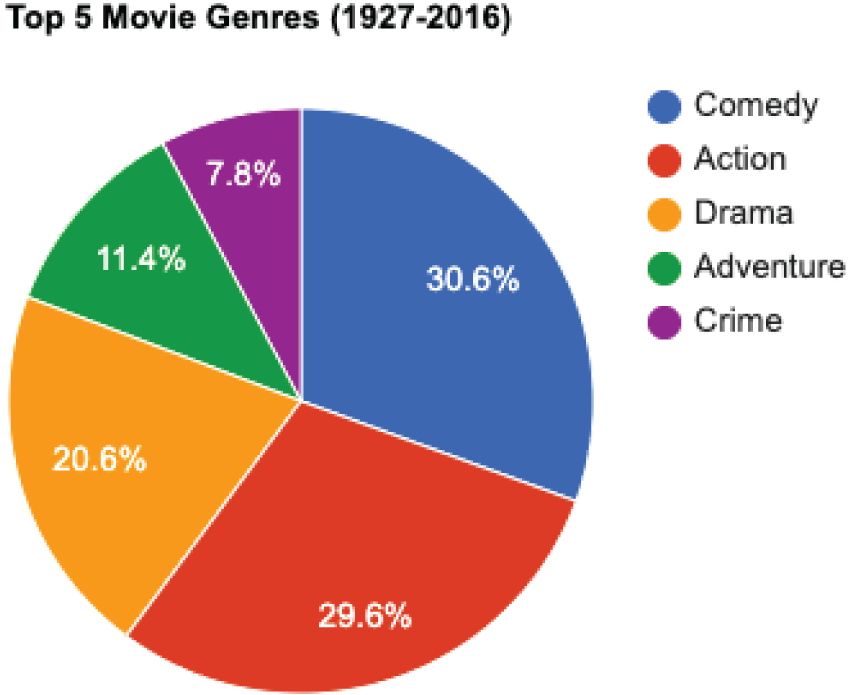
FIGURE 7.19 Pie chart

FIGURE 7.20 Bar chart by genre
Keep in mind the information you are trying to convey when using bar charts. If the alphabetic order of the categories is a critical component that your audience will anchor to, then Figure 7.20 is appropriate. However, as the title indicates, the intent is to show the top five movie genres between 1927 and 2016. Arranging the bars according to height is a better way to present the data, as Figure 7.21 illustrates.
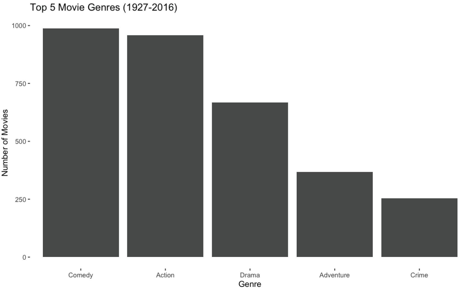
FIGURE 7.21 Bar chart by count
Stacked Chart
A stacked chart, or stacked bar chart, starts with a bar chart and extends it by incorporating proportional segments on each bar for categorical data. Suppose that you identify the top movie genres, as shown in Figure 7.21, and want to explore the number of movies in each category over time. Figure 7.22 uses a stacked bar chart to visualize the proportional number of films made over 10 years.
Scatter Chart
A scatter chart, or scatter plot, uses a dot for each observation in a data set to show the relationship between two numeric variables. Recall the line chart in Figure 7.18, which shows how the average duration for a film changes over the years. Since years are numeric, you can use a scatterplot to visualize the relationship between year and duration, as shown in Figure 7.23.
Suppose you are a pricing analyst for a movie studio and want to explore the relationship between a film's budget and its gross revenue. Since you can use dollars to measure both budget and revenue, you can use a scatterplot to visualize the relationship, as shown in Figure 7.24.
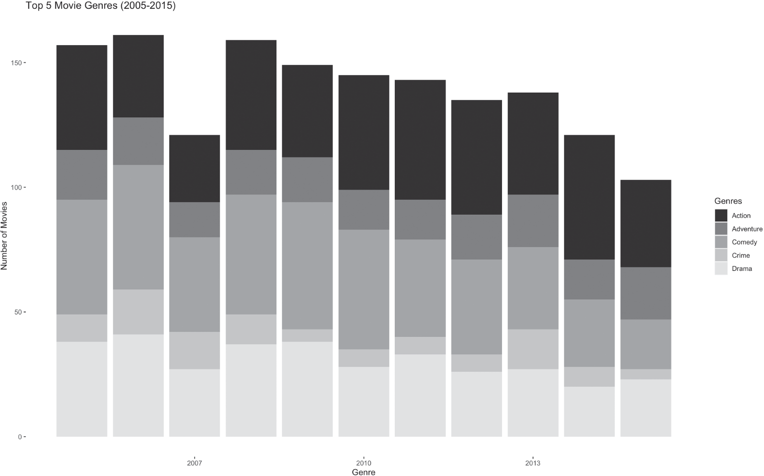
FIGURE 7.22 Stacked bar chart
Sometimes it makes sense to layer different charts together to increase a visualization's impact. Considering the scatterplot in Figure 7.24, it appears that the bigger a film's budget is, the higher the box office gross. Combining tools and visualizations, Figure 7.25 adds a linear regression line on top of the scatterplot. Adding a layer with the regression line facilitates conveying the message that there is a positive relationship between a film's budget and its box office gross.
Bubble Chart
A bubble chart is a scatterplot where the size of each dot is dependent on a third numeric variable. Consider the density of dots in Figure 7.25. One way to increase the visual appeal of that chart is to add aggregation. Converting the y-axis from actual gross to average gross gives us the graph in Figure 7.26. However, in aggregating this data, you lose the perspective of how many individual observations exist.
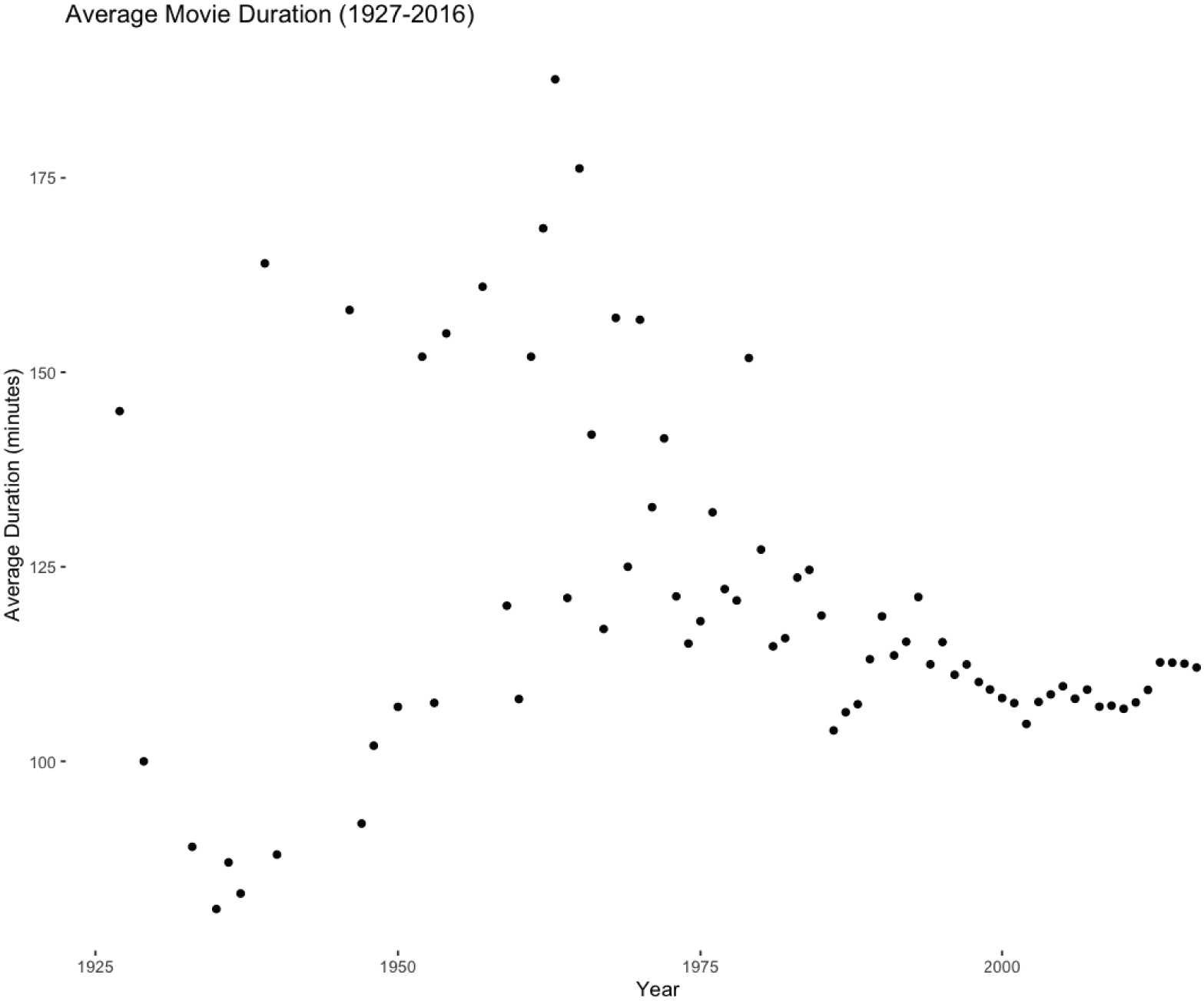
FIGURE 7.23 Average duration scatterplot
To illustrate the number of observations without cluttering the scatter chart, create a bubble chart, as shown in Figure 7.27. In this figure, the size of each dot represents the number of movies at that budget level. Using dot size to represent the third numeric dimension of movie count lets you convey additional information without adding clutter.
Histogram
A histogram is a chart that shows a frequency distribution for numeric data. When performing an exploratory data analysis, create histograms for numeric data. These histograms illustrate the shape of the distribution and can inform the next stage of analysis. Histograms are also effective for communicating a distribution's shape to stakeholders.
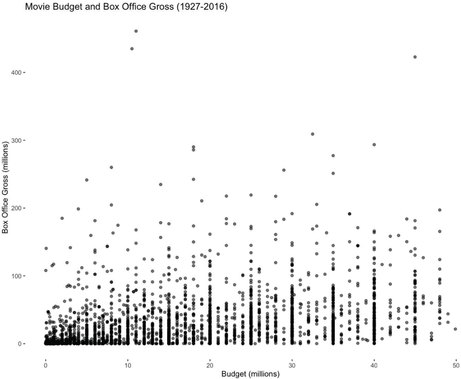
FIGURE 7.24 Budget and box office gross scatterplot
Considering Figure 7.28, there is a considerable right skew to the distribution and the majority of movies have a box office gross of under $200 million. Meanwhile, Figure 7.29 shows that the duration of films during the same period as Figure 7.28 has a more normal distribution with a slight right skew.
Maps
People frequently use maps to convey the location of a country, town, or individual address. Maps are effective methods orienting a person to a dataset. There are numerous types of maps available to visualize data, including geographic, heat, and tree maps.

FIGURE 7.25 Budget and box office gross scatter and line chart
Geographic Maps
Geographic maps are excellent for location-related data. For example, Figure 7.30 shows the location of higher education institutions in the United States where the undergraduate population exceeds 25,000 students. Use geographic maps when location is a component of your data.
Heat Maps
A heat map is a visualization that uses color and location to illustrate significance. Heat maps are versatile and apply in many different contexts. For example, you can use a heat map to represent organizational risks, as shown in Figure 7.31. You first assign the risks facing your business a likelihood and impact score. After scoring, you put the risks on the heat map. The higher the probability and impact of a specific risk, the more an organization needs to develop a strategy to manage the risk. Risk heat maps help orient leaders to the challenges they face, especially during times of transition.

FIGURE 7.26 Budget and average box office gross scatter and line chart

FIGURE 7.27 Budget and average box office gross bubble and line chart
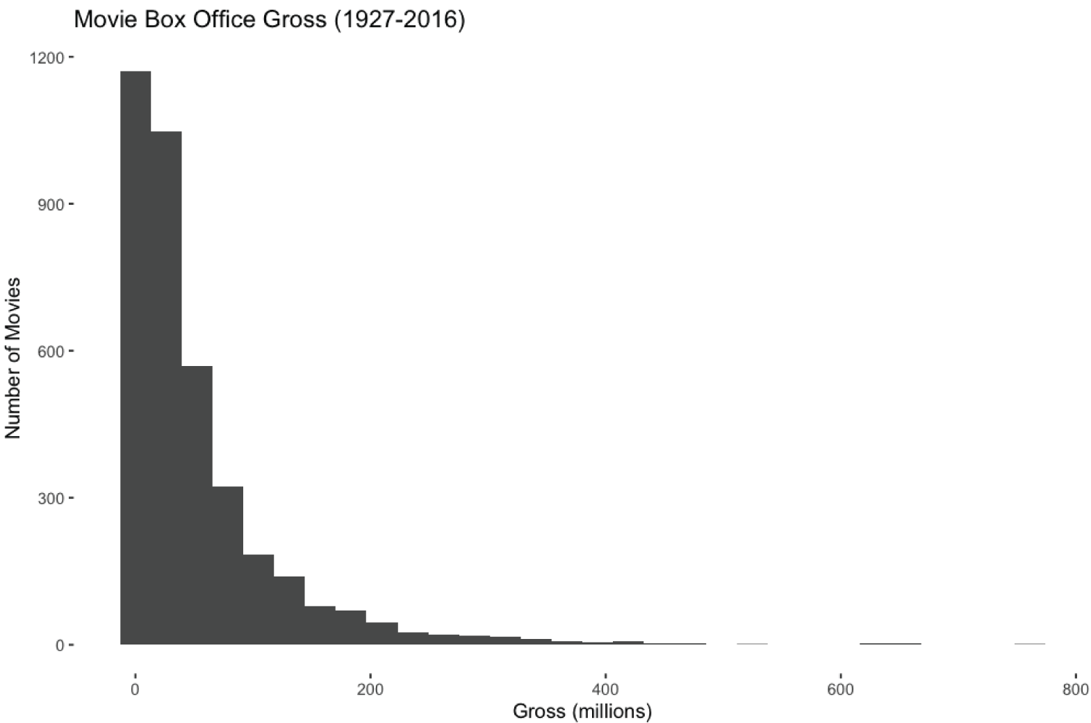
FIGURE 7.28 Histogram of box office gross
Heat maps can also illustrate the relationship between variables. Figure 7.32 shows the correlation between movie attributes. At one extreme, cast_total_facebook_likes and actor_3_facebook_likes are highly correlated, while movie_facebook_likes and facenumber_in_poster are not. Understanding correlation impacts the variables you would consider for making predictions.
Tree Maps
A tree map uses rectangles whose area depicts a proportional representation of hierarchical data. Tree maps are effective at showing the distribution at levels within the hierarchy. For example, Figure 7.33 shows aggregate movie genres from 1927 to 2016, with the area of each rectangle representing the number of films and the color indicating the genre. Looking at the size of the rectangles in Figure 7.33, the most prevalent genres are comedy and action. Figure 7.34 decomposes the comedy genre, where romantic comedies occupy the largest segment.
Consider tree maps when creating interactive visualizations. You can imagine a person opening the Comedy rectangle from Figure 7.33 to see the tree map in Figure 7.34.

FIGURE 7.29 Histogram of movie duration

FIGURE 7.30 Large U.S. colleges and universities
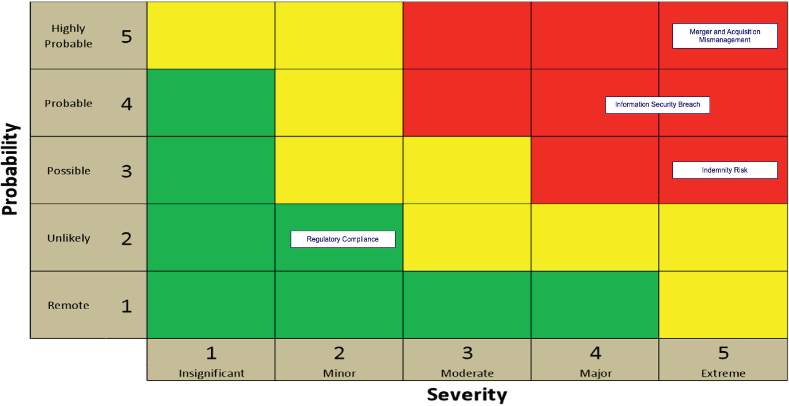
FIGURE 7.31 Risk heat map

FIGURE 7.32 Correlation heat map

FIGURE 7.33 Tree map of movie genres
Waterfall
A waterfall chart displays the cumulative effect of numeric values over time. Waterfall charts facilitate an understanding of how a series of events impact an initial value. Use a waterfall chart any time you want to see how events affect a baseline value.
For example, Figure 7.35 shows the change in the number of employees over a calendar year. Comparing End of Year Headcount to Initial Headcount shows that this organization grew the number of employees. The rest of the bars illustrate how a variety of factors impacted employee count during the year. The color and position for both Internal and External Hires show that these are positive events, whereas Internal Moves, Separations, and Involuntary Separations have a negative impact.

FIGURE 7.34 Tree map of the comedy genre

FIGURE 7.35 Headcount waterfall chart
Infographic
An infographic, which gets its name from the words “information” and “graphic,” is a visualization that presents information clearly and concisely. Infographics minimize text in favor of visual elements to represent a topic in a format that is easy to understand. The goal of an infographic is to convey an insight in a way that minimizes the time to comprehension.
Consider the infographic in Figure 7.36. This infographic conveys how advising and interventions combine to positively affect academic success. The central portion of the infographic illustrates how the design, build, capture, identify, notify, boost, evaluate, and report processes flow together. The detailed phase descriptions on the edges of this infographic provide additional information about how data is collected, analyzed, and assessed. By combining graphics, text, and data, this infographic tells a compelling story about how one university is building the infrastructure and processes to help students realize their potential.

FIGURE 7.36 Infographic
Word Cloud
A word cloud is a visualization that uses shape, font size, and color to signify the relative importance of words. Word clouds are effective at visualizing free-form text responses. When creating a word cloud, you eliminate common words and conjunctions as they occur frequently and don't add value in terms of meaning. The heart shape of Figure 7.37 conveys positivity, and the words system, learn, data, inspired, course, and think stand out.

FIGURE 7.37 Positive word cloud
Be deliberate when choosing a word cloud's shape, as it helps convey the overall sentiment. For example, the shape of Figure 7.38 establishes the context that responses about struggle form the basis of the word cloud, with assignments standing out as the most significant individual word.

FIGURE 7.38 Negative word cloud
Comparing Report Types
There are several report types to choose from, depending on the information you want to convey. When embarking on any reporting project, recall that you first have to identify the audience and their needs. After clarifying who will consume your report and what information they need to see, it is crucial to determine when they need it.
Static and Dynamic
It is imperative to identify whether a report needs to be static or dynamic, as that difference impacts where you get your data. Static reports pull data from various data sources to reflect data at a specific point in time. Suppose you work in a financial services firm and develop a five-year trend report for securities in the automotive sector, including Ford, Volkswagen, and Tesla. To feed your trend report, you need the daily price for each security over five years. Data marts and data warehouses are typical sources for this type of data.
Dynamic reports give people real-time access to information. Using your five-year trend report to inform their analysis, a financial analyst in your company may want to execute a trade. For the analyst to determine the price they are willing to pay for a given security, they need access to real-time pricing data. Data marts and data warehouses are insufficient for providing real-time information. In this case, you require current pricing information from the exchange where the security is actively traded, like the New York Stock Exchange or the Nasdaq. This type of real-time access typically uses an application programming interface (API).
Ad Hoc
Ad hoc reports, or one-time reports, use existing data to meet a unique need at a specific point in time. For example, suppose a hospital suffers an information security breach. As a result of the breach, some of their patient data is posted publicly on the Internet. In reaction to this one-time event, hospital administrators commission an ad hoc report to identify the patients they need to notify.
Self-Service (On-Demand)
Self-service reports, or on-demand reports, allow individuals to answer questions that are unique to them at a time of their choosing. Instead of having data pushed to them, an attribute of self-service reporting is that individuals can pull a report at the time of their choosing. For instance, consider an organization with 200 salespeople. Each one of those 200 people has a unique sales goal. A self-service progress-to-goal report lets the salespeople check the current state of their sales against their sales objective. Self-service reports can source their data from transactional or analytical systems depending on how up-to-date the data needs to be.
Recurring Reports
Recurring reports provide summary information on a regularly scheduled basis. Typically, recurring reports get delivered to their audience immediately after creation. For example, a company's sales leader will want monthly, quarterly, and annual sales numbers available regularly.
There are numerous types of recurring operational reports that organizations use to monitor organizational health and performance. Operational reports typically show the KPIs for an organization. For example, logistics organizations monitor the total number of packages and whether or not they were on time. Airlines monitor on-time departures and arrivals. Manufacturing companies keep track of daily defect rates. Financial KPIs, like the debt-to-equity ratio, apply to virtually every type of organization.
Compliance reports detail how your organization meets its compliance obligations. Depending on where your organization operates in the world, there are country-specific compliance requirements, including financial, health, information technology, and safety.
From a financial compliance reporting standpoint, if you are a public company in the United States, you need to document annual compliance with the Sarbanes–Oxley Act (SOX). SOX compliance ensures that your company provides proof of accurate financial reporting. To comply with SOX, you need to document access controls, security controls, your data backup methodology, and the processes by which people become authorized to make financially significant changes.
From a safety compliance reporting standpoint, you need to comply with the Occupational Safety and Health Act (OSHA) in the United States to ensure the safety of your employees. There are general industry standards that apply across the manufacturing, retail, and wholesale sectors.
If you process health-related data in the United States, you must meet health compliance reporting obligations. These obligations are subject to the U.S. Health Insurance Portability and Accountability Act of 1996 (HIPAA). HIPAA protects sensitive patient health information from being disclosed without a patient's knowledge or consent.
Organizations develop risk compliance reports to engender trust. For example, System and Organization Controls (SOC) reports document how an organization maintains its IT systems’ security, availability, and confidentiality in the information technology space. These reports also demonstrate how an organization collects, uses, retains, discloses, and disposes of data.
Each industry has its own set of unique regulatory requirements. Regulatory compliance reports document how an organization meets those compliance burdens. For example, if you process credit card payments, you must comply with the Payment Card Industry Data Security Standard (PCI DSS). This standard documents rules for storing, processing, or transmitting cardholder or sensitive authentication data.
These compliance obligations are a mere subset of the regulations that exist. Regardless of the type of compliance obligation, you need to produce the appropriate compliance report regularly.
Tactical and Research
It is vital to identify whether the report you create is for tactical or strategic purposes. Tactical reports provide information to inform an organization's short-term decisions. Tactical information helps organizations accomplish initiatives like constructing a building, opening a manufacturing plant, or shipping products from one location to another. Data for tactical reports come from various sources, including operational and analytical systems, and enables operational decisions.
A research report helps an organization make strategic decisions. To achieve strategic objectives, an organization executes multiple tactical initiatives. Where a tactical report informs a decision with a finite scope and duration, research reports inform the development of an overarching strategy. The implications of strategic decisions are broad, including whether to acquire a competitor, how many component suppliers an organization needs, and whether to diversify and enter an entirely new market. Since the decision implications are broad, strategic reports take more time to create than tactical reports. Strategic reports often combine internal data about an organization's operational performance and risks with data about external forces.
Summary
Communicating data visually is one of the most impactful activities an analyst performs. It is imperative to understand the audience of your visualization clearly. Senior leaders have different information requirements than individual salespeople, and you need to understand what decisions people make using your visualization.
You also need to clarify the business objectives for each visualization and the appropriate vehicle for distribution. If the situation requires static information, a report is a suitable choice. However, if people need to interact with the data, you need to create a dynamic dashboard that enables exploration.
As you identify requirements, make sure that you understand the limitations of the data or its use. If someone wants to look at 10 years’ worth of data but you only have data for seven years, you need to communicate that shortcoming and work with the business user to determine a viable path forward. Similarly, some circumstances require you to restrict access to specific data elements. Take data sensitivity into account as you consider distribution options.
In addition to any unique data-specific circumstances, you need to establish the publishing and distribution frequency. For instance, if people need a report in their email by 7 a.m. to start their day, you need to ensure that you have updated data sources and enough time to produce and distribute the report.
There are numerous visual elements to consider when designing a report. More formal reports need a cover page with instructions for use and an executive summary that provides a synopsis of insights. In the body of the report, ensure you use consistent, legible font sizes and styles. Make sure the chart titles, axes, and legends have clear labels. If you work with a large organization, work with corporate communications to incorporate corporate branding and style guides as appropriate.
From a change management perspective, make sure you update the publish date, version number, data sources, and refresh date when distributing a report. Careful change management helps ensure that people have the same data when contemplating decisions.
Dashboards are more complex than reports, as they are interactive and can reflect real-time information. When building a dashboard, keep dimensional modeling in mind when gathering business requirements. Understanding the dimensions that people want to use for segmenting data helps ensure you bring in the appropriate data sources. Keep in mind that the objective is to communicate essential information while minimizing clutter.
The key to an impactful dashboard is an iterative development process. Use wireframes to define the structure of your dashboard, and get mockups of the interface into the hands of the dashboard consumers as early as possible. If you have access to user experience professionals, tap into their knowledge to create a dashboard design that is intuitive and easy to use.
Just as you have different recipients for different reports, consider the types of roles that will access your dashboard. Work with your information security and application administration teams to identify the best way to implement role-based permissions.
There are many different types of charts that can help convey information visually. Keep in mind the situation where different chart types apply. For example, when presenting categorical data, you should choose between a bar, stacked bar, and pie chart, and histograms are ideal for showing a frequency distribution.
Make sure you can compare and contrast the different types of reports. For example, static reports provide a snapshot of information at a point in time, whereas dynamic reports incorporate real time data. Ad hoc reports tend to be tactical and helpful for a limited time, whereas research reports take longer to compile, include more data sources, and are valuable for a longer time.
Organizations have many different reporting obligations. These recurring reports can address internal and external audiences and satisfy compliance, risk, regulatory, and operational commitments.
Exam Essentials
Describe the most crucial first steps when developing a visualization. The most important first steps when developing a visualization are identifying the audience and understanding their needs. If you don't know who will use a visualization or understand its purpose, your creation will have a limited impact.
Compare reports and dashboards. Reports are static documents that get distributed physically or electronically. As static documents, they reflect data at the time of creation. Dashboards are dynamic and encourage data exploration. Typically delivered as a web interface, dashboards can integrate real-time data and enable users to explore segment data along multiple dimensions.
Identify the best type of chart for a given scenario. Given a specific scenario, select the type of chart that is most appropriate. Bar and pie charts work well for categorical data, whereas line charts are excellent for illustrating the relationship between two variables. Scatter charts show all of the points in a data set, whereas bubble charts use size to show the effect of a third numeric attribute. Maps are good for spatial data, waterfall charts show positive and negative impacts over time, and infographics convey a message. A word cloud is an optimal choice for displaying the relative significance of words when dealing with unstructured data.
Identify the type of report that should be used in a given scenario. Given a specific scenario, identify the type of report that would meet the requirement. For example, you need a recurring report on a regular schedule to meet various compliance objectives. On the other hand, self-service reports enable individuals to answer a specific question at the time of their choosing.
Describe considerations for maintaining data security. When working with static reports, having tight control over how reports get distributed is one approach to ensuring the security of the data in the report. Dashboards are more complicated, as they are accessible in an interactive manner. Work closely with information security and application administrators to map people's various roles to the appropriate dashboard sections. Restrict sensitive data access only to the functions that require it.
Review Questions
- Igor is creating an inventory report for the manager of a local convenience store. On average, replacement items are delivered within 3 days after the manager places an order. What is the most appropriate frequency for this report? (Choose the best answer.)
- Real-time
- Hourly
- Daily
- Weekly
- Jasmine is developing a daily report that will be posted at the entrances to 700 different franchise locations. What is the most appropriate color scheme?
- Black monochrome palette
- Red and green complementary palette
- Blue and orange complementary palette
- Yellow and purple complementary palette
- Bowen is developing a report that explores how consumer sentiment about his company's products changes over time. Where should he put a paragraph describing the most profound insight in the report? (Choose the best answer.)
- Title page
- Executive summary
- Report body
- Appendix
- Javier wants to illustrate the relationship between height and weight. What type of chart should he use?
- Bar
- Scatter
- Line
- Histogram
- John's CEO wants to be able to explore how retail sales have been changing over time. What is the best way to present the information to the CEO? (Choose the best answer.)
- Historical report
- Recurring report
- One-time report
- Interactive dashboard
- Ron is a recent hire at a large organization and is developing his first report. What should he do first? (Choose the best answer.)
- Check with the communications division to see whether any corporate style guides exist.
- Work with his supervisor to identify distribution mechanisms.
- Work with operations to develop a delivery schedule.
- Check with his colleagues to determine the best way to get his completed report to the appropriate people.
- Kelly wants to get feedback on the final draft of a strategic report that has taken her six months to develop. What can she do to get prevent confusion as she seeks feedback before publishing the report? (Choose the best answer.)
- Distribute the report to the appropriate stakeholders via email.
- Use a watermark to identify the report as a draft.
- Show the report to her immediate supervisor.
- Publish the report on an internally facing website.
- Maggie is a new analyst tasked with developing a dashboard. What should she focus on to obtain an understanding of requirements for internal senior leaders? (Choose the best answer.)
- Service credits
- Service level agreements
- Key performance indicators
- Defect rate
- Cian is mapping dashboard requirements to data sources. What should he use to ensure the structure is in place to deliver the dashboard successfully?
- Mockup
- Wireframe
- Data warehouse
- Data mart
- Zakir wants to visualize aggregate sales data over time. What type of chart should he select?
- Pie chart
- Tree map
- Histogram
- Line chart
- Celine wants to visualize annual precipitation in South America. What type of chart would create the greatest impact?
- Geographic heat map
- Stacked bar chart
- Word cloud
- Waterfall chart
- Luciana is an analyst for a sporting venue. She wants to distill post-event free-response survey data to inform leadership what respondents have on their minds. What type of visualization should she choose?
- Pie chart
- Bar chart
- Word cloud
- Dashboard
- Aubree wants to visualize the correlation between 15 different variables. What type of chart should she select?
- Tree map
- Bar chart
- Infographic
- Heat map
- Appa wants to tell a story about the effect of climate change on coastal cities with a single, static visualization. Which of the following should he choose?
- Tree map
- Bar chart
- Infographic
- Heat map
- Kingston wants to create an interactive visualization that allows people to explore brand sales by category and subcategory. What type of visualization should he choose for his dashboard?
- Tree map
- Bar chart
- Infographic
- Heat map
- Rita wants to illustrate the relationship between per capita GDP, life expectancy, and population size. What type of visualization should she choose?
- Bubble chart
- Bar chart
- Infographic
- Heat map
- Sanjay's company has three primary brands that drive corporate profitability. If Sanjay wants to visualize the contribution of each brand over time, what type of chart should he choose?
- Bubble chart
- Stacked bar chart
- Infographic
- Heat map
- Adeline is developing a poster to raise awareness about climate change. What type of visualization should she use?
- Bubble chart
- Stacked bar chart
- Infographic
- Heat map
- Abbas's CFO wants to drill down on cost centers across the organization. What type of visualization should Abbas create?
- Bubble chart
- Stacked bar chart
- Infographic
- Dashboard
- Shivang's CEO wants to visualize the relationship between height and 100-meter sprint time for 200 individuals. What type of chart should he choose?
- Bubble chart
- Stacked bar chart
- Infographic
- Scatter chart