4
Building a Native Settings Application Using Material and Cupertino Widgets
One of the best features of Flutter is that the framework gives you control over every pixel. Flutter ships with its own custom widget catalog, allowing you to define your own design system while also shipping both Material Design and Cupertino widgets. This capability is a departure from many other frameworks that choose to rely on original equipment manufacturer (OEM) widgets. The major benefit is that your app can be truly unique, using the high-level widget libraries of Google or Cupertino or a widget library of your own mechanizations.
In this chapter, first, we will examine how to use features of the Flutter framework to build platform-specific UIs. Then, we will learn how to build our Settings application using Apple theming with Flutter’s cupertino package. Wrapping up, we will learn how to build the same application using Material theming with Flutter’s material package.
So, in this chapter, you will cover the following topics:
- Building a platform-specific UI
- Building an iOS-specific UI with CupertinoApp
- Building an Android-specific UI with MaterialApp
Technical requirements
Make sure to have your Flutter environment updated to the latest version in the stable channel. Clone our repository and use your favorite IDE to open the Flutter project we’ve built at chapter_4/step_0_start.
The project that we’ll build upon in this chapter can be found on GitHub: https://github.com/PacktPublishing/Cross-Platform-UIs-with-Flutter/tree/main/chapter_4/step_0_start.
The complete source code can be found on GitHub as well: https://github.com/PacktPublishing/Cross-Platform-UIs-with-Flutter/tree/main/chapter_4/step_4_end.
Understanding that everything is a widget
Flutter relies heavily on component-driven development, in which UIs are built from the bottom up with basic components progressively being assembled into more complex components and, eventually, entire pages. In Flutter, these components are called widgets.
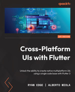
If you are new to Flutter, you may not be aware of its layered cake architecture. What this means is that Flutter is a series of independent libraries that each depend on the underlying layer.
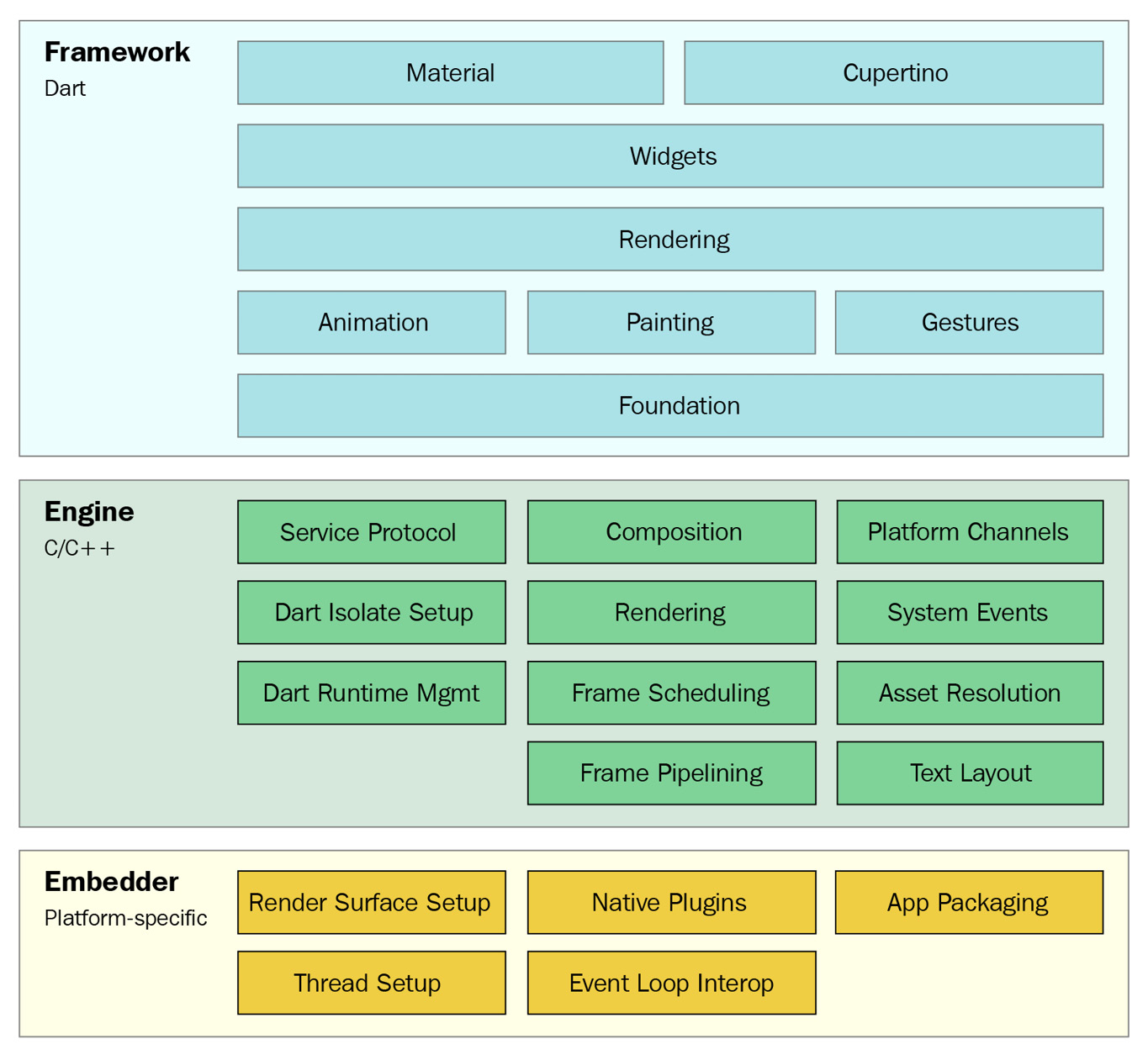
Figure 4.1 – Flutter’s layered architecture (Source: https://docs.flutter.dev/resources/architectural-overview)
As you can see from Figure 4.1, the topmost libraries of the Framework layer are represented by Material and Cupertino widgets, which build upon a platform-agnostic set of widgets. An example of this in action would be ElevatedButton for Material and CupertinoButton for Cupertino, which compose widgets such as Row, Align, and Padding to implement their respective designs. The phrase everything is a widget denotes that every component used for structure, layout, navigation, or interaction is a widget.
One of the most exciting features of Flutter is that it ships the framework with the application, which enables the use of all the framework’s widgets irrespective of the platform that the application is running on. Even common widgets defined under the package:flutter/widgets.dart library and WidgetsApp have platform-specific behaviors that can be overridden. ListView, for example, will customize its scrolling physics automatically; on an iOS device, reaching the scroll threshold results in a bouncing effect, whereas scrolling on an Android device results in a glow effect.
Let’s explore how to set up the project so we can start to explore how to build a platform-specific UI in our application.
Setting up the project
In this chapter, we will learn how to use platform-specific widgets to build a simple Settings application. The application will accept user input for several groups of fields and allow the user to change their theme from the system setting to either light or dark mode.
When we have finished, the resulting application should mirror Figure 4.2, which shows the same application but with two different platform-specific designs:

Figure 4.2 – Settings app
We will start with an example that displays an empty page and includes classes to update each application setting. We will first update this sample to display platform-specific messages to the user. We will then update the application to display a platform-specific UI when running on an Android or iOS device.
After downloading the initial application from GitHub, we can start by moving into its root directory and running the flutter pub get command from the terminal. This will install any package dependencies that the application needs. Additionally, opening the project in an IDE will also trigger an installation of the project on initial load and when the pubspec.yaml is updated.
After installing the application’s dependencies, execute the flutter run command from the same terminal window and view the project either in your browser or on your currently running emulator. When viewing the application in your IDE, you should observe the following file structure:
lib
|-- src:
   |-- settings
   |-- app.dart
|-- main.dart
Let’s briefly explore the purpose of each top-level folder/class:
- src: The source folder contains implementation details of our application that, unless exposed, will be hidden from consumers.
- settings: The settings folder contains SettingsController, which we will use to update each setting, and SettingsScope, which we will use to share the controller.
- app.dart: The widget that will control whether to display a Material-themed application or a Cupertino-themed application.
- main.dart: The entry point of the application.
Now, let’s explore the features of the Flutter framework that enable us to build platform-specific UIs.
Building a platform-specific UI
In a Flutter application, there are two primary ways to access the platform that the application is running on: statically (using platform flags) or dynamically (using the TargetPlatform object from BuildContext). The platform can be detected statically using the list of platform flags provided by the Flutter framework, as detailed here:
- isLinux
- isMacOS
- isWindows
- isAndroid
- isIOS
- isFuschia
Each name implies the platform in which the application is executing. The tradeoff of using these flags is that they cannot be used to dynamically switch the styles for a platform. To do so, we turn to TargetPlatform defined on context. Before we dive into using MaterialApp to build our Settings application, let’s demonstrate how to access the platform dynamically.
We can access the target platform information directly from BuildContext by using Theme.of(context).platform. Open the app.dart file and add the following code:
import 'package:flutter/material.dart';
class SettingsApp extends StatelessWidget {
  const SettingsApp({
    Key? key,
    this.platform,
  }) : super(key: key);
  final TargetPlatform? platform;
  @override
  Widget build(BuildContext context) {
    return MaterialApp(
      home: Scaffold(
        body: Column(
          mainAxisAlignment: MainAxisAlignment.center,
          children: [
            Text(platform?.name ?? 'Unknown'),
            if (platform == TargetPlatform.android)
                const Text('Hello Android'),
            if (platform == TargetPlatform.iOS)
                const Text('Hello iOS'),
           ],
        ),
      ),
    );
  }
}
There are three main refactors that occur in the previous code:
- We create a platform property to be passed into the constructor.
- We fall back to the platform from Theme.of(context).platform if one is not provided.
- We render the text of the platform as well as a welcome message that is dependent on the platform.
Passing in the target platform allows us to dynamically change the platform from the application root. Let’s test this by running the application on an Android emulator. We should see the following result:
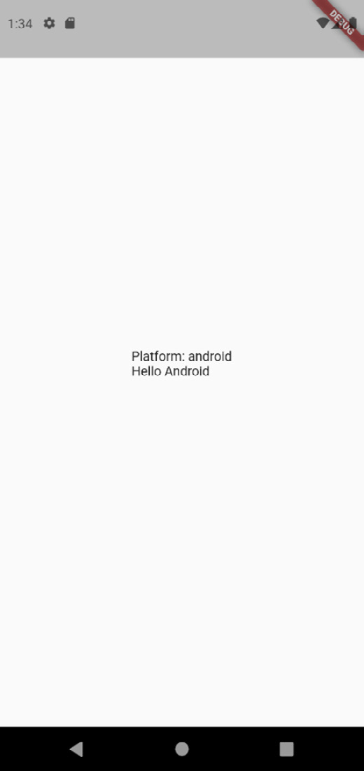
Figure 4.3 – App targeting Android
The resulting code should render both the platform and a welcome message specific to Android matching Figure 4.3.
Now, change main.dart, passing platform: TargetPlatform.iOS into the constructor of SettingsApp, and run the same application. The results should match the following figure:
Figure 4.4 – App targeting iOS
Our application should now match Figure 4.4, displaying text that signifies the target platform is iOS rather than Android. Our ability to override even the platform information for the sake of displaying a different UI should drive home the capabilities of Flutter’s widget system.
To fully enable SettingsApp, replace the code in the build function with the following:
  @override
  Widget build(BuildContext context) {
    final platform =
      this.platform ?? Theme.of(context).platform;
    switch (platform) {
      case TargetPlatform.android:
      case TargetPlatform.fuchsia:
        return const MaterialSettingsApp();
      case TargetPlatform.iOS:
      case TargetPlatform.macOS:
      default:
        return const CupertinoSettingsApp();
    }
  }
This code will return either MaterialSettingsApp or CupertinoSettingsApp depending on the target platform property. This code also demonstrates how we have the ability to display either UI regardless of platform – we could very well display CupertinoSettingsApp for Android.
Neither of these widgets has been created yet, but since we will start by defining CupertinoSettingsApp, comment out the line containing MaterialSettingsApp so that the iOS-specific Settings UI is always returned.
In the next section, you will see that regardless of whether the application is running on the Android emulator or the iOS simulator, the UI is still iOS-specific – a perfect demonstration of Flutter letting us choose the widgets to use regardless of the platform.
Now, let’s learn how to build our iOS-specific Settings UI using Flutter’s cupertino package.
Building an iOS-specific UI with CupertinoApp
Now that we have familiarized ourselves with Flutter’s platform detection capabilities, let’s put what we’ve learned into action by building a uniquely Cupertino Settings UI.
In Flutter, you can build an application that uses the iOS design system created by Apple by wrapping your application in CupertinoApp. This widget builds on WidgetsApp, which provides basic navigation and some foundational widgets by configuring the design system’s standards.
Because CupertinoApp is just a widget, the design system that you decide to use is not restricted by platform. You could very well use Material for iOS applications and Cupertino for Android applications, or even build something completely custom!
As we want to use a generic theme mode to represent iOS, let’s extend SettingsService first. Open settings_service.dart and replace the code with the following:
class SettingsService {
  Future<AdaptiveThemeMode> themeMode() async =>
    AdaptiveThemeMode.system;
  Future<void> updateThemeMode(AdaptiveThemeMode theme)
    async {
    //...
  }
}
enum AdaptiveThemeMode { system, light, dark }
We have introduced two significant changes in this refactor:
- At the bottom of the file, we defined an AdaptiveThemeMode.
- We replaced ThemeMode from the Material library with the one that we have defined.
Inside of the src directory, create a folder called cupertino. The first widget that we will create is CupertinoSettingsApp, which will configure CupertinoApp to use the theme mode defined in SettingsController. Then, create a file called cupertino_settings_app.dart and add the following code:
import 'package:flutter/cupertino.dart';
import 'package:settings/src/settings/settings_scope.dart';
import 'package:settings/src/settings/settings_service.dart';
import 'cupertino_settings_view.dart';
class CupertinoSettingsApp extends StatelessWidget {
  const CupertinoSettingsApp({Key? key}) : super(key: key);
  @override
  Widget build(BuildContext context) {
    final settingsController = SettingsScope.of(context);
    final brightness = settingsController.themeMode ==
      AdaptiveThemeMode.dark
        ? Brightness.dark
        : Brightness.light;
    return CupertinoApp(
      theme: CupertinoThemeData(
        brightness: brightness,
      ),
      home: const CupertinoSettingsView(),
    );
  }
}
Let’s examine what this code does:
- We created CupertinoSettingsApp as a stateless widget.
- We accessed the theme from SettingsController in CupertinoSettingsApp.build.
- We used the theme to set CupertinoThemeData brightness settings.
The brightness settings will determine whether our application uses a dark or light theme to render all the widgets that we will use from Flutter’s Cupertino library.
Next, let’s define the CupertinoSettingsView widget that CupertinoSettingsApp uses. Create a file called cupertino_settings_view.dart. In this file, we will define several private widgets to be used inside one main widget that is public.
To start, let’s create CupertinoSettingsView with the following code:
class CupertinoSettingsView extends StatelessWidget {
  const CupertinoSettingsView({Key? key}) :
                              super(key: key);
  @override
  Widget build(BuildContext context) {
    return const CupertinoPageScaffold(
      navigationBar: CupertinoNavigationBar(
        middle: Text('Settings'),
      ),
      child: SafeArea(
        child: _SettingsForm(),
      ),
    );
  }
}
In this code block, we are creating a stateless widget that builds a page scaffold using CupertinoPageScaffold and CupertinoNavigationBar. As a child of CupertinoPageScaffold, we pass in a _SettingsForm widget (which we will create next) wrapped in a SafeArea widget.
Let’s add that _SettingsForm widget by introducing the following code:
class _SettingsForm extends StatelessWidget {
  const _SettingsForm({
    Key? key,
  }) : super(key: key);
  @override
  Widget build(BuildContext context) {
    final settingsController = SettingsScope.of(context);
    final theme = CupertinoTheme.of(context);
    return ListView(
      children: [],
    );
  }
}
In this code block, we are only retrieving SettingsController and the CupertinoTheme objects from context, then building ListView. We will use the classes that we retrieve here as we build out the rest of the page.
Running the code should produce the following result:
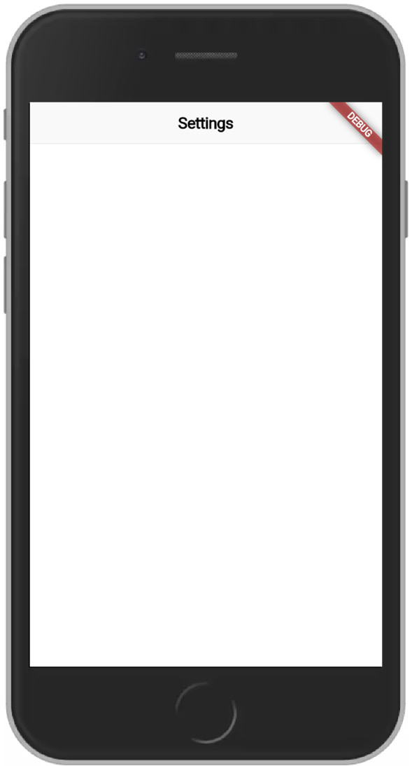
Figure 4.5 – Blank application
Our application should match Figure 4.5, displaying only an application bar.
Now, let’s use CupertinoFormSection to add a section for time settings. Add the following code to the children of ListView:
        CupertinoFormSection(
          header: const Text('Time and place'),
          children: [
            CupertinoFormRow(
              child: Row(
                mainAxisSize: MainAxisSize.min,
                children: [
                  Text(
                    “English (US)”,
                    style:
                      theme.textTheme.textStyle.copyWith(
                      color: theme.textTheme.textStyle
                        .color!.withOpacity(.5),
                    ),
                  ),
                  const Icon(CupertinoIcons.chevron_right),
                ],
              ),
              prefix: const Text(“Language”),
            ),
            CupertinoFormRow(
              child: CupertinoSwitch(
                value: true,
                onChanged: (value) {},
              ),
              prefix:
                const Text(“Set time zone automatically”),
            ),
          ],
        ),
CupertinoFormSection can be used to create an iOS-style form section. Also, notice that we are using CupertinoFormRow to create two iOS-style form rows in this section:
- One is the Language form row, styled as an action list item that could navigate to another page to select languages.
- The other is the Time Zone form row, using CupertinoSwitch to adjust the time zone automatically.
Now, if we run the code with these updates, we should see the following result:

Figure 4.6 – Settings app with a Time and place section
Our application should match Figure 4.6, displaying a Time and place section with Language and time zone information.
Now, let’s build a section that uses our SettingsController. While still in ListView.children, add the following code after the Time and place form section:
 CupertinoFormSection(
          header: const Text(“Look and feel”),
          children: [
            GestureDetector(
              onTap: () async {
                final themeMode =
                    await showCupertinoModalPopup
                      <AdaptiveThemeMode?>(
                  context: context,
                  builder: (context) {
                    return const _ThemeActionSheet();
                  },
                );
                if (themeMode != null) {
                  settingsController.updateThemeMode(
                    themeMode);
                }
              },
              child: CupertinoFormRow(
                child: Row(
                  mainAxisSize: MainAxisSize.min,
                  children: [
                    Text(
                      settingsController.themeMode.
                        name.capitalize,
                      style:
                        theme.textTheme.textStyle.copyWith(
                        color: theme.textTheme.textStyle
                          .color!.withOpacity(.5),
                      ),
                    ),
                    const Icon(
                      CupertinoIcons.chevron_right),
                  ],
                ),
                prefix: const Text(“Theme”),
              ),
            ),
          ],
        ),
Let’s walk through each highlighted section and explain what’s happening:
- When the theme section is tapped, an action sheet that returns a theme mode will be displayed using showCupertinoModalPopup.
- The builder function for showCupertinoModalPopup will return a _ThemeActionSheet widget, which we will define next.
- The theme mode will be used to update the SettingsController theme mode.
- The currently selected theme mode will be displayed in CupertinoFormRow.
To finish up this section, let’s create our _ThemeActionSheet widget by adding the following code at the bottom of the file:
class _ThemeActionSheet extends StatelessWidget {
  const _ThemeActionSheet({
    Key? key,
  }) : super(key: key);
  @override
  Widget build(BuildContext context) {
    return CupertinoActionSheet(
      title: const Text('Choose app theme'),
      actions: [
        CupertinoActionSheetAction(
          child: const Text('System Theme'),
          onPressed: () {
            Navigator.pop(context,
                          AdaptiveThemeMode.system);
          },
        ),
        CupertinoActionSheetAction(
          child: const Text('Light Theme'),
          onPressed: () {
            Navigator.pop(context,
                          AdaptiveThemeMode.light);
          },
        ),
        CupertinoActionSheetAction(
          child: const Text('Dark Theme'),
          onPressed: () {
            Navigator.pop(context, AdaptiveThemeMode.dark);
          },
        ),
      ],
      cancelButton: CupertinoActionSheetAction(
        child: const Text('Cancel'),
        onPressed: () {
          Navigator.pop(context);
        },
      ),
    );
  }
}
In this example, our widget builds a list of theme options using the CupertinoActionSheet and CupertinoActionSheetAction widgets. If any CupertinoActionSheetAction is pressed, we use Navigator.pop to close the modal and return the selected theme.
Before running the code, return to SettingsApp and uncomment the line that returns MaterialSettingsApp. Now, when we run this code on the Android emulator, we should see the following result:
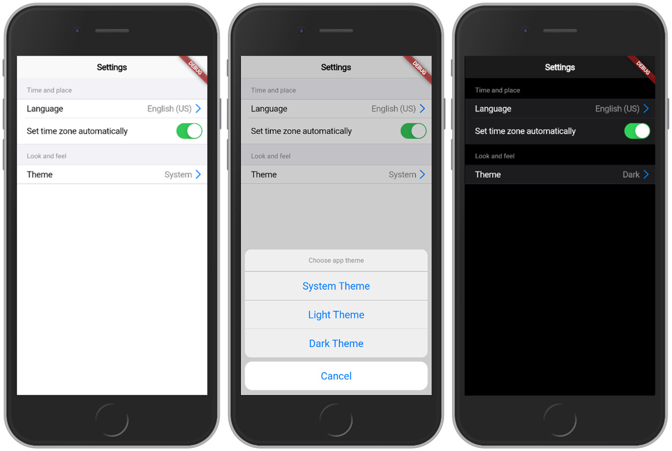
Figure 4.7 – Settings application with theme section
Our application should match Figure 4.7, which demonstrates our newly added Look and feel section, the action sheet that is displayed, and the result of selecting Dark Theme in the theme selector.
To finish up, let’s add form sections for Security, Notifications, and Support so that our Settings application will be complete. To do this, add the following code to ListView.children for the Security settings:
        CupertinoFormSection(
          header: const Text(“Security”),
          children: [
            CupertinoFormRow(
              child: CupertinoSwitch(
                value: true,
                onChanged: (value) {},
              ),
              prefix:
                const Text(“Two-factor authentication”),
            ),
            CupertinoFormRow(
              child: CupertinoSwitch(
                value: true,
                onChanged: (value) {},
              ),
              prefix: const Text(“Passcode”),
            ),
          ],
        ),
Follow up that block with another block for Notifications:
        CupertinoFormSection(
          header: const Text(“Notifications”),
          children: [
            CupertinoFormRow(
              child: CupertinoSwitch(
                value: true,
                onChanged: (value) {},
              ),
              prefix: const Text(“Play sounds”),
            ),
            CupertinoFormRow(
              child: CupertinoSwitch(
                value: true,
                onChanged: (value) {},
              ),
              prefix: const Text(“Haptic feedback”),
            ),
          ],
        ),
And finally, add the last block for Support:
        CupertinoFormSection(
          header: const Text(“Support”),
          children: [
            CupertinoFormRow(
              child: CupertinoSwitch(
                value: true,
                onChanged: (value) {},
              ),
              prefix: const Text(“Shake to send feedback”),
            ),
            CupertinoFormRow(
              child: Row(
                mainAxisSize: MainAxisSize.min,
                children: const [
                  Icon(CupertinoIcons.chevron_right),
                ],
              ),
              prefix: const Text(“Legal notes”),
            ),
          ],
        ),
This code uses the same techniques and widgets that we just learned to build out the rest of the Settings UI.
Now, if we run the application, we should be met with the following results:
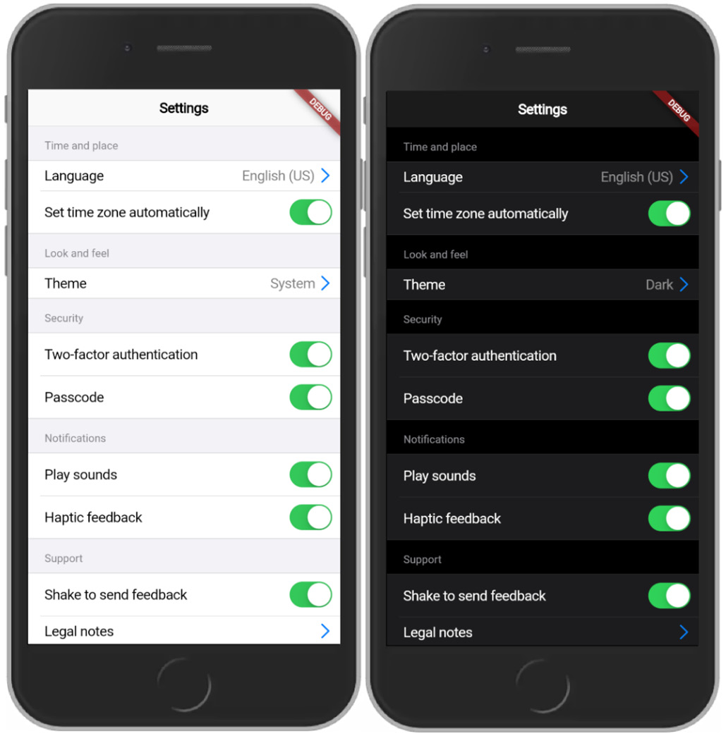
Figure 4.8 – Settings app in light/dark mode
If the application matches Figure 4.8, we should see a full set of settings and be able to toggle the application theme from being automatically detected by the system platform to manually set to light/dark.
In the next section, we will pivot to building our Android-specific Settings UI using MaterialApp widgets.
Building an Android-specific UI with MaterialApp
Now that we have built the iOS-specific version of our Settings app, we can focus on the Android-specific UI. Like CupertinoApp, MaterialApp builds on top of WidgetsApp by configuring the iOS design system created by Apple.
Inside of the src directory, create a folder called material. The first widget that we will create is our MaterialSettingsApp, which will configure MaterialApp to use the theme mode defined in SettingsController. Create a file called material_settings_app.dart and add the following code:
class MaterialSettingsApp extends StatelessWidget {
  const MaterialSettingsApp({Key? key}) : super(key: key);
  @override
  Widget build(BuildContext context) {
    final settingsController = SettingsScope.of(context);
    return MaterialApp(
      theme: ThemeData(),
      darkTheme: ThemeData.dark(),
      themeMode:
        settingsController.themeMode.materialThemeMode,
      home: const MaterialSettingsView(),
    );
  }
}
extension ThemeModeExtension on AdaptiveThemeMode {
  ThemeMode get materialThemeMode {
    switch (this) {
      case AdaptiveThemeMode.dark:
        return ThemeMode.dark;
      case AdaptiveThemeMode.light:
        return ThemeMode.light;
      default:
        return ThemeMode.system;
    }
  }
}
This code mirrors the behavior of the CupertinoSettingsApp widget:
- We created a MaterialSettingsApp as a stateless widget.
- We accessed the theme from SettingsController in MaterialSettingsApp.build.
- We used themeMode to set the ThemeData brightness settings, adding an extension to convert AdaptiveThemeMode to ThemeMode.
The themeMode setting will determine whether our application uses a dark or light theme to render all the widgets that we will use from Flutter’s material package. This is the first major difference between the material and cupertino packages that relies on the brightness setting.
Next, let’s define the MaterialSettingsView widget that MaterialSettingsApp uses. Create a file called material_settings_view.dart in the same folder. In this file, we will define several private widgets to be used inside one main widget that is public.
To start, let’s create MaterialSettingsView with the following code:
class MaterialSettingsView extends StatelessWidget {
  const MaterialSettingsView({Key? key}) : super(key: key);
  @override
  Widget build(BuildContext context) {
    return Scaffold(
      appBar: AppBar(
        title: const Text('Settings'),
      ),
      body: _SettingsForm(),
    );
  }
}
In this code block, we are creating a stateless widget that builds a page scaffold using Scaffold and AppBar. As a child of Scaffold, we passed in a _SettingsForm widget, which we will create next.
Let’s add that _SettingsForm widget by introducing the following code:
class _SettingsForm extends StatelessWidget {
  const _SettingsForm({
    Key? key,
  }) : super(key: key);
  @override
  Widget build(BuildContext context) {
    final controller = SettingsScope.of(context);
    return ListView(
      children: [],
    );
  }
}
If you are experiencing déjà vu, that is probably because this code is identical to _SettingsForm used in CupertinoSettingsView. The repetition is fine – we are not trying to prematurely abstract or optimize our code before we understand the patterns.
Before we start building out our form, we will define a helper widget called MaterialFormSection that approximates some of the capabilities of CupertinoFormSection.
In the same file, add the following code at the bottom:
class MaterialFormSection extends StatelessWidget {
  const MaterialFormSection({
    Key? key,
    this.header,
    required this.children,
  }) : super(key: key);
  final Widget? header;
  final List<Widget> children;
  @override
  Widget build(BuildContext context) {
    assert(children.isNotEmpty);
    return Padding(
      padding: const EdgeInsets.only(left: 16, right: 16,
                                     top: 6),
      child: Column(
        crossAxisAlignment: CrossAxisAlignment.start,
        children: [
          if (header != null)
            Align(
              alignment: AlignmentDirectional.centerStart,
              child: DefaultTextStyle(
                style: TextStyle(
                  color:
                   Theme.of(context).colorScheme.secondary,
                  fontWeight: FontWeight.bold,
                ),
                child: Container(
                  child: header,
                ),
              ),
            ),
          ...children,
        ],
      ),
    );
  }
}
Here, we have done the following:
- Defined a MaterialFormSection widget that accepts a header widget and children widgets as properties.
- Asserted that the children list is not empty.
- Added a padded Column to position the elements horizontally.
- Added a center-left aligned header if the header property is present with special theming.
- Added the children list to the end of Column.
Now we are ready to use the MaterialFormSection widget that we have created. Add the following code to the children of ListView inside the _SettingsForm widget:
        MaterialFormSection(
          header: const Text('Time and place'),
          children: [
            const ListTile(
              contentPadding: EdgeInsets.zero,
              title: const Text('Language'),
              subtitle: Text(“English (US)”),
              dense: true,
            ),
            SwitchListTile(
              title:
                const Text('Set time zone automatically'),
              contentPadding: EdgeInsets.zero,
              dense: true,
              value: controller.enableAutoTimeZone,
              onChanged:
                controller.updateEnableAutoTimeZone,
            ),
          ],
        ),
In this code, we have done the following:
- Added MaterialFormSecton for the Time and place section to create an Android-style form section.
- Added ListTile to create an Android-style form row for language in this section.
- Added SwitchListTile to create an Android-style switch for this section.
Now, if we run the code with these updates, we should see the following result:

Figure 4.9 – Material Settings app in light/dark mode
Our application should match Figure 4.9, displaying adding a new section with the form rows for Language and time zone.
Now, let’s build a section that uses SettingsController. While still in ListView.children, add the following code after the Time and place form section:
 MaterialFormSection(
          header: const Text('Look and feel'),
          children: [
            ListTile(
              contentPadding: EdgeInsets.zero,
              title: const Text('Theme'),
              subtitle: Text(_themeDisplayTextMap[
                controller.themeMode] ?? ''),
              dense: true,
              onTap: () async {
                var themeMode = await
                  showModalBottomSheet<AdaptiveThemeMode?>(
                    context: context,
                    builder: (context) {
                      return const _ThemeBottomSheet();
                    });
                if (themeMode != null) {
                  controller.updateThemeMode(themeMode);
                }
              },
            ),
          ],
        ),
Let’s walk through each highlighted section and explain what’s happening:
- When the theme section is tapped, an action sheet that returns a theme mode will be displayed using showModalBottomSheet.
- The builder function for showModalBottomSheet will return a _ThemeBottomSheet widget, which we will define next.
- The theme mode will be used to update the SettingsController theme mode.
- The currently selected theme mode will be displayed in ListTile.
To finish up this section, let’s create our _ThemeBottomSheet widget by adding the following code at the bottom of the file:
class _ThemeBottomSheet extends StatelessWidget {
  const _ThemeBottomSheet({
    Key? key,
  }) : super(key: key);
  @override
  Widget build(BuildContext context) {
    return Wrap(
      children: [
        ListTile(
          title: const Text('System Theme'),
          dense: true,
          onTap: () {
            Navigator.pop(context,
                          AdaptiveThemeMode.system);
          },
        ),
        ListTile(
          title: const Text('Light Theme'),
          dense: true,
          onTap: () {
            Navigator.pop(context,
                          AdaptiveThemeMode.light);
          },
        ),
        ListTile(
          title: const Text('Dark Theme'),
          dense: true,
          onTap: () {
            Navigator.pop(context, AdaptiveThemeMode.dark);
          },
        )
      ],
    );
  }
}
In this example, our widget builds a list of theme options using the Wrap and ListTile widgets. If any ListTile is pressed, we use Navigator.pop to close the modal and return the selected theme.
When we run this code, we should see the following result:

Figure 4.10 – Material Settings application with theme section
Our application should match Figure 4.10, which demonstrates our newly added Theme section (the bottom sheet that is displayed) and the result of selecting Dark Theme in the theme selector.
To finish up, let’s add form sections for Security, Notifications, and Support so that our Settings application will be complete. Add the following code to ListView.children:
        MaterialFormSection(
          header: const Text('Security'),
          children: [
            SwitchListTile(
              title:
                const Text('Two-factor authentication'),
              contentPadding: EdgeInsets.zero,
              dense: true,
              value:
                controller.enableTwoFactorAuthentication,
              onChanged: controller
                .updateEnableTwoFactorAuthentication,
            ),
            SwitchListTile(
              title: const Text('Passcode'),
              contentPadding: EdgeInsets.zero,
              dense: true,
              value: controller.enablePasscode,
              onChanged: controller.updateEnablePasscode,
            ),
          ],
        ),
        MaterialFormSection(
          header: const Text('Notifications'),
          children: [
            SwitchListTile(
              title: const Text('Play sounds'),
              contentPadding: EdgeInsets.zero,
              dense: true,
              value: controller.enableSounds,
              onChanged: controller.updateEnableSounds,
            ),
            SwitchListTile(
              title: const Text('Haptic feedback'),
              contentPadding: EdgeInsets.zero,
              dense: true,
              value: controller.enableHapticFeedback,
              onChanged:
                controller.updateEnableHapticFeedback,
            ),
          ],
        ),
        MaterialFormSection(
          header: const Text('Support'),
          children: [
            SwitchListTile(
              title: const Text('Shake to send feedback'),
              contentPadding: EdgeInsets.zero,
              dense: true,
              value: controller.enableSendFeedback,
              onChanged:
                controller.updateEnableSendFeedback,
            ),
            ListTile(
              title: const Text('Legal notes'),
              contentPadding: EdgeInsets.zero,
              dense: true,
              onTap: () {},
            ),
          ],
        ),
This code uses the same techniques and widgets that we just learned to build out the rest of the Settings UI.
Now, if we run the application, we should be met with the following results:
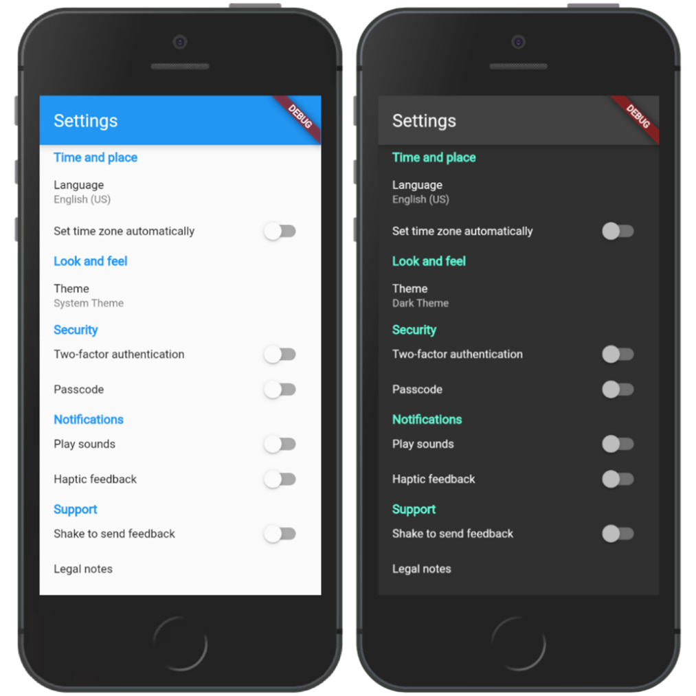
Figure 4.11 – Settings app in light/dark mode
If the Material application matches Figure 4.11, we should see a full set of settings and be able to toggle the application theme from being automatically detected by the system to manually set to Light/Dark.
Now that we have wrapped up our application, let’s review what we have learned.
Summary
In this chapter, we learned how to implement a platform-specific UI by using TargetPlatform defined on context. Then, we created an iOS-specific UI by using widgets from Flutter’s cupertino package. Finally, we recreated the same application with an Android-specific UI by using widgets from Flutter’s material package.
By learning how to build platform-specific applications, you now understand how to build applications that adapt to the platforms that they run on.
In the next chapter, you will learn how to bring your application to life using animations.
Further reading
- Platform-specific behaviors and adaptations: https://docs.flutter.dev/resources/platform-adaptations
- Building a Cupertino app with Flutter: https://codelabs.developers.google.com/codelabs/flutter-cupertino
- Detecting the Current Platform – iOS or Android: https://flutterigniter.com/detect-platform-ios-android