
BASIC SUPPLIES
Watercolor is my jam, and thus you will be seeing much watercolor goodness. My approach, though, may appear different: I don’t gravitate to quiet pastel hues and landscape-worthy washes. You’ll find me painting with the most saturated colors I can find, feeling that they offer great flexibility to go bold or go light. My fascination with these rich bleeds knows no limit, and I am here to be your personal concierge as we navigate the aisles of an art supply store.
And you’ll see more than watercolor in the pages of this book—after all, it’s primarily a book about drawing and painting animals! You’ll draw with pencils and markers, glide with ink, and play with gouache and acrylics (which are opaque, water-soluble paints). I’ll even show you how to implement some of these same ideas on a tablet—a relatively new medium for me as well!
WATERCOLOR PAINTS
Watercolor paints can be purchased as hard little blocks, flat chalky cakes, gooey tubes, or dropper-ready fluids. If you get frustrated with a medium, give one more brand a try. You may realize that it’s not a wrong fit, but that you’re ready to level up.

Tube Watercolors
Tube watercolors are the most versatile paints for intermediate painters (and on)! These are squeezed onto a palette and can be reused again and again. Fresh paints pack more pigment and they come in a variety of colors that you can choose and replace as you like.

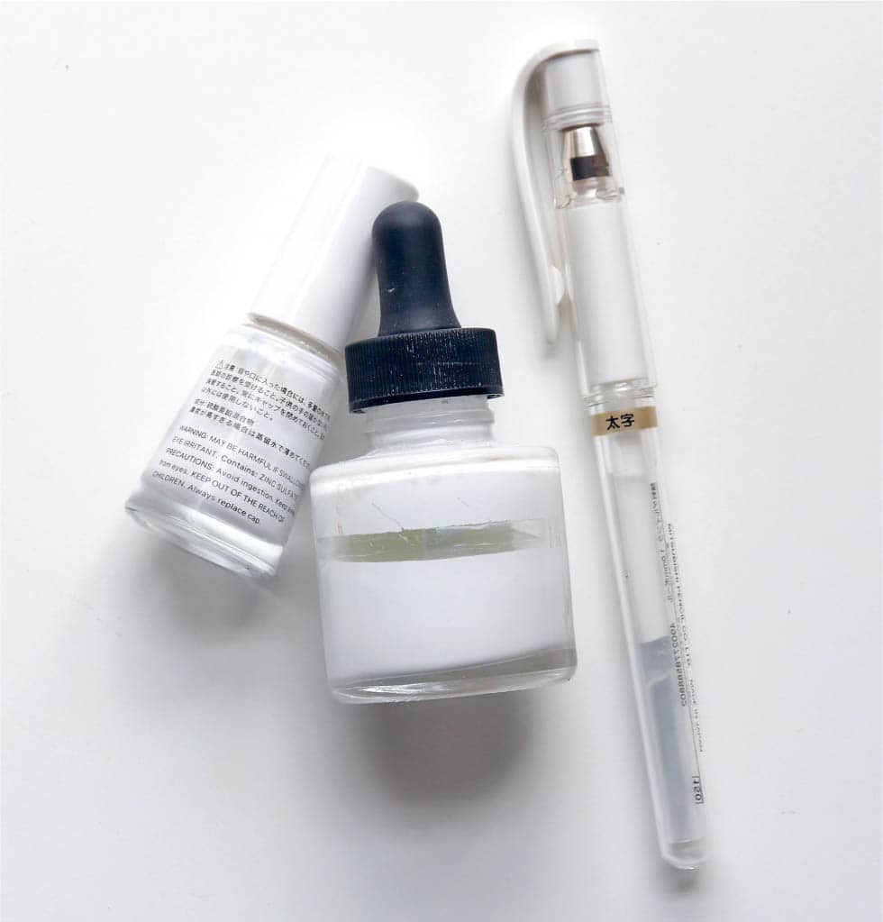
Fluid Watercolors
Fluid watercolors call for a controlled hand coupled with a free spirit! The colors bleed effortlessly and can create a few visual surprises. The paints come with ink droppers for dispersion. Colors can sometimes be so vibrant that they stain, but the risk is typically controlled—a few drops are all you’ll need. Use a palette with shallow wells; it’s easy to clean out with water and a paper towel, even once dry.

WHITE MEDIUMS
I often use a white medium at the end of a painting. White is typically reserved as the paper surface in watercolor, but trying to avoid tiny areas where whiskers should be? Nah! We’ll paint happily and then apply a few touches of white at the end. White is also fun for creating a set of pastel hues that are distinct from a light application of paint. Acrylic white ink, calligrapher’s white, or even a white gel pen prove handy for creating final details and texture.
INKS
In this book I use black India ink. Inks come in many colors and are water-soluble, but the consistency is very different from watercolor. Ink cannot be reactivated easily for a second use. Yet, it does have a sense of boldness you might want to call on, and it fares better in direct sunlight than watercolor paints do.

WATERCOLOR PAPER
I often see students try to stretch other kinds of paper—cardstock, sketchbook paper, or even copy paper! But their work falls flat . . . literally. Watercolor paper has the depth to allow the paint to glide and to sink in nicely. The very least thickness I recommend is 70 lb, but preferably 140 lb (300 grams) and up. Hot press paper has a tooth to it (feels bumpy), while cold press paper does not. I recommend cold press, as we’ll be painting small details and won’t want to fight against a texture.

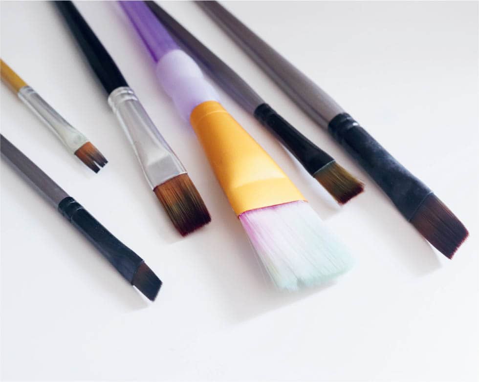
BRUSHES
Choose brushes that don’t fray and have a mind of their own. How do you know how they’ll behave? It’s best to buy these in person: you want round brushes with a sharp point by design (and not because they’ve got glue to make it seem so). I also like a brush that bends. The hairs of the brush with lots of flexible uses will be itself flexible; it shouldn’t be so packed or so short that it doesn’t want to flex when it hits the paper. You’ll need a medium-size round brush (about size 4–10) and a small brush (size 0–2) for the tutorials in this book. We’ll sometimes reach for a flat (square) brush or a fan brush for added texture.


MASKING FLUID
A useful tool though not a required one, masking fluid guards your paper from your paint strokes to reveal the white beneath. It’s most helpful when you know you’ll use heavy washes, lots of colors, and make a mess around areas that you want to remain white. Spots are a great use for masking fluid, as are bright white highlights.

GOUACHE AND ACRYLIC PAINT
I like to see that bit of texture that shows on the edges of a brushstroke that’s losing its paint. It’s an effect that’s not easily created with fluid mediums. Gouache paint is chalky, an opaque step away from watercolor paint. It can be watered down to look like watercolor, but it won’t blend the same way. Acrylic paint has a slick, plastic consistency. Unlike gouache, it isn’t reactivated by water and it dries hard.

PAINT MARKERS
Markers have long been an illustrator’s best friend for their versatility and clean edge. The markers in this book are paint markers from Japan. They are truly paint-like and useful for graphic motifs and fine details. They also come in a vast variety of colors, both trendy and classic. Select markers that can work on top of paint.

DIGITAL MEDIUMS
Many of us have migrated to tablet art. Personally, I enjoy holding a real brush in my hand too much to replace it with a stylus, but I see its convenience and unique brand of fun. As an added bonus, I’ll show you how to translate a couple of methods to a digital format. If you don’t own a tablet, no problem.
