1. Introduction
WINDOWS PRESENTATION FOUNDATION (WPF) represents a major step forward in user interface technology. This chapter will lay out some of the basic principles of WPF and walk through a quick overview of the entire platform. You can think of this chapter as a preview of the rest of the book.
WPF as the New GUI
Before we dive into WPF proper, it is interesting to consider where we’re coming from.
User32, à la Charles Petzold
Anyone programming to User32 has, at some point, read one of Petzold’s “Programming Windows” books. They all start with an example something like this:


This is “Hello World” when talking to User32. There are some very interesting things going on here. A specialized type (Window1) is first defined by the calling of RegisterClassEx, then instantiated (CreateWindow) and displayed (ShowWindow). Finally, a message loop is run to let the window receive user input and events from the system (GetMessage, TranslateMessage, and DispatchMessage). This program is largely unchanged from the original introduction of User back in the Windows 1.0 days.
Windows Forms took this complex programming model and produced a clean managed object model on top of the system, making it far simpler to program. Hello World can be written in Windows Forms with ten lines of code:

A primary goal of WPF is to preserve as much developer knowledge as possible. Even though WPF is a new presentation system completely different from Windows Forms, we can write the equivalent program in WPF with very similar code[1] (changes are in boldface):

In both cases the call to Run on the Application object is the replacement for the message loop, and the standard CLR (Common Language Runtime) type system is used for defining instances and types. Windows Forms is really a managed layer on top of User32, and it is therefore limited to only the fundamental features that User32 provides.
User32 is a great 2D widget platform. It is based on an on-demand, clip-based painting system; that is, when a widget needs to be displayed, the system calls back to the user code (on demand) to paint within a bounding box that it protects (with clipping). The great thing about clip-based painting systems is that they’re fast; no memory is wasted on buffering the content of a widget, nor are any cycles wasted on painting anything but the widget that has been changed.
The downsides of on-demand, clip-based painting systems relate mainly to responsiveness and composition. In the first case, because the system has to call back to user code to paint anything, often one component may prevent other components from painting. This problem is evident in Windows when an application hangs and goes white, or stops painting correctly. In the second case, it is extremely difficult to have a single pixel affected by two components, yet that capability is desirable in many scenarios—for example, partial opacity, anti-aliasing, and shadows.
With overlapping Windows Forms controls, the downsides of this system become clear (Figure 1.1). When the controls overlap, the system needs to clip each one. Notice the gray area around the word linkLabel1 in Figure 1.1.
Figure 1.1. Windows Forms controls overlapping. Notice that each control obscures the others.

WPF is based on a retained-mode composition system. For each component a list of drawing instructions is maintained, allowing for the system to automatically render the contents of any widget without interacting with user code. In addition, the system is implemented with a painter’s algorithm, which ensures that overlapping widgets are painted from back to front, allowing them to paint on top of each other. This model lets the system manage the graphics resource, in much the same way that the CLR manages memory, to achieve some great effects. The system can perform high-speed animations, send drawing instructions to another machine, or even project the display onto 3D surfaces—all without the widget being aware of the complexity.
To see these effects, compare Figures 1.1 and 1.2. In Figure 1.2 the opacity on all the WPF controls is set so that they’re partially transparent, even to the background image.
Figure 1.2. WPF controls overlapping, with opacity set to semitransparency. Notice that all the controls compositing together are visible, including the background image.

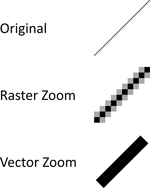
WPF’s composition system is, at its heart, a vector-based system, meaning that all painting is done through a series of lines. Figure 1.3 shows how vector graphics compare to traditional raster graphics.
Figure 1.3. Comparing vector and raster graphics. Notice that zooming in on a vector graphic does not reduce its crispness.
The system also supports complete transform models, with scale, rotation, and skew. As Figure 1.4 shows, any transformation can be applied to any control, producing bizarre effects even while keeping the controls live and usable.
Figure 1.4. WPF controls with a variety of transformations applied. Despite the transformations, these controls remain fully functional.

Note that when User32 and GDI32 were developed, there was really no notion of container nesting. The design principle was that a flat list of children existed under a single parent window. The concept worked well for the simple dialogs of the 1990s, but today’s complex user interfaces require nesting. The simplest example of this problem is the GroupBox control. In the User32 design, GroupBox is behind controls but doesn’t contain them. Windows Forms does support nesting, but that feature has revealed many problems with the underlying User32 model of control.
In WPF’s composition engine, all controls are contained, grouped, and composited. A button in WPF is actually made up of several smaller controls. This move to embrace composition, coupled with a vector-based approach, enables any level of containment (Figure 1.5).
Figure 1.5. WPF controls are built out of composition and containment. The button shown here contains both text and an image.

To really see the power of this composition, examine Figure 1.6. At the maximum zoom shown, the entire circle represents less than a pixel on the original button. The button actually contains a vector image that contains a complete text document that contains a button that contains another image.
Figure 1.6. The power of composition, as revealed by zooming in on the composite button shown in Figure 1.5

In addition to addressing the limitations of User32 and GDI32, one of WPF’s goals was to bring many of the best features from the Web programming model to Windows developers.
HTML, a.k.a. the Web
One of the biggest assets of Web development is a simple entry to creating content. The most basic HTML “program” is really nothing more than a few HTML tags in a text file:

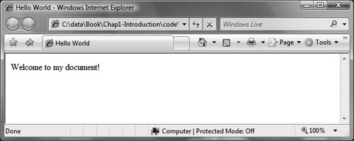
In fact, all of these tags can be omitted, and we can simply create a file with the text “Welcome to my document!”, name it <something>.html, and view it in a browser (Figure 1.7). This amazingly low barrier to entry has made developers out of millions of people who never thought they could program anything.
Figure 1.7. Displaying a simple HTML document in Internet Explorer
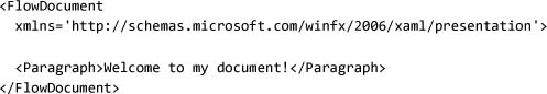
In WPF we can accomplish the same thing using a new markup format called XAML (Extensible Application Markup Language), pronounced “zammel.” Because XAML is a dialect of XML, it requires a slightly stricter syntax. Probably the most obvious requirement is that the xmlns directive must be used to associate the namespace with each tag:
You can view the file by double-clicking <something>.xaml (Figure 1.8).
Figure 1.8. Displaying a WPF document in Internet Explorer

Of course, we can leverage all the power of WPF in this simple markup. We can trivially implement the button display from Figure 1.5 using markup, and display it in the browser (Figure 1.9).
Figure 1.9. Displaying a WPF document in Internet Explorer using controls and layout from WPF

One of the big limitations of the HTML model is that it really only works for creating applications that are hosted in the browser. With XAML markup, either we can use it in a loose markup format and host it in the browser, as we have just seen, or we can compile it into an application and create a standard Windows application using markup (Figure 1.10):
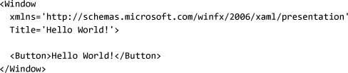
Figure 1.10. Running an application authored in XAML. The program can be run in a top-level window or hosted in a browser.

Programming capability in HTML comes in three flavors: declarative, scripting, and server-side. Declarative programming is something that many people don’t think of as programming. We can define behavior in HTML with simple markup tags like <form /> that let us perform actions (generally posting data back to the server). Script programming lets us use JavaScript to program against the HTML Document Object Model (DOM). Script programming is becoming much more fashionable because now enough browsers have support for a common scripting model to make scripts run everywhere. Server-side programming lets us write logic on the server that interacts with the user (in the Microsoft platform, that means ASP.NET programming).
ASP.NET provides a very nice way to generate HTML content. Using repeaters, data binding, and event handlers, we can write simple server-side code to create simple applications. One of the more trivial examples is simple markup injection:

The real power of ASP.NET comes in the rich library of server controls and services. Using a single control like DataGrid, we can generate reams of HTML content; and with services like membership we can create Web sites with authentication easily.
The big limitation of this model is the requirement to be online. Modern applications are expected to run offline or in occasionally connected scenarios. WPF takes many of the features from ASP.NET—repeaters and data binding, for example—and gives them to Windows developers with the additional ability to run offline.
One of the primary objectives of WPF was to bring together the best features of both Windows development and the Web model. Before we look at the features of WPF, it is important to understand the new programming model in the .NET Framework 3.0: XAML.
A Brief Look at the XAML Programming Model
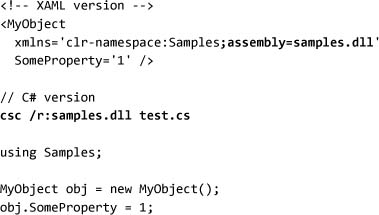
One of the major, and often misunderstood, features of .NET 3.0 is the new XAML programming model. XAML provides a set of semantics on top of raw XML that enables a common interpretation. To oversimplify slightly, XAML is an XML-based instantiation script for CLR objects. There is a mapping from XML tags to CLR types, and from XML attributes to CLR properties and events. The following example shows an object being created and a property being set in both XAML and C#:

XML tags are always defined in the context of a namespace. That namespace determines what tags are valid. In XAML we map XML namespaces to collections of CLR namespaces and assemblies. To make the simple example that was just illustrated work, we need to map in the required namespaces. In XML, we use the xmlns attribute to define new namespaces:

In C#, the list of assemblies where types are found is always determined by the project file or the command-line arguments to csc.exe. In XAML, we can specify the location of the source assembly for each namespace:
In XML the world is divided into two spaces: elements and attributes. In terms of objects, properties, and events, the XAML model is more closely aligned with the CLR. The encoding to attributes or child elements for property values is flexible. We can rewrite the previous example using a child element instead:

Every property element is qualified with the type that defines the property, allowing properties to contain arbitrarily complex structured data. For example, suppose we have a second property that takes a Person object with FirstName and LastName properties. We can easily write the code in XAML using the property element syntax:

XAML was created to be a markup language that integrated well with the CLR and provided for rich tool support. A secondary goal was to create a markup format that was easy to read and write. It may seem a little rude to design a feature of the platform that is optimized first for tools, then for humans, but the WPF team felt strongly that WPF applications would typically be authored with the assistance of a visual design tool like Microsoft Visual Studio or Microsoft Expression. To walk the line between tools and humans, WPF allows the type author to define one property to be the content property.[2]
In our example, if we make the Owner property of MyObject the content property,[3] then the markup can be changed to omit the property element tag:

For further readability, XAML has a feature known as markup extensions. This is a general way to extend the markup parser to produce simpler markup. Markup extensions are implemented as CLR types, and they work almost exactly like CLR attribute definitions. Markup extensions are enclosed in curly braces, { }. For example, to set a property value to the special value null, we can use the built-in Null markup extension:

Table 1.1 lists all of the built-in XAML features.
Table 1.1. Built-in XAML Features


Markup extensions are resolved exactly like object tags, which means that we must declare the “x” XML prefix for this markup to be parsed. XAML defines a special namespace for dealing with the parser built-in types:

It is also possible for any CLR assembly (or set of assemblies) to define a URI-based name for a collection of CLR namespaces and assemblies. This is the equivalent of the old #include ’windows.h’ statement that C/C++ developers know. The WPF assemblies use this mechanism, so we can use either format to import WPF into a XAML file:

The nice thing about the URI-based method is that it imports several CLR namespaces and assemblies, meaning that your markup is more compact and easier to work with.
The final feature of XAML is the ability to extend types with properties provided by other types; we call this feature attached properties. In effect, attached properties are just type-safe versions of the JavaScript expando properties. In the WPF version of XAML, attached properties work only if the type defining the property and the type whose property is being set both derive from the DependencyObject type, but the specification for XAML doesn’t have this requirement.
In the following example the property Dock is defined by the type DockPanel. Attached properties are always prefixed by the name of the type providing the property, even when they appear as attributes:

XAML is a fairly simple language with relatively few rules. In the .NET Framework 3.0 release of XAML, all the definitions for XAML tags are in CLR types—the goal being to ensure that anything we can do in markup we can also do in code. Throughout this book I will switch back and forth between using markup[4] and using code, depending on whichever one more easily demonstrates a particular concept.
Now that we have a grounding of XAML under our belts, we can begin looking at the main parts of WPF itself.
A Tour of WPF
When I started writing this book, I wanted to make it as short as possible, but no shorter (my apologies to Dr. Einstein). Even with that philosophy, I wanted to give you, the reader, a quick overview of the platform to provide a grounding in all the basic concepts you need to get started.
Getting Up and Running
There are many ways to approach WPF: from the browser, from markup, or from code. I’ve been programming for so long that I can’t help but start from a simple C# program. Every WPF application starts with the creation of an Application object. The Application object controls the lifetime of the application and is responsible for delivering events and messages to the running program.
In addition to the Application object, most programs want to display something to a human. In WPF that means creating a window.[5] We’ve already seen the basic WPF application source code, so this should come as no surprise to you:

To compile this code, we need to invoke the C# compiler. We have two options; the first is to directly invoke the C# compiler on the command line. We must include three reference assemblies to compile against WPF. The locations of the tools for building WPF applications depend on how they were installed. The following example shows how to compile this program if the .NET Framework 3.0 SDK has been installed and we’re running in the build window provided:

Compiling with C# directly works great for a single file and a couple of references. A better option, however, is to use the new build engine included with the .NET Framework 3.0 SDK and Visual Studio 2005: MSBuild. Creating an MSBuild project file is relatively simple. Here we convert the command line into a project file:

To compile the application, we can now invoke MSBuild at the command line:
Running the application will display the window shown in Figure 1.11.
Figure 1.11. Empty window created in an application

With our program up and running, we can think about how to build something interesting. One of the most visible changes in WPF (at least to the developer community) is the deep integration of markup in the platform. Using XAML to build an application is generally much simpler.
Moving to Markup
To build our program using markup, we will start by defining the Application object. We can create a new XAML file, called App.xaml, with the following content:
As before, it isn’t very interesting to run. We can define a window using the MainWindow property of Application:

To compile this code, we need to update our project file to include the application definition:

If we were to build now, we would get an error because, by including our application definition, we have automatically defined a “Main” function that conflicts with the existing program.cs. So we can remove program.cs from the list of items in the project, and we are left with just the application definition. At this point, running the application produces exactly the same result as Figure 1.11 shows.
Instead of defining our window inside of the application definition, it is normal to define new types in separate XAML files. We can move the window definition into a separate file, MyWindow.xaml:
We can then update the application definition to refer to this markup:

Finally, we need to add the window to the project file. For any compiled markup (except the application definition), we use the Page build type:

Now we have a basic program up and running, well factored, and ready to explore WPF.
The Basics
Applications in WPF consist of many controls, composited together. The Window object that we have already seen is the first example of one of these controls. One of the more familiar controls is Button:

Running this code will produce something like Figure 1.12. The first interesting thing to notice here is that the button automatically fills the entire area of the window. If the window is resized, the button continues to fill the space.
Figure 1.12. A simple button in a window

All controls in WPF have a certain type of layout. In the layout for a window, a single child control fills the window. To put more than one control inside of a window, we need to use some type of container control. A very common type of container control in WPF is a layout panel.
Layout panels accept multiple children and enforce some type of layout policy. Probably the simplest layout is the stack:

StackPanel works by stacking controls one on top of another (shown in Figure 1.13).
Figure 1.13. Two buttons inside of a stack panel

A lot more controls, and a lot more layouts, are included in WPF (and, of course, you can build new ones). To look at a few other controls, we can add them to our markup:

Running this code shows that you can interact with all the controls (Figure 1.14).
Figure 1.14. Several more controls added to a window

To see different layouts, we can replace StackPanel. Here we swap in WrapPanel:

Running this code reveals a noticeable difference in the layout of the controls (Figure 1.15).
Figure 1.15. Several controls inside of a wrap panel

Now that we have seen some controls, let’s write some code that interacts with the controls. Associating a markup file with code requires several steps. First we must provide a class name for the markup file:

It is also very common to use the C# 2.0 feature of partial types to associate some additional code with the markup file. To define a code-behind file, we need to create a C# class with the same name[6] that we specified in the markup file. We must also call InitializeComponent from the constructor of our class:[7]

To finish associating our code with the markup, we need to update the project file to include the newly defined C# file:

Because our code doesn’t do anything interesting, there isn’t a lot to see if we run the program. The most common link between a code-behind file and the markup file is an event handler. Controls generally expose one or more events, which can be handled in code. Handling an event requires only specifying the event handler method name in the markup file:

We can then implement the method in the code-behind file:

To access any control from the code-behind file, we must provide a name for the control:

We can then use the specified name in the code-behind file:

Running this application and clicking the Howdy! button reveals something like Figure 1.16.
Figure 1.16. Clicking a button to cause changes in another element

Beyond the basics of controls, layout, and events, probably the most common thing to do is have an application interact with data.
Working with Data
WPF has a deep dependency on data and data binding. A look at one of the most basic controls shows many types of binding:
At least three types of binding are occurring here. First, the way a button is displayed is determined by a type of binding. Every control has a Resources property, which is a dictionary that can contain styles, templates, or any other type of data. Controls then can bind to these resources.
Second, the data type of the content of a button is System.Object. Button can take any data and display it. Most controls in WPF leverage what is called the content model, which, at its core, enables rich content and data presentation. For example, instead of a string, we can create buttons with almost any content.
Third, the basic implementation of both the button’s display and the core content model uses data binding to wire up properties from the control to the display elements.
To get a feel for how binding works in WPF, we can look at a couple of scenarios. First let’s consider setting the background of a button:
If we want to share this background between multiple buttons, the simplest thing to do is to put the color definition in a common place and wire all the buttons to point at that one place. This is what the Resources property is designed for.
To define a resource, we declare the object in the Resources property of a control and assign x:Key to the object:

We can then refer to a named resource using the DynamicResource or StaticResource markup extension (covered in detail in Chapter 6):

Running this program reveals that both buttons have the same color (Figure 1.17).
Figure 1.17. Binding to a resource

Resource binding is a relatively simple type of binding. We can also bind properties between controls (and data objects) using the data-binding system. For example, we can bind the text of TextBox to the content of CheckBox:

When we run this code, we can type in the text box and the content of the check box will be updated automatically (Figure 1.18).
Figure 1.18. Data binding between two controls

Deep data integration with controls enables powerful data visualization. In addition to traditional controls, WPF provides seamless access to documents, media, and graphics.
The Power of Integration
The visual system in WPF includes support for 2D vector graphics, raster images, text, animation, video, audio, and 3D graphics. All of these features are integrated into a single composition engine that builds on top of DirectX, allowing many features to be accelerated by hardware on modern video cards.
To start looking at this integration, let’s create a rectangle. Instead of filling the rectangle with a solid color, we will create a gradient (blending from one color to another—in this case, from red to white to blue:
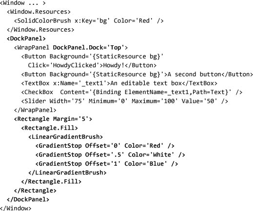
Figure 1.19 shows the result. Resizing the window shows that the rectangle changes size and the gradient rotates such that it starts and ends at the corners of the rectangle. Clearly, 2D graphics integrate with the layout engine.
Figure 1.19. Rectangle filled with a gradient

We can take this integration one step further, using a set of controls as the brush instead of filling the rectangle with a colored brush. In the following example, we will add a name to our wrap panel and use VisualBrush to fill the rectangle. VisualBrush takes a control and replicates the display of that control as the fill. Using the Viewport and TileMode properties, we can make the contents replicate multiple times:

Running this code shows that, if we edit the controls on the top, the display in the rectangle is updated (Figure 1.20). We can see that not only can we use 2D drawings with controls, but we can use controls themselves as 2D drawings. In fact, the implementations of all controls are described as a set of 2D drawings.
Figure 1.20. Using a visual brush to fill a rectangle

We can go even further with this integration. WPF provides basic 3D support as well. We can take the same visual brush and use it as a texture in a 3D drawing. Creating a 3D scene requires five things: a model (the shape), a material (what to cover the shape with), a camera (where to look from), a light (so we can see), and a viewport (someplace to render the scene). In Chapter 5 we’ll look at 3D scenes in detail, but for now the important thing to notice is that, as the material of the model, we use the same visual brush as before:
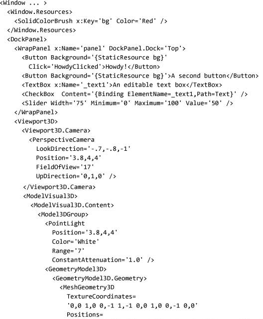

Figure 1.21 shows what this looks like. Just as when the shape was a 2D rectangle, changing the controls will be reflected on the 3D object.
Figure 1.21. Controls used as the material for a 3D shape

As the previous example shows, creating 3D scenes requires a lot of markup. I highly recommend using a 3D authoring tool if you intend to play with 3D.
Our last stop in looking at integration is animation. So far everything has been largely static. In the same way that 2D, 3D, text, and controls are integrated, everything in WPF supports animation intrinsically.
Animation in WPF allows us to vary a property value over time. To animate our 3D scene, we will start by adding a rotation transformation.
Rotation will allow us to spin our 3D model by adjusting the angle. We will then be able to animate the display by adjusting the angle property over time:

Now we can define our animation. There are a lot of details here, but the important thing is DoubleAnimation, which allows us to vary a double value over time. (ColorAnimation would allow us to animate a color value.) We are animating the angle of the rotation from –25 to 25. It will automatically reverse and take 2.5 seconds to complete each rotation.

Running this code produces something like Figure 1.22, but animated. (I tried to get the publisher to include a laptop in every copy of the book so you could see the animation, but they decided it wouldn’t be cost-effective.)
Figure 1.22. Adding rotation animation to our 3D scene

The integration of UI, documents, and media runs deep in WPF. We can give buttons texture with 3D, we can use a video as the fill for text—almost anything is possible. This flexibility is very powerful, but it can also lead to very unusable experiences. One of the tools that we can use to get a rich, but consistent, display is the WPF styling system.
Getting Some Style
Styles provide a mechanism for applying a set of properties to one or more controls. Because properties are used for almost all customization in WPF, we can customize almost every aspect of an application. Using styles, we can create consistent themes across applications.
To see how styles work, let’s modify those two red buttons. First, instead of having each button refer to the resource, we can move the setting of the background to a style definition. By setting the key of the style to be the type Button, we ensure that that type will automatically be applied to all the buttons inside of this window:

Running this code will produce a result that looks indistinguishable from Figure 1.22. To make this more interesting, let’s try customizing the Template property for the button. Most controls in WPF support templating, which means that the rendering of the control can be changed declaratively. Here we will replace the button’s default appearance with a stylized ellipse.
ContentPresenter tells the template where to put the content of the button. Here we are using layout, controls, and 2D graphics to implement the display of a single button:

Figure 1.23 (on page 40) shows what we get when we run this code. The buttons are still active; in fact, clicking the Howdy! button will still update the text box (remember, we wrote that code earlier in the tour).
Figure 1.23. Buttons with a custom template, provided by a style

We have now traveled through most of the areas of WPF, but we’ve only begun to scratch the surface of the concepts and features in this platform. Before we finish the introduction, we should talk about how to configure your computer to build and run all these wonderful programs that we’re creating.
Tools for Building Applications
To compile and run any of the code in this book, you will need a basic set of tools and some understanding of how they work. You can build a complete development environment with little more than an Internet connection because the new Visual Studio Express products give you a great development environment at no cost!
- .NET Framework 3.0[8]
- Windows Software Development Kit[9]
- Code editor of your choice (Visual C# Express[10] is what I’m using right now)
Optionally, you can get the .NET Framework 3.0 Extensions for Visual Studio (currently code-named Orcas), which right now is packaged as a community technology preview (CTP) of the next release of Visual Studio. Over time, though, this package will be replaced by a new release of Visual Studio that has native support for .NET Framework 3.0 development.
In our earlier tour of WPF, we walked through the basics of creating a project file for compiling WPF applications. With Visual Studio extensions installed, all the project file maintenance can be handled by Visual Studio. Alternatively, Microsoft’s Expression Blend (code-named Sparkle) can be used to build projects.
The two most useful sources for API documentation are the Windows SDK documentation and an assembly browser tool like Reflector.[11]
Where Are We?
In this chapter we’ve seen why Microsoft built WPF, and we’ve taken a brief tour through the major areas of the platform. We’ve learned how to use the tools needed to build WPF applications, and we’ve received some pointers on where to find the needed software to get started.