
Using visual aids
In this chapter
- The three main types of visual aids: those you project/create/show
- Making the most of PowerPoint
- Adding video or audio to your slides
- How to use a flip chart
- Using props
- Avoiding common mistakes
In this chapter, we’ll be looking at the three main kinds of visual aids, how to put them together and use them, as well as how many slides to have, and how to avoid common mistakes. Visual aids help you be persuasive, because they engage the sense of sight, as well as sound. When you engage all the senses you involve the listener totally.
There is more to visual aids than PowerPoint, but we can start with slides and how to use them. PowerPoint is a relatively new technology, developed in 1987 as The Presenter and upgraded to its present form ten years later, featuring transitions that rescued presentations from their linear structure, one image at a time, as in the use of overhead transparencies.
I had a call from a man who was offering training in some aspect of computer technology. He was happy with his content, but just wanted some help with platform technique – how to present with his slides.
Not wanting to carry his laptop, he arrived with his slides printed on overhead transparencies. As he took them from his briefcase, I said,
‘I think you have too many slides.’ He looked astonished, and said,
‘There’s only 40!’ For a presentation that was planned to last a little over half an hour, that was clearly too many, so we worked on cutting them down. As a simple rule of thumb, think of an average of two minutes per slide, although it does depend on what’s on the slides. If you are showing a succession of photographs, you can probably have more than text slides.
I pointed out that with so many slides, he might as well run a video.
Three months later he rang me and said, ‘I need help. I’ve now got 108 slides.’ He was illustrating every point he wanted to make, and would have been better off turning them into a stand-alone slideshow with text overlays and music.
That’s what Steve Kayser did when he had to produce a presentation for a budget committee, on what his PR department had achieved during 2009, in the tough economic climate that prevailed then. He was allotted five minutes. But when he had created all the slides he needed to tell the story, he had 118 of them: 118 slides in five minutes. So he put them in a slideshow, with music, and stood silent while it ran. It worked, and the budget committee even approved two additional staff on the team. To see what Steve produced, go here: http://bit.ly/tuAJX.
Apple’s former marketing chief, Guy Kawasaki, uses what he calls the 10-20-30 rule:
- 10 slides (one for each of 10 main points).
- 20 minutes (length of presentation).
- 30-point text (minimum size).
In fact, you could consider even larger type, and see how it looks when you try to cram the usual number of words on the slide. According to one study, the average number of words on a presentation slide is 40. In my own experience, that’s a serious underestimate, and I’ll deal with the effect of that in the next chapter, where I address the matter of how audiences listen.
Guy Kawasaki doesn’t believe in long presentations, especially if they are not structured. He once said, ‘I discovered that if there’s anything worse than a speaker who sucks, it’s a speaker who sucks and you have no idea how much longer he or she is going to suck.’ He added that all his presentations are in his ‘top ten’ format (as above), so that you always know how much longer he is going to be.
Types of visual aids
In broad terms, there are only three types of visual aids in general use with business presentations:
- Those you project (slides, film, video, audio).
- Those you create (flip chart, white board interactivity).
- Those you show (props, objects).
I’ll deal with each in turn, but the general point to make about visual aids is this: they are aids. Their function is to assist, but not supplant, the presenter. The presenter – you – must always be the presentation. No visual aid is more important or more powerful than a live presenter, and should never be allowed to become the most important part of the presentation.
Inevitably, there will be some who search their minds for exceptions, and one example might be when a presentation includes a contribution, on screen, from someone at a remote location. On such an occasion, the screen becomes central to the presentation, but the usual rules apply to the remote presenter. In effect you stand aside and they take centre stage.
Do not get carried away by the possibilities of technology. Your purpose is not to dazzle your audience with the gizmos at your disposal, but rather to inspire in them a sense of wonder at your way of looking at something they may have taken for granted. The magic of your imagination is what makes a presentation compelling, and the visual aids are there merely to help bring your ideas to life.
Good enough is not enough
I once saw a sensational presentation at the National Speakers Association in America, given by a National Geographic photographer called Dewitt Jones. The photographs he showed were breathtaking, but not because of their technical excellence, which any good photographer with the right equipment could match. What set his pictures apart was his perception, his viewpoint, and the patience to wait for the ‘great’ shot when he already had a ‘good’ one. It was what he called ‘seeing the extraordinary in the ordinary’.
Show people how to see something differently, and you’ll have their attention. If you can arouse the curiosity of your audience, they will hunger for your solution. You can do that with pictures, with words, with sounds. Don’t search for perfection, because there is usually more than one right answer. Find your own right answer, and use whatever it takes to bring it to life for your listeners. That’s the essence of creativity, and that is what will elevate your presentation high above the PowerPoint platitudes that others present.
Essential tip
- There’s usually more than one right answer. Find your own.
The Greek orators of old used no visual aids. They relied solely on the power of their words and delivery, and many a present-day speaker does the same. President Obama is one such example. But people remember better if the experience is multi-sensory, if they see as well as hear, and even more so if they can feel or touch as well.
Projecting slides or film
PowerPoint is the most common form of slides used for presentations, and is often derided because it is not properly used. ‘Death by PowerPoint’ is a favourite term used to put down slide-heavy presentations. However, if certain rules are followed, PowerPoint can provide a useful vehicle that’s easy to use. PowerPoint has a number of standard slide designs that conform to best practice.
Essential rules for slides
- Information slide: headline and supporting points.
- Word maximum: 5×5 (5 lines, 5 words per line).
- Topic slide: fewer than 5 words.
- Idea slide: picture with caption or limited words.
The function of a slide is simple. It is to provide a visual summary of what is being spoken by the presenter. Apart from graphs and other slides that contain complex information, it should be possible to glance at the slide and know in a moment what it means, and how it summarises what is being said. Like this:

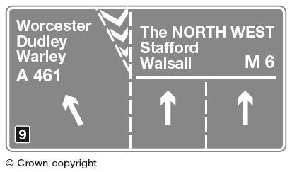
When you are driving along the motorway, at perhaps 70 mph, you need to take in the information on the sign very quickly. The two signs above, which you will see half a mile apart, tell you quite clearly what to expect and what to do if your destination is Worcester. Not all road signs are this clear, however, and you may sometimes have to drive more than once around a roundabout to find the right exit!
Here are a couple of slides that achieve their objectives by getting across their messages in an instant.

Try this little experiment. Switch on the radio, and tune to a non-music channel, with the volume turned up to normal conversational level, or have someone tell you a story, while you read a passage from a book or magazine. Try to listen and read at the same time, as though you were going to summarise both at the end of one minute. How long were you able to do it? Most people quit after a few seconds, because it just cannot be done. Yet that is what you will be expecting your listeners to do if your slide cannot be taken in instantly.
No full sentences, and use charts sparingly.
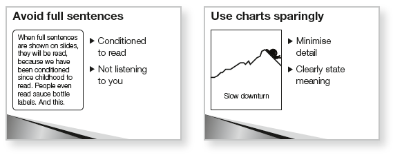
In the left-hand slide above, the small words in the box will be read, simply because we have been conditioned to read everything. Is that an argument for putting even more words on the slide? No, because you want people to listen to you, and not drift away while they read the slide. Mind you, if the text is too small to read, people become irritated and switch off.
Treat your information slides like press ads. Write a headline that clearly states what it is about. If you want to use bullet points, that’s fine, even though some people hate them. Bullet points should not be more than five words long, and there should not be more than five lines on the slide. Bring up the bullet points one at a time, to help your listeners concentrate on what you are saying. The slide design must conform to the way people are conditioned to read, i.e. left to right, top to bottom (right to left in some countries).
Why five? Because research has shown that people can remember an average of seven units of information, plus or minus two. Therefore, five is within everyone’s scope.
Avoid punctuation and capital letters. Email has conditioned us all to regard CAPITALS AS SHOUTING, so they are best avoided. Punctuation causes breaks in the flow, and gets in the way of the message.
Some tips on design:
- make every slide look different, even if you are using a design template, otherwise your listeners will have difficulty realising that they are not still looking at the previous slide;
- use the same colour scheme for text;
- avoid strongly coloured or fancy backgrounds;
- remember that red signals danger or warning and use it sparingly;
- if using pictures of people, position them to face into the page. A face turned towards the right should be placed on the left. The viewer’s eyes will follow the gaze of the person on the screen, and you don’t want them leaving the page;
- follow the natural inclination of the viewer, whose eyes naturally land one quarter of the way down from the top, run left to right, and down to the bottom right-hand corner – good direct response ads follow this pattern;
- use pictures wherever possible, either on their own or with brief captions, and preferably your own pictures, not ClipArt or stock photos;
- use large type, even on graphs, and check that it is all readable from the back of the room;
- use sans serif fonts such as Arial and Verdana, because they are bolder than serif fonts and better suited to large projection. Serif fonts were developed to help the eye to travel along the page of a book, in which type is small.
Transitions
Some people get rather carried away with transitions and animations. Their slides zoom in, explode on the screen, materialise out of a checkerboard, enter from all sides, and generally leave the viewer dizzy. Use transitions and animations sparingly. Your presentation is not a fireworks display, and the transitions should be used to serve a purpose, not just because they are available.
Finally, take a step back from the presentation and ask yourself if they look like a unified whole, like a set of smart, matching luggage, or are they like a tray of mixed cakes, each one different, a kaleidoscope of visually confusing images.
Number of slides
Some people reckon one slide per minute, but I work on an average of two minutes per slide, as I said earlier, but you should switch off the slides altogether from time to time, and re-engage with your audience.
Managing slides
I was at a seminar recently which was conducted with a PowerPoint presentation. After the first half hour or so, someone in the audience disputed a piece of information that was on one of the slides, and a lengthy discussion ensued, drifting away from the message on the slide, which stayed on the screen throughout, acting as a visual distraction. When the presentation resumed, another delegate asked if the presenter could go back to an earlier slide. He scrolled back through all the slides until he found it. Not very professional.
In the comfort break that followed, I approached the presenter and showed him three simple ways to control the mechanics of the presentation:
- To switch off the slides while a discussion is taking place, press letter B. The screen goes blank and attention reverts to the presenter. B for Black or Blank. Press B again to return to where you were.
- To switch off the slide but keep a bright screen, if for example the room lights have been dimmed, press letter W (for White). The slide disappears, but the screen remains lit. Press W again to return.
- To go directly to any slide, have a printout of all the slides, numbered. Type in the number of the slide you want and press Return. Essential tip
Essential tip
- Switch off the PowerPoint occasionally, to return attention to you.
One more thing
Always check that your slide presentation can run on any computer, especially if you are loading your presentation onto a CD or memory stick. Some computers have a different version of PowerPoint from your own, and some computers may not have PowerPoint at all, so you should have PowerPoint Viewer on your CD or memory stick as well.
Video or film clips
- Keep them short: people’s attention spans are very limited.
- Use only professionally produced clips, topped and tailed: we have all been trained by TV and the cinema to expect certain standards, so you should have Title and Presenter at the start and contact details at the end.
- Have a soundtrack: a silent film is disconcerting.
The biggest danger associated with film or video clips during a presentation is that they tend to interrupt your connection with the audience because:
- you are not doing it;
- the lights are usually dimmed;
- they are received as ‘entertainment’;
- the sound is different from you.
Video can be incorporated into PowerPoint presentations, but only if you follow the guidelines. It can be used as self-contained clips at given points of the presentation or as a background. The problem with video backgrounds is speed. Set the video background to a slow speed so that it doesn’t jar with the usual slow speed of slide introductions and animations, and use video selectively.
The video itself must be in a format that fits with PowerPoint. It can be QuickTime, Flash, AVI or MPEG, but the format that works best is Windows Media Program (WMV) which, like PowerPoint, was created by Microsoft itself. WMV is also the format used by YouTube.
To play video within a PowerPoint presentation
First create a WMV file for your video clip and place it on your desktop, then open your PowerPoint presentation (not through PowerPoint Viewer) to the slide where you want to insert the clip:
- Click on Insert (drop down menu).
- Select Movie.
- Browse on Desktop and select video clip.
- Decide if video should start immediately when you reach that slide or when you click it.
The same instructions apply if you want to insert a sound clip rather than a video, for example if you want to add applause or music to a particular slide, but remember to take advice on copyright if you are going to use someone else’s original music.
Essential tip
- If adding a video clip, first make it right for YouTube (WMV).
The visual aids you create
The simplest kind of visual aid is the flip chart, on which you might write words or draw a diagram. An alternative would be the white board, but the principles are the same. If you are skilled at it, this visual aid can be very effective, because it is live, it derives from the current discussion, and it grows in line with the conversation.
The seven advantages of a flip chart are:
- They can be used anywhere.
- They do not require electricity.
- They are directly relevant.
- You can use colour.
- They are economical.
- They encourage interaction.
- You can combine prepared content with new.
Here are the guidelines:
- Use only if your writing or drawing can be clearly seen and understood from the back of the room. I once saw a presenter using a flip chart when presenting to 300 people. Predictably, it failed.
- Use broad nib (chisel tip) pens. Always carry your own as most venues provide the wrong kind.
- Write LARGE (not less than 2in/5cm high).
- If you are going to draw a picture or diagram, lightly draw it in pencil in advance so that you produce an acceptable image that does not diminish you in the eyes of your audience.
- If possible, do the same for text you plan to write, using a ruler to keep the lines straight, or draw tramlines in pencil, 2in/5cm apart, to keep your writing straight and consistently large.
- Place the flip chart so that you do not stand with your back to the audience when writing on it.
- Practise writing fast and legibly. It’s not the same as writing on a page laid flat on your desk.
- DO NOT USE ALL CAPITALS. Upper and lower case is easier to read.
- Have some Blu-Tack ready in case you want to stick some completed pages up on the wall.
- If you write on any pages of the flip chart in advance, make sure you leave them covered by at least one blank page, so that they do not show through.
Essential tip
- Write or draw in pencil on the flip chart in advance.
A different kind of ‘created’ visual aid is any interactive participation by audience members. When you ask people to come forward and do something, they become visual aids, and it is important to manage the process well. Here are some rules:
- Treat every participant with respect.
- Never make a person feel uncomfortable.
- Remember that people in the spotlight can become tense or nervous, and may sometimes behave unpredictably.
- Always ensure that they leave the platform feeling good about themselves, and lead the applause for their contribution.
Use of props
Any object that you use to illustrate a point is a visual aid. It could be a paper aeroplane, an apple, a laptop, anything at all, even a rubber band. Apple’s Steve Jobs usually uses some prop, and when he introduced the new, slim Macbook Air, he held up one of those large manila envelopes for inter-office memos, undid the cord and slid out a Macbook, thus demonstrating how thin and light it was.
Props can be used metaphorically or to demonstrate some feature of the product you are describing. When I produced an apple and crossbow during my talk to dentists about rapport, it was a metaphor for trust, not about marksmanship with a bow.
On another occasion, when talking about getting rid of the limiting labels of the past, I said, ‘Write them on a sheet of paper and make a paper aeroplane with it, then go to some high place, throw the plane over the edge and let those nasty labels fly away.’ As I spoke I produced a paper plane I had prepared in advance and threw it down the aisle. People remember those things and reconstruct your message from them.
On another occasion, I was presenting to advertising people, about direct marketing, and used a small model aeroplane that I could throw and have it return and settle on my outstretched hand. A colleague later told me, ‘I bet everyone expected that to fail!’ But I had practised repeatedly in advance and knew it would succeed.
Essential tip
- When using props, practise so it can’t go wrong.
Essential guide to avoiding common mistakes
Too many slides: work on an average of two minutes a slide, and one minute per slide as a maximum. More than that and you might as well project a video. Are there exceptions to the rule? Of course, but only if you have a section in which several slides are projected in rapid succession, as when you are showing different examples of something.
Hard to read: Use large type (see Kawasaki, p. 89), and always check that EVERY word can be read from the back of the room. Use sans serif fonts, as they are bolder than serif fonts.
Too much information: Always work on the three-second rule. Pick any slide that has a lot of content, and test it on a colleague by showing it for just three seconds and asking them to tell you what they got from it. They don’t have to know the detail, as long as they understand the main point of the slide. Remember, too, that if they have to take time to read and understand the detail, they will not be listening to you while they do that. Follow the 5x5 rule as well, which is 5 lines max. and 5 words max. per line.
Slide dependency: It is not essential to have slides. Some of the world’s top motivational speakers use no visual aids at all. Don’t start your preparations from the slides. Draft the presentation and try delivering it without any, until you feel the need for illustration. That’s where to have a slide.
Unbalanced video clip: A film/video clip that is too long can kill the presentation stone dead, so keep it brief. Also, consider how it fits with the rest of the presentation, in terms of rhythm, sound, colour and pace. If you need to turn down the lights, you risk sending some people to sleep.
Illegible writing on flip chart: Use broad nib (chisel tip) pens, write large (2in high letters) and use pencil tramlines to keep your writing straight and consistently large.
Embarrassing participants: Every delegate is your customer and must not be made to feel uncomfortable. If you use delegates to demonstrate something negative, always return them to a positive state before releasing them. And never push them to do something they feel reluctant to do, even if it is something simple. Stage fright can seize anyone, and they should be helped to save face.
Props that fail: Always rehearse the use of props. I saw a very experienced speaker try to do the three-rope trick and fail because he had not practised it enough. He not only failed to make the point of the trick, but he lost some ground with the audience.
Let’s now consider how audiences listen, so that you can connect with them more effectively and maintain their interest.
Summary
- Guy Kawasaki’s 10-20-30 rule
- Visual aids you project, create or show
- Slide rules
- How to use video clips
- How to use a flip chart well
- The common mistakes to avoid