This appendix lists the most useful Windows Presentation Foundation (WPF) controls that are available in the .NET Framework 4, and briefly describes their purposes. This list does not include all of the hundreds of classes that WPF defines; it lists only the tools most likely to appear in the window designer's Toolbox.
These controls are part of the System.Windows.Controls namespace. In contrast, the controls used in Windows Forms are contained in the System.Windows.Forms namespace. Many of the controls in the two namespaces serve very similar purposes, although they have different capabilities. For example, both namespaces have buttons, labels, combo boxes, and check boxes but only the System.Windows.Controls classes provide foreground and background brushes, render transformations, complex content, and XAML-defined triggers.
This appendix describes the WPF controls in far less detail than Appendix G describes the Windows Forms controls. This is mostly due to space constraints, not because the WPF controls are inferior. These controls can do some amazing things that the Windows Forms controls cannot, such as containing other controls as content and applying transformations while drawing. Unfortunately, these new features would take at least a few hundred pages to cover in depth, and there just isn't room in this edition of the book to do them justice.
For much more information about WPF controls and WPF in general, see my book WPF Programmer's Reference (Stephens, Wrox 2010). You can learn more about the book at www.vb-helper.com/wpf.htm.
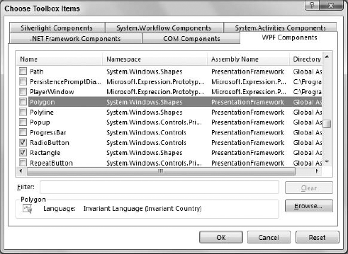
Note that not all of the controls described here are available by default when you create a new WPF application. You need to add some of these controls to the Toolbox before you can use them. To add a control that is missing, right-click a Toolbox section and select Choose Items. On the Choose Toolbox Items dialog, select the WPF Components tab to display the dialog shown in Figure H-1. Check the boxes next to the controls that you want, and click OK.
Controls in the following table are marked with superscripts 0, 1, or 2 to indicate whether they can hold 0, 1, or 2 children. Controls with no superscripts can hold any number of children.
CONTROL | PURPOSE |
|---|---|
| Provides a visible border around or background behind its contents. |
| Contains two children. The first is used as a bullet and the second is aligned with the first. For example, you can use this to align bullet images next to labels. |
| Displays a button that the user can click. Raises a Click event that the program can catch to perform an action. |
| Creates an area in which you can explicitly position children by specifying their Width, Height, Canvas.Left, and Canvas.Top properties. |
| Allows the user to select or deselect an item. Each CheckBox choice is independent of all others. |
| Allows the user to select an item from a drop-down list. The list can contain all sorts of objects, but typically holds a series of ComboBoxItems. |
| Represents an item in a ComboBox control's list. |
| Represents a control that contains a single piece of content. Note, however, that the content may, in turn, contain other objects. |
| Builds a popup menu for a control. This element should be inside the control's ContextMenu property (for example, inside a <Button.ContextMenu> element). Normally the ContextMenu contains MenuItem controls. |
| Docks its children to its left, right, top, or bottom much as the Dock property does in a Windows Forms application. If the control's LastChildFill property is True, the control makes its last child control fill the remaining space. |
| Displays a FixedDocument. See the section "Fixed Documents" in Chapter 12, "Using WPF Controls." |
| Displays an ellipse. |
| Displays a header and lets the user expand and contract a single detail item. The <Expander.Header> sub-element contains the content displayed in the header. |
| Displays a FlowDocument one page at a time. If the control is wide enough, it may display multiple columns although it still only displays one page at a time. See the section "Flow Documents" in Chapter 12. |
| Displays a FlowDocument in one of three modes. When in single page mode, it acts as a FlowDocumentPageViewer. When in scrolling mode, it acts as a FlowDocumentScrollViewer. In book reading mode, it displays two pages side-by-side much as a real book does. See the section "Flow Documents" in Chapter 12. |
| Displays a FlowDocument as a single, long, vertically scrolling page. See the section "Flow Documents" in Chapter 12. |
| Supports navigation and content display. The control can navigate to a .NET Framework object or to HTML content. |
| Displays children in rows and columns. This is similar to the Windows Forms TableLayoutPanel control. |
| Acts as a splitter that allows the user to resize rows or columns in a Grid. |
| Displays data in columns within a ListView control. |
| Represents a column header for a GridViewColumn. |
| Displays a visible border with a header. The Header property determines the content displayed in the header. The control also forms a grouping for any RadioButtons that it contains. |
| Used to group items in other controls such as a TreeView. |
| This is the base class for controls that have a single content element and a header. Although you can create one directly, usually it's better use a subclass such as GroupBox. |
| Displays a header and multiple content elements. |
| Displays an image. Can optionally stretch the image with or without distortion. |
| Displays or captures ink strokes. |
| Displays ink strokes. |
| Displays a collection of content items. |
| Displays non-editable text. |
| Draws a line segment. |
| Lets the user select items from a list. ListBoxItem objects hold the items. The control automatically displays scroll bars when needed. |
| Holds content for display by a ListBox object. |
| Displays a group of items in various display modes. |
| Contains the content for an item displayed in a ListView. |
| Presents audio and video. To let you control the media, it provides Play, Pause, and Stop methods, and Volume and SpeedRatio properties. |
| Builds a menu that is visible, in contrast to a ContextMenu, which is hidden until displayed. Normally, the Menu contains MenuItem controls representing the top-level menus. Those items contain other MenuItem controls representing commands. |
| Defines a top-level menu, submenu, or menu item for a ContextMenu or Menu. |
| Navigates to content and displays it, keeping a navigation history. Similar to Frame. |
| Panel is the parent class for Canvas, DockPanel, Grid, TabPanel, ToolbarOverflowPanel, UniformGrid, StackPanel, VirtualizingPanel, and WrapPanel. Usually, you should use one of those classes instead of Panel, but you can use Panel to implement your own custom panel controls. |
| A text box where the user can enter sensitive information such as passwords. The control's PasswordChar property determines the character displays for each character the user types. By default, this is a solid black circle. |
| Contains a series of drawing instructions that make line segments, arcs, curves, ellipses, and so forth. For more information, see the section "Path" in Chapter 12. |
| Draws a closed polygon. |
| Draws a series of connected line segments. |
| Displays content in a window above another control. Usually, you can use the Tooltip and ContextMenu controls instead of a Popup. |
| Displays a standard Windows print dialog. You shouldn't place a PrintDialog on a window. Instead use code to build and display the PrintDialog. |
| Indicates the fraction of a long task that has been completed. Usually, the task is performed synchronously, so the user is left staring at the form while it completes. The ProgressBar lets the user know that the operation is not stuck. |
| Lets the user pick from among a set of options. If the user checks one RadioButton, all others with the same parent become unchecked. |
| Draws a rectangle, optionally with rounded corners. |
| Acts as a Button that raises its Click event repeatedly when it is pressed and held down. |
| Displays a resize grip similar to the one used on the lower-right corner of a window. |
| Similar to a TextBox but contains text in the form of a document object. See the section "Managing Documents" in Chapter 11, "Selecting WPF Controls," for more information on documents. |
| Allows the user to drag a "thumb" to select a numeric value. Usually scroll bars are used internally by other controls such as the ScrollViewer and your applications should use a Slider instead. |
| Provides vertical and horizontal scroll bars for a single content element. Makes a scrollable area that can contain other controls. |
| Draws a vertical or horizontal separator in controls that contain other controls, such as StatusBar, Menu, ListBox, or ToolBar. |
| Enables the user to select a value from a range by sliding a Thumb along a Track. Similar to the Windows Forms TrackBar control. |
| Arranges children in a single row or column. If there are too many controls, those that don't fit are clipped. |
| Displays a container at the bottom of the form where you can place controls holding status information. Though you can place anything inside a StatusBar, this control is intended to hold summary status information not tools. Generally, menus, combo boxes, buttons, toolbars, and other controls that let the user manipulate the application do not belong in a SatusBar. |
| Contains an item in a StatusBar. |
| Arranges children in tabs. TabItem controls contain the items that should be displayed in the tabs. |
| Represents an item in a TabControl. The Header property determines the content displayed on the tab, and the Content property determines what's displayed on the tab's body. |
| Displays more complex non-editable text. This control's contents can include inline tags to indicate special formatting. Tags can include AnchoredBlock, Bold, Hyperlink, InlineUIContainer, Italic, LineBreak, Run, Span, and Underline. |
| Allows the user to enter simple text. Optionally can allow carriage returns and tabs, and can wrap text. |
| Represents an area that the user can grab and drag as in a ScrollBar or Slider. |
| This is the base class for controls that toggle between two states such as a CheckBox or RadioButton. You can make one directly, but it's easier to use CheckBox or RadioButton. |
| Contains a series of tools, typically Button controls, ComboBox controls, and other small controls. The Header property gives the ToolBar a header. |
| Contains ToolBars and allows the user to drag them into new positions. |
| Displays a tooltip. To give a control a simple textual tooltip, set its Tooltip property. Use the Tooltip control to build more complex tooltips. For example, a Tooltip control might contain a StackPanel that holds other controls. |
| Displays hierarchical data with a series of nested collapsible nodes. TreeViewItems contain the items displayed in the hierarchy. |
| Represents an item within a TreeView. The Header attribute or sub-element determines the content displayed for the item. |
| A container that you can use to create a simple compound control. Note, however, that classes derived from UserControl do not support templates. |
| Stretches its single child to fill the Viewbox. The Stretch property determines whether the control stretches its child uniformly (without changing the width-to-height ratio). |
| Generates child items to hold items that can fit in the available area. For example, when working with a ListBox bound to a data source, the VirtualizingStackPanel generates only the items that will fit within the ListBox. If the control is not bound to a data source, this control behaves like a StackPanel. |
| Represents a window, the WPF equivalent of a form. The Window includes two areas: the client area where you normally put controls and the non-client area where the window displays borders, title bar, caption, system menus, and so on. Normally, you add a Window to an application by using the Project menu's Add New Item command. |
| Arranges children in rows or columns depending on its Orientation property. When a row or column is full, the next child moves to a new row or column. This is similar to the Windows Forms FlowLayoutPanel control. |
For more detailed descriptions plus examples using these and other controls, see the Microsoft online help. You can find a reference for System.Windows.Controls classes at msdn.microsoft.com/system.windows.controls.aspx. You can find a reference for the System.Windows .Controls.Primitives classes, which include base classes used by other controls, at msdn.microsoft.com/system.windows.controls.primitives.aspx.
For much more information about WPF controls and WPF in general, see my book WPF Programmer's Reference. You can learn more about the book at www.vb-helper.com/wpf.htm