
Chapter 2: The New and Improved User Experience
What’s In This Chapter?
- Browser support in SharePoint 2010
- Updated user interface features
- Using sites, lists, libraries, and and views
- Working with pages in SharePoint
- Using the Multilingual User Interface
You may find yourself wondering what a chapter on the SharePoint user experience is doing in an administration book. Well, the answer to that is twofold. First, it is important for administrators to know at least a little about what SharePoint 2010 can do from a user’s standpoint and how it differs from its predecessor, SharePoint 2007, in terms of functionality. It’s one thing to know how to deploy, configure, and maintain SharePoint from the backend, but it’s another to actually understand what the program can do, what end users will be experiencing, and how it can help your organization. Often, administrators are the ones who will get questions from end users regarding functionality or how to accomplish certain tasks. Having an understanding of the interface will allow administrators to help users more quickly. In addition, some settings can only be enabled at a site level. Understanding Central Administration is only half of the picture. Turning on the option to allow incoming e-mail for document libraries, for example, is done in Central Administration, but what about when a user needs help actually configuring a document library to receive e-mail? Knowing the structure and setup of the user side of SharePoint is just as important as knowing the administration side.
This brings us to our second point. While much of the new functionality SharePoint 2010 brings to the table is for users, a lot of this information applies to administrators as well. The Ribbon interface, for instance, is used extensively throughout SharePoint 2010, in both Central Administration and in regular SharePoint sites. Understanding how it works is crucial for administrators to do their jobs, as well as being able to help users with issues they may experience.
SharePoint 2010 offers a great new interface for accomplishing tasks. The core functionality of SharePoint still remains and in many area has been vastly improved upon. Lists, libraries, and page editing are all still around, as they have been in previous versions, but what makes SharePoint 2010 such a departure from what we’ve all come to know and love is how users will interact with these items. This chapter helps you get cozy with the ins and outs of the new user experience, or UX, in SharePoint 2010.
SharePoint 2010 is a large, complex product. Although this chapter is designed to give you a fairly thorough overview of using the SharePoint 2010 interface, it would be impossible to cover every aspect of it in detail in a single chapter. Therefore, this chapter covers some of the most commonly used areas in SharePoint 2010.
As you probably already know, SharePoint 2010 sites are accessed through a web browser. With SharePoint 2010, Microsoft has put effort into making it more standards-compliant, meaning it will render and behave more similarly between different browsers than in past versions. There are different levels of browser support, however, so you shouldn’t expect that all features in SharePoint 2010 will work in exactly the same way when accessing the site with different browsers.
There are two main levels of browser support Microsoft has identified to work with SharePoint 2010: Supported, and Supported with known limitations.
A supported browser is a browser that is known to be 100% compatible with all features and functions in SharePoint 2010. Fully supported browsers include Internet Explorer 7 32-bit and Internet Explorer 8 32-bit. These browsers support all ActiveX controls used in SharePoint 2010 to provide the best and richest editing experience.
Supported browsers with known limitations are browsers that can access and use most of the SharePoint 2010 functionality, but there are some components that either will not work or that require a workaround to achieve the same functionality as a fully supported browser, since they may not support all the ActiveX controls used in SharePoint 2010. These browsers also have documentation readily available that lists the known limitations and workarounds. Some of these browsers include 64-bit versions of Internet Explorer 7 and 8, Firefox 3.6 and higher (on Windows), and Safari 4.04 on Mac OS X 10.6.
Internet Explorer 6 is officially an unsupported browser to use with SharePoint 2010. Due to the advanced authoring components used in SharePoint 2010, more modern and standards-based browsers should be used instead.
It’s important to mention that these browsers can all be used to browse a SharePoint 2010 site with no impact on functionality. These limitations generally come into play when you are actually working with SharePoint 2010.
For more information on browser support, see http://technet.microsoft.com/en-us/library/cc263526(office.14).aspx.
Changes to the SharePoint 2010 User Interface
Figure 2-1 shows a screenshot of a typical out of the box SharePoint 2010 site. If you are familiar with SharePoint 2007, you’ll notice that while many of the familiar items still exist on the page, a few of them have been shuffled around a bit, and they’re accompanied by a few new items as well.

Notice that the Site Actions menu has been moved from the right side of the page to the left. The All Site Content link has also been repositioned from the top of the left navigation menu to the bottom. A few other changes to the interface include the new site navigator icon — the folder and arrow icon — next to the Site Actions menu, which provides a tree structure of the current page’s location in relation to the rest of the site, providing a quick way to navigate back through the site after going a few levels deep.
In SharePoint sites, such as an Enterprise Wiki site or Team site, the site name in the title area of the site also can serve as the root of the breadcrumb trail. Some additional, contextual, functionality has also been built into the breadcrumb trail. For example, when working with a list, the last entry of the breadcrumb trail displays the list view name and also serves as a drop-down to select a different view (see Figure 2-2).

Also worth mentioning are the large tagging buttons, “I Like It” and “Tags & Notes,” underneath the user login drop-down, and the rating stars that appear on some SharePoint pages. These are covered in more detail in Chapter 17, but basically they serve as a way for users to tag certain pages to be available to them quickly, as well as a way to rate the page’s content. Higher-rated pages will have more relevance in search results, while lower-rated pages can serve as a good indicator to site owners that they may want to revisit the content on the page and revise it to meet the users’ needs.
Several other UI enhancements have been made to the experience of working with SharePoint 2010 — in particular, the addition of pop-up windows. In SharePoint 2007, it was easy to get lost when performing certain tasks, as every click led to a new screen with new links and options. Often, it wasn’t always apparent where SharePoint had taken you during the course of performing certain actions, such as uploading a document, especially with multiple browser windows opening and screens switching with every step. SharePoint 2010 addresses this problem by introducing pop-up windows that open over the top of a page but never fully cover the page, so you still have a sense of where you are in SharePoint.
These pop-ups aren’t new browser windows that open, but rather just new SharePoint windows opening within the browser, letting a user perform an action, then closing, with the changes reflected on the page without ever actually leaving the current screen. A good example is uploading a document into a document library, as shown in Figure 2-3. Instead of leaving the document library itself, a small pop-up window opens when the Upload button is clicked in the Ribbon, and the entire upload process can be carried out in the pop-up. The pop-up then closes and the document appears in the library without the user ever having left the page. This approach keeps SharePoint fairly “flat,” as opposed to “deep,” much like the new approach to Central Administration, which you’ll learn about in Chapter 6. There is less drill-down through SharePoint to get to the item you want.
The Ribbon
Perhaps one of the most obvious and important changes to the SharePoint UX is the addition of the Fluent UI, or the Ribbon, as it’s more commonly known. The Ribbon interface is now an integral part of the SharePoint 2010 experience for both administrators and users alike. It works very much like the Ribbon in the Microsoft Office 2007 and 2010 suite of clients. Also like the Office clients, the options available in the SharePoint 2010 Ribbon change depending on the task being performed, such as editing a page, working with an image, or working with a list. Tasks and functions are built into a visual, contextual menu. We will examine more specific details of the Ribbon and how it can be used in various areas of the site later in this chapter.
The Ribbon is divided into several tabs and categories, with different functions available depending on where in a site a user is working. You may also notice that the icons and text in the Ribbon change size, expanding when more screen real estate is available, very much like the Office clients. If the browser window is fairly small, smaller icons are used, some icons are grouped together in a drop-down menu, and very little text is displayed. With larger browser windows, more text is displayed with the Ribbon buttons, and many icons are much larger. This functionality helps manage the available real estate available in the Ribbon without reducing its functionality.
Love it or hate it, there’s no getting around using the Ribbon. There is no option to turn it off, and nearly every aspect of SharePoint uses the Ribbon to perform tasks in some way or other, from basic to complex. Administrators and users will likely find that the SharePoint 2010 Ribbon makes completing most tasks easier than in previous versions. Figures 2-4 and 2-5 show examples of the Ribbon.


The main purpose of the Ribbon is to enable more options to be available at once on a page without adding additional clutter to the site. Using this approach, users should find that in most cases, fewer clicks are required to perform a simple task. Additionally, users who are familiar with using the Office 2007 clients will feel right at home in SharePoint 2010, as they share a similar interface. Working with SharePoint 2010 will feel more like working with programs users already know, helping them to become more productive.
Using the Ribbon doesn’t take much effort — generally, it is exposed when it is needed, collapsed when it’s not, security trimmed from view if you don’t have permission to use its functionality (for example, editing a page), and some options are grayed out if they can’t be utilized at the moment. As mentioned earlier, the Ribbon interface is contextual, meaning that the set of available options varies according to the page or location in a site. Users get a different set of Ribbon options for working in a list than they do when working on a page. As you will learn in Chapter 6, Central Administration even features its own Ribbon menus, such as on the Service Application page.
The site creation process in SharePoint 2010 takes one of two forms: the “classic” way that we’ve all become familiar with from SharePoint 2007, and the new, fancy Silverlight-driven way. If Silverlight is installed for the client browser accessing the SharePoint site, the user will be presented with the fancy new site creation process. If not, or if the user is accessing the SharePoint site with a browser with known limitations when working with SharePoint 2010, the classic site creation process used in SharePoint 2007 will be presented. To begin the site creation process, click the Site Actions menu, and then click New Site.
Figure 2-6 shows the new Silverlight-powered site creation window. The new Silverlight site creation approach was designed to streamline and expedite the site and list creation process, since both now use the same interface. By dividing site types into categories, which can be filtered by clicking the category name on the left, it’s easy for users to find the type of site they want to create.
Users can select a category, choose a site type from the icons displayed, and then assign a name and URL to the site on the right workpane. Clicking the More Options button lets you enter a description for the site, set up unique permissions, and choose whether the site navigation will use the same items as the parent site or use its own unique navigation.

Lists and Libraries in SharePoint 2010
Lists and libraries are still at the core of the SharePoint platform and where much of the power in SharePoint lies. In SharePoint terms, a list is a collection of data stored in rows and columns, similar to a spreadsheet. A library is a specialized type of list that enables the storage of files, such as documents, images, and even web pages, in addition to the data that can be collected in the list. The functionality of lists and libraries continues to improve with each version of SharePoint, and this version is no exception. In fact, performance in SharePoint 2010 has increased to the point where lists and libraries are capable of storing up to 50 million items. In addition to this vastly increased capacity are a few other notable changes to working with lists and libraries:
- The Ribbon — As mentioned earlier, the Ribbon is used just about everywhere in SharePoint 2010, lists and libraries included. The Ribbon provides a user-friendly interface for working with lists and libraries by offering up front a host of frequently used list options that were previously buried in menus or several layers deep in settings screens. Creating a column or view is now only a single click away.
- Inline editing — A new way of working with lists in SharePoint 2010 is the capability to edit each item in the list directly on the page without opening the datasheet view or the individual item.
- Tabular Views — This allows individual checkboxes to appear beside list items, enabling users to select multiple items at once to perform bulk operations, such as deleting list items or performing bulk check-in and check-out of documents in a library.
Along with these new features, the same components that make lists and libraries in SharePoint so powerful, such as columns and views, also return. In the following sections, we cover some of the new features in more detail. We also look at some of the returning features, and how the new interface makes interacting with lists and libraries a little different from what you might be accustomed to.
Creating Lists and Libraries
In SharePoint 2010, the process of creating lists and libraries is almost identical to the process of creating a new site, as the two processes share the same interface now (as long as the client machine has Silverlight installed). To get started, navigate to the All Site Content page, which can be accessed from the Site Actions menu or from the Quick Launch menu on most types of sites. Click the Create button in the toolbar to start the creation process.
You can immediately filter the types of list and library templates available by List or Library or further refine the search by clicking a category. Once you select the type of list or library you want to create, you can simply give the list a name and create it, or click the More Options button to open the additional options: giving the list a description and choosing whether the list’s name will appear in the Quick Launch. These settings can always be changed later.
The various list templates available are actually nothing more than lists with pre-configured columns and views. You’ll learn about creating your own views later in this chapter, in the “Creating Views” section. In addition, these list templates are also based on content types, which are actually collections of columns stored at the root site level and then pulled down and copied into the newly created list. You can find more details about content types in Chapter 16.
Of course, if none of the list templates provided meet your needs, then you can easily build a custom list instead. A custom list provides only one column called Title, which all lists contain. From there, you can build out your list with columns and views.
Working with Lists
Once you have created your list, it’s time to start working with it. Overall, the major functions of working with a list aren’t that much different than in SharePoint 2007, but you now have more avenues for list management. The Ribbon is displayed as soon as the list is created, providing you with options for nearly every task you will need to accomplish when working with a list. In addition, the list’s name appears in the Quick Launch by default (unless you set this option to No during the list creation process), and you also have a link to add a new item directly on the page.
Adding content is as simple as clicking a link on the page. Clicking the Add New Item link will open a pop-up, enabling you to quickly enter a new item into the list. When you are finished adding your item, click OK and the page will refresh, with your new item showing.
If you need to collect more information for each item in the list, you can create new columns simply by clicking the Create Column button in the Ribbon under the List tab. Filling out the Create Column screen (shown in Figure 2-7) and clicking OK will add a new column to the list.

Datasheet View
A good way to quickly work with large quantities of data in a list, or to add data to the list quickly, is to utilize the Datasheet view. The Datasheet view opens the list in a view that very closely resembles the Excel interface, allowing you to quickly move between the cells of information and update or change them, or add new items to the list. Items added in the Datasheet view still must meet the parameters set in the Create Column screen, such as whether a cell is required. In addition, some information cannot be edited in the Datasheet view. Another thing to keep in mind is that only the current view of the list will open in the Datasheet view. This view can be a little intimidating to some users, and it can be easy to do real damage to a carefully constructed list
Inline Editing
Microsoft offers some improvements to the list editing experience with SharePoint 2010. First up is inline editing. As we stated earlier in this chapter, inline editing enables you to edit individual lines in a list without having to open the Edit Item window or switch to the Datasheet view. Inline editing is done directly on the list page. It is actually a component of the view displaying the list, and isn’t on by default. Enabling inline editing is a simple process. To enable it for your current view, click the Modify View button in the Ribbon, scroll down to the section called Inline Editing, expand this section, and then check the box to Allow Inline Editing. Click OK to save the change to the view, and you’ve just enabled inline editing. (Views are covered in more depth later in this chapter.) To use inline editing, click the small Edit icon that now appears to the left of each line in the list as you hover the mouse cursor over it (see Figure 2-8). The fields in each column for the line item will become editable. Make your changes, then click the Save icon where the Edit icon was. There is also a Cancel icon to close inline editing if you want to discard your changes.

Tabular Views
Next up is Tabular view. You may have noticed that in most lists a checkbox appears to the left of each line item as the mouse is hovered over. Tabular view lets you check multiple line items, thereby enabling actions to be performed in bulk on the selected items. Most commands are unavailable when multiple items are checked, as many item-related commands in a list can only be performed individually; however, multiple items can be deleted at the same time using the Tabular view feature. Additional options become available when working with Tabular view in libraries, which is covered in the “Using the Ribbon with Lists” section later in this chapter.
Another feature that has been carried over from SharePoint 2007 but implemented more subtly in this version is the list item drop-down menu. Hovering over an item in the list will highlight the entire line in a border, and display a drop-down menu next to the text in the Title column. Clicking the drop-down will bring up a few options, all but one of which are available on the Ribbon. The only item that doesn’t have a corresponding Ribbon button is Compliance Details. Selecting this will open a window that displays any compliance information that may be associated with the list item.
Compliance Details is a new option in SharePoint 2010 that lists the associated information and settings applied to a document. This is part of the new Records Management features included with SharePoint 2010, and is a way for users and administrators to easily see what retention policies and settings (if any) have been applied to the document.
Aside from the lists we’ve already described, several other types of list templates are also available for use on a SharePoint site. Here are a few notable list types in SharePoint 2010:
- Discussion Board — A list used as a full-fledged discussion board
- Links — A simple list of links to other web pages or documents
- Tasks — Can be used by a team or an individual to track progress of a project
- Project Tasks — Similar to the Tasks list, but provides a Gantt chart, which can be opened in Microsoft Project for additional tracking capabilities
- External List — Enables you to browse data from an external list within the SharePoint interface
- Survey — Use to create a survey to collect information from others in the organization
Using the Ribbon with Lists
As you work with your list, you’ll notice that the Ribbon’s items and tabs change when working with the various list components. When a new list is created, the Ribbon displays two tabs by default, List and Items.
The List tab contains items relevant to working with the list as a whole; columns and views are created from this menu, views can be changed, users can set up alerts for the list, and the list settings page can even be accessed from here, which opens up a page with more options for working with the list. Other options include viewing the list as an RSS feed if this functionality has been enabled for the site and list, exporting the list into an Excel spreadsheet, syncing to SharePoint Workspace, as well as other options for opening the list in SharePoint Designer and InfoPath to further customize it.
The Items tab contains buttons and options for working with individual list items. From this tab you can add new items, edit existing items, delete items, and manage item-level permissions. There are also options for using workflows in the list, as well as the capability to attach a file to a list item. You can use the tagging and “I like it” features from the Item tab as well.
Although all the buttons are visible at any given time, some buttons are not available, or enabled, in some scenarios. This is part of the contextual nature of the Ribbon — when an item can’t be used, it is grayed out. When an action is performed that allows the Ribbon item to be used, it will again become available to click.
For example, when the Item tab is initially selected, the only button available on the Ribbon is New Item. Everything else is grayed out. Hovering over the Ribbon will present the user with a description of the item but also provide a message saying that the control is unavailable. However, checking the box next to an item or clicking on an item’s line in the list (without clicking the item’s Title link) will make more of the Item tab’s buttons available. When using Tabular view, you may also notice that just about every option in the Ribbon becomes unavailable if more than one item is selected. The only options available are New Item and Delete. The capability to delete multiple items at once is in itself a handy feature.
As you work with the various types of lists, you’ll notice that the Ribbon displays different options. For instance, working with a Calendar view of a list, as shown in Figure 2-9, provides different options in the Ribbon than working with a standard view of a list.

Working with Libraries
Working with libraries in SharePoint 2010 is very similar to working with lists. As you’ll recall, libraries are nothing more than specialized lists designed for storing items. Instead of creating list items, the idea behind a library is that documents, images, and other files can be uploaded or created directly in the library. Generally, the same ideas that can be applied to lists in SharePoint also apply to libraries.
Libraries can be set up to create a specific file type when the New Document button is clicked in the Ribbon. For example, if the library is set up with a Word document as the default document type, then clicking the New Document button will create a new Word document in the library and then open the Word client to begin working with the document. Conversely, clicking the Upload button in the Ribbon or the link to Add New Document will open a pop-up window that enables you to upload a document from the client computer. The upload process is more streamlined in this version of SharePoint because it utilizes the pop-up window, eliminating the need to open multiple screens to upload and fill out metadata. The entire process is handled directly in the pop-up window; you don’t need to leave the library.
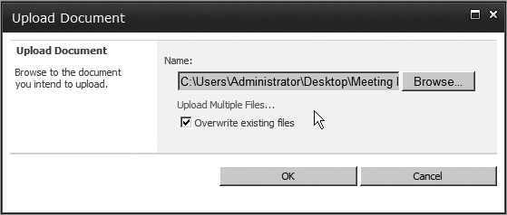
Single file upload isn’t the only upload option that has gotten a facelift. The multiple file upload has also been improved, adding drag and drop functionality to SharePoint libraries. To upload multiple files, you can either click the Upload button’s drop-down and select Multiple File Upload, or click the Upload button and select the link on the upload pop-up to Upload Multiple Files. Then simply drag your files into the space indicated and click OK. Once the files are uploaded, click Done. If the drag and drop functionality isn’t convenient, you can also browse for the files using a standard file-browsing Windows interface. Figure 2-10 shows the Upload Multiple Documents pop-up window.

The multiple file upload interface is available when the Microsoft Office clients are installed on the computer accessing the SharePoint site. The drag-and-drop functionality is available when using the Office 2010 suite of clients. In fact, the improved multiple file upload interface will also work with SharePoint 2007 when using Office 2010 on your computer.
Several types of libraries are available, such as a document library (which is the most commonly used type) and a picture library. The picture library is notable in that it doesn’t actually use the Ribbon interface, but instead continues to use the menu-driven interface from SharePoint 2007.
Using the Ribbon with Libraries
The Ribbon used in libraries utilizes many of the same buttons as the Ribbon that appears when working with a list. There are some key differences, however. The major difference between the List and Library Ribbon is in the Connect & Export group. The List commands in this group enable you to use the list to work with other programs such as Excel, Visio, Outlook, and Project. There are fewer commands in the Library tab’s Connect & Export group. You can still connect the document library to external clients, but there is also an icon to open the document library as a regular Windows Explorer window, as shown in Figure 2-11. This can be extremely handy when importing a large number of items into a SharePoint document library. Keep in mind, however, that when you are uploading multiple documents, either through Explorer view or through the multiple file upload interface, no metadata can be assigned to the files until after they are already uploaded.

The Documents tab is quite different from a list’s Items tab. The options here enable you to check in and check out documents for editing, edit and view the properties of a document, check the version history of a document, set unique permissions for a document, download copies of files in the library to your computer, and set up and use workflows, along with several other options. You’ll also notice that the New Folder option is available as long as the option to allow folders to be created is enabled.
The Check In and Check Out options enable you to check out a document (or multiple documents) to yourself to prevent others from editing the document while you work on it. This helps keep documents in sync as people work on them and prevents users from overwriting one another’s work.
The Edit Document button in the Open & Check Out group will open the selected document in the associated client application. (Not all document types can be opened from SharePoint and saved back into SharePoint. In some instances, a document may need to be opened, saved to the local machine, and re-uploaded into SharePoint as a new version.)
In the Manage section of the Ribbon, the View Properties button and Edit Properties button enable you to view and edit the selected item, respectively. The View Properties button may cause some initial confusion, as it actually refers to the action of viewing the properties of the selected document and not looking at properties of the current view. Also in the Manage section is the capability to set unique permissions on a document, and the option to delete a document.
When using Tabular view, most of the Ribbon items disappear, leaving only a couple of options available for working with the selected documents, such as Check Out (or Check In if the selected documents are checked out) and Delete. This new functionality makes working with many documents at once much easier than in previous versions.
Columns = Metadata
Columns can still be created in a SharePoint list and/or library, just as in previous versions; and because you can create columns in your list, you can associate metadata with each list item. Basically, metadata is data about data. When uploading a document to a library, certain information is automatically collected about the document, such as who uploaded it, when it was created, and when it was last modified. This information about the document is the document’s metadata. The same holds true when creating new items in a list.
Additional custom metadata can be added to a list or library in the form of columns. Columns refer to the extra type of information being collected about an item in a list or library. Creating a column enables you to collect and store additional information in the list about each item. To create a column, simply click the Create Column button in the Ribbon under the List tab (or Library tab if working with a library). The Create new column screen can also be accessed from the List or Library Settings screen.
You can create many different types of columns in order to collect metadata for items in a list or library. Table 2-1 outlines the various types of columns available in SharePoint 2010.
Table 2-1 SharePoint 2010 Column Types
| Column Type | Description |
| Single Line of Text | Allows users to enter a custom value for the column, up to 255 characters. |
| Multiple Lines of Text | Allows users to enter multiple lines for a custom value for the column. Additional options allow for rich text editing. |
| Choice (menu to choose from) | Allows users to select pre-determined options from a drop-down menu, radio buttons, or checkboxes, which allow for multiple selections. |
| Number | Allows only numbers to be entered. Options include configuring decimal places, maximum and minimum allowed values, and whether the number should show as a percentage. |
| Currency | Similar to the number column. Displays the number entered as the selected type of currency. |
| Date and Time | Allows users to enter a date and optionally a time using a date picker. Date and time columns can be useful when creating Calendar views or used as filtering options. |
| Lookup | This column can be used to look up values from another list or library in the same site. Not all types of columns can be used with the lookup column. |
| Yes/No (check box) | A simple checkbox that can be used to indicate that a condition is true or not based on whether the box is checked. When filtering with a yes/no column, the value of the check is either a 1 (for yes, or checked) or 0 (for no, not checked). |
| Person or Group | This column is essentially a “people picker” column that enables users and groups from the site to be looked up. |
| Hyperlink or Picture | Allows users to enter a URL to a site (internal or external) or an image in the site, depending on whether the option is selected to format the URL as a link or a picture. |
| Calculated | This column uses values from other columns in the same list in an equation to produce a value. The equations used in calculated columns are very similar to the types of equations used in Excel. |
| External Data | A new column for SharePoint 2010 that allows external content types to be browsed and used as metadata in a list. External content types must be enabled by an administrator before this column is available. |
| Managed Metadata | Also new to SharePoint 2010, this allows values from a managed metadata term store to be browsed and selected. (See Chapter 16 for more about managed metadata.) |
When creating a new column, it’s important to look at the Additional Column Settings section below the column type selector. This section varies according to the type of column that’s chosen, allowing various settings to be applied to further refine the type of data being collected. In addition, each column type can be configured to require that users enter something into the column, ensuring that the type of information that needs to be collected by an organization is being collected. Once the column is created, it can be populated with the corresponding type of data. Tagging list items with all this metadata can come in handy when working with filtering and creating views of the data, which is covered in more depth later in the chapter. Additionally, metadata can be searched, making it easy to find information in lists and libraries in this way.
This section has been referring to columns, but when you are adding a new item to a list or editing the properties of a document, you will notice that what you create as a column actually displays as a field to collect the information. In fact, they are one and the same. When viewing the entire list, the fields containing the information you entered are displayed in a column, but when working with an individual item, the information collected in the column is simply displayed as a field for usability purposes.
Working with Folders
Inevitably, one of the first questions many users ask when they begin working with SharePoint lists and libraries for the first time is, “Can’t I just put my stuff in a folder in SharePoint?” The answer is yes, but with some caveats. Users love folders. They’re familiar with the concept, their entire computer has documents and images all filed away in specific folders throughout the hard drive, and they probably have dozens more folders hanging out on a file share on a server somewhere too. However, folders have inherent drawbacks, such as ending up with duplicate files and multiple versions of the same file scattered throughout a department on several users’ machines, as well as on a file share. Keeping track of a single document becomes a task in itself (although SharePoint can help mitigate this mess). Unfortunately, users have been trained over the years to organize things in folders, so as an administrator, you need to understand that it’s only natural for users to ask about organizing their documents within folders when moving to SharePoint. It’s your job to help them understand why they ought to use metadata instead to organize their content.
While your natural reaction might be to “encourage” them either by osmosis or by using a ruler over the knuckles, you can probably do better than that. Try to explain to users how metadata helps them get better search results and how tagged content, coupled with custom views, gives them more flexibility. When they bury content in folders it is hard to get a view of all the content at once; for example, maybe you want to see all of the expense reports. With metadata it is easy to create a view that shows all expense reports.
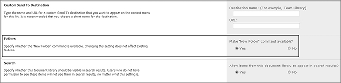
This isn’t to say that folders don’t have their place in SharePoint 2010. They can come in handy in many situations. In fact, just about every type of list and library supports using folders. Some of these lists enable the use of folders by default (such as a document library), while others need the option enabled before folders can be created (such as a custom list). Folders can also be useful when you need to work with permissions on a set of documents or items in a library. Although individual items can be assigned unique permissions, it can quickly become a nightmare managing permissions on dozens of documents in the same library. Instead of managing the permissions on each document individually, documents that require the same permissions can be grouped together in a folder, which can have its own set of permissions. This makes permission management much easier. To enable or disable the use of folders in a list or library, click the List/Library Settings button in the Ribbon, under the Library tab. Click the Advanced Settings link, and select Yes or No to make the “New Folder” command available (see Figure 2-12).
In addition, using folders can help scale a document library or list. Say, for example, that you have a particularly large document library, and your organization is using the large list throttling feature to only allow views of 2,000 items at a time. You could create several folders and divide the documents up between the folders, skirting around the 2,000-item per view limit imposed on the site without having to create custom views. In most cases, however, creating views based on metadata still offers more flexibility in terms of browsing through the content. For more information on large list throttling see Chapter 3.
Creating Views
SharePoint 2010 still offers the option to create different views of lists and libraries. Views are simply a way to reorganize and structure the data stored in a SharePoint list or library in meaningful ways. Multiple views can be created on a list or library, and can be used to group, sort, and filter the data. Sorting and filtering data is possible because of the list’s metadata. For example, you could create a view that shows all documents that were last modified by a particular user. Similarly, you could create a view that groups all items in a list that meet the same criteria based on information entered into a column.
Types of Views
You can create several types of views for any given list:
- Standard view — This is the most commonly used type of view. It presents the data in the list in the standard row and column format. You choose which columns you would like to display, the order in which they should appear, how they display, and how many items show at once, among other options. You can also group and filter data based on information in each column.
- Datasheet view — This is similar to the Standard view, but it opens the list in the Datasheet by default. Like the Standard view, you can choose which columns are displayed and in which order. You don’t have quite as many options for formatting the view as with a Standard view, however.
- Calendar view — This view displays the items in the list in a calendar format. Not all lists can utilize the Calendar view, however. Calendar views must be based on some kind of starting time, so a date and time column is necessary to use this view.
- Gantt view — Along the same lines as the Calendar view, this view also requires a starting time to work. This builds the list into a chart to track events or progress over a period of time.
- Access view — This opens the Access client to work with the values in the list outside of SharePoint.
- Custom view in SharePoint Designer — This opens SharePoint Designer 2010 to create custom views that can be modified and styled, such as with conditional formatting.
- Standard view, with Expanded Recurring Events — This option appears when creating new views based on the Calendar list template and is basically a Standard view that shows all occurrences of a recurring event.
When creating a view, it is important to consider how you want the data displayed. Probably the most commonly used view type is the Standard view, as it offers many options for configuring the view, such as grouping and filtering the data, as well as a few formatting options for how the data will be displayed. You can see the various view options on the dialog shown in Figure 2-13.

Creating a Standard View
To begin creating a view in a list or library, click the Create View button in the List or Library tab in the Ribbon. This will open the view selection screen. The rest of this section covers the creation of a Standard view. When creating a Standard view, you begin by giving the view a name and specifying whether this new view will be the default view that opens when the list or library is open. A word of caution here: For performance reasons, it is generally best to limit the number of items displayed by the default view of a list to a relatively small number if possible. Otherwise, the server may take a performance hit while rendering all the items in the list every time the list is opened.
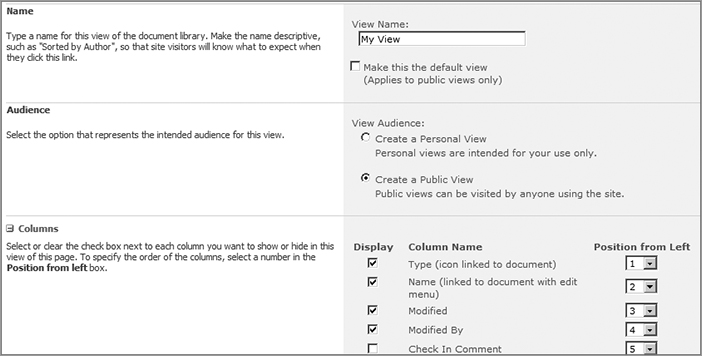
In the next section on the page you have the option to make this new view public (any user can select the view) or private (it appears only for your use). Next, you will see a list of all the available columns in the list. Select the ones you’d like to display in your view by checking the boxes next to them, and choose the order in which to display them by changing the numbers to the right of the column names. Column order is set from left to right, with number 1 being the first column on the left (see Figure 2-14).
Scrolling down the page, the next section enables you to sort the items in the list by a column, and allows for a second level of sorting by another column. For example, suppose you have a list of employees and you have set up two columns, one for Department and another for Personnel. You could sort the view first by the Department column, and then do a second sort on the Personnel column. The list would display all the departments alphabetically, and all the employees of each department alphabetically as well.
The next section of the view creation screen enables you to filter the data in the view, showing only a subset of the list’s information. By default, the view is not filtered. You can set up the view to filter out items based on criteria set in the drop-down menus and fields in this section. To do so, select which column will be used as the filter, and then choose the type of comparison to use from the drop-down menu. Options include “is equal to,” “is not equal to,” “is greater than or equal to,” “contains,” and several others.
Finally, in the field below the comparison drop-down, type in the value that should be compared. Basically, you are having SharePoint compare the selected column to the value you have entered, and if it finds items in the list that meet that criterion, it will display only those items. You can even create more than one filtering criterion as well, using an And/Or operator, by selecting either the And or the Or radio buttons, and then filling in the criteria for the second level of filtering. Up to ten columns can be used to filter the data in a list. Filtering can be a very powerful way to view only a subset of the data in the list.
The next several sections in the view creation screen are all collapsed, so if you want to set any of the options you need to click the section name to expand it. Here is a rundown of all these collapsed sections and how they affect the view:
- Inline Editing — You can check the box to allow inline editing on the view. Off by default.
- Tabular View — This allows multiple item selection in the list. On by default.
- Group By — This option allows the list items to be sorted into groups.
- Totals — This will keep a running total of the number of items in a column or perform other calculations, such as the sum of all numbers in a numeric column. Set on a per-column basis. Off by default.
- Styles — Use this option to choose a different style in which to present the list. Most styles result in simple cosmetic differences. Some, such as the Preview Pane and Boxed styles, present the list in a different format. The Preview Pane style shows a preview of the list item when it is hovered over. The Boxed styles present each list item in a separate box. Some styles work better for displaying different types of data than others, so try a few out to see what style works best for your list.
- Folders — If you are using folders in the library or list, you can choose whether to show the folders or just show all items in the list or library at once.
- Item Limit — This value sets the number of items that are displayed at once. If your list has more items than are set to display, you can page through the list to view the remaining items (30 is the default value).
The last section on the create view page is new to SharePoint 2010, and that is the capability to adjust some settings for this view when viewing it on a mobile device. You can choose to make the view the default view that displays when the list is opened on a mobile device, as well as choose whether or not the view should even be available for viewing on mobile devices. You can set the number of items to display at once for the mobile view when a page with the list on it is open with a mobile device. The idea is similar to the number of items set in the Item Limit section.
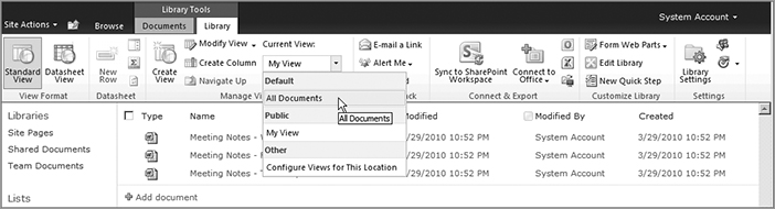
Once you have all your settings the way you’d like them, click OK to create your view. The list will display with your newly created view. The view is associated with the list, so whenever the list is open, you can change the list’s view to the custom view you created. You can do this in two ways. When opening a list, the last item in the breadcrumb trail displays the current view’s name. Clicking on the drop-down arrow next to this name will show a list of all views associated with the list (along with options for creating a new view or modifying the view that is currently displaying, and options for configuring the available views for the list). The second way to change the view is to click the List or Library tab in the Ribbon and select the view from the Current View drop-down menu, as shown in Figure 2-15.
Modifying a View
Custom views and even the preconfigured views provided out of the box can be modified simply by selecting the view you’d like to work with and clicking the Modify View button on the List or Library tab in the Ribbon. This opens the same screen as clicking the Create View button does, enabling you to change any settings you need.
The Modify View button also has a drop-down menu associated with it. Clicking the drop-down provides the additional option to modify the view using SharePoint Designer 2010, which offers additional options for changing the view, such as turning on conditional formatting for the list. For example, a company may use a SharePoint list to keep track of inventory. Modifying this list in SharePoint Designer could enable them to set conditional formatting on the list to highlight a line item when its inventory falls below a set value. See Chapters 22 and 23 for more information on using SharePoint Designer.
Creating Other View Types
As mentioned earlier, you can create several other types of views for a list. The process is relatively similar to setting up a Standard view, with some differences that will be pointed out in the following sections.
Note that below the available view formats is the option to create a new view using an existing view as a starting point. This can be useful if you are creating several similar views with only a few minor differences, such as showing or hiding a column or two. Instead of having to set all your options for each version of the view, you can select an existing view from the list, which copies the view’s settings, and then create a new view from it.
Datasheet View
Creating a Datasheet view is identical to the process of creating a Standard view, but with fewer options. You still select which columns to display and in which order, set any sorting or filtering properties, whether you want each column totaled, how folders should be displayed, and how many items should be shown at once. Once these few options are set, you have a Datasheet view.
Calendar View
Creating a Calendar view uses the same familiar interface but requires you to provide a few different settings. Calendar views are based on date and time columns, so your list must have a date and time column on which to base the calendar. Just about any list can have a Calendar view created, provided it has a date and time column. For example, suppose you have built a custom list of events for your organization, and you’d like to display it in a Calendar view. You have a column for when the event starts, and another column for when the event ends. In the Time Interval section, choose what date and time column will be used for displaying when events start (the Begin drop-down) and when they end (the End drop-down), as shown in Figure 2-16.

The next section enables you to specify which columns should be displayed as information in the calendar’s various views. Calendar views can be displayed as a week, a month, or a day. In the Month View Title drop-down, select the column you’d like to display as the item’s title in the month view. Similarly, choose which column information should display for the week view and day view. Generally, you’ll want to use the same title for each. Week view and day view also offer the option of specifying a column to use as a subtitle, as the views offer more room for text than a month view. For instance, you could use a column that has location information or a quick description of the event as the subtitle of the event.
Next, you can choose whether the default value of the calendar should open to a month view, a week view, or a day view. You can change the view when using the calendar; this simply defines how the calendar is displayed when it is initially opened.
The final two sections are identical to creating a standard view. You can filter events from the list so only certain events show up. For example, you could set a filter that shows events for only a certain department or group. This way, all the events are maintained in a single location, but each group can have a view that shows only the events relevant to them.
Another nice addition to SharePoint 2010 calendars are calendar overlays. Now you can have more than one calendar’s items displaying in a single calendar view. These items can be from an Outlook calendar stored in Outlook Web Access (OWA) or Exchange, or they can be other SharePoint calendars.
When working in a list’s calendar view, click the Calendar tab in the Ribbon, and then click Calendars Overlay. Click the New Calendar link to add in a calendar either from OWA or SharePoint. Choose whether the calendar is a SharePoint calendar or Exchange calendar and fill in the information below as appropriate. Figure 2-17 shows the options for adding a SharePoint calendar as an overlay. Click OK to save the overlay information. You can toggle the overlay on and off by clicking the Calendars Overlay button and checking or clearing the checkbox next to each overlay’s name. Up to ten overlays can be added per calendar view.

Gantt View
A Gantt view is a good way to display a set of information over a period of time. It’s similar to a calendar in that it displays events and tasks by date, but displays them in a chart with bars representing the length of time the task or event will take place. Creating a Gantt view is like a hybrid of creating a Calendar view and a Standard view. You still select which columns to display and in which order, and like a Calendar view you still select columns to represent the start and end dates for each item. You have additional options too, such as selecting a column to represent the task’s percentage of completion.
The rest of the Gantt view creation process is almost identical to the process for creating a Standard view. Once you create this view it will also be available for selection from the View drop-down.
Access View and Custom View in SharePoint Designer
The final two options on the create view screen, Access View and Custom View in SharePoint Designer, are available only if these programs are installed on the client machine accessing the site. As you may have guessed, each of these view types is made outside of SharePoint in the application you choose. An Access view will open Access and allow you to work with a list, while selecting a Custom view in SharePoint Designer will open SharePoint Designer, allowing you to add additional view formatting, such as conditional formatting, to the list.
Creating views in these two programs is out of the scope of this chapter, but you can refer to Chapter 18 for information on integrating SharePoint with the Office clients, and Chapter 22 to learn about SharePoint Designer 2010.
List View Web Parts
When a list or library is created in SharePoint, a corresponding Web Part is automatically created and made available for use throughout the site on a page. You’ll learn more about using Web Parts in the following section, but for now you should be aware that any library and list created can also be used on just about any page in a site. Users may find it useful to have a Web Part that lists newly uploaded documents or recent announcements directly on the company’s intranet home page.
List view Web Parts are also particularly useful in that they are directly tied to the list from which they are created. This also gives users the flexibility to update information on a web page without having to actually edit the content of the page itself — the List view Web Part is all maintained in the list itself. Another benefit of being able to use a List view Web Part is that it offers all the flexibility of being able to display any views created for the list, as well as have its own views created specifically for it. For example, you could create a list of events whose default view is a Calendar view when the list is open, and at the same time you can have the same list displayed on a web page, but in a Standard view format.
Yet another use for these List view Web Parts is the capability to display more than one instance of the same list on a page, with each instance displaying a different view. Or, you can even display many lists on a page, making it easy to compare information between lists. Perhaps you have a document library with specific views created that display only certain documents at a time. You can have two Web Parts of the document library on a web page, and set each Web Part to a unique view, so each shows different documents. When any documents that meet the criteria in the views are added to or removed from the library, the Web Parts on the web page will automatically reflect the changes.
Now that you know quite a bit about how lists and libraries work in SharePoint, this section describes how the new SharePoint 2010 interface has changed and improved the page-editing experience.
When browsing a SharePoint page, you are actually seeing the compilation of many different components all quickly rendered by the server and served to the browser. The two main components of a SharePoint page are the master page and the page layout. In very basic terms, the master page is the container for the overall site layout. It holds the basic structure of the site, such as the location of the navigation, search, and the Ribbon. It also houses the page layout, which is generally the main body of the page and contains the page’s content. Refer to Chapter 23 for more detailed information on master pages and page layouts. When you are editing a SharePoint page in the browser, you are actually working with the page layout to add content to the site.
The page-editing experience in SharePoint 2010 is a little different from that found in previous versions. Again, the Ribbon plays a major part in editing a page — in fact, it’s probably used even more extensively when editing a page than when working with lists and libraries.
Fortunately, the Ribbon has been very tightly integrated with the page-editing experience, to the point that many users will likely find that adding content to a SharePoint page is not much different from working in Microsoft Word. Just like the Office clients, the Ribbon is also contextual when working with various items. Different options appear in the Ribbon when working with a picture than when working with a List view Web Part, for instance. Before you can even begin working extensively with the Ribbon, however, you need to first begin to edit the page.

When browsing a page normally, the Ribbon is very discreet. Only the Browse and Page tabs are visible; the Ribbon menu itself is collapsed. By default, the Browse tab is selected. Next to these tabs is the Edit Page icon, which looks like a pencil on a piece of paper (see Figure 2-18). Clicking this icon is only one of several ways to begin the editing process. You can also edit the page by clicking the Site Actions button and then selecting Edit page, or click the Page tab in the Ribbon and click Edit Page. Note that only users with permission to edit pages will be presented with these options.
Exploring Edit Mode
Using the Ribbon to edit pages in SharePoint is actually a lot like using it in lists and libraries. Each tab is divided up into groups, and each group consists of several different options represented by icons (with the exception of the Browse tab, which doesn’t have a menu, but instead simply lets you browse the current page). As you work with various components of a page, additional tab options appear in the Ribbon, and other buttons become active when certain actions are performed on the page.
When a page is opened in Edit mode, you’ll notice a few changes. First, you’ll notice that the Ribbon has grown a bit. Under the Editing Tools heading, two new tabs now appear in the Ribbon — Format Text and Insert — under the heading “Editing Tools. The Format Text tab provides you with a menu very similar to Word’s Home tab, with options for formatting the text on the page. You can change the font, the font size and style, its justification, create numbered and bulleted lists, and even change the font color. There is even a Spell Check button, and advanced users can edit the HTML markup directly to achieve exactly the formatting they want. Editing a SharePoint page also provides the capability to copy, cut, and paste content to and from the page, and even features Undo functionality. This tab drives home the point that editing a SharePoint page is more like working in a Word document than creating a web page. You also have options such as Save and Check Out, which are covered in more detail later. Figure 2-19 shows the additional options that become available in the Ribbon when the page is in Edit mode.

The Insert tab allows you to do what you would expect it to — that is, insert content on the page. You can insert a table, a picture, or multimedia in the form of video and audio; create links to other websites; upload and create a link to a file on the fly; and insert any reusable content stored in the Reusable Content list, various Web Parts, an existing list, and a new list created on the fly (see Figure 2-20). The Insert tab provides a host of options to add content, making it extremely easy to spruce up a web page without much effort. You’ll be taking a more detailed look at these options in a bit.

When a page is in Edit mode, you will notice that switching back to the Page tab allows a few additional options to become available.
As you edit pages in SharePoint, you can save your changes to the server so others can see them. During the editing process, you can click the Save button in the Ribbon (either on the Format Text tab or the Page tab) to simply save your changes and stop editing. You also can click the drop-down arrow underneath the Save button for additional options, such as the capability to save content and continue editing, or to stop editing altogether. With the latter option, you are prompted to save your changes or discard your changes.
One final point to note about Edit mode is that the page is divided into blocks, called zones. In these zones you can place content such as text or Web Parts. How content is placed depends on the type of page you are working with, but generally just about any type of content can be added to a SharePoint page.
Adding Content to Pages
SharePoint 2010 utilizes several different page options, which are available on different site types. A team site, for example, features what are called Text Layouts. You have several different text layouts from which to choose, and their function is to reorganize the zones on the page to allow for more design options when formatting content. Using these text zones, you can add Web Parts and text directly. Other zones will allow only Web Parts to be inserted.
Other types of SharePoint sites utilize Page Layouts instead of Text Layouts. Sites that utilize the Publishing infrastructure of SharePoint, or that have the Publishing Feature enabled, will use Page Layouts. Page Layouts provide some flexibility over Text Layouts in that they can be edited in SharePoint Designer, and users with appropriate permissions can create and upload custom Page Layouts to meet their needs.
Direct Page Edits
Many Text Layouts and Page Layouts allow for direct page editing. As the name implies, direct page editing is the capability to edit directly on a page. This function was available in SharePoint 2007 with page content controls, but in SharePoint 2010, editing text and content on a page is now even easier. Indeed, adding and editing text on a SharePoint page is as easy as clicking on the page and starting to type. We keep emphasizing that editing SharePoint pages is similar to working with a Word document, and with the improved direct page editing, it truly is.
When working with text on a page, the Ribbon switches to the Format Text tab. As you work with the text on the page, you can use SharePoint’s Live Preview mode to preview most formatting changes before committing to them. To use Live Preview, highlight the text you’d like to change and hover the mouse cursor over, for example, a new font size in the size drop-down in the Ribbon, as shown in Figure 2-21. The highlighted text will temporarily change to the new size, letting you see if you like the change. You can also use Live Preview to experiment with different fonts, as well as styles and markup styles.

The Ribbon features more than just items for working with text on a page. Additional tasks that can be performed with a Ribbon include cutting, copying, and pasting text to and from a SharePoint page just as you would any other application. Undo and Redo buttons also help with the editing experience, as well as the capability to edit the HTML that makes up the page. In the Markup group in the Ribbon, you can choose to edit the HTML Source, or convert any existing HTML on the page into XHTML, which helps increase the page’s browser compatibility. SharePoint 2010 features a robust spell check as well.
Dealing with Save Conflicts
When more than one person is working on a web page at the same time, they may run into a save conflict. A save conflict occurs when user A and user B are making changes to the same web page, and user A saves the page while user B continues working. With SharePoint 2010, when you try to save the page, a window opens with several options:
- Continue Editing — You can continue editing, but you will need to manually merge any changes you make later.
- Merge Changes — A second window opens with the most current version of the page so you can merge changes or additional text from your version of the page with the saved version.
- Discard Your Changes — This option deletes any changes you’ve made to the page in favor of the version that’s been saved before yours.
- Overwrite the Page — This option discards the version saved by another user and replaces it with your version.
In most cases, you will probably want to choose Merge Changes, to at least look at the changes made by the other user. You can always close the newly opened window and save the changes again, choosing Overwrite the Page to discard the other user’s changes.
Checking Pages In and Out
The problem of save conflicts can be mitigated by using the check-out tools built into SharePoint. In the Ribbon, you can click the Check Out button to check the page out to yourself. Checking out a page is essentially the same idea as checking out a document from a library. Basically, the page is exclusively yours to edit and change while you have it checked out.
One note of caution here: If you have started editing a page before you check it out, your changes will be deleted, so check out a page before you begin editing it. If you have changed a page and need to check it out, save your changes first and then check the page out.
You can check in and out from the Ribbon, just as you can check out documents or items in a library or list. Click the Check Out button to check the current page out to yourself, preventing other users from being able to edit the page as you work on it. The Check Out button becomes the Check In button, and also provides you with a few additional options in the drop-down menu below the button. If you accidentally checked the page out, you can always discard the check out (which also discards any changes made to the page) by clicking the Check In drop-down menu and selecting Discard Check Out.
When a user with edit rights browses to a page that is currently checked out, a message is displayed at the top of the page indicating that the page is currently checked out, and to which user it is checked out. In addition, note that saving a page does not check the page in. If a page is checked out, then it remains checked out until it is checked in. You can, however, check a page in to save the page.
Overriding Check Outs
Administrators and users with the Override Check Out permission can override another user’s checked out page. The Override Check Out permission is built into the Design permission level. If you browse to a page that is checked out to another user, the Check Out/In button is replaced with an Override Check Out button. If you have sufficient rights, then you can click the button to change the check out to yourself, which will discard the other user’s changes and allow you to begin editing. Be aware, though, that there is no prompt to warn you that you will be discarding another user’s changes when overriding a check out from the Ribbon.
Users with override permission can also check in the page from the Pages library for another user. This is done by clicking the drop-down menu for a page in the Pages library and selecting the Check In option, or clicking the Check In button in the Ribbon. Checking in a page for another user is less destructive than overriding the check out, as it will save the changes to the page, and then check it in. Checking in a document for another user can only be done from the Pages library and not from the page itself. This method also lets you know that you are checking in a document for another user, and tells you how long the page has been checked out.
Publishing
When using a site with Publishing features enabled, you will have an additional tab in the Ribbon for publishing content. You will still be able to save a page’s content as you are working on it; but publishing, in SharePoint terms, means that the final version of the page is hidden from anyone without proper rights until the Publish button is clicked. Publishing a SharePoint page is the same concept as publishing a book. The book is available only to the author and editors during the creation process; until it is published, the public doesn’t have access to it. The same concept applies to SharePoint — the page author and other individuals with proper rights are the only ones who can see the page as it’s being worked on, but other general users of the site can’t see the contents of the page until it has been published.

When the Publish button is clicked, SharePoint will check the page for any draft items and spelling errors before committing the changes, as well as give you a text field to type comments about what has changed in this published version of the page. You can exit out of the checking pop-up to check the spelling from the Format Text tab, or click the link in the status bar that opened to see a report of all spelling errors and draft items on the page that will be published (see Figure 2-22).
If you are working on a previously published page, users will see the last published version of the page before you began editing it. SharePoint serves up the last published version of the page until a new version is published to take its place. Because SharePoint 2010 still supports versioning, it is possible to roll back to a previously published version of a page, as long as versioning is turned on for the library containing the SharePoint pages.
If a user with rights to edit a page browses to a page that’s being edited, a message is displayed indicating that the page is published and that it’s also checked out and being edited by another user. The user editing the page also has a notice under the Ribbon saying that the page is currently checked out and editable.
Working with Web Parts
Web Parts are specialized components that perform certain tasks. You can think of SharePoint Web Parts as building blocks for adding additional content and information to your web page.
It’s one thing to add text to a page. It’s another to add additional content in the form of video and audio, lists, RSS feeds, and data compiled from throughout a SharePoint site. An exhaustive treatment of how they are used is beyond the scope of this chapter. This section provides a high-level overview of the process of adding Web Parts to the page and the general experience of working with them.
Adding a Web Part
From the Insert tab, you can easily add images, tables, links, Web Parts, and lists. Adding Web Parts to a SharePoint 2010 page is different than in previous versions. When you click the Web Part button on the Insert tab, a Web Part picker opens at the top of the page, just below the Ribbon, as shown in Figure 2-23. At the left is a filter tree for the list of Web Parts, organized by category. The middle pane displays the available Web Parts for the selected category, and the right pane contains information about the selected Web Part. After selecting a Web Part, you can choose the zone it should be dropped into using the Add Web Part to: dropdown (that is, if multiple zones are available). Click the Add button to insert the Web Part onto the page where the blinking cursor was left in a rich text field, or into a specific zone selected in the drop-down at the bottom of the right panel.

Not all available Web Parts are displayed on the Ribbon. To see the full list of web parts that are available on the site, click the Web Part button.
You can also upload a file directly from the Insert tab into a SharePoint library and create a link to the document on the page, all without leaving Edit mode. The new Reusable Content Web Part can be used for elements that are frequently reused when creating pages, such as a copyright line, a byline, or a quote. You can view all the reusable content configured on the site and open the list in which it’s contained to add new content for use later.
Another novel addition to the Ribbon is the capability to create a new list on the fly directly from the Ribbon using the New List button. A pop-up window will open, from which you can choose your list template and give the list a name. The newly created list will appear on the page.
Using the Ribbon to Work with Web Parts
When a Web Part is selected on the page, a new contextual tab opens in the Ribbon. Depending on the Web Part selected, various options are available. For instance, inserting the new Media Web Part (from the Media and Content category) will open both the Options tab under the Web Part Tools header and another Options tab under the Media header (see Figure 2-24). The Media Web Part lets you add a Silverlight media player to the page to play audio and video clips. As you might guess, the Options tab under the Web Part Tools header contains options for working with the Web Part in general (such as opening its properties or deleting it), whereas the Media heading’s Options tab pertains specifically to the selected Web Part. Not all Web Parts have a dedicated tab in the Ribbon, but they all will open the Web Part Tools Options tab.

Many users familiar with older versions of SharePoint will also recognize the tool pane for working with Web Parts. Clicking the Web Part Properties button in the Ribbon will open the familiar tool pane along the right side of the screen, which contains options for working with the selected Web Part. You can change the Web Part’s title and description and chrome state (whether its title and border display), as well as other options specific to that Web Part.
Overall, working with Web Parts in SharePoint 2010 isn’t very different from past versions. Some Web Parts will have additional options in the tool pane depending on the type of Web Part. Figure 2-25 shows the tool pane for the Shared Documents library Web Part. The Content Query Web Part, for example, enables you to aggregate content from your site based on its content types. It has many different options for configuring the query used to gather its content, something that other Web Parts do not need and therefore do not feature. This tool pane can also be accessed from the Web Part’s drop-down menu, which appears to the far right of the Web Part’s title. Click the drop-down arrow and select Edit Web Part to open the tool pane.

A new option found on the tool pane for some Web Parts that wasn’t found in previous versions of SharePoint is the AJAX Options section. Expanding this enables you to use the Asynchronous Updates option for certain lists. For example, you may have asynchronous updates turned on if a Web Part is taking a particularly long time to load. Allowing asynchronous updates enables the rest of the page to load without waiting for the Web Part. It can finish loading after the rest of the page has been displayed, which makes for a better user experience. A few other options are also available for using asynchronous syncing, such as whether to allow manual and automatic refreshing of the Web Part, and defining the interval between each refresh.
When working with List view Web Parts on a page, a section opens in the Ribbon called List Tools. These list tools are, in fact, the very same Ribbon tabs that appear when working with a list directly. In other words, you can perform any action in a list through its List view Web Part that you would if you had the list open on the screen.
As you can see, the interface for editing pages and working with Web Parts has been significantly overhauled for SharePoint 2010, providing an intuitive way to work with various components of the page at once, usually without having to even leave the page in order to add images, media, text, and other Web Parts. These changes provide a much more pleasant experience for users and administrators alike, increasing productivity dramatically. Because many user-centric experiences have been revamped to more closely mimic the Office client interface that users are already familiar with, they should have an easier time adapting to the changes.
Using Site Templates in SharePoint 2010
Suppose you are setting up several team sites in order for various groups to be able to work on projects together. It’s been decided that each one of the sites will contain several custom lists and document libraries, all with custom columns set up, and that certain items will appear on the site’s home page, so that any new project site that is created looks the same. Instead of having to create every single project site from scratch, and build every list, library, and custom columns each time a new site is requested, you can create one version of the site that can be made into a template and reused any time a new site needs to be created. You can save just the site’s structure as a template, or you have the option to save any content built into the site as well, such as Web Parts added to a page, pictures and documents in a library, and items in a list.
The process is essentially the same as the site template creation process in SharePoint 2007. Sites can be created, configured, and saved as reusable templates; and you can use the browser interface or SharePoint Designer to make changes to a site. However, one difference is that SharePoint 2010 automatically packages up site templates as solution files with .wsp extensions. A WSP file is actually nothing more than a CAB file. You can even browse the contents of a WSP file by appending .cab to the end of the filename on the desktop and opening it with Windows Explorer.
Creating Custom Site Templates
In technical terms, a SharePoint custom site template is based on an existing site, which was created from a SharePoint site definition. Basically, a site definition is SharePoint’s blueprint for creating the various types of sites that are available. In other words, when a site is created in SharePoint, the site is created following the instructions laid out in the site definition file. The site definition specifies which features are activated on the site, which libraries and lists are initially available, and other components of the site.
When you build a site to be used as a site template, you are adding to the set of functionality that makes up an out-of-the-box site. You can also remove functionality by deactivating features you aren’t going to use. You are never actually touching the site definition file, but rather modifying a site that was created based on it. The differences between the original, out-of-the-box site and the changes you have made is essentially what defines your custom template.
One thing to be aware of is that any changes made to site definition files may render site templates and existing sites based on that site definition useless. It’s generally frowned upon to modify a site definition file in the first place, but doing so after sites have been provisioned can cause havoc in your SharePoint environment.
Saving a Template
After you have built out your site, click the Site Actions menu and select Site Settings. Under the Site Actions header, click Save as Template. After filling in the File name field, you can fill in the Template name field (see Figure 2-26). The filename is how the solution file is displayed, and the template name appears as a template selection during the site creation process. Give the template a description so users creating sites from the template will know what it should be used for. Optionally, you can choose to include content in the template, which will include all content from libraries and lists.
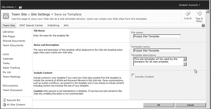
Security is not maintained in templates, so any content you save in the template will become available to anyone who creates a site based on that template.
Click OK to save the template. Not all sites can be saved as templates, however. For instance, if a site has the SharePoint Server Publishing feature enabled at the site or subsite level, then the option to save the site as a template is not enabled.
When you saved a template in SharePoint 2007, it was saved in a Template Gallery. Because SharePoint 2010 saves site templates as solution files, site templates are now stored in the Solution gallery in the top-level site collection. You can access the Solution Gallery from the Site Settings screen by clicking Solutions, under the Galleries Header on the Site Settings screen. Because the template is stored as a solution, it can be activated and deactivated as needed from the Solutions Gallery. Site template solutions are automatically activated after they are created. If you need to deactivate a solution, simply put a check in the box next to the solution name and click the Deactivate button in the Ribbon. This will open a confirmation pop-up, warning that you will lose the capability of the solution if it is deactivated, as shown in Figure 2-27.

You can activate a feature using the same method, but clicking the Activate button instead of Deactivate. You will receive a warning on the Activate pop-up window warning that you should only activate solutions you trust. If you’re working with site templates you created yourself you know they are safe to use. Go ahead and click the Activate button again in the pop-up’s Ribbon to turn on the template. Its status will be listed as Active in the Solution gallery. Now the template is available to use in all subsites in that site collection. From within the Solution Gallery, you can download a copy of the template file to upload into other SharePoint 2010 site collections or even farms.
Creating a Site from a Site Template
Creating a site from a custom site template is identical to the normal site creation process. Any custom site templates that have been activated in the Solution Gallery will show up in the Blank & Custom category on the left. Select your custom site template from the available templates, give the site a name and URL, and you can begin creating sites from the template. Just as in SharePoint 2007, you can also customize which site templates are available during the creation process when building out a site based on the Publishing template. This is done from the Site Settings page. Under the Look and Feel header, click on Page Layouts and Site Templates.
On this page, you can choose whether to allow any site template or only specify a select few. On a subsite, you can specify whether the subsite should inherit its available site templates from its parent site, or whether it should use a unique set of templates. The available page layouts section below the site template selection area also uses the same interface for selecting which page layouts should be available.
List Templates
Lists and libraries can also be saved as templates in exactly the same manner as site templates. From the List Settings page, click the Save as Template link to begin the save process. Just like saving a site template, you can give the template file a filename, a display name, and a description. You can also choose to include the list content, but lists do not retain security settings, so consider that before making any sensitive information available as a template to everyone.
The only difference between the site template and the list template is that list templates are stored in the List Template Gallery instead of the Solution Gallery. They are, however, solution files that can be reused. When creating a list from a custom list template, look for your custom templates in the Blank & Custom category on the left side of the Create window.
Many multinational companies with offices spread across the globe may need to deploy SharePoint 2010 in the local language of each branch. Fortunately, SharePoint 2010 offers an easy way for administrators to install language packs for various languages on the server farm, enabling the creation of new sites in a local language, and the interface of existing sites to be translated into the languages installed on the server.
Installation and Configuration of SharePoint 2010 Language Packs
Installing language packs is a fairly straightforward process. Both SharePoint Foundation 2010 and SharePoint Server 2010 have language packs available to install. SharePoint Foundation 2010 only needs the SharePoint Foundation language packs, but if you are running the full license of SharePoint Server 2010, you need to install both the SharePoint Foundation and the SharePoint Server language packs. Language packs for SharePoint 2010 can be downloaded from the Microsoft Download Center at http://www.microsoft.com/downloads.
When downloading the language packs, you should create a unique folder for each, or at least provide a unique name, as the names of the SharePoint Foundation language packs all share the same filename, meaning it’s possible that downloading one language pack can overwrite files of another. Every front-end web server will need a language pack installed for every language you want to use.
To begin the installation, first launch the SharePoint Foundation language pack for the selected language. When you launch the language pack’s installation file, you’ll be presented with a license agreement. The installation interface is written in the language of the language pack you are installing, which may look confusing at first. However, the installation process uses a standard Windows interface. Check the box below the user agreement and click the Next button (keeping in mind that “Next” is written in the language pack’s local language). The language pack will install. Figure 2-28 shows the installation of a French language pack.

When the installation finishes, you are prompted to run the SharePoint Products and Technologies Configuration Wizard. If you are only running SharePoint 2010 Foundation, you can click the Finish button to launch the wizard. However, if you need to install a SharePoint Server 2010 Language Pack, you do not need to run the configuration wizard until after the other language pack has been installed. In addition, if you are installing multiple language packs, you do not need to run the configuration wizard after each language pack installation, only after all the language packs have been installed. This can help mitigate downtime when installing language packs in a production environment.
If you are running SharePoint Server 2010, install the SharePoint Server 2010 Language Pack. The installation process is identical to the Foundation language pack installation. After you have finished installing the last language pack, you can leave the box checked to automatically launch the configuration wizard, or you can manually start the configuration wizard by clicking Start All Programs Microsoft SharePoint 2010 Products SharePoint 2010 Products Configuration Wizard. For more information about using the configuration wizard, see Chapter 3.
After the configuration wizard is complete, you will have successfully installed and configured a language pack to use the Multilingual User Interface.
Using the Multilingual User Interface
Once your language packs have been installed, you can take advantage of the Multilingual User Interface (MUI). Before you can change the display language of an existing site, the newly installed language needs to be enabled. This is done on a per-site basis. From the Site Settings page, select Site Administration Language Settings. On this page, you will see the default language of the site and any alternate languages that have been installed. Check the box next to the languages you wish to make available on the site collection. Below the Alternate language section, you are presented with the option to overwrite existing translations, as shown in Figure 2-29.
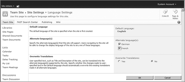
By default, some SharePoint content is translated into other languages when chosen. For example, some default SharePoint column headings are automatically translated into a selected language, such as the Title column that appears in virtually all SharePoint lists by default. When this option is set to No, you can make changes to the default SharePoint column headers in the default language without affecting any translations made to the column header. If you set the setting to Yes and change the name of the column in the default language, your change will overwrite any translations that may already be in place and display the default language even if an alternate language is selected.
Interface Translation
Once you turn on alternate languages, you can change the language of the SharePoint interface. Click your name in the upper right corner of the screen, hover over Display Language, and choose which language you’d like the site translated into. The Ribbon, Site Actions Menu, Site Settings menu, and other SharePoint components will be translated into the selected language, as shown in Figure 2-30. SharePoint will not translate any custom content on the page into the language chosen. Another thing you will notice is that the navigation may be displayed by its URL instead of by its name, or it may not be translated. SharePoint does not translate the site titles automatically.
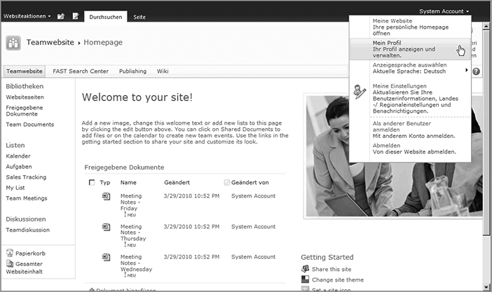
Navigation Translation
You can set up custom-translated navigation using the MUI. It doesn’t matter if SharePoint has created your navigation automatically based on your site structure or you have created the entire site’s navigation manually — either way, you can create multilingual navigation. One thing to keep in mind with multilingual navigation is that the translation is not done automatically for you. Setting up navigation translation is done manually. Although this can be a time-consuming process, it will likely produce a more accurate translation than a machine translation would.
Until the navigation translation is set up, when you switch display languages, your navigation items will be displayed in the site’s default display language until additional languages have been enabled for a site. Consider the following scenario: A portal site’s default language is English, and a subsite is created that has German set as the default language. The English portal will only display the title given to the German site in its navigation until English is enabled as an alternate language on the German site. Then, an alternate site name translation could be provided in English for the German site, and the English translation would then appear in the English site’s navigation.
To create translations for the languages in the navigation, you have a couple of options, depending on how the navigation is set up. If SharePoint has built the navigation automatically by displaying the current site’s children sites, navigate to a subsite. Because SharePoint is pulling the navigation information from the subsites, you need to make the changes at that subsite level. Open the Site Settings page and click the Title, Description, and Icon link. Then, change the language. In the Title field, type your translated title. You aren’t overwriting the default language title here, but simply creating an alternate title to display when the new language is selected. You can also enter a translated description if you wish. Click the OK button to save the changes. Now, when you return to the parent site and change the language, your navigation will also change to show the translated site title (see Figure 2-31).

If you have links in your navigation that were created manually, you can use a similar process. Instead of heading to a site to make the changes, you can enter translations for navigation links and headers from the Modify Navigation page, which can be accessed from the Site Actions menu. Once you open this page, you can change languages. Select the navigation link you would like to change, and click the Modify link in the navigation toolbox (it will be translated, so it’s good to be familiar with the link’s location in the default language). You can replace the default text with your translated text, and then click OK to save your alternate navigation text. Changing the display language also changes your manually created links to the alternate language.
These techniques work for both the top navigation links and Quick Launch links. Many items in the Quick Launch, such as the headings for the different list type categories, the Recycle Bin link, and the View All Site Content link, are automatically translated into the selected language. Any custom lists that show on the Quick Launch menu are not automatically translated, but you can easily change this using the methods just described. You will also learn how to translate list titles in the next section.
List Translation
Lists can also have some translation applied to the title, description, and column headers. Translation can’t be done on individual list items, however. Column titles that are pre-built into a list are automatically translated into the selected language. Custom columns are not automatically translated. You can, however, manually translate the column titles and descriptions for custom columns. The process for translating list names, descriptions, and column headers is fairly similar to the process of translating navigation.
The easiest way to translate a list title is to open the list in its default language and open the List Settings screen. Then, click the “Title, description and navigation link.” On this screen, switch to the desired language and type your translated title and description, and click OK. You can repeat this process for as many languages as needed. You may notice that, depending on the navigation settings for your site, the name of the list didn’t change in the Quick Launch menu. If this is the case, you can adjust the translation manually as outlined in the previous section.
Changing a column header translation is done on the Column Property screen. The List Settings page contains a section that lists all the columns in the list. Click one of the column names to open its properties. On the properties page, you can change the language, enter a translation for the column name and description, and click OK to translate the column header.
Generally, individual list items cannot be translated. However, if your list contains a Managed Metadata column type, you can take advantage of the Managed Metadata’s ability to store translated labels for each term. In Central Administration, you can open the Managed Metadata Service Application(s) that serve content to the rest of the site. (See Chapter 7 for more about the service application architecture, and Chapter 16 to learn about the Managed Metadata service application.) In each term group, you can open a term and provide a default value for each language installed on the server. For instance, if you have the term “elephant,” you can also add the translated Spanish term “elefante” and the German term “Elefant.” SharePoint will realize that both of these translated terms are synonymous with the English term “elephant.”
Multilingual Site Creation
In addition to being able to change the language of the interface and navigation, you can also set a site’s default language during the site creation process. Any new site can be built with any of the installed languages as its default language, not just the default language of the SharePoint installation. For example, the default language of the root site may be English, but suppose a company has a French-speaking branch. Their portal homepage can be built to have a default language of French, so its interface and the menus are all written in French. A Spanish-speaking branch’s portal home page can be created with Spanish as the default language. Not only will the interface display in the chosen default language, any text automatically generated by SharePoint (such as the Welcome message that displays when a Team site is created) will also display in the chosen default language. Figure 2-32 shows a subsite created with German set as the default language. All menus will display in this language as well. Regardless of the default language, you can still have SharePoint translate its interface by selecting a new language.
Creating a site with the MUI is the same as creating a site normally. The only difference is that you have the capability to select the default language from the Select Language drop-down in the Create pop-up during the site creation process. The rest of the process is identical. Keep in mind, though, that new sites are not automatically configured to allow language translation. You need to enable other languages to be displayed from the Site Actions menu before you can translate your newly created site into another language from its default.

Exporting and Importing Translations
A nice feature of the SharePoint 2010 MUI is the capability to export and import translation resource files. These resource files are XML files that contain references to items that can be translated. By translating the values in this file, an administrator can quickly provide translations of many components of the site in a relatively short amount of time without having to open every site, navigation item, list, and column.
On the Site Settings screen for a site, in the Site Administration section, there is a link to Export translations. On the Export Translations screen, you can choose which language(s) to export into files. The next section of the screen, Export Text, enables you to choose whether to export all items that can be translated or just the items that have not been translated yet. The translation resource files can be edited in just about any program that can open an XML file (even Notepad). This section doesn’t get into the details of editing this XML file, but generally speaking, anything toward the bottom section of the file in a <value> node can be translated. Replace the text in the <value> nodes with the translated text. When the changes have been made to the file, you can save it and import the translations into the site.
Importing the file into the site is also done from the Site Settings screen. Under the Site Administration heading, click Import Translations. You can browse the computer for the translation resource file and select the language to which the translations should be applied. Click the Import button, and you have added additional translation to the site, without having to open every page and manually add translations.
We hope that this chapter has given you some good insight into what has changed in the SharePoint 2010 user experience. Using SharePoint is now more like using the Office client programs than in any previous version, which should make editing and working with SharePoint pages a less daunting task for users. The addition of the Ribbon to the SharePoint interface has made working with nearly every aspect of SharePoint 2010 a different experience from what many users may be used to, but it has put more options for working with pages, lists, and libraries right in front of the user. Creating columns and views in lists is all done with the help of the Ribbon. Editing pages also relies on the Ribbon now in order to make changes to text and add Web Parts to the page.
The Live Preview mode now built into SharePoint gives users a good way to check how changes look before committing to them. Custom site templates provide administrators with a quick way to create new sites with preconfigured settings, which can be transferred to other SharePoint sites because site templates are built as solution files now. Finally, the Multilingual User Interface of SharePoint 2010 has been updated, enabling you to provide alternate translations for many items that appear in the SharePoint interface. Site navigation, site titles and descriptions, column headers in lists, and list names and descriptions can all have alternate translations based on the available language packs. You can even create sites with different default languages.
As you can see, there is a lot going on in SharePoint 2010!