
What Is Multimedia?
Journalists have been dabbling with multimedia for years. Steps ahead of the book business in embracing new digital forms, news organizations see multimedia's potential to tell stories with greater zip while enhancing the quality of their reporting. After years of experimentation, they've figured out how digital applications can add value to a reader's experience. This is evidenced by a December 2012 feature in The New York Times—one that critics regard as a turning point in digital age storytelling.
“Snow Fall: The Avalanche at Tunnel Creek” won the 2012 Pulitzer Prize for Feature Writing, thanks to its “evocative narrative,” which was “enhanced by its deft integration of multimedia elements.”8 Many agree “Snow Fall” was a good story on its own merit, but the way it was told was revolutionary. A week after it was released on the Times site, over 2.9 million visitors—many of them new to the venerable news organization—had tuned to a compelling story that exemplifies what digital-age communication should look like.
The story focuses on sixteen highly experienced skiers and snow-boarders who gathered at the summit of Cowboy Mountain in Washington State for an outdoor experience none of them would forget—and three of them would not survive. An abundance of fresh snow—the arrival of which they all cheered earlier in the day—turned deadly as a chunk 200 feet across, 3 feet deep, and weighing millions of pounds broke free from the mountaintop. The snow cascaded down Tunnel Creek, an unpatrolled “powder stash,” at over 70 miles per hour, steamrolling everything in its way for 2,650 feet. The avalanche snapped sturdy trees like flimsy toothpicks and picked up five skiers in its path. Only two survived.
Well written and engaging, the series captured the attention of its readers and effectively described the awesome strength of avalanches and the perils of going off piste. But the Times feature did more: It awakened millions to a new force that had nothing to do with Mother Nature's fury. “Snow Fall” opened readers’ eyes to the brilliant possibilities of multimedia as a turbo-charged communication vehicle.
More than a dozen people were enlisted to create the fifty multimedia elements used to tell this 16,000-word story, which was neither easy nor cheap to produce.9 Arguably no other news organization had produced such an extensive multimedia experience prior to this series. Consider a sampling of the multimedia features used to tell this story:
- An animated visualization reveals the avalanche's path in real-time. You can see the lines skiers and boarders took down the mountain as they relate to the avalanche's deadly path.
- A minute-and-a-half video clip shot from skier Ron Pankey's helmet cam shows his discovery of the debris field and buried skiers at the bottom of Tunnel Creek with boarder Tim Carlson. A voice-over of an emotional Carlson is added to the video as he relives the incident.
- The use of various technical and design components like scrolling mechanisms, curtain effect features, and cinema-graphs provides unique graphical backdrops.10
- An animated infographic explains how two weeks of snow and hoar frost set the stage for a “perfect storm” avalanche.
- Professional skier Elyse Saugstad, in a videotaped recollection, tells how she survived Tunnel Creek thanks to an air bag she had stored in her backpack. She describes vividly how she was “being tossed over and over and over,” equating her experience to being in a washing machine.
- An animation demonstrates how Saugstad's life-saving air bag worked.
- A recording of an actual 911 call offers real-time emotion from survivors.
The abundance of multimedia tools provided readers with a deeper appreciation of the tragedy and better educated them about the power of avalanches—much better than a mere print piece could ever do. Photography and animation of the mountain helped readers visualize the event geographically. The post-event interviews added credibility to the piece—making it feel more real. The weather-related infographic promoted a better understanding of how avalanches occur.
VIDEO AND AUDIO
Video and audio clips are powerful multimedia tools—and probably among the easiest for novices to incorporate into their communication efforts. Video and audio can be shot on a mobile phone, edited on site, and posted in a matter of minutes—all by an eight-year-old. These vehicles can enliven otherwise staid pieces—offering readers welcome relief from tedium—but they also provide us with a dynamic means to show rather than explain complicated topics.
Video's growth is explosive—just look at the success of video sharing website YouTube. Billions log on daily in fifty-four different languages for entertainment, information, and instruction. YouTube, like all video, is a force not a fad, but despite its widespread online presence, the use of clips is still in its infancy when it comes to business communication. You don't often find a video clip in a company's strategic plan, for example. We've been increasingly using these tools to communicate in popular culture, but we're really just scratching the surface of what can be done with audio and video when it comes to the kind of communication most of us do on a regular basis.
STILL IMAGES AND GRAPHICS
The term still images refers to just about anything visual that is not animated, interactive, or videotaped. This can include photography, illustrations, charts, graphs—just as long as they aren't moving or in some way interacting with the reader.
Still images and graphics have been in existence for as long as we can remember: think cave drawings. You probably already use some kind of graphics in your daily work, such as charts and graphs or maybe clip art or photography, to communicate your messages. Today's communicators need to know how to use them more effectively in our reshaped digital world. Graphic communication is a booming field. Much of what was written in the past is now being presented visually.
ANIMATION
The illusion of movement is an effective way to capture an audience's attention. Communicators use animation to tell stories or inform their audiences in a way video, audio, still images, and text cannot. Animation, like video, can be especially helpful when explaining a process or when elaborating on a topic that needs to be shown or demonstrated. Animation can be pricey, making it a reach for some communicators. But new technology is putting animation tools into the hands of regular folks. You no longer need to work for Pixar to generate a reasonable product.
Examples of successful animations are easy to find on YouTube. Seattle-based Common Craft has earned worldwide recognition thanks to its production of stop-action animation videos, which use white boards and paper cutouts to explain a variety of topics that nonspecialists may find difficult to comprehend. Learn about cloud computing, how to borrow money, or how to prepare an emergency plan. Members can access their library of ready-made videos designed to introduce complex subjects in about three minutes.
The Royal Society for the Encouragement of Arts, Manufactures and Commerce, or RSA, which calls itself an “enlightenment organization,” frequently shares ideas from its events as animation clips in an effort to “revolutionize the world of knowledge visualization.”11 You've probably seen its animations. They always include a hand holding a magic marker drawing visuals “in real time” onto a white board highlighting remarks given by thought leaders such as writer Dan Pink or education guru Sir Ken Robinson.
DATA VISUALIZATION
An explosion of evocative new media is quickly coming of age in the new millennium. Visualization is the buzzword for anything that helps us see data, information, or knowledge in a new light. Visualization builds on classic multimedia, but imagination, an abundant supply of data, and computer power have given birth to exciting new forms. All visualizations—whether they are static, animated, or interactive—seek to marry aesthetic form with functionality to yield insights that take us beyond basic comprehension. Vivid colors and eye-catching images are usually part of the data visualization experience.
Visualizations come in many forms—they could be static infographics that provide a snapshot of information you might find in a newspaper or a jaw-dropping animated display of scientific data projected onto a hyper-wall. There are many flavors of visualizations—and many of them overlap, making them difficult to distinguish or classify. What's important is awareness of the variety of different tools for communicators to use to explain complicated content.
Leading research institutions, corporations, and news media organizations have been the front-runners in this exciting field. In many cases, visualizations are produced to help analysts see their data from a different perspective. It just so happens that what helps the analysts see more clearly can also help other audiences experience a subject more fully. Much of the data visualization being done today is conducted to advance scientific research (like NASA), fight crime (like the FBI), and monitor credit card usage trends (like Visa), but that's just the start. Data visualization enables all of these groups to dig deep and pull out insights that help them see meaning.
INFOGRAPHICS
Presenting complex information quickly and clearly is the goal of information graphics, or infographics. Take your information, your data, or whatever knowledge you want to communicate, and package it in an appealing visual that concisely gets your point across.
Infographics have been around for centuries but have found greater popularity since they've been retooled, reshaped, and repurposed in the last couple of decades. Infographics gained popularity in the 1980s with the launch of USA Today, a North American daily priding itself on making news stories easy to digest. Readers found their “snapshots” of bite-size chunks of information engaging…and USA Today owner Gannett discovered they helped sell newspapers. Journalists continue to use these insightful text-, image-, and graphic-filled boxes to inform readers visually—hence cutting down on excessive straight running text. Infographics can be used to complement a story or can stand alone as their own feature. Businesses have more recently incorporated them into their communication mix as a way to impart information about their organization, services, or issues more quickly.
The visual nature of infographics makes them ideal for today's computer-based communication environment. The darling of website designers, infographics help capture surfing eyes by creating a focal point in what could otherwise be a sea of lackluster text. Browsers are intrinsically drawn into the graphic and hopefully become sufficiently engaged in its content, creating a level of stickiness—encouraging surfers to stay on the site. Additionally, infographics are highly transportable via social media, making them easy to share.
Form Follows Function
Infographics aren't intended to be great works of art. “Most editors aren't looking for eye candy, they're looking for something that catches the attention of their audience and makes them want to pay attention,” says Amy Balliett. Her Seattle-based firm, Killer Infographics, produces up to 150 infographics a month—none of which, she will proudly tell you, are museum worthy. First and foremost, infographics must bring clarity.
Many of us grew up thinking of simple graphs and charts—like bars and pies—as a great way to explain data visually. And they still are effective tools in many cases. “Graphics can and should be beautiful, fun, and engaging, but not at the cost of being harder to read or decode,” says University of Miami professor Alberto Cairo. “If a bar graph allows accurate comparisons, it is the right choice.”
Publishing an Excel bar graph with no visual embellishments may be too draconian if it's dull and doesn't engage your audience. Spend time making your graphics more visually appealing…but don't overdecorate. Always preserve functionality.
Cairo offers a completely made up example to drive this point. Using fake data, he shows the difference between a graphic that is easy to read and one that is difficult to comprehend. Figure 3.1 is what he calls “the Excel awful graph” which is “ugly, boring, badly organized, and with useless 3D effect.” Figure 3.2 is his makeover. See how he increased the visual appeal of the graphic without hurting the functionality. The second graphic highlights important data points and is easy on the eyes.

Figure 3.1. This example demonstrates what not to do when creating infographics. The visual enhancements, like the 3D effect, are a distraction.
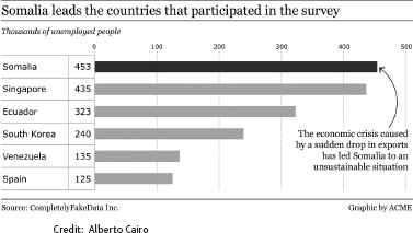
Figure 3.2. This improved graphic is clean and functional. Create visuals that help the audience grasp your point with minimal effort.
DATA VISUALIZATION—BIG DATA
Infographics only scratch the surface of the data visualization boom that's underway. To better understand big data, data sets so large and complex that you can't process or manipulate them with conventional database tools or applications, organizations are using new software to help them visualize the complex.12 They take unthinkably large chunks of data and fashion them into a form that humans can comprehend. Data visualizers marry science with design to produce graphics, static and interactive, that often transcend explanation to deliver deeper meaning of complicated topics.
“Visualization is a really effective method of getting into the data and getting not just information, but getting knowledge out the other side,” says visualization expert Noah Iliinsky of IBM. It's about “getting something to satisfy your own goals. You can enable a decision; you can enable an action…rather than just getting another number.”
NASA Makes Data Come to Life
Big data means big visualizations at NASA's Goddard Space Flight Center, where the Global Modeling and Assimilation Office uses a NASA Center for Climate Simulation (NCCS) supercomputer to process over 10 million satellite observations of the atmosphere a day to predict weather conditions and study global climate. Scientists see data come to life inside the NCCS's Data Exploration Theater, where simulations are projected in high-definition on a 17- by 6-foot hyperwall composed of fifteen monitors.
Tiny bits of information on rates of precipitation, wind, humidity, ice, and other environmental conditions are transformed into simulations that bring to life images more comprehensible to the human mind than raw data. Scientists can study epic storms of the past like Hurricane Sandy and the East Coast blizzards of 2010 to observe patterns that help them improve future weather and climate forecasts.
My NASA communication colleague Jarrett Cohen gave me the full NCCS Data Exploration Theater experience on a visit to Goddard (see Figure 3.3). One of the simulations he shared was visualizations of a 220-year record of climactic activity on Planet Earth, reaching back to 1880 and forward to 2100. At Cohen's command, larger-than-life maps of the world lit up and were instantaneously populated by millions of pieces of data. Like a weatherman's display on steroids, an enormous wall showed changing sea levels, precipitation amounts, temperature variations, and even aerosol levels. The 17- by 6-foot collage of the world alone would have been worth the price of admission just because of its sheer beauty, but as 220 years of data went to work, the constantly changing map told me a compelling story of the recent history of the Earth's climate. You can read about the climate in books, in newspapers, or online, but nothing strikes an emotional chord like experiencing the data flash before you on such a grand scale and in such vivid colors.
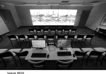
Figure 3.3 The Data Exploration Theater at NASA's Goddard Space Flight Center in Maryland turns scientific data into works of art.
The NCCS Data Exploration Theater delights schoolchildren and helps inform politicians—some of whom make laws that impact the environment. This visualization program does what communicators need it to do—it enables individuals to see data in a way that is meaningful to them. In this case, data visualization supplements knowledge people may already have about climate, raising their understanding of the subject to a deeper and more emotionally charged level.
But Does It Work?
“No one has done research about what sticks,” Lee Rainie, director of the Pew Research Center's Internet & American Life Project, tells me. “Is an infographic better than a headline?” he asks. Then he rhetorically responds, “No one knows.” This isn't exactly comforting news to those who are trying to get their arms around how to use digital media effectively. Methodologically, he tells me, surveys and interviews don't work in trying to figure out what resonates with either executives or the general population. Statistically, it's just too hard to figure out what to do to make people respond and sort out all their varied information inputs.
Supercommunicators may need to act on instinct and good judgment until researchers can figure out for us what new digital tools do to boost our ability to explain the complicated. But if you're always thinking about the importance of delivering meaning to your audience, chances are you will be far more effective in embracing multimedia. Multimedia shows lots of promise as a means to educate and inform, but users need to be thoughtful in the way they incorporate it into their communication mix.