
Quality and Integrity in Design
“Too many designers think they know what they're doing with information, but do not,” says John Grimwade, the director of information graphics at Condé Nast Traveler magazine. From the short time I spoke with him, I could tell he wasn't a mean person, nor was his remark meant maliciously. He takes his profession seriously and wants others to do the same. “There are no data police,” he tells me. Infographics are like the Wild West: “We need some kind of people to monitor these things and get them headed in the right direction.”
We're emerging from a “dark period of information design,” says Grimwade. Business people felt liberated when easy-to-use graphics programs were loaded onto personal computers back in the 1980s. They now had the tools and could create all sorts of documents. But to trained designers, those days were like the big hairstyles of the decade—an aesthetic train wreck. “People had the means to embellish a business document, but not the knowledge to do it in a meaningful way.”
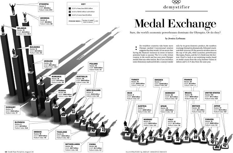
Perhaps you've seen Grimwade's award-winning work. Leaf through a copy of Traveler and you'll see his creations. Grimwade worked with Oceanic Control in Newfoundland to produce an infographic that illustrates the system that controls 900 daily flights over the North Atlantic (see Figure 28.1). Another infographic from Condé Nast Portfolio reveals the medal count from the Athens Olympics divided by the GDP of the country. Grimwade shows that athletes from countries with low GDP, like Ethiopia, Georgia, and Belarus, fared far better in garnering medals at the Athens Olympics than their counterparts from wealthier nations (see Figure 28.2). They are easy to understand, tell a story, and are aesthetically pleasing. But most important, they are purposeful, not adornments. “I'm just trying to turn on the lights a bit,” he says. “Graphics can help you unravel the complicated.”
DON'T CONFUSE VISUALIZATION WITH ART
Most visualization and graphics you see in the media are developed, as you would expect, by graphic designers. These creative individuals are trained to stylize content to make it visually appealing. That's how we've always seen their role. For centuries, making things pretty has been their primary focus. Alberto Cairo says this limited view of graphic design can deter good communication. The former director of infographics and multimedia at Editora Globo, the magazine division of Brazil's biggest media group, warns that we need to do more to improve the relationship between visualization and art.
In Brazil, Cairo says, journalists and designers alike call graphics “art.” He writes of his experiences working with them in São Paulo: “They would say with that charming musicality of South American Portuguese, ‘Vamos fazer uma arte!’”6 The translation, “Let's make a piece of art,” suggests graphics should be viewed as art, not a serious means to communicate substance.
Figure 28.1 “The Transatlantic Superhighway” by John Grimwade for Condé Nast Traveler. This infographic effectively illustrates the system that controls flights over the North Atlantic.

Figure 28.2 In “Medal Exchange,” Grimwade effectively communicates that deep pockets don't necessarily produce world-class athletes.
Jason Fries raised an interesting point in our interview. “We live in a visual world,” he says. “Today, people lose interest in verbal…. My experience is that to reach the younger people who grew up with everything digital, you have to use pictures.” Although I agree with Fries's statement, I must urge budding supercommunicators that they need to be just as focused on creating quality graphic images as they are in delivering excellent written or verbal content. Good graphics can boost your communication skills to new heights; bad visuals, however, will only confuse and obscure your message. And when you are working with information, you have to be really careful.
The challenge with using visuals, however, is that many of us aren't using them effectively. Just because technology gave us the ability to add images to our work doesn't mean communicators are using them wisely. Once again, we come back to the theme of “adding meaning.” Caught up in the gee-whiz excitement about digital tools, many of us forgot that good communication means bringing insight to an audience, not glitz. The widespread availability of graphics programs has opened a Pandora's Box of visual stimuli, but much of what's in there has been meaningless adornment.
Guidelines, Tips, and Observations for Multimedia, Graphics, and Visualization Design
No matter what media you're working in, there are a few guidelines to consider when producing visual communications. Make sure your effort packs a punch and delivers meaning to your audience:
Keep Visuals Clean and Simple
Thoreau's plea for “simplicity, simplicity” holds true when it comes to multimedia design. Keep content uncluttered. Eliminate any visual that does not add to the value of your communication effort. Favor clean aesthetics—your text and images should feel open and breezy, not dark and dense. Your audience will feel welcome to your content if it suggests a friendly tone.
Simplicity is essential. If you can't make a simple visualization that people understand easily, then move on. “I'm always fighting with my graphics people about the complexity of some visualizations,” notes The Washington Post's Dana Priest. “If I don't get it or if I have to work too hard…then it doesn't work.” But Priest goes on to offer me an example of an exception to the “rule” of simplicity and clean aesthetics. She refers to a map of counterterrorism organizations produced by the Post. The first attempt shows how crazily all the organizations were connected and the contorted routes the information flowed between them. The design team originally rejected this first attempt and came back to Priest with a cleaner, easier to navigate map. But Priest rejected the second visualization in favor of the first. “By its nature it's a confusing map,” says Priest, “but that's the whole point.” She believed the “crazy” map did a better job in telling her story about the intricate relationships among counterterrorism organizations.
Be Extra Careful When Working with Graphics
Many statistical graphics we see in the media, even from so-called reliable sources, distort data. This is unfortunate because it leads readers, users, and listeners astray. Whether it's a result of ignorance or malice, it's becoming more of a problem as designers untrained in statistics and other do-it-yourselfers have the resources to communicate data visually. Edward Tufte writes that complex ideas should be “communicated with clarity, precision and efficiency.”7 It can be tempting to originate a design that influences your audience to observe data favorable to the point you're trying to make. Graphics that show misleading information can be a blow to your organization; you run the risk of destroying credibility. Don't fall into the trap of distorting data.
Avoid Extraneous Images and Items That Distract
Multimedia can make your audience emotionally aroused. That can be a good thing if it boosts their cognitive level of engagement. But stimulation isn't always what the supercommunicator ordered if it interferes with the learning process. Too many pictures—or other bells and whistles—can alter your audience's ability to make sense of your subject. People have limited capacity for input, so don't distract them. Keep them focused.
Matching Zimbalist's “garnishes” reference, adult learning expert Ruth Clark coined the phrase pumpkin graphics to describe decorative visuals that are thought to add interest or possibly humor to content…but fall short on enhancing the overall message. Pumpkin graphics is her comical way of describing what results from someone slapping a clip-art jack o’ lantern onto a presentation just because the meeting happens to be taking place around Halloween.8 The smiling pumpkin with missing teeth does absolutely nothing to make the presentation better. It only serves as a reminder of the season and distracts from the purpose of the meeting.
You Can't “Force” Visualizations
It's easy to get caught up in the excitement of data visualization. This growing field is dynamic and communicators want to be part of the excitement. But a Berlin-based visualization architect I spoke with warns, “Data can have its limits.” He tells clients to set realistic goals and understand that results may not be as spectacular as what they're envisioning. “About one in ten data sets can support a visualization piece,” he cautions. Not every visualization is going to be epic, nor will they all go viral. He suggests you talk to your visualization pro about what is feasible and understand that you won't know how effective the piece will be until after it's done.
People Like Color
No surprise here. Audiences respond favorably to colorful images. Give them an emotional boost with a splash of color and put them a better learning frame-of-mind. But be careful with your color choices and don't overdo a good thing.
Discuss color with your designer or research color palates on your own. Choose the right color scheme and you can help draw your reader/user into your document. Select the wrong combination and you run the risk of alienating your audience. The wrong color scheme can disrupt their flow and encourage them to look elsewhere—away from your webpage. Amy Balliett of Killer Infographics suggests that to keep graphics cohesive and calming, as opposed to jarring, consider limiting your palette to three primary colors. She also suggests visiting websites that cater to helping people choose the right shades. Her suggestions include Adobe's Kuler and COULOURlovers.9
Animate
Animation can be a great way to explain content, especially hard-to-grasp data. In Chapter 17 we learned about the effectiveness of employing an “agent,” like the Android mascot, to guide learners through a new process or complicated material. Animation can add a level of “human” connection your audience will welcome. Extraneous animation, that which does not add meaning to your content, however, needs to be stricken.