
Chapter 16
Putting Your Geek to Work: Analyzing Campaign Results
In This Chapter
![]() Understanding and working with different types of data
Understanding and working with different types of data
![]() Profiling marketing campaign responders
Profiling marketing campaign responders
![]() Using decision tree techniques to understand responses
Using decision tree techniques to understand responses
![]() Building response models
Building response models
Chapter 15 explains how you go about measuring the success of your database marketing campaigns. Ultimately, you can assign a specific value to your campaign’s financial contribution. Once you’ve done that, it’s time to roll up your sleeves and see what you can learn from that campaign.
Analysis of marketing campaigns has become quite sophisticated over the years. Statistical software packages such as SAS and SPSS are incredibly advanced and easy to use. If I’d had one of these packages when I took undergraduate statistics, I could have done the entire semester’s worth of homework in an evening. In Chapter 19, I talk more about selecting statistical software.
Some of these packages actually have software modules specifically designed to analyze marketing campaigns. The convenience of this tool set is a great asset. I encourage you to explore and use these packages. But there’s a lot going on beneath the surface, and you need to be a little careful with these tools.
In this chapter, I explain some basic types of data that you typically see in customer databases and database marketing campaigns and talk about how to properly use that data. I go on to describe some analytic techniques that can help you to learn from your campaigns and apply that learning to future campaigns. These techniques range from simple reporting to more advanced modeling.
Measurement versus Classification: Numeric Data and Categorical Data
All your marketing data falls into one of two categories. The first is numeric data. Numeric data essentially measures something, like age or revenue. The second type of data is categorical data. As the name suggests, categorical data simply separates consumers (or households or products) into categories. Whether a customer responded to a marketing campaign or not is a typical categorical variable. They either did or they didn’t.
 This distinction may sound pretty trivial, but it’s one you need to keep in mind when you start analyzing data. In particular, you need to be sure that you recognize which type of data you’re really dealing with. It’s easier to make a mistake than you might think.
A silly example might make my point. I’m a baseball fan. Every morning during baseball season I pore over box scores and statistics while I sip my coffee. Batting averages, earned run averages, and every other kind of numerical data you can imagine are available on players and teams.
Every player has a number on the back of his jersey. But I’ve never seen statistics reported on the average jersey number per home run. Why not? Well, because that’s a meaningless calculation. The jersey numbers aren’t really numeric data. They don’t measure anything. They simply identify an individual player.
I told you it was a silly example, but bear with me for a second. The jersey numbers represent categorical data. The categories they identify are categories with only one member, but they’re categories nonetheless.
As I point out later in this section, it’s always possible to turn a numeric variable into a categorical variable. But you can’t go the other way. It leads to nonsense.
In marketing databases, many categorical variables are masquerading as numerical variables. In the next section, I point out some examples of this. I also explain in a little more detail how to determine whether a variable should really be considered a numeric variable and treated as a measurement of something.
Understanding Numeric Variables
All numeric data isn’t created equal. As my jersey number example illustrates, just because you have data that looks numeric doesn’t mean you can perform calculations with it. The jersey numbers are not numeric data at all. They’re just names. But even if you have actual numeric data, you can still run into problems.
Interval and ratio data: When averages are meaningful
Numeric data can take a couple different forms. Financial data is an example of robust numerical data that supports statistical calculations. The feature that makes this data robust is that a dollar is a dollar. The difference between a $10 purchase and a $20 purchase is exactly the same as the difference between a $100 purchase and a $110 dollar purchase.
This feature turns out to be exactly what’s needed to make the calculation of averages and other statistics meaningful. You need your data to have the property that different intervals are comparable. Age differences, income levels, purchase sizes, and any data that’s measured on a fixed scale have this property. Such data is called interval data.
 There’s actually another level of robustness related to data types, known as ratio data. Most of your marketing data will have this property if it’s interval data (meaning that different intervals can be meaningfully compared according to their length.) You don’t really need to worry too much about the difference between ratio and interval data except when you’re defining data types in your statistical software. Essentially, ratio data depends on the existence of some absolute 0 starting point. The classic example of interval data that’s not ratio data is Fahrenheit temperature. The difference between 32 degrees and 33 degrees measures the same amount of energy as the difference between 100 and 101 degrees. But 0 degrees doesn’t mean a total absence of heat. In fact, we observe temperatures below 0. For this reason, you can’t meaningfully say that 100 degrees is twice as much heat as 50 degrees.
Ordinal data: When averages aren’t meaningful
There’s a kind of numerical data that falls short of meeting the interval data requirements described in the preceding section. I’m talking about something called ordinal data. Ordinal data is fairly common in marketing databases. Ordinal data measures the degree to which something is true. Essentially, it sorts things.
Ordinal data appears frequently in survey results. You see it all the time when you’re shopping online. The 5-star rating system that seems to have taken over user ratings for everything from movies to pet-sitting services is an example of ordinal data. And it’s also an example of ordinal data being misused.
Typically, the results of these online surveys are reported as an average. This movie got 3.5 out of 5 stars, for example. Technically, this calculation isn’t justified. Why not? There’s no reason to assume or believe that the difference between 1 star and 2 stars is the same as the difference between 4 stars and 5 stars. In fact, it isn’t at all clear what a star is actually measuring.
Ordinal data should be reported according to the number or percentage of responses that, in this case, received a given number of stars. You would also be justified in reporting the percentage of responses above or below a certain level because there’s an implied order to the ratings.
In the case of product ratings, reporting averages based on this ordinal data isn’t terribly problematic. These calculations are really just used to compare one movie to another. Where you get in trouble with ordinal data is if you use it as input to another statistical procedure. When building a response model, for example, your statistical software will perform a lot of calculations on numeric data. If the data doesn’t support those calculations, your results will be compromised.
Ordinal data often appears in the results of survey research and polling. When customers and people who are polled are asked to rank preferences, the data is typically ordinal. Questions that ask someone to rate their agreement with a given statement on a scale of 1 to 5 or 1 to 10 also should be treated as providing ordinal data. In the next section, I talk about a method of converting measurement data into ordered subsets called deciling, which also produces ordinal data.
 Whenever you set out to analyze data using your statistical software, the program will ask you about your data. Most packages make assumptions about data types based on a cursory look at your data. But they also allow you to explicitly define the data type associated with each variable. It’s well worth your time to look through these data types in detail to make sure they accurately reflect what’s going on.
Analyzing Response Rates: The Simple Approach
When you begin to dig into the response data for your campaign, you start by trying to get a sense of who responded to your campaign. The first step is to build a profile of responders. You do that by looking at a wide variety of variables to see which ones effectively differentiate between responders and non-responders.
Some simple graphical techniques are very helpful in this regard. These techniques are supported by even the most rudimentary statistical software. In fact, they can even be applied using basic spreadsheet functions. They provide easy-to-interpret insights into the customer characteristics that are associated with responders. In this section, I outline a couple of common approaches to visualizing your campaign results.
Response distributions
In Chapter 6, I talk about a common graphical representation of data called a histogram. Histograms show how a variable is distributed. Figure 16-1 shows what a histogram charting the distribution of the number of children per household might look like.

Illustration by Wiley, Composition Services Graphics
Figure 16-1: Histogram showing the distribution of households by number of children.
Histograms are extremely useful tools for data visualization. They can be combined with your response data to give you a picture of where responses are coming from.
For example, suppose you’ve just completed a database marketing campaign designed to drive sales of minivans. If you combine your response data with the data on number of children pictured in Figure 16-1, it might look like Figure 16-2.
The darker bars in the chart in Figure 16-2 represent the percentage of responses that came from households with the given number of children. Notice that for families with 2 children or more, the percentage of responders is actually higher than the percentage of households that fall into those categories. This means that number of children is actually a useful differentiator between responders and non-responders.
If you add up the numbers for these larger families, you see that families with at least two children account for about 50 percent of the audience. But they account for 75 percent of the responses.

Illustration by Wiley, Composition Services Graphics
Figure 16-2: Response distribution for minivan purchasers by number of children in the household.
By applying this technique to a wide variety of variables, you can start to build a picture of the typical traits shared by your responders. Not all variables will show this level of differentiation, or lift. What you’re looking for is groups of customers where the responders appear in disproportionately high numbers.
 In Chapter 6 and again in Chapter 15, I stress the importance of making sure that you report results that are statistically valid. The idea is that when you compare response rates, you want to make sure that the differences you report actually hold water. That statistical rigor should not be forgotten when you do response profiling (though it very frequently is overlooked).
Analyzing non-categorical data
Histograms are especially well suited to categorical data, especially data that contains a relatively small number of categories, such as number of children, marital status, or home ownership. But when you have measurement data, like age or income, it gets a little harder to differentiate responders from non-responders.
When building responder profiles, you’ll no doubt run reports on things like average age of responders versus non-responders. You may even discover that the average age does differ significantly between the two groups. Such a discovery could indicate that age may be playing a role in response behavior. But this fact by itself isn’t all that useful.
One way to dig deeper into this relationship is to simplify your age data. In the next section, I describe a technique for doing that which standardizes the data into equal sized groups. This essentially makes the data look more categorical (although technically these groups are really ordinal).
Rank ordering your data
We’ve all been subjected to the stresses of standardized testing in school. Whether it’s college boards or achievement tests, the results of these wonderful little exercises are reported in the same way. The number you focus on is your percentile rank.
Your percentile rank is simply a measure of how many people scored lower than you did. A percentile rank of 50 means that half of the test takers scored lower and half scored higher than you. A percentile rank of 95 means you’re pretty doggone smart.
You can use a similar ranking technique to help you get your arms around some of your marketing data, particularly data that involves measurements. Because age, income, and other financial data is spread out, it sometimes helps to simplify it by expressing it as percentiles.
Actually, there’s nothing magical about percentiles. Percentiles are implicitly based on a scale of 0 to 100. But even this is still too granular to really be considered a simplification. You can actually break up your data into any number of groups you want.
The trick is simply to sort the data from lowest to highest and then split it into equal sized parts. These parts are referred to as quantiles, which is the generic term for percentiles. And you can choose any number of parts you want. The four most common ways of splitting groups are into 4 parts (quartiles), 5 parts (quintiles), or 10 parts (deciles).
If you divide a target audience into income deciles, your distribution might look like Table 16-1. The income associated with each decile represents the bottom of that range.
Table 16-1 Typical distribution of household income by decile
|
Decile |
Income ($) |
|
1 |
0–17,999 |
|
2 |
18,000–24,999 |
|
3 |
25,000–34,999 |
|
4 |
35,000–41,999 |
|
5 |
42,000–53,999 |
|
6 |
54,000–66,999 |
|
7 |
67,000–83,999 |
|
8 |
84,000–106,999 |
|
9 |
107,000–144,999 |
|
10 |
Over $145,000 |
You can see that the income ranges associated with these deciles are not at all uniform. The second decile ranges from $18K to $25K. This is quite narrow compared to the eighth decile, which ranges from $84K to $107K. What’s uniform about this distribution is that, by design, each group contains exactly the same number of households.
Using rank ordering to analyze response rates
When you use histograms to graphically analyze responses, you need to calculate the percentage of responses that come from each category on your graph. Just reporting the response rate by category is misleading because the categories are not all the same size.
This actually becomes problematic for categories that are very small. Here’s an extreme example: Suppose you end up with a category that only contains one household, and that household actually responded. You would show a response rate of 100 percent in that category, despite the fact that a single response is merely a drop in the bucket.
The fact that deciles (and other types of quantiles) are all the same size makes creating a useful graph a little easier. You can just report the response rates by decile. Figure 16-3 shows a (completely contrived) response report by decile for a campaign that’s designed to drive sales of luxury sedans.
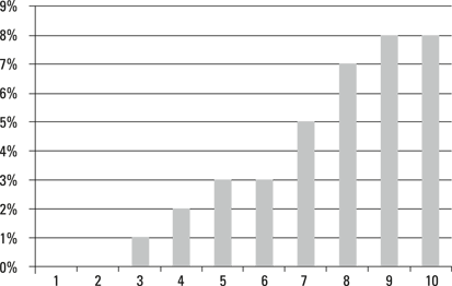
Illustration by Wiley, Composition Services Graphics
Figure 16-3: Response rates for luxury sedan campaign by income decile.
Because the reporting categories are all exactly the same size, the response rates in this graph are directly comparable. This graph clearly shows that income is a barrier to luxury sedan purchases.
Counting total responses
There’s another common way of viewing this same data that’s even more compelling. Figure 16-3 clearly shows that response rates are going up as you move up the income rankings. One thing you’ll want to think about is what income level you should use as a cutoff for future target audiences.
To do that, reverse the order of the deciles. Then graph the percentage of responders that fall into incomes above each successive decile. Here you’re measuring the cumulative response. Figure 16-4, which is called a gains chart, illustrates this approach.

Illustration by Wiley, Composition Services Graphics
Figure 16-4: Gains chart of responses by income decile.
This way of viewing the data makes it even clearer where your responses are coming from. Note that by the time you reach down to the 6th decile, you’ve accounted for over 80 percent of your responses. This means that you could have cut your audience (and therefore your campaign costs) in half and still have generated the vast majority of the responses.
Gains charts are commonly used in evaluating the success of statistical models. I discuss the use of gains charts in this context later on in this chapter.
Advanced Approaches to Analyzing Response Data: Statistical Modeling
The previous section talks about some simple ways to analyze your response rates based on what you know about your customers. All those techniques involve looking at one variable at a time to profile your responders. But no single variable is going to tell the whole story.
A couple of advanced modeling techniques are commonly used in database marketing. I discuss those later in this chapter. First I want to introduce you to some key elements of the modeling process.
The problem with cross tabs
When you start drilling further into your data, your first impulse (at least my first impulse) is to start building cross tab reports that take more than one variable into account.
You may have discovered that marital status and number of children are both associated with responses to your minivan campaign. The natural thing to do is to combine the two variables and look separately at response rates for married and unmarried parents of two kids, for example.
The problem with this approach is that it runs out of gas pretty quickly. What I mean is, the sizes of the individual cells that you’re analyzing get small quickly. A cross tab report that looks at response rates for number of children versus income decile might have 50 or 60 different cells. And that only takes two variables into account. Typically, you’ll find a half dozen or more variables that are relevant. Cross tabs become unmanageable (and statistically irrelevant) quickly as the number of variables grow.
What is a statistical model?
The primary function of modeling in database marketing is to help you predict who will respond to your marketing campaigns. A statistical model in this context is a set of rules that relate customer data to campaign responses.
I enjoy cooking, so a natural way for me to think about models is as recipes. A recipe for a particular dish requires a specific set of ingredients. But the relative amounts of each ingredient are important, and so is the way they’re combined and prepared. Many different bread recipes call for basically the same ingredients. But the amount of baking soda you use and the temperature at which you cook the bread can dramatically affect the outcome.
In database marketing, your target audience plays the role of the dish you’re trying to prepare. Customer data — the variables in your database — play the role of the ingredients. Your statistical model is the recipe. It tells you how to combine those data elements to select your target audience.
The model development process
Developing a statistical model is a technical exercise requiring some advanced knowledge of statistical methods. It’s not my intent here to address the details of various modeling techniques. But I do want to point out some highlights of the model-building process.
Specifically, I want to familiarize you with three main stages in model development:
![]() Preparing your data: Your data as it exists in your database isn’t ready for prime time when it comes to building models. You need to do a fair amount of cleanup and transformation of your data to maximize the quality of your model.
Preparing your data: Your data as it exists in your database isn’t ready for prime time when it comes to building models. You need to do a fair amount of cleanup and transformation of your data to maximize the quality of your model.
![]() Building the model: This actually turns out to be the easiest part because a lot of the work is done for you by statistical software.
Building the model: This actually turns out to be the easiest part because a lot of the work is done for you by statistical software.
![]() Testing the model: This step is extremely important. A number of things can go wrong when you build a model that you can catch with a good testing plan.
Testing the model: This step is extremely important. A number of things can go wrong when you build a model that you can catch with a good testing plan.
Though testing your model is the last phase of development, you need to set up a testing structure up front. That essentially involves holding out a portion of your target audience from the model development process to use later in testing. I discuss this process in a little more detail later.
Preparing your data
The first thing you need to determine is which variables you’re going include in your model. The profiling exercise that you’ve already performed on your campaign results can help immensely in this regard. You already have a pretty good sense of which variables are most strongly related to campaign responses. These ingredients, or predictor variables, will form the basis for your model.
Some modeling techniques purport to select your variables for you. Some decision tree approaches discussed later in this chapter will do this for you. My experience is that even if that option is available to you, it’s better to limit the number of variables you’re using to ones that you already know are relevant. This reduces the likelihood that your model-development process will get off track and produce less than optimal results.
Once you’ve identified your variables, you want to get them model ready. You need to look at a couple of standard things.
Getting rid of outliers
In Chapter 6, I talk about very long-tailed distributions. I give an example related to season pass use, in which the vast majority of pass holders use their pass only a handful of times. But some pass holders use them hundreds of times.
These very high transaction users represent a tiny fraction of the pass holders. But their high usage numbers can skew your model. Get rid of ’em. In statistical parlance, they’re known as outliers. It’s standard practice to ignore outliers when you build a model. It actually improves your model quality because the model isn’t trying too hard to take into account what amounts to misleading data.
Your statistical package will do this for you. There are a number of ways of identifying outliers. You also have some flexibility in how far “out” a data point has to be to consider it an outlier. Your geek can help you to determine what to leave in and what to leave out.
You may not want to get rid of outliers altogether. If you have a borderline target audience size you may decide that every scrap of data needs to be included to make your model successful. In this case, it may sometimes be appropriate to re-assign values to outliers that are more in line with the norm. In the case of the season pass example, you may decide to re-assign the visit count to 10 for all pass holders with more than 10 visits. Check with your geek about the consequences of doing something like this.
Making sure data types match your modeling technique
Returning to my recipe analogy, just knowing that a recipe calls for a particular ingredient isn’t always enough. Sometimes the form of that ingredient is important. I’ve found this to be particularly true of spices. A teaspoon of mustard is ambiguous. Does this mean prepared mustard, mustard seed, or ground mustard?
A similar thing is true of models. Some modeling techniques work best on categorical data. Others require the data to represent comparable measurements. As I point out earlier in this chapter, you can’t make a categorical variable into a measurement, but you can go the other way.
If you’re using a technique that likes categorical data, you don’t have to exclude measurement data from your set of predictor variables. You can use the rank-ordering technique described earlier to make your measurement data more model friendly. By converting measurement data into deciles (or any quantiles you choose), you can include this data in your model.
Paying attention to timing
When you build a model, you’re looking at the past. You’re analyzing the responses to a completed campaign. You need to make sure that the predictor variables you decide to use match up with the time period when the campaign was actually executed.
For example, suppose you pulled your mail file in May and responses were received through June. It’s now July, and you’ve decided to build a model based on this mailing. One of the variables you look at is the previous month’s purchases, because this variable was used in selecting your target audience.
What you’re going to find is that this variable predicts responses perfectly. Because you’re now in July, a purchase in the previous month is actually a response to your campaign. It’s not actually predicting the future. It’s predicting the past. Not terribly helpful.
Now this may sound like an obvious point, but I’ve seen it overlooked more than once. Because your customer data is always changing, it’s not always easy to determine if the data that’s currently in your database represents what was there when you pulled your mail file.
If you think you might later want to build a model based on responses to a campaign, it’s a good idea to create an analysis file when you pull your mail file. You can include any variables in that file that you think might be useful down the road in understanding responses. This guarantees that you have a snapshot of the way the data looked when you pulled the file, which is what you want if you’re going to build a useful model.
Making sure the distributions match your modeling technique
In the aftermath of the relatively recent meltdown in the banking and investment banking industries, you heard endless talk about financial derivatives being the culprit. These investment instruments are not only mind-numbingly complex, but they depend in a fundamental way on statistical models.
In particular, they way derivatives are priced is based on a series of advanced statistical methods. Those methods, like all statistical methods, rely on a complex set of assumptions about how the underlying variables are distributed.
What happened leading up to the financial meltdown, among other things, is that these pricing models were used in computer trading long after their underlying assumptions ceased to be true. Essentially, the pricing tools continued to be used long after they were broken.
When you build your database marketing models, you’ll be using techniques that depend on assumptions about the distributions of your predictor variables. In particular, the most commonly used response models like to see nice, normal, bell-shaped curves. Your data doesn’t look like this. That means that the data needs to be coaxed into shape.
There are lots of techniques available for doing that coaxing. They involve performing various mathematical operations on variables that change the shapes of the distributions. A relatively simple example is that taking the logarithm of a variable with a long-tailed distribution yields a much more bell-shaped curve. Performing these data transformations is definitely a job for your geek.
In my experience, this is the most commonly overlooked step in statistical modeling. And it’s an important one. You wouldn’t put granular sugar in a frosting recipe that calls for confectioner’s sugar. Don’t dump wacky variables into a model that calls for normal ones.
Building the model
Data preparation is by far the most involved part of building a successful model. Once you have the data right, getting a model built is largely the job of your statistical software. But there’s a bit of an art to it as well.
The modeling techniques typically used in database marketing involve culling through your data multiple times. It isn’t as simple as just calculating the right amount of each ingredient in the recipe. These techniques operate on a trial-and-error basis.
The basic idea is that the software keeps making guesses and then refining those guesses. This is where the art of modeling comes in. You have to tell it when to stop.
It’s actually possible to overcook a model. Essentially what happens is that the model stops predicting and starts memorizing the data. This phenomenon is referred to as over-fitting the data. When that happens, the usefulness of the model is limited to predicting the behavior of the audience that was used to build it. It falls apart when you try to apply it to a different target audience.
There are various statistical ways of sticking a fork in your model while it’s in the oven, so to speak. It requires some technical knowledge to interpret these statistics correctly. And experience plays a big role in knowing when to declare a model done.
Testing your model
Once the model is done, you do have a chance to taste it. (And here, mercifully, my recipe analogy comes to an end.) There’s a standard operating procedure for model building that allows you to test the model before you roll it out in an actual marketing campaign. When you develop a model, you’re using data from a previous campaign. As I point out earlier, it’s a good idea to pull an analysis file containing all the data about your target audience that you might want to use to build your model.
The first thing you need to do with this file is split it in half. This should be done at random. In Chapter 6, and again in Chapter 14, I talk in more detail about how to do this. The important thing is that both randomly selected halves need to be representative of the whole. You set one half, your validation file, aside and forget about it until you reach the testing phase. You use the other half, the training file, to build or train your model.
Once your model is built, you can use your validation file to check how you did. You simply apply the finished product to that validation file and check to see how well it did at predicting responses. This is an excellent way of identifying problems with over-fitting. If the model doesn’t validate well, it’s back to the drawing board. But at least you haven’t wasted the money on testing the model in an actual campaign.
Models typically don’t perform quite as well during validation as they do on the training data. This is to be expected. But you’ll also see some degradation in performance when you actually roll out the model in a campaign. For this reason, it’s important to temper your expectations for actual response rates when the model is rolled out. There are no hard-and-fast rules for how much you need to temper them. Experience in your situation is the best guide.
Common Response Modeling Techniques
Response models are basically attempts to use statistics to identify target audiences for marketing campaigns. Statistical techniques are evolving all the time, and new ones continue to pop up in marketing applications. There are, however, a couple of techniques that have stood up well over time.
In this section, I introduce you to a couple of the more common techniques used in database marketing. Both these approaches use past campaign response data to identify and refine target audiences for future campaigns. But they differ fundamentally in the way they go about it.
Classification trees
Earlier in this chapter, I point out the shortcomings of trying to produce detailed cross-tabulation reports (cross tabs) on campaign responses. The number of distinct combinations of variables becomes quickly overwhelming. For a human. But sorting stuff like this is exactly what computers do best. The classification tree approach to modeling responses tries various ways of combining data elements in various ways until useful combinations are found. In essence, the approach looks for hot spots in your target audience.
RFM models revisited
In Chapter 8, I introduce the notion of RFM models in the context of analyzing transaction data. These models look at transactions according to their recency, frequency, and monetary value. They then categorize customers according to how recent, how frequent, and how expensive their transactions were. By comparing response rates to past campaigns among these different customer categories, these RFM models are able to identify the best prospects for future campaigns.
In its simplest form, an RFM model might only look at whether or not a customer has reached a given threshold with respect to each of these measures. In other words, each customer would be classified as yes or no with respect to recency, frequency, and monetary value. This model is actually a classification tree model. The name becomes clear when you look at the data visually. Figure 16-5 shows a visual representation of a simple RFM.
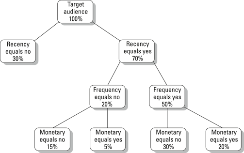
Illustration by Wiley, Composition Services Graphics
Figure 16-5: A simple RFM classification tree.
In this tree, the percentages represent the size of the groups relative to the entire target audience. There are a couple of things to keep in mind about these trees. First, the boxes that have nothing below them, called terminal nodes or terminal leaves, add up to 100 percent of the target audience.
Second, the advantage of this method is that you can abandon a branch of the tree at any point. Because customers who didn’t have a recent purchase aren’t going to pop up as frequent or high value customers anyway, that branch is pruned (actually a technical term) in favor of focusing somewhere else.
By looking at the response rates associated with nodes of the tree, you can develop a targeting strategy. The idea is to focus your campaign dollars on nodes that have high response rates. In the tree shown in Figure 16-6, the hot spots are probably the two terminal nodes with monetary equals yes classifications. This represents a reduction in the target audience to a quarter of its original size.
RFM models are simple. This is both their strength and their weakness. It’s a strength because they’re effective and simple to build and understand. It’s a weakness because they only look at three variables.
Building classification trees
There are a number of variations on how to go about building a classification tree. One of the first to be applied in marketing is a method called CHAID. This stands for chi-squared automatic interaction detection. Chi-squared (“chi” rhymes with “sky”) refers to the statistic that’s used to determine whether a difference between two groups is significant.
The automatic interaction detection part refers to the fact that this method determines all by itself how to set up the branches of your tree. You don’t need to tell it which variables to look at. You can feed it a bunch of variables, and it will pick ones that are most effective at differentiating responders from non-responders.
As I mention earlier in this chapter, I’m not a big fan of letting statistical procedures pick my variables for me. I think it increases your risk of over-fitting your model. These types of processes can end up going down the proverbial rabbit hole if they’re presented with too many possibilities.
But there’s a very powerful advantage to using classification tree methods, automated or not. They can actually tell you the optimal way of re-classifying your data based on the categories of a particular variable. For example, your demographic data contains information on the number of children in a household. This data might contain values from 0 to 4 and another category of 5+. That’s six different categories.
When presented with response data for a campaign, your classification tree software may come back and tell you that the only really relevant categories are 0, 1 to 2, and 3 or more. In this case, you’ve achieved a simplification by reducing the number of different cells by half. More importantly, the software has given you the “right” cells. These are the breaks that are most effective at distinguishing responders from non-responders.
Classification tree algorithms are particularly well suited to analyzing lots of categorical data. When preparing your data for a classification tree model, it’s a good idea to convert measurement data into categorical data beforehand. You can easily do that using the rank ordering process I describe earlier in this chapter. Some software packages do this for you as part of the classification tree model development.
Creating response scores
Another common approach to modeling campaign responses is to try to estimate the probability of getting a response based on your predictor variables. This technique generally uses a procedure called logistic regression. This approach can take into account both categorical and measurement data. When such a model is applied to a given audience, the result is that each consumer is given a response score. Typically, this is a number between 0 and 1 and purports to measure the likelihood of that customer responding to your campaign.
It’s been my experience that these response scores don’t really resemble actually probabilities at all. In other words, if you just mail to people with response scores above .9, you’re not going to get a 90 percent response rate. The important thing about them is that higher scores should be associated with higher response rates. In other words, these scores are a good sorting tool.
This brings me back to the notion of a gains chart, discussed earlier in this chapter. When you test your model against your validation group and again when you actually implement it, gains charts are a very easy way to visualize how the model is performing. The idea is simple. You sort your audience by response score from highest to lowest. Then you graph the percentage of total responses against the percentage of customers above each score level. Figure 16-6 represents a gains chart for a fairly successful model.
The model scores are represented along the bottom of Figure 16-6. These are the percentile ranks of the model scores. The leftmost 10 percent represents the top 10 percent of model scores. The vertical axis represents the percentage of responses that came from customers whose score exceeded a given percentile rank. For example, this graph is telling you that approximately 70 percent of responders came from the highest 30 percent of model scores.
When using a gains chart to evaluate a model, you’re looking, qualitatively at least, for only one thing. You want it to be steep. The faster your total response percentage gets up close to 100 percent, the fewer customers you had to contact to get those responses.

Illustration by Wiley, Composition Services Graphics
Figure 16-6: A gains chart showing actual responses vs. response scores.
A common application of the information provided in a gains chart relates to sizing your audience for a campaign. When it comes time to select a target audience using your model, you can use the gains chart to figure out how many customers to mail to. In the earlier example, if 70 percent of your responses are coming from the top 30 percent of your model scores, you don’t get many responses from the bottom 70 percent of your audience. Think about it from a cost/benefit perspective. Why spend 70 percent of your budget on the lower end of the audience when that’s only going to generate 30 percent of the overall revenue? The precise point where you draw the line depends on the details of your campaign costs and revenue outlook. But gains charts are a powerful way of visualizing the targeting efficiency that models can provide.