
CHAPTER 12
Oscillators: Trading Oscillators Systems
ANSWER 12.1 R US Daily MACD (12, 26, 9)

- Red divergence lines show turns caught by MACD.
- Turns denoted by blue arrows, as well as nondivergent comparisons shown in blue.
- Three-bar plateau on the MACD circled.
- No, the MACD does not generate OBOS signals.
ANSWER 12.2 BIDU Daily with MA Oscillator, Blue (5, 15, 1), and MACD, Green (default)
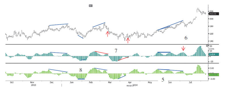
- No, each has a similar appearance.
- The reason is that both are moving average oscillators; the only difference is that the MACD always uses exponential moving averages, with defaults of 12, 26, and 9, while a MAOsc is more generic and can use simple, exponential, or weighted moving averages and has no standard default.
- Blue divergences are valid on the MAOsc.
- Blue divergences are valid on the MACD.
- The divergences were from the first to second and first to third peaks at area labeled 5.
- The divergence the MAOsc missed altogether is labeled 6, as shown by the red arrow. The oscillator has a higher high, not a lower or equal high as required.
- The MAOsc was “off tolerance” on two divergences, as shown in red, labeled 7. In both cases, momentum peaks took place three bars after the price peaks.
- The purple divergence line labeled 8 shows an instance of bullish flat divergence on the MACD. This is where the momentum peaks are the same, in this example, same lows.
ANSWER 12.3 Oscillators
- The Ultimate Oscillator used multiple periodicities, but only three. These are 7, 14, and 28.
- Kase's indicators use a loop through a range of periodicities to optimize for periodicity.
ANSWER 12.4 WAG 60M Kase Bars with KaseCD (Slope Filter Off, Otherwise Default Settings)

- Two overbought signals are denoted by red Ks. From the KCD one can identify an overbought signal by the magenta overbought lines, and the red dot showing a peak, coincident with a peak in price. An actual overbought signal triggers one bar after the peak, because a lower high is needed to actually identify that a peak has taken place.
- A higher high in price is accompanied by a higher high, not lower high, in momentum.
- The second low in momentum is six bars after the price low, so it's off tolerance.
- Correct divergences are shown, drawn in red.
ANSWER 12.5 XAU Daily with KaseCD (Tolerance 3, Otherwise Default Settings)

- See black arrows as marked.
- Each blue arrow, from left to right a bullish divergence then, a bearish divergence and a KCD peak (oversold signal), allowed for exits earlier and at better prices.
- The two sets of red arrows, exit long and reenter long, represent divergences that caused whipsaw trades.
- Both dotted line divergences made new lows without first hitting the top of the channel, so no exits were taken, and thus there's no difference.
ANSWER 12.6 K Daily with Kase Peak Oscillator, Annotated with PeakOuts and Divergences

- There are three bearish and two bullish PeakOuts, marked by Ps above and below price swings. If the Kase PeakOscillator shows a gray bar, that equates to a valid peak. The blue line denotes oversold above the zero line and overbought below. If a peak line takes place above a positive PeakOut line, that's a valid overbought signal, and below a negative line, that's a valid oversold signal.
- Three valid divergences are marked in green. The first, from the left, is bearish and the following two, bullish.
- Two incorrect comparisons are shown by the dotted lines. It's incorrect to compare falling highs or rising lows.
- Marked by black lines. The comparison is valid become one is comparing falling lows. The momentum indicator also falls, so that's why it's nondivergent.
- The turn marked by the black nondivergent lines was missed because of that phenomenon.
- Helpful PeakOuts and divergences marked in blue, as they preceded major turns.
- Black arrows show points at which exiting would have been helpful, but reentries, albeit likely at better prices, would have followed.
- The red arrow shows a point at which there was only a minor two-bar bounce. Note, however, that if dropping down to an short intraday chart, like a 15-minute, the signal still would have been helpful in that regard.
..................Content has been hidden....................
You can't read the all page of ebook, please click here login for view all page.