If you ask Drupal developers what the most powerful feature of Drupal is, many will say it's Drupal's ability to create custom content types. What is a content type? Think of a content type as a template that you provide to users who author content on your site. You may decide that the standard content types that come with Drupal out of the box, the basic page and article, provide all the features you need for your site. But it's likely that you'll encounter situations where you want more control over how users enter information and how that information is displayed on your site, and that's where custom content types come into play. In this chapter I'll show you how simple it is to create a new content type from scratch. Hold on to your tickets, we're about to take off!
When you install Drupal 7 you automatically receive two content types that have been defined by the team who maintains Drupal core: the Basic page and Article. If you author a piece of content using the Basic page content type you will see that it provides two basic fields: a title and a body.
An author using the Basic page content type simply enters a title (a required field as indicated by the red asterisk) and the text of their content in the body field. The body field is flexible and can contain whatever the author feels like writing about. The author could:
Write an entire book in the body field, including HTML markup (headings, tables, CSS, and so on).
Insert pictures.
Enter PHP code to extract information from the Drupal database and display the extracted information.
Write a single sentence.
The Article content type is similar to the Basic page, except it offers the ability to upload a picture and define a set of tags that can be used to categorize the content (see Chapter 4 for details on categorizing content).
Like a Basic page, and Article can be used to author content about any subject, and the body area is allows for entering free form text.
While the Basic page and Article content types are perfect for general content, there will likely be cases where you want to provide some form of structure around the information that is captured. You may want to:
Require that certain information is entered before the author submits the content item for publishing; for example the start date and time for an event, the address of the venue where the event is being held, and a link to the event on a Google map.
Have the ability to perform calculations based on the information that is captured in a content item.
Have the ability to sort content items by specific "fields."
Have the ability to "filter" or restrict which content items are displayed on a page based on a value in a field.
Enforce the structure of how a piece of content is rendered on a page; for example, you may want to display information about a book and want the title to be followed by the author, followed by the ISBN, followed by the price, followed by the description of the book.
While you could publish all of this information in a Basic page or an Article, providing the features for sorting, filtering, making values required, calculating, and structuring how a content item is rendered on a page would be extremely difficult. Fortunately, Drupal's ability to define custom content types makes all of the above possible, and provides many more features that you will find invaluable over time.
A custom content type is defined by you, the Drupal administrator, over and above the Basic page and Article content type. The ability to create custom content types is now included in Drupal 7 core.
To demonstrate the power and flexibility of custom content types, lets create a new custom content type for capturing information about upcoming events. An event could be a concert, a play, a class, a game, or any other activity that is scheduled in advance.
When authoring information about event, you may want to include:
The name or title of the event
The date and time when the event begins
The date and time when the event ends
The venue or address where the event will be held
A description of the event
The price for attending the event
As you will see in a few moments, Drupal provides a simple-to-use administrator's interface for creating and modifying custom content types. As soon as you define a custom content type, it is immediately available to those users who have the proper privileges to author, edit, publish, and delete that specific content type (Drupal provides the ability to restrict access to custom content types by user role).
Creating a custom content type takes two basic steps: sitting down and listing the types of information you want to collect, and building the custom content type using Drupal's custom content type administration screens.
For this example, let's create a custom content type for an event that includes the types of information listed in the previous section.
To get started, click on the Structure link at the top of the page. On the Structure page (shown in Figure 10-1), click on "Content types."

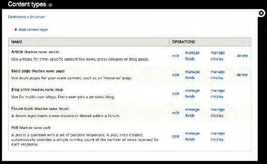
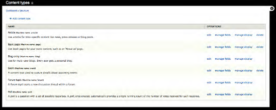
The "Content types" screen (shown in Figure 10-2) lists all of the existing content types, which in our case are the Article and Basic page content types that are included with Drupal 7 core, and the Blog, Forum topic, and Poll content types that were created when you enabled those modules in Chapter 9. The Content types page also provides a link to create a new content type. Click on the "Add content type" link to start the process of creating our Event content type.
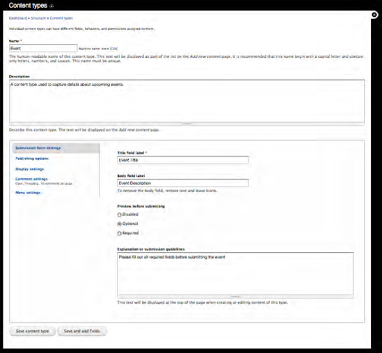
The first screen that appears when you click on the "Add content type" link is a form that defines the general characteristics of your new content type (see Figure 10-3). There is a field for the name of the content type, a field for a description that describes the content type (the description is displayed on the author's screen for creating new content), the label for the title field, the label for the body field, and several other configuration options that I will walk you through in detail.
To begin the process, do the following:
Fill in the Name of the content type, which in our case is Event. The text below the Name field provides a set of guidelines that you should follow when creating a name for a new content type.
Provide a description of how this content type should be used, such as "A content type used to capture the details about upcoming events."
Change the "Title field label" from just Title to Event Title, making it more descriptive and intuitive to the author who will be using this template for authoring event information.
Change the "Body field label" from Body to Event Description, making the label more indicative of the types of information you want the author to enter in this field.
Leave the "Preview before submitting" setting as Optional.
Provide a brief explanation of the submission guidelines for this content type. This is an optional value, and may not apply to your content type. For our Event content type, we will use "Please fill out all required fields before submitting the event" as the submission guidelines. You can choose to use or ignore this field when creating new content types.
There are other optional settings that you should consider carefully when creating a new content type. First are the Publishing options (see Figure 10-4). In the left vertical menu, click on the "Publishing options."
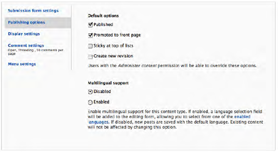
Depending on whether you want content to be automatically published (made viewable on your site immediately upon saving) and whether you want the content to automatically appear on the homepage of your website, you may wish to adjust these options. For our Event content type, we want Events to be automatically published when they are saved, but we don't want them to automatically show up on the homepage. So we will uncheck the "Promoted to front page" checkbox. We can also set whether an Event is sticky at the top of lists (meaning that, in a list of various content types on a page, the Event content would always be at the top of the list), and whether we want to automatically create a new version of a content item created as an Event when the author makes an update (typically a good idea, but it depends on whether you want the ability to see the changes made to an individual piece of content over time, and the ability to republish a previous version in the case where the current version is incorrect). For our Event content type, we'll check the "Create new version" checkbox.
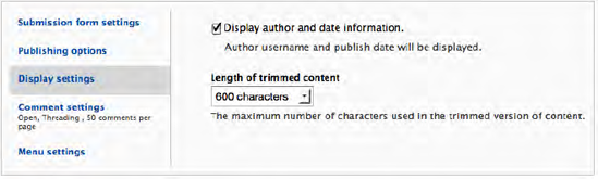
The next set of options is for display settings. Click on the "Display settings" tab in the left column to reveal the options that are available with this configuration parameter (see Figure 10-5). You can set whether Drupal should display the name of the author who created the Event content item and the date that the item was authored. Let's say in our case we don't feel that having the author and date published is relevant, so we'll uncheck that box. You may, depending on the type of content being authored, decide that it is important to display the author's name and the date that the content was published. If so, leave the box checked. The second option is to set the length of trimmed posts. Drupal uses the Teaser and Full Node views. Teasers are often used as an introduction to an article. When clicked on, the full version of the article (the Full Node view) is revealed. Teasers are a good way to keep the length of your pages with multiple content items to a reasonable size, and this feature allows you to set how many characters will be displayed in "teaser" mode before a "Read more" link is displayed. For demonstration purposes, we'll leave ours set to the default value of 600.
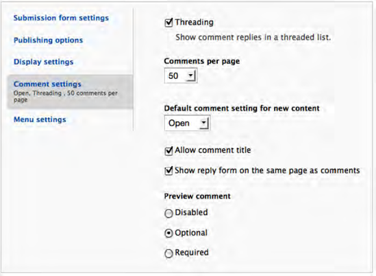
The next set of parameters deals with how comments are handled for content items created using your content type (see Figure 10-6).
Threading defines how comments are displayed on the page. Threaded comments allow a visitor to respond to another visitor's comment, where their response will appear immediately below the comment they responded to. If you do not select this option, comments are simply listed in the order they were posted. The advantage of threading is that it makes it easier to decipher what the person is responding to (for example, are they responding to the original content or are they responding to another person's comments).
Let's leave the default value of 50, but you may want to decrease that number. The default comment settings for new content allow you to define how comments are handled. The default option is open, meaning that a new content item created using this template will accept new comments. Selecting Closed means that the content will no longer accept comments. Selecting Hidden means that the content will not accept comments, and any existing comments will be hidden from display. The primary difference is that Closed will still display the comment headings below the content, but Hidden hides everything to do with comments from display. We'll select Hidden, as we don't want visitors to have the ability to submit comments about event content.
The "Allow comment title" option allows visitors to enter a title in addition to the body of their comment. You may wish to allow this so people can give a clue as to what their comment says without having to read the whole comment. For example, a title that reads "I loved it" indicates that the body of the comment is from someone who liked your content.
The "Show reply form on the same page as comments" setting means that the form for entering comments is visible on the page at all times. If you uncheck this box, the user will have to click on a link to see the form for entering comments. Generally speaking, most sites do not automatically show the comment box on the page, as it tends to clutter the design.
The "Preview comment" option specifies whether the author of the comment has to preview their comment before it can be published. Disabled means that the user does not have to preview their comment before it is posted, and in fact the option for previewing will not be displayed. Optional means that the user may preview their comments if they wish, but it is not required, and Required means that the user must preview their comment before they publish it.
The final set of parameters defines the menu options that are presented to the author. Click on the "Menu settings" tab to reveal the menu parameters (see Figure 10-7). The list of available menus controls which menus appear as available to assign a new content item to when an author wants to create a menu item for their content item. In the example in Figure 10-7, the only menu that will appear as available is the Main menu. You can uncheck Main to hide all menus from the list that may be selected from, or you can check more than one menu to allow the author to choose from multiple menus. The default parent item option allows you to set which menu is automatically selected when the Menu settings page is displayed when an author creates a new content item from your new content type.
For our example, leave the default values and click Save.

Drupal now redisplays the main Content Type page with your new Event content type listed as one of the options (see Figure 10-8).

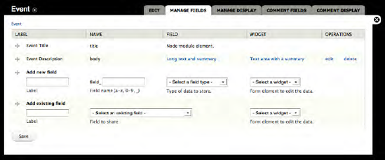
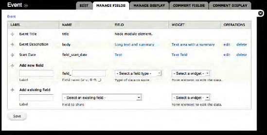
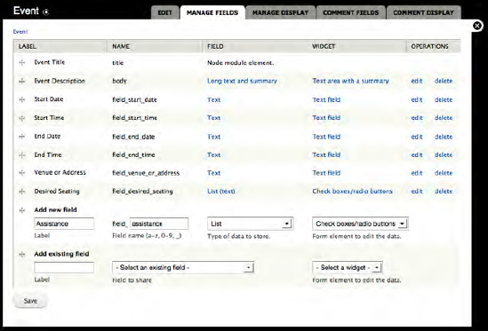
At this point we could create a new content item using our Event content type. However, the Event content type only has an Event Title and an Event Description field. Our requirements call for a start date, start time, end date, end time, venue/address, a picture, a price, and a link to the registration form. To add these fields, click on "Manage fields." You'll see the screenshot shown in Figure 10-9, in which our Event Title and Event Description fields appear in the list of fields that already exist, as well as a row for adding a new field and a row for adding a field that already exists to our content type (for example, you may have created a Start Date field for another content type, which you can reuse on your Event content type instead of having to create a new field).
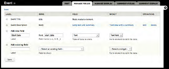
We'll start with the Start Date field and add that as the first field after the description field. Enter Start Date in the label field, enter "event_start_date" in the field name (this is the internal name that Drupal uses to identify this field), select Text as the field type, and "Text field" as the widget that we will use to collect the information from the user (see Figure 10-10).
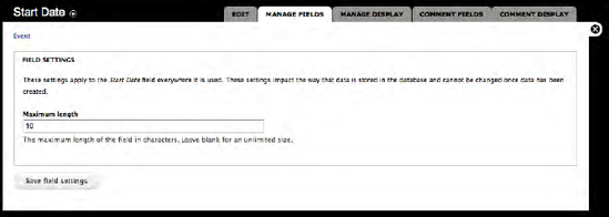
Click Save and you'll see the screen shown in Figure 10-11. The "Maximum length" field defines the maximum number of characters that an author can enter into this field. Because our field is date related, we'll ask the user to enter the date in mm/dd/yyyy format. Using this format, the maximum number of characters that they should be able to enter is 2 (for month) + 1 (for the slash) + 2 (for day) + 1 (for the slash) + 4 (for year) = 10. So we will set the maximum length to 10 instead of 255 (the default value). Next click "Save field settings."
The next form that Drupal displays (shown in Figure 10-12) enables you to set additional detailed parameters for the event start date field. On this form you have the ability to:
Change the label that we previously defined for this field. Unless you made a mistake or changed your mind, you can leave the value as it is shown.
Define whether this field is required. A required field is displayed with a red asterisk, and Drupal forces the user to enter a value in this field before it can be saved. Because our content type is about an Event and dates are important attributes of an Event, you want a date to be required. The size of the text field is used to define how wide the text field is on the screen, and does not affect the number of characters that the user can enter (which is the value we set on the previous page). For our Event type, we can shorten the length, as we only allow the user to enter 10 characters. Changing the length to 15 provides enough room to enter a full date with a little extra space.
Text processing allows you to set whether the user input will be treated as plain text (meaning that any HTML tags entered by the user in this field will be ignored when the value is rendered on the screen) or filtered text (meaning that HTML tags will be rendered). Because our field is dealing with a date, users should not have the ability to enter an HTML tag, so we will leave the value of plain text.
The content that you enter in the Help text field will be displayed beneath the text field on the screen. This is a great place to describe requirements for data that will be entered in this field, such as requesting that authors enter dates as mm/dd/yyyy. This is an optional field.
The Default Value field provides the ability to pre-fill the field with a default value before the content creation screen is displayed to the author. Because our field deals with dates in the future, providing a default value doesn't make sense. There may be cases for other fields where a default value does make sense, such as selecting a seating preference for the event: you may wish to set a default value to "best available." In those cases, this is the place where you would enter the default value.
The "Number of Values" field provides the ability for the author to dynamically create additional values for this field beyond the first one that is shown on the screen. You might use this feature for fields such as uploading a picture. You might want to provide the user with the ability to attach more than one picture to a piece of content, but you're not sure how many pictures they may want to attach. Setting the value to something greater than 1 results in an "Add another" link appearing below the field. If the author clicks on the "Add another" link, Drupal dynamically adds another field where the author can attach another picture, and they can keep adding another field for attaching another picture until they reach the limit that you set for this field. If the value is set to 1, then the user can only create one instance of this field. Because, by definition, our Events can only start on a single date, we'll leave the value at 1.
We also have the ability to change the maximum number of characters that the author can enter into this field. We already set the value in the previous screen, but have the opportunity to fix a mistake or change our mind by changing the value in this field. Because the lengths of dates haven't changed since we entered the value on the previous screen, we'll leave the value at 10.

We are now ready to click Save to add the field to our content type. Drupal then redisplays the general parameters screen for our content type.
If you click on the Manage Fields tab at the top of the page, you'll see that our new field now appears in the list, just below the Event Description field (see Figure 10-13).
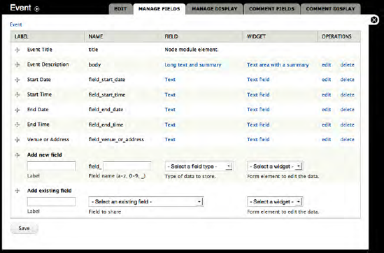
We are now ready to add the other fields that we defined earlier: the start time, the end date, the end time, and the venue/address. The process for adding the other fields is identical to what we just completed for the start date. Follow the same steps for the other fields, using the appropriate values for label, help text, maximum length, and text field length. When you're complete, your list of fields should look similar to Figure 10-14.
Our Event content type is now ready for authors to use. To try your new content type, click on the "Add content" link in the gray menu bar, revealing the list of content types that we have available on our site.
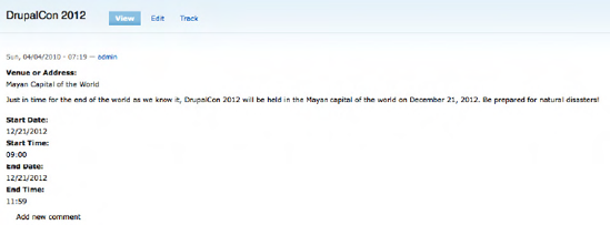
Our Event content type appears in the list of available content types. Click on Event to reveal the content creation page for our Event content type (see Figure 10-15). The page shows the Event Title, Event Description, Start Date, Start Time, End Date, End Time, and Venue fields.

Create a sample event using the event creation form. When you've finished entering values, click Save. Drupal will render your new Event content item using the values you specified. The example Event entered on the form in Figure 10-15 appears as a new Event in Figure 10-16.
In our Event content type, we created a set of text fields for authors to enter values for date, time, and venue. There may be instances where a text field is less effective than using something like:
Radio buttons: Great for providing a list of options to the author and only allowing the selection of a single item from the list.
Check boxes: Perfect for providing a list of options to the author, allowing selection of one or more items in the list.
Select lists: Great for long lists of items to select from, for example all of the countries in the world.
File uploads: The right field to use when you want to provide the ability to upload and attach a file to a piece of content.
Text areas (a box with multiple lines): The right field when the author is expected to enter paragraphs of content.
Numeric fields: Perfect when you want the author to only enter numbers.
The field types listed here are part of Drupal 7 core. There are other custom field types that are available as contributed modules (such as a date field that provides a pop-up calendar, allowing the author to select a date from a calendar instead of entering the date by hand). For a list of those modules please visit www.drupal.org/project/modules and click on the Custom Content Type link in the right column list of module categories. You'll find a long list of add-on modules that provide value-added capabilities, like other field types. You can install additional modules by following the process that we described in Chapter 8.
It is likely that you will come across the need to use one of the other field types as you create new content types. We will expand on our Event content type by adding several additional fields using other types of fields.
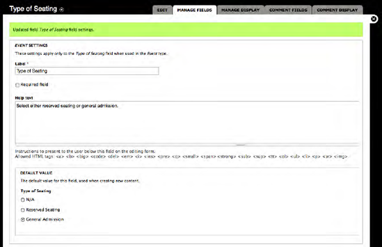
Radio buttons are useful when you want to present the author with a list of values from which they can select only a single item (check boxes are used when you want the author to have the ability to select one or more values). We will expand our Event content type to include the ability to select the type of seating that will be available at the event: either reserved seating or general admission. To start the process, click on the Structure link at the top of the page, followed by the Content type link on the Structure page and the "Manage fields" link for the Event content type. Figure 10-17 shows the values that you will want to enter to create the Type of Seating field.
Clicking Save takes us to the second configuration screen for check boxes and radio buttons. On this screen we have to specify the allowed values list, which are the options that will be presented to the author. Drupal requires that options be listed as a "key|label" pair, where "key" is a number representing which option that was selected (the numeric value will be stored in the database), followed by the "pipe" character (press the shift key and to enter a pipe character), and "label" is the value that will be displayed on the screen. In the example in Figure 10-18, I used 1|Reserved Seating and 2|General Admission, resulting in the values of 1 or 2 being stored in the database.

After entering all of the options, click Save to reveal the final configuration page for this field (shown in Figure 10-19). On this form we can:
Mark the field as required.
Create help text.
Set the default option that will be selected by default when the page is rendered.
Set the number of values that can be selected from the list. A value of 1 makes the list render as radio buttons, a value of more than 2 renders the list as check boxes.
Change the list of values from what we created on the previous screen.
Enter help text that will help the visitor understand what this field is about and set the General Admission option as the default value that will be selected automatically when the create new event page is displayed.
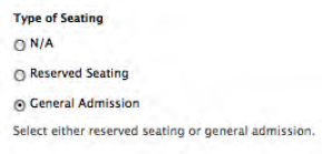
After updating the appropriate values and clicking the Save button, the field is now ready for use. Our radio buttons are shown in Figure 10-20.
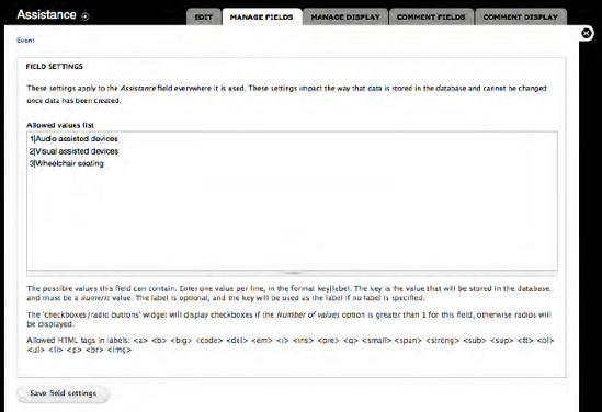
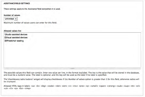
Check boxes are similar to radio buttons with the one exception: the author can select more than one value from the list. We will now expand on our events content type by adding a list of check boxes that address special accommodations available at this event for attendees with disabilities. We will create check boxes that specify whether audio-assisted devices, visual-assisted devices, and wheelchair seating is available for this event. To define the list of check boxes, return to the Event content type's manage fields page and enter the label (Assistance) and name (assistance), select List from the list of field types, and "Check boxes/radio buttons" from the widget lists (see Figure 10-21).
After clicking Save, enter the values for the three options, as shown in Figure 10-22.
The final step in the process is to change the "Number of values" field on the Event settings page. Changing the number of values to any value other than 1 instructs Drupal to render the list as check boxes instead of radio buttons. For our example, we'll allow the visitor to check all of the options, so set the value to Unlimited (see Figure 10-23).
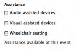
After updating, at minimum, the "Number of values" field, click Save. The example above will then appear on the content creation form for our content type as a list of check boxes (see Figure 10-24).
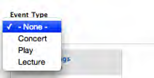
Select lists are often called drop-down lists. To demonstrate select lists, let's create a new field for the Event content type that lists whether the event is a concert, a play, or a lecture. Creating a select list is similar to the previous field types. On the manage fields page for the Event content type, enter "Type of Event" in the Label field, type_of_event in the field name field, choose Select as the type of data to store, and Select as the form element to display. After setting these values click the Save button to proceed with the definition of your new select list field.
On the next screen, as in previous examples, enter the list of values that you want to present to the author as a key|label pair, where the key is a numeric value and the label is the text that is displayed in the select list. For values enter 1|Concert, 2|Play, and 3|Lecture. After entering the list of values, one per line, click Save.
On the final configuration screen, set the default value to 1, as an event can only be one of the types listed in the select list. Click Save after you have set any values that you wish to change on the form. You are now ready to use your new select list field. Figure 10-25 shows what the select list defined in the steps above looks like on a when creating a new event.
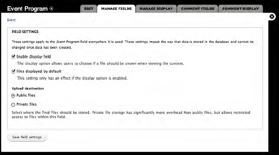
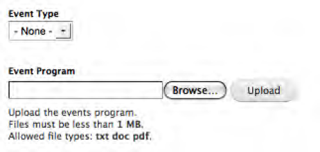
The "File upload" field type presents a file browser button that allows an author to browse their local computer for a file to upload to Drupal and attach to the content item that they are creating. Creating a "File upload" field is nearly identical to the steps for other field types. We will expand our Event content type to include the ability to attach the program for the event. As with previous fields, navigate to the Event content type's manage fields page and enter Event Program in the label field, event_program for the field name, select File as the type of data to store, and File as the form element to display.
After setting the values on the form, click Save. You will see the form shown in Figure 10-26. On this form, you can set parameters that define whether the field should be displayed, whether a link to the file should be displayed when a visitor views the content type, and the destination directory where the uploaded files will be stored. Check the "Enable display" option by checking the box, and the "File displayed by default" option. For most purposes, using the "Public files" directory is appropriate, unless the files are sensitive in nature and should be secured, in which case you would select the "Private files" directory (a case where you might want to use Private instead of Public is if you were providing a content type for the human resources department to collect data from field locations, where the field locations attach spreadsheets to the content item they are creating and that spreadsheet contains sensitive employee information). Once the values on this form have been set, click Save.
After clicking Save, the final configuration screen is displayed (see Figure 10-27). On this form are three fields that you will want to focus on: the Help text that explains what this field is used for (Upload the events program), the Allowed field extensions (in our case we'll allow an author to upload a file with either a txt, doc, or pdf file extension), and the "Maximum upload size" (for our example we'll allow files up to 1MB to be attached to the event). Once you've updated the values, click on the Save button at the bottom of the form.

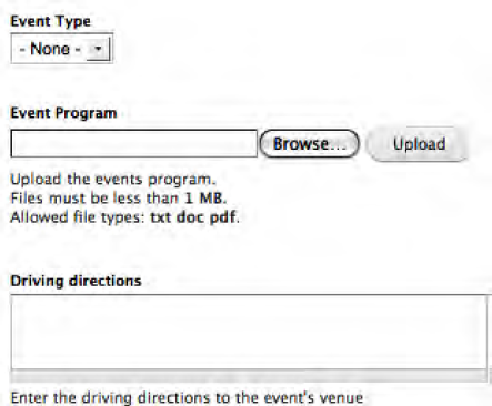
Figure 10-28 shows the new file upload field on the event creation form.
There will likely be scenarios where you want to provide a field on a content creation form where an author can enter a paragraph or more of text. While you could provide this capability through a text field (a single line text entry box), the more acceptable and standard way is to provide a text area. Extending our event example, let's add a new field that will be used to capture driving directions to the venue. To create a text area, follow the same steps as we used to create other fields. Enter "Driving directions" in the label field and driving_directions in the field name, select "Long text" as the field type, and "Text area" as the widget you will use to collect the content from the author.
After setting the values on the form above, click the Save button to continue to the next screen in the configuration process. This form provides you with the option to specify the maximum length of the content that can be entered into the text box. For demonstration purposes, we'll leave the value blank, an unlimited number of characters, and will continue with the configuration process by clicking on the Save button, revealing the final screen in the configuration process for this field type (see Figure 10-29). On this page, the key values to set for a text area are the Rows and Help text. The value you enter for rows determines how tall the text area will be when rendered on the screen. The default value is 5, which will render a text area the same height as the Help text field shown in Figure 10-29. For the example, leave the value set to 5 and enter Help text (for example, "Enter driving directions to the event's venue").

After setting the appropriate values and clicking the Save button, the text area field is ready to use. Try creating a new event and you'll see the new text area where you can enter driving directions (see Figure 10-30).
By walking through the various field types listed previously you can see that there is a pattern and a common set of parameters for nearly every field type we created. A numeric field is essentially a text field, but restricted automatically by Drupal so that it will only accept numeric characters (0–9). As you expand on the types of fields that you can create by downloading and enabling contributed Content Construction Kit (CCK) modules, you will find slight variations in the process due to the structure of the fields you are creating. However, the overall process will be the same. If you haven't done so, now is the perfect time to browse the list of CCK modules that are available to extend the capabilities of what is available in Drupal 7 core. Visit http://drupal.org/project/modules and click on the Content Construction Kit link in the right column. When you browse, make sure that you're focusing on CCK modules that are built for Drupal 7, as many of the capabilities inherent in CCK are now part of Drupal core, whereas prior to Drupal 7 you had to download an install CCK to do what we just accomplished using Drupal out of the box. To narrow the list to only Drupal 7, click on the "Filter by compatibility" link for Drupal 7 in the right column.
There will be times when the visual representation of your new content type doesn't fit with how you would like the content created with your new content type to be rendered on the screen.
Adjusting the order and positioning of the labels in relation to the field can be accomplished by clicking on the "Manage layout" link for the desired content type. To access this feature, click on the Structure link at the top of the page and then click on the "Content type" link on the Structure page. To access the layout feature, click on the "Manage display" link for the content type you wish to modify.
We will use our Event content type to demonstrate the capabilities. Clicking on "Manage display" reveals the page shown in Figure 10-32.
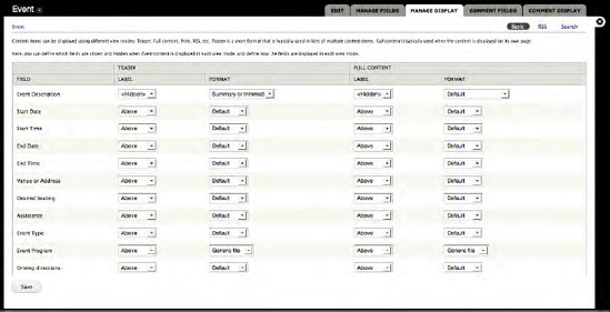
This page lists all of the fields that are associated with our content type, and provides the ability to define basic display attributes for the label and content for each of the fields. There are two sets of values that we can set: one for the Teaser view and the Full Node view.
If you click on the select list for Labels, you will find that there are three options:
Above: The label will be displayed on a line immediately above the widget that you selected for your field.
Inline: The label will be displayed to the left of your widget, on the same line as the widget.
Hidden: The label will not be displayed on the screen.
If you click on the select list for the Format of each field, you will see that there are four options:
Default: The content will be rendered on the screen as you specified when you created the field.
Plain text: The content will be rendered as plain text, ignoring any HTML characters the author entered as part of the content.
Trimmed: The content will be "trimmed" to a specified number of characters. If the content is longer than the specified characters, a "Read more" link will be displayed.
Hidden: The content will not appear on the screen.
If you need to change the order of the fields and how they appear, you can do so by dragging and rearranging the fields on the "Manage fields" page for your content type. You can access this page by clicking on the Structure link at the top of the page, clicking on the "Content types" link on the Structure page, and the "Manage fields" link on the "Content types" page. Clicking through to the "Manage fields" page should reveal a page that looks like Figure 10-33.

To reposition a field click and hold the plus (+) sign next to the field label of the item you wish to move, drag the field to the position where you want it to appear, and release your mouse button. Remember to click the Save button after you have moved all of the fields to their proper position.
Content types is one of the "killer app" aspects of Drupal, and is an important concept to understand. While you could construct a Drupal site with just the Basic page and Article content types, it is likely that you'll want to leverage the features and functions provided through the use of custom content types. In this chapter I demonstrated just one of the custom content types that I create for nearly every site that I build for my clients. Other custom content types that I frequently use include customers, products, departments, FAQs, locations, and employees. As you design and develop your new site, I'm sure you'll identify one or more custom content types.
Another powerful feature of custom content types is the ability to develop custom reports or "views" of custom content type data that is stored in the Drupal database. If you think about the Event content type we created in this chapter, it might be valuable to generate a list of events sorted by the start date and time, or a list sorted by venue. Drupal's Views module is a relatively easy to use mechanism for generating lists. In Chapter 11 I will demonstrate how easy it is to generate lists.