Chapter 5. Developing Your Web App
Putting a UI Together
Navigation
Using arrow keys or a D-pad for navigation is an essential part of the Google TV 10-foot experience. While it may seem straightforward at first, it can be complex to implement effective and flexible D-pad navigation for a web page. We’ll start with a simple example of a regular grid of fixed navigable items, add a lefthand navigation bar, and then items along the top of the page for meta-tasks like login.
Tip
You can use straight up JavaScript to code a web app, but we’ve found that the jQuery library enables effective and efficient JavaScript coding that can significantly reduce development time. You can learn more about jQuery at http://jquery.com.
A Regular Grid
Navigating a central section of a page with the arrow keys, which may be a regular grid (Figure 5-1), can be as simple as moving between adjacent items (left/right) and adjacent rows (up/down).

For flexibility, we’ll define our content as follows:
<div class="container">
  <div class="item-row">
    <div class="item-div">
      <p class="item"></p>
    </div>
    <div class="item-div">
      <p class="item"></p>
    </div>
    <div class="item-div">
      <p class="item"></p>
    </div>
  </div>
  <div class="item-row">
    <div class="item-div">
      <p class="item"></p>
    </div>
    <div class="item-div">
      <p class="item"></p>
    </div>
  </div>
</div>
The items we select are of class item held in
their columns by parents item-div, which are in turn
held in rows by their item-row class parents.
In jQuery, we can set the selection to the first item in the grid with:
var selected = $.find('.item').first();If the user presses the right arrow key, we can move to the
item to the right by going to the next element of class
item-div in the row:
var newSelected = selected.parent().next('.item-div').find('.item'),Note that we don’t want to immediately overwrite
selected with this next item. If we’re at the rightmost
item-div in the row, then newSelected here
will select zero elements in the DOM. We check that case:
if (newSelected.length != 0)
  moveSelection(newSelected);
The moveSelected function here will remove the
CSS class that highlights the item from the old selected item, add
it to the newly selected item, and then set the selection.
function moveSelected(newSelected) {
  if (selected) {
    selected.removeClass('highlight'),
  }
  newSelected.addClass('highlight'),
}
If the user presses the down arrow, we want to select the item
on the row below. We’ll assume for now that we want to remain in the
same column (that is, move vertically only, not return to the first
item in the row). This means we need to find the
item-div in the next row in the same vertical position.
There are a number of ways to accomplish this: we can perform a
search of the next row using the extents of the item on the page, we
can keep track of our index into the row, or we can attach a column
number to each item in the row representing the column
number.
For now, we’ll assume that we’ve used
jQuery.data() to attach a column number to each item.
We’ll iterate over each row and then over each item in the row,
assigning index numbers:
$.find('item-row').each(function() {
  $(this).find('.item').each(function(index) {
    $(this).data('index', index);
  }
}
Now we can move to the next row:
var newSelected;
var selectedIndex = selected.data('index'),
var nextRow = selected.parents('.item-row').next();
if (nextRow.length) {
  while (selectedIndex >= 0 && (!newSelected || newSelected.length == 0)) {
    newSelected = nextRow.find('.item-div').eq(selectedIndex).find('.item'),
    selectedIndex -= 1;
  }
}
if (newSelected && newSelected.length > 0)
  moveSelected(newSelected);
Notice that we use a loop to select the next item in the row below. It’s possible that the next row has fewer items in it. For example, if we’re on index 2 (third item) on the first row, and we move down to the second row, which has only two items, we want the selection to “snap” to the second item.
Now we have to call this code from our “keydown” event listener, using logic like this:
$(document).bind('keydown', function(e) {
  switch e.keyCode {
    case 37:  // left
      break;
    case 38:  // up
      break;
    case 39:  // right
      break;
    case 40:  // down
      break;
  }
});
This code (plus handling for left and up, which are mirror
operations of right and down) will allow the user to navigate around
a grid of items on a page. A good way to start to do this is to add
a key code listener for the ENTER
key (which has key code 13), and then handle the
keydown event on this key as if the user had clicked on that
item.
But we want our users to be able to access every clickable control on the page with our keyboard navigation code; unless the only thing we have on our page is a set of items arranged in a grid, we have more work to do. We want our users to be able to move other parts of the page, such as to a left navigation pane or to a login button on the page header.
Nearest Neighbor Navigation
This code relies on having the elements on the page indexed so that it can maintain the column position when navigating between rows. However, we might also choose to look through items in the DOM, calculate their position and distance from the current item and, taking into account the direction of movement, choose the next nearest item to select.
This approach has advantages: it doesn’t require us to index the items, and if the items float around the page into different positions, our navigation code still works because it depends on the actual position of the element instead of its “expected” position in a row and column.
There are disadvantages as well: when moving between elements of different sizes, going back and forth between them might not produce repeatable results. For instance, in the layout in Figure 5-2, A is the selected item. Pressing the right arrow will choose “C” (Figure 5-3) because it is the nearest element to the right. And then pressing the left arrow will choose “B” (Figure 5-4) because it is the nearest element to the left.


The algorithm for finding the nearest element starts by
selecting all items in the container with the .item
class. Then it iterates through each item (skipping the selected
item), looking for the item with the shortest Euclidean distance
from the selected item.
Mouse and Keyboard
While many users will move the selection around with only the keyboard, many will use the mouse or a combination of the two.
The best way to handle this is to implement a
mouseenter event listener on every selectable item and move the selection
to the item when its entered:
var items = $.find('.item'),
items.bind('mouseenter', function() {
  moveSelected($(this));
}
Similarly, you’ll want to bind the click event to
these items such that pressing enter and clicking perform the same
action.
Full-Page Navigation
Full-page navigation requires that one selection be maintained across the entire page so that it’s clear to the user what action would be taken were they to press OK or ENTER.
This sort of behavior can be easy to accomplish on pages with few controls. In most designs, however, a page often naturally segments into multiple logical sections. For instance, a page might have a menu on the side allowing the user to navigate to different areas of a site. The center of the page contains the main navigable content. Across the top of the page might be buttons for user login, settings, etc.
Segmented Pages
It’s often convenient to segment these parts of the page into separate objects to encapsulate the functionality, as is generally the case for pages populated with reusable UI components.
Having each component manage keyboard input events and navigation between its elements is still possible, although this approach results in several handlers being called for every key and mouse event they manage, and that behavior can cause performance problems if not coded carefully.
More critically, if the controls handle navigation independently, they still need a way to make sure that there is only one highlighted item on the page. This would require a hand-off protocol for the selection between the controls, which can quickly become complicated.
Unified Navigation
A unified navigation system for the page is an approach that can address this problem. It has the benefit of being able to own the highlight for the page, and avoids having each control handling a hand-off protocol or becoming complicated with common navigation tasks and event handling.
For a unified controller to work, each control has be registered with it. Controls designed with unified system in mind can participate directly. However, reusing existing controls requires a system that can register controls on their behalf.
One approach to this is to create a key navigation system that treats all page elements in a particular container (e.g., a DIV) as part of a control, and recognizes items in that container with a CSS class as participating in the navigation system.
Input Controls
Input controls, such as text input boxes, present specific challenges to key navigation. When on a page, the user needs to be able to navigate to these controls and give them focus (for example, by moving the highlight to them and pressing OK or ENTER). Once these controls have focus, the user has to be able to navigate within the control, perhaps using the left and right arrows to move the cursor inside a text input box. This has to happen without the highlight moving to other elements of the page. Finally, the user needs to be able to use the keyboard to blur the control and resume moving the highlight to other elements of the page.
Handling Special Keys
The Google TV keyboard contains a few keys that are prominent in the everyday browsing experience of the user. These include the media keys (play, pause, fast-forward, rewind, skip forward, skip back) and the back key.
Media Keys
The media keys are prominently placed on the Google TV controllers, and users will naturally expect these keys to be functional while watching video or listening to music in the 10-foot environment. Implementing support for these keys is a matter of configuring an onkeydown event handler.
window.addEventListener('keydown', function(e) {
  switch e.keyCode {
    case 176:
      // Skip forward
      break;
    case 177:
      // Skip back
      break;
    case 178:
      // Stop
      break;
    case 179:
      // Play/Pause
      break;
    case 227:
      // Fast forward
      break;
    case 228:
      // Rewind
      break;
  }
});
The Back Key
In the Chrome browser on Google TV, the back key is interpreted as a page navigation to the previous page in the browsing history. As such, the browser does not pass on the key press, so it is not captured by any JavaScript key events.
For websites that change state by using script to manipulate the DOM instead of browsing to distinct page URLs, this presents a challenge. Since these sites don’t automatically generate any browser history when their state changes, browsing to the previous URL in the user’s history would result in her leaving the site; worse, if the site is the only entry in her history, she would be returned to the Google TV home page.
This issue can be addressed by using the hash component of the browser location. This approach is not difficult, and is used by many non-Google TV sites that face this challenge.
The mechanics of the approach are simplified by the addition, in HTML5, of the onhashchange event, which is fired whenever the hash part of the location changes. (Previously, detecting the hash change required a timed polling loop.)
The following code implements a simple page that adds to the browser history by adding a location hash as the state changes. It then handles the onhashchange event and uses it to return the page to the appropriate state. Figure 5-5 illustrates how the first page in the following code example will render.

<html>
  <head>
    <style type="text/css">
      #page {
        -webkit-transition: opacity 1s ease-out;
        font-size: 24pt;
      }
      #next {
        visibility: hidden;
        outline: 6px solid #0e0;
        font-size: 20pt;
      }
    </style>
    <script type="text/javascript">
      var states = [
        'First page. Choose Next Page to advance.',
        'Second page. You can go on from here, or press the back key.',
        'Last page. Use the back key to go back.'
      ];

      var currentPage = 0;

      window.addEventListener('load', function() {
        // Handle the ENTER key and click event on the Next Page button.
        window.addEventListener('keydown', function(e) {
          // ENTER key
          if (e.keyCode == '13') {
            handleNext(e);
          }
        });
        var nextButton = document.getElementById('next'),
        nextButton.addEventListener('click', handleNext);

        // Add a listener function to be called when the opacity fade
        // transition on the page element completes.
        var pagePara = document.getElementById('page'),
        pagePara.addEventListener('webkitTransitionEnd', textFadeDone);

        // Add the all-important hashchange event to tell us when the user
        // pressed the back key.
        window.addEventListener('hashchange', handleBack);


        showPage(0);
      });

      function handleNext() {
        showPage(currentPage + 1);
      }

      function handleBack() {
        // Parse the hash string for the page number
        var newPage = parseInt(location.hash.substring(1)) || 0;
        if (newPage == currentPage) {
          // If the hash page matches the current page, just return.
          // This prevents showPage from being called recursively when we
          // change the hash.
          return;
        }
        showPage(newPage);
      }

      function textFadeDone() {
        var pagePara = document.getElementById('page'),
        pagePara.innerHTML = states[currentPage];
        pagePara.style.opacity = 1;

        var nextButton = document.getElementById('next'),
        if (currentPage < states.length - 1) {
          nextButton.style.visibility = 'visible';
        }
      }

      function showPage(newPage) {
        if (newPage < 0 || newPage >= states.length) {
          return;
        }
        currentPage = newPage;

        var pagePara = document.getElementById('page'),
        pagePara.style.opacity = 0;

        var nextButton = document.getElementById('next'),
        if (currentPage == states.length - 1) {
          nextButton.style.visibility = 'hidden';
        }

        if (currentPage) {
          location.hash = currentPage + '';
        } else {
          location.hash = '';
        }
      }

    </script>
  </head>
  <body>
    <div>
      <p id="page"></p>
      <button id="next" type="button">Next Page</button>
    </div>
  </body>
</html>
Controls
We’ll use the term “controls” to refer to any collection of elements under a common container that act together to provide a particular user experience. Controls often are encapsulated, reusable components and may be entirely from declarative HTML5/CSS3, entirely created at runtime in script, or some combination of the two.
This section discusses several control types that are common to 10-foot UI design and provides some sample implementations in HTML5/CSS3/JavaScript. The same logic can be adapted for Flash and Actionscript.
Menu Bars
For most pages on a 10-foot UI, the content is the star of the show. Even so, the user needs a way to navigate around the site, access different content, change settings, and interact with the web app.
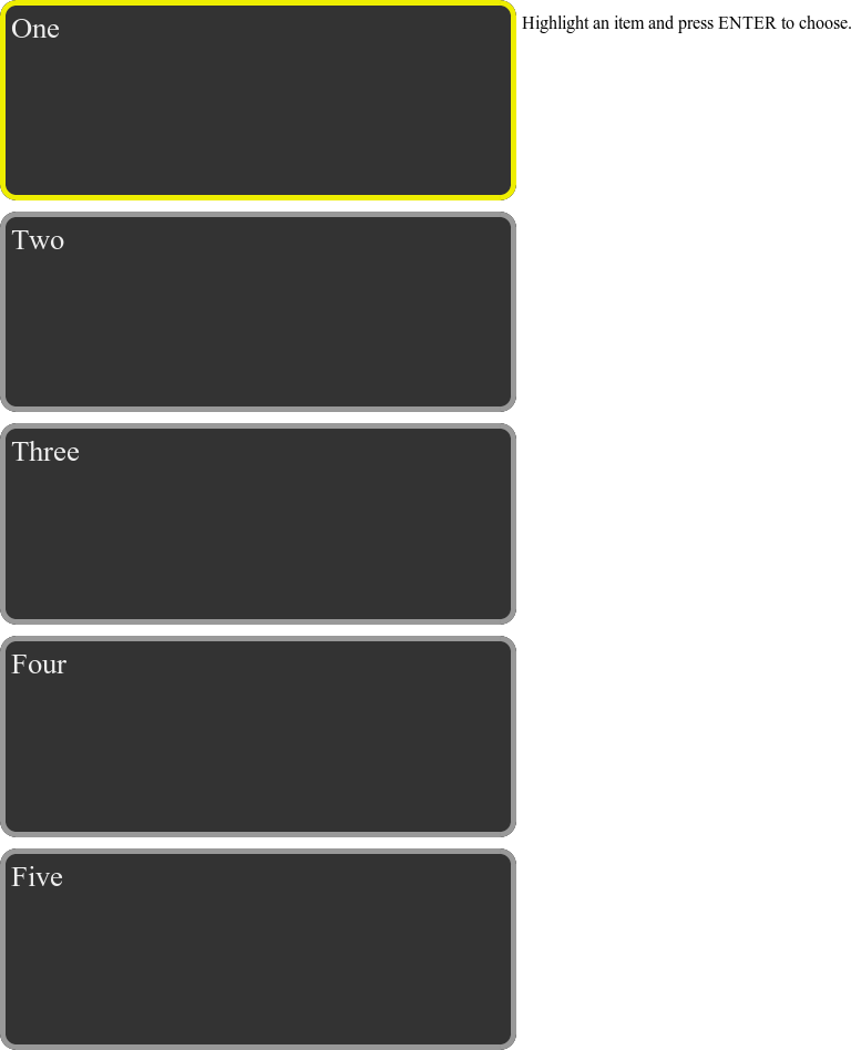
A common design approach to accomodate this need is the use of a navigation bar on the page. The navigation bar might contain thumbnails, descriptions of categories or subsections, or other appropriate filters. The user needs to be able reach the menu bar using the D-pad, choose an item, and then move back to the content.
The following sample code builds a static left-side menu (Figure 5-6) that can be navigated with the D-pad. This sample uses the CSS3 Flexible Box to arrange the menu items vertically on the page. It automatically positions and scales the child elements, considerably simplifying the CSS required to describe the menu.
<html>
  <head>
    <style type="text/css">
      html, body {
        height: 100%;
        overflow: hidden;
      }
      div.scroll-container > div {
        -webkit-box-flex: 1;
        background-color: #333;
        color: #eee;
        font-size: 20pt;
        margin: 5px;
        padding: 5px;
        border: 5px solid #999;
        border-radius: 15px;
      }
      div.scroll-container {
        display: -webkit-box;
        -webkit-box-orient: vertical;
        float: left;
        position: relative;
        height: 80%;
        width: 25%;
      }
      .item-highlight {
        border-color: #ee0 !important;
      }
      .item-chosen {
        background-color: #099 !important;
      }
    </style>

    <script type="text/javascript">
      var highlightItem = 0;
      var chosenItem;

      window.addEventListener('load', function() {
        document.addEventListener('keydown', function(e) {
          var dir;
          if (e.keyCode == 38) {
            // Left arrow key
            dir = -1;
          } else if (e.keyCode == 40) {
            // Right arrow key
            dir = 1;
          } else if (e.keyCode == 13) {
            // User pressed ENTER
            var content = document.getElementById('content'),
            var items =
                document.querySelectorAll('div.scroll-container > div'),
            content.innerHTML = "You chose item "
                + items[highlightItem].innerHTML;
            if (chosenItem != undefined) {
              items[chosenItem].className =
                  items[chosenItem].className.replace(/s*item-chosens*/g, ''),
            }
            chosenItem = highlightItem;
            items[chosenItem].className += ' item-chosen';
          }

          if (dir) {
            moveSelection(dir);
          }
        });
        moveSelection(0);
      });

      function moveSelection(dir) {
        // Get an array of all items in the list.
        var items =
            document.querySelectorAll('div.scroll-container > div'),
        if (highlightItem + dir < 0 || highlightItem + dir >= items.length) {
          // Prevent movement from going off either end of the list of items.
          return;
        }
        // Unhighlight the currently highlighted item.
        items[highlightItem].className =
            items[highlightItem].className.replace(/s*item-highlights*/, ''),

        // Move to the next item in the requested direction.
        highlightItem += dir;

        // Highlight the new item.
        var item = items[highlightItem];
        item.className += ' item-highlight';
      }
    </script>
  </head>

  <body>
    <div class="scroll-container">
      <div>One</div>
      <div>Two</div>
      <div>Three</div>
      <div>Four</div>
      <div>Five</div>
    </div>
    <div>
      <p id="content">Highlight an item and press ENTER to choose.</p>
    </div>
  </body>
</html>
Paging Content
Horizontal Scrolling
Horizontal scrolling lists of items are a fairly common approach to providing large lists of items in a format that can be easily navigated using the D-pad (Figure 5-7). The user moves the left/right arrow keys to change the highlight in the list, and the list scrolls to make sure that the highlighted item is visible. Generally, the scrolling is done with a transition to provide a visual cue to what movement is happening.

At the ends of the list, the designer may wish to wrap to the other end (again, transitions provide a visual cue to what is going on). Items in the list might scroll off the page at the right end, or the last item in the list might be anchored to the right side of the page.
There are a number of approaches to maintaining the highlight. The highlight can move freely in the list, only causing it to scroll when the sides of the page are reached, or it might stay in one place (e.g., the visual middle of the page) and the list might scroll underneath it.
The code that follows demonstrates a straightforward implementation of a horizonal scrolling list. Left and right arrow keys move the highlight through the items. The highlighted item is always the leftmost item on the page.
The horizontal list is set up using a few important CSS property settings:
Each item is displayed in an element using
display:
            inline-block
, which preserves the block properties of the DIV while providing inline arrangement.The item container uses
-webkit-transition: 1s left
            ease-in-out
to make sure that container movement smoothly animates when the CSS left property is changed.The inline-block setting on the contained elements would normally cause the container to insert a visual placeholder between each element. Since this placeholder is not a measurable value of each element, it’s difficult to compute scroll distance. Setting
font-size: 0px;eliminates this placeholder spacing.Finally, it sets
white-space: nowrapto prevent the elements in the container (which are being laid out as inline elements because of inline-block) from wrapping at the window boundary as they normally would.The overall container uses
overflow: hiddento make sure that elements that won’t fit in the window will be clipped at its boundaries. Without this, the browser would create a scrollbar for the window.
<html>
  <head>
    <style type="text/css">
      div.scroll-container > div > div {
        display: inline-block;
        background-color: #333;
        color: #eee;
        width: 100px;
        height: 100px;
        padding: 5px;
        font-size: 16px;
        border: 5px solid #eee;
      }
      div.scroll-container > div {
        position: relative;
        -webkit-transition: 1s left ease-in-out;
        font-size: 0px;
        white-space: nowrap;
      }
      div.scroll-container {
        overflow: hidden;
      }
      .item-highlight {
        border-color: #0e0 !important;
      }
    </style>

    <script type="text/javascript">
      var highlightItem = 0;

      window.addEventListener('load', function() {
        enableScrolling();
      });

      function enableScrolling() {
        document.addEventListener('keydown', function(e) {
          var dir;
          if (e.keyCode == 37) {
            // Left arrow key
            dir = -1;
          } else if (e.keyCode == 39) {
            // Right arrow key
            dir = 1;
          }

          if (dir) {
            moveSelection(dir);
          }
        });
        // Initialize selection at leftmost item.
        moveSelection(0);
      }

      function moveSelection(dir) {
        // Get an array of all items in the list.
        var items =
            document.querySelectorAll('div.scroll-container > div > div'),
        if (highlightItem + dir < 0 || highlightItem + dir >= items.length) {
          // Prevent movement from going off either end of the list of items.
          return;
        }
        // Unhighlight the currently highlighted item.
        items[highlightItem].className =
            items[highlightItem].className.replace(/s*item-highlights*/, ''),

        // Move to the next item in the requested direction.
        highlightItem += dir;

        // Highlight the new item.
        var item = items[highlightItem];
        item.className += ' item-highlight';

        // Move the container of items far enough in the correct direction
        // to make the new item visible.
        var itemWidth = item.offsetWidth;
        var container = document.querySelector('div.scroll-container > div'),
        var left = parseInt(container.style.left) || 0;
        container.style.left = left - (itemWidth * dir) + 'px';
      }
    </script>
  </head>

  <body>
    <div class="scroll-container">
      <div>
        <div>1</div>
        <div>2</div>
        <div>3</div>
        <div>4</div>
        <div>5</div>
        <div>6</div>
        <div>7</div>
        <div>8</div>
        <div>9</div>
        <div>10</div>
        <div>11</div>
        <div>12</div>
        <div>13</div>
        <div>14</div>
        <div>15</div>
      </div>
    </div>
  </body>
</html>
Vertical Scrolling
Vertical scrolling lists of items (Figure 5-8) meet a similar need to horizontal lists, but can also be used as a way to control the scrolling of content that extends beyond the bottom of a page. Using this approach, a page can provide large lists of items in a format that can be easily navigated using the D-pad. The user moves the up/down arrow keys to change the highlight in the list, and the list scrolls to make sure that the highlighted item is visible. Generally, the scrolling is done with a transition to provide a visual cue to what movement is happening.

At the top or bottom ends of the list, you may wish to wrap to the other end (again, transitions provide a visual cue to what is going on). Items in the list might scroll off the page at the bottom end, or the last item in the list might be anchored to the bottom of the page.
There are a number of approaches to maintaining the highlight. The highlight can move freely in the list, only causing it to scroll when the sides of the page are reached, or it might stay in one place (e.g., the visual middle of the page) and the list might scroll underneath it.
The code that follows demonstrates a straightforward implementation of a vertical scrolling list. Up and down arrow keys move the highlight (i.e., focus) through the items. The highlighted item is always the topmost item on the page.
The vertical list is set up using a few important CSS property settings:
The item container uses
-webkit-transition: 1s top
            ease-in-out
to make sure that container movement smoothly animates when the CSS top property is changed.The overall container has its height set as
height:
            100%
so that it fills the window vertically but does not extend beyond the window’s lower boundary and trigger the creation of a scrollbar.Setting
float: left;allows other elements on the page to flow to the right of the scrolling list.The HTML and body elements are given
height:
            100%
so that the height set in the overall container is used by the browser. (Percentage heights are only used for an element if the parent element also sets a height.)
<html>
  <head>
    <style type="text/css">
      html, body {
        height: 100%;
        overflow: hidden;
      }
      div.scroll-container > div > div {
        background-color: #333;
        color: #eee;
        width: 100px;
        height: 100px;
        padding: 5px;
        font-size: 20px;
        border: 5px solid #eee;
      }
      div.scroll-container > div {
        position: relative;
        -webkit-transition: 1s top ease-in-out;
      }
      div.scroll-container {
        height: 100%;
        float: left;
      }
      .item-highlight {
        border-color: #0e0 !important;
      }
    </style>

    <script type="text/javascript">
      var highlightItem = 0;

      window.addEventListener('load', function() {
        enableScrolling();
      });

      function enableScrolling() {
        document.addEventListener('keydown', function(e) {
          var dir;
          if (e.keyCode == 38) {
            // Left arrow key
            dir = -1;
          } else if (e.keyCode == 40) {
            // Right arrow key
            dir = 1;
          } else if (e.keyCode == 13) {
            // User pressed ENTER
            var content = document.getElementById('content'),
            var items =
                document.querySelectorAll('div.scroll-container > div > div'),
            content.innerHTML = "You chose item "
                + items[highlightItem].innerHTML;
          }

          if (dir) {
            moveSelection(dir);
          }
        });
        moveSelection(0);
      }

      function moveSelection(dir) {
        // Get an array of all items in the list.
        var items =
            document.querySelectorAll('div.scroll-container > div > div'),
        if (highlightItem + dir < 0 || highlightItem + dir >= items.length) {
          // Prevent movement from going off either end of the list of items.
          return;
        }
        // Unhighlight the currently highlighted item.
        items[highlightItem].className =
            items[highlightItem].className.replace(/s*item-highlights*/, ''),

        // Move to the next item in the requested direction.
        highlightItem += dir;

        // Highlight the new item.
        var item = items[highlightItem];
        item.className += ' item-highlight';

        // Move the container of items far enough in the correct direction
        // to make the new item visible.
        var itemHeight = item.offsetHeight;
        var container = document.querySelector("div.scroll-container > div");
        var top = parseInt(container.style.top) || 0;
        container.style.top = top - (itemHeight * dir) + 'px';
      }
    </script>
  </head>

  <body>
    <div class="scroll-container">
      <div>
        <div>1</div>
        <div>2</div>
        <div>3</div>
        <div>4</div>
        <div>5</div>
        <div>6</div>
        <div>7</div>
        <div>8</div>
        <div>9</div>
        <div>10</div>
        <div>11</div>
        <div>12</div>
        <div>13</div>
        <div>14</div>
        <div>15</div>
      </div>
    </div>
    <div>
      <p id="content">Highlight an item and press ENTER to choose.</p>
    </div>
  </body>
</html>
Multiple Pages
Collections of larger items in a window, such as thumbnails, are often better shown in grids with multiple rows and columns, broken up into distinct pages of content. Users navigate between the thumbnails using the D-pad arrow keys. If they move “off” the left or right side of the page, content on the previous or next page is scrolled into view.
The code that follows demonstrates a potential implementation of a multiple page control design (Figure 5-9). It chooses to have the logical pages, each with a pre-defined number of rows and columns, laid out inline next to each other as if each page were an item in a horizontal scrolling row.

A new complication of the multipage design is the need to navigate with the D-pad horizontally and vertically, between items that are next to each other visually but not next to each other in the DOM structure, and between items that have different parents (that is, between items on different pages).
The approach the code takes for key navigation is to use Euclidean distance calculations to find the nearest item element in the direction of navigation, and then, if it finds that the item is on a different page, shift to that page. The distance calculation used is simplified for example purposes, and it only calculates distance from the top left corner of each element. In a more complex layout, where the controls are not in a regular grid, this method will not produce reliable results.
The multipage display is set up using a few important CSS property settings:
The border for the selected item in this page is done by having slightly smaller DIV (with the actual contents in it) centered over a parent DIV. When the background color of the parent DIV changes, it appears to be a border around the child. This was done so that all sizes could be provided in percentages.
The individual pages contain DIVs set with
float:
            left
so that they flow into the page. The width and height of these DIVs, given in percentages, determines the number of rows and columns per page. Currently, the setting ofwidth: 50%andheight: 50%provides two rows and two columns.As mentioned earlier, the pages are arranged using
display: inline-blockas if they were individual items in a row.
<html>
<head>
<style type="text/css">
div.scroll-container > div > div > div > div {
background-color: #333;
color: #eee;
width: 96%;
height: 96%;
top: 2%;
left: 2%;
position: relative;
}
div.scroll-container > div > div > div {
float: left;
background-color: #aaa;
width: 50%;
height: 50%;
}
div.scroll-container > div > div {
display: inline-block;
white-space: normal;
font-size: 24px;
width: 100%;
height: 100%;
}
div.scroll-container > div {
position: relative;
-webkit-transition: 1s left ease-in-out;
white-space: nowrap;
width: 100%;
height: 100%;
font-size: 0px;
}
div.scroll-container {
-webkit-box-shadow: 0px 0px 5px 6px #777;
position: absolute;
overflow: hidden;
width: 50%;
height: 50%;
}
.item-highlight {
background-color: #0e0 !important;
}
</style>
<script type="text/javascript">
var highlightItem = 0;
window.addEventListener('load', function() {
enableScrolling();
});
function enableScrolling() {
document.addEventListener('keydown', function(e) {
var dirX = 0;
var dirY = 0;
if (e.keyCode == 37) {
// Left arrow key
dirX = -1;
} else if (e.keyCode == 39) {
// Right arrow key
dirX = 1;
} else if (e.keyCode == 38) {
// Up arrow key
dirY = -1;
} else if (e.keyCode == 40) {
// Down arrow key
dirY = 1;
}
if (dirX || dirY) {
moveSelection(dirX, dirY);
}
});
moveSelection(0, 0);
}
function sign(val) {
if (val > 0) {
return 1;
} else if (val < 0) {
return -1;
}
return 0;
}
function calcDistance(from, to, dirX, dirY) {
var fromLeft = from.offsetLeft + from.parentElement.offsetLeft;
var fromTop = from.offsetTop + from.parentElement.offsetTop;
var toLeft = to.offsetLeft + to.parentElement.offsetLeft;
var toTop = to.offsetTop + to.parentElement.offsetTop;
var dx = toLeft - fromLeft;
var dy = toTop - fromTop;
if (sign(dx) != dirX || sign(dy) != dirY)
return -1;
var distance = Math.sqrt((dx * dx) + (dy * dy));
return distance;
}
function moveSelection(dirX, dirY) {
// Get an array of all items in the list.
var items =
document.querySelectorAll("div.scroll-container > div > div > div");
// Unhighlight the currently highlighted item.
var currentItem = items[highlightItem];
currentItem.className =
currentItem.className.replace(/s*item-highlights*/, ''),
// Loop through all items, looking for the closest item in the
// correct direction of movement.
var minDist;
var newHighlightItem = highlightItem;
for (var i = 0; i < items.length; i++) {
var dist = calcDistance(currentItem, items[i], dirX, dirY);
if (dist > 0 && (minDist == undefined || dist < minDist)) {
minDist = dist;
newHighlightItem = i;
}
}
highlightItem = newHighlightItem;
// Get an array of all the pages. Use the number of items on the
// first page to calculate the page number the highlighted item is on.
var pageContainers =
document.querySelectorAll("div.scroll-container > div > div");
var pageNum = Math.floor(highlightItem /
pageContainers[0].children.length);
// Highlight the new item.
var item = items[highlightItem];
item.className += ' item-highlight';
// Move the container of items far enough in the correct direction
// to make the new item visible.
var container = document.querySelector("div.scroll-container > div");
var pageLeft = pageContainers[pageNum].offsetLeft;
var left = parseInt(container.style.left) || 0;
container.style.left = -pageLeft + 'px';
}
</script>
</head>
<body>
<div class="scroll-container">
<div>
<div class="page-container">
<div><div>1</div></div>
<div><div>2</div></div>
<div><div>3</div></div>
<div><div>4</div></div>
</div>
<div class="page-container">
<div><div>5</div></div>
<div><div>6</div></div>
<div><div>7</div></div>
<div><div>8</div></div>
</div>
<div class="page-container">
<div><div>9</div></div>
<div><div>10</div></div>
<div><div>11</div></div>
<div><div>12</div></div>
</div>
<div class="page-container">
<div><div>13</div></div>
<div><div>14</div></div>
<div><div>15</div></div>
</div>
</div>
</div>
</body>
</html>Using the knowledge you’ve gained in the previous two chapters and this chapter you now have a good sense for the different pieces that will be needed to build that killer web app. As you may have noticed, building web apps for Google TV does not rely on new technologies or rare techniques, but rather it is based on nuances and modifications to the way that web apps for the 2-foot experience are developed.
However, we’re not done yet. In the next chapter, we’ll be shifting our focus from the web app to content, and we’ll discuss how to tune and optimize your videos, an important factor for web apps that present this type of content.