
Chapter 5. The Execution Phase (How to Put Your Experiments into Action)
IN CHAPTER 4, WE focused on the importance of generating multiple hypotheses and also showed you how to evaluate and select the hypotheses you want to focus on. In this chapter, we will focus on the discussion of how to “design” hypotheses. Before we dive into the main part of this chapter, we want to underscore a couple of points.
First, we want to reemphasize the importance of not jumping too quickly to narrow and specific solutions; hastily moving to premature solutions is a common problem we’ve encountered time and again in the design process. This is a natural tendency for us all—we want to dive in and get working on the problem, designing elegant solutions, as soon as possible! And, of course, this tendency is exacerbated by pressing project timelines.
Second, we note that, even though we’ve separated hypothesis generation and designing your hypothesis into two separate chapters in this book, these two activities often go hand in hand.
Following the framework for experimentation outlined in Chapter 3, this chapter is focused on the execution phase (outlined in dashes in Figure 5-1).
This is where we take the hypotheses that you’ve defined and selected and then craft them into the test cells, which will make up the core of your experiments.
Through experimentation, in design practice we can test out a broad range of ideas that we may otherwise dismiss too early in more traditional product development processes. Premature commitments and unwarranted dismissal of ideas with great promise plague many design and development processes.
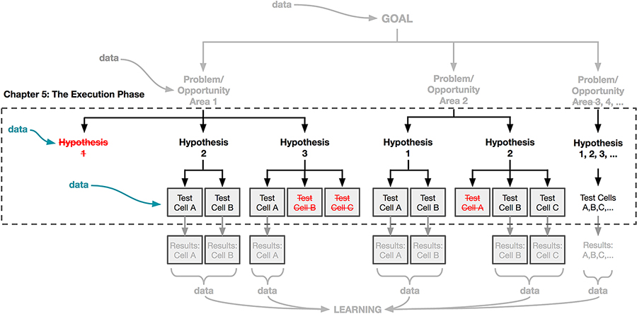
Figure 5-1. This chapter focuses on the execution phase of the experiment: designing the treatments of your hypothesis or hypotheses that you’ll launch in your A/B test.
As the goal of experimentation is to test more than just one idea, we now have a mechanism to get many ideas and many possible solutions in front of real users to see how they react to them. As you can see in Figure 5-1, each of these solutions results in a test cell.
“Testing” your ideas on a small group of users means that you are able to try bolder and more wide-ranging design solutions because you don’t have to be as confident about being “right” in the same way that you might if you were going to ship that solution to everyone and only had one chance to do it. In fact, testing solutions that are more divergent and different from each other can sometimes result in deeper and broader learning.
We believe that you can apply a data-aware framework to a full range of problems that you may want to solve or areas where you would like to understand user behavior and the impact of your designed solutions much more deeply. This can range from very tactical and small things (“What is the most effective layout of this page?”) to much larger and more strategic questions as well (“What is the relationship between qualified customers and retention?”).
We recognize that for designers who haven’t worked with data before, there are cultural challenges of incorporating data and A/B tests into your product development process. We’ve heard that it can feel to some people like leaning on data requires giving up control of determining your user experience. Chris Maliwat talks about this transition within the team at Warby Parker:
Culturally, at companies that are focused on brand, you want to put the best brand forward and what that generally means is you (not your consumer) are the editor and curator of what you think is best. Particularly for folks in our marketing and brand team who didn’t have experience with A/B testing, it was challenging to say we’re going to design some stuff and end up launching whatever works best. That ceding of control culturally was actually a bit difficult. We involved the brand team in the test cell design and ensured that the test cells were all within the brand constraints. The conversation then became “these are all within the brand constraints, but we’re still not sure which one works best so we’re going to test it and the one that wins, we should do.”
Here, Chris argues that data still needs to be balanced with design considerations like creating a brand. We believe that in this way, the designer’s intuition is a natural complement to data. By designing with data, designers should feel emboldened to take bigger risks in service of learning, which in turn can further hone their instincts. In the next section, we’ll dig deeper into this topic of how data can help put learning at the center of every design exploration.
Designing to Learn
One of the main reasons to bring data into your design process is so that you can begin to get a sense of how well your designs are performing. Another way to think of this is measuring how quickly you, as a designer, are learning how to most effectively meet your users’ needs. Over time, are you getting better at creating experiences that have the impact that you predict they will have on your users’ behavior? Do you find that you can predict the outcome of your experiments with better accuracy as you do more of them?
We want to convey two important points. First, that you approach your design work with the mindset of trying to understand how your craft will impact customer behavior rather than focusing on shipping a final product experience that is “done.” Understanding that you are engaging in an iterative and ongoing design process will help you focus on the act of learning along the way. Second, that your designs need to be effective representations of the ideas that you want to test with your users.
We first introduced the hypothesis in Chapter 2, and noted that it should capture “what you are going to do and what you think the effect will be.” We also said that you should have a clear “plan that addresses what you would learn by testing” your hypothesis. So in this chapter our aim is to demonstrate how you can approach experimentation and design as a way to get better and better at evolving your ability to serve your customers’ needs over time.
Engaging Your Users in a Conversation
A good way to approach this is to start by considering the difference between writing a book and having a conversation with someone. Let’s say that you’ve been recognized as an expert in your region and you’ve been asked to write a guidebook to the area. You’ll want to convey your take on the region to your readers, highlighting some of your favorite attractions, restaurants, and activities. However, with a book, the form, packaging, and content of your thoughts is fixed and static. As people read your book and have reactions to what you’ve written you can’t change the words that you wrote or react to their feedback. For this reason, you will spend a great deal of time perfecting your writing, polishing the book, and making sure that you’re picking just the right places to spotlight.
For your readers, there is also no easy way for them to give feedback to you about what they like or don’t like in the book. They might have wished that you spent more time highlighting outdoor activities, that you covered more of the “cheap eats” in the region, or that you had clearer maps in the book. But even if these readers took the time to write to you and give you suggestions on how to make your guidebook better, you would need to go through all the work of rewriting and republishing the book to incorporate their feedback. This is all just to illustrate that you will put a lot of extra effort into polishing and perfecting every aspect of your book, thinking of the final product as exactly that: final.
![]() In our summer camp example, the relationship you have with your summer campers is different. You can engage in regular conversations with your campers, and those conversations will be different than if you were to write a static book for them. You can ask them a question, propose an activity, and then see how they react in the moment. As you speak back and forth you’ll learn more about what motivates them, how they think, and how they react to the ideas you’re sharing with them.
In our summer camp example, the relationship you have with your summer campers is different. You can engage in regular conversations with your campers, and those conversations will be different than if you were to write a static book for them. You can ask them a question, propose an activity, and then see how they react in the moment. As you speak back and forth you’ll learn more about what motivates them, how they think, and how they react to the ideas you’re sharing with them.
Because you know you’ll have many opportunities to talk to the campers about the ideas you have, you’ll also become more comfortable with not having to polish your thoughts ahead of time. (“I’m thinking of doing something around a new water activity... What about something with boats?” can lead to “OK, I’m really focusing on the boats now, what do you think about sailing?” or “Last time you said you don’t like the water, what if we did a hiking activity instead?”)
Quick and frequent conversations will allow you to get feedback on some of your ideas from your campers. You can then react to their feedback, and re-engage with them once you’ve evolved your thinking to see if your refined ideas are meeting their needs and desires more closely. Having as many conversations as you can in quick succession with your campers is more convenient than polishing your ideas to perfection and instead taking a really long time between each conversation. Again, this is very different than the mindset and approach you might take if you were working on a book where you only have one opportunity to communicate with your readers.
The conversation is a great metaphor for how we see working with data. Ideally, you are trying to build a long-term relationship with your customers and both data and design can help you have those conversations with them. Your design allows you to present your ideas to your users. Letting them interact with your design is your way of asking, “Does this work for you?” The data you get back is their response to you. As we’ve said before, behind every point of data is a user, and behavioral data is the “language” that they are using to tell us if what we presented to them is working (the data shows positive results) or not working for them (the data shows negative results).
Having Quality Conversations
Conversations are most interesting when people are able to voice a strong opinion. This is also when you learn the most about what matters to them.
![]() For example, let’s go back to the idea of introducing a brand-new activity for the campers. If you start your conversation by asking “Should I add kayaking as an activity or should I add crew as an activity?” you may not get very insightful answers because the difference between those two activities isn’t very large: they are both on the water and they both involve rowing. If you were instead to ask, “Should I add kayaking as an activity or should I add orienteering as an activity?” or “Should I add kayaking as an activity or should I add painting as an activity?”, you might get more interesting answers and learn more about your campers. The differences between these two sets of activities are more pronounced and that means that this question might be a more effective vehicle for you to learn about their interests than the first question. They can talk about whether they are more interested in a water or land activity, whether they’re more interested in problem solving or physical exertion, or whether they’d rather take part in activities with a targeted goal or something more leisurely. On the flip side, if you jump too quickly to asking about water-specific activities, you may learn that campers would prefer kayaking to crew without realizing that in reality, they aren’t too excited about either activity at all.
For example, let’s go back to the idea of introducing a brand-new activity for the campers. If you start your conversation by asking “Should I add kayaking as an activity or should I add crew as an activity?” you may not get very insightful answers because the difference between those two activities isn’t very large: they are both on the water and they both involve rowing. If you were instead to ask, “Should I add kayaking as an activity or should I add orienteering as an activity?” or “Should I add kayaking as an activity or should I add painting as an activity?”, you might get more interesting answers and learn more about your campers. The differences between these two sets of activities are more pronounced and that means that this question might be a more effective vehicle for you to learn about their interests than the first question. They can talk about whether they are more interested in a water or land activity, whether they’re more interested in problem solving or physical exertion, or whether they’d rather take part in activities with a targeted goal or something more leisurely. On the flip side, if you jump too quickly to asking about water-specific activities, you may learn that campers would prefer kayaking to crew without realizing that in reality, they aren’t too excited about either activity at all.
It’s the same thing when you’re having those conversations with millions of people through data. If you’re trying to figure out what is going to work with your users, you’ll want to design experiences that elicit clear responses. Presenting your users with as many feasible and differentiated solutions as possible—with differences that they can recognize—helps them articulate what is important to them.
Designing to extremes to learn about your users
Eric Colson had a great example from Stitch Fix where they evaluate the feedback from “polarizing styles” to better understand their customers’ preferences:
We have a notion of a “polarizing style.” This is a piece of merchandise that clients tend to either love or hate. There’s no one in-between; no one just “likes it a little”—it’s one extreme or the other. We detect which styles are polarizing by studying the feedback data on our styles and applying measures of entropy. It’s hard to predict a priori which styles will be polarizing. It’s also hard to know which clients will be on the love side or hate side for a particular style. But after the fact, it’s obvious—they explicitly tell us. And this can be useful information. Each client’s response to a polarizing style reveals information about their preferences. The people who hate the style tend to share certain preferences. Likewise, people who love the style share similar preferences. So, regardless of whether or not the client loved or hated the polarizing style we now know more about them. This means we can even better serve them on their next fix. It’s about setting yourself up for long-term success by continually learning more about your clients’ preferences.
It reminds me of what I learned about baseball during the 2014 playoff series. I am a passive fan of the San Francisco Giants. But of course I get more interested during the playoffs. I happened to watch a game with a friend who was much more of an expert on baseball. It was not looking good for the Giants. The opposing team’s pitcher was on fire. He had the Giants shut down—no one was hitting off him. But the tide turned after a “great” at-bat by the Giants. I didn’t initially see it as “great”—he had struck out! Yet as he returned to the dugout, all the players were high-fiving him. I turned to my friend and said, “He struck out. Why the high-fives?” He explained to me that it was a productive at-bat: he took up nine pitches (pitchers are only good for 100 or so). And each of those pitches revealed information to the next set of batters watching from the dugout. That was nine more times that they got to learn from watching the pitcher’s timing. They got to see his slider, his fastball, the curve—even the sequencing of pitches is valuable to learn. So he revealed information that would benefit the next batter. It felt very similar to the value we get from our clients’ feedback to various styles; we learn for the next time.
This story is a great pointer back to the story we shared from Eric in Chapter 2, which illustrated how the key metric at Stitch Fix had to change as their business model changed. In a similar fashion, if the goal of the team was to optimize for purchasing activity in a single “Fix,” then there would be no incentive to risk an item that might be rejected. The stylists would only want to fill the box with items that were likely to be accepted. But once the incentive or the goal was changed to focus on building out a long-term relationship with their customers, the value of having a polarizing style in the box that better reveals the customer’s preferences becomes a clear long-term benefit, even if in the short term it decreases the likelihood of purchasing.
As we’ve noted before, data can be used to shape the experiences that you are building (through algorithms, recommendation engines, personalization) and it can be used to help inform decisions that you are making as a designer about building your product (through A/B testing, qualitative studies, surveys, etc.). Eric’s example isn’t exactly about A/B testing; he wasn’t describing a specific A/B test that was run where some users got a polarizing style and others didn’t. However, we thought it was a really great example of how the experimental mindset should be applied and how it’s important to think about what you can learn over time about your customers in a series of interactions. Every Stitch Fix box is an opportunity for the company to interact with their customer, learn more about him or her, and continue to evolve their conversation and relationship with the customer for the long term.
Revisiting the minimum detectable effect
You might remember that in Chapter 2 and Chapter 4 we introduced the concept of minimum detectable effect (MDE). Recall that this is the minimum difference we want to observe between the test cells and the control. The question you’d ask on an A/B test is for the metric(s) you’d be measuring, do you really believe that your design is capable of making an impact at least as big as (or bigger than) your minimum detectable effect? Colin McFarland, Head of Experimentation at Skyscanner, uses the example of changing the color background on your company’s home page to explain this concept. Say you’re trying to impact a harder to move metric, such as retention. You’ve formulated a hypothesis, and now you’re evaluating whether to pursue it. Your hypothesis is: “By changing the background color of our home page from red to green, users will be more likely to find our site more relaxing and enjoyable to use, which we will measure by an increase in retention.”
In the spirit of having effective conversations, we urge you to ask yourself whether you really believe that changing the background color will result in a measurable impact in your customer retention (or whatever your metric of interest is). Assessing whether you believe that your hypothesis can have the measurable impact that you set out to make is one place where the designer’s intuition and the science of experimentation must come together. By framing your hypotheses in terms of their potential and quantifiable impact, you’re forced to reflect on how substantial of an impact you really believe that hypothesis can make. If you don’t believe that you can create such an impact with your hypothesis about changing the background color, for instance, you might consider looking at your other hypotheses to see which of them are likely to have a greater impact, or think about different ways you could design your test cells for a single hypothesis to be more impactful.
It might seem daunting at first to try to make judgments about the size of the impact just on the basis of intuition, especially if you haven’t worked with A/B testing data before, or aren’t yet familiar with your company’s metrics and the types of things that affect them. However, as we said in Chapter 3, experimentation is a process that will help build these intuitions. These types of judgments about potential impact will become easier with time, and at the beginning, relying on your data friends who are more familiar with these metrics is a great place to start.
Designing the Best Representation of Your Hypothesis
Once you have a strong hypothesis statement (or a few) that you want to test, you’ll want to make sure the designs you create are truly representative of those statements and that the information that you gather from the results of your experiment will give you information that you can act on and learn from. This is the art of designing in a data-aware framework. We want designers to inspire small and large changes to your experiences and to test how effective those changes are. Your design will influence both what you can measure and what you can therefore learn.
In Figure 5-2 you’ll notice that our framework assumes that each hypothesis might have several different ways that you could represent it. Here, we show that Hypothesis 2 has four different possible ways of being treated—versions A, B, C, and D. To put this into A/B testing language, each of these “treatments” would be a test cell that we measure against the control. Each of the four test cells has the same measure of success, the same metric that we are judging them by, and every test cell has the same underlying hypothesis, a statement that captures our belief around the behavior we can incentivize and the result it will have.

Figure 5-2. A single hypothesis may have several representations, or “treatments.”
However, each test cell represents a different approach to how we might represent that hypothesis. Because it takes time to craft and build each test cell, you want to make sure that you can clearly articulate what it is that you will learn if that test cell either increases or decreases the metric you are measuring when compared with the control.
Understanding Your Variables
To illustrate this, let’s start with a very simple example from Netflix where they explored surfacing different amounts of content in different ways. Their slimmed-down hypothesis was the following:
By giving users more choice in the selection of movies and TV shows on their home page, we will increase consumption of content (hours viewed).
In the control experience, there were 25 rows on the home page and 75 titles in each row (Figure 5-3).
There are two simple ways that they could “put more choice” on this page:
Add a wider selection of movies in each category (add more options to each row)
Add more different genres and categories (add more rows)
One variable is the breadth of movies represented on each page (adding more rows, which allows a user to browse through a wider range of movies), and a second variable is the depth of selection (the number of movies in each category, which allows a user to dig deeper within a category). Essentially, this test was constructed to get some sense of whether it’s more important for you to provide more depth for your customers or more breadth or a little bit of both.
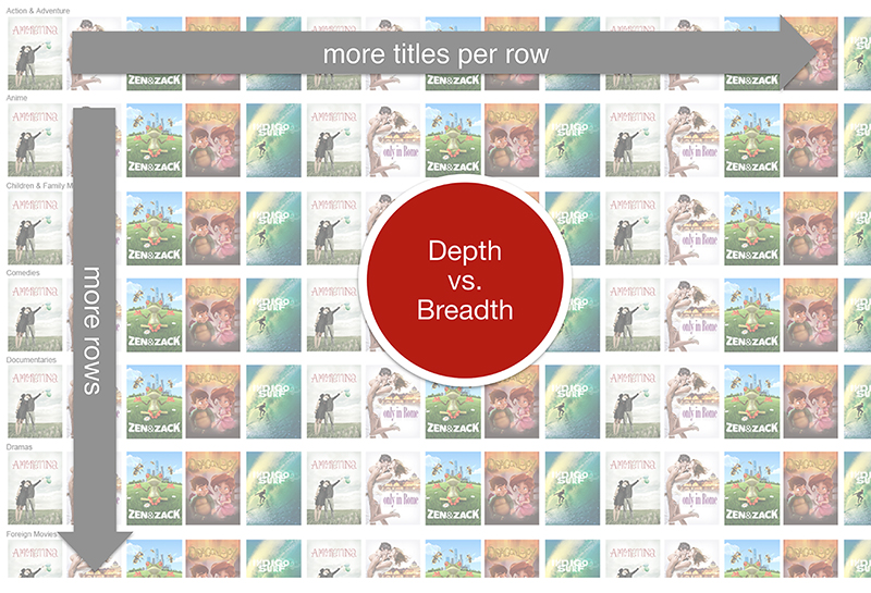
Figure 5-3. The Netflix home page at the time of testing.
The control had 25 rows × 75 movies per row. The team tested three test cells against this control:
Cell A: 25 rows × 100 movies per row
Cell B: 50 rows × 75 movies per row
Cell C: 50 rows × 100 movies per row
It turned out that the winning test was Cell B and the team learned that allowing customers to dig deeper within a category was not actually that important, but giving them more choices of different genres was. In many ways this would make sense because if you haven’t found a movie that you’re interested in out of 75 movies, it’s unlikely that you’d find a suitable movie if that list of movies were expanded to 100. It’s more likely that you would find a good movie by looking at a completely different genre.
A good experiment will balance the number of variations or test cells that you create with the level of detail that you are trying to learn. Like a good science experiment, you’ll obviously have a cleaner test if you control your variables so that you are only changing one thing at a time. This way you can isolate and understand what it was that impacted your results. In this example, the impact of adding movies to a row versus adding rows is pretty clear. However, not every experiment you run will be restricted to changing just one variable at a time. You would make very slow progress in your larger product experience if you were always just tweaking and iterating on one thing at a time. This is where the art of knowing how incremental you should be in your design work needs to be balanced with how quickly you want to learn and how quickly you want to get actionable results. Later, we’ll talk about how to approach designing for local versus global problems relative to the “design activity” framework we introduced in Chapter 2.
Not all variables are visible
When we speak of “design,” we sometimes only consider the parts of the experience that are “visible” to the user—for example, changing a layout, creating a new workflow in the user journey, or making a modification to the information architecture of your experience. However, a large part of many experiences nowadays is “invisible” to the user. Recommendation and personalization algorithms play a big role in creating a good or bad experience for your users.
Sometimes the variable in your test cells might be different versions of those algorithms. One version of the algorithm might weigh “popularity” more strongly than another, which might instead focus more on someone’s past history with your service. You might make these changes “visible” to your users by calling them out in the design (e.g., saying “Recommended to you because these are popular”) or you might do nothing at all and see if the invisible experience changes will be reflected in your customers’ behavior.
Another example might be that you are changing something about the algorithm that increases response speed (e.g., content download on mobile devices or in getting search results); users see the same thing but the experience is more responsive, and feels smoother. Although these performance variables aren’t “visible” to the user and may not be part of visual design, these variables strongly influence the user experience.
Jon Wiley spoke to us about how Google approached testing the perception of “speed.” According to Jon, “speed” has long been one of the core principles that defines a good experience at Google. Whenever Google makes improvements in speed, it results in a lift in their key metrics. Although one might consider speed to be purely technical, Jon and his team worked on understanding the effect that the perception of speed had on the user experience. Here Jon talks about how they use both behavioral data from A/B testing and feedback from the usability lab to measure something that is more nuanced like the perception of speed:
We started to investigate the perception of speed. We discovered that if there was a little bit of a delay, people thought it was faster, which is counterintuitive. There are tons of studies on people’s perceptions of time in terms of waiting. It’s like if you drove without traffic for 10 minutes versus if it still took you 10 minutes, but you were blocked in traffic—your perception of that would’ve been much slower even though it took you the same amount of time.
There is this interplay between people’s expectations of what is going to happen, and what actually happens, for example, the delay in the response of the server having to fetch it and render it. A great way of doing this, particularly on mobile devices, is to have a transition animation that carries you from one place to another so that you can see this is part of this continuous process. It’s not just a jump to the next thing. We’re trying to bring more of this into our software (in our web applications, in our native applications) so that people feel like it’s a smooth experience rather than a choppy one—even if it took exactly the same amount of time.
With an experiment, we can look at the amount of time it takes per action or between actions for a user in the lab. We can say, “They scroll down. They’ve gotten a result. That takes X amount of time on a typical basis. What if we added this animation, or what if we added this transition?” We can see what impact that has on the timing of it. We’re trying to match what we see in the lab up against what we see in the environment. If we can correlate behavioral changes on the experiment side with perception changes that we basically ask people about then we feel pretty strongly about it.
Think about playing your role as a designer in shaping these kinds of experiences and using experimentation to understand their impact on your customers as much as you do about the kind of design work that you might more traditionally associate with our craft.
Your Design Can Influence Your Data
So far we have been talking about the importance of making your designs a good representation of your hypotheses. However, it’s also important to understand how your design might influence the data that you collect.
We like the experiment Gaia Online ran many years ago as a tongue-in-cheek home page test (Figure 5-4). One of the ways that people often try to “game” test results is by simply making the thing you want to measure as prominent and large as possible. But sometimes doing this increases one measure of success (clicks on the feature you are focusing on) to the detriment of the overall user experience.

Figure 5-4. Gaia Online home page experiment.1
Designers often complain about being asked to make really big buttons to drive more traffic to a feature because simply making a huge button will definitely result in more engagement with that feature. However, the feature that you are driving that traffic to may not be the most important thing on that page or may not be “worthy” of such a strong presence. You want to be cautious of creating a design that optimizes for “winning” a single test instead of thinking about creating the right balance for the overall experience of your users.
If you’re not careful, the designs you create might impact or influence the data that you can and will gather. We want you to always be aware of this relationship between your designs and the data because sometimes we forget to see how one can influence the other.
Example: Netflix Wii
When Netflix first launched on the Wii, the wand was a relatively new input device and gesture a new input mechanism. It was most common when using a remote on other devices, to use the LRUD input (left-right-up-down buttons) to navigate TV interfaces. The team wanted to understand whether people preferred using the wand or the LRUD buttons on the remote control to navigate the Netflix UI.
A quick analysis showed that the vast majority of users were navigating the UI using the LRUD input. The most obvious conclusion might have been that the majority of users preferred to use the LRUD as input over the wand or that the wand was still not widely adopted enough. However, on reflection, the team realized that the UI of Netflix on the Wii mirrored its design on other devices; it was a simple grid. Perhaps if that UI were instead a random scattering of movie images on the screen or maybe arranged in a circle, then people might have used the wand to navigate the UI instead of the LRUD buttons.
This is a pretty clear example of where the design had a strong impact on the data that was collected. You can imagine that the conclusion that team drew might not have been an accurate representation of how users might naturally choose to navigate the Wii interface because there wasn’t a competing design that was optimized for using a wand instead of the LRUD buttons.
To this end, you can easily see how this might expand to other situations. At the most basic level, if you choose to have engagement with a particular feature as the predominant metric of success and your design makes that feature difficult to find on any given screen, then it’s likely that the design will have influenced the outcome of that test as much or more than the desirability of that feature itself.
Revisiting the Space of Design Activities
In Chapter 2, we introduced a framework for the different ways you might think about design depending on where you are in the space of possible design activities. Figure 5-5 was used to show how the nature of your design work and the type of feedback you are looking for in your experiments might vary. Most importantly, it’s not about thinking about solving either a “global” or a “local” problem or about looking to either “explore” or “evaluate” the merit of your ideas—it is about working across this spectrum of activities and being thoughtful about where you are (and where else you might be) at any given point in time.
To revisit the concepts quickly—global and local refer to the scope or approach you are taking to addressing your problem/opportunity area. Will your designs change multiple variables in each test cell (global) or will you be focusing on just one or two elements (local)? Exploration and evaluation are good ways to articulate how far along you are in addressing your problem/opportunity area. Are you in an exploration stage where you are crafting your experiments so that you can get directional feedback on your designs (e.g., “Should we keep working on this feature/does this feature matter at all?”)? Or are you looking to evaluate your design, changing as few variables as possible to gather the strongest evidence and establish causality (e.g., “Is X better than Y?”). The nature of the design work that you do and the way that you leverage your designs to answer the problems you are looking to solve will vary depending on where you are on the diagram shown in Figure 5-5.

Figure 5-5. Consider what kinds of designs you should be producing relative to where you might be on the spectrum of local–global and evaluation-exploration.
When you are on the global side of this diagram, you are generally operating under the belief that there might be a very different experience from what you have today that will result in big gains to the metric(s) of interest that you are looking to impact. Remember that in Chapter 2, we introduced the concept of local maxima and global maxima. Global design gives you a greater opportunity to try out all of the possible design solutions to your problem at hand, to see whether there are solutions out there (“other mountains”) that are more promising than the one you’ve landed on now. In those cases, it would make most sense to do design explorations that are not just very different from your existing experience but also very different from each other. You can see this illustrated in Figure 5-6.

Figure 5-6. Global experiments might involve designs that are very different from each other, whereas local experiments normally have less variation between the designs.
Doing this type of global exploration makes most sense when:
You are developing for a new space that you don’t have pre-existing expertise or experience in.
You are interested in making a big strategic shift that would require foundational shifts in your experience in order to execute.
Your existing product/experience has been static for a long time and you now have access to new technology that will allow you to try things that were previously not possible.
You feel like you have reached a local maxima and any further optimizations on your product or feature won’t give you significant increases in performance.
When you are on the local side of the diagram in Figure 5-6, you are looking to optimize your existing experience. Here, the difference between each of your design iterations or test cells will not be as different from each other and also are not likely to be that different from your current experience. You’ll need to be much more precise in what it is that you are designing and which components of that design are being optimized to create a change in your user behavior. In doing so, you’re measuring the specific causal impact of individual components of your experience on your user’s behavior. Getting back to the mountain metaphor, in these local design iterations you’ll be optimizing for the best solution within the space you’ve already identified and worked in.
Situations where this arises might include the following:
You want to investigate a specific aspect of your experience more deeply or focus on optimizing it.
You believe that your current experience is already close to optimal (and you are not yet at a point of diminishing returns where the effort put into optimization outweighs the potential gains you would get for your business).
Avoiding Local Maxima
It’s risky to do the type of global design we’ve proposed, where you test with multiple variables altered at once. More often than not, any change to a variable is more likely to result in a negative result than a positive, and the more variables involved, the less likely to find a win.
Sometimes, however, the win you seek may not be reachable from the place you are in single steps. As we’ve discussed, with local design you aim to take small steps up the mountain you’re already on. This practice of “hill climbing” one step at a time, however, won’t get you to the top of the peak next door if you are climbing a mountain surrounded by valleys. It’s perhaps only by taking multiple large steps in different directions that you can discover whether the landscape that isn’t contiguous to your current product may have a higher peak (refer back to Figure 5-6 to see this in action).
A note: when probing for adjacent non-local peaks, it’s rare to have the insight to stumble directly upon a higher piece of the landscape. However, if you do a handful of tests with simple variations near the one big leap you are studying, you may find that the land surface isn’t too much lower, but that it has a steep gradient, as indicated by differences in the test results between your small differences tests, and that steep gradient might indicate that there is a promising destination to be found nearby.
It’s important to remember, however, that the impact of your experiment on metrics might be either large or small, regardless of whether you are running a local or global test. For example, you might classify introducing an “Other users also bought” feature as a local test, since you are simply introducing this feature to one page. However, that recommendation feature might have a big impact on your metrics by introducing a new user behavior. It might be that you learn that you begin to move a metric that you weren’t even considering before. For example, this feature might negatively impact conversion by adding a distraction, but increase average basket/cart size. That could be a much larger learning and have the impact you would expect from a larger redesign. Sometimes small changes can also have big adverse impacts. LinkedIn learned this when they found that introducing only 5px to the header (shown in Figure 5-7) resulted in a sudden drop in advertising click-through metrics on advertisements, perhaps because of fewer accidental clicks on the ad.2
Another example might be making a change to a call to action, but if that call to action appears on every page in your experience then the ramifications of that experiment might be quite large in some areas of your product.

Figure 5-7. Slide from Ya Xu’s talk on A/B testing show that a mere 5px had a large measurable impact on LinkedIn’s advertising click-through metrics.
Of course, the inverse can also be true: a “global” change may not lead to the positive change you’d expect in metrics despite how big of a change to the experience it might be. This illustrates the point that the return on investment of experiments is not relative to the nature of the change. It’s important to use this global versus local metaphor as a tool to think about how much of a change you’re making to your experience, rather than as an indicator about the potential impact of the change. Also consider whether you are exploring or evaluating your solution. How far along are you in your design process? What will your next steps be after your A/B test? The way you will approach your designs and what you’ll learn from your tests depends on whether you are exploring or evaluating.
If you’re taking an exploratory mindset, you and your team have the license to think big. You need not feel constrained by product ideas you would be proud to ship, since your goal is to learn from your designs rather than to create a “finished” product. Your aim is to get directional feedback about where to push harder, and which ideas you can probably abandon without too much more investment. You are probably exploring if:
You have just kicked off a new long-term project and want to start to build up your knowledge about different possible approaches.
You and your team are aligned on taking more time to investigate a bunch of directions and iterate over time.
If you instead at the point of evaluation, you’re looking to quantify whether your design had the intended impact. Did you move your metrics in the way you had hoped? These types of tests are candidates for rollout, if you and your team decide based on the results that you feel comfortable launching at scale. One important impact of this is that your designs should feel polished—work you would be proud to make your default experience in the future. You are probably evaluating if:
You and your team have already aligned on a particular direction, and now you want to see whether you made the impact you had hoped.
As you can see, how far along you are in your product process will have material impact on the types of designs you product, and also what you’ll learn from your A/B test.
Different problems for summer camp
![]() As we go deeper into our discussion of designing for different types of problems, we wanted to walk through an example from the summer camp metaphor for each of the four quadrants. Remember that these are spectrums rather than binary classifications; however, for the purposes of simplicity we won’t specify where on the spectrum these different questions fall.
As we go deeper into our discussion of designing for different types of problems, we wanted to walk through an example from the summer camp metaphor for each of the four quadrants. Remember that these are spectrums rather than binary classifications; however, for the purposes of simplicity we won’t specify where on the spectrum these different questions fall.
| Local | Global | |
|---|---|---|
Exploration | Goal: Make camp more fun Questions: Which activities should we pick for our outdoors-focused camp? Kayaking, orienteering, yoga, painting, rock climbing? | Goal: Increase revenue Questions: Should I move to a new location? Target a new audience (moms instead of kids)? Move to a new value prop—like yoga camp instead of general summer camp? |
Evaluation | Goal: Make camp more fun Questions: Do kids enjoy kayaking more than rowing crew? | Goal: Increase revenue Questions: Should I stay in the camp business? Is this the best way to maximize my revenue? |
We hope that this helps make the framework we’ve been discussing feel more concrete. We encourage you to refer back to this as you’re thinking about what type of problem you’re most similar to at any given point. As a thought exercise, you might also consider drawing out a similar chart for a problem you’re working on. What are the different ways you might approach the same goals, depending on the type of problem you’re solving? What creative ideas can you come up with?
Directional testing: “Painted door” tests
Recall that exploratory tests provide directional input about whether you should pursue a particular idea. Ideally, you’d want to understand whether something is directionally worthwhile prior to investing any resources. One example of a way you could test a concept pretty bluntly to understand whether you should follow a particular direction is a “painted door” test. In this kind of testing, you have a feature or an idea that might take a lot of time to build out but you want to learn whether your users have interest in the feature first. Building a new door is costly (you have to cut into the wall, buy the materials, etc.), so you don’t want to do that without knowing whether your users want a door there at all. Instead, you can first paint a fake door on the wall and see how many folks try to open it. This will give you some signal about the interest in that feature and perhaps the potential addressable audience.
In a painted door test, you might tell your users about a particular feature or offer, giving them the option to select it. However, when they do click on it, they get a message saying that there was an error and the feature isn’t available for them. By tracking the number of people who clicked on that offer, you could gain a rough sense of whether it would ultimately be worth building out. Although this is a common practice, we recognize that it is nevertheless a bit questionable—it is misleading to tell your users that a feature exists and to then deny it to them because it never existed. We will discuss the ethics of A/B testing in more detail in Chapter 8, to help you think about the ethics of these types of experiments.
![]() Let’s take a simple example that could illustrate how a “painted door” test might be used to explore a pretty large change to a business proposition. Let’s go back to that summer camp example. You’re working on a website for your camp. You want to know if you can make a big shift in your business by broadening your customer base. One idea that you have is to move from offering a camp for just kids to now offering a “family camp” where the parents and kids could get away together. However, building out all the services needed to make that change in your business is likely costly and time consuming, since it fundamentally changes the experience of camp. Before you do that, you could put an offer on your website that gives people the option to sign up for the family camp. You might measure how many people click on the offer and you might even ask a few questions as the first step of that flow to find out which activities they want to do as a family. However, when it comes to the final step where they need to choose which week(s) to sign up for, you could give them a message that there is no more availability. This would give you a fair amount of data to inform the decision about whether to invest further in this idea. You’d have to take into account a few things—like the fact that you might have gotten more sign-ups if you had advertised properly or that you are only hearing from folks that are already looking at your website for your kids’ camp—but the signal you get from this limited audience is likely still useful.
Let’s take a simple example that could illustrate how a “painted door” test might be used to explore a pretty large change to a business proposition. Let’s go back to that summer camp example. You’re working on a website for your camp. You want to know if you can make a big shift in your business by broadening your customer base. One idea that you have is to move from offering a camp for just kids to now offering a “family camp” where the parents and kids could get away together. However, building out all the services needed to make that change in your business is likely costly and time consuming, since it fundamentally changes the experience of camp. Before you do that, you could put an offer on your website that gives people the option to sign up for the family camp. You might measure how many people click on the offer and you might even ask a few questions as the first step of that flow to find out which activities they want to do as a family. However, when it comes to the final step where they need to choose which week(s) to sign up for, you could give them a message that there is no more availability. This would give you a fair amount of data to inform the decision about whether to invest further in this idea. You’d have to take into account a few things—like the fact that you might have gotten more sign-ups if you had advertised properly or that you are only hearing from folks that are already looking at your website for your kids’ camp—but the signal you get from this limited audience is likely still useful.
As you can imagine, the downside of a painted door test is that it can be very frustrating for the users who were hoping to get that feature. You risk alienating them in order to get the information back. For this reason, you should keep the test group for your “painted door” tests as small as possible and use them sparingly. You should also avoid any types of painted door tests that could be physically or emotionally harmful to your users or detrimental to their relationships with others.
Picking the right level of granularity for your experiment
Picking the right level of design polish is a function of where you are in the diagram in Figure 5-5 as well. For example, if you are working on a local problem/opportunity, you might want to further understand the causal impact of each component of the experience by refining and optimizing your:
Language
Stylistic elements and visual representation
Algorithmic testing (e.g., testing different algorithms for recommendations)
Activity flows and changes to user paths
It’s often the case that focusing on this level of detail will result in more test cells. However, these variables are also usually “cheaper” to test because they are isolated and therefore easier to build.
When you are executing a lot of different variations it will be easy to be drawn into the idea of testing everything you’ve come up with. You’ll still need to use your design instinct to filter down your test cells into the ones that you truly believe in and into the ones that you think will actually have an impact on your users. If you can’t quickly see a difference between one test cell and another, it’s worth questioning if your users will either and whether it will in turn result in a change in behavior that could actually impact your metrics.
You can also take advantage of the sequential nature of experimentation. For example, if you’re testing sizes of buttons, you could consider just doing small and large in your initial test, to see if changing button size makes a difference at all. If you find that changing the button size does indeed have a measurable effect on your user’s behavior, then you might want to continue to invest time into exploring different button sizes more granularly to optimize, but you will eventually need to balance testing something like button sizes against testing other parts of your experience that might have a bigger effect on customer behavior and therefore more potential impact on your metrics.
Example: Netflix on Playstation 3
To illustrate the way in which your design reflects your hypothesis, let’s look at an in-depth example. You can always do parallel testing where you are exploring multiple hypotheses at the same time and for each hypothesis you might find that you can design multiple treatments of each hypothesis. This is what happened when the Netflix team launched their experience on the PS3. The team focused on four hypotheses, which we introduced in Chapter 4 to build out and test. Now, we’ll show you what those hypotheses looked like when visualized:
- Hypothesis 1
In the original or the control PS3 experience, many users expressed a concern that they were only getting access to a limited part of the catalog. The basis for Hypothesis 1 was to ensure that users felt confident that they had access to the entire catalog. By providing a menu, they were trying to give the user an overview of all the areas of the catalog at Netflix and allow the user to drill deeper either through the menu or via the box shots at the left (Figure 5-8). This design was predominantly focused on making it apparent to the user that they had access to the full catalog of movies and TV shows.
However, one of the downsides of a design like this is that it can also be quite complex. The user can easily see that they have access to a lot of functionality, but it might feel like more work to get through the full catalog.

Figure 5-8. Hypothesis that browsing more titles using a flexible menu system and hierarchy will lead to more viewing.
- Hypothesis 2
While the first hypothesis traded simplicity for depth, in the second hypothesis, the team strove to simplify the design (Figure 5-9). Everything from using a flat hierarchy (no drilling deeper) to having the entire experience in a single view was a means of simplifying the prior design. There were no categories to drill into. Only a few ways to navigate—up, down, left, and right. This concept also most closely mimicked the successful website interface.

Figure 5-9. Concept for a simple, flat interface that focuses on content.
- Hypothesis 3
The argument was made that the team could simplify the design even further. And in this hypothesis, they attempted to challenge a core design principle at Netflix, which was that you needed to show users box art from the very first screen (Figure 5-10). This kind of exploratory testing can be a really great mechanism for deciding whether long-established beliefs should still stand.
Here the driving concept was that you could simplify the experience more by separating the navigation from the content itself. Many people seemed to know that they wanted to watch a “drama” before they even launched Netflix. If you could give them even fewer choices and guide them through a step-by-step process to select the movie, it would make the process faster for them by presenting less along the way. The team took away as many distractions of choice as they could at each step in the process.

Figure 5-10. Hypothesis to simplify by separating navigation from content.
- Hypothesis 4
In this final hypothesis (Figure 5-11), the team started to think about how people watch TV today. People are used to turning on the TV, sitting back, and just flipping through channels to serendipitously find something to watch—why not replicate that experience? Let customers decide what to watch through the act of watching. In this design, as you clicked through each box shot, video would start playing. The idea was that you might stumble onto an interesting moment of a TV show or movie and then keep watching. The differences between this design and the others was that you had to significantly limit the number of box shots that were on the page since so much of the real estate was taken up by the video.

Figure 5-11. Hypothesis of a video-rich browsing experience.
These four hypotheses were A/B tested against each other and though there were many variables that were different from concept to concept, the belief was that by launching these different experiences to their users the team would get directional guidance about what the potential was for each of these different ideas.
Within each hypothesis, minor differences or variables were also tested so that each hypothesis had perhaps four or five test cells within it. For example, in Hypothesis 4, the variation was whether or not the video started playing automatically.
This example illustrates how it’s possible to be working on a global problem while also using A/B testing to validate a few concrete hypotheses against a specific metric (consumption time). Each of these concepts tries to serve the same goal—so while the design may differ dramatically, they share the common goal to “lead to more viewing hours.” At the same time, the teams also looked at the resulting data and tried to drill into all the other metrics in order to understand where the strengths and weaknesses were in each of the versions. So to that end, you could say that both exploration and evaluation were being done using this set of A/B tests. We wanted to include this example to show how adopting A/B testing doesn’t mean that you need to be restricted to small changes. We believe tests like these “large-scale concept tests” can provide a lot of directional information for you as a designer.
Example: Spotify Navigation
Let’s look at another example of how designing for A/B testing can work in practice. In 2016, the existing Spotify navigation on the mobile application was in desperate need of a cleanup. It had grown organically over the years and become confusing and cumbersome to use.
While everyone in the team instinctually knew that the navigation could be improved, there was also evidence from research that indicated that simplifying the navigation and restructuring it to more clearly reflect what a user could do in Spotify could significantly improve the user experience. For example:
In usability testing, the task completion rate for the existing navigation was very low. For example, if a researcher asked a user to complete a core task for Spotify’s product, such as “find some music to dance to,” only 30% of the users could do so successfully.
A previous test that performed poorly indicated that one of the reasons it did so was because of some changes to the navigation-t—the team thought would not have a sizable effect. (This is also a good example of how you can learn from “failed” tests as well as successful ones.)
Finally, there was also a lot of discussion in the design community about UX best practices around avoiding the “hamburger” menu, which created an “out of sight, out of mind” navigation structure3,4 (circled in red in Figure 5-12).
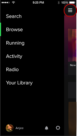
Figure 5-12. The Spotify navigation with the “hamburger” menu.
The team believed that if they could successfully improve the user experience by fixing the navigation, they might ultimately have a positive effect on “second-week retention,” which is the number of users that stay with Spotify (or “retain” two weeks after signing up) Second week retention is often a good prediction of long-term retention (and is this used as a proxy metric for long term retention). Therefore, looking at retention just two weeks after a user signs up allows the company to get a perspective on how their test is performing fairly quickly.
In Figure 5-13, which shows how this example maps to the framework that we introduced in Chapter 3, you can see that one of the problem/opportunity areas identified is navigation. There certainly might have been other data that would have pointed to other areas of focus aside from navigation (e.g., ease of use), but for the sake of simplicity, we’ll only focus on one problem/opportunity area. The team decided to approach this problem/opportunity area using iterative A/B testing to understand what changes within the navigation space could improve second week retention.

Figure 5-13. Spotify navigation example using the framework introduced in Chapter 3 showing the data that led to the “problem/opportunity” area of “navigation.”
Experiment 1: Defining the hypothesis to get early directional feedback
As the team broke this problem space down, they came up with two different hypotheses to test. One was around restructuring the information architecture of the navigation to make the “value proposition” (or what Spotify offers) more clear. A better organization of the navigation could clarify the main activities and areas in Spotify:
Access to the large catalog of music (“all the world’s music”)
Access to the music saved and earmarked by the user (“my world of music”)
The intersection of the two preceding bullets (“music I like and might like”)
The other hypothesis was around making the navigation more prominent in the UI so that it would be easier for users to discover the features that were in the Spotify app. Using the formula introduced in Chapter 4, you could articulate this as:
- Clarify the value proposition
We predict that by simplifying the information architecture of the navigation, more new users will retain past the second week because the organization of the features will be more logical and therefore the value of Spotify’s services will be more clear.
- Make it easier to discover features
We predict that by making the navigation of the application more prominent, more new users will retain past the second week because it is easier for them to discover more features in the application.
Figure 5-14 shows our experimentation framework now with the hypotheses outlined.

Figure 5-14. Spotify navigation example showing the two hypotheses that were being explored.
Experiment 1: Designing the hypotheses
Figure 5-15 shows two examples of designs the team created to represent the two hypotheses that they came up with and compares them to the control. Here you’ll see that in the treatment of the first hypothesis, the content of the navigation has changed, but the mechanism to get there (the “hamburger menu”) is still the same. We are just showing one treatment here for simplicity, but the team also tried different treatments with different information architectures as well.
If you look at the treatment for the second hypothesis, the team had to make some decisions about which tabs to set as the first four and which to put behind the “ellipses” tab, in order to keep the same basic grouping as the control.
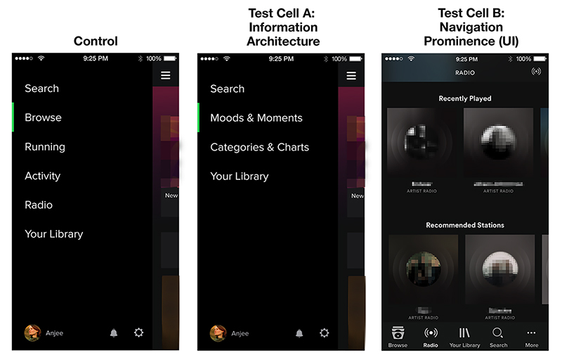
Figure 5-15. The Control navigation shown next to two examples of hypotheses for improving it by either simplifying the information architecture (cell A) or by making the navigation more prominent (cell B).
This first round of A/B testing was done to get some directional learning on a large sample before the team invested heavily in one direction or another. Because this was an early and informational test, the team didn’t spend as much time on fine-tuning the design. Since this was a test intended purely for learning, they never intended to fully launch either of these cells to the entire user base.
The results of this initial test showed that there wasn’t a significant effect on second-week retention for either of the treatments. However, the treatment with a more prominent navigation (test cell B) improved some of the secondary metrics that the team was interested in. Users who experienced test cell B tended to explore more of the application. The team knew about some evidence from a separate piece of analytics research that showed increased exploration of the application was tied to retention. Being aware of this older data helped the team decide to invest further in exploring a more prominent navigation.
Interlude: Quick explorations using prototypes and usability testing
In Chapter 3, you might remember that we talked about taking an iterative approach to experimentation. Figure 5-16 shows how we described this.
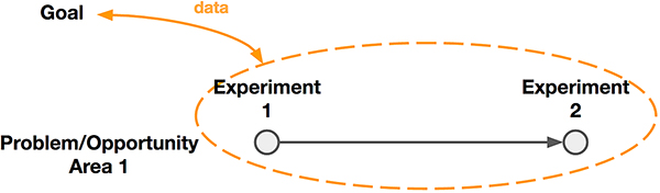
Figure 5-16. When exploring a problem/opportunity area, you might run a series of experiments. Each experiment can provide new data that informs your goal.
Before jumping into another round of A/B testing right away, the team created some quick prototypes to explore different ways to make the navigation more prominent. You could say that they were moving down the spectrum of “global” to “local” and from “exploratory” to “evaluatory.” Some of the things they explored included placing the navigation at the top and bottom of the screen, more prominent directory structures, as well as tab variations that included fewer items, different icons, and icons with and without labels. Usability testing showed that explorations that used the tab structure were generally more successful than the other explorations. Triangulating methods by conducting lightweight usability testing early on made it clear that the team should focus in that direction.
Although we are focusing on A/B testing in this book, we wanted to highlight how using different methods can be beneficial to getting different kinds of data and information at different stages in your design process.
Experiment 2: Refining the “tabbed” navigation
With this information in mind, the team went into another set of A/B tests focusing on the bottom tab bar. In Figure 5-17, you see the next iteration of the A/B test. You’ll notice that the team was now testing two different treatments, each with five tabs, against a new “hamburger” menu control which had fewer navigation items. Two versions of the information architecture were being tested (remember in Chapter 4 when we suggested you keep some of your old hypotheses in your back pocket?). In test cell A, the “Profile” page had been combined with the “Your Library” tab; in test cell B, “Radio” had been combined with the “Browse” tab.

Figure 5-17. Design treatments for Experiment 2 showing the “hamburger” navigation control versus the two versions of the tabbed navigation.
| Experiment 2: Information Architecture | ||
|---|---|---|
| Control | Cell A | Cell B |
Search | Home | Home |
Home | Browse | Browse |
Browse | Search | Search |
Radio | Radio | Your Library |
Your Library | Your Library | Profile |
Now, all of this was being tested on iOS and on Android, and this time the new designs resulted in an improvement to second-week retention. Cell A had the added benefit of also increasing another proxy metric that the team cared about—and so it made sense to launch that one to all users.
After this, the team continued to run experiments to further refine the experience. They experimented with things like number of tabs, labels for the tabs and icon treatments. When it no longer seemed like the experiments they were running were yielding the results they were looking for (impact on key metrics) they determined that they had reached a local maxima in the navigation space. Then, the team was able to move on to other problem area/opportunities to experiment in.
“Designing” your tests
As much as we talk about designing the experiences that you are going to test, it’s also important to think about the structure of the test itself. We sometimes refer to this as “test design.” This is where you take into consideration the set of cells that you are testing. As a team will you be able to get the information that you are looking for from this experiment? Are there any cells that might be extraneous or redundant? Are there any test cells that would be better in the next set of experiments rather than the one you are running now? Are there test cells that are missing, but that would address other ideas your team is thinking about?
You should see each experiment as an opportunity to build your instinct around what would work in future experiments as well as being concerned about the results for the experiment you happen to be running now. There are two things that can help at this stage:
Articulating a strong list of things that you hope to learn (both in success and failure) before you invest in building out your current solution and testing it on your users.
Asking yourself “If X succeeds/fails, what experiment would I run next? What is the next set of experiences I would design?”
This can help you to take a step back and consider what you might choose to amplify differently in each test cell for your current experiment. It might also result in you choosing not to bother with refinements that you might make later because those refinements don’t contribute to learning that would affect your decision on “what to design next.”
It’s useful to think of all of your test cells as part of a larger portfolio. Any given experiment is just one in a series of experiments that you might run. In this way, just as the design process itself is iterative, so is A/B testing. One tangible benefit of this is that you can feel free to exaggerate features of a test cell with the intention to learn about the impact that it has on user behavior, rather than the intention of shipping that as a polished design, letting you take more risks that better inform your knowledge and understanding.
![]() Let’s return to our camp metaphor. Let’s say that you have a hypothesis that you can increase enrollment by offering some new activities. Our hypothesis is:
Let’s return to our camp metaphor. Let’s say that you have a hypothesis that you can increase enrollment by offering some new activities. Our hypothesis is:
We predict that by adding new activities to our program, more campers will enroll because we will be able to engage a wider range of interests and attract a broader group of kids.
It’s your first time experimenting with this idea, so you cast a wide net and decide to offer kayaking, orienteering, bird watching, studio painting, and hip-hop dance. The “control” in your test would be to not offer any new activities. Thinking back to our conversation about asking meaningful questions in Chapter 4, you choose activities that give you a nice range of variables that you can learn about.
| What do we want to learn? | What experiment would we do next? |
|---|---|
Do campers prefer outdoor activities to indoor activities? | Do people prefer outdoor water activities or outdoor land activities? Depending on what we learn, we could also optimize to figure out which indoor or outdoor activities perform best. |
Do campers prefer strenuous activities or relaxing ones? | Try other strenuous or relaxing activities depending on what we learn to see which specific activities perform best. |
You have both outdoor and indoor activities, you also have activities that take place on land and in water and you have some activities that are relaxing and some that are more active. Sometimes it can be helpful to organize your test cells into a table as shown here.
| Indoor versus outdoor | water versus land | active versus relaxing | |
|---|---|---|---|
Cell A: Kayaking | Outdoor | Water | Active |
Cell B: Orienteering | Outdoor | Land | Active |
Cell C: Birdwatching | Outdoor | Land | Relaxing |
Cell D: Studio Painting | Indoor | Land | Relaxing |
Cell E: Hip-Hop Dance | Indoor | Land | Active |
If you were just thinking about this single experiment, then the likely next step is that you would just take the “winning” activity, the one that had the highest enrollment, and offer it to your campers in the coming year. However, if you were proactively thinking about refining your hypothesis through a few more experiments, then you could begin to plan some of your next steps right away. For example:
If all the “active” test cells (A, B, and E) perform well, then you might want to try another experiment with only different kinds of strenuous activity. Would you offer activities that are even more strenuous than the ones you tested in this experiment?
If you see a trend where the “indoor” activities (cells D and E) seem to perform better than the “outdoor” ones, then you might want to explore adding other “indoor” activities, like drama or arts and crafts.
If you find that both of the “relaxing” activities (cells C and D) and the “outdoor” activities seem to perform well, an option might be to offer outdoor painting in the next experiment.
At this point, you might even decide that it’s not worth differentiating between land and water activities, so you might put off Test Cell A off until the next round. Also, based on the results you get from this experiment, you might consider looking for other areas where you can apply your learnings. If it seems that your campers would prefer more outdoor activities, then you might think about what activities you currently have that you might want to move outdoors to see whether it’s the location of the activities or the nature of the type of activities you’ve offered outdoors that caused that preference. Let’s say you already have a yoga class which is in the auditorium, maybe you’ll see if your campers would prefer to do yoga outside instead? What would you learn if the outdoor yoga class did not perform as well as expected?
Other Considerations When Designing to Learn
There are a few traps that you might fall into when you are in the design phase. We’ll point out some of the most common ones in this section. We’ll also highlight some of the other things you could take into consideration during this phase as well.
Polishing your design too much, too early
At the beginning of this chapter, we talked about the importance of designing to the right level of granularity for the stage of experiment that you are in. A fairly common pitfall is getting too detailed too quickly. For example, if the second or third experiment in the Spotify navigation example was five different test cells where the icon styles were varied, instead of considering if the navigation structure could have been simplified further (from five tabs to three tabs) then it might have felt like the team leaped too quickly to testing an execution detail. You would want to prove that your hypothesis was worthwhile first before investing more time in polishing your treatment of it.
On the other side of this issue is the risk of only releasing design work that addresses the MDE (minimum detectable effect, first introduced in Chapter 2). Many designers worry that once they “ship” a version, they’ll never get the chance to revisit or polish it. We already talked about the importance of building alignment within your team about whether you are “exploring” or “evaluating” your hypothesis, as a way to help determine how close you are to finishing, and therefore how much polish your design work should have. Beyond that, having a clear plan of next steps as you’re experimenting can help to combat that kind of behavior, so that designers always have the opportunity to feel proud of finished and launched work. To do so, consider highlighting not just what you would learn, but package it along with a series of additional things that you might have planned, in order to get it to a stage where you feel comfortable with launching it to 100% or your user base.
A helpful tactic is to keep a list of the things you would refine or investigate further as you are designing your test cells—you could call this your 100% launch plan, which gets its name from the notion of rolling out an experience to 100% of your users. This way you already have a number of ideas around where you would invest further. If your experiment is successful, then this list might include things like:
Visual and language polish
Refinement of edge and corner cases
Variations on visual treatments
Now, depending on the kind of test that you are running, what you are trying to learn, and how mature your product is, it could also be the case that having fine-tuned language or visuals might play a significant role in your results and should be taken into consideration early on.
You will need to become a good judge of how much you need to refine the execution of your idea in order to be effective at getting a response from your users. If you’ve done usability studies or used prototyping extensively, you should be familiar with finding this balance. Fundamentally you want to be able to understand if the idea/feature or concept that you have resonates with your users in the way you expect it to. Ensure your design communicates that proposition effectively enough to get a response. As we’ve stated before with respect to the MDE, if we can’t measure the impact of our design work, then we can’t learn from what we’ve done. You should feel that your design does a good job of expressing your hypothesis such that if it were correct you would have seen a response. The question to ask here is “If this test cell doesn’t perform as well as the control will I blame the design for not being effective or will I dismiss the core concept instead?” If you think you might blame the design for not being a good treatment of the hypothesis, then you may want to do more work on it.
Underlying all of this is the notion of prioritization. You’ll have to use your design intuition, your interests, and negotiations with your team and other data sources as you navigate a way to balance providing the “best” treatment of a hypothesis with polishing individual A/B test cells. This is another point where all of those factors will have to come together.
Edge cases and “worst-case” scenarios
As you are designing different treatments of your hypothesis, you’ll want to ensure that none of the designs are at a disadvantage because of edge cases that could break the experience for your users. One approach is to exclude edge-case scenarios from the experiment so that you can keep your data clean. This means, of course, that you will need to design for them later—but only if your experiment is successful. This is one of the advantages of experimentation: you get to decide who is “in” the test groups, so you can ensure that it works for the majority and see how the design lands with some users before fixing those edge cases for everyone.
Another philosophically distinct approach that we learned about in addressing those edge cases, is using “worst-case” data. Josh Brewer, former Principal Designer at Twitter and currently a cofounder of the design tools startup Abstract, shared with us how it “became a necessity” at Twitter to use and consider the messiest possible tweets in their designs: tweets with authors who have very long names with wide letters, geolocation information, broken images, a whole bunch of favorites, and so on. Using the real worst-case data from your company (What is the longest name in your user database? How many favorites does the most favorited tweet have?) is one way to make sure you stress test your designs rigorously and steer away from wasting time testing work that is slated to fail at the outset.
At Airbnb, they also incorporate the notion of worst-case data in their design by including it in their mocks and prototypes. The goal is to ensure the product is well designed for the best- and worst-case scenarios. For example, they make prototypes showing a listing with low-quality photos and incomplete information, as well as a listing with high-quality photos and in-depth information. And they make prototypes for a host with one listing and another with 50 listings so they know that every user will be supported.
As the company grows, international considerations become even more important. At Airbnb, it was a big realization for the design team when they learned that the majority of the interactions between hosts and guests were not in English. Hearing that data helped provoke the team to recognize how they needed to broaden their thinking around the experiences they were designing. The copy, layout, and overall utility of the product needs to be thought through for a global audience. Simple things like word length and line breaks in different languages become problematic if not addressed early in the design work. Now designers are expected to create mocks and prototypes in a variety of languages to ensure the product will support the differences between them.
Addressing these edge cases could become another part of your 100% launch plan along with design polish.
Taking advantage of other opportunities to learn about your design
Every time you run an A/B test, it’s a good opportunity to learn things about your design beyond whether it impacted the metric you were looking to affect. The design phase is a great time to get involved in the discussion around instrumentation and measurement. Think of this as designing the measurements for the change you expect to see as a result of your design.
You might be pinpointing a very specific thing that you want to learn or you might be taking more of a shotgun approach where you are trying many different design techniques. Think in advance about what kind of data you would like to see from your design and work with the partners you are building the product with to ensure that you have the right kind of tracking on your data:
What are the elements in your design that you want to understand? What data will best help you learn about those elements? (Some examples might be the number of clicks on a particular element, how many times something is seen before it’s clicked, how much of a given feature does someone see—page scrolls, or how far down a process the average user gets.)
Aside from tracking elements on a particular view, what are other things about the users’ path or journey that you would want to understand? (How did they get there? What are the demographics of the people who use it? Where do they go next? How often do they use something over the course of a session or over the course of their time as a user?)
Identifying the Right Level of Testing for Different Stages of Experimentation
In the Spotify navigation example we shared earlier in this chapter, you saw that there were a couple of different directions that the team was exploring. The very first exploration was around the impact of information architecture on the user behavior versus the impact of the user interface (how prominent the navigation was) on the navigation. They had two hypotheses they were exploring simultaneously to improve the experience for all Spotify users:
- Hypothesis 1
“We predict that by simplifying the information architecture of the navigation, more people will retain past the second week because the value proposition for Spotify will be more clear.”
- Hypothesis 2
“We predict that by making the navigation of the application more prominent, more people will retain past the second week because it is easier for them to discover the other features in the application.”
Each hypothesis might have multiple treatments, each becoming a single test cell. This would look like Figure 5-18.

Figure 5-18. An experiment might have multiple hypotheses; each hypothesis can have multiple expressions or test cells.
We’ve already highlighted the trap of prematurely testing designs that are too specific, which could result in narrowing down your explorations too soon. We also talked about the importance of thinking of your experiments as a sequence of events, and thinking about which tests you might run next depending on the results you get. Figure 5-19 illustrates this concept.
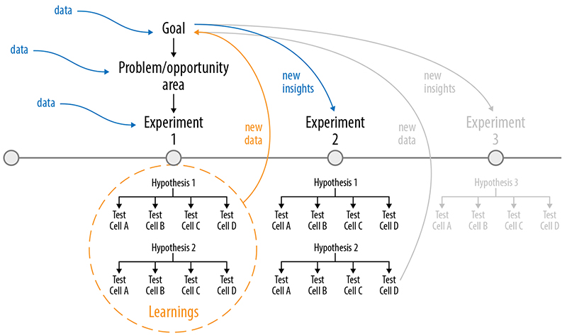
Figure 5-19. Thinking about your experiments as a series can help you be proactive about how you design.
A/B testing shouldn’t slow you down. It’s an easy mistake not to think about what your next steps are until you get your results back. But if you are always waiting for results like this, then your pace of improvement will be limited. If you can anticipate what your next steps might be depending on the results you get, you can start to design your next stage of experiments while you are waiting for results. In Figure 5-19, we’ve illustrated this by showing two hypotheses that are being tested in parallel.
In this manner you might already be able to come up with some ideas for Hypothesis 1 and Hypothesis 2 that you start designing or “concepting” right away. If the actual results from your test come back, and you see that Hypothesis 2 is more successful than Hypothesis 1, you might abandon some of the exploratory work that you were doing on Hypothesis 1. However, you will also have a head start on some of the work on Hypothesis 2 and might have uncovered some new ideas in Hypothesis 1 that you could still use to inform the next round of design. This is shown in Figure 5-20.

Figure 5-20. As you learn from your experiments, you can adjust future experiments accordingly.
Running parallel experiments
Running parallel experiments is another way you might think about sequencing your tests. This approach can bring local/global experiments together. For example, we could run various overlapping experiments instead of individual experiments. In Figure 5-21, we show how if a number of these individual overlapping experiments won, it could be another way of getting to the global result in Figure 5-6.

Figure 5-21. How parallel experiments can work together.
This is a slightly different approach than adding more treatments. Running parallel experiments at large scale will likely require investment in experimentation tooling to manage assigning users to test groups. One reason this is important is that being allocated into multiple experiments can, in rare conditions, confound results, making it hard to attribute a change in behavior to a particular experimental condition.5
At small scale, interaction between individual experiments can be reduced by planning carefully to run experiments on aspects of the design that aren’t highly related—for example, a change to the home page of your product may not have influence on how a user uses the checkout.
If you are running parallel experiments, you’ll also need to consider whether the results you get from each experiment will be compounded when they are combined or if there were some aspects of the experience that might impact or cancel each other out. If you get two “winners” at the same time, validate how they work together with a new experiment.
Thinking about “Experiment 0”
Now, we want to introduce one more consideration when you are at the design phase. Before you get too attached to running the first experiment in a new problem/opportunity area, a good question to ask yourself is, “What is the experiment I might have run before the one that I am planning now?” (see Figure 5-22). This is a way to determine if you’ve jumped prematurely to a set of experiments that are too detailed for the phase you’re in.
A simple example of this kind of “Experiment 0” thinking is to remove the feature entirely to see if it has any value at all before running Experiment 1 and 2. The team at Skyscanner did exactly this kind of experiment by removing the “cheapest flights ticker” from their home page. They found it made no difference to their metrics of interest so they killed the feature and moved onto other ideas rather than spending time on designing and supporting experiences that might have been optimizations around that “cheapest flights ticker.” Killing features can be a great way to save resources because it means you don’t have to maintain them. This can be an added bonus, especially in teams where you tend to focus on adding features rather than removing them.

Figure 5-22. Questioning what experiment you might have been able to run prior to the experiment you’re currently running.
The strategy of using “painted door” experiments (discussed earlier in this chapter) is also another way of accomplishing an “Experiment 0.” Before you build out the feature or invest a lot of time in crafting it, a “painted door” experiment can help you do something quick and easy that gets you some initial metrics. Ronny Kohavi gives an example where before investing engineering effort to improve performance, Microsoft ran a latency experiment (adding various delays) to see how much speed mattered.6
Where you are in the product development cycle (whether you are at an exploration stage or an evaluation stage) will affect:
The breadth or narrowness of your hypotheses
The number and nature of variables that are being considered in your experiment
The questions and solutions that you are investigating in your experiments
If you’re working on a product that is fairly mature and been around for a while, you probably already have a good handle on what is and isn’t working, and your experiments will be more focused. If, however, you are earlier in your stage of product development (e.g., launching on a new platform for the first time—as was the case in the Netflix PS3 example) then you will probably have hypotheses that are very different from each other and your explorations might be further apart.
As you continue to run more experiments, your explorations will naturally become more focused and narrow. This happens both at the macroscopic as well as at the microscopic level of your experiments. As you learn more about what works for your customers, you may not need to explore as many “problem areas” simultaneously (as shown in Figure 5-23) or you may start to focus on changing only specific variables.
A key question that gets asked often is “How do you know when to stop experimenting?” It’s perhaps better to answer this by saying you shouldn’t ever think about “stopping” experiments, but rather changing the nature of the experiments you are running if you don’t see more gains in the area you are pursuing.
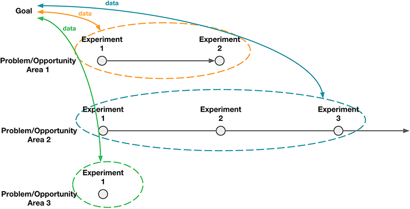
Figure 5-23. You may explore multiple problem area/opportunities simultaneously.
You’ll remember that we talked about this as the difference between global and local experiments and we’ll revisit the return on investment in the following chapter as well when we look at results. Generally speaking, though, you will develop an understanding over time of how much effort it takes to run an experiment and the “cost” of different kinds of experiments. As you start to see how much improvement in your metrics these experiments result in, you’ll become adept at making decisions around whether it’s worth your efforts to continue down a single line of experimentation or to instead break out and look for a new direction.
Summary
As most designers know, there are many different ways to craft a design. In this chapter, we talked about the importance of creating multiple expressions of your hypothesis and understanding if your designs were going to be good expressions of your hypothesis.
With A/B testing, remember that each test cell is a proposed solution to a problem. It is your hope that each of the new test experiences you design will perform better in the metric that you are measuring than your control. To vet whether you’re testing the right things or enough things or too many things, for each version you must keep asking yourself “What did I learn with this test cell or this design that I wouldn’t have learned with the others?” If the answer to your question feels like it’s premature (e.g., are you answering an evaluation question when you should be exploring?) or if it feels redundant (e.g., you already have another test cell that tells you the same thing) then consider eliminating that solution.
It’s always a shame when you get to the end of the test and you realize that you’ve drawn yourself into a tangent during the design phase because you’ve somehow lost sight of the core metrics that you’re trying to move or you’ve gotten caught up in the details. Part of data-aware design is having the ability to hold yourself accountable to producing design that is in service of delivering a great experience but also learning more about how you can make that experience as good as possible in the short and long term.
We encourage you to think as much about designing with the purpose of maximizing learning as you might think about solving the problem itself. This is a slightly different mindset than when you are “designing to ship.” When you design with just shipping in mind, you sometimes don’t think of the act of designing as an ongoing and iterative process. You might spend more time polishing every aspect of your design rather than focusing on the ones that are most critical to helping express your hypothesis. When you “design to learn,” you’re generally not designing just one experience but designing several experiences—use each of those opportunities to design as differently as you can and to learn as much as you can from the results you gather.
As a designer, you are defining and inspiring the changes in your product experience. You’re in an ongoing dialogue with your customers to find out what is the best experience that you can craft for them. Your design will express the different possibilities and solutions that you can provide to your customers, and the data that you collect along the way will help you tune that experience and measure whether you’ve succeeded.
Finally, we want to end with a quick reminder that you can always ask your colleagues for feedback at this stage to see if they think that your designs capture the essence of the hypothesis that you are trying to represent. It’s a simple way to get some feedback: think of it as “internal user testing” with your coworkers who may not have worked on the product or design. (And as you know, we always encourage leveraging methods other than A/B testing along the way to understand the impact of your designs.) Analysts who have worked with A/B testing analysis and results and user researchers who have countless hours of seeing how users respond to different designs are often very insightful at helping to recognize the effectiveness of your design and can be very good at predicting what outcomes you might expect.
Questions to Ask Yourself
We covered a lot of ground in this chapter, but wanted to highlight a few key questions that you might consider asking yourself along the way:
How can you create a design or an experience which best expresses your hypothesis?
How are the key components of your hypothesis represented in your design?
How does the design you’ve made help you gather the right kind of data that will provide evidence in favor of or against your hypothesis?
What are the elements that are key to your design at this stage in the process? What are the things you can afford to focus on later?
What “Experiment 0” would you want to have run before running your current experiment? Should you run that “Experiment 0” first?
Are there edge cases that could fail your design? Can you exclude them from the first iteration of your experiment to get feedback on the majority group earlier?
For each test cell, what is the unique thing that you will learn from that cell compared to the others? (If you don’t feel like you will learn something new or different, then you should question if you are really putting your effort into something that will give you measurable impact.)
What is the minimum number of test cells (independent designs) that you need to create in order to get the learning that you are looking for?
Can you articulate the differences between each of your test cells and also identify what it is that you will learn from them?
Are you making the right kinds of experiments for the phase of exploration or evaluation that you are in? (Have you gone too narrow too quickly with your line of testing?) Have you aligned on that with your team?
Are you properly scoped into a global problem or a local one? Have you aligned on that with your team?
1 http://gaia.wikia.com/wiki/File:GaiaOnline_Homepage_2010_-_Big_Red_Button.png
2 https://building.coursera.org/blog/2014/09/11/talks-at-coursera-a-slash-b-testing-at-internet-scale/
3 https://techcrunch.com/2014/05/24/before-the-hamburger-button-kills-you/
4 http://blog.booking.com/hamburger-menu.html
5 http://research.google.com/pubs/pub36500.html; http://www.exp-platform.com/Pages/ControlledExperimentsAtLargeScale.aspx
6 https://www.quora.com/How-would-you-design-an-experiment-to-determine-the-impact-of-latency-on-user-engagement