Chapter 6. Images
So far you’ve learned how to set up your web page, add some basic styles, and use media queries to adjust the layout depending on viewport width.
But your page is going to look quite boring until you get some images on it.
You’ve probably heard that there’s a lot of complexity around adding images to responsive websites. Images won’t always be displayed at the same size, because they’re flexible, so how do we make sure that we aren’t wasting bandwidth by sending a huge image to a device with a small screen?
And then how do we make sure we’re sending appropriate images to high-density (retina) screens?
This is one of the parts of responsive design that’s still being worked out. There are a few solutions that are in common use, which we’ll talk about here, but each has some drawbacks, and none of them seem like the perfect solution. It’s likely that there will be new ideas coming along in this area in the next couple of years that may change how we handle images on responsive websites.
In the meantime: start with the basics, which we’ll cover in this chapter. Optimize your images for the Web. Don’t use images when stylized text can do the same job, and use other solutions like icon fonts when appropriate. Make sure your images have good alternative (alt) text so they’re accessible to everybody.
When you’re deciding the best way to handle responsive images on your site, look at the different options and figure out what works for you. If you don’t implement a responsive image solution on your site, the site may take longer to load. That’s not optimal, but it’s not the end of the world as long as you don’t have lots of huge images. There are other ways to reduce page weight (the combined size of all the files needed to display the page), which we’ll address in Chapter 11.
Providing images to high-density screens is complicated too, but it’s also not the end of the world if you aren’t able to do it. Regular images will still work; they just won’t be as crisp.
Most importantly, keep up with what’s new in responsive images, to make sure you can take advantage of the new ideas and solutions that are likely to be coming soon.
Note
We’ll be talking a lot about the size of an image in this chapter. In this context, we’re using that word to mean the file size of the image, usually measured in kilobytes (KB). We’ll refer to the height and width of an image as its dimensions to avoid confusion.
Ways to Display Images
When adding images to your website, there are several methods you can use, depending on the purpose of the images.
CSS Alternatives
When adding images to your site, the first thing to consider is whether you actually need all the images.
For example, CSS makes it possible to add borders, shadows, and gradients to buttons and other elements, like you see in Figure 6-1. Until recently, it was common to use images for this type of decorative effect. But now you can get the same look using CSS, meaning that there will be fewer images to download (and less page weight).

Additionally, by having elements such as buttons styled with CSS instead of displayed as images, you can easily change colors and other styles site-wide by changing a bit of CSS, rather than having to re-create each image. CSS-styled elements are also more responsive, as they can change dimensions without losing quality.
Not all older browsers support these CSS properties, but this small proportion of your users will still get usable buttons on the screen—they just might not have rounded corners or a shadow.
The code to create a button like that is pretty complex, but if you do a web search for “CSS button generator” you’ll find numerous websites that will allow you to design a button by choosing values for all the possible properties, and then provide you with the necessary CSS that you can copy and paste into your stylesheet.
You can also display any stylized text on your site using CSS instead of an image. Pretty much anything you can do in an image editor with text is also possible in CSS—outlined text, sideways text, and so on. Take advantage of that, so you can make sure your stylized text is responsive and also accessible.
However, if the stylized text is something like a company logo that needs to always look exactly the same, it’s best to use an image to make sure it comes out correctly.
Content Images
Content images are those that convey meaning to the user, either as part of the message of the site (such as an action photo accompanying a newspaper article), or as a navigational element (such as icons that lead the user to the website’s social media pages).
Remember that not all of your users will be viewing the website in the same way. Some may be using devices that can’t display the latest CSS, and some will be using screen readers that display alternative text in place of images.
For images that are part of the site content, you’ll generally use the HTML <img> element. Remember with structured HTML, each element has meaning.
The <img> element is one of the few that has only one tag, not a starting and ending tag. It also has attributes:
<img src="images/norwaypine.jpg" alt="An evergreen tree with big bushy branches.">
The two attributes you’ll always use are the src attribute, which tells the browser where to find the image file, and the alt attribute, which provides a text alternative in case the browser is unable to display the image. We’ll go into alt text in more detail shortly.
Background Images
The CSS background-image property allows you to add images to the page for decorative purposes, without having them be part of the content:
p { background-image: url(flowers.png); }You shouldn’t use background-image to add content images because they won’t be visible to people using screen readers or other text-based browsers.
When you add background-image to the CSS for an element, the image will display as the background of that element, behind whatever is contained inside it (like the text in a paragraph). You’ll see an example later in the chapter.
Image Sprites
As you’ll learn in Chapter 11, each separate HTTP request that a web page makes for necessary files (CSS files, images, etc.) will add to the load time of the page. Reducing the number of requests will make your page load faster.
You can reduce the number of image files that need to be loaded by combining many small images into one large image, and then using CSS positioning to only display each particular piece of the image in the correct place on the page.
These combined images are called image sprites.
For example, Figure 6-2 is the image sprite that Apple uses to display the background for the top navigation on its website. It’s various states for each button (active page, hover, etc.), combined in one image.
The actual navigation looks like what you see in Figure 6-3, with the active page (here, “iPhone”) having a different background than the other buttons. Each rectangle section of the image sprite provides a possible background image for a button, and with CSS, only one rectangle is displayed for each button.
Of course, as we learned earlier in this chapter, buttons like this often can be displayed with pure CSS, not requiring images at all!
Icon Fonts
Icon fonts are a great solution for small graphics. An icon font set is like any other font, but the alphanumeric characters have been replaced by symbols. You can see an example of an icon font in Figure 6-4.
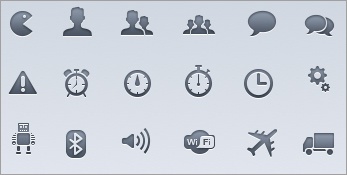
Icon fonts, like regular fonts, are vector-based, which means each character can be displayed at any size without any change in quality. This means they scale well, even to large dimensions and on high-density displays.
Although each character can only be one color, not multicolor, you can choose any color, just like you do for text (and also use any other CSS you like to style them, as you do for text).
You can find an icon font with pretty much any symbol you need. Usually they’re based on themes. There is an icon font set with symbols of the shapes of all the world’s countries. You can also find weather icons, social media icons, animals, traditional symbols—anything.
To include icon fonts in your design, use @font-face, just like with any other font (you’ll learn how to add fonts to your site in Chapter 9).
Check out Chris Coyier’s “Using Fonts for Icons...” (http://css-tricks.com/using-fonts-for-icons/) on CSS-Tricks for instructions on how to get started. Also make sure to read Drew Wilson’s “Using Icon Fonts” (http://pictos.cc/articles/using-icon-fonts/) on Pictos to find out how to ensure they are accessible.
You can search the Web to find icon fonts (many of which are free), and there are even websites that allow you to create your own icon font.
Although icon fonts generally have a small file size, don’t use them indiscriminately—it does add up.
Alt Text
Keep in mind that not every user visiting your website will be able to see the website.
Most commonly, this will be the case for users who are blind and using a screen reader. The user cannot see the image, so the screen reader reads the alt text to describe to the user what’s in the image. You need to have good alt text so that these users aren’t missing out on important parts of your content.
But it’s not only blind users who are a potential audience for your alt text. Sometimes an image won’t load because of problems with the Internet connection or the files, and in that case the user will see your alt text on the screen in the location where the image should appear.
In Figure 6-5, you can see the Amtrak website with all its images displayed, and in Figure 6-6 with all of the images replaced with alt text.
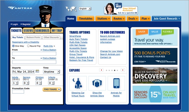
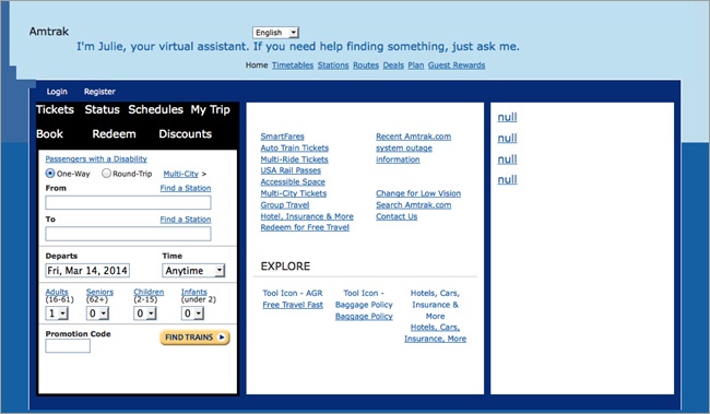
You’ll notice that the content images are replaced with alt text, such as the Amtrak logo at the top left. However, the train conductor head next to the logo is not replaced, because it’s decorative and does not contribute to the meaning of the content.
If it would not make sense to replace an image with alt text, use an empty set of double quotation marks for the alt attribute’s value, without a space between them:
<img src="images/decorative.jpg" alt="">
Don’t simply omit the alt attribute. If you do that, screen readers won’t know whether or not the image is meant to be content, and because there is no alt text, they will read the filename to the user as the next best option.
Using empty double quotation marks will tell the screen readers to skip the image entirely.
One problem on the Amtrak site is that the promo images in the right column don’t have any alt text—not even empty quotation marks—so they show up as “null.”
Writing Good Alt Text
It’s not enough to add alt text to images; it needs to be text that actually tells a user what’s in the image, in the context of the content. The alt text is a replacement of the information provided by the image, not just a description of the image. I’ll explain the difference.
To figure out what the alt text should be for a particular image, imagine that you are reading the web page out loud to someone. When you get to the image, what would you say?
Keep in mind that the caption provides information as well, and you don’t need to duplicate that information.
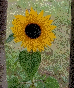
For example, consider the image in Figure 6-7. Let’s say that the caption of the photo is “Along Highway 101 in Florida.”
To choose good alt text, you’ll need to consider the context of the surrounding content first.
For example, maybe this picture accompanies an informational article about hurricanes. The picture conveys the effect of a hurricane on palm trees. Your alt text might be, “A line of palm trees during a storm, with their branches all being pulled in one direction by the wind.”

Or perhaps the picture accompanies a news article about a hurricane that went through Florida yesterday, and conveys a description of what the highway looked like during the hurricane. Your alt text might be, “Palm trees tilting in the wind, alongside a wet, deserted highway.”
The same picture accompanying different content has a different meaning, and because you can’t possibly describe every nuance of the photo, you need to decide what’s most relevant to the context.
Even though only a few of your users will likely see this alt text, it’s very necessary to those users, and you should put effort into it. It may be tempting to be overly terse and give the photo brief alt text such as “Trees.” Although that does describe the image, it doesn’t provide helpful information to the user.
Go into as much detail as is necessary to adequately convey the meaning of the image. However, don’t make the alt text too long. It’s customary to keep it under 256 characters (including spaces), but there’s not actually a character limit.
You don’t always need to describe the visual appearance of the image. For example, a company logo can generally be replaced by the name of the company and any additional text that appears in the logo. You don’t need to describe the colors and appearance of the stylized text.
In other cases, the image may display redundant information. Say you have a page listing corporate sponsors for an event, and each list item has the company’s logo next to the company name in text. If your alt text would mean that the list item would be read as “Company Name, Company Name,” it would make more sense to not use any alt text for the logo, so “Company Name” is only read once.
If you’re not sure, just imagine the page without the images, and see if your alt text helps the page make sense. Your browser or an add-on likely has an option where you can replace all the images on your page with the alt text, so you can see exactly how it turns out.
You don’t need to start your alt text with “Image of...” or “Picture of...”; the screen reader will announce that it’s an image before reading the alt text.
It’s fairly common, but not a good practice, to use the title attribute to provide additional information about an image, which will “pop up” when users move the mouse cursor over the image. Doing this means the information is not available to all users (mobile users, keyboard-only users, most screen reader users). If you have information to provide to users, it needs to be in the caption so it’s provided to all users.
And don’t simply duplicate the alt text in the title field, because some screen readers will read both. For more information, see Steve Faulkner’s “Using the HTML title attribute” (http://blog.paciellogroup.com/2013/01/using-the-html-title-attribute-updated/) on The Paciello Group website.
Image File Formats
Generally, the images you’ll use on your site will be JPEG, GIF, and PNG images. Any browser can display those file types. We’ll also look at SVG images; these are more flexible than the other types, but currently not all browsers can display SVG images. You can tell the file type of an image by its extension.
The differences among the file formats are important for responsive design, because the format you choose can affect the size of the image. You want to use the format that results in the lowest file size, while still producing an image that looks the way you want it to.
There are other image file types, but they don’t work in all browsers, so you should avoid them. If you have an image with a different extension that you want to use on your page, you can use your image editing software to convert it to a JPEG, GIF, or PNG file.
JPEG
File extension: .jpg or .jpeg. Pronounced “jay-peg.”
These are traditionally the most common type of images used on the Web. They work well for photographs and other types of images that use a large range of colors.
GIF
File extension: .gif. Commonly pronounced with a hard G, like “gift,” but some people pronounce it with a soft G, like “jif.”
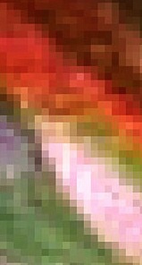
This type of image is compressed (giving it a smaller file size) by reducing the number of colors used in the file. A GIF can display no more than 256 colors, which means that it generally can’t be used for photos, which might have thousands of colors. Figure 6-8 shows a photo saved in GIF format. It looks pixelated because there aren’t enough colors to make everything blend together.
The GIF format is best used for images with a smaller range of colors, such as logos or illustrations, rather than photos.
Unlike JPEG images, GIFs can be made to have areas that are transparent, so when the GIF is displayed on the page, the background will show through the transparent areas of the image.
Additionally, GIF images can be used for very short animation clips, by saving a number of different frames to be displayed in sequence. Although this may occasionally be useful, the file size will greatly increase. You may be able to reproduce the animation using CSS, which will have less impact on your site’s performance.
Another thing to consider is that many people find moving parts on a web page to be distracting, so animated images are best avoided.
PNG
File extension: .png. Pronounced “ping.”
There are two types of PNG images, and when you save a file as a PNG in your image editing application, you’ll be asked to choose between these:
8-bit PNG files support only 256 colors, similar to a GIF file, but because PNGs are compressed differently, the file size might be smaller than the same image as a GIF.
24-bit PNG files support millions of colors, similar to a JPG file, although the compression often leads the file size to be larger than the same image as a JPG.
Both types of PNG files allow for transparency, like GIF files. However, the 24-bit PNG files also allow for partial transparency, which is when you can see the background (the web page) behind the image as a whole, not just through the empty areas of the image (this effect isn’t supported by IE 6 or older). You can achieve a similar transparency effect with CSS using opacity.
SVG
File extension: .svg. Pronounced “ess-vee-gee.”
SVG is a vector graphics format for images. What that means is that instead of having data for every individual pixel of the image, as other formats do, it has data in XML format that defines the various parts of the image and their relationships: lines, shapes, colors, gradients, filters, and so on. This type of image is appropriate for graphics, but not photos.
Because SVG stores the data in this way instead of pixel by pixel, it’s resolution-independent. You can resize the image to any dimensions without degrading the quality, so you don’t need to have separate images for different resolutions.
The only downside is that IE 8 and earlier and Android 2.3 and earlier don’t support SVG images at all, so in those browsers you’ll need to use JavaScript to replace the images with images in a different format. You can do this with a plug-in such as SVG Swap (https://github.com/teleject/svg-swap).
To learn more about using SVG images, read Chris Coyier’s “Using SVG” (http://css-tricks.com/using-svg/) on CSS-Tricks.
Optimizing Images
One of the biggest problems with user experience on websites is performance—how long it takes the page to load and finish rendering. If it takes too long, the user will give up and go away. Worse, over a slow connection the page might not finish loading at all, no matter how long the user waits.
One of the most common culprits is images.
Pixels and Resolution
Before we talk about optimizing images, we need to talk about pixels. You probably know what a pixel is. On your computer screen, it’s one physical point of color (or grayscale), the smallest point the screen can display. The images you see on the screen are actually made of dots, the same as images that you see on a TV or printed on paper. There are so many of them that you generally can’t see each individual dot, but zooming in, they look like what you see in Figure 6-9.
The number of pixels determines the resolution of a computer screen. For example, a 1024 × 768 monitor screen is 1,024 pixels wide by 768 high. That’s considered a 15” display—12” wide by 9” high, or 15” diagonal.
Until recently, pixels were always the same size. You could tell from a screen’s resolution how big it was. A 1280 × 1024 screen was physically larger than a 1024 × 768 screen.
And so that was how we designed things—in pixels, because they’d always be the same size on every screen. An image that was 300 pixels × 300 pixels would appear the same size no matter what monitor you used to view it.
But in recent years some device manufacturers realized that if they made the pixels smaller, fitting more pixels on the screen, it would make what’s on the screen look more “real.”
For example, an iPhone screen appears to be 320 × 480 pixels, when you look at the physical size. But the actual resolution is 640 pixels × 960 pixels—twice as many pixels in each direction.
What does this mean for that 300-pixel image that we just mentioned? Well, the iPhone screen, when displaying a web page at actual size, will behave as if the screen is 320 × 480 pixels—otherwise, everything would always be really tiny. So that 300-pixel image will be displayed using twice as many pixels in each direction: instead of 300 × 300, it will use 600 × 600 pixels.
So now we need to differentiate between the pixels that the iPhone pretends it has when it displays the web page (320 × 480 pixels) and the actual, physical pixels that make up the screen (640 × 960 pixels). The pretend pixels that we refer to in our designs are called reference pixels or CSS pixels, and the physical pixels on the screen are called device pixels or hardware pixels.
High-Density Screens
These newer screens like the iPhone’s that have more device pixels than reference pixels are called high-density screens. By definition, they have a pixel ratio of higher than 2. The extra pixels make these screens look better than normal screens—with enough pixels, the human eye is unable to see the individual pixels, and it looks more “real.”
Apple calls these screens retina displays, and you can find them on newer iPhones, iPads, and MacBook Pros. For example, an iPhone 3 has a resolution of 320 × 480. The iPhone 4 is the same physical size, but has a resolution of 640 × 960, which is twice as many pixels in each direction (four times as many total).
The difference between device pixels and reference pixels can be pretty confusing, which is one reason why we’re moving toward using relative units like ems and percentages in web design—so we don’t have to rely on what the screen is calling a pixel (which could change in future devices), but instead use measurements that will be the same on every screen.
Different devices represent pixels differently, and that’s all still being worked out.
If you want to learn more, read Scott Kellum’s “A Pixel Identity Crisis” (http://alistapart.com/article/a-pixel-identity-crisis) on A List Apart.
The issue with high-density screens is that if you send normal images to these screens, the screens will display the images at the expected dimensions, but because they are filling a space with four times as many physical pixels as if they were displayed on a non-high-density screen, they will often look pixelated or blurry.
The optimal solution is to provide an image with twice the dimensions. For example, instead of a 200 × 200 image, provide a 400 × 400 image, but display it in the same 200 × 200 (reference pixel) space. On high-density screens, it will look the same size, but it will appear very sharp.
But now that we’re trying to provide different images for high-density screens, we have images with greater file sizes that take more time to load. You don’t want users with non-high-density screens to have to waste bandwidth on these larger images. We’ll address this later in the chapter when we talk about responsive images—how to use different images depending on whether the screen is high density.
If you’re using sets of two equivalent images, the convention has been to add “@2x” on the end of the filename to designate which images are for high-density screens. For example, your files may be named tree.jpg and tree@2x.jpg.
Additional images don’t have to always be 2x, because high-density screens can have various pixel densities; sometimes it’s ideal to create both 1.5x and 2x images for screens with different resolutions, although it may not always be necessary and can just create an extra level of complication.
You can use various solutions involving JavaScript or CSS to switch out images so that high-density screens get high-density images. To learn more, read Edward Cant’s Menacing Cloud blog post, “Optimising for High Pixel Density Displays” (http://menacingcloud.com/?c=highPixelDensityDisplays).
If you don’t have the skills or resources to add separate high-density images to your site, you have two options.
First, you can use a high-density version for all screens, and just make sure it’s sized correctly. The downside to this is that the image will be much larger and take longer to load. If your site doesn’t have very many images, this may be an acceptable solution.
The second option is to stick with the regular-density versions of your images. They will still display on high-density screens, but may look slightly blurry. Check out how your site looks on a high-density screen to determine if that’s acceptable to you.
Of course, you can decide between one option and the other for each particular image on your site—you don’t have to do the same thing for all of them.
Compressing Images
Compressing your image files is a way to decrease their size and help your images load faster.
In your image editing application, you can start with finding an option to save your image as low, medium, or high quality (look for an option like “Save for Web” or “Export”). Try saving your image at different quality levels to see how the file size changes. Some images will look blurry or pixelated at lower quality, and not acceptable to use on your site. But other images will still look good at a lower quality setting, allowing you to use smaller-sized files.
Changing the image file type may also decrease the file size. Try saving your image as a JPEG, GIF, or PNG to see if that makes a difference. Again, make sure it doesn’t noticeably decrease the quality.
Applications like Photoshop give you the option to see different versions of your image next to each other before saving, and compare file size and file type on the screen.
Try to use the version of your image with the smallest possible file size that still looks good. Make sure you test it on different device screens, as that can make a difference in the appearance.
Also try tools like Smush.it (http://www.smushit.com/ysmush.it/) from the Yahoo! Developer Network, a web-based tool that can optimize images without changing the visual quality.
To learn more about how to optimize your images for the Web, read Christopher Schmitt’s Designing Web & Mobile Graphics: Fundamental Concepts for Web and Interactive Projects (New Riders).
Note
Even though you’re compressing images to optimize them for the Web, you need to keep the original, high-resolution image files in case you need them someday. One trick for keeping track of the original files is to simply upload them to the same directory in your website as the optimized images you’re using on the site. Even though the high-res versions won’t actually be used on the site, if someone else needs to use the files in the future, they’ll know where to find them.
Storage is cheap, so your cost in keeping them there will be minimal. Give the original files similar names that make it clear they’re originals so you’ll know which is which, such as flowers_original.psd.
Actual Dimensions
If you don’t use HTML or CSS to tell the browser what dimensions to make the image, the browser will by default display it at full size. These are the dimensions you saved it as in your image editing program—let’s say 300 × 400 pixels.
Sometimes this is fine, but sometimes you want your image to be smaller than its actual dimensions, depending on the width of the viewport. You can use CSS to make it smaller.
However, you never want to have your image display larger than its actual dimensions, because it will end up being blurry. Luckily the browser will never do that, unless you purposely specify it in your CSS. Figure 6-10 and Figure 6-11 compare the difference between an image at its actual dimensions, and an image displayed larger than its actual dimensions.

With responsive design, your image might be resized for different screen widths, so you always want to start out with an image file that’s the largest dimensions you’d want your image to be at any viewport width, and go from there.
However, you don’t want your website to download an image file that’s much larger than the one you need for a particular screen size—we’ll address that issue later in the chapter.
Content Images
When adding content images to your website, you’ll be using the <img> element. In the next few sections, we’ll look at how to add content images to your page, get them in the right place, and make sure they’re the right size.
The <img> element
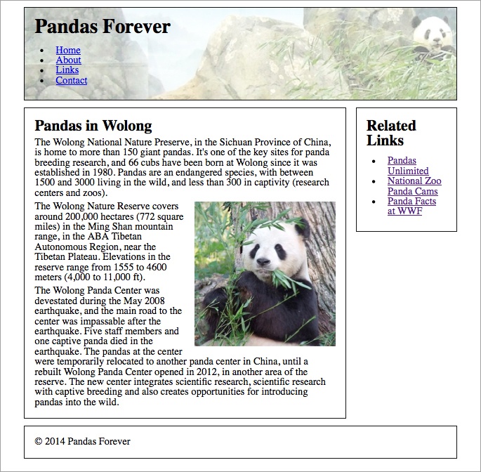
The <img> element is an inline element. In the following code, it is between two block elements, the <h2> and a <p>, so it’s stacked between those elements, as you see in Figure 6-12:
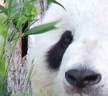
<h2>Pandas in Wolong</h2>

<img src="images/pandaphoto.jpg" alt="A panda eating bamboo.">

<p>The Wolong National Nature Reserve, in the Sichuan Province of China ...

The <img> element is a little different from other elements we’ve looked at so far, in that it doesn’t have opening and closing tags with content between them, as heading and paragraph elements do. Instead, it has only one tag, and uses the src and alt attributes to determine what to display on the page. Both of those attributes are required.
The src attribute simply is a link to your image file, either as a relative link if your image file is part of the same website (images/pandaphoto.jpg) or an absolute link to another website (http://www.example.com/pandaphoto.jpg).
We already discussed the alt attribute, which tells the browser what to display when the image is unavailable.
Adding an Image
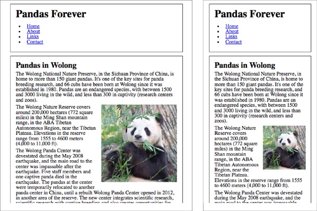
Right now we’re just going to look at our layout at the widest viewport width. There’s a big empty space next to the photo that we want to do something about.
You’ve seen enough websites, magazines, and newspapers to know that the text usually will wrap around the picture to fill all that whitespace. This is where the float property, which we discussed in Chapter 4, comes in.
We’ll give the image a float: left so the element will be positioned all the way to the left and the following elements will “float” around it to fill any available space, as in Figure 6-13:
article img { float: left; }You could also float the image to the right, as in Figure 6-14:
article img { float: right; }And then you may need to add a little padding to make it look right, as in Figure 6-15:
article img { float: right; padding-left: 3%; padding-bottom: 10px; }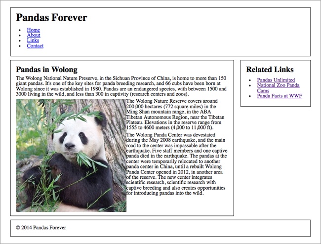


Flexible Image Dimensions
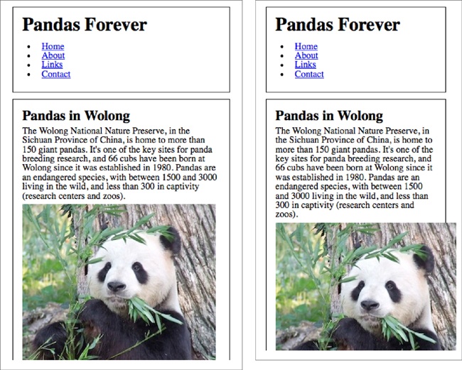
The image is displayed at full size, because we didn’t use CSS to change its dimensions. At our maximum page width, that works well—the image is large enough to see a lot of detail, and there’s still plenty of room for the text to flow around it.
But if we make the browser window narrower, it gets to a point where the text is kind of cramped around the image, as in Figure 6-16.
As the viewport gets smaller, it makes sense for the image to get smaller, so it’s not taking up so much of the screen real estate. We can do this by giving the image a width of 50%, which means it is half the width of the containing element:
article img { width: 50%; }As you see in Figure 6-17, the image is a nice size on the screen at a range of widths, heading down to 36 ems, where the layout is going to switch to one column (we’ll look at that shortly).


On a larger screen, you can take advantage of the available space to show the image at a large size. On smaller screens, the image is still a good size, but it doesn’t overwhelm the other content.
Note
It’s possible to give an image an exact width and height using HTML, and this used to be the common way to code images (e.g., <img src="image.jpg" alt="alt text" width="400" height="200">). However, if you use HTML to give images a size, you can’t make them responsive. So, avoid doing this, and if you need to size images, do it with CSS instead.
Media Queries
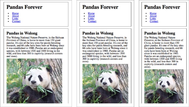
When the screen gets narrower and passes our breakpoint of 36 ems, the layout changes to one column. The image now takes up half of the single column, and at 36 ems and slightly smaller, it’s still a good size.
But as you continue to decrease the width of the viewport, as in Figure 6-18, the image gets really small—you can’t see the details as well, and it just feels like it should be larger.
Fixing this is pretty simple—we can just add a media query so that at this viewport width (or narrower) the photo takes up the entire width of the column, rather than just half. We’ll need to add a breakpoint at about 28 ems.
This time we’re going from wide to narrow, so we need to use max-width instead of min-width in the media query.
We’ll give the image a width of auto, which means it will display at its natural size, which is 300 pixels wide. To override the styles that we’ve already added, we need to stop it from floating to the right by adding float: none to the styles, and remove the left padding that we used when it had text wrapping around it:
@media only screen and (max-width: 28em) {
    article img { width: auto; float: none; padding-left:
    0; }
}
Now we get what you see in Figure 6-19.

You might be wondering why we’ve gone from wide to narrow when adding this image, instead of narrow to wide as we’ve done previously. Really, we could have gone in either direction. When adding an image to a design it’s sometimes easier to go wide to narrow, simply because the size of your image has a hard stop at its actual width (300 pixels, in this case).
You can certainly mix min-width and max-width media queries in your stylesheets. The problem is that now our default style for this image (without any media queries) is for wider screens, so small screens that can’t understand media queries will get our wide-screen image instead of our narrow-screen image.
Don’t worry, though; even if you add media queries going in both directions, you can easily flip some of them around so they all go the same way (it tends to be less confusing if all the media queries on a site go in the same direction).
For example, these styles that we used in the earlier example have the default for wider screens, and a media query to add styles for narrower screens:
article img { float: right; padding-left: 3%; padding-bottom: 10px; }
@media only screen and (max-width: 28em) {
    article img { width: auto; float: none; padding-left:
    0;  }
}
Flipping that around, you get this:
article img { }
@media only screen and (min-width: 28em) {
    article img { float: right; padding-left: 3%;
    padding-bottom: 10px; }
}
But hold on—why aren’t there any styles for article img on the first line, for the narrow-screen styles? Because all the styles we used in our example for the narrower design range—width: auto; float: none; padding-left: 0;—were used to change properties back to the default values.
If we start with the defaults, we don’t need to declare them. (Taking this further, of course, the entire article img { } line is unnecessary, because there are no styles in it.)
Maximum Width
Using max-width on your website is one of the keys to making responsive design work correctly, and it’s actually super easy. Here’s an example of how it works.
Our photo looks good right at our breakpoint of 28 ems, but of course we need to look at the entire design range, down to our minimum of 320 pixels. Unfortunately, we have a problem, as you see in Figure 6-20.
Once we get down to about 22 ems, the image is wider than the column! Not only does the image go outside the border of the column, but its edge is cut off because it goes outside the browser window.
Luckily, this is an easy problem to fix.
We don’t want to simply give the image a set percentage size, because we want it to be as large as it can be, up to its actual size of 300 pixels.
Instead, we can use a really handy property, max-width. You’ll remember that we used this property in Chapter 5 to tell our two-column layout to stop getting wider at a certain viewport width. In that example, we set the value in ems.
For this image, we’re going to give it a value of max-width: 100%. By using 100%, we’re telling the browser that the image should never be displayed at a width that is greater than the width of its containing element—in this case, the <article> that it’s inside of:
article img { max-width: 100%; }You can see in Figure 6-21 that although the image at its actual size doesn’t quite fill the column at 28 ems on the left, as we make the window narrower, the image gets narrower to fit inside the column (it will also stay inside the element’s padding).
If you’ve read up much on responsive design, you’ve probably heard that max-width is part of the three main tenets of responsive design. And it is definitely important—without max-width, responsive sites wouldn’t work, because you’d often run into this issue of images that don’t fit where they’re supposed to.
But here’s a little secret: because max-width for images is so critical to your responsive website, you can simply apply it to the entire website. That is, you can apply max-width:100% to all of your images by adding the following code near the top of your stylesheet (just below the reset code is a good place):
img { max-width: 100%; }Once you’ve done that, you don’t have to think about it again; it’s done!
Although you don’t need max-width: 100% on all of the images on your site, there’s no harm in having it apply to all the other images, because the only thing it does is make sure images aren’t larger than their containers. It doesn’t affect anything else having to do with the size of the image. In the rare instances where you don’t want max-width: 100% to apply to a particular image, you can simply add CSS to override it for that particular image.
Note
Using max-width in IE 7 and earlier browsers creates some issues—the images don’t look good as they scale down. If you need to support those browsers, check out Ethan Marcotte’s blog post “Fluid Images” (http://unstoppablerobotninja.com/entry/fluid-images/) for a JavaScript solution.
Telling Stories with Photos
When choosing photos to place on your site, make sure that the images are interesting and actually convey the personality of your site.
It’s tempting to use purchased stock photos—and while many of these are great photos, they are often not chosen with care and look overposed, which makes it obvious that they are stock photos. This makes your site look bland.
If you have a restaurant website, don’t use a stock photo of a random person eating a random hamburger. Use actual photos of your restaurant and its food. Make sure they are good-quality photos—it may be worth it to hire a professional photographer.
Most importantly, use captions as much as you can. The story of a photo is not always apparent from the photo itself. A photo of your busy restaurant is nice, but it’s even more effective with a caption reading, “The restaurant on a busy Saturday night. We often fill up early with the theater crowd, so don’t forget to make a reservation so you don’t have to wait.”
Background Images
Not all images are part of the content. You’ll also have images that are decorative, that add to the design of the site without adding any meaning.
You can add images that that are part of the style rather than the content using the CSS property background-image.
Don’t add content images with background-image, because they won’t be visible to people using screen readers or other text-based browsers.
(An exception: there are actually ways you can display a CSS image and then provide alternate text with HTML that’s hidden from the visible website, but it’s hacky and difficult, and there are few circumstances where it’s a good design choice.)
Adding Background Images
Let’s say we want to add a background image to the header of our example website.
Again, we’re going to start at the widest screen width. When our design is at its maximum, the header is approximately 900 pixels wide, accounting for margins, so we need to make the banner image at least that wide. The header area on our page appears about 140 pixels high, but it could be taller depending on the size of the fonts, so we need to make the banner image tall enough so that the header will definitely be covered (see Figure 6-22).

Adding the background image to the header is simple. You can see the results in Figure 6-23:
header { background-image: url(images/pandabanner.png); }You’ll notice that the image in the banner is lighter than an actual photo would be. This is called opacity, or transparency. In this case, I wanted the photo to be light so that it wouldn’t be difficult to read the text that’s on top of it.
You can use CSS to adjust the opacity of a content image using the opacity property, but to do so on a background image isn’t all that easy. So instead, I changed the opacity of the photo in an image editing application before uploading it to the site.

Alignment
If you make the browser window narrower to see how the banner looks, you’ll notice that the panda that was more or less centered in the banner is now off to one side, as seen in Figure 6-24.
This is because the banner image is aligned to the left (by default), and the right side of the banner is cut off because it doesn’t fit in the element.
Unlike content images, the background-image is applied as a style to an element, so it will never go outside the bounds of the element (you simply won’t see the excess areas of the image). Thus, there’s no need for max-width.
By default, background images are aligned to the top left. You can use the background-position property along with two values to align the image horizontally (along the x-axis) and vertically (along the y-axis).
In our case, we want to center the image but keep it at the top, as in Figure 6-25. We can do this as follows:
header { background-image: url(images/pandabanner.png); background-position: center top; }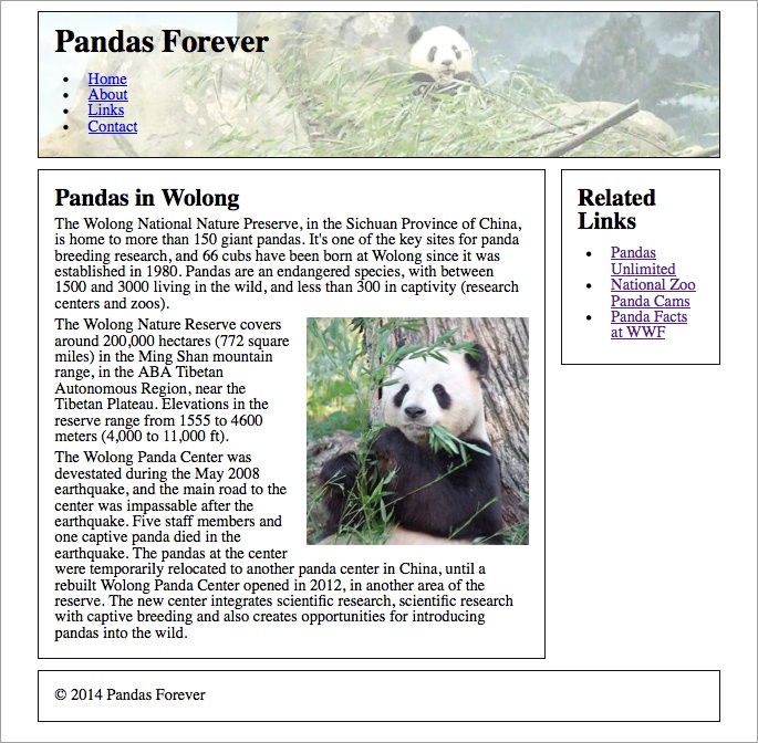
You can also use percentages or fixed measurements such as pixels to align a background image.
Responsive Images
One big topic of discussion in responsive web design is responsive images. How do we provide images with appropriate dimensions to large screens, taking advantage of the screen space, but not waste bandwidth by sending those huge images to devices with small screens? And how do we serve crisp-looking images to high-resolution screens, but not send those larger files to devices with lower-resolution screens that don’t need them?
If we have multiple image files of different sizes for different screens, we want to make sure devices are only downloading the one they need, not all of them.
A lot of possible solutions have been thrown around, and while we’ll look at some of the more popular solutions here, none of them are perfect. It’s likely that there will be a lot more discussion on this issue during the next few years, and it’s definitely possible that other responsive image solutions will come about.
One of the major issues with the current solutions is that they’re all fairly complex. A lot of web content is created by people who are not developers, and who use content management systems (CMSs) to edit their websites. WYSIWYG (what you see is what you get) editors allow the website editor to add an image by clicking a button and choosing a file—for example, adding a photo within a blog post.
Although some of these solutions could be integrated into a CMS, website editors would have little control over choosing the best image sizes (and likely not have the knowledge to do so).
Even for developers, if a responsive image technique is too complicated, many of them will simply avoid it and continue to use the straightforward <img> element.
Creating multiple images to switch out is also not future-friendly. We are choosing image dimensions and resolutions based on the screen sizes of today, but they may be very different in the future.
Proposed Client-Side Solutions
Ideally, there would be a way to switch out images based on device capabilities, using HTML and/or CSS, that would be supported by all the browsers.
And this is the goal that the W3C’s Responsive Images Community Group (http://responsiveimages.org) is working toward.
Unfortunately, its work is still in progress. There are two potential responsive image solutions, the <picture> element and the srcset attribute, but neither has been implemented by all the major browsers and neither is part of the HTML specification yet.
It is likely that one or both of these solutions will become part of a future HTML specification, so we’ll go over them briefly here so you can get a sense of how they are intended to work (although you won’t be able to use <picture> or srcset on your website yet).
Later in the chapter, we’ll address other solutions that can currently be used.
srcset
The srcset attribute to the <img> element will allow you to specify and upload multiple versions (different files) of the same image, and the browser will only download the particular file it needs, instead of all of them.
Currently, the src attribute to <img> allows you to specify one image file; the srcset attribute would allow you to specify multiple files, separated by commas. Each image file would be described by the viewport size or pixel density it should be used for. The browser would then choose the most appropriate image, and download and display that image.
Let’s consider an example:
<img src="images/flower.jpg" alt="a flower" srcset="
images/flower-HD.jpg 2x, images/flower-small.jpg 600w,
images/flower-small-HD.jpg 600w 2x">
In this example, the default image is flower.jpg. For high-density screens (a pixel density of 2 or greater), flower-HD.jpg will be used instead. For narrow screens, less than 600 pixels wide, flower-small.jpg will be used. For screens that are both less than 600 pixels wide and high density, flower-small-HD.jpg will be used.
The image can be replaced on the fly, if the device’s conditions change. For example, if you rotate a tablet screen so that the viewport width changes, the browser will check if it needs to download a different image from the srcset.
Note that you can specify images by maximum viewport width (as in the 600w in this example), which has the same effect as a max-width media query (if the viewport is a maximum of 600 pixels wide, use this image). Unfortunately, srcset can be used only with maximum widths, not minimum widths.
Older browsers that do not support srcset will simply ignore the other options and use the default image in the src attribute.
<picture>
As with srcset, the <picture> element would allow you to specify and upload multiple versions of the same image, and the browser would only download the particular file it needs, instead of all of them:
<picture>
<source media="(min-width: 45em)" src="images/flower-large.jpg">
<source media="(min-width: 18em)" src="images/flower-medium.jpg">
<source src="flower-small.jpg">
<img src="images/flower-small.jpg" alt="a flower">
</picture>
You can see in this example that the media attribute uses very similar syntax to a CSS media query. You can query by either min-width or max-width.
For viewports of 45 ems or wider, the browser will use the first <source>, flower-large.jpg. For viewports of 18 ems or wider, but less than 45 ems, the browser will use flower-medium.jpg. And for all other viewports (less than 18 ems), the browser will use the third <source>, which doesn’t have a media query, flower-small.jpg.
You’ll notice that by ending with the default, this goes in the opposite order of how we use media queries in CSS, where we start with the default value and follow it with media queries.
Any browsers that don’t support the <picture> element will ignore it and use the fallback <img> element, which is located inside the <picture> element.
You can also combine the <picture> element and the srcset attribute if you want to use both viewport size media queries and versions with different resolutions:
<picture>
<source media="(min-width: 45em)" srcset="flower-large.jpg 1x, flower-large-hd.jpg 2x">
<source media="(min-width: 18em)" srcset="flower-med.jpg 1x, flower-med-hd.jpg 2x">
<source srcset="flower-small.jpg 1x, flower-small-hd.jpg 2x">
<img src="flower-small.jpg" alt="a flower">
</picture>
Other Solutions
Other responsive image solutions are available, but they are mainly polyfills. A polyfill is a piece of code that replicates newer HTML/CSS features in older browsers. Some of these solutions replicate the behavior of the proposed <picture> and srcset. The downside of using a polyfill is that it will add additional code to your site.
None of these solutions is perfect for every circumstance, so you’ll need to understand the pros and cons of each, and when they should be used. If you need to choose between responsive image solutions, you can refer to Chris Coyier’s “Which responsive images solution should you use?” (http://css-tricks.com/which-responsive-images-solution-should-you-use/) on CSS-Tricks, where he compares many of the solutions.
Picturefill
Although you can’t actually use the <picture> element yet (because it hasn’t been implemented by the browsers), Scott Jehl has created a polyfill called Picturefill (https://github.com/scottjehl/picturefill) that essentially does the same thing using JavaScript.
To use Picturefill, visit the website and follow the instructions. You will need to add the picturefill.js file to your website.
The code for Picturefill uses similar syntax to the <picture> element:
<span data-picture data-alt="a flower">
<span data-src="images/flower-small.jpg"></span>
<span data-src="images/flower-medium.jpg"
data-media="(min-width: 18em)"></span>
<span data-src="images/flower-large.jpg"
data-media="(min-width: 45em)"></span>
<noscript><img src="images/flower-small.jpg" alt="a flower"></noscript>
</span>
The Picturefill JavaScript uses the <span> element to create an <img> element in the appropriate size for the viewport. Inside the <noscript> element is a fallback for non-JavaScript browsers.
You can also use Picturefill to give the browser image options based on resolution, for high-density screens.
Adaptive Images
Adaptive Images is another polyfill for responsive images. This one is a server-side solution, which means that the server hosting the website does some of the work—it’s not all up to the HTML and CSS.
It works differently than the responsive image solutions described previously, as you only need to create one version of your image—at full size. Adaptive Images detects the size of the user’s screen (not viewport), and creates and serves a resized version of each image at an appropriate width for that screen.
To use this polyfill, your server needs to be running Apache and PHP, so Adaptive Images doesn’t work for every website. But as long as you have those on your server (and they are very common), you can easily add Adaptive Images to any website, as it doesn’t require you to change your HTML for images at all—you just use the regular <img> element.
Because you don’t have to change your HTML, this will likely be the best solution for adding responsive images to existing websites, where it’s not feasible to go back and change the code of legacy content.
To install Adaptive Images on your website, download the files from the Adaptive Images website (http://adaptive-images.com), then follow the setup instructions, including editing the .htaccess file on your website and adding some JavaScript to your page <head>.
You then choose and set the breakpoints (viewport widths) at which you want your image dimensions to change. Because you’re uploading the largest version of your image, the breakpoints are the widths at which your image will be made smaller. (Note that breakpoints have to be set in pixels, not in the ems that we’ve used for the earlier examples in this book.)
So, if your breakpoints are set to 800 pixels and 400 pixels, and you upload an image that’s 1,000 pixels wide, it will be resized to two versions: 800 pixels wide and 400 pixels wide (and of course, the height of the image will be adjusted accordingly).
As your web page is loading, when it encounters an <img> element, it requests the image from the server. The Adaptive Images code looks at the width of the user’s screen, and picks the smallest image that’s at least as wide as the screen. So, if the screen is 320 pixels wide, it will pick the 400-pixel image (based on the breakpoints in the previous paragraph); if the screen is 700 pixels wide, it will pick the 800-pixel image.
If you upload an image that’s only 500 pixels wide—because that’s the widest you need it to be on the screen—it will only be resized for the 400-pixel breakpoint. Images are never made larger.
When an image is requested, the server automatically creates a file at the requested dimensions. It then caches the image to save it for the next request, so only the first user visiting the site in any breakpoint range will have a slight delay while the extra image is being created.
One downside of this polyfill is it only resizes images based on the screen size, not the dimensions at which the image is going to be displayed. So images that aren’t displayed at the full screen width are less likely to get a scaled-down version, even when one would be appropriate.
This polyfill needs JavaScript to work. In browsers without JavaScript, Adaptive Images will simply not run; the browsers will display the original, full-sized images in the <img> elements.
Adaptive Images is licensed under Creative Commons, so it’s free for you to use with attribution to the author, Matt Wilcox. There are also plug-ins available for WordPress and Drupal.
HiSRC
HiSRC (https://github.com/teleject/hisrc) is a jQuery plug-in from Chris Schmitt that allows images to be replaced based on network speed and screen resolution.
The browser will first load a low-resolution “mobile first” version of each image. It will check the speed of the connection via JavaScript, and if the device has mobile bandwidth such as 3G, it will keep the low-res version of the image in place. If there’s more bandwidth available, it will download a higher-resolution version and replace the original low-res image with the new image file. If it also detects that the screen is high density, it will download and replace the image with an appropriate version.
To use HiSRC, you will need to add jQuery to your site and upload and link to the HiSRC JavaScript file. You will also need to make and upload the three versions of each image.
The HTML is fairly simple. You will need a <div> with the appropriate class, and the <img> element will have extra attributes to specify the three image files:
<div class="hisrc">
<img src="images/flower-mobile.png" data-1x="images/flower-400x200.png" data-2x="images/flower-800x400.png">
</div>
Note
You don’t have to use HiSRC for all the images on your site. If you don’t want to use it for a particular image, just use the <img> element without the extra <div>. Another JavaScript plug-in that provides responsive images is Foresight.js (https://github.com/adamdbradley/foresight.js).
Third-party services
Several companies offer responsive image services that will automatically resize your images to fit the screen width. As an example, we’ll look at Sencha.io SRC (http://www.sencha.com/learn/how-to-use-src-sencha-io/). This third-party service is free for small websites.
Note
Other third-party services that provide responsive images include ReSRC (http://www.resrc.it), Thumbr.io (http://www.thumbr.io), and Responsive.io (https://responsive.io). Pricing is generally based on either the number of images or total GB per month.
The way it works is by detecting what brand and model the device is, and then using that information to determine the screen size. It scales the images to the width of the device screen, and also holds the images in the cache for 30 minutes so subsequent requests by the same device will be faster.
All you have to do is add the Sencha URL, http://src.sencha.io/, into the src of your image.
For example, if this is your <img> element:
<img src="http://www.example.com/images/butterfly.jpg" alt="butterfly">
you would add in the Sencha URL like this (note that you also must use a full URL for your image, like http://www.example.com/images/butterfly.jpg, rather than a relative link like images/butterfly.jpg):
<img src="http://src.sencha.io/http://www.example.com/images/butterfly.jpg" alt="butterfly">
The image will be resized to the width of the device screen. This means that if the image is actually being displayed on the screen at a percentage of the width, the image file will be bigger than it needs to be.
If you want to have the image resized to a specific size, you can do that by adding either the width and height as part of the URL, as in the following example, or just the width (it will automatically constrain the height):
<img src="http://src.sencha.io/400/200/http://www.example.com/images/butterfly.jpg" alt="butterfly">
Even more useful: you can use percentages. If you want an image to be resized, and you know that it never takes up more than 50% of the screen width in your design, this code will resize it to whatever 50% of the device’s screen width is:
<img src="http://src.sencha.io/x50/http://www.example.com/images/butterfly.jpg" alt="butterfly">
Or you could do 50% of the width, and 25% of the height:
<img src="http://src.sencha.io/x50/x25/http://www.example.com/images/butterfly.jpg" alt="butterfly">
Sencha can do a whole lot of other things, including reducing the image size by a given amount of pixels, using formulas that are combinations of any of the above, and changing file formats.
Keep in mind that when you use any third-party service, you’re relying on that service to render parts of your site. There’s always the remote possibility that a service like Sencha could suddenly cease to exist, without warning—which would essentially break your website. More likely, there may be times when the third-party site is temporarily down, or slow, and this will affect the performance of your site.
If you don’t want to rely on a third-party solution, and if you have a very large site that makes the effort worthwhile, you could build a similar system on your own server.
Breakpoints
Some of these responsive image solutions require choosing one or more breakpoints—the viewport widths at which the images change from one file to the other. How do you choose where those breakpoints are?
If your responsive images use art direction (displaying a different crop of the image, rather than just a different resolution of the same image), you probably will need to have your image breakpoints at the same widths as your layout breakpoints.
But if you’re using the same image at different resolutions, it doesn’t depend on your layout at all. Instead, you should switch to a different image at the point where the file that’s being downloaded is unnecessarily large.
If you’re using Picturefill (as we’ll do in the next example) or any other solution that allows you to set breakpoints individually for each image, you’ll have to do a little bit of work to make the best choices for each image.
Start by determining the smallest and largest dimensions that the image will be on the screen, so you know what your limits are. Determine the file size’s for each of those two images, and then you’re going to decide on the breakpoints in between.
It’s kind of arbitrary how far apart the breakpoints are. If you have a lot of images on each page of your site, you may want to have the breakpoints closer together, to waste the least amount of bandwidth. Of course, that means creating more image files—you’ll need one for each size variation of an image.
Or, if you have only a few images on each page of your site, you might not think it’s worth doing this extra work at all just to save a few KB.
A good place to start is to aim for a gap of 20 KB between images. Try resizing your image to various dimensions, check the file size, and pick spots at which the file size is about 20 KB less than that of the previous image file.
For example, if your image is displayed in your design at widths between 320 pixels and 960 pixels, you might end up with a list of images like that in Table 6-1.
Dimensions | File Size |
960 × 720 | 108 KB |
780 × 585 | 85 KB |
600 × 450 | 63 KB |
500 × 375 | 43 KB |
320 × 240 | 19 KB |
To tell the images apart, you might want to include the width in the filename, like panda960.jpg.
Next, you’ll need to set media queries for each of these file sizes. If the image is something like a banner that will always be displayed at the full width of the viewport, it’s easy: match the breakpoints to the image widths.
You’ll start with the largest image as your default. If the browser doesn’t have JavaScript, it will only be able to display the default image. You want the largest image as the default so it will work on any screen size.
So, for the widest screens, we’re displaying panda960.jpg, which is 960 pixels wide (we already determined that’s the widest the image will ever be displayed). That image will either be displayed at 960 pixels, or scaled to a smaller size.
For the first media query we’re saying that if the viewport is 780 pixels wide or less, the browser should use panda780.jpg instead. That image will either be displayed at 780 pixels, or scaled to a smaller size. Images will never be made larger than their actual size.
Notice that for this example we’re using pixels instead of ems, because we’re matching images that are sized in pixels:
<span data-picture data-alt="A panda eating bamboo.">
<span data-src="images/panda960.jpg"></span>
<span data-src="images/panda780.jpg"
    data-media="(max-width: 780px)"></span>
<span data-src="images/panda600.jpg"
    data-media="(max-width: 600px)"></span>
<span data-src="images/panda500.jpg"
    data-media="(max-width: 500px)"></span>
<span data-src="images/panda320.jpg"
    data-media="(max-width: 320px)"></span>
<noscript><img src="images/panda320.jpg" alt="a
    flower"></noscript>
</span>
Keep in mind that when we created the five different versions of this file, aiming for about a 20 KB difference in size, that only applied to this particular image. If you did the same for another image, you might have a different number of variations, and their widths would be different. So, optimizing your images in this way to waste the least amount of bandwidth would clearly involve a lot of manual work.
Another option would be to just choose a few breakpoints and resize all of your images to those breakpoints. You would still have to create variations of each image, but you wouldn’t have to spend time calculating file sizes and determining the best breakpoints for each image. The downside is that you wouldn’t save as much bandwidth as you would if you calculated sizes for each image.
For more details about how to choose image breakpoints, read Jason Grigsby’s “Sensible jumps in responsive image file sizes” (http://blog.cloudfour.com/sensible-jumps-in-responsive-image-file-sizes/) on the Cloud Four Blog.
Summary
Images are a key part of both your site’s content and its design.
The images you use on your website can be JPEG, GIF, PNG, or SVG files. The file types you should use depend on what kinds of images you have. Make each file as small as possible to reduce the amount of time it takes to download.
When displaying images on your site, first determine if you actually need the images, or if you can replace the effect using CSS. Use the <img> element for content images, and CSS background-image for decorative images. Icon sprites and icon fonts can help you lower the bandwidth required for your images.
Images need to be flexible on responsive websites. Use max-width to make sure they aren’t too large for their containing elements. You can float images in your layout to get text to wrap around them.
Content images need to have alt text so that their messages are still available if the images can’t be viewed. Make sure your alt text provides the same information as the image, which depends on context.
High-density screens need images of a higher resolution, but you should avoid having every device download these files if they don’t need them. You can use various methods to have the browser only download the images that it needs.
The <picture> element allows you to specify different images depending on viewport width, but it hasn’t been implemented by the browsers yet. One option you can use now is the Picturefill polyfill; others include Adaptive Images and third-party services such as Sencha.io.
Choose breakpoints for switching out images based on when the file size of the image being downloaded is unnecessarily large.
The area of responsive images is still evolving, so make sure to keep up with what’s happening so you can take advantage of new ideas and solutions.
Now that we’ve touched on all the major pieces that you need to put together a website, in Chapter 7 we’re going to talk about the process of creating responsive websites.