
Chapter 3. HTML for Responsive Sites
To create a responsive website, you’ll be using both HTML and CSS (with an occasional smattering of JavaScript as well).
Even if your job doesn’t involve creating the code for websites, you should know a bit about what’s going on “under the hood” of responsive sites, so don’t skip the next few chapters.
This chapter assumes you have at least some basic familiarity with HTML. If you’re not a coder, you don’t have to understand exactly how everything works, just get a general idea.
Even if you have a lot of experience with HTML, there will be concepts addressed in this chapter that you may not be familiar with, like the viewport attribute and creating a web page using the structural elements that are new in HTML5.
Other concepts, like doctype and charset, might not be new to you, but they’re addressed here because they’re necessary to understanding how to properly set up an HTML page for a responsive website.
In this chapter, we’ll also look at versions of HTML, and what it means that you’ll be using HTML5 to create websites. Then we’ll set up an example web page, using HTML5 structural elements to put it together.
We’ll finish up by talking about how to write good code, using semantic HTML and separating content and presentation, along with best practices for using HTML to properly mark up your content to make it accessible to all users.
Note
If you don’t know HTML at all, a good place to start is the “Introduction to HTML” (https://developer.mozilla.org/en-US/docs/Web/Guide/HTML/Introduction) from the Mozilla Developer Network.
Working with HTML
HTML is not set in stone: it is revised over time to accommodate new technologies and add new features. HTML was meant to be a living organism, which would change over time as the needs of the Web and the technology behind it changed.
Every several years, a new version of HTML comes out. As this book is published, browsers are still in the process of switching from one version to another (HTML 4 to HTML5).
For the examples in this book, we’ll be using the most recent version of HTML, which is HTML5. But because HTML5 is a work in progress, not every part of HTML5 is available to use right now. In this section, you’ll learn how versioning works and how to find out which new HTML5 elements you can safely use on your website.
Versions of HTML
A lot of HTML stays the same from one version to the next, so it’s not like you need to start over learning HTML from scratch each time a new version comes along.
A good comparison is if you were to read something by Shakespeare, written 500 years ago. It’s in English, the same language we speak today. But it’s different. There are some words in Shakespeare’s work that we no longer use in English. Other words are still around, but are spelled differently or have slightly different meanings. Likewise, if Shakespeare were suddenly transported to modern times, there would be many words that he wouldn’t recognize.
But even with those differences, it’s still the same language and you would be able to understand nearly all of it.
The same is true when comparing different versions of HTML. HTML is made of elements, which are the components that are used to describe the web page’s content. For example, there’s a paragraph element that is used to signify paragraphs, and an image element that is used to add images to a web page.
In each new version of HTML there will be new elements, some existing elements will have slightly different meanings, and some elements will go away. The paragraph element, <p>, has stayed consistent since the first version of HTML, but elements like <key> have disappeared, and new elements like <canvas> have only recently been added.
Browsers will understand any version of HTML for the most part, but older browsers may have trouble with some of the new pieces, so you’ll have to do a little extra to make sure they can display everything correctly.
And as with human language, it takes a while for HTML to change; it doesn’t happen all at once. A new version of HTML is proposed, and then the web community spends a lot of time (years) discussing it piece by piece. The browsers then start implementing it, piece by piece. As some parts of the new HTML specification are being implemented by the browsers, other parts are still being discussed and tested.
There’s a lot of overlap between the versions. Work on HTML5 started in 2004, and the specification is scheduled to be “finished” in late 2014 (right now it’s just a “draft”). But that won’t mean the changes are done: there will be a version 5.1, then 5.2, and so on, with minor changes. HTML6 is already being discussed, and older versions of HTML are still being used.
Besides newer web pages created in HTML5, you will likely encounter websites that were created in HTML 4, as well as in XHMTL, which came between HTML 4 and HTML5.
Web Standards
The World Wide Web Consortium (W3C) is a voluntary standards organization that decides what’s in the “official” version of HTML. (Voluntary means that although the industry has agreed to use the W3C’s rules, it is not required to do so.)
Before the W3C came along, the browsers made up their own rules as to how they would interpret HTML. As a result, a web page could look very different from one browser to the next, and HTML that worked in one browser might not even be recognized by another.
Because the W3C is voluntary, the browsers aren’t actually required to follow the rules. But for the most part, they do, because if a browser displays web pages very differently than the other browsers, nobody will want to use that browser. There are some differences, though, so as we go along you’ll learn what you need to do in your code to make sure everything is displayed correctly in the situations where some browsers aren’t playing by the rules.
And as web designers, we need to follow the rules. That’s what will ensure our websites will work across different browsers and devices. Following the standards also makes sure your website is future-friendly, and much more likely to be compatible with devices and technologies that haven’t even been invented yet.
Using HTML5
When someone talks about an “HTML5 element,” he generally means an element that’s new in HTML5 (i.e., that wasn’t part of HTML 4).
If an element is new to HTML5, you need to know whether browsers are supporting that element yet. And even if they are, you need to be aware that some users still have older browsers on their computers that don’t support some of the new elements.
When I reference new HTML5 elements in this book, I will let you know whether they are currently well supported, and what you need to do to accommodate older browsers.
And as I mentioned earlier, much of HTML stays the same from version to version.
There are more than 100 different elements in HTML5. In this book, we’ll only talk about the elements you are likely to use with any frequency. There are many others. If you ever encounter an HTML element you don’t recognize, look it up to determine what it does and if it is valid in HTML5.
Note
For a list of all current and previous HTML elements, try the “HTML element reference” (https://developer.mozilla.org/en-US/docs/HTML/Element) from Mozilla Developer Network.
To find out which new elements are supported by which browsers, refer to Can I Use... (http://www.caniuse.com).
Basic Page Structure
The first thing to do when creating a web page from scratch is to start out the page with basic HTML.
Document Type Declaration (DOCTYPE)
The first thing that goes at the top of the HTML file is the document type declaration (doctype). The doctype tells the browser what version of HTML the page is using.
For HTML5, the doctype is:
<!DOCTYPE html>
If you work with existing websites that use an older version of HTML, you will encounter a few other doctypes.
Even after a new version of HTML comes out, pages using older versions of HTML continue to work—but they must have the correct doctype to match the version of HTML that’s being used, or else the browser may have trouble displaying the page.
If the doctype doesn’t match the HTML being used in the page, the browser will make some guesses and probably get everything to work correctly. But not always, so don’t count on it. If things really aren’t looking like you think they should on your web page, check and make sure your page has the correct doctype to match the version of HTML you are using.
Note
You can learn about the differences between the older doctypes in the “HTML <!DOCTYPE> Declaration” (http://www.w3schools.com/tags/tag_doctype.asp) from W3Schools.
Document Structure
Everything after the doctype in your HTML file comprises the HTML of the page, which is further separated into exactly two sections, the <head> and <body>:
<!DOCTYPE html>
<html>
<head>
...
</head>
<body>
...
</body>
</html>
Note that when you see “...” in a code example, it signifies that other code or content will go in that space—the “...” is not a part of the code.
You’ll see that we’re using a few elements here that come in matched sets, like <head> and </head>. Most HTML elements, but not all, have opening and closing tags that surround the content they’re describing. Everything between those opening and closing tags comprises the <head>.
The <html> element should always have a lang attribute to tell the browser the language of the page’s content—in this case, en for English. Although this attribute is optional, it’s important because it tells screen readers what language to read in, and it helps the browser decide how to hyphenate words.
Note
If your website is in a language other than English (especially one that uses a different character set), or if it’s multilingual, there are a few more things you need to know to make sure your website works correctly. Start by taking a look at “Internationalization Techniques: Authoring HTML & CSS” (http://www.w3.org/International/techniques/authoring-html-dynamic) from the W3C.
The <head> contains information about the page (often called metadata, using the <meta> element). It also can contain links to external files containing CSS or JavaScript, and sometimes embedded styles or scripts. What’s in the <head> is not part of what’s displayed on the page as content.
The <body> contains all of your page content.
The Page Title
The page’s <title> doesn’t appear anywhere on your web page, and can in fact be totally different from the title you see on the page.
However, the words you use in the <title> element need to be well thought out because they are used as the page title in a lot of other locations, such as:
The top of the browser window, or in the page tab when using a browser with tabbed browsing
The page name that will display in a user’s bookmarks after the page has been bookmarked
The link for the page in search engine results
The page title is often a combination of the site name and the page title, separated by a dash, colon, or pipe character.
A few examples:
<title>Metro - The Boston Globe</title>
<title>Flickr: Groups</title>
<title>Ways to Help | American Red Cross</title>
Although the <title> can be different from what appears on the page as its title, they should be fairly similar, otherwise users may get confused.
Long titles will show up truncated in search engine results, so don’t make your title excessively long. A general guideline is 64 characters, although each search engine has a different maximum length.
Charset
The charset specifies the character encoding (“character set”) of the characters in your HTML document (i.e., all of the HTML and content you are typing in your HTML file).
charset is not an HTML element; it’s an attribute to the <meta> element. You can have one or more <meta> elements in the <head> of your HTML document, each one of them providing information about the page.
The character encoding is essentially the code that translates letters, numbers, and symbols into the binary language that the computer can recognize.
Even though you may not be aware of it, whatever application you’re using to create your HTML file (such as a text editor) has a default encoding. Each browser also has a default encoding. If they don’t use the same one, sometimes things get lost in translation. So you need to tell the browser which one to use, or it might have trouble displaying the page.
The charset you are going to use for your HTML5 page is UTF-8, which is the most widely used and flexible character encoding for web pages. It supports the characters found in most international languages:
<meta charset="utf-8">
Older versions of HTML declare the character encoding differently. If you’re working with an existing website that uses an older version of HTML, you can learn more on the “Declaring character encodings in HTML” (http://www.w3.org/International/questions/qa-html-encoding-declarations) page of the W3C website.
Note
Sometimes when you copy and paste text from another application into a plain-text editor, some of the symbols (like “smart” quotation marks) will be replaced with question marks or little boxes. That means the two applications were using different encodings. You’ll need to retype the characters (or do a search and replace).
Viewport
The viewport meta element is something that generally wasn’t used for most nonresponsive websites in the past, but is key to making your responsive site work.
Note
Like charset, viewport is an attribute to the <meta> element. Each type of metadata you are providing has to be in a separate <meta> element—you can’t simply combine all the attributes in one element.
The viewport is the area on the computer or device screen where you are viewing a web page. In Chapter 1, you learned that responsive design media queries are based on the viewport width.
On a desktop computer, if you start with the browser window, and subtract the menus, toolbars, scrollbar, and everything else that’s part of the browser itself, what’s left inside it is the viewport, as you see in Figure 3-1.
On a mobile device, the viewport width is the same as the screen width.
The viewport meta attribute gives instructions to the browser as to what size the web page should be displayed at so it fits properly in the viewport.
Web pages without a viewport setting are rendered, or displayed, at full size on desktop monitors, the way you’re accustomed to seeing them.

A mobile phone browser, by default, will render a web page without viewport as it would look on a desktop-sized browser, but scale it down so that it fits inside the phone’s viewport, as in Figure 3-2. If there are media queries based on viewport width, they won’t work, because the browser will act as if the viewport is desktop-sized.
Most mobile phone browsers will render a web page using a default viewport width of 980 pixels. Just imagine you have a desktop monitor that’s 980 pixels wide, and what you see on that screen will be scaled down to fit on the phone’s screen. If the web page is wider than 980 pixels, it may be scaled down even further to fit on the screen.
For a responsive site, we don’t want the mobile browser to render the page as it would appear on a 980-pixel-wide monitor; we want it to render the page at actual size for the mobile device’s screen (which could be any width), because we’ve designed the page to fit the small screen’s width without zooming.

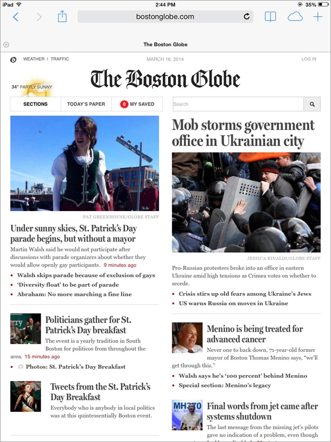
In Figure 3-3, you see The Boston Globe’s front page rendered on an iPhone screen, and in Figure 3-4 you see the same site rendered on an iPad screen. The site is full size on both screens, although they are different physical widths.

Generally, you should set the viewport for a responsive site as follows:
<meta name="viewport" content="width=device-width, initial-scale=1">
Width
The width attribute tells the browser how to scale the web page.
For a responsive site, the value width=device-width tells the browser to render the page at full size, whatever the size may be. The browser is rendering the page so that the viewport width is the actual width of the device (i.e., at 100%).
If device width is not specified in the viewport meta attribute, the device will use its own default viewport setting to render the page. For example, the default width for iPhones is 980 pixels. So in Figure 3-2, the browser is rendering the page as if the browser window was 980 pixels wide, but then shrinking it down to ⅓ of the size so that it fits on a screen that’s only 320 pixels wide.
If you use width=device-width, the width used to render the page will automatically adjust if the user changes the orientation of the device. So, if the user turns her iPhone from vertical to horizontal, the web page that rendered as 320 pixels will automatically re-render for 480 pixels, the width of the screen as you hold the phone horizontally.
Initial-Scale
The initial-scale attribute tells the browser how to scale the web page when it’s first loaded on the screen (i.e., the zoom factor).
Using the value initial-scale=1 means that the page will be rendered at the size determined by the width attribute, and will not be zoomed in or out.
If you use a number larger or smaller than 1, then the page will be zoomed to that level. For example, an initial-scale=2 value would mean that the page would be zoomed to be twice as large as actual size, so you would only see half of the page on the screen.
User-Scalable
The initial-scale value only determines the size of the web page when it’s first loaded on the screen. Remember that your mobile device also gives users the ability to zoom in and out.
There’s a value for viewport that will turn off the user’s ability to zoom: user-scalable=no.
However, for most websites, you should avoid using this value—let users zoom if they want to. Although a responsive site will load at full size no matter the width of the screen, there may still be circumstances in which users may wish to zoom in, such as if they have difficulty reading small text.
You would only want to turn off zooming in very limited circumstances, such as for games built with HTML/CSS, and certain other web apps.
If you don’t include this value, the default is yes, which allows users to zoom.
Maximum-Scale
You can also use the width attribute to set the maximum-scale value for the page. For example, maximum-scale=2 would mean your users could only scale the page to twice as big as full size, and then it would not let them zoom any further.
Setting maximum-scale=1 would mean that the user could not zoom in at all, having the same effect as using user-scalable=1.
Again, you should avoid using this value except in very limited circumstances.
Structural Elements
The <body> element contains all the content for the page.
First, we’ll use HTML5 structural elements to divide the page into major sections, such as <header>, <nav>, and <footer> (they’re called structural elements because they give the page structure). This makes it easier for us to apply styles to different parts of the page.
The elements for each section of the page have descriptive names, such as <header>, <footer>, <nav> (navigation), <section>, and <aside>.
These elements are new in HTML5. Previously, web designers used generic elements such as <div> (division) to divide the page into sections, and then identified each one using an id or class as a way to target specific sections when applying CSS.
Using structural elements is an example of what’s called semantic markup, which refers to using elements that accurately describe the meaning of page content, rather than generic elements like <div>.
Note
Although I’m showing you how to use particular elements as a preferred way to set up your HTML pages, they are not required. In fact, there are no elements that you must include inside the <body> element of a web page.
Screen Readers
Additionally, structural elements make it easier for users to navigate the page using assistive technology such as a screen reader, which reads the page content out loud for blind users, or voice command software, which allows users to speak to the computer if they can’t use a keyboard or mouse (i.e., the user might speak, “go to nav”).
Note
When creating a website, you need to make sure it’s accessible for people with disabilities. We will discuss accessibility in depth in Chapter 8. Web accessibility is closely related to usability. You can learn more in “Web Accessibility and Usability Working Together” (http://www.w3.org/WAI/intro/usable) from the W3C.
However, not all older browsers and screen readers can recognize these new elements, so we need to do a little something extra to accommodate them.
Before these new elements came about, a separate specification had already been created to help make websites fully accessible. WAI-ARIA (Web Accessibility Initiative - Accessible Rich Internet Applications) comes from the W3C, the same organization that gives us standards for HTML. This is a set of attributes that can be added on to HTML to provide additional information and functionality.
Part of WAI-ARIA are roles, which are attributes set on HTML elements to provide more information about what they’re used for, including roles that correspond to many of the new HTML5 structural elements.
The new structural elements are great, because they’re built right into the HTML, but because not all browsers and screen readers will be able to take advantage of these elements, we need to also include the corresponding WAI-ARIA role attributes on our structural elements.
Newer browsers will look at the HTML elements, while older browsers will look at the WAI-ARIA roles.
I’ll include the WAI-ARIA roles as I explain each page element. Although these aren’t required, it’s a best practice to include them in your code to make your websites as accessible as possible.
<header>
Generally the first thing at the top of your page, inside the <body> element, is the <header>. (Keep in mind that <head> and <header> are different elements—it’s easy to get them confused.)
According to the HTML specification, the <header> contains introductory and navigational aids. This may include the logo, site title, search functionality, and main navigation.
Besides having a header for the entire page, you can also have additional <header>s elsewhere on the page, which would contain introductory and navigational aids for a particular page section.
The corresponding WAI-ARIA attribute is banner, so you would just add that as an attribute to the <header>:
<header role="banner">
...
</header>
<nav>
The page navigation is contained in a <nav> element, as are any subnavigations in the page. You will often have a <nav> inside the <header>, but not always.
Navigation can be either links to other pages on the site, or links to sections on the same page, such as in a table of contents.
You can have more than one <nav> on a page. The corresponding WAI-ARIA attribute is navigation:
<nav role="navigation">
...
</nav>
<footer>
A <footer> is a section on the page, not necessarily at the end, which contains information about the content of the page.
For example, a footer may contain a copyright notice, information about the page, and links to related materials such as a privacy policy or contact page.
Besides having a footer for the entire page, you can also have footers elsewhere in the page, performing the same function for sections of content rather than the whole page.
You can have more than one <footer> on a page. The corresponding WAI-ARIA attribute is contentinfo:
<footer role="contentinfo">
...
</footer>
<article>
An <article> is a self-contained piece of content within the web page. For example, it might be a newspaper article, a blog entry, or a post in a forum. Because it’s self-contained, this type of content could be distributed in syndication, such as through an RSS feed.
You can have more than one <article> on a page. There is no WAI-ARIA attribute to coincide with <article>:
<article>
...
</article>
<aside>
An <aside> is used for secondary content, either related to the site or page as a whole (e.g., a blogroll) or, if it’s nested inside an <article>, related to that article (e.g., a glossary).
You can have more than one <aside> on a page. The corresponding WAI-ARIA attribute is complementary:
<aside role="complementary">
...
</aside>
IE Support
There’s one little issue with these new HTML5 structural elements: some older browsers won’t recognize these elements.
For most browsers, this is no big deal. They treat unrecognized elements like <span>s, which are generic elements.
However, while older versions of Internet Explorer (8 and earlier) will display these elements like <span>s, they will also refuse to apply any CSS to the elements, which could really mess up the design of a page.
If you want your site to look the way it’s supposed to in these older versions of IE, you need to add a little JavaScript that will effectively make the browser recognize the elements.
There are two ways to go about this. Don’t worry, you don’t need to understand JavaScript to use them!
The first workaround is to use what’s called a polyfill or a shiv, which is a bit of code that can be used to make an older browser act like a newer browser.
The HTML5 Shiv (https://github.com/aFarkas/html5shiv) is a piece of code created and improved by several developers (see the GitHub page for a list of all the people who were involved). All you need to do is follow the instructions on that page to download a JavaScript file and add it to your website, then link to it from the <head> of the site (use the Manual Installation instructions if you don’t know what Bower is).
The instructions tell us to use this code to add the shiv to our site:
<!--[if lt IE 9]>
    <script src="files/html5shiv.js"></script>
<![endif]-->
The first part of that tells the browser to only run the script if the browser is Internet Explorer, in a version earlier than IE 9.
There are other resources, such as Modernizr (http://modernizr.com/), that do the same thing as the HTML5 Shiv.
Creating a Page
For our example page, we’re going to start out with some common elements.
We’re going to create a website about pandas, with the title “Pandas Forever.” To make this simple, we’ll only use some basic content sections.
On most websites, you’ll be using a CMS (which includes blog software like WordPress), so your HTML might be distributed into separate files for editing purposes, instead of being all on one page. But for the purposes of this example, we’ll be looking at a single page of HTML code.
If you’re new to working with web pages, go ahead and open up a text editor on your computer, such as TextEdit on Mac OS or Notepad on Microsoft Windows. Save a file containing your HTML using the .html extension, not .txt. You’ll then be able to open that from your browser and view it as a web page.
Structural Elements
The <body> will start with a <header> that will contain the page title along with a <nav> that will contain our navigation.
After that, we’ll have a blog post, which will use <article>, and then a related links section, which will use <aside>, because it’s supplemental information to the page.
The page will end with a <footer> that will have some supplemental information like our copyright:
<body>
    <header role="banner">
        <nav role="navigation">...</nav>
    </header>
    <article>...</article>
    <aside role="complementary">...</aside>
    <footer role="contentinfo">...</footer>
</body>
Note
You’ll often see in HTML that elements are indented to different levels, like in the preceding example. This isn’t necessary—and the browser just ignores the extra spaces—but it helps the developer see what’s going on with the structure of the page, and more easily match up opening and closing tags.
Adding Content
Keep in mind we’re coding the page so that it can be viewed without any CSS if necessary. All the content should be coded in the order we would want it to appear on the page if there was no layout, just one piece of content after another.
Putting all the pieces together, and adding content, we get this:
<!DOCTYPE html>
<html lang="en">
<head>
<title>Pandas Forever</title>
<meta charset="utf-8">
<meta name="viewport" content="width=device-width,
initial-scale=1">
<!--[if lt IE 9]>
<script src="files/html5shiv.js"></script>
<![endif]-->
</head>
<body>
<header role="banner">
<h1>Pandas Forever</h1>
<nav role="navigation">
<ul>
<li><a href="/">Home</a></li>
<li><a href="/about/">About</a></li>
<li><a href="/links/">Links</a></li>
<li><a href="/contact/">Contact</a></li>
</nav>
</header>
<article>
<h2>Pandas in Wolong</h2>
<p>The Wolong National Nature Preserve, in the
Sichuan Province of China, is home to more than
150 giant pandas. It's one of the key sites for
panda breeding research, and 66 cubs have been
born at Wolong since it was established in 1980.
Pandas are an endangered species, with between
1500 and 3000 living in the wild, and less than
300 in captivity (research centers and zoos).</p>
</article>
<aside role="complementary">
<h2>Related Links</h2>
<ul>
<li><a href="http://www.flickr.com/groups/
pandasunlimited/">Pandas Unlimited</a></li>
<li><a href="http://nationalzoo.si.edu/animals/
webcams/giant-panda.cfm">National Zoo Panda
Cams</a></li>
<li><a href="http://worldwildlife.org/species/
giant-panda">Panda Facts at WWF</a></li>
</ul>
</aside>
<footer role="contentinfo">
<p>© 2014 Pandas Forever</p>
</footer>
</body>
</html>We have all the <header> elements previously described. This includes the HTML5 Shiv, which we’ve uploaded to the files directory on our site and linked to per the installation instructions, so that IE 8 and earlier browsers will recognize the new HTML5 structural elements.
The site title uses an <h1> heading, and the page title an <h2>. The convention for styling navigation is usually to put it in an unordered list with a <ul> as we’ve done, although it’s not required—you can use <span>s or <div>s for each navigation item if you prefer.
Inside the <body>, we’ll add all the content. This is a fairly basic page like what you might see as an article or a blog entry.
Following that, the <footer> contains our copyright notice.
Unstyled Page
You’re starting off with unstyled content, so Figure 3-5 is what you’d see in a desktop browser without any CSS being applied, while Figure 3-6 is what you’d see on an iPhone.
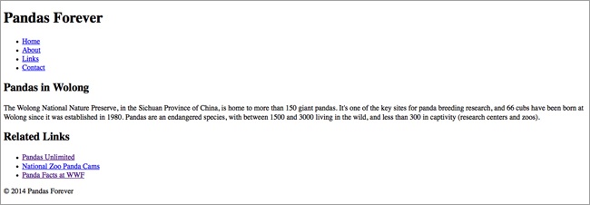
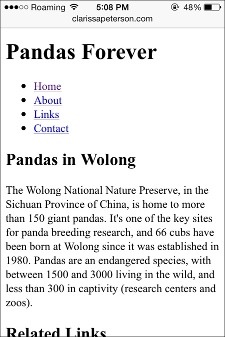
We haven’t added any CSS yet, and the site is already responsive! HTML is responsive by default.
Clean and Semantic HTML
A key to having a website that works well is to keep your code as simple as possible. I don’t mean that you need to keep your design overly simple—I just mean that as you’re creating the code to display your design, you should keep the code straightforward.
This will make the code for your site much easier to write and maintain.
Use the HTML elements correctly, and make sure you’re familiar with all the elements so you know what’s available to you.
Just to start, make sure you’re doing the basics right, like using heading elements for headings (and in the correct numerical order), and list elements for lists. But also take advantage of new elements like <nav> and <section>, which we looked at earlier in this chapter, to properly label the sections of the page.
<div>s and <span>s are container elements that don’t have any semantic meaning. You can use them when there is no semantic HTML element that conveys the meaning you need, but use them sparingly, only when necessary.
Separating Content and Presentation
HTML and CSS are separate languages that have different purposes. HTML is used to display the content and provide information about the content, not to provide any style or decoration. CSS is used to determine the visual appearance of everything on your site, such as layout, typeface, sizes, and colors.
Your content may not always be displayed using the styles you intended, so make sure not to use CSS to convey meaning.
For example, using the heading levels appropriately (<h1> through <h6>) will ensure that all devices and browsers displaying the content know which parts are most important, even if the browser can’t apply the CSS. For example, for a blind user with a screen reader, if the software knows the page is divided into sections with headings, it will let the user jump from section to section instead of having to read the whole page straight through.
On the other hand, if instead you use CSS to give your headings a large, bold font, but you don’t use the appropriate HTML heading elements, the browser won’t actually know that those phrases are headings that describe the content on the page.
Even beyond users with disabilities, there will be plenty of people accessing your website’s content from somewhere other than a page on your site—so they won’t see your design, only your content.
These users might be using RSS readers or read-later apps, as we saw in Chapter 2. For them to be able to view your content correctly, the content needs to be structured in a way that this software can display it.
Also, some of the most important visitors to your site are search engines, and they will not be able to see the site’s design. When search engine software, called a robot, looks at your website, it only sees the HTML, not the design. It uses the information provided by the HTML to determine how your page should be categorized and appear in search results.
Using HTML to structure your content lets the search engines know what the different pieces of content on the page are for, rather than just giving them a jumble of text. If your page does not use semantic code, it can definitely have a negative effect on where your site appears in search engine results.
Designing the page structure first is the best start toward making sure your content can be understood and displayed properly anywhere.
Comments
Comments are an important part of your HTML (and CSS) files, even though the user will never see them. With comments, you can add notes to the source code, which the browser will then simply ignore when it is rendering the page. For example:
<!-- this is an HTML comment -->

<!-- this
is another comment,
on multiple lines -->
Comments are useful to the developer, or anyone who will be working on the code for the page. Often, multiple people will work on a website over time, and comments can be used to explain why things are set up in a certain way, or as reminders as to which things do what.
This is especially important in responsive sites, because there’s so much going on. Adding comments to your code will make it much easier to keep track of what each part of your code does.
Of course, don’t go overboard; as with any code, adding comments does add to the size of your page, which can increase the download time.
You might notice that comments use similar syntax to the code we just used to add the HTML5 Shiv to our example website:
<!--[if lt IE 9]>
    <script src="files/html5shiv.js"></script>
<![endif]-->
That code is actually called a conditional comment, which can only be read by IE browsers (the other browsers just see it as a regular comment and ignore it), and it can be used to give special instructions to IE.
Summary
Every web page is created using HTML, a markup language that uses elements to give meaning and context to each piece of content.
The current version of HTML is HTML5. The doctype at the top of your HTML document lets the browser know which version of HTML your page is written in. Not all elements in HTML5 are supported yet, so you need to be aware of which elements you can safely use, and which elements require additional code to make them work in older browsers.
You need to follow web standards, set by the W3C, so that browsers will display your website the way you expect it to be displayed.
Your HTML document starts with a doctype. That’s followed by the <head>, which supplies information about the page, such as the <title>, as well as information that tells the browser how the page should be displayed, such as the charset and the viewport. For responsive websites, the viewport is key to making sure the page is displayed correctly.
The <head> is followed by the <body>, which contains all of the page content. Use semantic HTML to properly convey the meaning of each page element so that it’s displayed properly regardless of the device or method of viewing the content.
The page structure can be set up using several HTML5 structural elements, such as <header>, <footer>, <nav>, <section>, and <aside>. To make your site accessible, you need to also use WAI-ARIA attributes on these elements to provide navigational help for older screen readers that don’t recognize the HTML5 elements.
It’s especially important on responsive sites—because there are so many complex things going on—that you write simple, semantic HTML, separating content from presentation. You should also include comments in your code to document information that might be helpful to anyone working on the website in the future.
In Chapter 4, we’ll learn how to apply styles to a web page using CSS, and add some style to our example website.