
Chapter 11. Progressive Web App UX
Grace and Trust
Progressive web apps present a true paradigm shift in the way the web works. They provide an experience that is beyond users’ expectations of the web.
Users do not expect web apps to continue working when they are offline. Yet progressive web apps over-deliver on those expectations.
Users do not expect web apps to send them updates when new information relevant to them is available. Yet progressive web apps over-deliver on those expectations too.
Users do not expect full-screen experiences, launched from the homescreen, that look and behave just like native apps. Yet once again, progressive web apps over-deliver.
On the other hand, when a user visits a web app, she expects the content that loads to be up to date. But a user who does not realize she is offline may also not realize that content shown on the screen may be hours or even days old. To her, progressive web apps seem to be under-delivering on the experience she expects.
While the gap between the abilities of the web and the native app is quickly closing, the gap between the modern progressive web app’s abilities and users’ expectations and perception is still very wide.
In the long run, as users use progressive web apps more and more, this gap between expectation and reality will shrink and disappear. But until that happens, this dissonance between users’ expectations and the modern progressive web app presents us with a new challenge. One that we can solve by communicating properly with our users.
Note
As developers, it is not our role to educate users about the web, but to guide them and help them achieve their goals within our apps. We can accomplish this by communicating clearly (both verbally and visually), in ways that help our users understand our apps. In time, as users and developers spend more and more time with progressive web apps, common patterns will emerge.
Think how in just a few years, navigation menus on mobile became almost synonymous with the ☰ hamburger icon. One day, not too long from now, offline will have its own hamburger moment.
In many ways, as progressive web apps catch up with native apps in terms of capabilities, native’s edge over the web boils down to a matter of trust. Users trust their apps to work, no matter where they are, and won’t think twice before launching a messaging app while on a plane. Yet those same users won’t open their web browser after takeoff. Users trust their apps to keep them up to date with notifications, yet will visit a site over and over to check for updates.
As the difference between the web and native becomes more about trust, it becomes more and more important for us to communicate a feeling of trust in our web apps. When a user loses connectivity while using your app, reinforce his trust by communicating to him that his work will not be lost. When your app is fully cached, consider letting your user know that she can now use your app while offline. Before asking for permission to send push notifications, let your user know exactly how he will benefit from these notifications and what they may include. Remember, trust is not just about your progressive web app’s capabilities, but also about letting your users know you won’t abuse those capabilities.
In this chapter, we will explore different patterns for communicating these and other messages to your users. We will also look at a few great opportunities to enhance your progressive web app’s UI to improve the user experience and improve your site’s success. These concepts go hand in hand with the lessons learned in Chapter 5, where we explored building offline-first apps that handle changes in connectivity with grace. Once your app successfully handles any connection with grace and communicates clearly with the user, instilling a sense of trust, it can truly rival the experience delivered by any native app.
Communicating State from the Service Worker
Let’s begin with one of the messages you might want to communicate to your user, and then see how we can implement it in our app.
The first enhancement we added to the Gotham Imperial Hotel app was allowing it to work even when the user is offline. By allowing the app to work seamlessly no matter the connection, we have improved the user’s experience. But what if the user is unaware that she is offline and doesn’t realize she is viewing content that might be stale. We can communicate this to the user by detecting when the user is offline and viewing cached content, and show her a message letting her know that content she is looking at may be out of date.
We can accomplish this in two steps:
-
In the service worker, we will detect when the user is offline and viewing cached content, and communicate that to the page.
-
In the page, we will listen for that communication and inform the user.
In our app, most dynamic content is either returned from IndexedDB or from the cache falling back to the network. The only thing that we truly go to the network for every time (only falling back to the cached response when the user is offline) is the events data. This makes this request a great opportunity to detect when the user is offline and communicate that to the page.
Note
This request is also a good place to detect when to communicate the message to the user, because the events data is only loaded after the page’s DOMContentLoaded event fired. If we were to try and communicate to the page from the request to the page itself (the HTML), the page might not be ready to receive our message and display the notification. In this case, we would have to modify the service worker code to wait for the page to load before sending the message.
Make sure that your code is in the state we left it in at the end of the last chapter by running the following commands in the command line:
git reset --hard
git checkout ch11-start
We begin coding in serviceworker.js by modifying the part of the fetch event listener that handles requests to /events.json:
}elseif(requestURL.pathname==="/events.json"){event.respondWith(caches.open(CACHE_NAME).then(function(cache){returnfetch(event.request).then(function(networkResponse){cache.put(event.request,networkResponse.clone());returnnetworkResponse;}).catch(function(){self.clients.get(event.clientId).then(function(client){client.postMessage("events-returned-from-cache");});returncaches.match(event.request);});}));}
Most of this code has already been explained in “Implementing Our Caching Strategy”. The only additions are the first three lines of the catch statement. When a network request to events.json fails, and the catch statement is executed, our code will post a message to the client that requested the events file. The content of the message (its data) is a simple string I have chosen for this type of event—events-returned-from-cache.
Next, we need to make sure our page listens for this message and displays a notification. We can add the following event listener to app.js:
if("serviceWorker"innavigator){navigator.serviceWorker.addEventListener("message",function(event){if(event.data==="events-returned-from-cache"){alert("You are currently offline. The content of this page may be out of date");}});}
The code begins by making sure the user’s browser supports service workers. Next, it adds a new event listener that will listen for message events. When this event is detected, we check the content of that message (available in event.data), and if it matches the event name we chose, we display an alert to the user. For a refresher on how posting messages between the service worker and the page works, see Chapter 8.
Showing an alert is obviously not the kind of slick user experience that we are going for. Let’s do something about this.
Communicating with Progressive UI KITT
Before we implement the rest of the messages, let’s look at a handy library that can make communicating with our users much easier.
Progressive UI KITT is a small library that handles both the communication between the service worker and the page, as well as rendering the notifications to the user. It can handle sending notifications to one or more windows at a time, can include buttons in the notifications, and can easily be customized with your visual style or any of the visual themes that come with it.
Let’s see how we would go about adding the same offline message shown in the previous section using Progressive UI KITT (Figure 11-1).
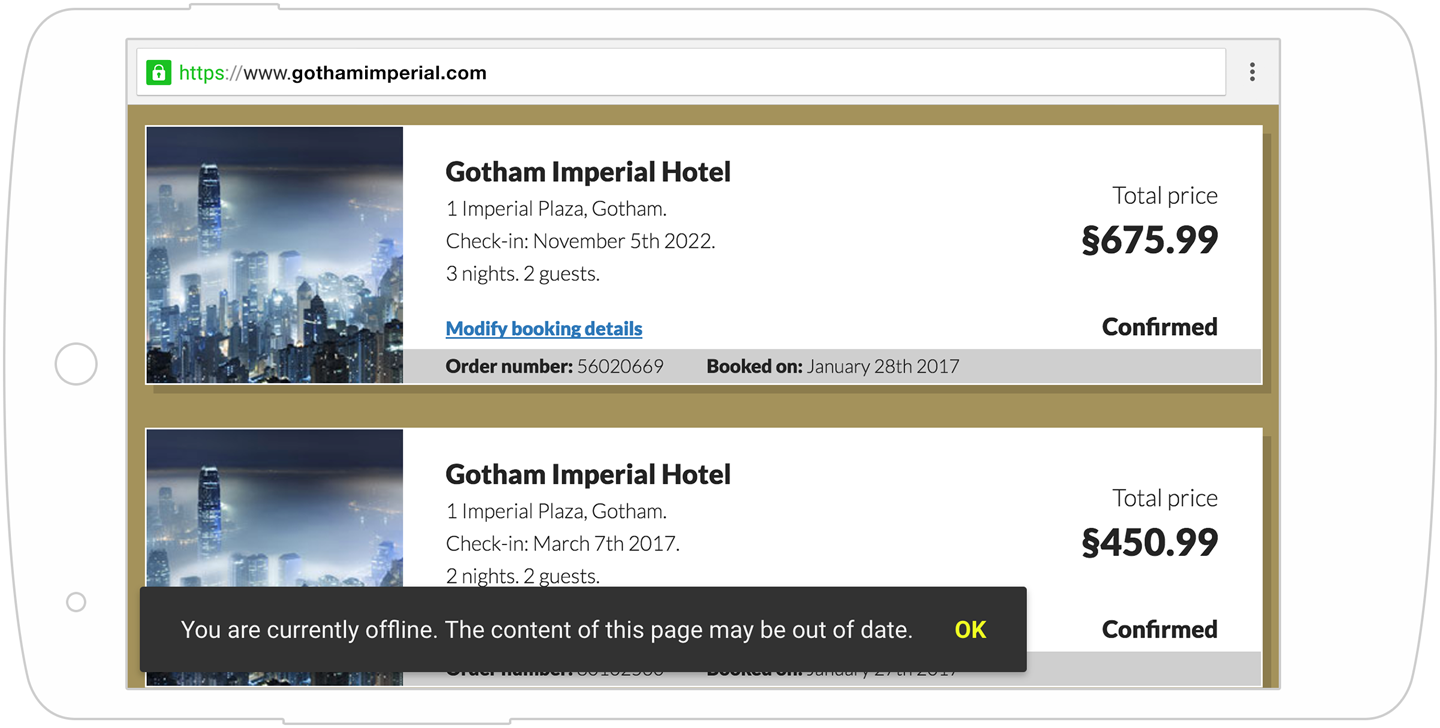
Figure 11-1. Progressive UI KITT’s offline message
Warning
If you implemented the two changes shown in the previous section, you can revert those changes. Our new code will replace it.
Progressive UI KITT is available in the project in the public/js/vendor/progressive-ui-kitt directory. To use it, we will need three files:
-
progressive-ui-kitt.js—The main library file. Include this in any page that needs to display notifications.
-
themes/flat.css—A theme file used to style the notification. Feel free to replace flat.css with any other file from the themes directory, or create your own.
-
progressive-ui-kitt-sw-helper.js—Contains helper functions to be included in the service worker that can trigger notifications on any page from the service worker.
Before we begin, let’s make sure Progressive UI KITT and its stylesheet are both cached in our service worker so that we can use them even when the user is offline.
In serviceworker.js, add the following files to the CACHED_URLS array:
"/js/vendor/progressive-ui-kitt/themes/flat.css","/js/vendor/progressive-ui-kitt/progressive-ui-kitt.js"
Next, on the top of serviceworker.js, add the following line to import Progressive UI KITT’s service worker helper:
importScripts("/js/vendor/progressive-ui-kitt/progressive-ui-kitt-sw-helper.js");
Finally, we need to include and initialize Progressive UI KITT in any page where we want to display notifications.
Add the following code to the bottom of index.html and my-account.html, just before the closing </body> tag:
<scriptsrc="/js/vendor/progressive-ui-kitt/progressive-ui-kitt.js"></script><script>ProgressiveKITT.setStylesheet("/js/vendor/progressive-ui-kitt/themes/flat.css");ProgressiveKITT.render();</script>
This code will include the main Progressive UI KITT file. Choose a style for the notifications (we are using the flat theme here), and initialize KITT by calling render().
Now that KITT is ready in our page and the service worker, we can create our first message.
In serviceworker.js, modify the part of the fetch event listener that handles requests to /events.json:
}elseif(requestURL.pathname==="/events.json"){event.respondWith(caches.open(CACHE_NAME).then(function(cache){returnfetch(event.request).then(function(networkResponse){cache.put(event.request,networkResponse.clone());returnnetworkResponse;}).catch(function(){ProgressiveKITT.addAlert("You are currently offline."+"The content of this page may be out of date.");returncaches.match(event.request);});}));}
The only thing we added in this code is to modify the catch block to call ProgressiveKITT.addAlert, passing it our message.
That’s it. All it takes is a single command, and KITT takes care of the rest. Next time our user visits the app while he is offline, he will see a notification like the one shown in Figure 11-1.
Note
You can use KITT to create messages, alerts, or confirmation messages by calling ProgressiveKITT.addMessage(), ProgressiveKITT.addAlert(), or ProgressiveKITT.addConfirm().
Alerts contain text and a single button (labeled OK by default):
ProgressiveKITT.addAlert("Caching complete!");ProgressiveKITT.addAlert("Caching complete!","Great");
Confirmations contain text and two buttons (labeled OK and Cancel by default):
ProgressiveKITT.addConfirm("Caching complete!");ProgressiveKITT.addConfirm("Caching complete!","Great","OK");
Messages contain text and nothing else:
ProgressiveKITT.addMessage("Caching complete!");
Because messages do not contain any buttons, you might want to use them with the hideAfter option to hide them automatically after some time:
ProgressiveKITT.addMessage("Expiring message",{hideAfter:2000});
All of these commands would work both from within the service worker as well as from the page.
For a full list of all the options KITT accepts, instructions on how to attach callback functions to the buttons, as well as the complete documentation, visit https://pwabook.com/kitt.
Common Messages in Progressive Web Apps
Besides the offline notification shown in the previous section, what are some other messages you would want to communicate to your user? The answer to this depends on your app, but here are a few ideas.
Caching Complete
Once a service worker has finished its installation and cached all assets needed to display the app, you might want to show the user a message letting her know the site will now work offline:
self.addEventListener("install",function(event){event.waitUntil(caches.open(CACHE_NAME).then(function(cache){returncache.addAll(CACHED_URLS).then(function(){ProgressiveKITT.addMessage("Caching complete! Future visits will work offline.",{hideAfter:2000});returnPromise.resolve();});}));});
Page Cached
In “Window to Service Worker Messaging”, we looked at a site offering a travel guide listing every restaurant in Gotham. As Gotham has thousands of restaurants, we decided it would be unreasonable to cache the details for all of them. Instead, we chose to cache only the restaurants the user has shown an interest in (by visiting their page). How would we communicate this back to the user, letting him know he can now get directions to that new restaurant he has been meaning to try, even while he is offline?
self.addEventListener("message",function(event){if(event.data==="cache-current-page"){varsourceUrl=event.source.url;caches.open("my-cache").then(function(cache){returncache.addAll([sourceUrl]).then(function(){ProgressiveKITT.addMessage("This restaurant's details can now be accessed offline.",{hideAfter:2000});returnPromise.resolve();});});}});
Later, in “Progressive Web App Design”, we will also look at a visual way to communicate this kind of information.
Action Failed But Will Complete When User Regains Connectivity
In Chapter 7, we learned how to use background sync to make sure any action the user takes will reliably complete, even if her connection fails. But users are skittish when it comes to taking important actions on mobile devices or filling out forms when their connectivity could fail at any time. If this happens, we can assure our users that the action they tried to take will be done as soon as they regain connectivity:
self.addEventListener("sync",function(event){event.waitUntil(saveChanges().catch(function(){ProgressiveKITT.addAlert("You are currently offline, but your reservation has been saved.");}));});
Notifications Enabled
Once a user has subscribed for push notifications, you can inform him that he will receive updates as they become available:
navigator.serviceWorker.ready.then(function(registration){returnregistration.pushManager.subscribe(subscribeOptions);}).then(function(){ProgressiveKITT.addMessage("Thank you. You will be notified of any changes to your reservation.",{hideAfter:3000});});
This can be a more subtle way to show this message than by immediately abusing the notification permission to let the user know she will receive notifications by sending her a notification about notification.
Choosing the Right Words
A vital part of communicating with your user in a way that instills trust in your app is choosing the right words.
If a user just spent a few minutes carefully editing an image, applying artsy filters, and adding a hashtag filled description, only to lose connectivity a second before hitting the Submit button, do not respond with an ominous “network error” message. Instead reassure him that his image, message, and hard work aren’t lost—they’ll just be posted at a later time.
You could even modify the wording of your app’s interface on the fly based on the connection status. If you reword a Save button to say “Save locally,” or change a Send button to say “Send when online,” you can increase your users’ confidence in your app—confidence that their work won’t be lost. Otherwise, they are left staring at the button and wondering what will happen if they click it.
Always Be Closing
Another area where messaging and trust are critical is when we are asking the user for her permission to do something.
In Chapter 10, we let our users sign up for push notifications as a way to inform and re-engage them. But the user experience of asking for the user’s permission was lacking. We simply opened the permission dialog without providing the user with any context or explaining how the notifications will be used.
Unfortunately, we often see this kind of user experience done so poorly, and with such self-destructive results, that it is worth taking the time to consider a better alternative.
Before you even think about requesting permission to send push notifications, consider two things: timing and your message.
Remember that once a user has denied the permission request, you can’t ask for it again. For this reason, it is vital to consider the timing of the request. Simply opening the permission dialog as soon as the user has arrived at your site is a surefire way to get him to decline immediately, and perhaps even leave your site. Instead, ask for the permission when the notification offers a tangible benefit for him. For example, if you plan to send notifications alerting your users to changes to their reservations, only ask for the permission after they have made a reservation. If you are working on a news site, consider offering a notification about new football articles only after the user has shown interest in them. Remember, you only get one chance to ask—if you ask before the user sees the value in it, you lose that chance forever.
Next, we need to consider the message. When you simply open the browser’s native permission dialog, you can’t control that message, and the user is presented with a generic <URL> wants to send you notifications (Figure 11-2).
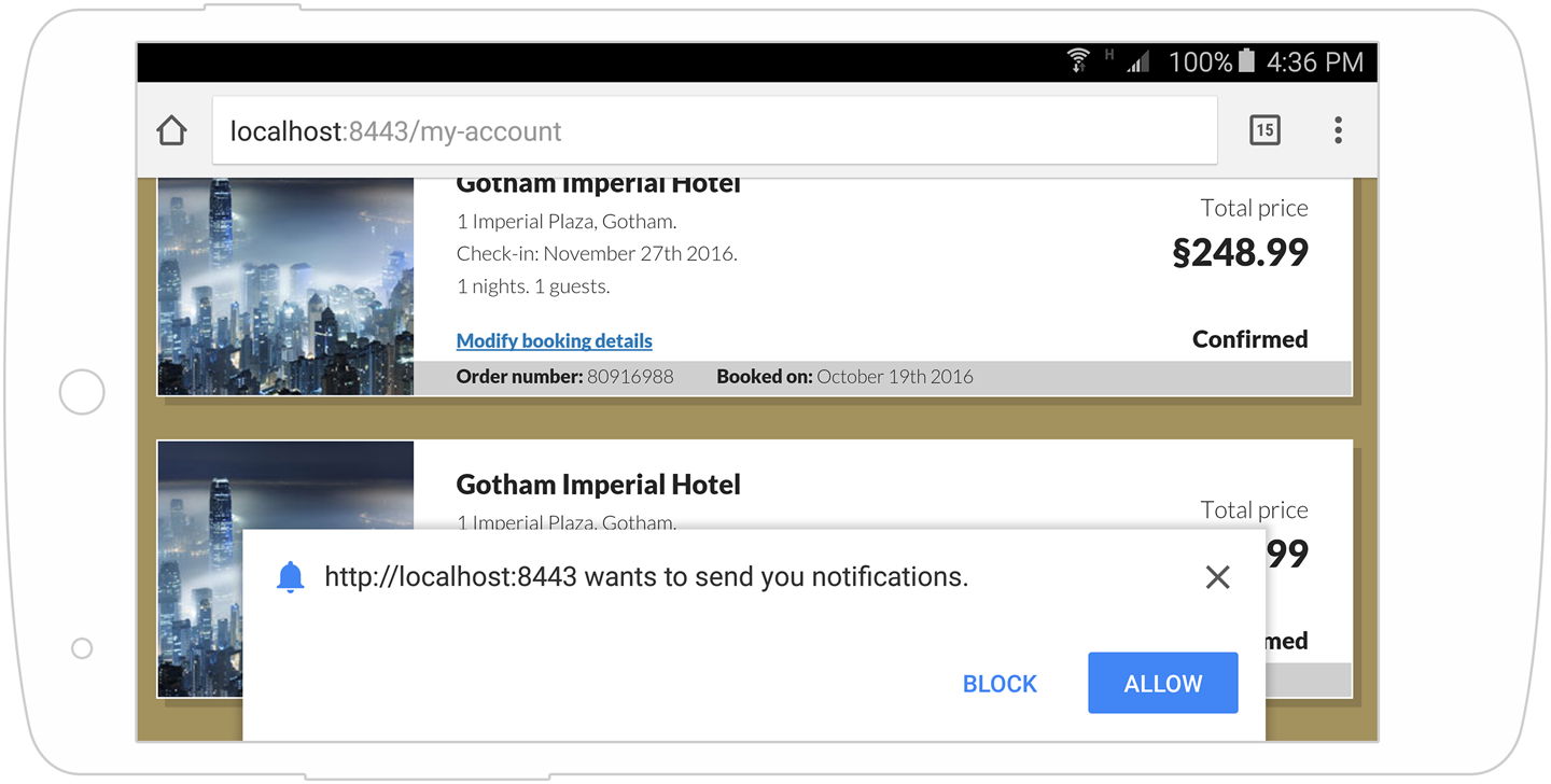
Figure 11-2. Chrome’s default notification permission dialog
As a user looking at that message, the benefit to you isn’t clear. Sure, some site wants to send me notifications—but what’s in it for me? What kind of notifications? Will clicking Allow cause me to get spammed? Instead of instilling confidence, it raises questions and doubt.
This is an awful user experience, and we really should aim higher.
Instead of immediately triggering the native permission request, consider creating your own UI for letting the user trigger it herself. Within this UI, you can control the message—a message that should make it clear to the user what the notifications are and the type of messages he can expect. He can then choose to enable notifications, in which case you can call Notification.requestPermission(), or he may choose to decline it. Yes, this adds an extra step to the process and requires two clicks from the user to give the permission, but it almost always results in more conversions.
Note
Creating your own UI for offering notifications has two more benefits:
-
If the user declines your offer, you can always try to offer it again in the future. If he declines the browser’s
requestPermission()dialog, you can’t. -
You can use the same interface for subscribing to notifications to later let the user unsubscribe from those notifications.
Speaking of the message, there’s an old saying among salespeople: don’t try to sell your product’s features; sell its benefits. This isn’t about some slimy marketing technique, but about making sure your user understands what you are offering and what she is agreeing to.
When crafting your message, don’t just offer the feature (e.g., “Enable push notifications”). Instead, describe the benefit to the user (e.g., “Get a notification when your order ships”).
Which of the messages shown in Figure 11-3 do you think will result in more conversions?

Figure 11-3. Two different approaches to notification
As a user, the benefit offered by the message on the right is clear to me. It is important enough to me that I would go through 17 extra clicks if I had to, as long as I don’t miss hearing about changes to my reservation.
Let’s see how we can improve the user experience of the Gotham Imperial Hotel’s notifications.
Modify the offerNotification() function in my-account.js to match the following:
varofferNotification=function(){if("Notification"inwindow&&"PushManager"inwindow&&"serviceWorker"innavigator){if(Notification.permission!=="granted"){showNotificationOffer();}else{subscribeUserToNotifications();}}};
While the old code always called subscribeUserToNotifications() (which asks for permission, if it is needed, and then creates a subscription, if it is needed), we are now only calling it if the user has already granted the notification permission. If not, we do not want to immediately trigger the native permission dialog, but use our own. We call showNotificationOffer() which turns on the display of a div (#offer-notification) containing a link to turn on notifications.
At the bottom of my-account.js, add the following code to make sure when the link offering notifications inside that div is clicked, subscribeUserToNotifications() will be called:
$("#offer-notification a").click(function(event){event.preventDefault();hideNotificationOffer();subscribeUserToNotifications();});
The two changes we did are quite small. If the user hasn’t granted us permission yet, we no longer call subscribeUserToNotifications() as soon as she makes the reservation. Instead, we display our own UI element offering the notification and only call subscribeUserToNotifications() if she chooses to click it.
This way we control the timing of the message, showing it only when we know it offers a real benefit to the user. And we control the messaging, making the benefit to the user clear.
Progressive Web App Design
As our apps break away from the confines of the old web, their designs need to adapt as well.
This starts with our app’s icon on the homescreen, continues through adapting our design for the limitations of each medium (e.g., missing address bar and back button in full-screen progressive web apps, a changing screen orientation in websites, etc.), and culminates in instilling confidence in the app despite changing network conditions.
Your Design Should Reflect Changing Conditions
We have already discussed reflecting changing network conditions verbally, but this can also be communicated visually.
Your app can automatically disable or hide buttons for features that are unavailable when offline. It can even modify those buttons to help the user understand what will happen (e.g., modifying a Send button to a “Send later” button).
Consider a progressive web app with a large amount of dynamic content that is cached on demand as you visit it. A user visiting this app while offline may only have some of its content available to her. How would you reflect this visually to the user?
One great example comes from Housing.com, one of India’s top real estate platforms.
When visitors visit Housing.com while offline, listings and cities that haven’t been cached are grayed out and cannot be selected, while those that have been cached are displayed normally. The distinction is subtle, yet clear (Figure 11-4).
Connectivity is not the only changing condition your design can reflect. For example, you might consider modifying your UI based on whether a user has granted notification permissions, showing either a button to enable notifications or controls to customize which notifications to display.

Figure 11-4. Reflecting content availability while offline in Housing.com
Your Design Should Fit Its Environment
Now that a small piece of your app (and your brand) can live outside the browser on your user’s homescreen, make sure it fits there or it will stick out like a sore thumb. Don’t just reuse your existing icon or favicon on all platforms. App icons look vastly different as Android homescreen icons than they do as Windows 10 tiles, which is vastly different than Safari pinned tabs, which is very different than a MacBook Pro’s Touch Bar icon. For more details on adapting your app’s icon to various mediums, see “Backwards, Sideways, and Future Compatibility”.
Your Design Should Adapt to the Particularities of Each Medium
Consider how your app’s look differs when launched in full-screen versus how it looks when viewed in a web browser. Will the lack of a location bar affect your branding? Do you have tech-savvy users who are used to copy-pasting URLs from your site? Will the lack of a visible security indication next to your HTTPS URL affect conversions?
One possible way to tackle this is to add extra UI elements that can provide similar functionality. These UI elements can be made visible only when the display is set to full-screen or standalone using CSS media queries:
@mediaalland(display-mode:fullscreen){#back-button{display:block;}}
Your Design Should Instill Confidence and Inform the User
Just like the verbal communications discussed earlier in the chapter, your design can also be used to communicate with the user and instill a sense of trust and confidence.
For example, when sending a message using WhatsApp, a single gray checkmark appears next to the message as soon as it is entered. This happens even if the user is offline. This helps assure the user that whether he is offline or online, the message was recorded in the app and will be delivered as soon as possible. If your app delivers the same kind of reliability, assure your users that their carefully crafted message is safe in your app’s hands. Don’t leave them wondering.
Your Design Should Help the User and Your Business Achieve Their Goals
Can your travel app work even when your users are in airplane mode? That’s a serious edge over the competition. Make sure your users know.
Will getting more users to sign up for push notifications help your business re-engage more users? Make sure you properly communicate how they work and their benefits to your users.
Taking Charge of the Install Prompt
Earlier in the chapter, we saw how we can improve the user experience of asking for permission to send notifications. Another prompt you might want to improve on, is the web app install banner—specifically, its timing.
The timing of the install prompt is completely up to the browser. Unfortunately, the browser can only guess when the best time to show the install prompt is—but it doesn’t know your app or your audience like you do.
What if the user is in the middle of a checkout process when the browser decides to show the install prompt? Do you really want to distract your users at that point?
Luckily, the browser gives you some control over this.
While you can’t control when to initiate the install prompt, you can listen for when the browser decides to show it, intercept that event, and delay it to a later time (or cancel it completely):
window.addEventListener("beforeinstallprompt",function(promptEvent){promptEvent.preventDefault();setTimeout(function(){promptEvent.prompt();},2000);});
The code listens for the beforeinstallprompt event, and when it is triggered calls preventDefault() on that event to stop the install prompt from showing. It then waits two seconds and manually initiates the display of the install prompt using the event’s prompt() method.
One interesting implementation of this comes from Flipkart, one of India’s largest ecommerce retailers. The Flipkart home page contains a small + icon on the right side of the header (as seen on the left side of Figure 11-5). This icon wiggles from time to time to entice the user to try it. Once clicked, Flipkart displays an overlay instructing the user how to add a homescreen shortcut to Flipkart (shown in the center of Figure 11-5). If, however, this link is clicked after the browser tries to show an app install banner—which Flipkart blocks and stores the reference to—the browser’s app install banner is shown instead (shown on the right side of Figure 11-5).

Figure 11-5. Flipkart’s Add to Homescreen experience
Just like with push notifications—controlling the timing and messaging is key to delivering a great experience to your users.
Measuring and Aiming for Performance with RAIL
Once your app is on the homescreen, it is indistinguishable from native apps. And as the saying goes when mashed together with an unrelated saying: with great power come great expectations. When your progressive web app gains a position of privilege on the user’s homescreen among the rest of their native apps, it had better be as slick and run as smoothly as the native apps that sit beside it.
We have already discussed the many powerful new features that progressive web apps can use to become as powerful as native apps. But just as important as what they can do—is how they feel.
Your app needs to feel right when the user uses it.
To do that, it needs to be performant. Responsive. Slick. It needs to have that certain something that makes it feel right. It is the difference between the experience of an app that responds immediately to your clicks and the old web experience where clicking something led to long waits, wondering whether your click registered, and sometimes even clicking a second time just to make sure. When an app feels right, all of these doubts disappear.
The need to translate this feeling of responsiveness and performance into something we can measure, and thus aim to achieve, has lead to the RAIL model.1
RAIL is not a new technology, nor is it a new tool. It is simply a set of guidelines that help us understand what makes an app (native, progressive, or plain old website) feel right. And like so many great things in tech, RAIL’s name is an acronym that reminds us of the guidelines to keep in mind: response, animation, idle, and load:
- Response
-
When the user takes any action, such as clicking any element on the screen, we want to respond in under 0.1 seconds.
Can you show the information the user requested in that time—amazing! If not, can you begin to transition the screen toward the result the user asked for (even if it doesn’t include the actual data yet)?2 If you can’t do that, can you at least show some indication that the user’s action was detected and something is happening? This could be as simple as showing a loading indicator.
As long as you can show some kind of response to the user’s action in under 100 ms, it will feel like an instant response. Strive to provide the feeling of an app that responds instantaneously to the user. Don’t leave the user wondering if she clicked the right thing or whether she should click again.
Remember Newton’s paraphrased third law: for every action, there should be an instant reaction. Don’t mess with Isaac.
- Animation
-
For an animation to look and feel smooth to the human eye, it needs to update at least 60 times a second.
Achieving this 60 frames per second holy grail means updating the screen every 16.66 ms (1,000 / 60). And since the browser also needs some time to paint new frames to the screen, realistically you only get about 10 to 12 ms for each frame.
Remember that when we talk about animation, we are also referring to how the page looks like when the user is scrolling. Having a page start to stutter when the user is scrolling is often worse than any other delays in your animations.
- Idle
-
Defer nonessential work to idle time.
Nonessential means anything that isn’t part of the response, animation, or load. Is the user scrolling through an endless list of items? Make sure loading and rendering the next items does not cause scrolling to freeze or look janky. Do you need to download and cache some assets for the user’s next visit? Make sure it does not slow down his current visit.
- Load
-
When a user performs an action such as requesting a page on your site, aim to show the results of that action in one second or less.
Ambitious? Perhaps.
Possible? With service workers, CacheStorage, IndexedDB and the rest of the modern toolkit—definitely.
Remember, you don’t have to load your entire app in one second. You just need to give the user the perception that the app has loaded. Sometimes just loading the content shown above the fold and deferring the rest to idle time can help you achieve this (Figure 11-6).

Figure 11-6. Housing.com’s search page renders even before the results are available
The guiding principles of RAIL:
-
Show some kind of response to any user action in 100 ms or less.
-
Make sure your animations draw to the screen every 16 ms or less.
-
Perform work when the page is idle, and in chunks of no more than 50 ms.
-
Load and display what the user requests in under 1,000 ms.
The specifics of achieving all of these goals are beyond the scope of this book. You can find many handy resources to get you started with performance at https://pwabook.com/performancelinks.
Summary
Progressive web apps provide us with new UX challenges. But when properly handled, progressive web apps also provide many great opportunities to improve on both the user’s experience as well as your web app’s success.
While some things can be added to your app without much consideration of how they affect the user’s experience, others must be carefully considered before they are added. Caching static assets and always serving them from the cache is a no-brainer, but if your plan for adding push notifications simply involves adding some code to ask for permission as soon as the user hits the home page, you can expect an interesting email from management involving the words funnel, conversions, and KPIs.
In the end, user experience matters more than anything else.
When employing any of the techniques described in this book, always first stop and consider how these changes would affect your user’s experience.
1 RAIL was coined and defined by Paul Irish and Paul Lewis https://pwabook.com/railintro
2 You can see a great example of this in Figure 11-6.