Temporal, Geographical and Categorical Aggregations Viewed through Coordinated Displays: A Case Study with Highway Incident Data
Anna Fredrikson, Chris North, Catherine Plaisant and Ben Shneiderman, Human-Computer Interaction Laboratory, University of Maryland, UMIACS, A.V. Williams Bldg, College Park MD 20742, http://www.cs.umd.edu/hcil. E-mail address: [email protected]
ABSTRACT
Information visualization displays can hold a limited number of data points, typically a few thousand, before they get crowded. One way to solve this problem with larger data sets is to create aggregates. Aggregations were used together with the Snap-Together Visualization system to coordinate the visual displays of aggregates and their content. If two displays each hold one thousand items then rapid access and visibility can be maintained for a million points. This paper presents examples based on a database of highway incident data.
1 INTRODUCTION
An information visualization display can hold a limited amount of data points, typically a few thousand, before it gets crowded. One way to accommodate larger data sets is to create aggregates. An aggregate is a single item that represents or summarizes a group of data points. Aggregates simplify the display because fewer markers are needed and users can understand overall patterns and select the details that are relevant to their tasks. Aggregations were used together with the Snap-Together Visualization system to coordinate the visual displays of aggregates and their details. This paper presents a case study with incident data from Maryland highways in which aggregation and coordinated displays were used.
2 SNAP TOGETHER VISUALIZATION
Snap-Together Visualization (Snap) [NS99] enables users to explore their data by rapidly constructing their own coordinated displays. Users choose the set of component visualizations they need and specify the coordination between them as appropriate for their tasks. This allows users to mix and match visualizations and coordinations to their liking, without programming. Then, these customized displays maximize users ![]() capability to explore, understand, and discover phenomena in their data.
capability to explore, understand, and discover phenomena in their data.
Snap![]() s coordination model is based on the relational database model. First, users load and display individual relations in visualizations. Then, they coordinate the visualizations based on the join relationships between the relations.
s coordination model is based on the relational database model. First, users load and display individual relations in visualizations. Then, they coordinate the visualizations based on the join relationships between the relations.
With Snap, users can create many different types of coordinations between visualizations. For example, the brushing-and-linking coordination enables users to identify corresponding data items between views. When users select and highlight an item in one view, the corresponding item is also highlighted in the other view. The synchronized-scrolling coordination enables users to easily scroll through two corresponding lists of data items simultaneously.
This paper focuses on using Snap for the drill-down coordination. This enables users to navigate from aggregates in one view to aggregate details in another view (one-to-many joins).
3 AGGREGATIONS
Aggregates are groups of data points that are used as summarization. They can be formed as a result of decomposition or aggregation [GR94]. The aggregates are used in the visualization instead of all the data points to simplify the display. There are a variety of aggregates, but our experience has been that the most common are geographical, temporal, and categorical. The aggregates have data characterizations that are derived from the data characterization of the elements, and they can be defined in advance in the database or specified when needed (on the fly” or just-in-time”).
In traditional databases, aggregation is specified as a query with a group function that is submitted to the system. The system processes a large volume of data and delivers the answer. Online aggregation [HHW97] is a new interaction interface that lets users observe the progress of the aggregate query execution and to control it when needed. Another tool for aggregates is Aggregation Eye [Moc98], which is used for manipulating the extent of an aggregate dynamically. Visage [GR94] takes a completely different approach, allowing users to create an aggregate by manually collecting a set of items into a group, much like a shopping basket. This deals with only one aggregate at a time.
Several systems, including DEVise [LRB97] allow users to display data in a variety of plots and establish different types of coordinations between them. However, its coordinations focus on synchronizing the panning and zooming of plots that share common axes.
One of the interesting problems about aggregation is to select the granularity of the aggregate. Depending on the task and the application domain, different aggregates are needed. For example, in an application with highway incident data, it is interesting to look at both the number of incidents per year and the average number of incidents per hour on one day.
4 AGGREGATIONS AND COORDINATED DISPLAYS
The increasingly popular visualization strategies, such as starfìeld displays [AS94], are effective in dealing with thousands or even tens of thousand data values. However many databases are much larger. As the number of values grow, the display can become too crowded with data points and it becomes difficult to recognize trends, clusters, outliers, or gaps in the data (Figure 1).

Figure 1 A Spotfire display with incidents around Baltimore marked on a map. The display is crowded with data points and it is difficult to identify any high hazard locations.
Aggregation can be used to provide an overview, and together with other coordinated displays show the details of the aggregates. This allows users to maintain an overview and at the same time look at the details. The aggregates are displayed in the overview, and the contents of the selected aggregate are displayed in detail views. The visualization displays are tightly coupled, so that when users select an aggregate the details of the aggregate are immediately shown in the other display. This is the drill-down coordination.
This technique enables the exploration of very large-scale databases. For example, 1,000,000 traffic incidents could be aggregated into 1000 aggregates, each with 1000 incidents. This could be displayed with two coordinated views, an overview of 1000 points, and a detail view of 1000. Furthermore, this approach can be repeated by chaining several views, adding an additional view for each level.
The drill-down technique is used in the Visage system [LR96], but users have to drag and drop the aggregate onto a new display to see the details. The Apple Dylan programming environment [DP95] lets users split and link frames for drilling down through file structures (similar to Windows Explorer).
5 EXPLORING INCIDENT DATA
Maryland State Highway Administration is responsible for responding to incidents and gathering data for planning purposes. When an incident occurs on the highway, a traffic operator at one of the centers fills in an incident report form. The form has information about the incident, including location, time and date, weather conditions, vehicles involved in the incident etc. The data in this study is based on a subset of incident report forms from the Maryland State Highway Administration. Today those forms exist only on paper and had to be transcribed for this study. The only incidents that are routinely analyzed are the ones resulting in personal injury, and the analysis is based on the police reports, not the incident report forms. One of our goal was to inform the redesign of the highway management information system and explore what information would be useful to collect in an improved incident report form.
This study included more than ten different prototypes of coordinated visualization displays with highway incident data using Snap. We first defined the aggregates in the database by writing SQL queries, and then created the views with the specification of the coordination between the different views. For each prototype we documented it by writing down advantages, disadvantages, and other details about the view or the aggregation.
Most of the examples presented below used Spotfire for the data visualization (www.spotfire.com). Spotfire can display a single data table as a scatter plot (2D or 3D), bar chart, or pie chart. It can display the same table in multiple views simultaneously, with brushing-and-linking between them. However, it does not support multiple tables, aggregation, or drill-down coordination. Hence, Snap is used to coordinate multiple instances of Spotfire.
5.1 Geographical aggregations
The first prototype consisted of geographical displays coordinated with Snap. The first step (Figure 2) was to create aggregates for the exit numbers (geographical aggregation) and to use the incident database with the records from the Baltimore Beltway. We added data about the exits and calculated how many incidents occurred close to each of them. An estimated distance to a response unit for each exit number was used for color coding (Figure 2). When an exit was selected all the incidents were shown in a table grid at the bottom of the screen.
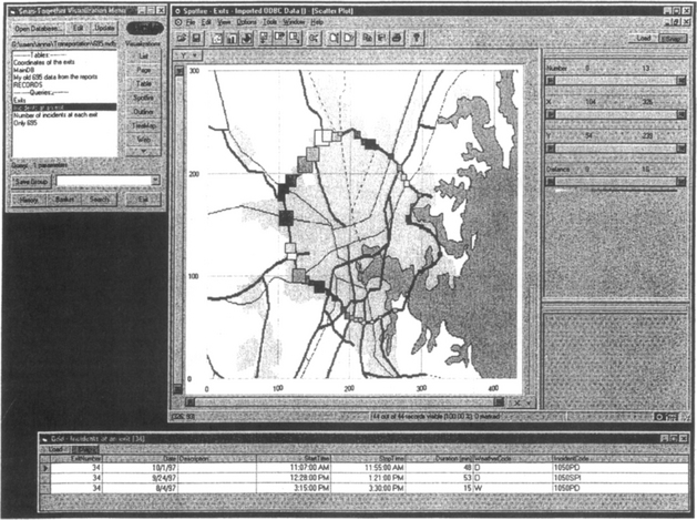
Figure 2a With exit aggregates on a map it is easy to see where most of the incidents occurred. The size of the markers depends on the number of incidents and the color depends on the distance to a response unit. When the users click on an intersection the incidents are shown on a table.
The map makes it easy to see where most of the incidents occurred, since the size of each exit marker indicates on the number of incidents close to that exit. The distance to a response unit is used as color-coding, with dark blue as the longest distance and white as the shortest. This view could serve as an aid in placing the response units where they are most needed. The exits with dark blue color and rather large size are probably in need of an extra unit!
To construct this coordinated display using Snap, we first open the incident database with Snap. The Snap Main Menu window (Figure 3a) displays the relations in the database and the available visualizations. We created an aggregate query to group the incidents by which exist they occurred near on the 695 Baltimore beltway. In SQL, this • •Exits″ query is:

Figure 3a The Snap-Together Visualization menu lists the tables and queries in the incident database and displays a menu of available visualizations.
Dragging the Exits aggregate query onto the Spotfire button displays the Spotfire chart of the exits, size-coded by the number of incidents near each exit. Likewise dragging a query for incidents at any given exit (aggregate contents) on the Table button displays the table at bottom.
Now we can coordinate the visualizations by dragging the Snap button ![]() from Spotfire to the table. These buttons are automatically added to each visualization by Snap. The Snap Specification dialog (Figure 3b) is displayed for specifying which actions to coordinate between the views. Choosing Select” for Spotfire and • •Load” for the table establishes a drill-down coordination. Now we can examine specific incidents near an exit by selecting the exit in Spotfire to display them in the table.
from Spotfire to the table. These buttons are automatically added to each visualization by Snap. The Snap Specification dialog (Figure 3b) is displayed for specifying which actions to coordinate between the views. Choosing Select” for Spotfire and • •Load” for the table establishes a drill-down coordination. Now we can examine specific incidents near an exit by selecting the exit in Spotfire to display them in the table.

5.2 Temporal aggregations
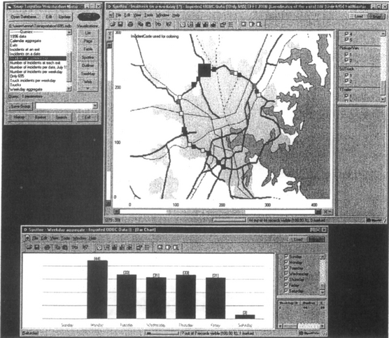
Since traffic during one week is similar to traffic during other weeks, it seemed promising to try and group the incidents by day of the week (Figure 4). The number of incidents each day was shown in a display with bar charts. Each bar represented one day of the week. When a bar was selected a map with markers of the incidents was loaded in the other display. The size of the markers in this display depended on the duration of the incident. In this sample, there were few incidents on the weekend compared to the weekdays. In Figure 5, instead of grouping the incidents by day, they were grouped by date in this prototype. A calendar was shown in one display and if a date was selected, information about the incidents was loaded into a table grid.
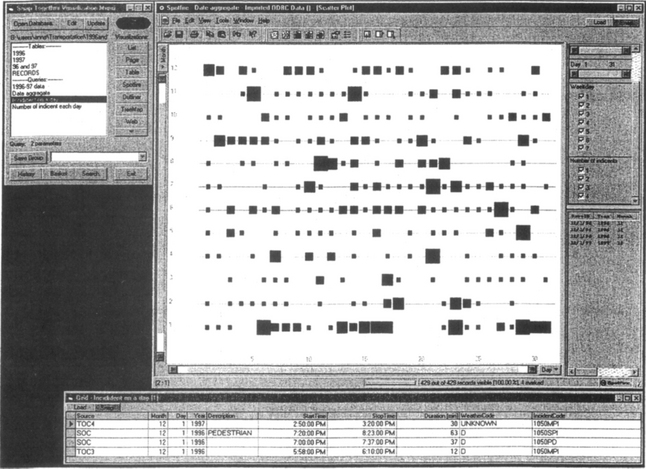
5.3 Categorical aggregates
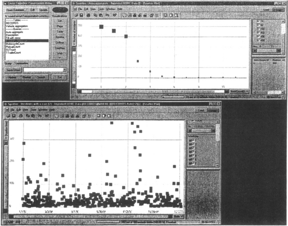
Finally categorical aggregates were found useful: by vehicle type (cars, trucks, …), incident type (crash, fire, …), weather condition (dry, rainy, …), etc. Figure 6 shows an aggregation by the number of vehicles in the accident - mostly 0.1 or 2.
6 COORDINATION ARCHITECTURE
Once a coordinated display is constructed. Snap maintains the specified coordination while users manipulate the display. When users invoke an action in one view. Snap automatically invokes actions coordinated to that action in other views (Figure 7). In the case of the drill-down coordination, the Select action of the aggregates overview is coordinated to the Load action in the aggregate contents view. Figure 7 shows the structure of the example in Figure 2b. When users click on an Exit aggregate in the overview, the visualization reports the ID (primary key value) of the selected exit to Snap. According to the drill-down coordination specified by the user. Snap in turn invokes the Load action on the detail view. Snap binds the exit ID to the parameter of the aggregate-contents query, to retrieve all incidents at that exit from the database. Snap loads this data into the detail view.

Figure 7 The Snap-Together Visualization architecture for drill-down coordination. Users select queries to load data into visualizations. Then, they snap visualizations together to coordinate actions between them. This example demonstrates how the actions propagate in the display in Figure 2b. When users select an exit aggregate in the left map, the query to the right map extracts the incidents in that aggregate from the database and loads them into the map.
6 CONCLUSIONS
More than ten different prototypes with different kinds of aggregates were developed and analyzed. Recommendations and advice regarding the use of aggregation were given to people working with transportation systems and the developers of Spotfire.
We encountered challenges in the development of the prototypes. Some were related to the limitation of the APIs of the visualizations we used. For example, we could not automatically load the maps into Spotfire. The calculation of the aggregates is also a challenge since it is unreasonable to calculate all the possible aggregates in advance but on-the-fly calculation may not always be practical.
We extended Snap to coordinate dynamic queries across multiple instances of Spotfire. For example, users could filter to show only the Truck-related incidents in both the aggregate and contents views in Figures 2 and 4.
In future work on Snap, we would like to explore the use of multiple selection of aggregates to display unions and intersections of aggregates contents:
• Selecting multiple aggregates in a single overview would display the union of their contents in the detail view. For example, in Figure 4 users could select both Monday and Tuesday to view all the incidents on both days in the map.
• Selecting multiple aggregates from different overviews would display the intersection of their contents in a detail view. For example, we might combine the geographical and temporal aggregations of Figures 2 and 4. Selecting an exit on the map and a day-of-year from the calendar would display only the incidents at that exit on that day in the detail table. This enables construction of simultaneous menus [HS99] applications with Snap.
To conclude, our experience confirms that Snap-Together Visualization is a valuable tool for rapidly prototyping interfaces, and indicates the importance of time, location and category as major attributes in the construction of aggregates.
ACKNOWLEDGEMENTS
Partial support for this work was provided by Spotfire the Maryland Department of Transportation and the U.S. Bureau of the Census.
This case study was mainly conducted during the visit of Anna Fredrikson from Chalmers University, Sweden, in the summer of 1999.
URL
A longer technical report on this work is accessible online in our project webpage http://www.cs.umd.edu/hcil/highway
See also http://www.cs.umd.edu/hcil/snap
REFERENCES
+ color plates Ahlberg, C., Shneiderman, B., Visual Information Seeking: Tight coupling of dynamic query filters with starfield displays April. Proc. of ACM CHI94 Conference. ACM: New York. 1994; 313–317.
June Dumas, J., Parsons, P. Discovering the way programmers think about new programming environments. Communications of the ACM. 1995; 38(6):45–56.
April Goldstein, J., Roth, S. F. Using aggregation and dynamic queries for exploring large data sets. In: Proc. ACM CHI’ 94 Conference. New York: ACM; 1994:23–29.
Hellerstein, J. M., Haas, P. J., Wang, H. J. Online Aggregation. In: Proceedings of the ACM SIGMOD International Conference on Management of Data. New York: ACM; 1997:171–182.
September Hochheiser, H., Kositsyna, N., Ville, G., Shneiderman, B. Performance Benefits of Simultaneous over Sequential Menus as Task Complexity Increases. University of Maryland Computer Science Dept Technical Report CS-TR-4066, UMIACS-TR-99-60. 1999.
Livny, M., Ramakrishnan, R., Beyer, K., Chen, G., Donjerkovic, D., Lawande, S., Myllymaki, J., Wenger, K. DEVise: integrated querying and visual exploration of large datasets. In: Proc. ACM SIGMOD’ 97. New York: ACM; 1997:301–312.
April Lucas, P., Roth, S. Exploring Information with Visage. In: Conference Companion of ACM CHI’ 96 Conference. New York: ACM; 1996.
Mockus, A. Navigating Aggregation Spaces. In: Proc. IEEE Conference on Information Visualization ’98. New York: IEEE; 1998.
North, C., Shneiderman, B. Snap-Together Visualization: Coordinating Multiple Views to Explore Information. University of Maryland Computer Science Dept. Technical Report CS-TR-4020. 1999.