

Chapter 10
Model Comparison
Model Comparison with Continuous Dependent Variable
Model Comparison with Binary Dependent Variable
Model Comparison Using the Lift Chart
Train, Validate, and Test
References
Exercises
We all know how to compare two linear regression models with the same number of independent variables: look at R2. When the number of independent variables is different between the two regressions, look at adjusted R2. What should you do, though, to compare a linear regression model with a nonlinear regression model, the latter of which really has no directly comparable definition for R2? Suppose that you wish to compare the results of the linear probability model (linear regression applied to a binary variable) to the results of a logistic regression. R2 doesn’t work in this case, either.
There is a definite need to compare different types of models so that the better model may be chosen, and that’s the topic of this chapter. First, we will examine the case of a continuous dependent variable, which is rather straightforward, if somewhat tedious. Subsequently, we will discuss the binary dependent variable. It permits many different types of comparisons, and its discussion will be quite lengthy.
Model Comparison with Continuous Dependent Variable
Three common measures used to compare predictions of a continuous variable are the mean square error (MSE), its square root (RMSE), and the mean absolute error (MAE). The last is less sensitive to outliers. All three of these get smaller as the quality of the prediction improves. They are defined as:
MSE:

RMSE:

MAE:

The above performance measures do not consider the level of the variable that is being predicted. For example, an error of 10 units is treated the same regardless of whether the variable has a level of 20 or 2000. To account for the level of the variable, relative measures can be employed, such as:
RELATIVE SQUARED ERROR:

RELATIVE ABSOLUTE ERROR:

The relative measures are particularly useful when comparing variables that have different levels.
Another performance measure is the correlation between the variable and its prediction. Correlation values are constrained to be between -1 and +1 and to increase in absolute value as the quality of the prediction improves. The correlation measure is defined as:
CORRELATION COEFFICIENT:

where ![]() and
and ![]() are the standard deviations of
are the standard deviations of ![]() and
and ![]() , respectively, and
, respectively, and ![]() is the average of the predicted values.
is the average of the predicted values.
These performance measures are but a few of many such measures that can be used to distinguish between competing models. Others are the Akaike Information Criterion (AIC), which was discussed in Chapter 8, as well as the similar Bayesian Information Criterion.
In the sequel, we will largely use the absolute rather than the relative measures, because we will be comparing variables that have the same levels.
Which measure should be used can be determined only by a careful study of the problem. Does the data set have outliers? If so, then absolute rather than squared error might be appropriate. If an error of five units when the prediction is 100 is the same as an error of 20 units when the prediction is 400 (i.e., 5% error), then relative measures might be appropriate. Frequently these measures all give the same answer. In that case, it is obvious that one model is not superior to another. On the other hand, there are cases where the measures contradict, and then careful thought is necessary to decide which model is superior.
To explore the uses of these measures, open the file McDonalds48.jmp, which gives monthly returns on McDonalds and the S&P 500 from January 2002 through December 2005. We will run a regression on the first 40 observations and use this regression to make out-of-sample predictions for the last 8 observations. These 8 observations can be called a “hold-out sample.”
To exclude the last 8 observations from the regression, select observations 41-48 (click in row 41, hold down the shift key, and click in row 48). Then right-click and select Exclude/Unexclude. Each of these rows should have a red circle with a slash through it, similar to ![]() . Now run the regression:
. Now run the regression:
Select Analyze→Fit Model, click Return on McDonalds, and then click Y. Select Return on SP500 and click Add. Click Run. To place the predicted values in the data table, click the red triangle, and select Save Columns→Predicted Values.
Notice that JMP has made predictions for observations 41-48, even though these observations were not used to calculate the regression estimates. It is probably easiest to calculate the desired measures using Excel. So either save the datasheet as an Excel file, and then open it in Excel, or just open Excel and copy the variables Return on McDonalds and Predicted Return on McDonalds into columns A and B respectively. In Excel, perform the following steps:
1. Create the residuals in column C, as Return on McDonalds – Predicted Return on McDonalds.
2. Create the squared residuals in column D, by squaring column C.
3. Create the absolute residuals in column E, by taking the absolute value of column C.
4. Calculate the in-sample MSE by summing the first 40 squared residuals, which will be cells 2-41 in column D, and then dividing the sum by 40.
5. Calculate the in-sample MAE by summing the first 40 absolute residuals, which will be cells 2-41 in column E, and then dividing the sum by 40.
6. Calculate the out-of-sample MSE by summing the last 8 squared residuals, cells 42-49 in column D, and then dividing the sum by 8.
7. Calculate the out-of-sample MAE by summing the last 8 absolute residuals, cells 42-49 in column E, and then dividing the sum by 8.
8. Calculate the in-sample correlation between Return on McDonalds and Predicted Return on McDonalds for the first 40 observations using the Excel CORREL( ) function.
9. Calculate the out-of-sample correlation between Return on McDonalds and Predicted Return on McDonalds for the last 8 observations using the Excel CORREL( ) function.
The calculations and results can be found in the file McDonaldsMeasures48.xlsx and are summarized in Table 10.1.
Table 10.1 Performance Measures for the McDonalds48.jmp File
|
MSE |
MAE |
Correlation |
|
|
In-Sample |
0.00338668 |
0.04734918 |
0.68339270 |
|
Out-of-Sample |
0.00284925 |
0.04293491 |
0.75127994 |
The in-sample and out-of-sample MSE and MAE are quite close, which leads one to think that the model is doing about as well at predicting out-of-sample as it is at predicting in-sample. The correlation confirms this notion. To gain some insight into this phenomenon, look at a graph of Return on McDonalds against Predicted Return on McDonalds.
Select Graph→Scatterplot Matrix (or select Graph→Overlay Plot), select Return on McDonalds and click Y, Columns. Then select Predicted Return on McDonalds and click X. Click OK.
In the data table, select observations 41-48, which will make them appear as bold dots on the graph. These can be a bit hard to distinguish. To remedy the problem, while still in the data table, right-click on the selected observations, select Markers, and then choose the plus sign (+). (See Figure 10.1.) These out-of-sample observations appear to be in agreement with the in-sample observations, which suggests that the relationship between Y and X that existed during the in-sample period continued through the out-of-sample period. Hence, the in-sample and out-of-sample correlations are approximately the same. If the relationship that existed during the in-sample period had broken down and no longer existed during the out-of-sample period, then the correlations might not be approximately the same, or the out-of-sample points in the scatterplot would not be in agreement with the in-sample points.
Figure 10.1 Scatterplot with Out-of-Sample Predictions as Plus Signs

Model Comparison with Binary Dependent Variable
When actual values are compared against predicted values for a binary variable, a contingency table is used. This table is often called an “error table” or a “confusion matrix.” It displays correct versus incorrect classifications, where “1” may be thought of as a “positive/successful” case and “0” may be thought of as a “negative/failure” case.
It is important to understand that the confusion matrix is a function of some threshold score. Imagine making binary predictions from a logistic regression. The logistic regression produces a probability. If the threshold is, say, 0.50, then all observations with a score above 0.50 will be classified as positive, and all observations with a score below 0.50 will be classified as negative. Obviously, if the threshold changes to, say, 0.55, so will the elements of the confusion matrix.
Table 10.2 An Error Table or Confusion Table
|
Predicted 1 |
Predicted 0 |
|
|
Actual 1 |
True positive (TP) |
False negative (FN) |
|
Actual 0 |
False positive (FP) |
True negative (TN) |
A wide variety of statistics can be calculated from the elements of the confusion matrix, as labeled in Table 10.2. For example, the overall accuracy of the model is measured by the Accuracy:
![]()
This is not a particularly useful measure because it gives equal weight to all components. Imagine that you are trying to predict a rare event—say, cell phone churn—when only 1% of customers churn. If you simply predict that all customers do not churn, your accuracy rate will be 99%. (Since you are not predicting any churn, FP=0 and TN=0.) Clearly, better statistics that make better use of the elements of the confusion matrix are needed.
One such measure is the sensitivity, or true positive rate, which is defined as:
![]()
This is also known as recall. It answers the question, “If the model predicts a positive event, what is the probability that it really is positive?” Similarly, the true negative rate is also called the specificity and is given by:
![]()
It answers the question, “If the model predicts a negative event, what is the probability that it really is negative?” The false positive rate equals 1-specificity and is given by:
![]()
It answers the question, “If the model predicts a negative event, what is the probability that it is making a mistake?”
When the False Positive Rate (FPR) is plotted on the x-axis, and the True Positive Rate (TPR) is plotted on the y-axis, the resulting graph is called an ROC curve (“Receiver Operating Characteristic Curve”; the name derives from the analysis of radar transmissions in World War II when this graph originated). In order to draw the ROC curve, the classifier has to produce a continuous-valued output that can be used to sort the observations from most likely to least likely. The predicted probabilities from a logistic regression are a good example. In an ROC graph, such as that depicted in Figure 10.2, the vertical axis shows the proportion of ones that are correctly identified, and the horizontal axis shows the proportion of zeros that are misidentified as ones.
Figure 10.2 An ROC Curve
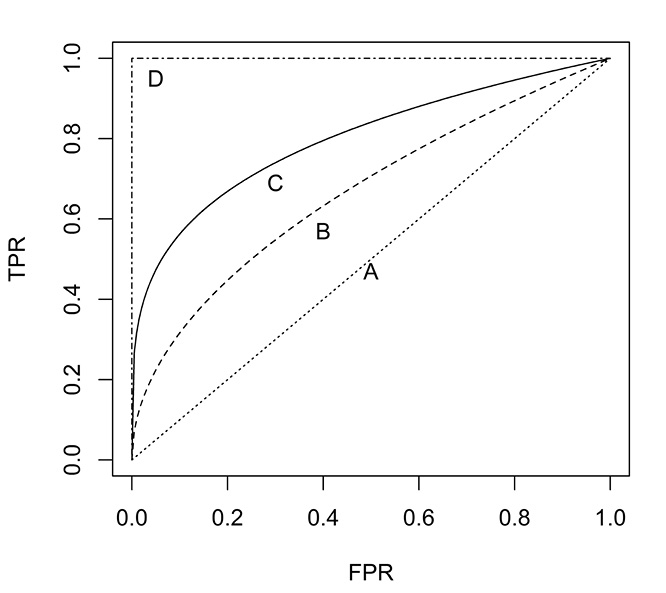
To interpret the ROC curve, first note that the point (0,0) represents a classifier that never issues a positive classification: its FPR is zero, which is good. But it never correctly identifies a positive case, so its TPR is zero, also, which is bad. The point (0,1) represents the perfect classifier: it always correctly identifies positives and never misclassifies a negative as a positive.
In order to understand the curve, two extreme cases need to be identified. First is the random classifier that simply guesses at whether a case is 0 or 1. The ROC for such a classifier is the dotted diagonal line A, from (0, 0) to (1, 1). To see this, suppose that a fair coin is flipped to determine classification. This method will correctly identify half of the positive cases and half of the negative cases, and corresponds to the point (0.5, 0.5). To understand the point (0.8, 0.8), if the coin is biased so that it comes up heads 80% of the time (let “heads” signify “positive”), then it will correctly identify 80% of the positives and incorrectly identify 80% of the negatives. Any point beneath this 45o line is worse than random guessing.
The second extreme case is the perfect classifier, which correctly classifies all positive cases and has no false positives. It is represented by the dot-dash line D, from (0, 0) through (0, 1) to (1, 1). The closer an ROC curve gets to the perfect classifier, the better it is. Therefore, the classifier represented by the solid line C, is better than the classifier represented by the dashed line B. Note that the line C is always above the line B; i.e., the lines do not cross. Remember that each point on an ROC curve corresponds to a particular confusion that, in turn, depends on a specific threshold. This threshold is usually a percentage. E.g., classify the observation as “1” if the probability of its being a “1” is 0.50 or greater. Therefore, any ROC curve represents various confusion matrices generated by a classifier as the threshold is changed. For an example of how to calculate an ROC curve, see Tan, Steinbach, and Kumar (2006, pp. 300−301).
Points in the lower left region of the ROC space identify “conservative” classifiers. They require strong evidence to classify a point as positive. So they have a low false positive rate; necessarily they also have low true positive rates. On the other hand, classifiers in the upper right region can be considered “liberal.” They do not require much evidence to classify an event as positive. So they have high true positive rates; necessarily, they also have high false positive rates.
Figure 10.3 ROC Curves and Line of Optimal Classification

When two ROC curves cross, as they do in Figure 10.3, neither is unambiguously better than the other, but it is possible to identify regions where one classifier is better than the other. Figure 10.3 shows the ROC curve as a dotted line for a classifier produced by Model 1—say, logistic regression—and the ROC curve as a solid line for a classifier produced by Model 2—say, a classification tree. Suppose it is important to keep the FPR low at 0.2. Then, clearly, Model 2 would be preferred because when FPR is 0.2, it has a much higher TPR than Model 1. Conversely, if it was important to have a high TPR—say, 0.9—then Model 1 would be preferable to Model 2 because when TPR =0.9, Model 1 has an FPR of about 0.7 while Model 2 has an FPR of about 0.8.
Additionally, the ROC can be used to determine the point with optimal classification accuracy. Straight lines with equal classification accuracy can be drawn, and these lines will all be from the lower left to the upper right. The line that is tangent to an ROC curve marks the optimal point on that ROC curve. In Figure 10.2, the point marked A for Model 2, with an FPR of about 0.1 and a TPR of about 0.45, is an optimal point. Precise details for calculating the line of optimal classification can be found in Vuk and Curk (2006, Section 4.1). This point is optimal assuming that the costs of misclassification are equal, that a false positive is just as harmful as a false negative. This assumption is not always true, as shown by misclassifying the issuance of credit cards. A good customer might charge $5000 per year and carry a monthly balance of $200, resulting in a net profit of $100 to the credit card company. A bad customer might run up charges of $1000 before his card is canceled. Clearly, the cost of refusing credit to a good customer is not the same as the cost of granting credit to a bad customer.
A popular method for comparing ROC curves is to calculate the “Area Under the Curve” (AUC). Since both the x-axis and y-axis are from zero to one, and since the perfect classifier passes through the point (0,1), the largest AUC is one. The AUC for the random classifier (the diagonal line) is 0.5. In general, then, an ROC with a higher AUC is preferred to an ROC curve with a lower AUC. The AUC has a probabilistic interpretation. It can be shown that AUC = P(random positive example > random negative example). In words, this is the probability that the classifier will assign a higher score to a randomly chosen positive case than to a randomly chosen negative case.
To illustrate the concepts discussed here, let us examine a pair of examples with real data. We will construct two simple models for predicting churn, and then compare them on the basis of ROC curves. Open the churn data set (from Chapter 5) and fit a logistic regression. Churn is the dependent variable (make sure that it is classified as nominal), where TRUE or 1 indicates that the customer switched carriers. For simplicity, choose D_VMAIL_PLAN, VMail_Message, Day_Mins, and Day_Charge as explanatory variables and leave them as continuous. Click Run. Under the red triangle for the Nominal Logistic Fit window, click ROC Curve. Since we are interested in identifying churners, when the pop-up box instructs you to Select which level is the positive, select 1 and click OK.
Figure 10.4 ROC Curves for Logistic (Left) and Partition (Right)

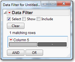
Observe the ROC curve together with the line of optimal classification; the AUC is 0.65778, the left ROC curve in Figure 10.4. The line of optimal classification appears to be tangent to the ROC at about 0.10 for 1-Specificity and about 0.45 for Sensitivity. At the bottom of the window is a tab for the ROC Table. Expand it to see various statistics for the entire data set. Imagine a column between Sens-(1-Spec) and True Pos; scroll down until Prob = 0.2284, and you will see an asterisk in the imagined column. This asterisk denotes the row with the highest value of Sensitivity (1-Specificity), which is the point of optimal classification accuracy. Should you happen to have 200,000 rows, right-click in the ROC Table and select Make into Data Table, which will be easy to manipulate to find the optimal point. Let’s try it on the present example.
In the Logistic Table beneath the ROC Curve, click to expand ROC Table. Right-click in the table itself and select Make into Data Table. In the data table that appears, Column 5 is the imaginary column (JMP creates it for you). Select Rows→Data Filter. Select Column 5 and click Add. In the Data Filter that appears (see Figure 10.5), select the asterisk by clicking the box with the asterisk. Close the data filter by clicking the red X in the upper right corner.
Figure 10.5 Data Filter
In the data table that you have created, select Rows→Next Selected to go to Row 377, which contains the asterisk in Column 5.
We want to show how JMP compares models, so we will go back to the churn data set and use the same variables to build a classification tree. Select Analyze→Modeling→Partition. Use the same Y and X variables as for the logistic regression (Churn versus D_VMAIL_PLAN, VMail_Message, Day_Mins, and Day_Charge). Click Split five times so that RSquare equals 0.156. Under the red triangle for the Partition window, click ROC Curve. This time you are not asked to select which level is positive; you are shown two ROC Curves, one for False and one for True, as shown in the right ROC curve in Figure 10.3. They both have the same AUC because they represent the same information. Observe that one is a reflection of the other. Note that the AUC is 0.6920. The partition method does not produce a line of optimal classification because it does not produce an ROC Table. On the basis of AUC, the classification tree seems to be marginally better than the logistic regression.
Model Comparison Using the Lift Chart
Suppose you intend to send out a direct mail advertisement to all 100,000 of your customers and, on the basis of experience, you expect 1% of them to respond positively (e.g., to buy the product). Suppose further that each positive response is worth $200 to your company. Direct mail is expensive; it will cost $1 to send out each advertisement. You expect $200,000 in revenue, and you have $100,000 in costs. Hence you expect to make a profit of $100,000 for the direct mail campaign. Wouldn’t it be nice if you could send out 40,000 advertisements from which you could expect 850 positive responses? You would save $60,000 in mailing costs and forego $150x200=$30,000 in revenue for a profit of $170,000-$40,000=$130,000.
The key is to send the advertisement only to those customers most likely to respond positively, and not to send the advertisement to those customers who are not likely to respond positively. A logistic regression, for example, can be used to calculate the probability of a positive response for each customer. These probabilities can be used to rank the customers from most likely to least likely to respond positively. The only remaining question is how many of the most likely customers to target.
A standard lift chart is constructed by breaking the population into deciles, and noting the expected number of positive responses for each decile. Continuing with the direct mail analogy, we might see lift values as shown in Table 10-3:
Table 10.3 Lift Values

If mailing was random, we would expect to see 100 positive responses in each decile. (The overall probability of “success” is 1,000/100,000 = 1%, and the expected number of successful mailings in a decile is 1% of 10,000 = 100.) However, since the customers were scored (had probabilities of positive response calculated for each of them), we can expect 280 responses from the first 10,000 customers. Compared to the 100 that would be achieved by random mailing, scoring gives a “lift” of 280/100 = 2.8 for the first decile. Similarly, the second decile has a lift of 2.35.
A lift chart does the same thing, except on a more finely graduated scale. Instead of showing the lift for each decile, it shows the lift for each percentile. Necessarily, the lift for the 100th percentile equals one. Consequently, even a poor model lift is always equal to or greater than one.
To create a lift chart, refer back to the previous section in this chapter where we produced a simple logistic regression and a simple classification tree. This time, instead of selecting ROC Curve, select Lift Curve. It is difficult to compare graphs when they are not on the same scale, and, further, we cannot see the top of the Lift Curve for the classification tree. See Figure10.6.
Figure 10.6 Initial Lift Curves for Logistic (Left) and Classification Tree (Right)

Let’s extend the y-axis for both curves to 6.0. Right-click Lift Curve for the classification tree and select Size/Scale→Y Axis. Near the top of the pop-up box, change the Maximum from 3.8 to 6. Click OK. Do the same thing for the Logistic Lift Curve. (Alternatively, if you have one axis the way you like it, you can right-click it and select Edit→Copy Axis Settings. Then go to the other graph, right-click on the axis, and select Edit→Paste Axis Settings.)
Both lift curves, in Figure 10.7, show two curves, one for False and one for True. We are obviously concerned with True, since we are trying to identify churners. Suppose we wanted to launch a campaign to contact customers who are likely to churn, and we want to offer them incentives not to churn. Suppose further that, due to budgetary factors, we could contact only 40% of them. Clearly we would want to use the classification tree, because the lift is so much greater in the range 0 to 0.40.
Figure 10.7 Lift Curves for Logistic (Left) and Classification Tree (Right)

Train, Validate, and Test
It is common in the social sciences and in some business settings to build a model and use it without checking whether the model actually works. In such situations, the model often overfits the data; i.e., it is unrealistically optimistic because the analyst has fit not just the underlying model but also the random errors. While the underlying model may persist into the future, the random errors will definitely be different in the future. In data mining, when real money is on the line, such an approach is a recipe for disaster.
Therefore, data miners typically divide their data into three sets: a training set, a validation set, and a test set. The training set is used to develop different types of models. For example, an analyst might estimate twenty different logistic models before settling on the one that works the best. Similarly, the analyst might build 30 different trees before finding the best one. In both cases, the model probably will be overly optimistic. Rather than compare the best logistic and best tree based on the training data, the analyst should then compare them on the basis of the validation data set, and choose the model that performs best. Even this will be somewhat overly optimistic. So to get an unbiased assessment of the model’s performance, the model that wins on the validation data set should be run on the test data set.
To illustrate these ideas, open McDonalds72.jmp, which contains the monthly returns on McDonald’s stock, the monthly return on the S&P 500, and the monthly returns on 30 other stocks, for the period January 2000 through December 2005. We will analyze the first 60 observations, using the last 12 as a holdout sample.
As we did earlier in this chapter, select observations 61-72, right-click, and select Exclude/Unexclude. Then select Fit Y by X and click the red triangle to regress McDonalds (Y, response) on the S&P 500 (X, factor). Observe that RSquared is an anemic 0.271809, which, since this is a bivariate regression, implies that the correlation between ![]() and
and ![]() is
is ![]() = 0.52413. This can easily be confirmed. Select Analyze→Multivariate Methods→Multivariate. Then select Return on McDonalds and Return on SP500, click Y, Columns, and click O.
= 0.52413. This can easily be confirmed. Select Analyze→Multivariate Methods→Multivariate. Then select Return on McDonalds and Return on SP500, click Y, Columns, and click O.
Surely some of the other 30 stocks in the data set could help improve the prediction of McDonald’s monthly returns. Rather than check each stock manually, we will use stepwise regression to automate the procedure:
Select Analyze→Fit Model. Click Return on McDonalds and click Y. Click Return on S&P 500 and each of the other thirty stocks. Then click Add. Under Personality, click Stepwise. Click Run. The Fit Stepwise page will open.
Under Stepwise Regression Control, for the Stopping Rule, select P-value Threshold. Observe that Prob to enter is 0.25 and Prob to leave is 0.1. For Direction, select Mixed. Note that Prob to enter is still 0.25, but Prob to leave is now 0.25. Change Prob to leave back to 0.1.
Next to each variable are the options Lock and Entered. Entered will include a variable, but it might be dropped later. To keep it always, select Lock after selecting Entered. If you want a variable always omitted, then leave Entered blank and check Lock. We always want Return on SP500 in the model, so check Entered and then Lock for this variable. (See Figure 10.8.) Click Go.
Figure 10.8 Control Panel for Stepwise Regression

Observe that all the p-values (Prob>F) for the included variables (checked variables) in the stepwise output (not counting the intercept) are less than 0.05 except for Stock 21. So uncheck the box next to Stock 21 and click Run Model at the top of the Control Panel. The regression output for the selected model then appears. See Figure 10.9.
Figure 10.9 Regression Output for Model Chosen by Stepwise Regression

We now have a much higher RSquared of 0.525575 and five stocks (in addition to S&P500) that contribute to explaining the variation in the Return on McDonalds. Stocks 02, 06, 09, 17, and 18 all have p-values of less than 0.05. In all, we have a very respectable regression model; we shouldn’t expect to get an RSquared of 0.9 or 0.95 when trying to explain stock returns.
Indeed, this is where many such analyses stop: with a decent R2 and high t-stats on the coefficients. Concerned as we are with prediction, we have to go further and ask, “How well does this model predict?” If we have correctly fitted the model, then we should expect to see an R2 of about 0.53 on the holdout sample; this would correspond to a correlation between predicted and actual of ![]()
We can compute the MSE, MAE, and Correlation for both in-sample and out-of-sample as shown in Table 10.4. In the Fit Model window, click the red triangle next to Response Return on McDonalds and select Save Columns→Predicted Values. Then follow the same steps (outlined earlier in the chapter) that were used to create Table 10.1. An Excel spreadsheet for the calculations is McDonaldsMeasures72.xlsx. You will find:
Table 10.4 Performance Measures for the McDonalds72.jmp File
|
MSE |
MAE |
Correlation |
|
|
In-Sample |
0.00318082 |
0.04520731 |
0.72496528 |
|
Out-of-Sample |
0.00307721 |
0.04416216 |
0.52530075 |
(If you have trouble reproducing Table 10.4, see the steps at the end of the exercises.)
MSE and MAE are commonly used to compare in-sample and out-of-sample data sets, but they can be misleading. In this case, the MSE and MAE for both in-sample and out-of-sample appear to be about the same, but look at the correlations. The in-sample correlation of 0.725 compares with the RSquared of the model. Yet the out-of-sample correlation is the same as the original bivariate regression. What conclusion can we draw from this discrepancy? It is clear that the five additional stocks boost only the in-sample R2 and have absolutely no effect on out-of-sample. How can this be?
The reason is that the additional stocks have absolutely no predictive power for McDonald’s monthly returns. The in-sample regression is simply fitting the random noise in the 30 stocks, not the underlying relationship between the stocks and McDonalds. In point of fact, the 30 additional stock returns are not really stock returns, but random numbers that are generated from a random normal distribution with mean zero and unit variance.1 To see other examples of this phenomenon, consult the article by Leinweber (2007). Let’s take another look at this overfitting phenomenon using coin flips.
Imagine that you have forty coins, some of which may be biased. You have ten each of pennies, nickels, dimes, and quarters. You do not know the bias of each coin, but you want to find the coin of each type that most often comes up heads. You flip each coin fifty times and count the number of heads to get the results shown in Table 10.5.
Table 10.5 The Number of Heads Observed When Each Coin Was Tossed 50 Times
Coin (number of heads observed in 50 tosses) |
||||||||||
1 |
2 |
3 |
4 |
5 |
6 |
7 |
8 |
9 |
10 |
|
| Penny | 21 |
27 |
25 |
28 |
26 |
25 |
19 |
32 |
26 |
27 |
| Nickel | 22 |
29 |
25 |
17 |
31 |
22 |
25 |
23 |
29 |
20 |
| Dime | 28 |
23 |
24 |
23 |
33 |
18 |
22 |
19 |
29 |
28 |
| Quarter | 27 |
17 |
24 |
26 |
22 |
26 |
25 |
22 |
28 |
21 |
Apparently, none of the quarters is biased toward coming up heads. But one penny comes up heads 32 times (64% of the time); one nickel comes up heads 31 times (62%); and one dime comes up heads 33 times (66%). You are now well-equipped to flip coins for money with your friends, having three coins that come up heads much more often than random. As long as your friends are using fair coins, you will make quite a bit of money. Won’t you?
Suppose you want to decide which coin is most biased. You flip each of the three coins 50 times and get the results shown in Table 10.6.
Table 10.6 The Number of Heads in 50 Tosses with the Three Coins We Believe to be Biased
|
Penny #8 |
26 |
|
Nickel #5 |
32 |
|
Dime #5 |
28 |
Maybe the penny and dime weren’t really biased, but the nickel certainly is. Maybe you’d better use this nickel when you flip coins with your friends. You use the nickel to flip coins with your friends, and, to your great surprise, you don’t win any money. You don’t lose any money. You break even. What happened to your nickel? You take your special nickel home, flip it 100 times, and it comes up heads 51 times. What happened to your nickel?
In point of fact, each coin was fair, and what you observed in the trials was random fluctuation. When you flip ten separate pennies fifty times each, some pennies are going to come up heads more often. Similarly, when you flip a penny, a nickel, and a dime fifty times each, one of them is going to come up heads more often.
We know this is true for coins, but it’s also true for statistical models. If you try 20 different specifications of a logistic regression on the same data set, one of them is going to appear better than the others if only by chance. If you try 20 different specifications of a classification tree on the same data set, one of them is going to appear better than the others. If you try 20 different specifications of other methods like discriminant analysis, neural networks, and nearest neighbors, you have five different types of coins, each of which has been flipped 20 times. If you take a new data set and apply it to each of these five methods, the best method probably will perform the best. But its success rate will be overestimated due to random chance. To get a good estimate of its success rate, you will need a third data set to use on this one model.
Thus, we have the train-validate-test paradigm for model evaluation to guard against overfitting. In data mining, we almost always have enough data to split it into three sets. (This is not true for traditional applied statistics, which frequently has small data sets.) For this reason, we split our data set into three parts: training, validating, and testing. For each statistical method (e.g, linear regression and regression trees), we develop our best model on the training data set. Then we compare the best linear regression and the best regression tree on the validation data set. This comparison of models on the validation data set is often called a horserace. Finally, we take the winner (say, linear regression) and apply it to the test data set to get an unbiased estimate of its R2, or other measure of accuracy.
References
Foster, Dean P., and Robert A. Stine. (2006). “Honest Confidence Intervals for the Error Variance in Stepwise Regression.” Journal of Economic and Social Measurement, Vol. 31, Nos. 1-2, 89–102.
Leinweber, David J. (2007). “Stupid Data Miner Tricks: Overfitting the S&P 500.” The Journal of Investing, 16(1), 15–22.
Tan, Pang-Ning, Michael Steinbach, and Vipin Kumar. (2006). Introduction to Data Mining. Boston: Addison-Wesley.
Vuk, Miha, and Tomaz Curk. (2006). “ROC Curve, Lift Chart and Calibration Plot.” Metodoloski Zvezki, 3(1), 89–108.
Exercises
1. Create 30 columns of random numbers and use stepwise regression to fit them (along with S&P500) to the McDonalds return data.
To create the 30 columns of random normal, first copy the McDonalds72 data set to a new file, say, McDonalds72-A. Open the new file and delete the 30 columns of “stock” data. Select Cols→Add Multiple Columns. Leave the Column prefix as Column and for How many columns to add? enter 30. Under Initial Data Values, select Random, then select Random Normal, and click OK.
After running the stepwise procedure, take note of the RSquared and the number of “significant” variables added to the regression. Repeat this process 10 times. What are the highest and lowest R2 that you observe? What are the highest and lowest number of statistically significant random variables added to the regression?
2. Use the churn data set and run a logistic regression with three independent variables of your choosing. Create Lift and ROC charts, as well as a confusion matrix. Now do the same again, this time with six independent variables of your choosing. Compare the two sets of charts and confusion matrices.
3. Use the six independent variables from the previous exercise and develop a neural network for the churn data. Compare this model to the logistic regression that was developed in that exercise.
4. Use the Freshmen1.jmp data set. Use logistic regression and classification trees to model the decision for a freshman to return for the sophomore year. Compare the two models using Lift and ROC charts, as well as confusion matrices.
5. Reproduce Table 10.4. Open a new Excel spreadsheet and copy the variables Return on McDonalds and Predicted Return on McDonalds into columns A and B, respectively. In Excel perform the following steps:
a. Create the residuals in column C, as Return on McDonalds – Predicted Return on McDonalds.
b. Create the squared residuals in column D, by squaring column C.
c. Create the absolute residuals in column E, by taking the absolute value of column C.
d. Calculate the in-sample MSE by summing the first 60 squared residuals (which will be cells 2-61 in column D). Then divide the sum by 60.
e. Calculate the in-sample MAE by summing the first 60 absolute residuals (which will be cells 2-61 in column E). Then divide the sum by 60.
f. Calculate the out-of-sample MSE by summing the last 12 squared residuals (cells 62-73 in column D). Then divide the sum by 12.
g. Calculate the out-of-sample MAE by summing the last 12 absolute residuals (cells 62-73 in column E). Then divide the sum by 12.
h. Calculate the in-sample correlation between Return on McDonalds and Predicted Return on McDonalds for the first 60 observations using the Excel CORREL( ) function.
i. Calculate the out-of-sample correlation between Return on McDonalds and Predicted Return on McDonalds for the last 12 observations using the Excel CORREL( ) function.
(Endnotes)
1 This example is based on Foster and Stine (2006). We thank them for providing the McDonalds and S&P 500 monthly returns.