
chapter three
building your first dashboard
When asked to design a dashboard, you must spend some time with the users understanding their needs and goals. Many users ask for a dashboard and use the term in a generic way to mean a web-based report with charts and graphs that can link to other web pages. A dashboard is more than a report because it involves conclusions.
In Effective Dashboard Design, La Grouw notes that you can differentiate a dashboard and a report by their core attributes. A report does not lead users to a conclusion; it simply presents facts that allow users to make their own judgments. Consider Figure 3.1. The chart on the left tells the viewer what sales were for each month. The viewer sees that sales improved by year end after taking a sharp decrease in the spring. This chart shows useful facts, but what we do not know is whether it is a good thing.
Figure 3.1 Difference in reports and dashboards

A dashboard can provide context for facts, and thus provide the basis to form a conclusion. Effective dashboards can help a user quickly understand what is happening and what needs to happen next. In the preceding figure, consider the chart in the right pane. The viewer can draw a conclusion from the chart, which is that the team is not meeting their goal. Presenting the facts in this way provides an immediate understanding of what is happening, and indirectly suggests the follow-up action.
Dashboards help users understand if a process or project is running smoothly. Typically, metrics are centered on some performance aspect, such as strategic objectives, time lines, or quality result. Keep in mind, the information does not present the next level of detail, which is what or why events are happening.
Is it a dashboard or a scorecard?
In the early 1990s, when the terms performance dashboard and balanced scorecard were introduced, there were fewer vendors able to support either method. Scorecards tend to be tabular in nature, whereas dashboards tend to contain graphical elements, such as gauges or line charts. Since their introduction, the terms have somewhat become synonymous. Both terms generically refer to presenting actionable data on a web page.
In Information Dashboard Design, the author Stephen Few defines a dashboard as a “visual display of the most important information needed to achieve one or more objectives.” The word objective is a key in this definition because it implies a performance measurement. There are no set rules for what a performance dashboard must contain other than focusing on visualizing organizational objectives.
A scorecard or balanced scorecard is a management system framework that was popularized in the book, The Balanced Scorecard by Doctors Robert Kaplan and David Norton. This methodology encourages organizations to monitor performance against financial and nonfinancial strategic goals. This method tends to focus on progress instead of performance.
Dashboard building process
The dashboard building process requires that you identify the organization objectives. Place the objectives in a pleasing layout with accurate data that viewers can easily understand. In this topic, you will learn a dashboard building process.
Understanding your customer
We are going to continue the work from the Building Your First Report chapter with the Toy Company. This is a large international company with multiple products and a large sales force that is spread across the world. The Sales vice president has requested a dashboard to track sales targets, profitability, and approval ratings. The main users of the dashboard are the three regional sales managers. The company has several issues that include decreasing profits and poor customer approval ratings. This dashboard should help the organization improve profitability, sales targets, and customer service.
When designing the dashboard, keep your user’s skill level, use case, and purpose in mind. Let’s think about the audience for this dashboard. We know these users are not seeking detailed statistical analysis. Their goal is much simpler. They want to monitor their organization. Most of the time these particular users are traveling and plan to use their tablets to consume the information.
The main goal is for the user to have a takeaway. We want the vice president to know whether the organization is on target; and, likewise, we want the regional managers to know what is going wrong so that they can address the issues. You can train users to understand a dashboard. So, do not shy away from a more complicated visualization if it will help the user understand or compare what is happening.
Establishing objectives
After studying the issues from the previous year, the management team has set the following key performance indicators (KPIs). These KPIs are intended to improve overall sales performance and increase customer approval. The following table explains the selected KPIs and how these should be measured.
| Key performance indicators | Explanation |
| Achieve regional sales target of 40% by end of year. | Many of the sales reps consistently fail to reach their targets, which affects the regional sales target. The management team wants to compare the Sales Rep target to their actual values to determine which Sales Reps need help. The CEO set a minimum goal of 40% for each region. |
| Achieve profitability of 60% for all regions by year end. | One of the regional managers discovered that many of the sales reps were giving massive discounts to improve their approval ratings. This action interferes with the company’s ability to meet revenue goals. In many cases, the ratings did not improve because of other factors that the management wants to monitor. The management team wants to ensure the sales reps understand that profitability is equally important to satisfaction. The CEO set a minimum goal of 60% for each region. |
| Improve Regional Approval ratings by established target by year end. | Many customers complained that the order details were incomplete and that sales reps were not helpful in resolving issues. These complaints caused decreased sales and ratings in the regions. It was different for each region, so individual targets need to be created for each region. The ultimate goal is to move from an average of 55% approval to consistently above 60%. |
Determine supporting information
With each KPI, you should provide supporting charts and information. The Sales Vice President set the KPIs based on desired improvements. The regional managers realize the KPIs require some organizational changes. They need to understand which sales reps need more coaching or if the targets are set too high.
The regional managers asked to have additional charts created on the dashboard. Some of the suggestions were to see the actual sales against the target and to track the target achieved against the profitability. They want to compare the differences between the product lines and the sales reps. Since the ratings were important to the vice president, it would be useful to see the best and worst ratings for each sales rep. Maybe some customers were more difficult to please and the ratings were not fair.
Planning the data and data objects
For this dashboard, the sales database contains the records. The management team knew this data was available because they had used it for several years. When an established data collection method exists, this makes the job of creating a dashboard easier.
Getting data for your dashboard
If your organization does not use a database to store data, there are some other options. You can maintain the information in a spreadsheet or a SAS data set. In those cases, the measures can be summarized so that there is less effort in updating and storing the data.
Determining the best way to present the measures is your next step. The choice is obvious in some instances. When you are presenting KPIs, the gauge is a natural choice. In many cases, the controls are obvious as well.
Base your selections on good data visualization practices and what works best for your audience. Keep in mind that there might be multiple ways to show the measurement without one being better than the other. It might take several iterations to find the perfect way to show the measurements. For a more detailed discussion of data visualization techniques, refer to the chapter Visualizing your data.
The following table lists the measurement, the required data, and the data objects the team chose for this dashboard after several iterations.
| Measurement | Required data items | Data object chosen |
| KPI 1 – KPI 3 | KPI 1: Regional Sales Target as percentage KPI 2: Regional Profitability Ratio KPI 3: Regional Approval Rating as percentage |
Gauge A gauge is perfect to show KPIs. It shows how measurement is tracking against the goal. |
| Sales Reps with Actual Sales against Target Sales | Sales Rep Actual Sales in currency Target Sales Goal in currency |
Targeted Bar Chart This data object shows the individual measurements and targets for each sales rep. |
| Sales Reps with Sales Target Achieved against Profit Ratio | Sales Rep Total Sales Profitability ratio |
Bar-Line Chart This object enables you to compare the total sales against the profitability ratio. A dual-axis line chart would have also worked. |
| Sales Reps by region and date with ratings | Region Date Sales Rep Best approval rating Worse approval rating Average approval rating Profit Ratio |
List Table with display rules A detailed listing of information was requested. The list table works best for this information. |
| Filters: Regional Month/Year Product Line Sales Rep Picklist |
Regions Date Product line Sales Reps |
Button Bar Drop-Down List List Text Input List These control objects allow the user to filter what they see. |
Creating a mock layout
The dashboard layout signals to the user which elements are the most important. In this case, we know the KPIs are of primary concern. Thus, they will receive a starring role in the layout. The regional managers had suggested some supporting information to allow some exploration that we can incorporate.
Considering your layout
The first instinct is to put everything on a single page. In the following figure, this layout placed all information on the same page.
Figure 3.2 Dashboard layout

There are several issues with this layout, indicated by the following numbers:
![]() When the KPIs are along the side, they appear equal to the exploration information. These KPIs should have a starring role.
When the KPIs are along the side, they appear equal to the exploration information. These KPIs should have a starring role.
![]() The center of the layout has a big gaping hole.
The center of the layout has a big gaping hole.
![]() Some regions have 20-30 sales reps. For the regional managers to select sales reps to view, they must scroll through a long list. That does not seem very useable. The list needs to be in a vertical position.
Some regions have 20-30 sales reps. For the regional managers to select sales reps to view, they must scroll through a long list. That does not seem very useable. The list needs to be in a vertical position.
![]() The graph and list table appear crowded in our mock layout! Imagine how it will look on the screen. We need some color to help the user know which items are related.
The graph and list table appear crowded in our mock layout! Imagine how it will look on the screen. We need some color to help the user know which items are related.
![]() The arrows indicate which data object controls the other data objects. Without these arrows, the user would assume the top controls filter everything below, including the table. There’s no reason to have the detailed list table on this page; it can move elsewhere.
The arrows indicate which data object controls the other data objects. Without these arrows, the user would assume the top controls filter everything below, including the table. There’s no reason to have the detailed list table on this page; it can move elsewhere.
Creating a workable layout
After playing with the data objects, you are able to determine which objects belong together. Instead of creating multiple dashboards, this dashboard has a single layout to support the vice president and regional managers. The management team can check the KPIs for the entire organization. Then, using the filters, they can compare each region and multiple dates if desired.
In the bottom area, the regional managers can use the filters to compare product lines and individual sales reps. A second page called Sales Rep Ratings enables the regional manager to drill down to more detail about the ratings. Color is added to help the eye quickly spot differences.
Figure 3.3 Determining interactivity

Tips for more useable dashboards
The most successful dashboards use a clean, minimal look. As Edward Tufte would direct us, “Let the data talk.” Avoid using logos or other decorative elements on your page. You must be careful that your design choices do not distract your user from understanding the main messages. The design should instead be the sex appeal that attracts the user’s eye!
Here are some additional tips to make your dashboard easier to use:
• If your dashboard is internal to the organization, there is little reason to have the logo on it. If it’s required to be there, keep it small and near the right top or bottom. This keeps the logo from appearing to be the central focus.
• Add a first page or section to your dashboard that contains any supporting information that the users might need. This information might link to related websites, explain how to access the dashboard, or provide housekeeping information. The content might contain topics such as when the data is updated or the counting rules.
• Ensure that your dashboard is fast. This might require pre-summarizing data, rethinking calculations, or using different visualizations. Users do not like extensive wait times. This process might take some experimentation to determine the optimal load and display time.
• Minimize the navigation and click paths that a user needs to get information. If the users have to navigate multiple screens for an answer, they might look for other organizational sources.
One final note: In these past few pages, you might have the impression that the dashboard design process is a few simple steps. In reality, it took several weeks of planning. There were multiple layout iterations considered before this one was selected. SAS Visual Analytics makes the process easier, but you still must know what you want to achieve and ensure that your data supports the desired outcome. After the dashboard is complete, it most likely will continue to change as the organization grows and improves.
Building the dashboard
After the preliminary work is complete, you can build the final product. Here are the two layouts that you are going to create in this topic. The first layout is the Regional Manager Dashboard, and the second layout is the Sales Rep Report.
Figure 3.4 Regional manager dashboard and sales rep report

Adding the data objects
With the layout planned and measurements identified, you can determine the required data items. In some cases, the data source might already exist. If you have to create the data source, it’s useful to know what items are needed. Some of the data items can be created within SAS Visual Analytics to keep your data source as small as possible.
In this case, we are using the VA_SAMPLE_SMALLINSIGHT data source. This data source lists each order from January 1997 to October 2013. For each order, we know the sales rep, the order amount, the transaction date, and several other factors that you might expect to find with an order. SAS Visual Analytics enables you to aggregate the measures so that you can sum the order total by several categories. You can use region, country, product line, or even sales rep. The aggregation also makes it easy to build measurements and use filters to quickly get results.
The following table lists the requirement measurements identified in the Establishing objectives topic on page 38, the data item that you can use with your data object, and any special steps that you need to use the data item.
| Required measurements | Data items from data source | Special steps |
| Sales Rep User ID | Sales Rep | No changes needed |
| Product Line | Product Line | No changes needed |
| Sales Rep Actual Sales | Sales Rep Actual | No changes needed |
| Sales Rep Target | Sales Rep Target | No changes needed |
| Orders from the past 3 years represented by Month and Year | Transaction Date | Use a format to change this data item to month and year. |
| Regional Territories based on continents | Facility Continents | Create a Custom Category based on this data item to use in Button Bar |
| Sales Rep Target Achieved | Sales Rep % of Target | This data item must be an average across all sales. Change the aggregation method. |
| Sales Rep Approval Rating as average, minimum, and maximum | Sales Rep Rating | Using this value create some additional aggregations. |
| Profitability Ratio | Order Total Order Product Costs |
Create an aggregated measure based on the gross margin. Gross margin is the order total minus order product costs. |
| Regional Approval Target | None | Create a parameter based on a new calculated item called RegionalRatingTarget. |
Creating new data items
From the preceding table, you can see several new data items that need to be created. This topic explains how to create the data items.
Working with data items
It is easy to be confused when your data source contains more data items than you need. You can filter the list to keep it manageable and to reduce confusion. In the following figure, you can see the data items listed in the Data pane are the ones checked in the Show or Hide Data Items window.
To show or hide data items:
![]() Click the Data menu drop-down list.
Click the Data menu drop-down list.
![]() Click Show or Hide Items.
Click Show or Hide Items.
![]() In the Show or Hide Items window, check the data items that you want to appear.
In the Show or Hide Items window, check the data items that you want to appear.
Figure 3.5 Showing and hiding data items

Applying a format
The drop-down list on the Regional Manager section contains a drop-down filter that uses a date variable. It appears as the month and year value, but you only have the transaction date value that is based on a daily value. If you think that you need to add more data items to the source data—you don’t. You can change the format so that the data item appears as Month-Year.
To create the new data item, duplicate the Transaction Date data item by right-clicking and selecting Duplicate Data Item. A new data item appears.
Select the new data item so that it is active in the Property area. Its name is displayed in the Name field.
![]() Change the name to Transaction Month, Month Year, or a name that makes sense for your report.
Change the name to Transaction Month, Month Year, or a name that makes sense for your report.
![]() Change the Format to MMYYYY. Notice that the count changes from 4,131 to 191. This count indicates the format is applied.
Change the Format to MMYYYY. Notice that the count changes from 4,131 to 191. This count indicates the format is applied.

Date formats
If you are not familiar with SAS programming methods, then you might not understand a format. Formats are handy! You can turn a date value such as 01FEB2016 into several other values.
• If you apply the Year format, the data item appears as 2016.
• If you apply the Month format, the data item appears as Feb.
• If you apply Quarter format, the data item appears as 1st Quarter, 2016.
The underlying data does not change, but the appearance is changed. This enables you to build charts based on different groupings, such as year, month name, or quarter. Formats can also be used to change a value from dollars to other money formats, such as Euro or Yen.
Creating custom categories
The dashboard uses a button bar to filter the data. The button bar is based on the business regions called APAC, EMEA, and Americas. The business regions are based on the facility continents. However, these values do not exist in the data source. You can create this data item using a custom category. A custom category enables you to assign labels to groups of values in an existing category or measure.
To create the new data item, do the following:
1. Select Data ▶ New Custom Category.
2. Select the Facility Continents.
3. In the Name field, type Business Regions. You can use any name that is not already in use. The name that you choose is what appears in the data items list.
4. In the Label1 area, type APAC. From the values list, drag AS and OC.
5. Click New label and type EMEA in the Label2 area. From the values list, drag AF and EU.
6. The remaining continents belong to the Americas. Instead of creating another label, click the Group remaining values as button and replace Other with Americas in the field. This assigns any values left to that values.
Your window should appear similar to the following figure when you are finished.

Dealing with remaining values
When creating custom categories, consider if the data values will change in the future before assigning the remaining values. In the preceding example, you created two custom categories and then assigned the remaining values as Americas. In this case, the region values are controlled by the organization. But consider other situations. For example, what if the North Pole or South Pole were added as a data value? Would it still make sense to default the remaining values to Americas?
Changing the aggregation method
The regional managers want to review the best, worst, and average approval rating for each sales rep. By changing the aggregation method, you can find this value quickly. The default aggregation is SUM for all data items, and the same is true for Sales Rep Rating. Using this data item, you can create your two new data items: one for minimum rating and one for maximum rating.
These data items are aggregated based on the categories applied. In the following example, the Sales Rep Rating, Sales Rep Rating (Min), and Sales Rep Rating (Max) are shown. In the top table, the values are an aggregation across all business regions for all years. In the bottom table, the yearly aggregation was added and the data filtered for 2009. Compare the two tables to see how the values changed based on the category applied.
Figure 3.6 Measures

When used as the Overall Approval Ratings at the top, the values are similar across the regions. However, in the second table when adding the year, the individual values have more variation. The point is that the same measure was used, but it quickly changed value based on the category applied. The aggregation method prevents you from needing to create a separate data item for each level because the values update based on the category.
To create the new data items:
1. Right-click the Sales Rep Rating and change the aggregation method to Average.
1. Right-click the Sales Rep Rating data item and select Duplicate Data Item.
2. Select the new data item. In the Properties area, change the name to Sales Rep Rating (Min) and the aggregation method to Minimum. This value represents the worse rating the sales rep received.
3. Right-click the Sales Rep Rating data item and select Duplicate Data Item.
4. Select the new data item. In the Properties area, change the name to Sales Rep Rating (Max) and the aggregation method to Maximum. This value represents the best rating the sales rep received. You should have two new data items in your list.
Create calculated items
You can add calculations based on your own formulas. Typically, a calculated data item is an expression, such as cost * quantity. For this dashboard, we need to measure gross profit. Gross profit is based on the Order Total minus the Product Cost. You can calculate items based on date or character values. You can also use IF/THEN logic to create new data items.
Creating your own measures
Calculated items and aggregated measures enable you to add new data items to your data source. SAS Visual Analytics calculates these data items in real time. Not only does this save data preparation time, it also helps the dashboard be more dynamic because the user is getting answers on demand.
The Calculated Item window has three main areas: Data Items, Operators, and Work area. From the Data Items area, you can access data items in your data source or other calculated items that you have created. From the Operators area, you can make changes to your data item. For example, you can add, subtract, or compare data items. In the Work Area, you apply operators to your data item. For example, in the following figure, the EMEA Target value is created by testing if the business region equals EMEA. This calculated item can be used in a data object or as part of another calculation.
Figure 3.7 Creating a calculated item

To create a new calculated items:
1. Click Data ▶ New Calculated Item. The New Calculated Item window appears.
2. In the Name field, type Gross Margin. You can use any name not already in use. This name appears in your Data Item list.
3. In the Operator field, type the minus sign (-). Drag the x – y object to the work area.
4. In the Data Items area, select Order Total and drag it to the first empty box.
5. In the Data Items area, select Order Product Cost and drag it to the second empty box.
Your window should look similar to the following figure. You can click Preview in the left corner to review your calculation.

Creating aggregated measures
Aggregated measures are difficult to understand when you first start. These data items are similar to the calculated items. You can create logic, do calculations, and return complex formulas. It is often not obvious how the two data items are different. There is an easy way to think of each one. Calculated items go across the rows while aggregated measures go down the columns. In the following figure, Gross Margin was created as a calculated item and as an aggregated measure. Notice that the aggregated measure contains the overall result of Order Total - Order Product Cost across all regions and years.
Figure 3.8 Calculated item versus aggregated measure

Aggregated measures are calculated in two ways. You can create the data item so that it recognizes the category and uses a BY group calculation or uses an overall calculation. In the following figure, additional aggregated measures were added that use the BY group option. You can see that the Gross Margin (Aggregated Measure By Group) reacts to the Transaction Year and shows the individual values. In fact, it does not have a value different from the Gross Margin (Calculated Item). This is why new users are often confused by the two different methods.
Figure 3.9 Aggregated measurement types

When showing overall values, it is smarter to use an aggregated measure. However, that doesn’t mean that it is always the best approach. You might need to experiment to get the result that you want.
For the dashboard, you need an aggregated measure that has the Profitability Ratio. This aggregated data item is based on the Gross Margin data item. The formula is Total Sales divided by Gross Margin. Use the following instructions to create the aggregated measure.
1. Click Data ▶ New Aggregated Measure. The New Aggregated Measure window appears.
2. In the Name field, type Profitability Ratio.
3. In the Operator field, type the divide sign (/). Drag the x / y object to the work area.
4. In the Data Items area, select Gross Margin and drag it to the first empty box.
5. In the Data Items area, select Order Total and drag it to the second empty box.
Your window should look similar to the following figure.

6. Click OK to create the aggregated measure.
7. In the Properties area, change the Format to Percent. Adjust the Decimals value to 0.

Creating the layout
After creating your data items, you can start on your dashboard layout. The following figure shows two pages and the data objects for each. This layout is based on the example shown in the Building the dashboard topic.
Figure 3.10 Creating the layout

Adding sections or pages
Sections (also called pages) provide a way to organize report content. When you open a new report, there is one section. You can create multiple sections for your reports.
1. Start a new report.
2. Right-click the Section 1 tab and select Rename. Type Regional Manager Dashboard.
3. Click the + button to add a new section.
4. Right-click the Section 1 tab and select Rename. Type Sales Rep Report.

Adding containers
Containers provide a way to group data objects. You can change the color and size of containers to show the data objects that belong together. This dashboard uses three containers: one for the gauges, one for the prompts, and one for the graphs. The containers have different colors to show how they are related to each other. The top container is a darker gray, and the two bottom containers are the same color of gray.
Figure 3.11 Container layout

To add a container:
1. From the Objects pane, drag the Container data object to the work area. The container uses all available the space.
2. Select the container object.
3. From the Style menu, change the border color to blue and the line to 3.

4. Add the second container object beneath the first. You might need to add a container to the left and then drag it under the other container. The mouse pointer turns into a green + sign when you move it on top of the left margin. The step might take several attempts the first time you try it.

5. Change Container 2 to a .50 transparency. Select the first gray as the background color.

6. Add the third container by right-clicking container 2 and selecting Duplicate Container. Position the container so that it uses 75% of the bottom half as shown in the layout example above. It doesn’t have to be exact.
Your layout should look similar to the following figure:

Adding section filters
Using a section filter, you can filter all data objects within a section. The dashboard has two section filters on the Regional Manager section and one on the Sales Rep Ratings section.
Figure 3.12 Adding the section filters

To create the section filters:
1. Add the Button Bar control to the regional manager section.
a. In the Roles pane, select Business Region as the Category and remove Frequency from the Frequency field.
b. In the Style pane, change the Background selection color to light blue. The setting turns the active button a different color so the user knows which selection is made.
2. Add Drop-down list data objects to the regional manager section.
a. In the Filter pane, add a Filter on Transaction Month and set the begin date to January 2012. This prevents earlier dates showing.
b. In the Roles pane, select Transaction Month as the Category and remove Frequency from the Frequency field.

3. Switch to the Sales Rep Ratings section.
a. Drag the text input control to the section filter area.
b. In the Roles pane, select Sales Rep as the Category and remove Frequency from the Frequency field.
Working with data objects
You can now add the data objects to the containers. Container 1 has three data objects, Container 2 has two filter items, and Container 3 has two data objects.
Using gauges in a container
There are five different gauges available in SAS Visual Analytics. Some of the gauges can be shown as horizontal or vertical, so it appears that there are more choices. A gauge requires a measurement and display rules. You can add a target if you want. Refer to the Visualizing your data chapter for more details about gauges and display rules.
Display rules use color to show the user the ranges for each measurement. For these gauges, the display rules are set to indicate different values. All gauges use a traffic light (red/yellow/green) method to indicate good or bad. The lower measurements are red and the over goal measures are green. The following figure shows the same gauge in different traffic light values.
Figure 3.13 Dashboard gauges
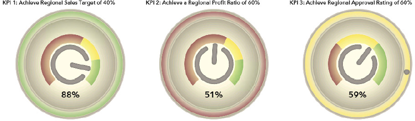
SAS Visual Analytics does not limit the scale or the colors on the display rules.
To add the gauges, do the following:
1. Drag the Gauge data object to Container 1.
a. On the Properties tab, change the Name to KPI 1 and the Title to KPI 1: Achieve Regional Sales Target of 40%.
b. On the Roles tab, add the Sales Rep % of Target as the Category. Change the aggregation to Average or Maximum.
c. On the Properties tab, set the Width to 33. This indicates the percentage this data object is allowed to use.
d. On the Properties tab, set the Gauge Type to Speedometer.
e. On the Style tab, set the Data Skin style to Modern.
f. On the Display Rules tab, set the following values. Enter the values for green first and then work your way up.

2. Right-click the first gauge and select Duplicate KPI 1.
a. In the Properties tab, change the Name to KPI 2 and the Title to KPI 2: Achieve Regional Profit Ratio of 60%.
b. In the Roles tab, add the Profitability Ratio as the Category.
c. In the Display Rules tab, set the following values:
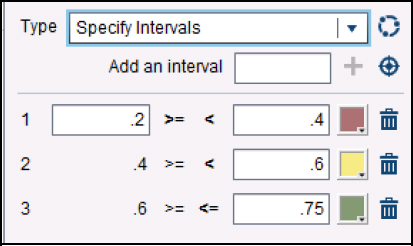
3. Right-click the second gauge and select Duplicate KPI 2.
a. On the Properties tab, change the Name to KPI 3 and the Title to KPI 3: Achieve regional approval rating of 60%. Set the aggregation to Average.
b. On the Roles tab, add the Sales Rep Rating as the Category.
c. On the Display Rules tab, set the values the same as ones for KPI 2.
Using parameters for targets
The Sales vice president wanted each business region to have an individual target for KPI 3. The target is a stretch goal based on the previous year’s sales goal. Since we want each one to be different, we need to add a parameter so the gauge knows to read the value from a calculated item.
Understanding parameters
Parameters allow the data objects to change based on user selection. When the user selects the region, the tool uses the target value for the gauge updates based on that selection. In the following figure, the user selected APAC which sets the target on dashboard gauge to 59%. The target is represented by the dot. If the user selects EMEA, the target is changed and the gauge updated.
Figure 3.14 Using parameters for targets

Parameters can be used with filters, calculated items, and aggregated measures. The parameter value is set globally for the section. This means that when the user makes the selection, the filter only contains that value until another selection is made.
Creating a parameter
You need three items to set a target:
• Parameter data item to contain the value of the Business Region filter. This value is populated when the user clicks a button on the button bar.
• Calculated data item that contains the target value for each business region. You present these values when you create the calculated data item.
• Gauge with the target value set.
To add the parameter to the gauge:
1. Create the parameter:
a. Select Data ▶ New Parameter.
b. In the Name field, type RegionalSelection.
c. In the Type field, select Character.
Your window should look similar to the following figure:
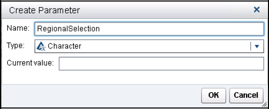
d. Click OK to create the new parameter.
e. Select the Button Bar and add the new parameter to the Parameter field.

2. Create the Calculated Item. There are multiple ways to create this formula.
a. Select Data ▶ New Calculated Item.
b. In the Name field, type _RegionalRatingsTarget.
c. On the Visual tab, drag the IF … ELSE operator to the Work area. Then drag a second IF … ELSE operator into the Else field.
d. Drag the = operator to each condition box.

e. Drag the RegionalSelection parameter into the first condition field. Then type EMEA in the second box.
f. In the Return field, type .69.
g. Drag the RegionalSelection parameter into the first condition field. Then type APAC in the second box.
h. In the Return field, type .59.
i. In the Else field, type .62. There are only 3 regions, so this value is for the Americas.
Your formula should look like the following:

Some users find it easier to type formula on the Text tab as shown in the following figure. It might be easier to cut and paste or work with complex formulas using this method.

3. Click OK to create the data item.
4. In the Format area, change the aggregation method to Mean. The default aggregation is Sum, which causes the value to display as the aggregation for all rows. If you select mean or max, then you get a single value for the row.
5. Select the KPI 3 gauge. On the Roles tab, add the _RegionalRatingsTarget as the Target.
A dot appears on the gauge and moves each time a different region is selected. The parameter causes the value to change when the user makes a different selection.

Adding data objects to a container
The dashboard has two data objects in Container 3. These data objects provide more details than the gauges and help the user understand more about the data.
Using a targeted bar chart
A targeted bar chart enables the user to see how close or far a category was from a goal. For this dashboard, we want to show each sales rep with her actual sales against the target. The target is represented by the gray bar above each bar. The closer the bar is to the box, the closer the sales rep was to meeting the target value.
All sales reps are expected to achieve 80% of their target. This chart includes a display rule, so the bar turns green when the target was achieved. Otherwise the bar remains red.
Figure 3.15 Targeted bar chart show individual performance

To add a targeted bar chart:
1. Drag the Targeted Bar Chart to the Container 3 object.
2. On the Properties tab, change the Title to Sales Reps Actual to Target (in Currency). Change the font to bold.
3. On the Roles tab, set the following:
a. In the Category field, add Sales Rep.
b. In the Measure field, add Sales Rep Actual.
c. In the Target field, add Sales Rep % of Target.
4. On the Display Rules tab, select New. An Add Display Rule window appears.
a. Select the Expression Details tab.
b. In the Column field, select Sales Rep % of Target.
c. Type .8 in the Value field.
d. Change the Style color to green.

5. On the Styles tab, change the first data color from blue to red. This causes all bars to be red unless the Display Rule overrides the color and sets it to green.

Using a dual axis bar-line chart
A bar-line chart mixes a line and bar chart. The line chart uses the left and right axes for its values. For this dashboard, the bar represents each sales rep total sales. The line represents the profitability ratio. This is just additional information that shows high sales does not translate to a large profit. Managers might want to review the data to determine if heavy discounts have been given.
Figure 3.16 Dual axis bar chart allows comparisons

To add a dual axis bar chart:
1. Drag the Dual Axis Bar-Line chart to the Container 3 object.
2. On the Properties tab, change the Title to Sales Reps Sales with Profitability Ratio. Change the font to bold.
3. On the Roles tab, set the following:
a. In the Category field, add Sales Rep.
b. In the Measure (bar) field, add Order Total.
c. In the Measure (line) field, add Profitability Ratio.
4. On the Styles tab, change the color so it is easier to see the data:
a. In the Fill area, change the first data color to light blue.
b. In the Line/Marker area, change the second data color to black or dark blue. The line is on the second measure and uses the colors in the second box.
Adding controls to a container
The dashboard uses Controls to enable the Regional Managers to explore the data based on product line or sales rep. These controls are then made interactive with the data objects in container 3. In the following figure, you can see the planned interactions for the controls and objects. The drop-down list and list controls interact with the Targeted Bar Chart. The Targeted Bar Chart passes the filtering to the Bar-Line chart. For more details about interactions, refer to the Creating your first report chapter.
Figure 3.17 Establishing interactivity between objects

To add the controls and set up the interactions:
1. Add a Drop-Down List to Container 2.
a. In the Roles tab, assign Product Line to Category. Remove the Frequency value.
b. In the Properties tab, set Title to Product Line and the Height to 20.
c. In the Interaction tab, set the control to filter the Targeted Bar Chart.
2. Add a List to Container 2 under the other control.
a. In the Roles tab, assign Sales Rep to Category. Remove the Frequency value.
b. In the Properties tab, set the Height to 75. This allows some white space beneath the controls.
c. In the Interaction tab, set the control to filter the Targeted Bar Chart.
3. Add an interaction to the Targeted Bar Chart.
a. Select the Targeted Bar Chart.
b. In the Interaction tab, set the Targeted Bar chart to filter the Bar-Line Chart.
Adding a list table
The Sales Rep Report uses a list table to contain some detailed approval ratings metrics. The table can be filtered by the Text Input control in the section filter area. A display rule is used to highlight the sales reps with low ratings. Refer to the Visualizing your data chapter for more details about working with list tables.
Figure 3.18 Using display rules with a list table

To add a list table:
1. Drag the List table to the Work area.
2. On the Properties tab, change the Title to Sales Rep by Region and Month.
3. On the Roles tab, add the following data items to list table:

4. On the Style tab, make the following changes to enhance readability:
a. Click the Wrap text check box to allow the headings to go on 2 lines.
b. Change the Background color on the Column headings to light blue.
c. Change the Font to Bold.
5. Click the Sales Rep Rating column and select Add Display Rules. You want any average ratings below 40% to be highlighted with a different color background.
a. Set the value to .4.
b. Change the background color to red or orange. You can also change the text color or font.

Linking to another section
The Sales Rep Ratings section uses a table to contain some detailed approval ratings metrics. The managers can click the KPI 3 to get the regional details for each sales rep. This action is called linking. You can link to other sections or other reports. When a parent section links to a child section, the filtered values are passed to the data objects in that section. In this case, the list table is filtered based on the selections for Gauge 3.
Figure 3.19 Linking objects to sections

Understanding section linking
When an object is linked to another, a special symbol appears on the section. Click the icon to see which section has linked to the tab or click the Link icon to return to the section. In the following figure, notice that the list table is filtered for APAC. The link icon shows the list is filtered from the Regional Manager dashboard.
Figure 3.20 Applying section filtering

You can investigate a single sales rep. In the following figure, you would type the sales rep user ID in the control field. This action filters the list table. To see more than a specific month, uncheck the Apply section link filters.
Figure 3.21 Removing filtering

Applying section linking
To set up the link from the dashboard gauge to list table:
1. Right-click Gauge 3 (KPI 3) and select Add Link ▶ Section Link.
2. In the Create Section Link window, select the section where you want to link.
There may be multiple sections and you can link to more than one.

Other dashboard enhancements
In this chapter, you created a pre-designed dashboard. This topic contains some additional ideas and methods for enhancing a dashboard.
Adding text boxes
In some cases, a dashboard might contain data or formulas that might confuse new users. You might want to provide commentary about the dashboard or a link to a helpful website. You can do this with a text object. The Sales Rep Report provides ratings, but it doesn’t explain how the data was collected or what the colors mean. Let’s add a text box that explains the ratings colors and provides a link to an example survey.
Text boxes contain text or a link to an external location, an existing report or report section. You can control the appearance of each text item. You can also use the Properties tab to add a border or change the background color.
To add a text object:
1. Drag a Text object to the work area.
2. In the text box, type your text. You can control the format of individual text items. In the example, the heading text is larger. The color names were highlighted in the figure below as an example of some changes you can make.
3. To add a hyperlink, highlight the text that you want to have the link, click the Link icon, and type your link in the box. In the example, a link was added to an example survey.

Adding artwork
You can add images to your dashboard, such as an icon or a logo. For this example, we are adding a link to the SAS training videos and using an image. Here’s an example of how the image would look after adding it to the Sales Rep Report.
Figure 3.22 Using image and text objects in your report

There are three supported file types (JPG, PNG, and GIF). When you add the image, it is stored with your report. It can be re-used in other reports and dashboards.
To add a new image:
1. Drag the Image object to the work area. An Image Selection window prompts you to use an existing image or load one from your local machine.
2. Click the Load from local machine option and click Browse to locate the image file.
3. Click the Save image to the repository to select where the image is stored.
4. Select the image scale if you need to control the final size. This setting is also available on the Properties menu.
5. Add any text in the Tooltip text. When the user hovers over the image, this text is displayed.

6. Click OK to return to the work area.
7. To add a link, right-click the image and select the Add Link choice. You can link to an external or internal location.
Embedding a stored process
From SAS Visual Analytics, you can embed a stored process in your report or link to a stored process from a data object. When embedding a stored process in your report, you can take advantage of existing stored processes or add other SAS-based reports.
SAS Visual Analytics has a stored process object that enables you to place the stored process within the report. However, the stored process does not interact with the other elements of the report. For example, you cannot use the report or section filters on the stored process or use the prompt choices to interact with other objects.
When embedding a stored process in SAS Visual Analytics, the data can be located on the SAS Visual Analytic server or from other locations. You can use the tables loaded in the SAS LASR Analytics Server, but it’s better that you avoid the practice. If you use data from the SAS LASR Analytic Server, it must be transferred from the in-memory location to a local SAS session. For smaller tables, the performance would hardly be noticed, but larger tables might take a long time to download and overwhelm the SAS session.
SAS Visual Analytics ships with some sample stored processes. In this example, you will embed a sample stored process in the existing dashboard.
1. Create a new section in your report.
2. Drag the Stored Process object to the work area.
3. When prompted, navigate to the SAS Folders > Products > SAS Intelligence Platform > Sample folder and select the Sample: Multiple Output Formats stored process from its metadata location.
The stored process runs and the results appear in the section.

When the stored process has prompts, you can change the prompt values from the Properties pane. Click the Edit prompts button to select the different prompt values. The choices you select are saved with the stored process and become the default for all users. However, the user can change the values in the Report Viewer.
Extending stored processes
You can also link to a stored process from a data object. You can pass parameters to the stored process. This technique is often used when you want the user to download a larger data set for more analysis.
Summary
This chapter was focused on helping you learn how to use the tool to create a dashboard for a fictional company. The design process presented was to demonstrate the overall process and how each step would work. Much of the process might have appeared as if the designer was working alone with some minimal management direction.
If you build a dashboard and no one uses it, it can be frustrating or disappointing. The main reason this situation occurs is because the users do not find the dashboard useful. It might be because the dashboard contains measurements that no one uses. Or the data used within the dashboard is inaccurate. It’s also possible that the dashboard is too difficult to use. Many of these symptoms point to a designer who didn’t work with the end user.
The only time you should build a dashboard alone is when you are prototyping an idea. Many managers do not realize the need for a dashboard until they can see a working model. You can then have a conversation with the managers about what is happening in their organizations that is creating so-called pain points. You want to know about the pain points because this is where the opportunity for change and process control presents itself.
As you build the dashboard, you want to present layout ideas to the end users. This enables the team to become excited about what you are doing and guide you to help them get the best end result. Even after you finish the dashboard, it is a good idea to watch the users interact with it. You want to ensure that they are able to understand the information pathways and how to answer the questions they have.
Keep in mind that creating a dashboard is a highly iterative process. While some dashboards may be needed for a short time period, most dashboards are used for several years within organizations. This doesn’t mean the content changes. Ensure that you have documented your process well enough for someone else to understand the design and intended use.
References
Aanderud, Tricia, and Angela Hall. 2012. The 50 Keys to Learning SAS Stored Processes. Raleigh, NC: Siamese Publishing.
Aanderud, Tricia, and Michelle Homes. 2014. “SAS Admins Need a Dashboard, Too.” Proceedings of the SAS Global Forum 2014 Conference. Paper 1247-2014. Cary, NC: SAS Institute Inc.
Aanderud, Tricia. 2016. “Five Secrets for Building Fierce Dashboards.” SESUG 2016: Proceedings of the SouthEast SAS Users Group. Paper RV-185. Cary, NC: SAS Institute Inc.
Bodt, Mark. 2014. “The Many Ways of Creating Dashboards Using SAS.” Proceedings of the SAS Global Forum 2014 Conference. Paper 1269-2014. Cary, NC: SAS Institute Inc.
Few, Stephen. 2013. Information Dashboard Design: Displaying Data for At-a-Glance Monitoring, Second Edition. Burlingame California: Analytics Press
Grouw, Gail La. 2012, Effective Dashboard Design: Design Secrets to Getting More Value From Performance Dashboards. Seattle, Washington: Self-published through CreateSpace Independent Publishing Platform.
Kaplan, Robert S. and David P. Norton, D. 1996. The Balanced Scorecard: Translating Strategy into Action. Boston, Massachusetts: Harvard Business School Press.
Tufte, Edward R. 2001. The Visual Display of Quantitative Information. Cheshire, CT: Graphics Press.