
Our objective is to help the teams that are in charge of purchasing, production, and shipping, to deliver on the expectations that the sales and marketing teams have built for our customer. We may sell items based on prices or quality, but our customers expect us to deliver what we sell. The first requirement is that we deliver our products On-Time and In-Full (OTIF).
We are not only concerned about whether the delivery arrives on time but also whether it is completed without any returns. Although, in some cases, early deliveries may be a problem, we will assume that they are not in this case. We calculate OTIF with the following formula:
OTIF = the number of line items shipped on or before promised delivery and complete divided by the total number of line items shipped
When we use the number of line items, we apply an equal weight to all line items, regardless of whether they represent large or small volumes. If we want to place a bias on deliveries that generate more value for the company, we can replace the number of line items with gross profit, sales, or quantity. We calculate OTIF by line item and by total quantity in the following chart:

Before beginning the following exercise, we import this chapter's exercise files into the QDF as we did in Chapter 2, Sales Perspective. Let's create a bar chart that analyzes OTIF with the following property options in 1.ApplicationOperations_Perspective_Sandbox.qvw:
|
Dimensions | |
|---|---|
|
Label |
Value |
|
Delivery Year-Month |
DeliveryYear-Month |
|
Expressions | |
|
Label |
Value |
|
On-Time In-Full by Line Item |
sum({$<[Process Type]={'Sales'},[Delivery First Step]={'No'}>} if([Delivery Document Date]<=[Order Due Date] and [Order Quantity]=rangesum([Delivery Quantity],-[Return Quantity]),1))/count({$<[Process Type]={'Sales'},[Delivery First Step]={'No'}>} DISTINCT [Delivery Line No.]
)
|
|
On-Time In-Full by Total Quantity |
sum({$<[Process Type]={'Sales'},[Delivery First Step]={'No'}>} if([Delivery Document Date]<=[Order Due Date] and [Order Quantity]=rangesum([Delivery Quantity],-[Return Quantity]),[Delivery Quantity]))/sum({$<[Process Type]={'Sales'},[Delivery First Step]={'No'}>} [Delivery Quantity])
|
We use the Delivery Year-Month field as a dimension because we specifically want to analyze the deliveries in the month that they were made. In each expression, we use an if-statement within the sum() function. For better performance, we can also migrate this logic to the script and create a field in the data model that identifies which line items were OTIF. The conditional expression of the if-statement evaluates whether what we promised in the sales order matches the delivery. Therefore, we filter out delivery documents that start a sales cycle in the set analysis because no promise was ever documented in the ERP system.
An accumulating snapshot tends to contain many null values that represent steps in the cycle that have yet to happen or that never will. In QlikView, binary functions, such as +, -, *, and /, do not work when one of the variables is a null value. For example, the =8+null() expression returns a null value instead of eight. On the other hand, the rangesum() function treats a null value as if it were zero, so we add we use it to sum [Delivery Quantity] and [Return Quantity] because they often contain a null value.
We can gather from our OTIF analysis that, for six months in 2013, we delivered 100% of our orders on-time and in-full. The most difficult month in 2013 was June when we delivered 80% of the line items and 72% of the quantity satisfactorily. Assuming that we use a standard unit of measurement for all of our products, this discrepancy between line items and quantity is due to a higher OTIF among lower-quantity deliveries. Let's now analyze how we work through our data to discover opportunities to improve our OTIF.
There are various ways to analyze OTIF in more detail. Just like we did with the DSI calculation in our working capital perspective, we can break up the OTIF calculation into its parts. For example, we can analyze on-time deliveries separately from in full deliveries and also analyze the total absolute number of deliveries per month see its behavior.
We can also analyze the different cycles that support OTIF. For example, we can explore data from the production cycle, the purchasing cycle, or the shipping cycle. As we've added the purchasing cycle to our operations perspective, we can easily analyze our suppliers' OTIF rate in the following chart:

- Clone the chart that we created in Exercise 6.1.
- Change the code,
[Process Type]={'Sales'}, in the metric expressions to[Process Type]={'Purchasing'}.
Finally, we can break down the cycles by their corresponding dimensions, such as supplier, customer, sales person, or item. We notice in the previous chart that our suppliers do not have a high OTIF and we decide to break down the metric by supplier:

To perform this exercise:
- We create the following variable so that the code looks cleaner:
Variable
Label
Value
vSA_PurchaseDelivery_NotFirstStep{$<[Process Type]={'Purchasing'} ,[Delivery First Step]={'No'}>} - Let's create a bar chart with the following dimensions and metrics options:
Dimensions
Label
Value
Supplier
SupplierDays Late
=aggr(
       if(only($(vSA_PurchaseDelivery_NotFirstStep) [Delivery Days Late])<=0, dual('On Time',1),if(only($(vSA_PurchaseDelivery_NotFirstStep) [Delivery Days Late])<=3, dual('1-3 Days Late',2),if(only($(vSA_PurchaseDelivery_NotFirstStep) [Delivery Days Late])<=15, dual('4-15 Days Late',3),if(only($(vSA_PurchaseDelivery_NotFirstStep) [Delivery Days Late])<=30, dual('16-30 Days Late',4)
       ,dual('>30 Days Late',5)))))
,_KEY_ProcessID)
Expressions
Label
Value
% of Deliveries
count($(vSA_PurchaseDelivery_NotFirstStep) DISTINCT [Delivery Line No.])/count($(vSA_PurchaseDelivery_NotFirstStep)
      Total <Supplier> DISTINCT [Delivery Line No.])
Number of Deliveries
count($(vSA_PurchaseDelivery_NotFirstStep) Total <Supplier> DISTINCT [Delivery Line No.]) - Change the background color attribute expression for % of deliveries to the following code:
=aggr(if(only($(vSA_PurchaseDelivery_NotFirstStep) [Delivery Days Late])<=0, RGB(171,217,233) ,if(only($(vSA_PurchaseDelivery_NotFirstStep) [Delivery Days Late])<=3, RGB(254,217,142) ,if(only($(vSA_PurchaseDelivery_NotFirstStep) [Delivery Days Late])<=15, RGB(254,153,41) ,if(only($(vSA_PurchaseDelivery_NotFirstStep) [Delivery Days Late])<=30, RGB(217,95,14) ,RGB(153,52,4))))),_KEY_ProcessID) - Select the expression
Number of Deliveriesand, in Display Options, disable Bar and enable Values on Data Points. - In the Sort tab, sort the
Supplierby Expression in Descending order using the following code:count(Total <Supplier> $(vSA_PurchaseDelivery_NotFirstStep) DISTINCT [Delivery Line No.])
- Sort
Days Lateusing Numeric Value. - In the Style tab, change Orientation to horizontal bars and change the Subtype to Stacked.
We've created the [Delivery Days Late] field in the script to make for cleaner code and reduce calculation time. For larger datasets, it may also be necessary to create days late bins in the script instead of using a calculated dimension, as we did in this exercise. Either way, we should create bins using the dual() function so that we can easily sort them.
We can use this chart for any step in a cycle that has a due date. We group all on-time instances in one bin and then we divide late instances into bins that represent ranges that are analytically significant. On the other hand, if we simply want to analyze the time that it takes to complete a step, we can use a histogram. Let's take what we've discovered about our suppliers' OTIF and analyze each item's real lead time.
Lead time is the time that it takes from the moment that we order an item to the moment that we receive it in inventory. We first saw lead time in our working capital perspective in Chapter 5, Working Capital Perspective. In that chapter, we used a predefined lead time to calculate each item's reorder stock level. In this section we look at how to use data to calculate a more accurate lead time. We can also apply these same methods to analyze the time taken to complete any of the steps in a cycle. For example, we can measure how long it takes to generate a customer invoice or convert a quotation into an order.
We begin our analysis by visualizing the average time that it takes from the moment we create a purchase order until we create an inventory delivery receipt. We analyze the trend of average lead times by month.

Let's create a bar chart with the following dimensions and metrics options:
|
Dimensions | |
|---|---|
|
Label |
Value |
|
OrderYear-Month |
|
|
Expressions | |
|
Label |
Value |
|
Average Lead Time |
avg({$<[Process Type]={'Purchasing'}>} [Lead Time])
|
We create a [Lead Time] field in the script that is the difference between [Delivery Document Date] and [Order Document Date]. The avg() function works without the help of aggr() because we want the average lead time of each line item, which has the same level of detail as our accumulating snapshot.
If the only statistical measurement that we use is average, then we risk over-simplifying our analysis and failing to define optimal inventory levels. Let's study the time span between a purchase order and its receipt in more detail with a distribution analysis that we first saw in the sales perspective in Chapter 2, Sales Perspective:
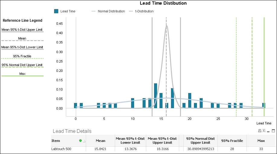
Lead time distribution contains the following three objects:
Let's first create the Lead Time Details table:
|
Dimensions | |
|---|---|
|
Label |
Value |
|
Item |
Item |
|
Expressions | |
|
Label |
Value |
|
Mean |
avg({$<[Process Type]={'Purchasing'}>} [Lead Time]) |
|
Mean 95% t-Dist Lower Limit |
TTest1_Lower({$<[Process Type]={'Purchasing'}>} [Lead Time], (1-(95)/100)/2) |
|
Mean 95% t-Dist Upper Limit |
TTest1_Upper({$<[Process Type]={'Purchasing'}>} [Lead Time], (1-(95)/100)/2) |
|
<empty> |
='' |
|
95% Normal Dist Upper Limit |
avg({$<[Process Type]={'Purchasing'}>} [Lead Time]) +2*Stdev({$<[Process Type]={'Purchasing'}>} [Lead Time]) |
|
97.5% Fractile |
Fractile({$<[Process Type]={'Purchasing'}>} [Lead Time],.975) |
|
Max |
max({$<[Process Type]={'Purchasing'}>} [Lead Time]) |
Just as we did in Chapter 2, Sales Perspective, we calculate the mean and evaluate its range using a t-distribution. We can use one of these results as the average lead time to calculate our minimum stock level. For example, we can use the upper limit if we want to reduce the risk of any inventory shortage or the lower limit if we want to reduce the risk of purchasing too much stock.
The other set of statistics tells us the maximum lead time that we've recorded and introduces two alternatives that we can use to avoid stocking too many items if the maximum happens to be an outlier. The first alternative, 95% Normal Dist Upper Limit assumes that we have more than thirty lead times in our data sample and that lead times are distributed normally. If this is the case, then we can add the mean and two standard deviations to calculate the upper limit of a 95% confidence level for a standard normal distribution. The result is the lead time that we predict will be larger than 97.5% of past and future lead times.
We can also use fractiles to remove possible outliers. The result of the 97.5% fractile is a number that is larger than 97.5% of past lead times. This fractile works regardless of how lead times is distributed and is easier for the business user to grasp. We can also use it as a test to evaluate whether lead times are normally distributed. If there is a large difference between the 97.5% fractile and the upper limit of the 95% confidence level, then lead times may not be normally distributed.
We may also decide to use the actual maximum lead time even when it is an outlier because the cost of not having an item in stock is greater than the cost of storing too much inventory. Which method we use to determine maximum lead time depends on our strategy and neither is perfect. We should test the accuracy of each and constantly fine tune the calculation according to our findings.
- Let's create a Combo Chart that helps us visualize lead time distribution and the key numbers in our Lead Time Details table:
Dimensions
Label
Value
Lead Time
=ValueLoop($(=min([Lead Time]))
     ,$(=max([Lead Time])).1)
Expressions
Label
Value
Lead Time
sum({$<[Process Type]={'Purchasing'}>}
    if([Lead Time]=
        round(ValueLoop($(=min([Lead Time]))
            ,$(=max([Lead Time])),.1)),1))/count({$<[Process Type]={'Purchasing'}>} [Lead Time])
Normal Distribution
NORMDIST(ValueLoop($(=min([Lead Time])),$(=max([Lead Time])),.1),avg({$<[Process Type]={'Purchasing'}>} [Lead Time]),stdev({$<[Process Type]={'Purchasing'}>} [Lead Time]),0)t-Distribution
TDIST( (fabs(ValueLoop($(=min([Lead Time])),$(=max([Lead Time])),.1) -avg({$<[Process Type]={'Purchasing'}>} [Lead Time]))) / (Stdev({$<[Process Type]={'Purchasing'}>} [Lead Time]) / sqrt(count({$<[Process Type]={'Purchasing'}>} [Lead Time]))) ,count({$<[Process Type]={'Purchasing'}>} [Lead Time]) ,1) - In the Axes tab, enable the Continuous option in the Dimension Axis section.
- In the Presentation tab, add the six metrics in the Lead Time Details table as reference lines along the continuous x axis. Make the line style and color the same as the previous figure so that we can create a legend in the next step.
- Finally, let's add a Line Chart that serves as our Reference Line Legend:
Dimensions
Label
Value
Lead Time
=ValueLoop(0,2)
Expressions
Label
Value
Max
=dual(if(ValueLoop(0,2)=1,'Max',''),sum(.1))
95% Normal Dist Upper Limit
=dual(if(ValueLoop(0,2)=1
  ,'95% Normal Dist Upper Limit',''),sum(.2))
97.5% Fractile
=dual(if(ValueLoop(0,2)=1
  ,'95% Fractile',''),sum(.3))
Mean 95% t-Dist Lower Limit
=dual(if(ValueLoop(0,2)=1
  ,'Mean 95% t-Dist Lower Limit',''),sum(.4))
Mean
=dual(if(ValueLoop(0,2)=1,'Mean',''),sum(.5))
Mean 95% t-Dist Upper Limit
=dual(if(ValueLoop(0,2)=1
  ,'Mean 95% t-Dist Upper Limit',''),sum(.6))
- Modify the Background Color and Line Style in the following way:
Expression
Background Color
Line Style
Max
RGB(178,223,138)
='<s1>'
95% Normal Dist Upper Limit
RGB(178,223,138)
='<s2>'
97.5% Fractile
RGB(178,223,138)
='<s3>'
Mean 95% t-Dist Lower Limit
RGB(192,192,192)
='<s1>'
Mean
RGB(192,192,192)
='<s2>'
Mean 95% t-Dist Upper Limit
RGB(192,192,192)
='<s1>'
- In the Expressions tab, enable Values on Data Points in the Display Options section.
- Disable Show Legend in the Presentation tab.
- Disable Show Legend in the Dimensions tab.
- Enable Hide Axis in the Axes tab.
- Resize and adjust each of the objects as necessary.
As in Chapter 2, Sales Perspective, we use the valueloop() function as a dimension to create a continuous X-Axis so that we can visualize the distribution curves. We also use it in the Reference Line Legend to create a dummy line with three points. We then use the dual() function in each line's expression to add a text data value in the center point.
We've just used advanced statistical methods to create a more complex model to estimate lead time. Let's now use another statistical method called the Chi-squared test of independence to test whether on-time deliveries depend on the supplier.
When we want to test whether two numeric metrics are correlated, we use scatterplot charts and R-squared. Similarly, we can also test the correlation between two categorical groups using the Chi-squared test of independence.
In this example, we want to confirm that the supplier is not one of the factors that determines a delivery's timeliness. In order to test this hypothesis, we calculate a value called p, which is the probability that supplier and delivery status are independent. Before analyzing the results of the Chi-squared test of independence, we decide that if p is less than .05, then we will reject the assumption that delivery timeliness does not depend on the supplier. This then implies that there is a relationship between them. We call this point (.05) where we would reject the hypothesis of independence as the critical point. Let's analyze and evaluate whether there is a relationship between these two variables:

Our independence test contains the following three objects:
- Let's first create the Delivery Status and Supplier Matrix pivot table:
Dimensions
Label
Value
Supplier
Supplier
Status
Status
Expressions
Label
Value
Number of Deliveries
count({$<[Process Type]={'Purchasing'}>} [Delivery ID])We notice from the table that there are deliveries that have a null status. Upon further investigation, we find that some deliveries do not have originating orders and therefore no due date to evaluate the timeliness of the delivery.
Aside from that observation, it is hard to use this matrix to detect whether the status depends on the supplier or not. Therefore, we use a statistical method to evaluate the numbers.
- Let's create the Chi Dist Details table that contains the statistical results. This straight table has no dimensions and the following expressions:
Expressions
Label
Value
p
Chi2Test_p(Supplier,Status
  ,aggr(count({$<[Process Type]={'Purchasing'}>}
   [Delivery ID])
,Status,Supplier))
Degrees of Freedom
Chi2Test_df(Supplier,Status
      ,aggr(count({$<[Process Type]={'Purchasing'}>}
       [Delivery ID])
,Status,Supplier))
Chi-squared
Chi2Test_Chi2(Supplier,Status
   ,aggr(count({$<[Process Type]={'Purchasing'}>}
    [Delivery ID])
,Status,Supplier))
The p value of .89 is much larger than the critical point of .05, so we don't have enough evidence to reject our assumption that
[Delivery Status]andSupplierare independent. If the p value were below .05, then that would imply that[Delivery Status]andSupplierare correlated in some way.We use degrees of freedom and Chi-squared to create and build the distribution curve. We can confirm that our chi-squared of 7.98 is far from the chi-squared that crosses the critical point in the distribution curve in the chart.
- Let's create a Line Chart with the following dimensions and expressions:
Dimensions
Label
Value
Lead Time
=ValueLoop(0,100,1)
Expressions
Label
Value
Chi Distribution
CHIDIST(ValueLoop(0,100,1),$(=Chi2Test_df(Supplier,Status ,aggr(count({$<[Process Type]={'Purchasing'}>} [Delivery ID]),Status,Supplier)))) - In the Axes tab, enable the Continuous option in the Dimension Axis section.
- Add the following reference lines along the continuous x axis of the chart:
Reference Lines
Label
Value
Chi-squared
=Chi2Test_Chi2(Supplier,Status
   ,aggr(count({$<[Process Type]={'Purchasing'}>}
    [Delivery ID]),Status,Supplier))
Critical Point
=CHIINV(.05,$(=Chi2Test_df(Supplier,Status
   ,aggr(count({$<[Process Type]={'Purchasing'}>}
    [Delivery ID]),Status,Supplier))))
In a Chi-squared distribution curve, the p value of .89 is actually the area of the curve to the right of Chi-squared value of 7.98. QlikView draws an accumulated distribution curve that indicates the area that corresponds to a particular Chi-squared value. Therefore, we can see that the Chi-squared reference line crosses the accumulated Chi-squared distribution curve where the y value is close to .89. We also note that it is far from the critical point.
We've used advanced statistical methods to perform both relational analysis and predictive analysis. Other than predictive analysis through statistical methods, our business users can also input data into QlikView and help us plan demand.