
In the marketing data model, we use each customer's NAICS code, employee size, and average revenue to create profiles. We want to look for profitable customers, so we also cross this data with the the gross profit each customer generates. We use a parallel coordinates chart and a Sankey chart to visualize customer profiles.
In
Marketing_Perspective_Sandbox.qvw, we are going to make the following parallel coordinates chart. This chart helps us analyze multivariate data in a two-dimensional space. We often use metrics that result in numbers to create it and we can find such example at http://poverconsulting.com/2013/10/10/kpi-parallel-coordinates-chart/.
However, in the following chart, we use descriptive values for NAICS, Size, and Average Revenue that we can see in detail in the text popup. The highlighted line represents construction companies that have 10-19 employees and $100,000-$250,000 in annual revenue. The width of the line represents the relative number of customers of this type compared to other types.

Before we begin to create this chart, let's create the following variable:
|
Variable | |
|---|---|
|
Label |
Value |
|
|
|
Now, let's create a line chart with the following property options:
|
Dimensions | |
|---|---|
|
Label |
Value |
|
Customer Attributes |
|
|
Customer Profile |
='NAICS:' & [Customer NAICS]
& ' || Emp. Size:' & [Customer Employment Size]
& ' || Revenue:' & [Customer Est. Annual Revenue]
|
|
Expressions | |
|
Label |
Value |
|
Attribute Value |
pick(match(only({$<$(vIgnoreSelectionToHighlight)>} CustomerProfileAttribute),'NAICS','Size','Avg Revenue','Avg Gross Profit'),only({$<$(vIgnoreSelectionToHighlight)>}
[Customer NAICS (2digit)])/max({$<$(vIgnoreSelectionToHighlight)>} total
[Customer NAICS (2digit)])+(Rand()/50-(1/100)),only({$<$(vIgnoreSelectionToHighlight)>}
[Customer Employment Size])/max({$<$(vIgnoreSelectionToHighlight)>} total [Customer Employment Size])+(Rand()/50-(1/100)),only({$<$(vIgnoreSelectionToHighlight)>}
[Customer Est. Annual Revenue])/max({$<$(vIgnoreSelectionToHighlight)>} total [Customer Est. Annual Revenue])+(Rand()/50-(1/100)),avg({$<$(vIgnoreSelectionToHighlight)>}aggr(sum({$<$(vIgnoreSelectionToHighlight)>}
[Gross Profit])
,Customer,CustomerProfileAttribute,[Customer NAICS],[Customer Employment Size],[Customer Est. Annual Revenue]))/max({$<$(vIgnoreSelectionToHighlight)>}total aggr(sum({$<$(vIgnoreSelectionToHighlight)>}
[Gross Profit])
,Customer,CustomerProfileAttribute,[Customer NAICS],[Customer Employment Size],[Customer Est. Annual Revenue])))
|
|
Expression Attributes |
Value |
|
Line Style |
='<w' & (count(Customer)/max(total aggr(count(Customer),CustomerProfileAttribute,[Customer NAICS (2digit)],[Customer Employment Size],[Customer Est. Annual Revenue])) * 7.5 + .5) & '>'
|
The CustomerProfileAttribute dimension is an island table in the data model that includes a list of customer attributes for this chart. We use this island table instead of a valuelist() function because we are going to use the aggr() function in the metric expression. In a chart, the aggr() function works properly only when we include every chart dimension as a parameter, and it doesn't accept a valuelist() function as a parameter.
The expression is quite long because it includes a different expression for each attribute. If we are not accustomed to the use of pick() or match(), we should review their functionality in QlikView Help. In the script that loads the data model, we assign a number value behind each attribute. For example, we use the autonumber() function to assign a number for each NAICS description. This number's only purpose is to define a space for the description along the Y-Axis. Its magnitude is meaningless.
We then normalize the number by dividing each customer attribute value by the maximum value of that particular attribute. The result is a number between 0 and 1. We do this so that we can compare variables that have different scales of magnitude. We also add a random number to the attribute value expression when it is descriptive, so as to reduce overlapping. Although it is not a perfect solution, a random number that moves the line one-hundredth of a decimal above or below the actual value may help us handle a greater number of lines.
We also dynamically define each line's width in the Line Style expression attribute. A line's width is defined as <Wn> where n is a number between .5 and 8. We calculate each line's width by first calculating the percentage of customers each represents, which give us a number between 0 and 1. Then, we multiply that number by 7.5 and add .5 so that we use the line width's full range.
Finally, the numbers along the Y-Axis don't add any value, so we hide the axis and we add dimensional grid lines that are characteristic of parallel coordinate charts. It is likely that this chart will contain myriad lines, so we make every color in the color bucket about 50% transparent, which helps us see overlapping lines, and we disable the option to show the chart legend.
Although this chart is already loaded with features, let's add the ability to dynamically highlight and label the profiles that are most interesting to our analysis. When we are done, we should be able to select a line and have it stand out amongst the others and reveal the detailed profile it represents.

We added the first element of this feature in the previous exercise when we defined the set analysis of various functions as {$<$(vIgnoreSelectionToHighlight)>} in the chart's expression. This causes the expression to ignore all selections made to the profile attributes. The final step to enable dynamic highlighting is to add the following code to the background color expression attribute of the chart expression:
if(
not match(only({1} [Customer NAICS (2digit)]&'_'&[Customer Employment Size]&'_'&[Customer Est. Annual Revenue]),Concat(distinct [Customer NAICS (2digit)]&'_'&[Customer Employment Size]&'_'&[Customer Est. Annual Revenue],','))
,LightGray(200)
)
The next step is to reveal the labels of only the highlighted lines. To do so, we use the dual() function to mask the line's number values with text. The general layout of the Attribute Value metric will be dual(text,number). The number parameter will be the expression that already exists in Attribute Value and the text parameter will be the following code:
if(
  count(total distinct [Customer NAICS (2digit)]&'_'&[Customer   Employment Size]&'_'&[Customer Est. Annual Revenue])
<>
  count({1} total distinct [Customer NAICS (2digit)]&'_'&[Customer   Employment Size]&'_'&[Customer Est. Annual Revenue])
  and CustomerProfileAttribute='Size'
  ,'NAICS:' & [Customer NAICS] & ' || Emp. Size:' & [Customer  Employment Size] & ' || Revenue:' & [Customer Est. Annual Revenue]

,''
)
This code only returns a nonempty text when at least one line is filtered and only appears on the data point where the dimension value is equal to Size. We make the text conditional so as to reduce the risk overlapping labels. We also make the label stand out by adding the ='<b>' to the Text Format expression attribute. Finally, only when we tick the Values on Data Points option for the Attribute Value metric will any label appear.
Optionally, we left out the set analysis that contains the vIgnoreSelectionToHighlight variable in the line width expression in the first exercise, so that every line that isn't selected becomes extra thin to let the highlighted lines stand out more. If you want to conserve the line width of the lines that are not highlighted, then we add the set analysis that contains vIgnoreSelectionToHighlight to this expression.
The parallel coordinates chart offers us a native QlikView solution to visualize customer profiles. Let's also look at another powerful visualization that we can add to QlikView by means of an extension.
Similar to the parallel coordinates, the Sankey chart is an excellent method to analyze the relationship between dimensional attributes. In the following chart, the width of the bands represents the number of customers that have each attribute value. We can easily see which are the most common at the same time that we see how each attribute value relates to the others.
The order of the attributes is important. For example, we can infer that all construction companies have 10-19 employees using the following chart, but we can't say that all construction companies have 10-19 employees and an annual revenue of $10-25 million. The only thing we can be sure of is that all construction companies have 10-19 employees and an annual revenue of $10-25 million or $25-50 million.
This visual representation may seem inferior to the previous section's parallel coordinates chart where we could follow a continuous line. However, the Sankey is easier to read than a parallel coordinates chart when we are dealing with a large number of customer profiles. In every analytical problem that we encounter, we should respect both the weakness and strengths of type of visualization as we analyze data.

Let's create this chart in our marketing perspective sandbox.
The following steps show you how to create a marketing analysis sandbox:
- Download and install the Sankey extension created by Brian Munz in Qlik Branch (http://branch.qlik.com/#/project/56728f52d1e497241ae69783).
- In Web View, add the extension to the marketing perspective sandbox and assign the
[Customer Profile Path]field to Path. - Add the following expression to Frequency:
=count(distinct Customer)
We should now have a Sankey chart with three attributes: NAICS, Employee Size, and Annual Revenue. The [Customer Profile Path] field contains a comma-delimited list of these predefined attributes. We decide to dynamically calculate the fourth attribute that measures the average yearly gross profit that a customer contributes to the business. This allows us to select certain products and see how much gross profit each profile contributes only to these products. Let's go back to the properties of the Sankey and add this dynamic attribute to the path.
- Navigate to the edit expression window of Path by clicking on the cog button and then the expression button.
- Add the following expression to the edit expression window:
=[Customer Profile Path] & ',' &
  class(
    aggr(avg(
      aggr(sum([Gross Profit])
        ,Customer,Year))
    ,Customer)
  ,100000,'GP')
We add the dynamic attribute using the class() function over two aggr() functions that calculate each customer's average annual gross profit contribution. The cross between a customer's contribution and its attributes helps us to not only look for new customers, but profitable new customers. Let's take a look at how we can use the census data to look for a new profitable market.
Now that we can identify profitable customer profiles, we use the census data to look for companies that fit that profile. We begin our search using a layered geographical map that helps us choose which regions to focus our marketing efforts in.
Even though we have geographical data, such as states, or countries, it doesn't mean that we should use a map to visualize it. Bar charts are usually enough to analyze the top ranking geographical regions. However, maps can be useful when it is important to see both the physical proximity of each entity along with the magnitude of the associated metrics. For example, in the United States, we can expect California and Texas to rank the highest because they have the largest populations. However, the group of smaller states in the northeast may not rank as high as separate states in a bar chart, but, in a map, we can appreciate the proximity of their populations.
QlikView does not have a native map chart object. However, there are multiple third-party software options that are well-integrated with QlikView. QlikMaps (http://www.qlikmaps.com), GeoQlik (http://www.geoqlik.com), and Idevio (http://www.idevio.com) create popular mapping extensions for QlikView.
In this example, we are going to use Idevio to create geographical analysis. You can request an evaluation license and download the extension from http://bi.idevio.com/products/idevio-maps-5-for-qlikview. We install this extension like any other by double-clicking the .qar file. Once you've installed it, let's create the following geographic heat map that reveals the number of companies that are similar to our own customers in each state:
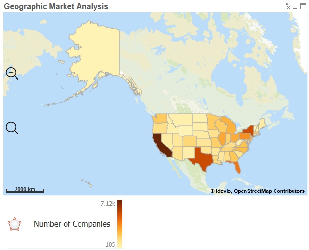
- In WebView, right-click anywhere on the sheet and select New Sheet Object.
- In the Extension Objects, add a Idevio Map 5 object and a Area Layer object to the sheet.
- Open the Properties dialog of the Area Layer object and set
STATEas the Dimension and the following expression as the Color Value:=sum([NUMBER OF FIRMS])
- Click More… and go to the Location tab.
- Make sure Advanced Location is not enabled and select
United Statesin the Country drop-down box. - In the Legend tab, disable the Color Legend Auto option and add an empty space to the first expression field and
Number of Companiesin the second expression field. This last step will make the legend clean and simple.
We've used states in this example, but geographic maps that have a greater level of detail, such as counties, or zip codes, have greater analytical value. Also, political or administrative boundaries may not always be the best way to divide a population. Imagine if meteorologists used the previous map to show today's weather forecast. Like weather analysis, we may more easily recognize patterns in human behavior if we were to use heat map that can group data beyond artificial boundaries.
Let's create the following geographical analysis that helps us appreciate the market size of the northeast that is made up of smaller states:

The following steps help us to create the geographical analysis:
- In WebView, right-click anywhere on the sheet and select New Sheet Object.
- In the Extension Objects, add a Heatmap Layer object to the sheet.
- Open the Properties dialog of the Heatmap Layer object and set
STATEas the Dimension and the following expression as the Weight Value:=sum([NUMBER OF FIRMS])
- Click More… and go to the Location tab.
- Make sure that Advanced Location is not enabled and select
United Statesin the Country drop-down box. - In the Legend tab, disable the Color Legend Auto option and add an empty space to the first expression field and
Number of Companiesin the second expression field.
At first, we'll see both layers together in the same map. Left-click the Area Layer legend and disable Visible. We can now appreciate how the proximity of each state's populations can create groups outside their political boundaries. Along with counties and zip codes, this type of heat map also works well with latitude and longitude.
As we saw in the previous exercise, we can overlap several analytical layers in the same geographical map. This multilayering effect can provide a data-dense, insightful chart. For example, we can combine a bubble, area, and chart layer to compare market size, market penetration, and customer location in the same map. The following chart uses the same area layer that we created in Exercise 4.5 along with overlapping bubble and chart layers:

First, let's add the layer of pie charts and then let's add the points that indicate customer locations. Although pie charts are not an ideal data visualization, in this case, they are the best possible solution until we can add other charts, such as bullet graphs:
- In WebView, right-click anywhere on the sheet and select New Sheet Object.
- In the Extension Objects, add a Chart Layer object to the sheet.
- Open the Properties dialog of the Chart Layer object and set
STATEas the ID Dimension. - Define the Chart Dimension Label as
% Market Penetrationand the following expression as the Chart Dimension:=ValueList('% Customers','% Not Customers') - Define the Chart Value Label as
%and the following expression as the Chart Value:=round(pick(match(ValueList('% Customers','% Not Customers'),'% Customers','% Not Customers'),count(DISTINCT if(STATE=[Billing State], Customer)) / sum([NUMBER OF FIRMS])*100,(1-count(DISTINCT if(STATE=[Billing State], Customer)) / sum([NUMBER OF FIRMS]))*100),.01) - Click More… and go to the Location tab.
- Make sure that Advanced Location is not enabled and select
United Statesin the Country drop-down box. - In the Legend tab, disable the Color Legend Auto option and add an empty space to the first expression field and
% Market Penetrationin the second expression field. - In the Presentation tab, adjust the Radius to
20. - In the Color tab, disable the Auto option. Select By Dimension in Color Mode and Categorized 100 in Color Scheme. Adjust Transparency to
25. - Close the Properties dialog of the Chart Layer object, and in the Extension Objects, add a Bubble Layer object to the sheet.
- Open the Properties dialog of the Bubble Layer object and set
Customeras the ID Dimension. - Define Latitude / ID as
=[Billing Latitude]and Longitude as=[Billing Longitude]. - Define Size Value as
1. - Click More… and go to the Legend tab, disable the Size Legend Auto option, and add
Customerin the first expression field. - In the Shape and Size tab, define Min Radius and Max Radius as
2. - In the Color tab, disable the Auto option. Select Single Color in the Color Mode and Black in the Color Scheme. Adjust Transparency to
25.
If we select one of the most common customer profiles (NAICS: Educational Services || Emp. Size: 100-499 || Revenue: $25000000-$50000000) and zoom into the central part of the United States around Iowa and Wisconsin, we can reproduce the chart as shown in the previous figure. After creating the maps and its different layers, we organize the legends next to the map, so that the business user can left-click any of the legends at any time to hide or show a layer as they see fit. We also help the user add as many layers as possible by using visual elements such as transparency, as we did in the previous exercise.
Once we understand the demographics of our current customers and our potential market, we may want to understand what they are saying about our company, products, and services. Over the last decade, social media sites, such as Twitter, Facebook, and LinkedIn, have become an increasingly important source of data to measure market opinion. They can also exert a large amount of influence on a potential customer's decision to do business with us more than any other marketing campaign that we run.
Data from social media sites is often unstructured data. For example, we cannot directly analyze text comments without first using a semantic text analysis tool. Along with several other different types of analysis, these tools apply advanced algorithms over text in order to extract keywords, classify it under certain topics, and determine its sentiment. The last piece of data, text sentiment, is whether the text has a positive, negative, or neutral connotation.
In the following example, we use QlikView's RESTful API to extract tweets containing the hashtag, #qlik, from Twitter. The RESTful API is a free connector from QlikView. You can download the installation file and the documentation that explains how to retrieve data from Twitter at Qlik Market (http://market.qlik.com/rest-connector.html).
After extracting the data, we use the same RESTful API to evaluate each tweet's keywords and sentiment using a semantic text analytical tool called AlchemyAPI (http://www.alchemyapi.com/). AlchemyAPI is free for up to one thousand API calls per day. If you want to evaluate more than one thousand texts, then they offer paid subscription plans. We've stored the result of this process and the example script in Twitter_Analysis_Sandbox.qvw which we can find in the application folder of the marketing perspective container.
In the following exercises, we first use powerful data visualization techniques, such as a histogram and a scatterplot, to analyze text sentiment. Then, we'll use a word cloud to display important keywords extracted from the texts. Although a bar chart is a more effective way to compare keyword occurrence, a word cloud may make for an insightful infographic summary of all the tweets.

Sentiment is divided into three groups. We represent sentiments that are negative as a negative number, those that are positive as a positive number, and those that are neutral as zero. The closer the number is to -1 or 1, the more negative or positive the sentiment, respectively. Histograms are the best data visualization method to view the distribution of numerical data. In order to create a histogram, we create numerical bins as a calculated dimension and then count how many instances fit into each bin. We also take care to visualize this diverging sequence with a similarly diverging color scheme:
- Add the following color variables that we will use throughout the next three exercises:
Variable Name
Variable Definition
vCol_Blue_ColorBlindSafePositiveARGB(255, 0, 64, 128)vCol_Orange_ColorBlindSafeNegativeARGB(255, 255, 128, 64)vCol_Gray_ColorBlindSafeNeutralARGB(255, 221, 221, 221) - Add a bar chart with the following calculated dimension that creates numerical bins one-tenth of a decimal wide:
=class([Sentiment Score],.1)
- Add the following expression that counts the number of instances that fit into each bin:
=count([Tweet Text])
- Open the Edit Expression window of the metric's Background Color attribute and, in the File menu, open the Colormix Wizard….
- In the wizard, use
avg([Sentiment Score])as the Value Expression. - Set the Upper Limit color to
$(vCol_Blue_ColorBlindSafePostive)and the Lower Limit color to$(vCol_Orange_ColorBlindSafePositive). Enable the Intermediate option, set the value to0and the color to$(vCol_Gray_ColorBlindSafeNeutral). Finish the Colormix Wizard…. - Go to the Axes tab and, in the Dimension Axis section, enable Continuous.
- In the Scale section that is found within Dimension Axis, set Static Min to
-1and Static Max to1.
After cleaning up this presentation, we should now have a chart that is similar to the one pictured before the exercise, which shows how tweets are distributed by sentiment score. We easily note that most of our tweets with the #qlik hashtag are positive. Now, let's compare a tweet sentiment with the number of times that users like that tweet.

Scatterplots are the best data visualization method to view the relationship between two numerical values. In the previous chart, each dot represents a tweet. Its two-dimensional position depends on its number of likes and its sentiment. We also use the same diverging color scheme as the histogram in order to emphasize the sentiment.
- Add a scatterplot chart with Tweet Text as the dimension and the following two metrics:
Metric Label
Metric Expression
Sentiment
avg({$<Retweet={0}>} [Sentiment Score])Likes
sum({$<Retweet={0}>} [Like Count]) - Similarly to the previous exercise, use the Colormix Wizard under the
Sentimentmetric to determine each dot's color.
The scatterplot shows us that most tweets are positive and that those that are moderately positive tweets are the ones that receive the most likes.
The next step in our social media analysis is to visualize the keywords that are used in these tweets by importance. Although we could compare keyword instance using a bar chart more accurately, a word cloud provides an excellent way to present an executive summary of all tweets:

Word clouds can be a great way to visually analyze unstructured data, such as text. The size of each keyword or phrase is related to its importance, which can be determined by the number of times that it appears in a text or a relevance score. In this case, we've used AlchemyAPI to extract keywords or phrases and give them a relevance score between 0 and 1. In the same way an internet search engine ranks search results according to their relevance to a query, AlchemyAPI ranks a keyword's relevance to each tweets. The higher the relevance value, the larger the text size. We also use a diverging color scheme for the text color so as to determine whether they are more common in tweets with negative or positive sentiments:
- Download and install the Word Cloud extension created by Brian Munz in Qlik Branch (http://branch.qlik.com/#/project/56728f52d1e497241ae69781).
- In Web View, add this extension to the sheet and assign the Keyword field to Words.
- Add the following expression to Measurement:
=sum([Keyword Relevance])
- In Color Expression, paste the expression created by the Colormix Wizard in either of the two previous exercises.
As we would expect, the words QlikView and Qlik Sense are common in our word cloud. These words in the context of training is also quite common. The biggest single keyword trend is the word Anniversary. Its relevance in each tweet where it appeared multiplied by the number of times is was retweeted make it the largest word in the cloud. If we want to investigate which tweets are related to Anniversary, we can click on the word.
We also discover that the negative tweets are mistakenly classified by the sentiment analysis tool. The words generic and mixed usually have a negative connotation, but they are neutral words referring to technical subjects in this case. All sentiment analysis tools will occasionally classify words incorrectly and we can use the word cloud to identify these errors.
After all our work to understand our current customers, find potential markets, and analyze our social media presence, we want to figure out the tangible consequences of our work. Let's end this chapter by analyzing sales opportunities.
The sales pipeline is the bridge between marketing and sales. Potential customers that are discovered by a market analysis or motivated by a advertising campaign are registered in the CRM system as leads. The sales team then goes through a series of steps to convert the lead into a customer. These steps may include having a first meeting, sending product samples, or sending an initial sales quote.
It is very important to monitor the number of opportunities that we have in the pipeline along with their progress through the steps. An opportunity that doesn't advance consistently through each step is likely to end up as a lost opportunity. It is also important to monitor the potential amount of sales that we currently have in the pipeline. This potential amount not only tells us what we can expect to sell in the immediate future, it also gives us first-hand information about a market's potential.
Let's create a flow chart like the following figure that shows us how each sales opportunity is progressing through the different stages of a sales process. Each line represents a sales opportunity. As it climbs higher, it is advancing to the next step in the sales process.
We can also appreciate the total number of opportunities that are at each stage throughout the month, and how many total opportunities are moving between stages. The lines that come to an end before the final month in the chart are opportunities that are closed.

This chart is only possible when we've linked the master calendar with the sales opportunities using intervalmatch(), as we did for this data model:
- Create a line chart with
DateandDocument IDas dimensions. - Create a metric labeled
Sales Opportunity Stagewith the following expression:dual(only([Sales Opportunity Stage ID]),only([Sales Opportunity Stage ID])+aggr(rank(-only({$<_DocumentType={'Sales Opportunities'}>} [Document ID]),4,1),Date,[Sales Opportunity Stage ID],[Document ID]) /max(total aggr(rank(-only({$<_DocumentType={'Sales Opportunities'}>} [Document ID]),4,1),Date,[Sales Opportunity Stage ID],[Document ID]))*.5) - In the Axes tab, enable the option to Show Grid in the Expression Axes section and set the Scale with the following values:
Option
Value
Static Min
1
Static Max
6.75
Static Step
1
The text value of the metric returns the sales opportunity stage, while the number is the sales opportunity stage plus a decimal amount that makes each line stack one on top of the other. The decimal amount is calculated by dividing the rank of the Document ID, which is a sequential number by the total number of documents in each stage during each day.