
In this recipe, we will look at the use of color to convey a message. Since we are looking at dashboarding, we need to know how to use color effectively to make the most of a small space. Here, we will use a box-and-whisker plot to convey a lot of information about the data in a small space, along with additional information on the figures themselves using color.
For the exercises in this recipe, let's start with a fresh Tableau workbook. There are no other requirements for this recipe.
- In Tableau, navigate to File | New and rename the sheet to Box Whiskers.
- Select the Connect to Data link at the top-left corner of the screen.
- Click on Text File on the left-hand side. Navigate to the
DimProductCategory.csvfile, which is located in the folder where you downloaded the code samples, and click on the Open button to import it into the Tableau workbook. - Drag the
DimSubProductCategory.csvfile from the Files section on the left-hand side to the white canvas. - Drag the
DimProduct.csvfile from the Files section on the left-hand side to the white canvas. - Drag the
FactInternetSales.csvfile from the Files section on the left-hand side to the white canvas. - In the join clause, select FullDateAlternateKey for the
DimDatetable and Order Date Key for theFactInternetSalestable. - Hide the columns in DimDate, keeping only the Max year, FullDateAlternateKey, FiscalYear, FiscalSemester, and FiscalQuarter fields.
- Now, go back to the Tableau worksheet by navigating to Go to Worksheet. You should now see the Tableau worksheet with your data source on the left-hand side. Right-click on the data source and Rename it to
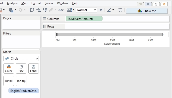
Chapter Seven. - Drag SUM(SalesAmount) onto the Columns shelf.
- Drag EnglishProductCategory onto the Rows shelf.
- Select the box-and-whisker plot from the Show Me panel.
- You'll see that the selected dimensions and measures change. Click on the Swap button, which you'll find under the Map menu item. The screen will look as shown in the following screenshot:
- Drag EnglishProductCategory back onto the Rows shelf.
- Drag Year(FullDateAlternateKey) onto the Marks shelf.
- Filter Year(FullDateAlternateKey) so that only the year 2008 is selected. Drag Year(FullDateAlternateKey) onto the Filters shelf. In the pop-up dialog box that appears, select Years.
- In the Filter[Year of FullDateAlternateKey] editor box, select 2005, 2006, 2007, and 2008 and click on OK.
- Drag SUM(SalesAmount) onto the Rows shelf. It should appear in the Columns shelf and the Rows shelf now.
- Right-click on the SalesAmount axis and deselect Show Header.
- Select Circle from the dropdown list on the Marks shelf.
- Drag SUM(SalesAmount) onto the Size button.
- Click on the Size button and move the slider so that it is half way between the start and the end of the slider. This will increase the size of the circles for SalesAmount.
- Drag SUM(SalesAmount) onto the Color button.
- Click on the Color button and select Edit Colors….
- From the dropdown list, select Red-Blue Diverging and click on Apply, and then click on OK.
- Reduce the size of the rows by clicking down and pressing on one of the Rows lines and dragging it upwards.
- Right-click on the Sales Amount x axis and select Edit….
- In the Edit Reference Line, Band or Box dialog box, under the Formatting section, choose Glass for the Style setting.
- Set Fill to be white from the drop-down list.
- For the border, select the thinnest border from the available selection.
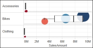
- For Whiskers, select the middle option. You can see the settings in the following screenshot:

The final result appears as in the following screenshot:
Ever played with a Rubik's cube? Color is a vital way of understanding and categorizing what we see. We can't order colors in terms of low to high value, for example, red plus yellow gives blue, since people experience colors differently. However, we can use color to tell a story about the data. We can use color to categorize, order, and display quantity.
In this recipe, we chose color to highlight some elements over others, and we used it to convey a message. Red was used to denote smaller values, and blue was used to denote higher values. Red is often seen as a warning color in the West. We reduced the color intensity in the box-and-whisker plot so that the circles could be seen through them. This allows us to add visualizations on top of one another but not occlude one another. The users can click on the box-and-whisker plot to get more detail about the data.
Data visualization is about displaying high-dimensional data on a low-dimensional canvas. Color can help us to distinguish between the dimensions that you want to display. Bright colors pop at us, and light colors recede into the background. We can use color to focus attention on the most relevant parts of the data visualization. This is very important when we are dealing with Big Data sources. We tend to spot things that stand out.
In Tableau, we can see that there are a number of ways to choose colors. Further, we know that a percentage of the population is color blind, so their color perception is reduced. We can choose colors that feel natural, thereby bringing the dashboard closer to the viewer, and they can understand it better. Fortunately, Tableau often helps you to choose the right type of color for the data.
Color choice depends on the numbers that you are trying to represent. If you are looking at ordering data, you can choose a sequential palette. This is where you choose one color to reflect the metric, but the intensity, brightness, or darkness of the color increases as the value increases. You may want to use a sequential palette to represent age, for example, where lighter values represent younger age groups and darker colors represent older age groups.
Alternatively, if you are looking at distinguishing metrics, you could use a diverging palette. For example, the palette could diverge from red right through the spectrum to white and then on to blue. This palette could be used to represent profit and loss. For example, white could represent zero or thereabouts, red could indicate a loss, and blue could indicate profit.
If you are looking at categorizing data, you could use different colors to represent different dimensional attributes. For example, you could use a different color to represent a different country or a different product group.
Picking color isn't easy. We can't say precisely that this color of blue is twice as blue as another shade of blue. However, Tableau does give you a helping hand.