
In this section, you'll be able to build up your theme design piece by piece, starting with aspects that affect the default.hbs template and moving on to each individual template. As you go, you can choose the sections that correspond to your quick start theme quiz choices, and hence have the ability to create several different types of designs via different combinations of the below.
Before you begin, run the grunt watch command on your project's compiler as per the instructions in Chapter 3, Preparing for Theme Development.
As you hash out the initial layout stages, don't worry if your theme looks plain, because we'll be using only placeholder colors and visual styling to begin with. The idea is to get your layout and essential functionality in place first, then add a unique design style to fit over the top.
There are a lot of tips and tricks you can use in this section, so you don't necessarily need to read and absorb everything in one go. You can follow only the sections you need for the specific theme you're designing, and you can come back and refer to a different set of sections for your next theme when you come to it.
Let's look at the overall default themes first.
Your theme is already in a single column in the sense that the header sits on top of the posts which sits on top of the footer. However, it's currently too wide and hence too difficult for a visitor to read. It also has some gaps between the header, posts area, and footer that aren't supposed to be there, as well as no padding on the interior of any of the elements. To fix all these issues add these mixins to the bottom of layout.styl:
readable_column_layout()
  width 100%
  max-width readable_column_width
  clearfix()
  align_this(center)

blog_header_layout()
  padding-left unit( add_hpadding, rem)
  padding-right unit( add_hpadding, rem)
  padding-top unit( golden, rem)
  padding-bottom unit( add_vpadding, rem)

posts_area_layout()
  padding-top unit( golden, rem)
  padding-bottom unit( golden, rem)

post_layout()
  padding-left unit( add_hpadding, rem)
  padding-right unit( add_hpadding, rem)
  padding-top unit( golden, rem)
  padding-bottom unit( golden, rem)

tag_archive_name_layout()
  padding-left unit( add_hpadding, rem)
  padding-right unit( add_hpadding, rem)
  padding-top unit( golden, rem)
  padding-bottom unit( golden, rem)

pagination_layout()
  padding-left unit( add_hpadding, rem)
  padding-right unit( add_hpadding, rem)
  padding-top unit( golden, rem)
  padding-bottom unit( golden, rem)

blog_footer_layout()
  padding-left unit( add_hpadding, rem)
  padding-right unit( add_hpadding, rem)
  padding-top unit( golden, rem)
  padding-bottom unit( golden, rem)
The readable_column_layout()mixin works by taking the readable_width variable (already set to 40em in your layout.styl file by default) and adding horizontal padding to it via the add_hpadding variable (set to five times the golden ratio by default). This is done via a calculation also already present in your layout.style file:
readable_column_width = readable_width + 2 * add_hpadding
Note
The value of the the golden ratio is saved at meta/global.styl under the golden variable. Read about the golden ratio's long history of aesthetic application at http://en.wikipedia.org/wiki/Golden_ratio#Applications_and_observations.
If you want to change the overall width of your layout, just change the readable_width variable, and likewise if you want to change the horizontal padding amount, change the add_hpadding value.
The use of the clearfix() mixin, a built-in part of the Stylus Nib mixin library, ensures that the spaces between the header, posts area, and footer are removed.
The blog_header_layout(), posts_area_layout(), post_layout(), tag_archive_name_layout(), pagination_layout(), and blog_footer_layout() mixins add padding to the header, posts area, articles, pagination, and footer based on the golden, add_hpadding and add_vpadding variables.
We also want to add some basic color differentiation between the header, posts area, and footer to help you see where each section starts and finishes. There are already some prewritten color mixins in the color_and_bgs.styl file, so we'll apply those to the design now.
Apply the layout and color mixins to the theme by adding this code to the bottom of custom_classes.styl:
.blog_header_lg
blog_header_color()
blog_header_layout()
.posts_area_lg
posts_area_color()
posts_area_layout()
.post
post_layout()
.tag_archive_name
tag_archive_name_layout()
.pagination
pagination_layout()
.blog_footer_lg
blog_footer_color()
blog_footer_layout()
.blog_header_lg
.posts_area_lg
.blog_footer_lg
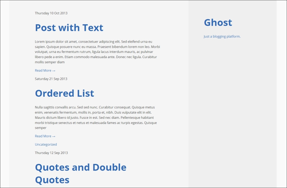
readable_column_layout()Your theme will now look like this:

You'll also notice that this function is used in the readable_column_layout() mixin:
align_this(center)
This automatically aligns your columns centrally. If you would like to left or right align them instead, simply change the value in between the parenthesis to align_this(left) or align_this(right).
In order to have the header section align to the one side, and the posts area and footer align to the other, we'll need to make a small addition to the default.hbs template. This will be to create a wrapper that prevents the elements aligning flush with the left and right sides of the screen.
Above the comment that reads {{! Document header }}, add this opening div:
<div class="wrap_lg">
After the closing </footer> tag, add a closing div:
</div>
Now, add the following new variables to your layout.styl file, under the readable_column_width variable:
sidebar_width = 33%
add_sidebar_hpadding = 3 * golden
readable_column_percentage = 100% - sidebar_width
total_width = (readable_column_width / readable_column_percentage) * 100
The first variable here lets you set the width you'd like your sidebar to be as a percentage of your layout's overall width. You can set it to anything you want, as long as it's a percentage value. By using a percentage value, the sidebar can flexibly adjust depending on viewport width.
The second line allows us to add some horizontal padding to the sidebar.
The third line calculates the width your readable columns should be as a percentage, by simply subtracting the width of the sidebar from 100 percent.
The last line then figures out what the total width of your layout should be in order to keep the readable column to the width set under the readable_column_width variable.
These extra lines mean you can still change the value of the readable_column_width variable to any em value you want, and the sidebar_width variable to any percentage you want, and the rest of your layout will be calculated automatically.
If you already have a readable_column_layout() mixin in your layout.styl file, delete it, then add the following mixins:
readable_column_layout()
    width readable_column_percentage
    float left

sidebar_layout()
    absolute top right
    bottom 0
    width sidebar_width
    padding-left unit( add_sidebar_hpadding, rem)
    padding-right unit( add_sidebar_hpadding, rem)

wrapper_layout()
    width 100%
    min-height 100%
    max-width total_width
    position relative
    align_this(center)
    clearfix()
Also, ensure that the blog_header_layout(), posts_area_layout(), post_layout(), pagination_layout(), and blog_footer_layout() mixins from the previous sections are included, if you haven't already added them.
Note that the above will put the sidebar in the right, and the posts area and footer on the left. If you would like them the other way around, change readable_column() to float right and sidebar() to absolute top left. (This uses the absolute seamless mixin from the Nib library.)
The next step is to apply these mixins via your custom_classes.styl file.
If you already have code in place from trying out the single column layout, delete everything but the .post_title_list_lg class and then add this new code:
.wrap_lg
    wrapper_layout()

.blog_header_lg
    blog_header_color()
    blog_header_layout()
    sidebar_layout()

.posts_area_lg
    posts_area_color()
    posts_area_layout()
    readable_column_layout()

.post
    post_layout()

.tag_archive_name_lg
  tag_archive_name_layout()

.pagination
    pagination_layout()

.blog_footer_lg
    blog_footer_color()
    blog_footer_layout()
    readable_column_layout()
The application of the wrapper_layout() mixin to the wrapper div we added to the default.hbs file will set the appropriate width to the overall area, and will also clear the floats of the elements it contains.
Additionally, the wrapper div is centered via the wrapper_layout() mixin's use of align_this(center). As with a single column layout, if you would prefer to left or right align your design, simply change the value passed through align_this().
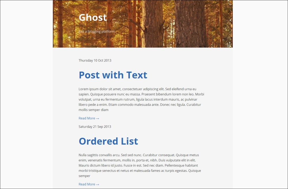
On executing a refresh operation, your layout will now look like this:
You can have your theme use the blog cover image equally well as a site background with a single column or twin column background.
First, open up your default.hbs template file and find the opening body tag, which by default uses this code:
<body class="{{body_class}}">Then replace the preceding line with this:
<body class="{{body_class}}" {{#if @blog.cover}}style="background-image: url({{@blog.cover}});"{{/if}}>This checks to see if a blog cover image is available, and if available, sets it as the background image for the body.
Next, open up the color_and_bgs.styl file from the vars_mixins_etc folder of your project source. Update your body_color() mixin by adding the following code:
body_color()
    background-color color_01
    color color_02
    background-repeat no-repeat
    background-position center center
    background-attachment fixed
    background-size cover
This code tells the background image to fit to the viewport size, and to remain still when the user scrolls up and down.
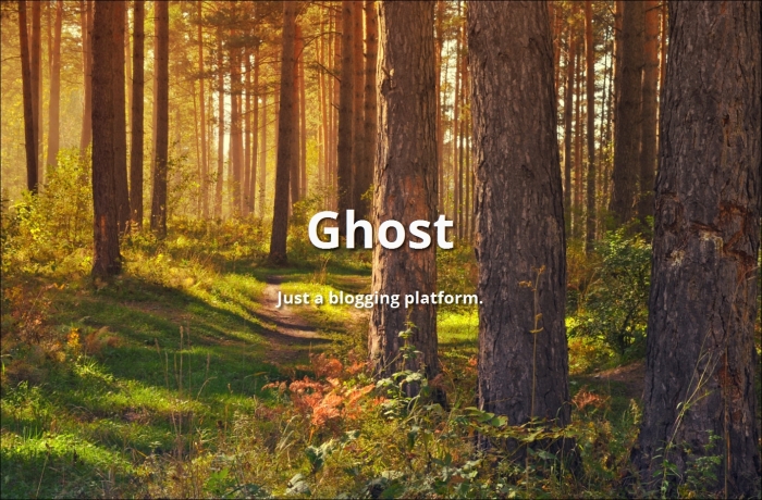
Find a large image you can use as a test background and set it via the Ghost admin as your site's blog cover. In our examples, we're using September in the Forest by Larisa Koshkina from PublicDomainPictures.net (http://www.publicdomainpictures.net/view-image.php?image=25507).
Refresh and, on a single column layout, you should see something like this:

Use the blog cover image as the header background for a single column and a sidebar background for a twin column.
Essentially, the same technique as above is used to set the blog cover as the header/sidebar background.
In the default.hbs template, find the opening <header> tag, which by default is:
<header class="blog_header_lg" role='banner' itemscope itemtype='http://schema.org/WPHeader'>
Then replace the preceding line of code with this:
<header class="blog_header_lg" {{#if @blog.cover}}style="background-image: url({{@blog.cover}});"{{/if}} role='banner' itemscope itemtype='http://schema.org/WPHeader'>Again, this checks for the presence of a blog cover image and sets it as the background if available.
Then, update the blog_header_color() mixin in the color_and_bgs.styl file to the following:
blog_header_color()
  background-color darken(color_05, 2.5%)
  background-repeat no-repeat
  background-position right top
  background-attachment fixed
  background-size cover
  a:link,
  a:visited
  color color_01
This sets the image to fill the <header> section's background, and also lightens the color of the text therein, so it can be read on the darkened background.
If you are using a twin column layout, it will now look something like this:

The background image will remain in a fixed position due to the background-attachment fixed line in the blog_header_color() mixin. This prevents any vertical repeating images or empty space.
With the header code as you have so far, the header height will already automatically size itself to its content. With the blog cover in the background will look like this:
You may also wish to allow your header background to expand to the full width of the screen. To do this, we'll need to make another modification to the default.hbs file to add a full-width wrapper around the header that the background can be applied to.
Before the opening <header> tag, add the following line of code:
<div class="header_bg_lg">
If you would like the cover image applied to the background, make it:
<div class="header_bg_lg" {{#if @blog.cover}}style="background-image: url({{@blog.cover}});"{{/if}}>Close the div after closing the </header> tag:
</div>
If you have already followed the section above and added the blog cover to the background of your header section, set the opening <header> tag back to its default code:
<header class="blog_header_lg" role='banner' itemscope itemtype='http://schema.org/WPHeader'>
Now, in your custom_classes.styl file, note the following code:
.blog_header_lg
    blog_header_color()
    blog_header_layout()
Replace it with the following code:
.header_bg_lg
    blog_header_color()

.blog_header_lg
    blog_header_layout()
This takes the color and bg settings that were applied to the header itself and applies them instead to the new wrapper div.
You'll now have this layout:

To set your header height to a large size, similar to the style of Casper, the default Ghost theme, add the following mixin to your layout.styl file:
blog_header_bg_layout()
    display table
    position relative
    width 100%
    height 60%
Then, in your custom_classes.styl file, apply the mixin to your .header_bg_lg class by updating it to the following:
.header_bg_lg
    blog_header_color()
blog_header_bg_layout()To vertically and horizontally align the blog logo, title, and description within this large header space, update your blog_header_layout()mixin to the following:
blog_header_layout()
    padding-top unit( golden, rem)
    padding-bottom unit( add_vpadding, rem)
    display table-cell
    vertical-align middle
    text-align center
Your layout will now look like this:

To have the header take up the full height of the screen in order to create the whole page blog cover, follow the same steps as in the previous section, with one significant difference. Instead of setting the head blog_header_bg_layout() mixin to height 60%, set it to height 100%:
blog_header_bg_layout()
    display table
    position relative
    width 100%
    height 100%
In order to make the title and description stand out a little more, add the following mixin to your typography.styl file:
blog_header_type()
  font-size 200%
  font-weight 700
  text-shadow 0.125em 0.125em 0.125em rgba(0, 0, 0, 0.7)
Then apply the mixin to your .blog_header_lg class in your custom_classes.styl file as follows:
.blog_header_lg
  blog_header_layout()
  blog_header_type()
With these new settings in place, you'll get an effect like this:
In this section, we are going to take a look at the different types of index and tag archives, their properties, and usage.
We've already covered how to use the {{excerpt}} and {{content}} tags in the Creating your theme shell section earlier on, so you can refer to that for a refresher.
The theme shell you have already created uses an {{excerpt}} tag with the default length of fifty words. If you use this or any other form of a shortened post, be sure to include some type of link through to the single post. In the theme as you have it so far, it is included in this form:
<p><a href="{{url}}">Read More →</a></p>If you are using the {{content}} tag at its default of showing the entire post, a Read More functionality would not be required; however, you may wish to retain the link and change its display to Permalink instead, so people can grab the single post URL should they want to share it with friends.
If you're using an excerpt, HTML is trimmed to show text only. This means any images, videos, soundcloud embeds, and so on from within your post won't show on your index or tag archive pages. Therefore, you can choose to pull the first of these from your post and display it above your excerpt without worrying about an image or video appearing twice in one space.
To do this, place the following tag somewhere in between the <article>...</article> tags of your index.hbs and tag.hbs files, typically, directly above or below the <header>...</header> section:
{{content words="0"}}To add zebra striping to your posts, find the opening. Now, replace the opening <article> tag of your index.hbs and tag.hbs files with:
<article role="article" itemscope itemtype="http://schema.org/BlogPosting" class="{{post_class}} {{#if @even}}post_even_lg{{else}}post_odd_lg{{/if}}">This will add a class of post_even_lg to every second post, and post_odd_lg to every other post.
To set background colors for these, add the following mixins to your color_and_bgs.styl file:
post_even_color()
    background-color darken(color_05, 2.5%)

post_odd_color()
    background-color color_05
Then, add the following styles to your custom_classes.styl file:
.post_even_lg
    post_even_color()

.post_odd_lg
    post_odd_color()
You'll also most likely want to adjust the vertical padding of the posts area and the posts to better suit the zebra striping, using the posts_area_layout() and post_layout() mixins by changing them to:
posts_area_layout()
  padding 0

post_layout()
  padding-left unit( add_hpadding, rem)
  padding-right unit( add_hpadding, rem)
  padding-top unit( add_vpadding, rem)
  padding-bottom unit( add_vpadding, rem)
On performing refresh, you'll now see alternating background colors at the width of your posts:

If instead, you want the zebra striped backgrounds to stretch to the full width of the screen, you'll need to add a wrapper around the posts to which the background can apply.
Set your index.hbs and tag.hbs files' opening <article> tag back to its default code:
<article role="article" itemscope itemtype="http://schema.org/BlogPosting" class="{{post_class}}">Above the opening <article> tag, place the following:
<div class="{{#if @even}}post_even_lg{{else}}post_odd_lg{{/if}}">Close the new post wrapper div after the closing </article> tag:
</div>
This code will now apply the zebra striping background colors to the wrapper instead of the post itself. Now, in order to allow those backgrounds to stretch full width, we have to allow the post area that wraps them to stretch to full width as well. However, we still want the actual posts to stay at readable width.
To achieve this, find this block of code in your custom_classes.styl file:
.blog_header_lg
.posts_area_lg
.blog_footer_lg
    readable_column_layout()
Change it to:
.blog_header_lg
.post
.pagination
.blog_footer_lg
    readable_column_layout()
Note that the .posts_area_lg class has been removed so the readable_column() mixin is no longer applied to it and hence no longer limits its width.
In its place, the .post and .pagination classes have been added so the mixin will now limit their widths and center them on the page.
If you'd like to also have the blog footer background full width, apply the same process that you already have to the header and posts; add a wrapper div around the footer element, apply the blog_footer_color() background styling mixin to that wrapper, and add the footer element's .blog_footer_lg class to the list of elements the mixin is applied to.
By default, the {{#foreach posts}}...{{/foreach}} loop will show all your posts, whether featured or not, in chronological order. To list the featured posts first, you need to create two loops; one with the featured posts and the other with unfeatured posts:
- To do this, in your
index.hbsandtag.hbsfiles, make a duplicate of your entire{{#foreach posts}}...{{/foreach}}block. - After the opening
{{#foreach posts}}of the first block, add this:{{#if featured}} - Then just before the closing
{{/foreach}}of the first block add:{{/if}}This first loop will now output only featured posts.
- Now, after the opening
{{#foreach posts}}of the second block, add this:{{#unless featured}} - Then, just before the closing
{{/foreach}}of the second block add:{{/if}}The second block will now output only posts that are not featured.
- Set some of your test posts to the
Featuredstatus, refresh your site, and you'll see they now appear at the top of the post list.
If you want to have featured posts styled differently to other posts, the easiest way is to work with the .featured class Ghost automatically adds to these posts.
In your color_and_bgs.styl file, create a mixin to control the styling of featured posts:
featured_post_color()
    background-color lighten(color_03, 10%)
Then apply that mixin to the .featured class by adding this to your custom_classes.styl file:
.featured
    featured_post_color()
With featured posts listed first and styled differently, you'll now have an effect like this:
In the same way you can style featured posts differently, you can also style posts differently if a specific predetermined tag is applied to them.
For every tag that is applied to a post, a class of tag-<tagname> is added by Ghost. So you can easily create tag specific styles in your CSS using the same method as described previously for featured posts, that is, create mixin(s) to style the post differently, and then apply those mixins to a new class added to your custom_classes.styl file.
However, you can also have your theme output completely different code if a certain tag is detected using the {{#has}} block helper. Let's take a look at a basic example where we modify the presentation of video tagged posts.
In your index.hbs and tag.hbs files, add these lines after your opening {{#foreach posts}} tag:
{{#has tag="video"}}

{{else}}
Before your closing {{/foreach}} tag place:
{{/has}}Now, in between the {{#has tag="video"}} and {{else}} tags place this:
<article role="article" itemscope itemtype="http://schema.org/BlogPosting" class="{{post_class}}">
{{content words="0"}}
<div class="video_inner">
<header>
<h1 class="post_title_list_lg" itemprop="headline"><a href="{{{url}}}" rel="bookmark">{{{title}}}</a></h1>
<time datetime="{{date format="YYYY-MM-DD"}}" itemprop="datePublished">{{date format="dddd DD MMM YYYY"}}</time>
</header>
<p><a href="{{url}}">Read About This Video →</a></p>
<footer>
<p>{{{tags}}}</p>
</footer>
</div>
</article>The preceding code will now be used for any post bearing a video tag, while the code you already had in place will be used for any post that does not have this tag.
In your layout.styl file add this:
video_post_layout()
    padding 0
And in your custom_classes.styl file add:
.tag-video
    video_post_layout()

.video_inner
    post_layout()
What this does is remove all the padding from any video post, allowing the video to sit flush against the outer edges.
You'll notice that in the new code added to the index and tag template files, there is a div with the video_inner class wrapped around all the text content of that post. The post_layout() mixin is applied to that wrapper's class instead of the entire post. This means that while the video sits flush against the edges, the text content will still have spacing placed around it.
Any posts tagged as video will now appear like this:

Style the whole tag archive page differently for specific tags.
In the same way you saw a single post tagged as video styled differently in the previous section, you can style an entire tag archive page differently for specific tags. So, for example, you could create a gallery of images when on the archive for the tag name image. I won't go into how to create a gallery specifically here, but I will give you the code required to set up your tag archive pages for unique styling.
There are two parts to this technique: styling the individual posts (so you can do things such as creating a grid layout with them) and styling the overall document (so you can do things such as allowing a grid to tile across the full width of the screen).
The individual posts can be styled with the exact same method as in the previous section, that is, in your tags.hbs file use the {{#has tag="<tagname>"}}...{{/has}} block helper to output different layout code depending on the current archive tag name. If you're on the image tag archive, you know all the posts will have the image tag, so they'll output in the same way.
In order to apply styling to the whole document, you'll need to add a custom class to the opening <body> tag, for example, image_gallery. You can then use that body class to control the styling of the entire page. To do this, we use what are known as content blocks.
For example, to set a body class of image_gallery, on the image tag archive, you would update your opening body tag to:
<body class="{{body_class}} {{block "customBodyClass"}}">The {{block "customBodyClass"}} tag creates a placeholder that can be dynamically updated within your template files.
Then, in between the {{#has tag="image"}}...{{/has} tags, you will have added to your tag.hbs template file and set the value of customBodyClass to image_gallery as follows:
{{#has tag="image"}}

{{#contentFor "customBodyClass"}}image_gallery{{/contentFor}}
The image output code is as follows:
{{else}}The non-image output code is as follows:
{{/has}}Now, when a visitor is on the image tag archive page, the opening body tag will output as follows, giving you the ability to style the whole page uniquely:
<body class="archive-template image_gallery">
In the previous sections, we've covered all of the little Ghost tag-driven tricks you can use to control the formatting of your theme. Let's now deep-dive into how to set up the header size of the page and deal with posts.
One of the design options we've covered so far is the ability to have a large or full screen header area in a single column design. This is nice to welcome the visitor to your homepage, but you don't want that much space to be taken up with the header on your posts and static pages.
You should instead set the header to shrink down to an automated height in these areas, that is, fit to the logo, title, and description it contains. To enable you to do this, we'll again use a content block as we did in the last section, this time applied to the blog header.
If you are using a full width header background, add a content block class placeholder to your header wrapper div as shown in the following code:
<div class="header_bg_lg {{block "customHeaderClass"}}" {{#if @blog.cover}}style="background-image: url({{@blog.cover}});"{{/if}}>Alternatively, if you are not using a wrapper around your header, add the class directly to your opening header tag instead:
<header class="blog_header_lg {{block "customHeaderClass"}}" role='banner' itemscope itemtype='http://schema.org/WPHeader'>Then in your post.hbs and page.hbs files, anywhere after the {{!< default}} tag, add the following:
{{#contentFor "customHeaderClass"}}auto_height_lg{{/contentFor}}This will add a class of auto_height_lg to your header when on a post or static page.
In your layout.styl file, add this new mixin:
auto_height_layout()
    height auto
And then apply it to the auto_height_lg class by adding the following to your custom_classes.styl file:
.auto_height_lg
    auto_height_layout()
Now, when a visitor is on a post or page, the header will only be the size it needs to be to accommodate its content.
Now that we come to implementing the choices you made in the post section of your theme quiz, you've already learned the actual techniques to use in the previous sections. The only difference is you'll be applying the techniques within your post.hbs template file.
So instead of going into great detail on how to apply the techniques again to your post.hbs template, I'll give you a quick rundown of which techniques to use for each of your theme quiz choices.
- Featured single post; style differently to default single post
Use the techniques described in the section on styling featured posts in your index and tag archive areas. If you have already applied featured post styling in those areas, the same styling will automatically apply in single post view too.
If you want featured post styling on your single posts to be different to that of your index and tag archive, the easiest way is to use a
{{#if featured}}...{{/if}}check in yourpost.hbstemplate file to output a custom class on the post. - Specifically tagged single post; style differently for certain tags
The techniques to style single posts differently, depending on tags, are essentially the same as used in the index and tag archive areas. As with featured posts, any styling applied to the index and tag archive areas will automatically be applied in the single post context too. However, if you need different HTML to be output for specific tags, remember to use the
{{#has tag="<tagname>"}}...{{/has}}check in yourpost.hbstemplate to do so.