At this point, you should now have a fully functional theme with a completed layout, but with the same placeholder color scheme and visual styling you began with. Now, it's time to turn your bland looking theme into something visually unique.
90 percent of the visual styling from here is just a matter of working with the mixins you already have in place in your typography.styl, layout.styl and color_and_bgs.styl files. You can do a great deal just by adding custom values to the color variables and modifying the _color() mixins.
Of course, the actual designs you create will come down to your own unique talents and style so we can't teach you that here, but what we can do is give you an example of a design laid over the top of one of the layouts we've already covered earlier, along with the code used to create it so you can see what kind of things can be done.
Before moving onto that example, there are a couple of extra tricks you'll want to know about to help your visual styling process along.
Casper, the default theme for Ghost, includes an awesome set of font files that give you icons for Ghost's own logo as well as RSS, Google+, Facebook, and Twitter. Instead of using static-sized icon images, you can use this font and your icons can then be sized and colored as you would any text-based content.
To add them to your theme, copy all the files from the assets/fonts folder of the Casper theme into the assets/fonts folder of your own theme.
The CSS code to enable this icon font is already in place in your project folder's stylus/meta/global.styl file, it just needs to be activated. Open the file and find this line of code:
use_icon_font = false
Change it to:
use_icon_font = true
You'll now automatically see icons in the social sharing section of your single posts and in your blog footer:

If you want to show only icons and not text, wrap the text labels of the above in span tags with the class, hidden_lg, for example:
<p><a class="subscribe icon-feed" href="{{@blog.url}}/rss/"><span class="hidden_lg">Subscribe!</span></a></p>If you're using the blog cover as an integral part of your theme design, or any other images set via Ghost's admin panel, that is, the logo, author image, author cover, then you may want to set fallback images that will appear if the user has not set their own.
To do this, check to see if there is a user set image, as we already did previously in the sections working with the blog cover:
{{#if @blog.cover}} style="background-image: url({{@blog.cover}});" {{/if}}Then, add a fallback image using the {{asset}} helper by adjusting that check as follows:
{{#if @blog.cover}} style="background-image: url({{@blog.cover}});" {{else}} style="background-image: url( {{asset "images/default.jpg"}} );" {{/if}}Let's take a look at the layout which was created using the twin column layout settings described earlier, with the overall alignment set to the left, the header/sidebar also aligned to the left with its width set to 30 percent, and zebra striping in place.
The layout has two small tweaks from the default twin column code, whereby the sidebar_layout() and blog_header_layout() mixins are altered in order to remove horizontal padding and center text.
The resulting layout.styl code is:
//**
// Vars
//**

hr_vmargin = golden
add_hpadding = 5 * golden
add_vpadding = 3 * golden
readable_width = 40em
readable_column_width = readable_width + 2 * add_hpadding

sidebar_width = 30%
add_sidebar_hpadding = 3 * golden
readable_column_percentage = 100% - sidebar_width
total_width = (readable_column_width / readable_column_percentage) * 100

//**
// Functions
//**

align_this(align)
  if align is center
    margin-left auto
    margin-right auto
  else if align is left
    margin-left 0
    margin-right auto
  else if align is right
    margin-left auto
    margin-right 0

// layout - mixins
readable_column_layout()
  width readable_column_percentage
  float right

sidebar_layout()
  absolute top left
  bottom 0
  width sidebar_width
  text-align center

wrapper_layout()
  width 100%
  min-height 100%
  max-width total_width
  position relative
  align_this(left)
  clearfix()

blog_header_layout()
  padding 0

posts_area_layout()
  padding 0

post_layout()
  padding-left unit( add_hpadding, rem)
  padding-right unit( add_hpadding, rem)
  padding-top unit( add_vpadding, rem)
  padding-bottom unit( add_vpadding, rem)

tag_archive_name_layout()
  padding-left unit( add_hpadding, rem)
  padding-right unit( add_hpadding, rem)
  padding-top unit( golden, rem)
  padding-bottom unit( golden, rem)

pagination_layout()
  padding-left unit( add_hpadding, rem)
  padding-right unit( add_hpadding, rem)
  padding-top unit( golden, rem)
  padding-bottom unit( golden, rem)

blog_footer_layout()
  padding-left unit( add_hpadding, rem)
  padding-right unit( add_hpadding, rem)
  padding-top unit( golden, rem)
  padding-bottom unit( golden, rem)
The blog cover image used is named Fresh Spring Background and comes from www.publicdomainpictures.net, which is an excellent source of images to practise your theming techniques with.
The visual styling was created entirely by setting this content in the color_and_bgs.styl file:
//**
// Color vars
//**

color_01 = #F7F4EA
color_02 = #424242
color_03 = #C2C983
color_04 = #E0BC72
color_05 = #000

//**
// Mixins
//**

body_color()
    background-color color_01
    color color_02
    background-repeat no-repeat
    background-position center center
    background-attachment fixed
    background-size cover

link_color()
    color darken(color_03, 20%)

link_hover_color()
    color color_04

blog_header_color()
  background-color rgba(color_05, 0.875)
  border-right 0.25rem solid rgba(color_05, 0.9)
  a:link,
  a:visited
    color color_03

posts_area_color()
    background-color rgba(color_01, 0.3)
    border-right 0.25rem solid color_03

blog_footer_color()
    border-top 0.0625rem solid color_03
    background-color darken(color_01, 5%)
    border-right 0.25rem solid color_03

post_even_color()
    background-color rgba(color_01, 0.7)
    border-bottom 0.0625rem solid rgba(color_03, 0.5)

post_odd_color()
    border-bottom 0.0625rem solid rgba(color_03, 0.5)
There is also a small addition to the theme's typography, whereby the Google Font Lobster Two is applied to the blog title and it is made larger. First, the Google font is loaded into the theme in the default.hbs file:
<link href='//fonts.googleapis.com/css?family=Open+Sans:400,700,400italic,700italic|Lobster+Two:700italic' rel='stylesheet' type='text/css'>
In the typography.styl file, this code is added:
blog_title_font = "Lobster Two"

blog_title_type()
    font-family blog_title_font
    font-size 6rem
The font is applied to the blog title by adding this to the custom_classes.styl file:
.blog_title_lg
    blog_title_type()
The post_even_color() mixin is also applied to the tag archive's title to differentiate it from the posts area. The entire custom_classes.styl file thus ends up as follows:
//**
// Styles
//**

// Standardize Index and Tag Archive post titles
.post_title_list_lg
  post_title_list_type()

.wrap_lg
  wrapper_layout()

.blog_header_lg
  blog_header_color()
  blog_header_layout()
  sidebar_layout()

.posts_area_lg
  posts_area_color()
  posts_area_layout()
  readable_column_layout()

.post
  post_layout()

.tag_archive_name_lg
  tag_archive_name_layout()
  post_even_color()

.pagination
  pagination_layout()

.blog_footer_lg
  blog_footer_color()
  blog_footer_layout()
  readable_column_layout()

.post_even_lg
  post_even_color()

.post_odd_lg
  post_odd_color()

.blog_title_lg
  blog_title_type()
So, as you can see, thanks to the groundwork already laid, it takes very little code to add an entire design style to your theme.
Your theme already has responsiveness in place for both images and anything placed in an iframe, such as videos and soundcloud embeds. The only thing remaining is to add media queries to ensure the layout works well at all screen sizes.
The technique to achieve this is quite straightforward. You simply open up the media_queries.styl file from the stylus/styles folder of your project source and add media queries at each point your design breaks as you shrink it. These points will be arbitrary depending on the specifics of the design.
Note
We personally use a script named RDBL to help me handle the assessment of where breakpoints should be. If you'd like to do the same, the script is free on Github at https://github.com/polygonix/RDBL.
This stage of your theme creation process should always occur after your default design is complete; otherwise, you won't be able to account for all elements of the layout.
For example, the following code is all that's required to make our example twin column design fully responsive:
@media (max-width: 71.187em)
  //reduce blog title font size
  .blog_title_lg
    font-size 5rem

  //reduce h padding
  .post
  .tag_archive_name_lg
  .pagination
  .blog_footer_lg
    padding-left unit( add_hpadding * 0.75, rem)
    padding-right unit( add_hpadding * 0.75, rem)

@media (max-width: 62.687em)
  //reduce blog title font size
  .blog_title_lg
    font-size 4rem

  //reduce h padding
  .post
  .tag_archive_name_lg
  .pagination
  .blog_footer_lg
    padding-left unit( add_hpadding * 0.5, rem)
    padding-right unit( add_hpadding * 0.5, rem)

@media (max-width: 56.812em)
  //reduce blog title font size
  .blog_title_lg
    font-size 3rem

  //reduce h padding
  .post
  .tag_archive_name_lg
  .pagination
  .blog_footer_lg
    padding-left unit( add_hpadding * 0.25, rem)
    padding-right unit( add_hpadding * 0.25, rem)
@media (max-width: 51.125em)
  //convert to single column
  //move header to the top, add vpadding and add left border to balance right border
  .blog_header_lg
    position static
    width 100%
    padding-top unit( golden, rem)
    padding-bottom unit( add_vpadding, rem)
    border-left 0.25rem solid rgba(color_05, 0.9)

  //move posts area and footer below header and add border to left side to match right
  .posts_area_lg
  .blog_footer_lg
    float none
    width 100%
    border-left 0.25rem solid color_03

  //increase blog title font-size again now there's more horizontal space
  .blog_title_lg
    font-size 4rem
    padding-top unit( golden, rem)
    padding-bottom unit( golden, rem)

  //increase h padding agin now there's more room
  .post
    padding-left unit( add_hpadding * 0.75, rem)
    padding-right unit( add_hpadding * 0.75, rem)
    padding-top unit( golden, rem)
    padding-bottom unit( golden, rem)

  .tag_archive_name_lg
  .pagination
  .blog_footer_lg
    padding-left unit( add_hpadding * 0.75, rem)
    padding-right unit( add_hpadding * 0.75, rem)

@media (max-width: 44em)
  //reduce h padding
  .post
  .tag_archive_name_lg
  .pagination
  .blog_footer_lg
    padding-left unit( add_hpadding * 0.5, rem)
    padding-right unit( add_hpadding * 0.5, rem)

@media (max-width: 39.937em)
  //getting thin now so remove borders
  .blog_header_lg
  .posts_area_lg
  .blog_footer_lg
    border-left 0
    border-right 0

  //reduce h padding
  .post
  .tag_archive_name_lg
  .pagination
  .blog_footer_lg
    padding-left unit( add_hpadding * 0.25, rem)
    padding-right unit( add_hpadding * 0.25, rem)

//set the min resolution width you want to cater for
@media (max-width: 480px)
  html
    min-width 480px
The purpose of each of the adjustments made via these media queries is described in the comments throughout.
In a nutshell, the preceding code makes sure the design is viewport optimized and is easily readable at any resolution between the layout's maximum width and a minimum of 480 px.
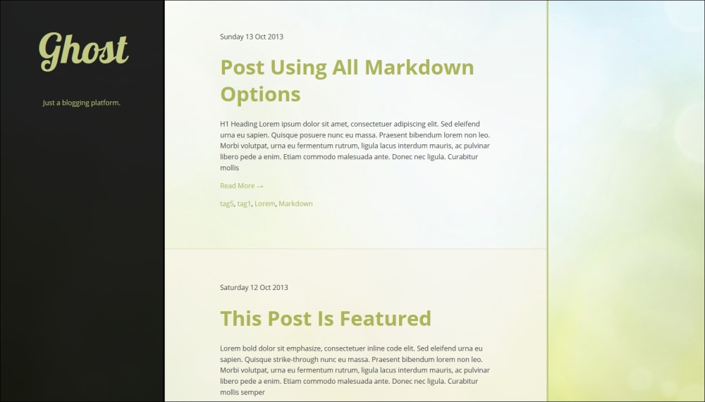
At 1024 px resolution, the screen looks like this:
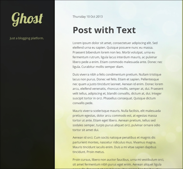
At 768 px resolution, the screen looks like this:

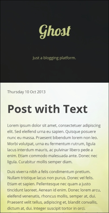
At 480 px resolution, the screen looks like this: