
In this chapter, we will explore a few of the more advanced features and plots that can be realized in ggplot2. We will build on the knowledge you already acquired on the grammar of graphics, and we will see how the different components discussed in the previous chapter can be combined in order to get a more sophisticated and complex plot to represent your data.
In the previous chapter, you saw how plots are composed of different components and how the data, aesthetic mapping, and geometry are the three minimally required elements needed in order to make a plot. In reality, statistics are also needed in order to draw a plot, but it is not necessarily needed to be specified since, as we have seen in the previous chapter, each geometry has default statistics, which, in many cases, are simply the identity statistics. This stat transformation actually does not produce anything on the data but leaves the data as it is in the plot. Another common stat that you have already used, probably without realizing it, is bin, which is used by default, for instance, in histograms and barplots, to divide the data into bins that are then represented in the graph.
The default stat used from each geom function will be sufficient in most common situations, but in some cases, it could be important for you to use a different stat or add an additional stat on top of the one used by default. In the following pages, we will see a few examples of two of the most important and commonly used statistics: smooth lines and regression lines.
The smooth line implemented in ggplot2 generates a local regression that will follow the data and allow you to have an idea of the fluctuation of the data points. The smooth line can be added in the plots in two different ways: using the stat function stat_smooth() or using the geom function geom_smooth(). Both these methods are very similar, and we will see some examples for both the methods in the following pages.
The stat_smooth()function is the statistic function responsible for creating the smooth line, so using this function will allow you to have greater statistical control over the computation of the smooth line. In this function, you have available the argument method, which allows you to choose the smoothing method used in the calculation. The options available are lm, glm, gam, loess, and rlm. As an alternative, a formula can also be specified in the formula argument. For a dataset with the number of observations smaller than 1,000, the default method is loess, while for data with more than 1,000 observations, the default is gam. The following is a summary table for the different methods, while for a detailed description of the statistical calculation used in each method, you can refer to the help page of the different functions:
|
Smoothing method |
Package |
Description |
|---|---|---|
|
|
|
This fits a polynomial surface determined by one or more numerical predictors using local fitting. This is used by default when n<1000. |
|
|
|
This fits a generalized additive model ( |
|
|
|
This fits a linear model. |
|
|
|
This fits a linear model with a more robust fitting algorithm, which is less affected by outliers. |
We will see a few examples of how to add a smooth line using the data from the ToothGrowth dataset that we have already used in the past chapters. In Chapter 3, The Layers and Grammar of Graphics, we have already seen how the stat function is simply added to the geom and the ggplot() functions to create facets with a smoother in each subplot using the following code:
ggplot(data=ToothGrowth, aes(x=dose, y=len, col=supp)) + geom_point() + stat_smooth() + facet_grid(.~supp)
As you have seen in this example, we just added the specification of the stat transformation and the smooth line was added in each facet. This happens because the data and the aesthetic color are specified only in the main function, ggplot(), and for this reason, they are used for all the following functions. You have also probably noticed that when running the code, you see appearing on the screen a message specifying the method used in the calculation of the smooth line.
If we are not interested in having the data split into facets, we can simply remove the faceting argument. The following code shows this:
ggplot(data=ToothGrowth, aes(x=dose, y=len, col=supp)) + geom_point() + stat_smooth()
The plot we just realized is represented in Figure 4.1. If you would like to use a different method to calculate the smoothing, you can specify it within the stat_smooth() function.

Figure 4.1: This shows the data and smooth line of the ToothGrowth dataset. The data is grouped by administration supplement
As you can see in the graph, without faceting, the data is in just one plot window but remains grouped by the administered supplement. Also, in this case, this depends on the fact that the data and the aesthetic attributes are specified only in the function creating the plot object. So, the same grouping based on the supp variable is applied to the geom attribute, which generates different colors, as well as the stat attribute, which generates two different smoothers. Keep in mind that if you want to get a different behavior, you can specify a different aesthetic mapping within the stat_smooth() function. For instance, let's assume that we want the data in the plot grouped by color depending on the supp variable, but we want a smooth line for the data altogether. We can specify independent aesthetic mapping within each function. The following code shows this:
ggplot() + geom_point(data=ToothGrowth, aes(x=dose, y=len, col=supp)) + stat_smooth(data=ToothGrowth, aes(x=dose, y=len))
As you can see in the resulting plot represented in Figure 4.2, we now have the data represented with the same grouping but with a smoothing that does not take into account the grouping. For this reason, the default color used in the new smoothing is different from the grouping colors.
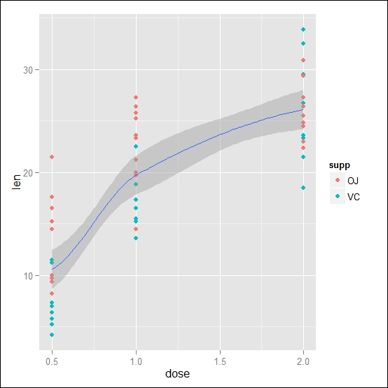
Figure 4.2: Here, the data and the smooth line of the ToothGrowth dataset are shown. The data is grouped by the administration of the supplement, while the smooth line is calculated on the overall dataset
Using the same approach, you can also combine several stat or geom functions by adding different degrees of representation of your data. In this case, it could be interesting to look at the same time at the smoothing lines specific to each subgroup of the supplement administration as well as the total tendency of the data, for instance, to see whether the overall tendency is driven particularly by one of the subgroups. The following code shows this:
ggplot() + geom_point(data=ToothGrowth, aes(x=dose, y=len, col=supp)) + stat_smooth(data=ToothGrowth, aes(x=dose, y=len)) + stat_smooth(data=ToothGrowth, aes(x=dose, y=len,col=supp))
The resulting plot is shown in Figure 4.3:
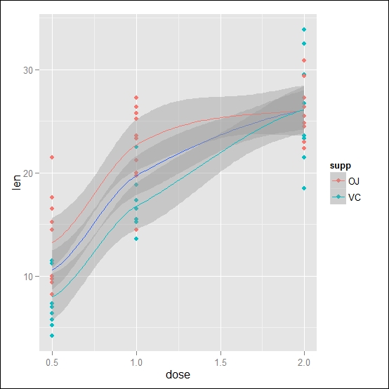
Figure 4.3: Here, the data and the smooth line of the ToothGrowth dataset are shown. The data is grouped by the administration of the supplement, and the smooth lines are calculated for each group as well as for the overall dataset
The stat_smooth() function contains two other arguments that can turn out to be very useful to adapt the data representation to your needs—the se and span arguments. The se argument is a logical argument, where you can specify whether or not you want the point-wise confidence interval, which is represented in gray, included in the plot the point-wise confidence interval, which is represented in gray. So, setting se=FALSE, you can switch off its representation. By default, the confidence interval is calculated at 95 percent; you can change that by changing the level = 0.95 argument. The argument span controls the degree of smoothing of the line. With the smoothing, the fitting is calculated locally, so for a fit in a point x, the fitting is calculated using points in a neighbor of x. The span parameter defines the size of this neighbor. You can think of this option simply as a way to control the width of the smoothing. This parameter can be used when the loess smoothing method is used since it is passed directly to the loess() function of the stats package. If you want more details, you can look at the help page of this function. The default value, which was used in the previous examples, is 0.75.
The stat_smooth() function uses a specific default geometry, that is, geom_smooth(). As an alternative you can also use this function directly to generate the smooth line as you would use any other geom function. So, for instance, the following code would produce the same graph as in Figure 4.1:
ggplot(data=ToothGrowth, aes(x=dose, y=len, col=supp)) + geom_smooth() + geom_point()
In a few cases, the use of the geom_smooth() function can be very useful. In fact, as we saw in the previous chapter, to realize a plot, you need to specify a geometry. This means that if you want smoothing of the data without representing the data, you can simply use the geom_smooth() function. As an alternative, you could use the stat_smooth() function and specify an empty geom function, such as geom_blank(). So, the following two blocks of code are equivalent, and they will produce a smoothing for each administration group without representing the observations:
ggplot(data=ToothGrowth, aes(x=dose, y=len, col=supp)) + geom_smooth()

### Equivalent coding
ggplot(data=ToothGrowth, aes(x=dose, y=len, col=supp)) + geom_blank()+stat_smooth()
You can see the resulting graph in Figure 4.4:

Figure 4.4: These are the smooth lines of the ToothGrowth dataset for each administration of the supplement
Linear regression can be used to represent as a straight line the relationship between a variable x and a variable y. As a difference from smoothing, in this case, the relationship is assumed to be linear and is calculated over the total range of the data available. As we have seen in the previous section, the stat_smooth() function allows us to select different methods, with one of them being the lm method, which calculates exactly the linear regression. Using the data from ToothGrowth, we can represent this time the linear regression of the data by representing a different regression line depending on the supplement administered. Here, you will see two examples of how to obtain the regression line and how to get the regression without the confidence interval represented on the plot:
## Regression with confidence interval
ggplot(data=ToothGrowth, aes(x=dose, y=len, col=supp)) + geom_point()+stat_smooth(method="lm")

## Regression without confidence interval
ggplot(data=ToothGrowth, aes(x=dose, y=len, col=supp)) + geom_point()+stat_smooth(method="lm", se=FALSE)
The resulting plots are represented in Figure 4.5:

Figure 4.5: Here's the data and linear regression of the ToothGrowth dataset. (A) This shows linear regression with the confidence interval and (B) shows regression without the confidence interval
We already introduced the basic concept of faceting in Chapter 3, The Layers and Grammar of Graphics, so now, we will see a few examples of how statistics can be used with faceting. Simply using the stat function with faceting, you will obtain smooth or linear regression in each facet calculated on the data of each facet, so, for instance, the following code will include a smooth line in each facet:
ggplot(data=ToothGrowth, aes(x=dose, y=len, col=supp)) + geom_point() + stat_smooth() + facet_grid(.~supp)
The resulting graph is represented in Figure 4.6. As you have seen, we simply applied the facet_grid() function, together with the stat_smooth() function, and we were able to obtain a statistic description in each subset of data.

Figure 4.6: Here's the data and smooth regression of the ToothGrowth dataset with the data divided into facets
In some cases, on the other hand, you could be interested in visualizing different information. For instance, it could be interesting to get an overview of the tendency of the dataset together with the statistical description of each subgroup of the data. This kind of analysis can be done by adding the margin to the facets, which will add a column or row, along with the statistical analysis applied to them, to the facet containing all the data. This is how it would look for our example:.
ggplot(data=ToothGrowth, aes(x=dose, y=len, col=supp)) + geom_point() + stat_smooth() + facet_grid(.~supp,margins=TRUE)
As you can see from the code, we used the margin=TRUE option to generate the additional facet with all the data. This kind of summary could be very useful if you are interested in comparing the overall smooth regression to one of each subgroup. The resulting plot is depicted in Figure 4.7:

Figure 4.7: Here's the data and the smooth regression of the ToothGrowth dataset with the data divided into facets and also with a facet containing all the data
In other cases, you would want to apply the statistics only to one facet, for instance, if in some facets, you do not have enough data and you do not want to show any statistics since it would not be representative of the data group. You can do that by applying the statistical transformation to a subset of the data so that it will be applied only in the facet you are interested in. You can also use this approach if you want to apply different statistics to different facets. As an example, we will apply a smooth line to the first facet, corresponding to the data for the orange juice vehicle, and a linear regression, corresponding to the data for vitamin C, in the second facet:
ggplot(data=ToothGrowth, aes(x=dose, y=len, col=supp)) + geom_point() + stat_smooth(data = subset(ToothGrowth, supp =="OJ")) + stat_smooth(data = subset(ToothGrowth, supp =="VC"),method="lm") + facet_grid(.~supp)
To make the code more clear, you can see each function on a different row. After creating the ggplot object and adding the observations as points, we apply the smooth statistic only on the subset of data where our supp variable is OJ. This means that only this data will have a smooth line, meaning only the first facet will have a smooth line. The same applies to the other facet except that this time we change the method used in the stat_smooth() function by selecting a linear method. You can see the resulting plot in Figure 4.8. The same approach can also be used to have the statistics only in one facet; in this case, you would simply apply the statistics to the facet you are interested in.
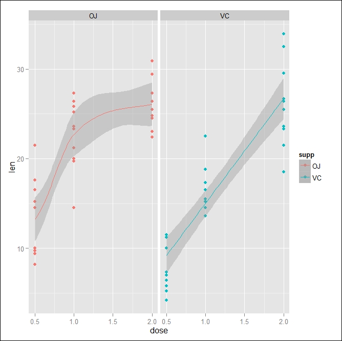
Figure 4.8: Shown here are the data and statistics regressions of the ToothGrowth dataset with the data divided into facets. The left facet contains the smooth line regression, while the right one is the linear regression