On our demo site, we have an app with a number of demographic measures per country. You can find it at http://sense-demo.qlik.com under the name Happiness. It analyzes, among other demographic indexes, the Happy Planet Index (HPI) in a number of countries. You can learn more about this index at www.happyplanetindex.org.
This index measures the sustainable well-being of 151 countries across the globe, focusing not on their abilities to produce material goods and services, but rather on their abilities to produce long, happy, and sustainable lives for the people who live in them. A happy life doesn't have to come at the expense of our environment, and the HPI is used to promote a policy that puts the well-being of people and the planet first.

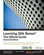
The app overview of the Happiness application
Below this overview, you will see a number of sheets. The leftmost sheet is an introduction, whereas the other sheets are prepared for analysis and detailed information.
If you click on the Stories button to the left, you will see that the app also contains one story—a story that can be used to present data in the app. It can also be used as an introduction to the app the first time you open it.

The sheets on the app overview page
The first sheet is an introduction sheet that explains what the app is all about. The second sheet, which is the first one with traditional charts, is called Happy Planet Index (HPI). On it, you will see the happiness index for all countries, first on a map, and then in a table.
The countries in the map are colored according to the happiness index—the darker the color, the higher the happiness index.

A map showing the happiness index per country
Below the map, there are three scatter charts showing the happiness index per country, plotted against the life expectancy, GDP per capita, and total population. These three charts are excellent tools to analyze any correlation between happiness and the mentioned demographic measures.

Scatter charts that show the correlation (or lack of correlation) between happiness and other demographic measures
Finally, at the bottom, you have three filter panes, allowing the user to choose only a region, subregion, or country to zoom in the numbers for a specific area.
The other sheets contain additional and more detailed information, ordered by topics. The final sheet contains a table showing the details, should the user be interested in drilling down to the lowest level.
When looking at data in this app, the first question that pops up in the user's mind is usually, "Is there any correlation between happiness and x?" To get a qualitative answer to this, you only need to browse through the scatter charts.
On the Happy Planet Index (HPI) sheet, you have three scatter charts. In the leftmost chart, HPI vs Life Expectancy, you can see a correlation between the two measures, at least for lower life expectancies. In the other two charts, however, there is no clear correlation.
On the HPI Comparison sheet, you have three additional scatter charts. In the leftmost chart, HPI vs Happy Life Years, you can see a weak correlation between the two measures. The same is true for the rightmost chart, HPI vs Global Footprint, but in the chart in the middle (HPI vs Governance), there is no clear correlation.
However, as in all statistics, you have to be careful with your conclusions. Firstly, correlation does not imply causation. You have to look at many factors and use common sense to find the true cause and effect. In this case, it is just that the happiness index is an artificial index calculated from the life expectancy and ecological footprint among others, hence the correlation with happy life years and global footprint.
Now, let's explore the data. One question could be, "Where in the world do we find the countries with a low average life expectancy?" To answer this, you need to make a selection in the scatter chart showing life expectancy:
- First, navigate to the Happy Planet Index sheet. Maximize the scatter chart that shows HPI vs Life Expectancy by clicking on the fullscreen arrow in the upper-right corner of the object.
- Then, click on the chart so that the chart controls, including the lasso symbol, appear in the upper-right corner.
- Next, click on the Turn on lasso selection option. Now you can draw a line around the points you want to select.
- Finally, confirm your selection by clicking on the green tick mark in the upper-right corner.

Lasso selection in the scatter chart
If you now look at the map, you will see where these countries appear in the world. It's predominantly Africa and South Asia. If you click on the map, you can zoom in using the scroll wheel of the mouse. You can also pan the map.

Countries with low life expectancy
Of course, you can also make a selection the other way round. Use the lasso selector in the map and see how the selected countries are distributed in the scatter chart. The way to do this is as follows:
- Maximize the map.
- Click somewhere in the map.
- Click on the Turn on lasso selection option and encircle the part of the world you want to explore.
- Finally, confirm your selection.

Making a lasso selection of America on the map
You can also use the global selector to make selections. Just click on the global selector and make selections directly in the fields.
For instance, you may have a question like this, "Where in the world do I find the richest countries?" In such a case, perform the following steps:
- Open the global selector. (This is found to the right in the toolbar with Selections tool as a popup.)
- Find a field called GDP/capita ($PPP). To do this, you might first need to check Show fields in the global selector.
- Once you have found this field, you can investigate it just by scrolling. You will then see that there are some countries with less than $400 in GDP per capita, while the richest countries have more than $80,000 in GDP per capita.
If you want to find the countries where the GDP is greater than $10,000, perform the following steps:
- Click on the search icon and type
>10000. - Confirm the search by pressing Enter, and then confirm the selection by clicking on the green tick mark.

Selecting the countries in the world with the highest GDP
If you now close the global selector and go back to the map and the scatter charts, you will be able to see where you find the richest countries, both on the map and in the scatter charts.