
In order for a health insurance company to make money, it needs to collect more in yearly premiums than it spends on medical care to its beneficiaries. Consequently, insurers invest a great deal of time and money to develop models that accurately forecast medical expenses for the insured population.
Medical expenses are difficult to estimate because the costliest conditions are rare and seemingly random. Still, some conditions are more prevalent for certain segments of the population. For instance, lung cancer is more likely among smokers than non-smokers, and heart disease may be more likely among the obese.
The goal of this analysis is to use patient data to forecast the average medical care expenses for such population segments. These estimates could be used to create actuarial tables that set the price of yearly premiums higher or lower according to the expected treatment costs.
For this analysis, we will use a simulated dataset containing hypothetical medical expenses for patients in the United States. This data was created for this book using demographic statistics from the US Census Bureau, and thus, approximately reflect real-world conditions.
The insurance.csv file includes 1,338 examples of beneficiaries currently enrolled in the insurance plan, with features indicating characteristics of the patient as well as the total medical expenses charged to the plan for the calendar year. The features are:
age: An integer indicating the age of the primary beneficiary (excluding those above 64 years, as they are generally covered by the government).sex: The policy holder's gender: either male or female.bmi: The body mass index (BMI), which provides a sense of how over or underweight a person is relative to their height. BMI is equal to weight (in kilograms) divided by height (in meters) squared. An ideal BMI is within the range of 18.5 to 24.9.children: An integer indicating the number of children/dependents covered by the insurance plan.smoker: A yes or no categorical variable that indicates whether the insured regularly smokes tobacco.region: The beneficiary's place of residence in the US, divided into four geographic regions: northeast, southeast, southwest, or northwest.
It is important to give some thought to how these variables may relate to billed medical expenses. For instance, we might expect that older people and smokers are at higher risk of large medical expenses. Unlike many other machine learning methods, in regression analysis, the relationships among the features are typically specified by the user rather than detected automatically. We'll explore some of these potential relationships in the next section.
As we have done before, we will use the read.csv() function to load the data for analysis. We can safely use stringsAsFactors = TRUE because it is appropriate to convert the three nominal variables to factors:
> insurance <- read.csv("insurance.csv", stringsAsFactors = TRUE)
The str() function confirms that the data is formatted as we had expected:
> str(insurance)
'data.frame':    1338 obs. of  7 variables:
 $ age     : int  19 18 28 33 32 31 46 37 37 60 ...
 $ sex     : Factor w/ 2 levels "female","male": 1 2 2 2 2 1 ...
 $ bmi     : num  27.9 33.8 33 22.7 28.9 25.7 33.4 27.7 ...
 $ children: int  0 1 3 0 0 0 1 3 2 0 ...
 $ smoker  : Factor w/ 2 levels "no","yes": 2 1 1 1 1 1 1 1 ...
 $ region  : Factor w/ 4 levels "northeast","northwest",..: ...
 $ expenses: num  16885 1726 4449 21984 3867 ...
Our model's dependent variable is expenses, which measures the medical costs each person charged to the insurance plan for the year. Prior to building a regression model, it is often helpful to check for normality. Although linear regression does not strictly require a normally distributed dependent variable, the model often fits better when this is true. Let's take a look at the summary statistics:
> summary(insurance$expenses)
   Min. 1st Qu.  Median    Mean 3rd Qu.    Max.
   1122    4740    9382   13270   16640   63770
Because the mean value is greater than the median, this implies that the distribution of insurance expenses is right-skewed. We can confirm this visually using a histogram:
> hist(insurance$expenses)

Figure 6.6: The distribution of annual insurance expenses
As expected, the figure shows a right-skewed distribution. It also shows that the majority of people in our data have yearly medical expenses between zero and $15,000, in spite of the fact that the tail of the distribution extends far past these peaks. Although this distribution is not ideal for a linear regression, knowing this weakness ahead of time may help us design a better-fitting model later on.
Before we address that issue, another problem is at hand. Regression models require that every feature is numeric, yet we have three factor-type features in our data frame. For instance, the sex variable is divided into male and female levels, while smoker has categories for yes and no. From the summary() output, we know that region has four levels, but we need to take a closer look to see how they are distributed:
> table(insurance$region)
northeast northwest southeast southwest
      324       325       364       325
Here, we see that the data has been divided nearly evenly among four geographic regions. We will see how R's linear regression function handles these factor variables shortly.
Before fitting a regression model to data, it can be useful to determine how the independent variables are related to the dependent variable and each other. A correlation matrix provides a quick overview of these relationships. Given a set of variables, it provides a correlation for each pairwise relationship.
To create a correlation matrix for the four numeric variables in the insurance data frame, use the cor() command:
> cor(insurance[c("age", "bmi", "children", "expenses")])
               age        bmi   children   expenses
age      1.0000000 0.10934101 0.04246900 0.29900819
bmi      0.1093410 1.00000000 0.01264471 0.19857626
children 0.0424690 0.01264471 1.00000000 0.06799823
expenses 0.2990082 0.19857626 0.06799823 1.00000000
At the intersection of each row and column pair, the correlation is listed for the variables indicated by that row and column. The diagonal is always 1.0000000 since there is always a perfect correlation between a variable and itself. The values above and below the diagonal are identical since correlations are symmetrical. In other words, cor(x, y) is equal to cor(y, x).
None of the correlations in the matrix are very strong, but there are some notable associations. For instance, age and bmi appear to have a weak positive correlation, meaning that as someone ages, their body mass tends to increase. There are also positive correlations between age and expenses, bmi and expenses, and children and expenses. These associations imply that as age, body mass, and number of children increase, the expected cost of insurance goes up. We'll try to tease out these relationships more clearly when we build our final regression model.
It can also be helpful to visualize the relationships among numeric features with scatterplots. Although we could create a scatterplot for each possible relationship, doing so for a large number of features quickly becomes tedious.
An alternative is to create a scatterplot matrix (sometimes abbreviated as SPLOM), which is simply a collection of scatterplots arranged in a grid. It is used to detect patterns among three or more variables. The scatterplot matrix is not a true multi-dimensional visualization because only two features are examined at a time. Still, it provides a general sense of how the data may be interrelated.
We can use R's graphical capabilities to create a scatterplot matrix for the four numeric features: age, bmi, children, and expenses. The pairs() function is provided in the default R installation and provides basic functionality for producing scatterplot matrices. To invoke the function, simply provide it the data frame to plot. Here, we'll limit the insurance data frame to the four numeric variables of interest:
> pairs(insurance[c("age", "bmi", "children", "expenses")])
This produces the following diagram:

Figure 6.7: A scatterplot matrix of the numeric features in the insurance dataset
In the scatterplot matrix, the intersection of each row and column holds the scatterplot of the variables indicated by the row and column pair. The diagrams above and below the diagonal are transpositions because the x axis and y axis have been swapped.
Do you notice any patterns in these plots? Although some look like random clouds of points, a few seem to display some trends. The relationship between age and expenses displays several relatively straight lines, while the bmi versus expenses plot has two distinct groups of points. It is difficult to detect trends in any of the other plots.
By adding more information to the plot, it can be made even more useful. An enhanced scatterplot matrix can be created with the pairs.panels() function in the psych package. If you do not have this package installed, type install.packages("psych") to install it on your system and load it using the library(psych) command. Then, we can create a scatterplot matrix as we had done previously:
> pairs.panels(insurance[c("age", "bmi", "children", "expenses")])
This produces a slightly more informative scatterplot matrix, as follows:
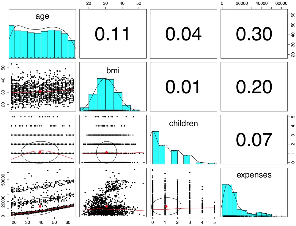
Figure 6.8: The pairs.panels() function adds detail to the scatterplot matrix
In the pairs.panels() output, the scatterplots above the diagonal are replaced with a correlation matrix. The diagonal now contains histograms depicting the distribution of values for each feature. Finally, the scatterplots below the diagonal are presented with additional visual information.
The oval-shaped object on each scatterplot is a correlation ellipse. It provides a visualization of correlation strength. The more the ellipse is stretched, the stronger the correlation. An almost perfectly round oval, as with bmi and children, indicates a very weak correlation (in this case 0.01).
The ellipse for age and expenses in much more stretched, reflecting its stronger correlation (0.30). The dot at the center of the ellipse is a point reflecting the means of the x axis and y axis variables.
The curve drawn on the scatterplot is called a loess curve. It indicates the general relationship between the x axis and y axis variables. It is best understood by example. The curve for age and children is an upside-down U, peaking around middle age. This means that the oldest and youngest people in the sample have fewer children on the insurance plan than those around middle age. Because this trend is nonlinear, this finding could not have been inferred from the correlations alone. On the other hand, the loess curve for age and bmi is a line sloping up gradually, implying that body mass increases with age, but we had already inferred this from the correlation matrix.
To fit a linear regression model to data with R, the lm() function can be used. This is part of the stats package, which should be included and loaded by default with your R installation. The lm() syntax is as follows:

The following command fits a linear regression model that relates the six independent variables to the total medical expenses. The R formula syntax uses the tilde character (~) to describe the model; the dependent variable expenses goes to the left of the tilde while the independent variables go to the right, separated by + signs. There is no need to specify the regression model's intercept term, as it is included by default:
> ins_model <- lm(expenses ~ age + children + bmi + sex +
    smoker + region, data = insurance)
Because the period character (.) can be used to specify all features (excluding those already specified in the formula), the following command is equivalent to the prior command:
> ins_model <- lm(expenses ~ ., data = insurance)
After building the model, simply type the name of the model object to see the estimated beta coefficients:
> ins_model

Call:
lm(formula = expenses ~ ., data = insurance)

Coefficients:
    (Intercept)              age          sexmale
       -11941.6            256.8           -131.4
            bmi         children        smokeryes
          339.3            475.7          23847.5
regionnorthwest  regionsoutheast  regionsouthwest
         -352.8          -1035.6           -959.3
Understanding the regression coefficients is fairly straightforward. The intercept is the predicted value of expenses when the independent variables are equal to zero. However, in many cases, the intercept is of little explanatory value by itself, as it is often impossible to have values of zero for all of the features. This is the case here, where no person can exist with age zero and BMI zero, and consequently, the intercept has no real-world interpretation. For this reason, in practice, the intercept is often ignored.
The beta coefficients indicate the estimated increase in expenses for an increase of one unit in each of the features, assuming all other values are held constant. For instance, for each additional year of age, we would expect $256.80 higher medical expenses on average, assuming everything else is held equal.
Similarly, each additional child results in an average of $475.70 in additional medical expenses each year, and each unit increase in BMI is associated with an average increase of $339.30 in yearly medical expenses, all else equal.
You might notice that although we only specified six features in our model formula, there are eight coefficients reported in addition to the intercept. This happened because the lm() function automatically applies dummy coding to each of the factor type variables included in the model.
As explained in Chapter 2, Managing and Understanding Data, dummy coding allows a nominal feature to be treated as numeric by creating a binary variable for each category of the feature. The dummy variable is set to 1 if the observation falls into the specified category or 0 otherwise. For instance, the sex feature has two categories: male and female. This will be split into two binary variables, which R names sexmale and sexfemale. For observations where sex = male, then sexmale = 1 and sexfemale = 0; conversely, if sex = female, then sexmale = 0 and sexfemale = 1. The same coding applies to variables with three or more categories. For example, R split the four-category feature region into four dummy variables: regionnorthwest, regionsoutheast, regionsouthwest, and regionnortheast.
When adding a dummy variable to a regression model, one category is always left out to serve as the reference category. The estimates are then interpreted relative to the reference. In our model, R automatically held out the sexfemale, smokerno, and regionnortheast variables, making female non-smokers in the northeast region the reference group. Thus, males have $131.40 less medical expenses each year relative to females and smokers cost an average of $23,847.50 more than non-smokers per year. The coefficient for each of the three regions in the model is negative, which implies that the reference group, the northeast region, tends to have the highest average expenses.
The results of the linear regression model make logical sense: old age, smoking, and obesity tend to be linked to additional health issues, while additional family member dependents may result in an increase in physician visits and preventive care such as vaccinations and yearly physical exams. However, we currently have no sense of how well the model is fitting the data. We'll answer this question in the next section.
The parameter estimates we obtained by typing ins_model tell us about how the independent variables are related to the dependent variable, but they tell us nothing about how well the model fits our data. To evaluate the model performance, we can use the summary() command on the stored model:
> summary(ins_model)
This produces the following output, which has been annotated for illustrative purposes:

The summary() output may seem overwhelming at first, but the basics are easy to pick up. As indicated by the numbered labels in the preceding output, there are three key ways to evaluate the performance, or fit, of our model:
- The Residuals section provides summary statistics for the errors in our predictions, some of which are apparently quite substantial. Since a residual is equal to the true value minus the predicted value, the maximum error of 29981.7 suggests that the model under-predicted expenses by nearly $30,000 for at least one observation. On the other hand, 50 percent of errors fall within the 1Q and 3Q values (the first and third quartile), so the majority of predictions were between $2,850.90 over the true value and $1,383.90 under the true value.
- For each estimated regression coefficient, the p-value, denoted
Pr(>|t|), provides an estimate of the probability that the true coefficient is zero given the value of the estimate. Small p-values suggest that the true coefficient is very unlikely to be zero, which means that the feature is extremely unlikely to have no relationship with the dependent variable. Note that some of the p-values have stars (***), which correspond to the footnotes that specify the significance level met by the estimate. This level is a threshold, chosen prior to building the model, which will be used to indicate "real" findings, as opposed to those due to chance alone; p-values less than the significance level are considered statistically significant. If the model had few such terms, it may be a cause for concern, since this would indicate that the features used are not very predictive of the outcome. Here, our model has several highly significant variables, and they seem to be related to the outcome in logical ways. - The Multiple R-squared value (also called the coefficient of determination) provides a measure of how well our model as a whole explains the values of the dependent variable. It is similar to the correlation coefficient in that the closer the value is to 1.0, the better the model perfectly explains the data. Since the R-squared value is 0.7494, we know that the model explains nearly 75 percent of the variation in the dependent variable. Because models with more features always explain more variation, the Adjusted R-squared value corrects R-squared by penalizing models with a large number of independent variables. It is useful for comparing the performance of models with different numbers of explanatory variables.
Given the preceding three performance indicators, our model is performing fairly well. It is not uncommon for regression models of real-world data to have fairly low R-squared values; a value of 0.75 is actually quite good. The size of some of the errors is a bit concerning, but not surprising given the nature of medical expense data. However, as shown in the next section, we may be able to improve the model's performance by specifying the model in a slightly different way.
As mentioned previously, a key difference between regression modeling and other machine learning approaches is that regression typically leaves feature selection and model specification to the user. Consequently, if we have subject matter knowledge about how a feature is related to the outcome, we can use this information to inform the model specification and potentially improve the model's performance.
In linear regression, the relationship between an independent variable and the dependent variable is assumed to be linear, yet this may not necessarily be true. For example, the effect of age on medical expenditures may not be constant across all age values; the treatment may become disproportionately expensive for the oldest populations.
If you recall, a typical regression equation follows a form similar to this:
To account for a nonlinear relationship, we can add a higher order term to the regression equation, treating the model as a polynomial. In effect, we will be modeling a relationship like this:
The difference between these two models is that an additional beta will be estimated, which is intended to capture the effect of the x2 term. This allows the impact of age to be measured as a function of age squared.
To add the nonlinear age to the model, we simply need to create a new variable:
> insurance$age2 <- insurance$age^2
Then, when we produce our improved model, we'll add both age and age2 to the lm() formula using the form expenses ~ age + age2. This will allow the model to separate the linear and nonlinear impact of age on medical expenses.
Suppose we have a hunch that the effect of a feature is not cumulative, but rather that it has an effect only after a specific threshold has been reached. For instance, BMI may have zero impact on medical expenditures for individuals in the normal weight range, but it may be strongly related to higher costs for the obese (that is, BMI of 30 or more).
We can model this relationship by creating a binary obesity indicator variable that is 1 if the BMI is at least 30 and 0 if it is less than 30. The estimated beta for this binary feature would then indicate the average net impact on medical expenses for individuals with BMI of 30 or above, relative to those with BMI less than 30.
To create the feature, we can use the ifelse() function that, for each element in a vector, tests a specified condition and returns a value depending on whether the condition is true or false. For BMI greater than or equal to 30, we will return 1, otherwise we'll return 0:
> insurance$bmi30 <- ifelse(insurance$bmi >= 30, 1, 0)
We can then include the bmi30 variable in our improved model, either replacing the original bmi variable or in addition to it, depending on whether or not we think the effect of obesity occurs in addition to a separate linear BMI effect. Without good reason to do otherwise, we'll include both in our final model.
So far, we have only considered each feature's individual contribution to the outcome. What if certain features have a combined impact on the dependent variable? For instance, smoking and obesity may have harmful effects separately, but it is reasonable to assume that their combined effect may be worse than the sum of each one alone.
When two features have a combined effect, this is known as an interaction. If we suspect that two variables interact, we can test this hypothesis by adding their interaction to the model. Interaction effects are specified using the R formula syntax. To interact the obesity indicator (bmi30) with the smoking indicator (smoker), we would write a formula in the form expenses ~ bmi30*smoker.
The * operator is shorthand that instructs R to model expenses ~ bmi30 + smokeryes + bmi30:smokeryes. The colon operator (:) in the expanded form indicates that bmi30:smokeryes is the interaction between the two variables. Note that the expanded form automatically also included the individual bmi30 and smokeryes variables as well as their interaction.
Based on a bit of subject matter knowledge of how medical costs may be related to patient characteristics, we developed what we think is a more accurately specified regression formula. To summarize the improvements, we:
- Added a nonlinear term for age
- Created an indicator for obesity
- Specified an interaction between obesity and smoking
We'll train the model using the lm() function as before, but this time we'll add the newly constructed variables and the interaction term:
> ins_model2 <- lm(expenses ~ age + age2 + children + bmi + sex +
                     bmi30*smoker + region, data = insurance)
Next, we summarize the results:
> summary(ins_model2)
The output is as follows:

The model fit statistics help to determine whether our changes improved the performance of the regression model. Relative to our first model, the R-squared value has improved from 0.75 to about 0.87.
Similarly, the adjusted R-squared value, which takes into account the fact that the model grew in complexity, improved from 0.75 to 0.87. Our model is now explaining 87 percent of the variation in medical treatment costs. Additionally, our theories about the model's functional form seem to be validated. The higher-order age2 term is statistically significant, as is the obesity indicator, bmi30. The interaction between obesity and smoking suggests a massive effect; in addition to the increased costs of over $13,404 for smoking alone, obese smokers spend another $19,810 per year. This may suggest that smoking exacerbates diseases associated with obesity.
Note
Strictly speaking, regression modeling makes some strong assumptions about the data. These assumptions are not as important for numeric forecasting, as the model's worth is not based upon whether it truly captures the underlying process—we simply care about the accuracy of its predictions. However, if you would like to make firm inferences from the regression model coefficients, it is necessary to run diagnostic tests to ensure that the regression assumptions have not been violated. For an excellent introduction to this topic, see: Multiple Regression: A Primer, Allison, PD, Pine Forge Press, 1998.
After examining the estimated regression coefficients and fit statistics, we can also use the model to predict the expenses of future enrollees on the health insurance plan. To illustrate the process of making predictions, let's first apply the model to the original training data using the predict() function as follows:
> insurance$pred <- predict(ins_model2, insurance)
This saves the predictions as a new vector named pred in the insurance data frame. We can then compute the correlation between the predicted and actual costs of insurance:
> cor(insurance$pred, insurance$expenses)
[1] 0.9307999
The correlation of 0.93 suggests a very strong linear relationship between the predicted and actual values. This is a good sign—it suggests that the model is highly accurate! It can also be useful to examine this finding as a scatterplot. The following R commands plot the relationship and then add an identity line with an intercept equal to zero and slope equal to one. The col, lwd, and lty parameters affect the line color, width, and type, respectively:
> plot(insurance$pred, insurance$expenses)
> abline(a = 0, b = 1, col = "red", lwd = 3, lty = 2)
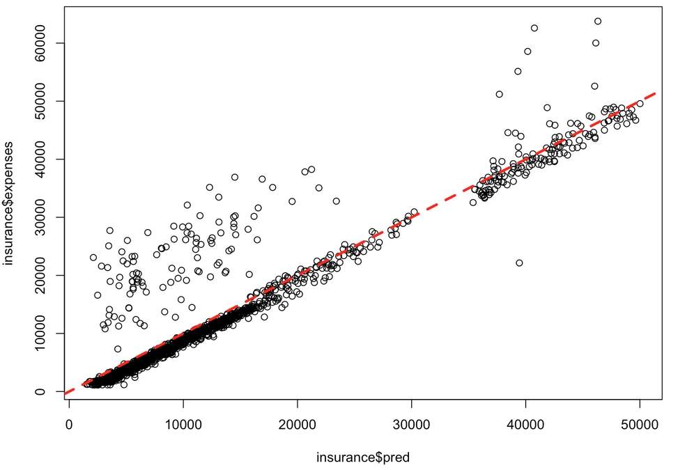
Figure 6.9: In this scatterplot, points falling on or near the diagonal dashed line where y = x indicate the predictions that were very close to the actual values
The off-diagonal points falling above the line are cases where the actual expenses were greater than expected, while cases falling below the line are those less than expected. We can see here that a small number of patients with much larger-than-expected medical expenses are balanced by a larger number of patients with slightly smaller-than-expected expenses.
Now, suppose you would like to forecast the expenses for potential new enrollees on the insurance plan. To do this, you must provide the predict() function a data frame with the prospective patients' data. In the case of many patients, you may consider creating a CSV spreadsheet file to load in R, or for a smaller number, you may simply create a data frame within the predict() function itself. For example, to estimate the insurance expenses for a 30 year old, overweight, male non-smoker with two children in the Northeast, type:
> predict(ins_model2,
          data.frame(age = 30, age2 = 30^2, children = 2,
                     bmi = 30, sex = "male", bmi30 = 1,
                     smoker = "no", region = "northeast"))
       1
5973.774
Using this value, the insurance company might need to set its prices to about $6,000 per year, or $500 per month in order to break even for this demographic group. To compare the rate for a female who is otherwise similar, use the predict() function in much the same way:
> predict(ins_model2,
          data.frame(age = 30, age2 = 30^2, children = 2,
                     bmi = 30, sex = "female", bmi30 = 1,
                     smoker = "no", region = "northeast"))
       1
6470.543
Note that the difference between these two values, 5,973.774 - 6,470.543 = -496.769, is the same as the estimated regression model coefficient for sexmale. On average, males are estimated to have about $496 less in expenses for the plan per year, all else being equal.
This illustrates the more general fact that the predicted expenses are a sum of each of the regression coefficients times their corresponding value in the prediction data frame. For instance, using the model's regression coefficient of 678.6017 for the number of children we can predict that reducing the children from two to zero will result in a drop in expenses of 2 * 678.6017 = 1,357.203 as follows:
> predict(ins_model2,
          data.frame(age = 30, age2 = 30^2, children = 0,
                     bmi = 30, sex = "female", bmi30 = 1,
                     smoker = "no", region = "northeast"))
      1
5113.34

> 6470.543 - 5113.34
[1] 1357.203
Following similar steps for a number of additional customer segments, the insurance company would be able to develop a profitable pricing structure for various demographics.