
When only the wealthy could afford education, tests and exams did not evaluate the students. Instead, tests judged teachers for parents who wanted to know whether their children learned enough to justify the instructors' wages. Obviously, this is different today. Now, such evaluations are used to distinguish between high-achieving and low-achieving students, filtering them into careers and other opportunities.
Given the significance of this process, a great deal of effort is invested in developing accurate student assessments. Fair assessments have a large number of questions that cover a wide breadth of topics and reward true knowledge over lucky guesses. A good assessment also requires students to think about problems they have never faced before. Correct responses therefore reflect an ability to generalize knowledge more broadly.
The process of evaluating machine learning algorithms is very similar to the process of evaluating students. Since algorithms have varying strengths and weaknesses, tests should distinguish among the learners. It is also important to understand how a learner will perform on future data.
This chapter provides the information needed to assess machine learners, such as:
- The reasons why predictive accuracy is not sufficient to measure performance, and the performance measures you might use instead
- Methods to ensure that the performance measures reasonably reflect a model's ability to predict or forecast unseen cases
- How to use R to apply these more useful measures and methods to the predictive models covered in previous chapters
Just as the best way to learn a topic is to attempt to teach it to someone else, the process of teaching and evaluating machine learners will provide you with greater insight into the methods you've learned so far.
In the previous chapters, we measured classifier accuracy by dividing the number of correct predictions by the total number of predictions. This finds the proportion of cases in which the learner is right or wrong. For example, suppose that a classifier correctly predicted for 99,990 out of 100,000 newborn babies whether they were a carrier of a treatable but potentially fatal genetic defect. This would imply an accuracy of 99.99 percent and an error rate of only 0.01 percent.
At first glance, this appears to be an extremely valuable classifier. However, it would be wise to collect additional information before trusting a child's life to the test. What if the genetic defect is found in only 10 out of every 100,000 babies? A test that invariably predicts no defect will be correct for 99.99 percent of all cases, but incorrect for 100 percent of the cases that matter most. In other words, even though the classifier is extremely accurate, it is not very useful for preventing treatable birth defects.
Though there are many ways to measure a classifier's performance, the best measure is always that which captures whether the classifier is successful at its intended purpose. It is crucial to define performance measures for utility rather than raw accuracy. To this end, we will explore a variety of alternative performance measures derived from the confusion matrix. Before we get started, however, we need to consider how to prepare a classifier for evaluation.
The goal of evaluating a classification model is to better understand how its performance will extrapolate to future cases. Since it is usually infeasible to test an unproven model in a live environment, we typically simulate future conditions by asking the model to classify cases in a dataset made of cases that resemble what it will be asked to do in the future. By observing the learner's responses to this examination, we can learn about its strengths and weaknesses.
Though we've evaluated classifiers in prior chapters, it's worth reflecting on the types of data at our disposal:
- Actual class values
- Predicted class values
- Estimated probability of the prediction
The actual and predicted class values may be self-evident, but they are the key to the evaluation. Just like a teacher uses an answer key—a list of correct answers—to assess the student's answers, we need to know the correct answer for a machine learner's predictions. The goal is to maintain two vectors of data: one holding the correct or actual class values, and the other holding the predicted class values. Both vectors must have the same number of values stored in the same order. The predicted and actual values may be stored as separate R vectors or as columns in a single R data frame.
Obtaining this data is easy. The actual class values come directly from the target in the test dataset. Predicted class values are obtained from the classifier built upon the training data, which is then applied to the test data. For most machine learning packages, this involves applying the predict() function to a model object and a data frame of test data, such as: predictions <- predict(model, test_data).
Until now, we have only examined classification predictions using these two vectors of data, but most models can supply another piece of useful information. Even though the classifier makes a single prediction about each example, it may be more confident about some decisions than others. For instance, a classifier may be 99 percent certain that a SMS with the words "free" and "ringtones" is spam, but only 51 percent certain that a SMS with the word "tonight" is spam. In both cases, the classifier classifies the message as spam, but it is far more certain about one decision than the other.
Figure 10.1: Learners may differ in their prediction confidence even when trained on the same data
Studying these internal prediction probabilities provides useful data to evaluate a model's performance. If two models make the same number of mistakes, but one is more able to accurately assess its uncertainty, then it is a smarter model. It's ideal to find a learner that is extremely confident when making a correct prediction, but timid in the face of doubt. The balance between confidence and caution is a key part of model evaluation.
The function call to obtain the internal prediction probabilities varies across R packages. In general, for most classifiers, the predict() function allows an additional parameter to specify the desired type of prediction. To obtain a single predicted class, such as spam or ham, you typically set the type = "class" parameter. To obtain the prediction probability, the type parameter should be set to one of "prob", "posterior", "raw", or "probability" depending on the classifier used.
For example, to output the predicted probabilities for the C5.0 classifier built in Chapter 5, Divide and Conquer – Classification Using Decision Trees and Rules, use the predict() function with type = "prob" as follows:
> predicted_prob <- predict(credit_model, credit_test,
    type = "prob")
To output the Naive Bayes predicted probabilities for the SMS spam classification model developed in Chapter 4, Probabilistic Learning – Classification Using Naive Bayes, use predict() with type = "raw" as follows:
> sms_test_prob <- predict(sms_classifier, sms_test, type = "raw")
In most cases, the predict() function returns a probability for each category of the outcome. For example, in the case of a two-outcome model like the SMS classifier, the predicted probabilities might be stored in a matrix or data frame, as shown here:
> head(sms_test_prob)
              ham         spam
[1,] 9.999995e-01 4.565938e-07
[2,] 9.999995e-01 4.540489e-07
[3,] 9.998418e-01 1.582360e-04
[4,] 9.999578e-01 4.223125e-05
[5,] 4.816137e-10 1.000000e+00
[6,] 9.997970e-01 2.030033e-04
Each line in this output shows the classifier's predicted probability of spam and ham. According to probability rules, the sum of each line is one because these are mutually exclusive and exhaustive outcomes. Given this data, when constructing the model evaluation dataset, it is important to ensure that you select only the probability for the class level of interest. For convenience during the evaluation process, it can be helpful to construct a data frame collecting the predicted class, the actual class, and the predicted probability of the class level of interest.
Tip
The steps required to construct the evaluation dataset have been omitted for brevity but are included in this chapter's code on the Packt Publishing website. To follow along with the examples here, download the sms_results.csv file and load it to a data frame using the sms_results <- read.csv("sms_results.csv") command.
The sms_results data frame is simple. It contains four vectors of 1,390 values. One vector contains values indicating the actual type of SMS message (spam or ham), one vector indicates the Naive Bayes model's predicted message type, and the third and fourth vectors indicate the probability that the message was spam or ham, respectively:
> head(sms_results)
  actual_type predict_type prob_spam prob_ham
1         ham          ham   0.00000  1.00000
2         ham          ham   0.00000  1.00000
3         ham          ham   0.00016  0.99984
4         ham          ham   0.00004  0.99996
5        spam         spam   1.00000  0.00000
6         ham          ham   0.00020  0.99980
For these six test cases, the predicted and actual SMS message types agree; the model predicted their status correctly. Furthermore, the prediction probabilities suggest that the model was extremely confident about these predictions because they all fall close to zero or one.
What happens when the predicted and actual values are further from zero and one? Using the subset() function, we can identify a few of these records. The following output shows test cases where the model estimated the probability of spam between 40 and 60 percent:
> head(subset(sms_results, prob_spam > 0.40 & prob_spam < 0.60))
     actual_type predict_type prob_spam prob_ham
377         spam          ham   0.47536  0.52464
717          ham         spam   0.56188  0.43812
1311         ham         spam   0.57917  0.42083
By the model's own estimation, these were cases in which a correct prediction was virtually a coin flip. Yet all three predictions were wrong—an unlucky result. Let's look at a few more cases where the model was wrong:
> head(subset(sms_results, actual_type != predict_type))
    actual_type predict_type prob_spam prob_ham
53         spam          ham   0.00071  0.99929
59         spam          ham   0.00156  0.99844
73         spam          ham   0.01708  0.98292
76         spam          ham   0.00851  0.99149
184        spam          ham   0.01243  0.98757
332        spam          ham   0.00003  0.99997
These cases illustrate the important fact that a model can be extremely confident and yet it can still be extremely wrong. All six of these test cases were spam messages that the classifier believed to have no less than a 98 percent chance of being ham.
In spite of such mistakes, is the model still useful? We can answer this question by applying various error metrics to this evaluation data. In fact, many such metrics are based on a tool we've already used extensively in previous chapters.
A confusion matrix is a table that categorizes predictions according to whether they match the actual value. One of the table's dimensions indicates the possible categories of predicted values, while the other dimension indicates the same for actual values. Although we have only seen 2x2 confusion matrices so far, a matrix can be created for models that predict any number of class values. The following figure depicts the familiar confusion matrix for a two-class binary model, as well as the 3x3 confusion matrix for a three-class model.
When the predicted value is the same as the actual value, this is a correct classification. Correct predictions fall on the diagonal in the confusion matrix (denoted by O). The off-diagonal matrix cells (denoted by X) indicate the cases where the predicted value differs from the actual value. These are incorrect predictions. Performance measures for classification models are based on the counts of predictions falling on and off the diagonal in these tables:
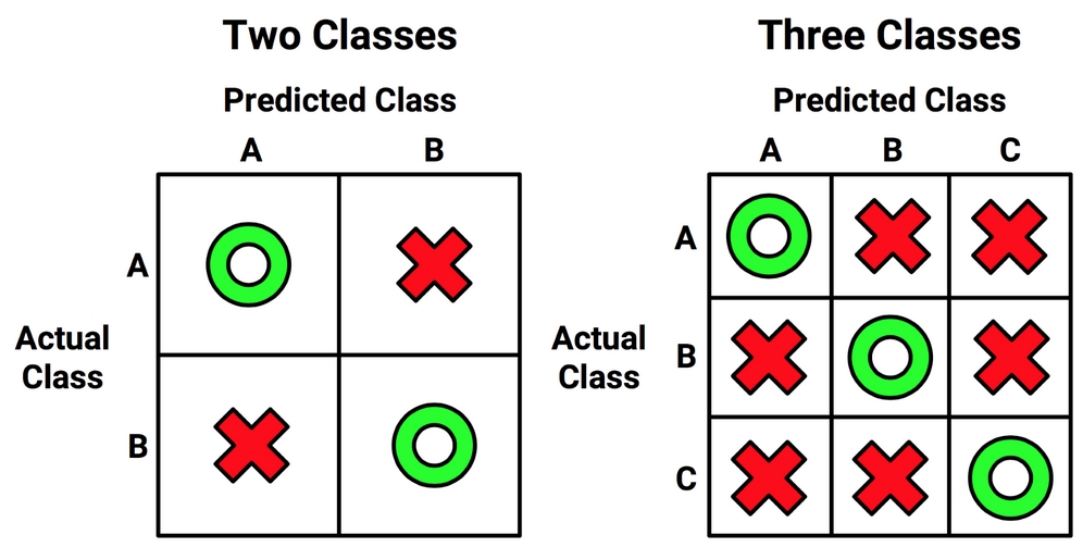
Figure 10.2: Confusion matrices count cases where the predicted class agrees or disagrees with the actual value
The most common performance measures consider the model's ability to discern one class versus all others. The class of interest is known as the positive class, while all others are known as negative.
Tip
The use of the terms positive and negative is not intended to imply any value judgment (that is, good versus bad), nor does it necessarily suggest that the outcome is present or absent (such as birth defect versus none). The choice of the positive outcome can even be arbitrary, as in cases where a model is predicting categories such as sunny versus rainy, or dog versus cat.
The relationship between positive class and negative class predictions can be depicted as a 2x2 confusion matrix that tabulates whether predictions fall into one of four categories:
- True positive (TP): Correctly classified as the class of interest
- True negative (TN): Correctly classified as not the class of interest
- False positive (FP): Incorrectly classified as the class of interest
- False negative (FN): Incorrectly classified as not the class of interest
For the spam classifier, the positive class is spam, as this is the outcome we hope to detect. We then can imagine the confusion matrix as shown in the following diagram:
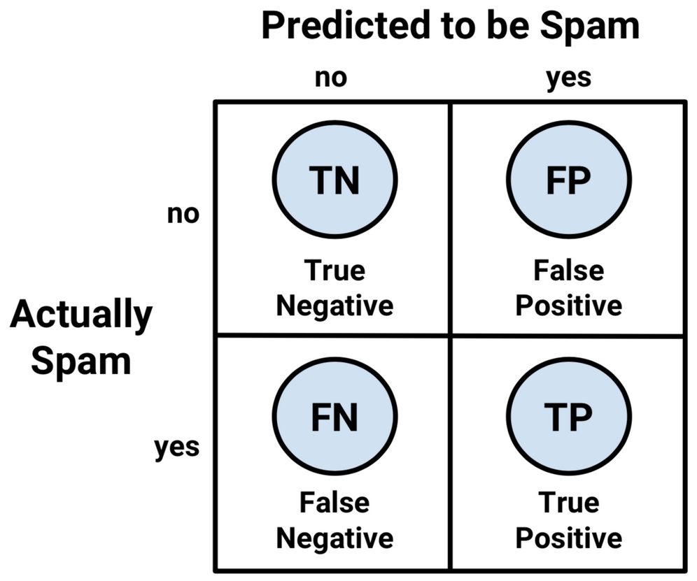
Figure 10.3: Distinguishing between positive and negative classes adds detail to the confusion matrix
The confusion matrix presented in this way is the basis for many of the most important measures of model performance. In the next section, we'll use this matrix to better understand exactly what is meant by accuracy.
With the 2x2 confusion matrix, we can formalize our definition of prediction accuracy (sometimes called the success rate) as:

In this formula, the terms TP, TN, FP, and FN refer to the number of times the model's predictions fell into each of these categories. The accuracy is therefore a proportion that represents the number of true positives and true negatives divided by the total number of predictions.
The error rate, or the proportion of incorrectly classified examples, is specified as:

Notice that the error rate can be calculated as one minus the accuracy. Intuitively, this makes sense; a model that is correct 95 percent of the time is incorrect five percent of the time.
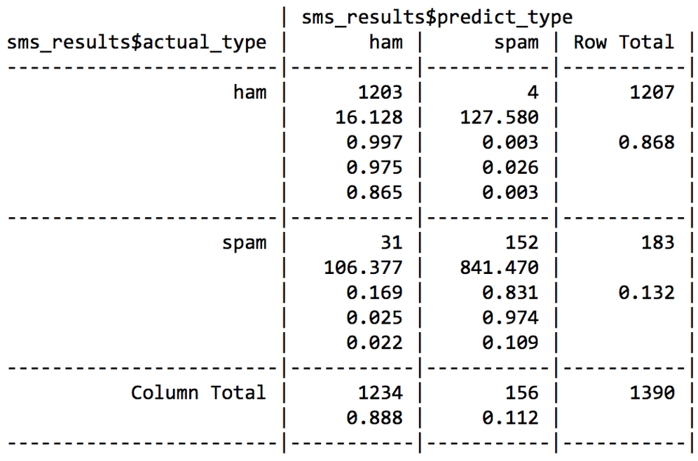
An easy way to tabulate a classifier's predictions into a confusion matrix is to use R's table() function. The command for creating a confusion matrix for the SMS data is shown as follows. The counts in this table could then be used to calculate accuracy and other statistics:
> table(sms_results$actual_type, sms_results$predict_type)

        ham spam
  ham  1203    4
  spam   31  152
If you would like to create a confusion matrix with more informative output, the CrossTable() function in the gmodels package offers a customizable solution. If you recall, we first used this function in Chapter 2, Managing and Understanding Data. If you didn't install the package at that time, you will need to do so using the install.packages("gmodels") command.
By default, the CrossTable() output includes proportions in each cell that indicate the cell count as a percentage of the table's row, column, and overall total counts. The output also includes row and column totals. As shown in the following code, the syntax is similar to the table() function:
> library(gmodels)
> CrossTable(sms_results$actual_type, sms_results$predict_type)
The result is a confusion matrix with a wealth of additional detail:

We've used CrossTable() in several previous chapters, so by now you should be familiar with the output. If you ever forget how to interpret the output, simply refer to the key (labeled Cell Contents), which provides the definition of each number in the table cells.
We can use the confusion matrix to obtain the accuracy and error rate. Since accuracy is (TP + TN) / (TP + TN + FP + FN), we can calculate it as follows:
> (152 + 1203) / (152 + 1203 + 4 + 31)
[1] 0.9748201
We can also calculate the error rate (FP + FN) / (TP + TN + FP + FN) as:
> (4 + 31) / (152 + 1203 + 4 + 31)
[1] 0.02517986
This is the same as one minus accuracy:
> 1 - 0.9748201
[1] 0.0251799
Although these calculations may seem simple, it is important to practice thinking about how the components of the confusion matrix relate to one another. In the next section, you will see how these same pieces can be combined in different ways to create a variety of additional performance measures.
Countless performance measures have been developed and used for specific purposes in disciplines as diverse as medicine, information retrieval, marketing, and signal detection theory, among others. To cover all of them could fill hundreds of pages, which makes a comprehensive description infeasible here. Instead, we'll consider only some of the most useful and most commonly cited measures in machine learning literature.
The Classification and Regression Training package caret by Max Kuhn includes functions for computing many such performance measures. This package provides a large number of tools for preparing, training, evaluating, and visualizing machine learning models and data. In addition to its use here, we will also employ caret extensively in Chapter 11, Improving Model Performance. Before proceeding, you will need to install the package using the install.packages("caret") command.
The caret package adds yet another function to create a confusion matrix. As shown in the following command, the syntax is similar to table(), but with a minor difference. Because caret computes measures of model performance that reflect the ability to classify the positive class, a positive parameter should be specified. In this case, since the SMS classifier is intended to detect spam, we will set positive = "spam" as follows:
> library(caret)
> confusionMatrix(sms_results$predict_type,
    sms_results$actual_type, positive = "spam")
This results in the following output:

At the top of the output is a confusion matrix much like the one produced by the table() function, but transposed. The output also includes a set of performance measures. Some of these, like accuracy, are familiar, while many others are new. Let's take a look at some of the most important metrics.
The kappa statistic (labeled Kappa in the previous output) adjusts accuracy by accounting for the possibility of a correct prediction by chance alone. This is especially important for datasets with severe class imbalance because a classifier can obtain high accuracy simply by always guessing the most frequent class. The kappa statistic will only reward the classifier if it is correct more often than this simplistic strategy.
Kappa values range from zero to a maximum of one, which indicates perfect agreement between the model's predictions and the true values. Values less than one indicate imperfect agreement. Depending on how a model is to be used, the interpretation of the kappa statistic might vary. One common interpretation is shown as follows:
- Poor agreement = less than 0.20
- Fair agreement = 0.20 to 0.40
- Moderate agreement = 0.40 to 0.60
- Good agreement = 0.60 to 0.80
- Very good agreement = 0.80 to 1.00
It's important to note that these categories are subjective. While "good agreement" may be more than adequate for predicting someone's favorite ice cream flavor, "very good agreement" may not suffice if your goal is to identify birth defects.
The following is the formula for calculating the kappa statistic. In this formula, Pr(a) refers to the proportion of actual agreement and Pr(e) refers to the expected agreement between the classifier and the true values, under the assumption that they were chosen at random:

These proportions are easy to obtain from a confusion matrix once you know where to look. Let's consider the confusion matrix for the SMS classification model created with the CrossTable() function, which is repeated here for convenience:
Remember that the bottom value in each cell indicates the proportion of all instances falling into that cell. Therefore, to calculate the observed agreement Pr(a), we simply add the proportion of all instances where the predicted type and actual SMS type agree. Thus, we can calculate Pr(a) as:
> pr_a <- 0.865 + 0.109
> pr_a
[1] 0.974
For this classifier, the observed and actual values agree 97.4 percent of the time—you will note that this is the same as the accuracy. The kappa statistic adjusts the accuracy relative to the expected agreement, Pr(e), which is the probability that chance alone would lead the predicted and actual values to match, under the assumption that both are selected randomly according to the observed proportions.
To find these observed proportions, we can use the probability rules we learned in Chapter 4, Probabilistic Learning – Classification Using Naive Bayes. Assuming two events are independent (meaning one does not affect the other), probability rules note that the probability of both occurring is equal to the product of the probabilities of each one occurring. For instance, we know that the probability of both choosing ham is:
Pr(actual_type is ham) * Pr(predicted_type is ham)
And the probability of both choosing spam is:
Pr(actual_type is spam) * Pr(predicted_type is spam)
The probability that the predicted or actual type is spam or ham can be obtained from the row or column totals. For instance, Pr(actual_type is ham) = 0.868 and Pr(predicted type is ham) = 0.888.
Pr(e) can be calculated as the sum of the probabilities that either the predicted and actual values agree that the message is spam or ham. Recall that for mutually exclusive events (events that cannot happen simultaneously), the probability of either occurring is equal to the sum of their probabilities. Therefore, to obtain the final Pr(e), we simply add both products, as follows:
> pr_e <- 0.868 * 0.888 + 0.132 * 0.112
> pr_e
[1] 0.785568
Since Pr(e) is 0.786, by chance alone we would expect the observed and actual values to agree about 78.6 percent of the time.
This means that we now have all the information needed to complete the kappa formula. Plugging the Pr(a) and Pr(e) values into the kappa formula, we find:
> k <- (pr_a - pr_e) / (1 - pr_e)
> k
[1] 0.8787494
The kappa is about 0.88, which agrees with the previous confusionMatrix() output from caret (the small difference is due to rounding). Using the suggested interpretation, we note that there is very good agreement between the classifier's predictions and the actual values.
There are a couple of R functions to calculate kappa automatically. The Kappa() function (be sure to note the capital "K") in the Visualizing Categorical Data (vcd) package uses a confusion matrix of predicted and actual values. After installing the package by typing install.packages("vcd"), the following commands can be used to obtain kappa:
> Kappa(table(sms_results$actual_type, sms_results$predict_type))
               value        ASE
Unweighted 0.8825203 0.01949315
Weighted   0.8825203 0.01949315
We're interested in the unweighted kappa. The value of 0.88 matches what we computed by hand.
Tip
The weighted kappa is used when there are varying degrees of agreement. For example, using a scale of cold, cool, warm, and hot, a value of warm agrees more with hot than it does with the value of cold. In the case of a two-outcome event, such as spam and ham, the weighted and unweighted kappa statistics will be identical.
The kappa2() function in the Interrater Reliability (irr) package can be used to calculate kappa from vectors of predicted and actual values stored in a data frame. After installing the package using install.packages("irr"), the following commands can be used to obtain kappa:
> kappa2(sms_results[1:2])
 Cohen's Kappa for 2 Raters (Weights: unweighted)

 Subjects = 1390
   Raters = 2
    Kappa = 0.883

        z = 33
  p-value = 0
The Kappa() and kappa2() functions report the same kappa statistic, so use whichever option you are more comfortable with.
Finding a useful classifier often involves a balance between predictions that are overly conservative and overly aggressive. For example, an email filter could guarantee to eliminate every spam message by aggressively eliminating nearly every ham message. On the other hand, to guarantee that no ham messages will be inadvertently filtered might require us to allow an unacceptable amount of spam to pass through the filter. A pair of performance measures captures this tradeoff: sensitivity and specificity.
The sensitivity of a model (also called the true positive rate), measures the proportion of positive examples that were correctly classified. Therefore, as shown in the following formula, it is calculated as the number of true positives divided by the total number of positives, both those correctly classified (the true positives), as well as those incorrectly classified (the false negatives):
The specificity of a model (also called the true negative rate), measures the proportion of negative examples that were correctly classified. As with sensitivity, this is computed as the number of true negatives divided by the total number of negatives—the true negatives plus the false positives.
Given the confusion matrix for the SMS classifier, we can easily calculate these measures by hand. Assuming that spam is the positive class, we can confirm that the numbers in the confusionMatrix() output are correct. For example, the calculation for sensitivity is:
> sens <- 152 / (152 + 31)
> sens
[1] 0.8306011
Similarly, for specificity we can calculate:
> spec <- 1203 / (1203 + 4)
> spec
[1] 0.996686
The caret package provides functions for calculating sensitivity and specificity directly from vectors of predicted and actual values. Be careful to specify the positive or negative parameter appropriately, as shown in the following lines:
> library(caret)
> sensitivity(sms_results$predict_type, sms_results$actual_type,
              positive = "spam")
[1] 0.8306011

> specificity(sms_results$predict_type, sms_results$actual_type,
              negative = "ham")
[1] 0.996686
Sensitivity and specificity range from zero to one, with values close to one being more desirable. Of course, it is important to find an appropriate balance between the two—a task that is often quite context-specific.
For example, in this case, the sensitivity of 0.831 implies that 83.1 percent of the spam messages were correctly classified. Similarly, the specificity of 0.997 implies that 99.7 percent of non-spam messages were correctly classified, or alternatively, 0.3 percent of valid messages were rejected as spam. The idea of rejecting 0.3 percent of valid SMS messages may be unacceptable, or it may be a reasonable tradeoff given the reduction in spam.
Sensitivity and specificity provide tools for thinking about such tradeoffs. Typically, changes are made to the model and different models are tested until you find one that meets a desired sensitivity and specificity threshold. Visualizations, such as those discussed later in this chapter, can also assist with understanding the balance between sensitivity and specificity.
Closely related to sensitivity and specificity are two other performance measures related to compromises made in classification: precision and recall. Used primarily in the context of information retrieval, these statistics are intended to indicate how interesting and relevant a model's results are, or whether the predictions are diluted by meaningless noise.
The precision (also known as the positive predictive value) is defined as the proportion of positive examples that are truly positive; in other words, when a model predicts the positive class, how often is it correct? A precise model will only predict the positive class in cases very likely to be positive. It will be very trustworthy.
Consider what would happen if the model was very imprecise. Over time, the results would be less likely to be trusted. In the context of information retrieval, this would be similar to a search engine such as Google returning unrelated results. Eventually, users would switch to a competitor like Bing. In the case of the SMS spam filter, high precision means that the model is able to carefully target only the spam while ignoring the ham.

On the other hand, recall is a measure of how complete the results are. As shown in the following formula, this is defined as the number of true positives over the total number of positives. You may have already recognized this as the same as sensitivity; however, the interpretation differs slightly.
A model with high recall captures a large portion of the positive examples, meaning that it has wide breadth. For example, a search engine with high recall returns a large number of documents pertinent to the search query. Similarly, the SMS spam filter has high recall if the majority of spam messages are correctly identified.

We can calculate precision and recall from the confusion matrix. Again, assuming that spam is the positive class, the precision is:
> prec <- 152 / (152 + 4)
> prec
[1] 0.974359
And the recall is:
> rec <- 152 / (152 + 31)
> rec
[1] 0.8306011
The caret package can be used to compute either of these measures from vectors of predicted and actual classes. Precision uses the posPredValue() function:
> library(caret)
> posPredValue(sms_results$predict_type, sms_results$actual_type,
               positive = "spam")
[1] 0.974359
Recall uses the sensitivity() function that we used earlier:
> sensitivity(sms_results$predict_type, sms_results$actual_type,
              positive = "spam")
[1] 0.8306011
Similar to the inherent tradeoff between sensitivity and specificity, for most real-world problems, it is difficult to build a model with both high precision and high recall. It is easy to be precise if you target only the low-hanging fruit—the easy-to-classify examples. Similarly, it is easy for a model to have high recall by casting a very wide net, meaning that the model is overly aggressive at identifying the positive cases. In contrast, having both high precision and recall at the same time is very challenging. It is therefore important to test a variety of models in order to find the combination of precision and recall that meets the needs of your project.
A measure of model performance that combines precision and recall into a single number is known as the F-measure (also sometimes called the F1 score or the F-score). The F-measure combines precision and recall using the harmonic mean, a type of average that is used for rates of change. The harmonic mean is used rather than the more common arithmetic mean since both precision and recall are expressed as proportions between zero and one, which can be interpreted as rates. The following is the formula for the F-measure:
To calculate the F-measure, use the precision and recall values computed previously:
> f <- (2 * prec * rec) / (prec + rec)
> f
[1] 0.8967552
This comes out exactly the same as using the counts from the confusion matrix:
> f <- (2 * 152) / (2 * 152 + 4 + 31)
> f
[1] 0.8967552
Since the F-measure describes model performance in a single number, it provides a convenient way to compare several models side-by-side. However, this assumes that equal weight should be assigned to precision and recall, an assumption that is not always valid. It is possible to calculate F-scores using different weights for precision and recall, but choosing the weights can be tricky at best and arbitrary at worst. A better practice is to use measures such as the F-score in combination with methods that consider a model's strengths and weaknesses more globally, such as those described in the next section.
Visualizations are helpful for understanding the performance of machine learning algorithms in greater detail. Where statistics such as sensitivity and specificity, or precision and recall, attempt to boil model performance down to a single number, visualizations depict how a learner performs across a wide range of conditions.
Because learning algorithms have different biases, it is possible that two models with similar accuracy could have drastic differences in how they achieve their accuracy. Some models may struggle with certain predictions that others make with ease, while breezing through cases that others cannot get right. Visualizations provide a method for understanding these tradeoffs by comparing learners side-by-side in a single chart.
The receiver operating characteristic (ROC) curve is commonly used to examine the tradeoff between the detection of true positives while avoiding the false positives. As you might suspect from the name, ROC curves were developed by engineers in the field of communications. Around the time of World War II, radar and radio operators used ROC curves to measure a receiver's ability to discriminate between true signals and false alarms. The same technique is useful today for visualizing the efficacy of machine learning models.
The characteristics of a typical ROC diagram are depicted in the following plot. The figure is drawn using the proportion of true positives on the vertical axis and the proportion of false positives on the horizontal axis. Because these values are equivalent to sensitivity and (1 – specificity) respectively, the diagram is also known as a sensitivity/specificity plot.
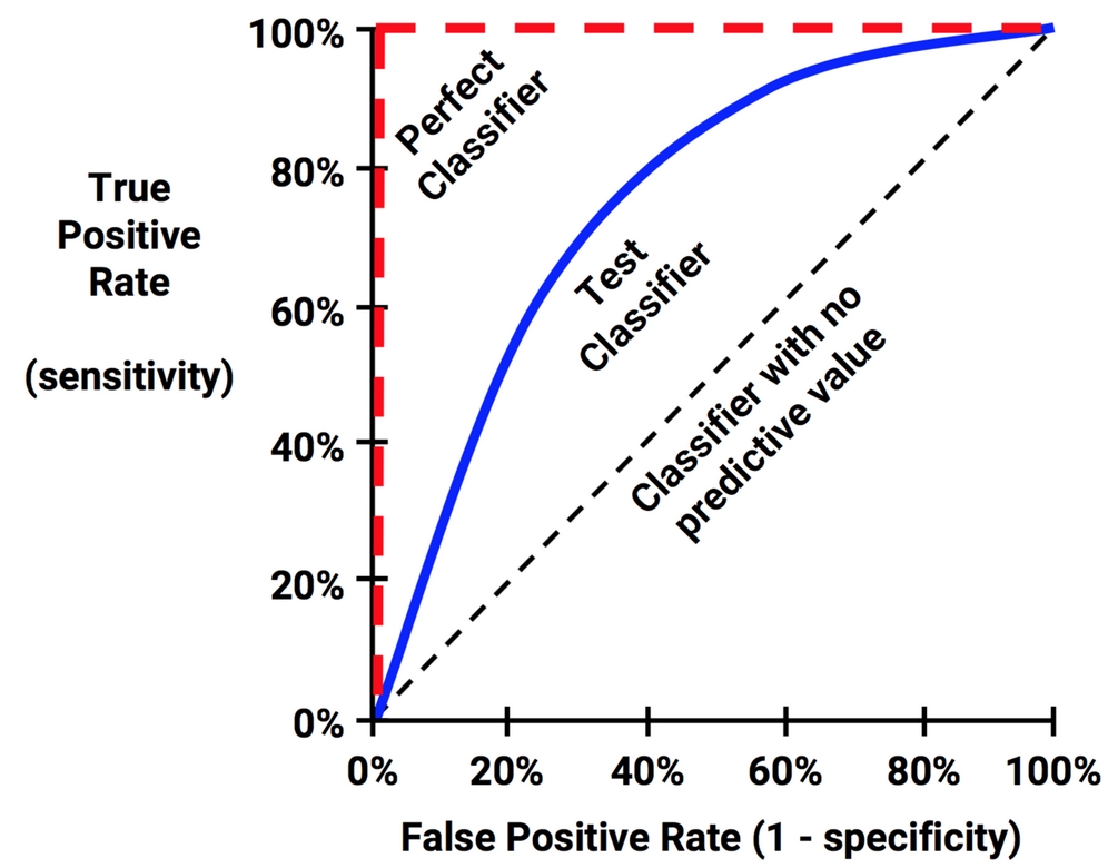
Figure 10.4: The ROC curve depicts classifier shapes relative to perfect and useless classifiers
The points comprising ROC curves indicate the true positive rate at varying false positive thresholds. To create the curves, a classifier's predictions are sorted by the model's estimated probability of the positive class, with the largest values first. Beginning at the origin, each prediction's impact on the true positive rate and false positive rate will result in a curve tracing vertically (for a correct prediction) or horizontally (for an incorrect prediction).
To illustrate this concept, three hypothetical classifiers are contrasted in the previous plot. First, the diagonal line from the bottom-left to the top-right corner of the diagram represents a classifier with no predictive value. This type of classifier detects true positives and false positives at exactly the same rate, implying that the classifier cannot discriminate between the two. This is the baseline by which other classifiers may be judged. ROC curves falling close to this line indicate models that are not very useful. Similarly, the perfect classifier has a curve that passes through the point at 100 percent true positive rate and zero percent false positive rate. It is able to correctly identify all of the true positives before it incorrectly classifies any negative result. Most real-world classifiers are similar to the test classifier in that they fall somewhere in the zone between perfect and useless.
The closer the curve is to the perfect classifier, the better it is at identifying positive values. This can be measured using a statistic known as the area under the ROC curve (AUC). The AUC treats the ROC diagram as a two-dimensional square and measures the total area under the ROC curve. AUC ranges from 0.5 (for a classifier with no predictive value), to 1.0 (for a perfect classifier). A convention for interpreting AUC scores uses a system similar to academic letter grades:
- A: Outstanding = 0.9 to 1.0
- B: Excellent/Good = 0.8 to 0.9
- C: Acceptable/Fair = 0.7 to 0.8
- D: Poor = 0.6 to 0.7
- E: No Discrimination = 0.5 to 0.6
As with most scales like this, the levels may work better for some tasks than others; the categorization is somewhat subjective.
As illustrated by the following figure, it's also worth noting that two ROC curves may be shaped very differently, yet have identical AUC. For this reason, AUC alone is insufficient to identify a "best" model. The safest practice is to use AUC in combination with qualitative examination of the ROC curve.
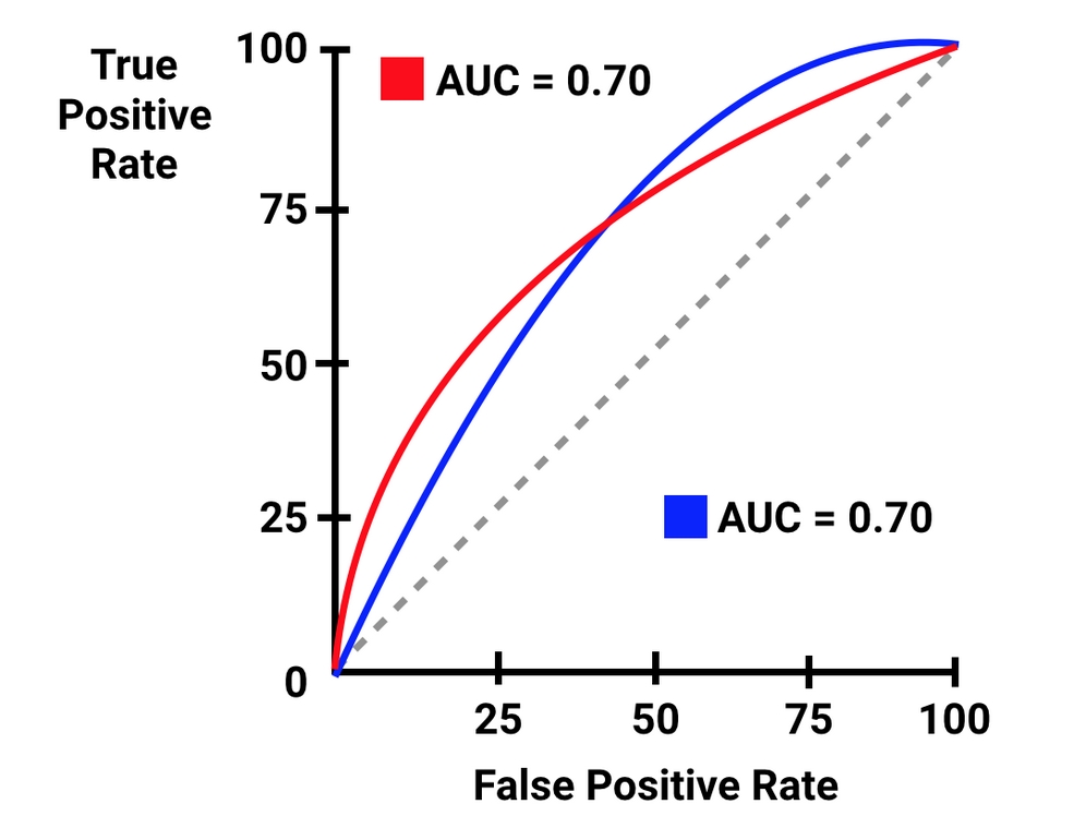
Figure 10.5: ROC curves may have different performance despite having the same AUC
The pROC package provides an easy-to-use set of functions for creating ROC curves and computing AUC. The pROC website at https://web.expasy.org/pROC/ includes a list of the full set of features, as well as several examples of the visualization capabilities. Before continuing, be sure that you have installed the package using the install.packages("pROC") command.
To create visualizations with pROC, two vectors of data are needed. The first must contain the estimated probability of the positive class and the second must contain the predicted class values. For the SMS classifier, we'll supply estimated spam probabilities and the actual class labels to the roc() function as follows:
> library(pROC)
> sms_roc <- roc(sms_results$prob_spam, sms_results$actual_type)
Using the sms_roc object, we can visualize the ROC curve with R's plot() function. As shown in the following code lines, many of the standard parameters for adjusting the visualization can be used, such as main (for adding a title), col (for changing the line color), and lwd (for adjusting the line width). The legacy.axes parameter instructs pROC to use an x axis of 1 – specificity, which is a popular convention:
> plot(sms_roc, main = "ROC curve for SMS spam filter",
         col = "blue", lwd = 2, legacy.axes = TRUE)
The end result is a ROC plot with a diagonal reference line representing a baseline classifier with no predictive value:

Figure 10.6: The ROC curve for the Naive Bayes SMS classifier
Qualitatively, we can see that this ROC curve appears to occupy the space in the top-left corner of the diagram, which suggests that it is closer to a perfect classifier than the dashed line representing a useless classifier.
To compare this model's performance to other models making predictions on the same dataset, we can add additional ROC curves to the same plot. Suppose that we had also trained a k-NN model on the SMS data using the knn() function described in Chapter 3, Lazy Learning – Classification Using Nearest Neighbors. Using this model, the predicted probabilities of spam were computed for each record in the test set and saved to a CSV file, which we can load here. After loading the file, we'll apply the roc() function as before to compute the ROC curve, then use the plot() function with the parameter add = TRUE to add the curve to the previous plot:
> sms_results_knn <- read.csv("sms_results_knn.csv")
> sms_roc_knn <- roc(sms_results$actual_type,
                       sms_results_knn$p_spam)
> plot(sms_roc_knn, col = "red", lwd = 2, add = TRUE)
The resulting visualization has a second curve depicting the performance of the k-NN model making predictions on the same test set as the Naive Bayes model. The curve for k-NN is consistently lower, suggesting that it is a consistently worse model than the Naive Bayes approach:
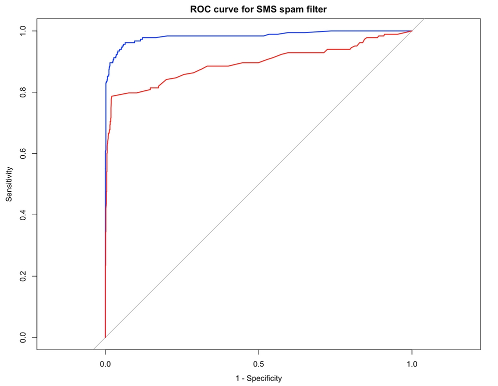
Figure 10.7: ROC curves comparing Naive Bayes (topmost curve) and k-NN performance on the SMS test set
To confirm this quantitatively, we can use the pROC package to calculate the AUC. To do so, we simply apply the package's auc() function to the sms_roc object for each model, as shown in the following code:
> auc(sms_roc)
Area under the curve: 0.9836
> auc(sms_roc_knn)
Area under the curve: 0.8942
The AUC for the Naive Bayes SMS classifier is 0.98, which is extremely high and substantially better than the k-NN classifier's AUC of 0.89. But how do we know whether the model is just as likely to perform well on another dataset, or whether the difference is greater than expected by chance alone? In order to answer such questions, we need to better understand how far we can extrapolate a model's predictions beyond the test data.
Tip
This was mentioned before, but is worth repeating: the AUC value alone is often insufficient to identify a "best" model. In this example, AUC does identify the better model because the ROC curves do not intersect. In other cases, the "best" model will depend on how the model will be used. When the ROC curves do intersect, it is possible to combine them into even stronger models using techniques covered in Chapter 11, Improving Model Performance.