
8
Build an Adaptive, Responsive Note-Taking Application with Flutter and Dart Frog
Flutter is a multiplatform framework, which means that we are not just limited to one platform or a handful of screen sizes. To truly maximize the potential of Flutter, our application must adapt to being used on different platforms and respond to being used in different screen sizes.
In this chapter, we will learn how to leverage layout widgets such as MediaQuery and ConstrainedBox (just to name a few) to build a responsive and adaptive application. We will create a note-taking application like Google Keep, where users can create and edit notes and view them as a list, and demonstrate responsive and adaptive design by having the application’s UI change depending on the platform being either mobile or desktop.
So, first we will learn about the differences between responsive and adaptive layouts. Then, we will enhance our application to be responsive. Next, we will enhance our application to be adaptive. Finally, we add a backend API for our application and refactor the application to use the backend API rather than local data.
In this chapter, we’ll cover the following topics:
- An introduction to responsiveness and adaptiveness
- Making an app responsive
- Making an application adaptive
- Creating REST endpoints for the Notes application
Technical requirements
Make sure to have your Flutter environment updated to the latest version in the stable channel. Clone our repository and use your favorite IDE to open the Flutter project we’ve built at chapter_8/start.
The project that we’ll build upon in this chapter can be found on GitHub: https://github.com/PacktPublishing/Cross-Platform-UIs-with-Flutter/tree/main/chapter_8/start
The complete source code can be found on GitHub as well: https://github.com/PacktPublishing/Cross-Platform-UIs-with-Flutter/tree/main/chapter_8/step_5.
Let’s set up the project so that we can start to explore how to build responsive Flutter applications.
Setting up the project
In this chapter, we will learn how to use Flutter’s layout widgets and APIs to build a responsive, adaptive Notes application that allows us to create, edit, and delete notes.
When finished, the resulting application on your mobile should mirror Figure 8.1:

Figure 8.1 – The Notes application running on a mobile platform
And if you view the application on your desktop, it should mirror Figure 8.2:

Figure 8.2 – Notes application running on a desktop platform
In Figure 8.1, we see the notes application when running on a mobile platform. In Figure 8.2, we see the same application running on a desktop platform. Notice the following differences:
- The mobile list view renders as a vertical single-column list, while the desktop list view renders as a multi-column grid.
- FloatingActionButton floats in a mobile view and is docked in AppBar in the desktop view.
- Dimensions such as padding are changed depending on the layout of the application.
We will start with an example that already includes the views to view, create, and edit notes. The application uses Equatable, Dio, and Riverpod as dependencies for equality, HTTP requests, and caching and dependency injection respectively. It keeps track of a list of notes locally. After an overview of responsive and adaptive design, we will use responsive mechanisms to allow the application to respond to different screen sizes. Then we will use adaptive mechanisms to allow the application to adapt to different platforms. Finally, we will conclude the chapter by replacing the local data with a backend API.
After downloading the initial application from GitHub, we can start by moving into its root directory and running the flutter pub get command from the terminal. This will install any package dependencies that the application needs. Additionally, opening the project in an IDE will also trigger an installation of the project on initial load and when the pubspec.yaml file is updated.
Install the project’s dependencies by using the flutter pub get command from the project’s root, and after installing the application’s dependencies, execute the flutter run command from the same terminal window and view the project either in your browser or on your currently running emulator.

Figure 8.3 – The starting application
In the left-hand screenshot in Figure 8.3, note that the application renders a list of notes on the initial screen. Upon pressing the Add note button the application redirects to a form that can be used to create a note. Tapping on an existing note from the initial screen will redirect to the same form but to edit the existing note.
When viewing the application in your IDE, you should observe the following file structure:
notes_app
    lib
    |-- src:
       |-- data
       |-- localization
       |-- ui
          |-- notes
       |-- app.dart
    |-- main.dart
packages
    notes_common
        lib
        |-- notes_common.dart
Let’s briefly explore the purpose of each top-level folder/class:
- notes_app: The project for the Notes frontend application.
- src: The source folder contains implementation details of our application that, unless exposed, will be hidden from consumers.
- data: This folder includes any reusable business logic for our application. In this case, it includes the NoteFacade service that we will use in our views and our controllers.
- ui: The folder that includes all the presentational components of our application. This can include controllers and widgets.
- note: The folder that includes all the presentational components, controllers, and providers associated with notes.
- app.dart: The widget that initializes the basic theming and routing of the application.
- main.dart: The entry point of the application.
- packages/notes_common: The project for any reusable components across the frontend and backend.
For now, notes_common will only be used in the frontend application, but we will be adding a backend in a later section.
Hopefully, you should notice some similar patterns to previous chapters, such as defining providers for dependency and state management, creating a class to handle application routing, and project organization.
Now let’s explore the features of the Flutter framework that enable us to build responsive and adaptive applications.
Introduction to responsiveness and adaptiveness
In Flutter you will commonly hear the terms adaptive and responsive when referring to building applications. While these terms are both related to layout, they have very different meanings:
- Responsive design refers to adjusting the layout of the application for the available screen size.
- Adaptive design refers to adjusting the behavior, layout, and even the UI of the application for the platform or device type in use, such as mobile, desktop, or web.
An application can be responsive without being adaptive, or adaptive without being responsive. Alternatively, an application can be neither. We have all opened a fair share of applications that, regardless of the device, still look and behave like mobile applications. The starter version of our Notes application does just that.
Run flutter run -d {platform} from the notes_app folder, substituting {platform} for the desktop platform that you are developing on. Even though you are running in a desktop environment, note that the application looks like a giant phone application.

Figure 8.4 – The Notes list view in a desktop environment
Figure 8.4 shows a list view with all the pre-generated notes in giant tiles. The call-to-action button to add a new note is in the lower right corner of the application, an odd position for a desktop environment, and the button in AppBar has an unusually large splash radius.
The application is currently being displayed in a mobile-first layout. As the term suggests, mobile-first denotes that the application is built for mobile devices first.
The note creation page is not much better:
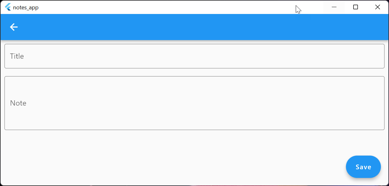
Figure 8.5 – The Notes creation page viewed in a desktop environment
Like the notes cards in Figure 8.4, the form in Figure 8.5 grows to fill the entire application window. While this design is perfectly reasonable on a mobile device, it can create bad user experiences in a browser or desktop environment.
Instead, we would like our application to adapt to make the most of screen real estate and the environment in which it is running. This is where the responsive and adaptive APIs and widgets of Flutter come in handy; they allow you to create applications that can adapt to the device’s environment, screen size, and orientation.
Now we should have a clearer understanding of the differences and uses of adaptive and responsive design. Next, let’s learn to make the Notes application responsive using Flutter APIs and widgets.
Making an app responsive
Hopefully, the previous section demonstrated the importance of building applications that can look nice no matter what environment they are running in, especially when using a multiplatform framework such as Flutter. Now let’s explore how to make the Notes frontend application responsive, allowing us to adjust the layout of the application for the available screen size.
Take a look at the Notes application running on the desktop. If you resize the window, you’ll notice that regardless of the size of the window, the grid view remains two-column. While this is fine for a mobile or tablet device, on a large screen we are wasting screen real estate. Instead, we will use the ScreenType enum defined in utils/screen_type.dart to decide how many rows to display. Open that file and examine its contents:
enum ScreenType {
  desktop._(minWidth: 901),
  tablet._(minWidth: 601, maxWidth: 900),
  handset._(maxWidth: 600);
  const ScreenType._({
    this.minWidth,
    this.maxWidth,
  });
  factory ScreenType.fromSize(double deviceWidth) {
    if (deviceWidth > ScreenType.tablet.maxWidth!) return
      ScreenType.desktop;
    if (deviceWidth > ScreenType.handset.minWidth!) return
      ScreenType.tablet;
    return ScreenType.handset;
  }
  final int? minWidth;
  final int? maxWidth;
}
The previous code does the following:
- Defines three screen types with optional minimum and maximum widths: desktop, tablet, and handset
- Defines a factory function to compute the screen type from the device width
Now let’s use these values to determine how many grid columns to display. Open up the notes_list_view.dart file and append the following code to the block that returns StaggeredGrid:
 if (layout == Layout.grid) {
     final screenSize =
       MediaQuery.of(context).size.shortestSide;
     final crossAxisCount = min(
       (screenSize / ScreenType.handset.minWidth!).floor(),
        4);
     //...
 }
In this code, we grab the screen size of the application and then compute the grid column count by dividing it by the minimum width of a handset, choosing the minimum of that value or 4. This will ensure that our grid column count never grows beyond 4. Refresh the app and observe that resizing the window changes the row count, mirroring Figure 8.6.

Figure 8.6 – A non-responsive Notes list view
Figure 8.6 shows the application with three rows when the screen width is larger than 900 pixels.
Also note that once the application reaches a size where four columns can be supported, the columns just continue to grow to match the window size. We would prefer the windows to max out at a certain width. Fortunately, we can use the ConstrainedBox widget to accomplish this by passing it a maxWidth constraint. Wrap StaggeredGrid with ConstrainedBox using the following code:
 return ConstrainedBox(
     constraints: const BoxConstraints(maxWidth: 1200),
     child: StaggeredGrid.count(
         //...
     ),
 );
In this code, we give ConstrainedBox a maxWidth constraint of 1200 pixels. This is the equivalent of telling the StaggeredGrid to stop growing in width once it has reached 1200 pixels. Rerun the application, and you should now see that at a certain width, the StaggeredGrid remains centered, mirroring Figure 8.7.

Figure 8.7 – A responsive Notes list view
As displayed in Figure 8.7, no matter how large the application grows, the grid will not increase in size.
Now that we have an understanding of how to use different implicit animations we can learn how to utilize even more high-level widgets to elicit more robust implicit animations.
Making an app adaptive
Now that we have learned how to build responsive applications, adjusting the layout of the Notes application for the available screen size, let’s switch focus to making our application adaptive.
Recall that adaptive design refers to adjusting the behavior, layout, and even the UI of the application to the platform or device type in use, such as mobile, desktop, or web. For examples of adaptive widgets that already exist, look no further than Flutter’s Material framework. A tooltip, for example, has very different behavior depending on the platform that it is rendered.
A tooltip is a widget that enhances another visual element with additional information while maintaining a minimal interface. In environments that support a mouse as an input, the Material tooltip’s default behavior is to display itself when its target is hovered and dismiss itself when that same target exits a hover state.
In touch-enabled environments or when a mouse is not present, the default behavior of the tooltip is to display itself when its target is in a long-pressed state and dismiss itself when that target exits a long-pressed state.
In Flutter, we can make our own adaptive components by checking the platform that the application is currently running on. Open the device.dart file in the notes_app project. Observe the following code:
import 'dart:io';
import 'package:flutter/foundation.dart';
bool get isMobileDevice => !kIsWeb && (Platform.isIOS || Platform.isAndroid);
bool get isDesktopDevice =>
    !kIsWeb && (Platform.isMacOS || Platform.isWindows ||
                Platform.isLinux);
bool get isMobileDeviceOrWeb => kIsWeb || isMobileDevice;
bool get isDesktopDeviceOrWeb => kIsWeb || isDesktopDevice;
Here we have created several helper variables that we can use throughout the application:
- isMobileDevice will check whether the application is running on a mobile device such as iOS or Android.
- isDesktopDevice will check whether the application is running on a desktop device such as Windows.
- isMobileDeviceOrWeb will check whether the application is running on a mobile device or in the browser.
- isDesktopDeviceOrWeb will check whether the application is running on a desktop device or in the browser.
Let’s start by changing the default orientation of the Notes list page to be a vertical list when the application is running on a mobile device and a staggered grid for all other platforms. Change layoutProviderProvider to the following code:
final layoutProviderProvider = StateProvider<Layout>((ref) {
  return isMobileDevice ? Layout.list : Layout.grid;
});
Here we are using the isMobileDevice global variable to alter the default layout. Upon refreshing the application, we should see a different layout on each platform, matching Figure 8.8.

Figure 8.8 – An adaptive notes list view
Next, let’s change the location of FloatingActionButton to be docked in AppBar when the application is running on a desktop device or in the browser. Inside of notes_list_view.dart add the following code to the Scaffold widget:
    return Scaffold(
      //...
      floatingActionButton: Padding(
        padding: isDesktopDeviceOrWeb
            ? const EdgeInsets.only(right: 12)
            : EdgeInsets.zero,
        child: FloatingActionButton.extended(
          elevation: 0,
          onPressed: () {
            appRouter.pushNamed(
              NoteDetailsView.routeNameCreate);
          },
          label: const Text('Add note'),
        ),
      ),
      floatingActionButtonLocation: isMobileDeviceOrWeb
          ? FloatingActionButtonLocation.endFloat
          : FloatingActionButtonLocation.endTop,
      //...
);- Adds FloatingActionButton that will navigate to the note creation view when pressed
- Changes the positioning of FloatingActionButton based on whether the app is running on a mobile device or the web
Now run the code targeting desktop environments and you should observe how the application displays differently in each environment.

Figure 8.9 – An adaptive notes list view
Figure 8.9 displays a mobile version of the application where the FloatingActionButton is displayed in the bottom right corner and a desktop version where the FloatingActionButton is docked in AppBar. If you hover over the menu action button in a desktop environment, you can see that it has an unnecessarily large splash radius. Let’s tweak this behavior to be exclusive to the mobile platform by updating AppBar with the following code:
      appBar: AppBar(
        title: const Text('Notes'),
        actions: [
          Consumer(builder: (context, ref, _) {
            final layout =
                ref.watch(layoutProviderProvider);
            final iconData =
                layout == Layout.grid ? Icons.grid_view :
                    Icons.view_stream;
            return IconButton(
              splashRadius: isDesktopDeviceOrWeb ? 16 :
                  null,
              icon: Icon(iconData),
              onPressed: () {
                final newLayout =
                    layout == Layout.grid ? Layout.list :
                      Layout.grid;
                ref.read(layoutProviderProvider.notifier)
                  .state = newLayout;
              },
            );
          }),
        ],
      ),
With the preceding code, we will display a much smaller splash radius in a desktop environment or web environment where the user is likely to be be using a mouse for input.
Next, let’s make similar enhancements to the form for creating notes. Open up note_form.dart and add the following code to Scaffold:
    return Scaffold(
      //...
      floatingActionButtonLocation: isMobileDeviceOrWeb
          ? FloatingActionButtonLocation.endFloat
          : FloatingActionButtonLocation.endTop,
      //...
    );
This code will also change the position of FloatingActionButton. Additionally, we should add some spacing to account for the button when it is docked in the AppBar. Add the following code to the ListView widget:
            padding: isDesktopDeviceOrWeb
                ? const EdgeInsets.only(left: 12,
                                        right: 12, top: 26)
                : const EdgeInsets.all(12),
Upon re-running the application and navigating to the Notes Create or Edit page, we should see results matching Figure 8.10.

Figure 8.10 – An adaptive Notes edit/create view
Finally, let’s restrict the size of the form using a ConstrainedBox and by adding alignment using the Align widget. Wrap ListView with the following code:
        child: Align(
          alignment: Alignment.topCenter,
          child: ConstrainedBox(
            constraints: const BoxConstraints(
              maxHeight: 420,
              maxWidth: 720,
            ),
            child: ListView(
             //...
            ),
          ),
        ),
The previous code does the following:
- Aligns the form at the top and center of the body of Scaffold
- Constrains the width of the form to not increase past 720 pixels
- Constrains the height of the form to not increase past 420 pixels
Upon rerunning the application, we should now see a much better design for desktop and web, matching Figure 8.11.

Figure 8.11 – An adaptive Notes create/edit view
Now that we have learned how to leverage Flutter’s adaptive mechanisms to create an application that adapts to its environment, let’s wrap up this chapter by creating a backend for the Notes application.
Creating REST endpoints for the Notes application
Up until this chapter, we have mainly relied on free third-party APIs when building out our Flutter applications. Unfortunately, as developers, we won’t always be able to rely on open APIs or a backend team to build the services we need. Fortunately, the Dart language is just as capable of building APIs as it is for building Flutter applications. In this section, we will wrap up our Notes application by building our own backend API.
To build our API, we will be using dart_frog, a fast and minimalistic framework that is heavily inspired by Node.js and Next.js and allows developers to build backends in Dart. Start by installing dart_frog globally using the following command:
dart pub global activate dart_frog_cli
Once the command is finished running, we are ready to create our project. Run the following command at the root of the project, a level above the application:
dart_frog create notes_api
After running this command, we should see a new folder called notes_api that contains our backend code. When viewing the application in your IDE, you should observe the following file structure:
routes
|-- index.dart
test
|-- routes
   |-- index_test.dart
Let’s briefly explore the purpose of each top-level folder/class:
- routes: The source folder contains routes for the API.
- index.dart: A pre-generated API route.
- test: The folder that includes all of the tests for the API.
In Dart Frog, a route is made by creating a .dart file in the routes directory that exports a route handler onRequest function. Open the index.dart file and you should see the following code:
import 'package:dart_frog/dart_frog.dart';
Response onRequest(RequestContext context) {
  return Response(body: 'Welcome to Dart Frog!');
}
This example route merely returns a welcome message when queried. Now let’s start the API by running dart_frog dev in the folder. After the script is finished running, navigate to http://localhost:8080 in the browser. We should see a welcome message once the page is finished loading, mirroring Figure 8.12.

Figure 8.12 – The initial API response
Before creating routes for our API, let's first migrate our mock data to the backend. Create a data folder and add a notes.dart file to it with the following code:
import 'package:faker/faker.dart';
import 'package:notes_common/notes_common.dart';
List<Note> notes = List.generate(
  10,
  (index) => Note(
    id: index.toString(),
    title: _faker.lorem.sentence(),
    content: _faker.lorem.sentences(5).join(' '),
  ),
);
final _faker = Faker();
In the previous code, we are generating 10 notes with random data. We will use this notes list in the routes that we are about to create.
Next, let’s add a route to return our notes. Create a notes directory in the routes folder and add an index.dart file with the following code:
import 'package:dart_frog/dart_frog.dart';
import 'package:notes_common/notes_common.dart';
import '../../data/notes.dart';
Future<Response> onRequest(RequestContext context) async {
  switch (context.request.method) {
    case HttpMethod.get:
      return _handleGet(context);
    case HttpMethod.post:
      return _handlePost(context);
    // ignore: no_default_cases
    default:
      return Response(statusCode: 404);
  }
}
This code does the following:
- Forwards all GET requests to the _handleGet function
- Forwards all POST requests to the _handlePost function
- Returns a 404 error in any other case, denoting that the route could not be handled
Now add the missing functions to the file with the following code:
Response _handleGet(RequestContext context) {
  return Response.json(
    body: notes.map((e) => e.toMap()).toList(),
  );
}
Future<Response> _handlePost(RequestContext context) async {
  final body = await context.request.json();
  final note = Note.fromMap(body).copyWith(id:
      (notes.length + 1).toString());
  notes = [...notes, note];
  return Response.json(
    body: note.toMap(),
  );
}
In this code, the _handleGet function will return all our notes in the response after converting them to JSON. The _handlePost function will retrieve the JSON payload from the request, create a new note and add it to our list of notes, and then return the newly created note in the response, also converting it to JSON.
We are still missing the ability to delete and edit notes. In both cases, we would like to include the unique identifier of the note in the URL of the API request. Fortunately, Dart Frog supports path parameters by using dynamic routes, using the convention of creating the filename with brackets around the parameter. Create a file in the notes folder called [id].dart. Now the onRequest route handler will be provided with an extra path parameter for the note’s unique identifier. Open the file and add the following code:
import 'package:dart_frog/dart_frog.dart';
import 'package:notes_common/notes_common.dart';
import '../../data/notes.dart';
Future<Response> onRequest(RequestContext context, String id) async {
  switch (context.request.method) {
    case HttpMethod.put:
      return _handlePut(context, id);
    case HttpMethod.delete:
      return _handleDelete(context, id);
    // ignore: no_default_cases
    default:
      return Response(statusCode: 404);
  }
}
This code should look very similar to the first route handler that we defined:
- Forwards all PUT requests to the _handlePut function
- Forwards all DELETE requests to the _handleDelete function
- Returns a 404 in any other case
Now add the missing functions to the file with the following code:
Future<Response> _handlePut(RequestContext context, String id) async {
  final body = await context.request.json();
  final note = Note.fromMap(body).copyWith(id: id);
  notes = notes.map((e) => e.id == note.id ? note :
      e).toList();
  return Response.json(
    body: note.toMap(),
  );
}
Response _handleDelete(RequestContext context, String id) {
  notes = notes.where((note) => note.id != id).toList();
  return Response(statusCode: 204);
}
The _handlePut and _handleDelete functions will handle editing and removing notes respectively. Now we can start to refactor our application to correctly use our API. Inside of the notes_service.dart file, enhance the NotesService constructor with the following code to accept dio as a parameter to be able to make HTTP requests:
class NotesService {
  NotesService(this.dio);
  final Dio dio;
  //...
}
Next, update the provider to pass in an instance of dio with the following code:
final notesServiceProvider = Provider<NotesService>((ref) {
  final baseUrl =
      isMobileDevice ? 'http://10.0.2.2:8080' :
          'http://localhost:8080';
  final options = BaseOptions(baseUrl: baseUrl);
  return NotesService(Dio(options));
});
Note that when creating an instance of Dio we set the baseUrl parameter based on whether or not the application is targeting a mobile platform. This is done because the emulator does not have knowledge of localhost.
Next, we will refactor the create and getAll functions to call the API with the following code:
class NotesService {
  //...
  Future<List<Note>> getAll() async {
    final response = await
        dio.get<List<dynamic>>('/notes');
    final notes = response.data
            ?.cast<Map<String, dynamic>>()
            .map(Note.fromMap)
            .toList() ??
        [];
    return notes;
  }

  Future<void> create({
    required String title,
    required String content,
  }) async {
    await dio.post('/notes', data: {
      'title': title,
      'content': content,
    });
  }
  //...
}- Inside of the getAll function, it creates a GET request to retrieve the notes from the API.
- Inside of the create function, it creates a POST request to the API to create a new note.
Finally, we just need to refactor the update and delete functions with the following code:
class NotesService {
  //...
  Future<void> update({
    required String id,
    required String title,
    required String content,
  }) async {
    await dio.put('/notes/$id', data: {
      'title': title,
      'content': content,
    });
  }
  Future<void> delete({
    required String id,
  }) async {
    await dio.delete('/notes/$id');
  }
  //...
}- Inside of the update function, it creates a PUT request to update an existing note, using the unique identifier as a path parameter.
- Inside of the delete function, it creates a DELETE request to delete an existing note, using the unique identifier as a path parameter.
Upon running the application, we should see no changes in our screens and now be able now to retrieve, create, update, and delete notes from the backend API that we have created.
Now that we have completed our backend and frontend updates, we know how to efficiently build a full stack Flutter application. Let’s review what we have learned in this chapter.
Summary
In this chapter, we learned adaptive and responsive design, how to use responsive mechanisms to change the layout of the application to accommodate different screen sizes, and how to use adaptive mechanisms to alter the behavior and display of the application. We started with an application that used mobile-first design and enhanced it to respond to different screen sizes. Then we enhanced the application further to alter its behavior depending on its target platform. Finally, we moved our hardcoded data to a backend server that is written in dart_frog.
You should now have a good understanding of how to build truly immersive applications that look good no matter where they are run.
In the next chapter, you will learn how to build write tests to ensure that you deliver high-quality applications to your users.
Further reading
- Creating responsive and adaptive apps: https://docs.flutter.dev/development/ui/layout/adaptive-responsive
- Building adaptive apps: https://docs.flutter.dev/development/ui/layout/building-adaptive-apps