
Visualizing Basic Statistics
In the previous chapter, one of the issues you encountered during your evolution was continuing your algorithm after it had already converged. When you analyzed the mean fitness at different generations, you saw that there was basically no change between the 500th and 1000th generation. This is because the algorithm had already converged.
The easiest way to recognize roughly when your algorithm converges is by creating a graph of mean fitness versus generation. When you do this, you’ll notice a dramatic plateau.
To create a basic graph, you’ll use gnuplot-elixir.[8] gnuplot-elixir is a port of the Gnuplot library. Gnuplot is a library for generating simple plots using the command line. You first need to ensure you have Gnuplot installed. Go to the Gnuplot home page[9] to learn how to install it for your specific operating system. In Ubuntu, you install Gnuplot like this:
| | $ sudo apt-get install gnuplot |
Once it’s installed, you need to add gnuplot-elixir to your dependencies in mix.exs:
| | defp deps do |
| | # ... |
| | {:gnuplut, "~> 1.19"} |
| | end |
Next, adjust your algorithm to only run with the default statistics:
| | tiger = Genetic.run(TigerSimulation, |
| | population_size: 5, |
| | selection_rate: 0.9, |
| | mutation_rate: 0.1) |
Finally, you need to export these statistics to a format that is compatible with gnuplot-elixir:
| | stats = |
| | :ets.tab2list(:statistics) |
| | |> Enum.map(fn {gen, stats} -> [gen, stats.mean_fitness] end) |
The tab2list/1 function converts an ETS table to a list of tuples. You need to adjust this list of tuples to be a list of lists where each list contains a generation and the mean fitness of each generation. Now you can generate a plot using the Gnuplot library:
| | {:ok, cmd} = |
| | Gnuplot.plot([ |
| | [:set, :title, "mean fitness versus generation"], |
| | [:plot, "-", :with, :points] |
| | ], [stats]) |
When you run your script, you’ll see a window appear that looks like this:

Notice how almost immediately the mean fitness climbs up to around 7 before it plateaus. If you move your cursor around the plot, you’ll notice that after around 150 generations the evolution plateaus. Try adjusting your termination criteria to 150 generations. Your graph should now look something like the image.
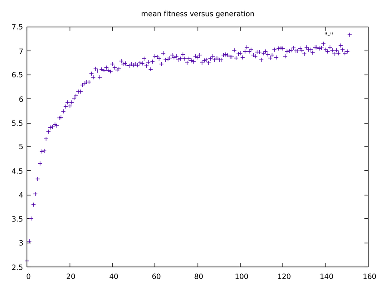
Your graph looks similar to the last one; however, you should notice a slight increase in mean fitness versus generation up to the 150th generation.
Gnuplot is a useful tool for providing insights into some of the statistics you gather during your evolutions. This section introduced only one way of visualizing one statistic. The possibilities are literally endless.
Now, you can finally wrap up your work on the tiger evolution and move into a different problem requiring visualizations: playing Tetris.