
5
Create User Interfaces
“One difference between poetry and lyrics is that lyrics sort of fade into the background. They fade on the page and live on the stage when set to music.”
—Stephen Sondheim
User Interfaces
The primary focus of JavaFX is to provide a platform to easily and quickly develop cool user interfaces. The goal is to create appealing user interaction that engages the user’s full senses and leaves the user with a positive impression. At the core of this is JavaFX’s user interface classes.
JavaFX employs a theater metaphor within the JavaFX user interface framework. There is a stage that provides space for the action and presents a focal point for the user. A scene represents a slice of the action or discrete unit of the application. A layout positions the individual components within a scene.
In this chapter, we will cover the key elements required to build a user interface in JavaFX. This chapter covers the basic user interface components, whereas subsequent chapters will discuss animations, special effects, and multimedia features. To begin, you must first define your stage.
The Stage
The javafx.stage.Stage class is the topmost container for a JavaFX display. It insulates the underlying implementation from the JavaFX developer so it can be readily reused on multiple platforms such as desktop, mobile phone, or a television set top box. In a desktop environment, the Stage parallels a window in the windowing system.
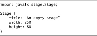
A stage has a title and geometry, may or may not have decorations (the window border, etc.), and may be resizable. The code in Listing 5.1 creates an empty stage that is shown in Figure 5.1.
Listing 5.1 Empty Stage
Let’s modify this empty stage to place it at position 150,150, change the title, and set resizable to false, so that the stage cannot be resized by the user. Notice that we set visible to true, which is already the default value, but if we did not want to display this stage at a specific instant, we could have set this to false. This is shown in Listing 5.2.
Listing 5.2 Unsizable Stage

Figure 5.1 Empty Stage

There are also options to set the stage style to DECORATED, UNDECORATED, or TRANSPARENT. DECORATED is the default, and defines a stage with a solid background with platform-specific decorations. On a desktop, this would be the window border and title and the maximize, minimize, and close controls. UNDECORATED is a solid white background with no platform specific decorations. TRANSPARENT defines a stage with a transparent background with no decorations.

We have already seen a DECORATED style in Figure 5.1. By setting the style to UNDECORATED, the surrounding decoration, the border, the controls for minimize, maximize, and close, and the title are no longer shown (see Figure 5.2). Just a rectangular area with a white background color appears. In this example, we added the text “JavaFX – Developing Rich Internet Applications”.
Figure 5.2 Undecorated Stage on Desktop

The TRANSPARENT style sets the window into a transparent mode without any decorations.

Here, there is no visible background region. Figure 5.3 shows this.
Figure 5.3 Transparent Stage on Desktop

Only the text “JavaFX – Developing Rich Internet Applications” is displayed on the desktop. To achieve this, there was one more thing we had to do. We had to also set the fill for the Scene to null. We will cover this in the next section on the Scene class.
Developer Warning:
TRANSPARENT may not be supported on all platforms. If it is not supported, it will show the same as UNDECORATED.
It is possible to have multiple stages defined for an application. Some may be visible, some not. A stage may acquire the focus and become active. Actions, like mouse presses, may cause a stage to appear or close. If the platform supports it, the stage may fade in or fade out by changing its opacity. The contents of a stage can change during the life of the application. Of course, an empty stage is the same as a dark theater. There is no reason to go there; we need a scene.
The Scene
The Scene, javafx.scene.Scene, is the top-level node within a scene graph. Representing the entire visual scene, a scene graph is a collection of nodes in a hierarchal tree graph. The scene has geometry, a fill paint for the background, a mouse cursor setting, and optionally a set of cascading style sheets (CSS) that may be used by the scene’s components.
The scene’s geometry represents the area within the stage’s region that is available for displaying components. If the stage is resized, the scene will be resized accordingly. Using the scene’s geometry, you can position components within the scene to make sure they are fully visible.
Listing 5.3 displays the stage’s and scene’s geometry, side by side, for comparison (see Figure 5.4). This information is displayed using a Text node that is horizontally centered. As the stage is resized, the display automatically updates with the new geometry for both the stage and scene and repositions the text in the horizontal middle.
Listing 5.3 Stage and Scene Geometry
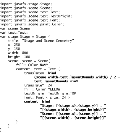
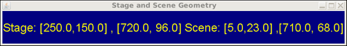
Figure 5.4 Stage and Scene Geometry

To accomplish the repositioning, we first assigned the Scene instance to the script variable scene. Then we used the instance variable, scene.width, to calculate the start position for the Text. We had to use a bind, because the scene’s geometry will change, at least initially, from zero width and height to the width and height based on the stage’s geometry.
Notice that the stage’s position, [250,150], is relative to the desktop coordinate space, whereas the scene’s position, [5, 23], is relative to the stage’s coordinate space. Also, the scene’s width, (790), and height, (72), is less than the stage’s width, (800), and height, (100). This takes into account the border space taken up by the stage that is not available to the scene for rendering graphical nodes.
When the stage is resized, the scene’s width and height will also be automatically recalculated and through binding, we quickly see the new geometry and the recalculated text position, to keep it centered (see Figure 5.5).
Figure 5.5 Stage and Scene Geometry – Stage Resized
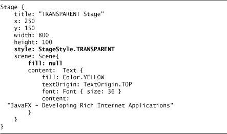
In the preceding example, also notice that we set the stage’s fill to navy blue, so the entire background is painted with this color. This is shown as a black background in Figures 5.4 and 5.5. For a full color view of these figures, please check out the book’s Web site at http://jfxbook.com. The default color is white. You can also set the fill to null or transparent by using Color.TRANSPARENT. The color displayed when setting it to one of these two values is platform dependent. When we used the StageStype.TRANSPARENT option as shown in Figure 5.3, we also had to set the scene’s fill to null so that the default fill of white would not fill the rectangular area represented by the scene. Listing 5.4 shows a TRANSPARENT stage with an invisible background.
Listing 5.4 Transparent Stage
The choice for null or Color.TRANSPARENT does not matter for a Scene; however, it does matter later on with Nodes. The main difference is that mouse events will not be delivered to a node with a null fill when the mouse is over the invisible part of the node. On the other hand, if the fill is Color.TRANSPARENT, mouse events will be delivered to the node, even if the mouse is over the invisible part. This is because Color.TRANSPARENT is actually a valid color being black with opacity of zero—therefore, it is a color that appears invisible.
In addition to the fill paint, the scene also allows you to set the Cursor style for the entire scene. The default is null indicating that the System default cursor will be used. The options from the javafx.scene.Cursor class are default, wait, crosshair, hand, move, and text. There is also a set for the resize cursors based on compass direction: east, north, northeast, northwest, west, southwest, south, and southeast, and vertical and horizontal. Of course, there is also an option for no cursor at all.
Style Sheets
Cascading style sheets (CSS) are commonly used on the Web to partition content from presentation. This provides flexibility to easily change the presentation qualities without modifying the code that provides the basic content and behavior. A style sheet is a set of rules that control how to display elements. Each rule is made up of a selector that matches an element and a set of properties with values that define the presentation settings for the selected element. JavaFX includes support for style sheets, but there are some minor differences from their HTML cousins.
The most obvious difference is that instead of using HTML or XML elements for the selector, JavaFX uses the JavaFX class names. These can be fully qualified class names enclosed in double quotes, or for the standard JavaFX user interface classes, you can just use the base class name. For example, javafx.scene.shape.Rectangle or Rectangle will resolve equally.
For CSS ID selectors, instead of using the XML id attribute, JavaFX uses the Node’s id variable. CSS class selectors are similar to the way they are used in HTML. CSS pseudo-classes are defined on certain Boolean instance variables within the JavaFX Control and Skin classes. To use a style sheet, include its URL in the Scene's stylesheet instance variable. There may be zero or more style sheet URL strings.
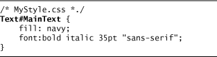
There are several ways to use a style on a display node. First, you can set the node’s id attribute to match the CSS ID selector. Secondly, you can include the style in the node’s style variable. Lastly, you can include the CSS class in the node’s styleclass variable. Listing 5.5 shows a style sheet that uses a CSS ID selector.
Listing 5.5 Style Sheet CSS ID Selector

This creates a CSS ID selector for the JavaFX Text class, named MainText. The fill is navy blue with a bold italic sans serif font. To use this in JavaFX, include the style sheet URL in the Scene object literal and add an ID to the Text display node to match the ID declaration. Listing 5.6 demonstrates how this is done.
Listing 5.6 JavaFX Class Using Node ID to Match the CSS ID in the Style Sheet

This Text node is created with an ID to match the style sheet’s ID selector, "MainText". When run, this displays the text in bold italic sans serif font with a size of 35 points (see Figure 5.6).
Figure 5.6 Using Style Sheets

In the style sheet file, besides using the fully qualified class name for javafx.scene.text.Text, you can also just use the basic class name Text. This is true for all the standard JavaFX user interface classes. Notice that when you use the fully qualified class name, it needs to be enclosed in double quotes. This is so the CSS parser can distinguish it from a CSS class selector. The alternative style for our text example is shown in Listing 5.7.
Listing 5.7 Style Sheet – Short Class Name for JavaFX Standard Classes
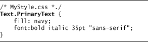
Another way to define styles is to use CSS class selectors. You do this by defining a CSS class selector, then by using it with the styleClass instance variable of the display node. Listing 5.8 shows how to create a CSS class of PrimaryText on the Text class.
Listing 5.8 Style Sheet CSS Class Selector
This is then used in the object literal for the text by initializing the styleClass instance variable with the name of the CSS class. Listing 5.9 shows how to use this in a JavaFX object literal.
Listing 5.9 JavaFX styleClass for CSS Class Selector

A third alternative is to use an in-line string with the style settings. This is done using the style instance variable in the display node’s object literal. For instance, Listing 5.10 shows using a style with a Text node.
Listing 5.10 Node Style Instance Variable

When using the node’s style variable, the style is applied to all the nodes in the scene graph starting with the node that contains the style declaration. For example, if the node is a Group, the style is applied to the group node and all the nodes defined as children contained in the group’s content sequence. So, if you have a group that contains many text objects, setting the fill style would apply to all the text instances. If you need finer control over this, use either a styleClass or ID selector defined in a style sheet.
CSS Pseudo Class
Pseudo classes are supported for classes that extend javafx.scene.control.Control and javafx.scene.control.Skin. The currently supported pseudo classes are :hover, :focused, :disabled, and :pressed. The pseudo class :hover indicates that the style is active when the mouse if over the control; :focused is active when the control has the keyboard focus; :pressed is active when the mouse is pressed while over the control; and :disabled is active when the node is marked as disabled.
Listing 5.11 shows examples of using these CSS pseudo classes with javafx.scene.control.TextBox.
Listing 5.11 Style Sheet – JavaFX Supported Pseudo Classes
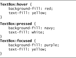
When the TextBox has the focus, it will have a purple background with yellow text. When the mouse moves over the TextBox, the background changes to red, and the text changes to yellow. When the mouse is pressed in the TextBox, the background changes to navy blue and the text to white. (Who chose these colors?)
To implement these pseudo classes in custom controls and skins, the custom code must set the value for the corresponding properties. An example is provided in the section Custom Controls, later in this chapter.
CSS Properties
In the StyleSheet file, the properties map directly to instance variables within the specified JavaFX class. In the preceding example, the CSS properties (fill and font) map directly to the instance variables fill and font in the javafx.scene.text.Text class. CSS type properties like background-fill would map to a JavaFX instance variable backgroundFill. The hyphen is removed and the second word is capitalized.
The allowed property values are decimal number, integer, string, color, paint, or font. Strings are enclosed in quotes.
Colors
Colors may be represented with a color name, (e.g., gray, red, or black), a hexadecimal triplet beginning with a sharp (#) sign, #808080, or using a function-like syntax, rgb (red, green, blue)—for example, rgb(128, 128, 128).
Paint
Paint may either be linear or radial.
linear maps to the javafx.scene.paint.LinearGradient class.
For example, the following style sheet entry would create a linear gradient starting with sky blue from the upper-left migrating to white in the lower-right part of the paint area.
For linear, the startX/startY and endX/endY may be expressed as an absolute value or a percent. The only restriction is that all values must be in the same units. reflect and repeat are optional and map to the javafx.scene.paint.Cycle-Methods of REFLECT and REPEAT, respectively. Reflect means the gradient is reflected to fill remaining space. When reflect is used, the gradient colors are painted start to end, then painted end to start, and so on to fill in extra space. Repeat means the start and end colors are repeated to fill in extra space.
radial maps to the javafx.scene.paint.RadialGradient class.
For example, to create a RadialGradient starting at position 0,0 with a focus a quarter of the way across and down migrating from red to blue, you use a style sheet entry using the following syntax:
For radial, the startX/startY and focusX/focusY may be expressed as an absolute value or a percent. The only restriction is that all values must be in the same units. reflect and repeat are optional and map to the javafx.scene.paint.CycleMethods of REFLECT and REPEAT, respectively. Reflect means the gradient is reflected to fill remaining space. When reflect is used, the gradient colors are painted start to end, then painted end to start, and so on to fill in extra space. Repeat means the start and end colors are repeated to fill in extra space.
Font
Fonts are defined as having optional font weight, a font size, and a font name. Font weight may be bold, italic, or both. Size is a number, either decimal or integer, with units of either pt (point), mm (millimeters), cm (centimeters), pc (pica), or in (inch).
font: bold italic 35pt "sans-serif";
Image
There is a special url syntax for defining images.
background-image: url(http://jfxbook.com/NASA/nasa.jpg);
This actually creates a java.awt.image.BufferedImage object that can then be used to create a javafx.scene.Image. A JavaFX example to handle this is shown in Listing 5.12.
Listing 5.12 JavaFX Example for Creating Image from BufferedImage

Nodes
As we already mentioned, a scene graph is a representation of a display scene. It is represented as a tree data structure with a set of linked nodes. Nodes may be either inner nodes, sometimes called branch nodes or leaf nodes that have no children. The javafx.scene.Node class is the base class for all the scene graph nodes.
In JavaFX, the Scene is the root node and contains a set of direct child nodes; inner nodes are either a javafx.scene.Group or javafx.scene.CustomNode. The leaf nodes are all the other nodes like shapes, controls, text, and the Swing Extension nodes.
Each node may be given an ID represented as a string. A lookup function is provided to find a node with a specific ID. Already, we saw ID used in conjunction with style sheets and the developer should take care to assign unique IDs when they are used.
Nodes have a set of instance variables of function type that can be assigned and are called when certain input events occur. These include the onKeyXXXX and onMouseXXXX instance variables that hold functions to handle key or mouse events, where XXXX represents the specific type of event. The blocksMouse instance variable indicates whether mouse events should be delivered to the parent. These will be discussed in more depth in the section Input Events, later in this chapter.
Nodes may also have a set of transforms applied, including translate, scale, rotate, and shear. Transforms may be provided as one sequence of transforms, each being applied in the order they are presented in the transforms sequence. Alternatively, the instance variables, translateX, translateY, scaleX, scaleY, and rotate may be used. When using these instance variables, there is certain default behavior. For example, scaleX/scaleY and rotate use the center point as the anchor. If you need finer control over these kinds of transforms, use the transforms sequence.
The geometry of nodes is contained in four instance variables: boundsInLocal, boundsInParent, boundsInScene, and layoutBounds. boundsInLocal is the rectangular area defined for the node without considering any transformations. boundsInParent is the rectangular area defined for the node after all the transformations have been applied and is in the coordinate space of the node’s parent. boundsInScene is the rectangular area defined for the node after all the transformations have been applied and is in the coordinate space of the node’s scene or root node if the node is not connected to a scene. layoutBounds is the geometry that should be used in all calculations for node layout and includes all the transformations defined in the nodes transforms sequence.
There are several indicators available with a node: hover, pressed, and focused. The indicator hover indicates that the mouse is over the node. pressed indicates that the mouse is over the node and the mouse button is pressed, focused indicates that the node has the input focus. To programmatically gain the input focus, call the node function requestFocus().
To control the appearance of a node, there are instance variables for opacity and visible. Also, there are functions to move the node forward (in front of other nodes), toFront(), or backward (behind other nodes), toBack(). You can assign a special effect using the effect variable. This will be discussed in depth in Chapter 6, Apply Special Effects. We have already discussed the style and styleClass variables when we discussed style sheets, earlier in this chapter.
Lastly, you can use another node to define a clip region for this node, using the clip attribute. When doing this, only the portion of the node that is contained within the region of the other node is visible.
Custom Nodes
To create a custom node, just extend javafx.scene.CustomNode and implement the abstract function, create(), which returns a node. The following Title class is a CustomNode.
To implement this, Title first extends CustomNode then implements the create() function. In the create function, it creates a rectangle that fills the background, a circle, and a text object to display “JavaFX is Cool”. This is shown in Figure 5.7 and Listing 5.13.
Figure 5.7 Title Object Display

Listing 5.13 “JavaFX is Cool” – CustomNode

This custom node is comprised of a group containing a rectangle that fills the entire background with a linear gradient paint, a circle, and a text. The create() function returns the group, which is a node. This is the most common way to create a custom node, but this is not the only way. The only requirement is that the returned object extend javafx.scene.Node.
javafx.scene.Group
The Group (javafx.scene.Group) node contains a sequence of child nodes that are displayed in the order reflected in the sequence. It merely displays the nodes as they are defined and will take on the geometric bounds that encapsulate all its children. It does not do any layout for the children and each child node must position itself. Its main purpose is to group together a set of nodes and allow those nodes to be manipulated as a group. For example, you can apply transforms to the group, change its visibility or opacity, and so on.
The order of the nodes in the Group’s content sequence dictates which nodes are drawn first and which are drawn last. If there is overlap on the display, nodes at the beginning of the content sequence will be underneath nodes later in the sequence. Actually, the Node’s method toFront() moves the affected node to the end of the containing Group’s content sequence. Likewise, toBack() merely moves the affected node to the beginning. Of course, you can always change the order of the nodes assigned to content to achieve the desired layering.
Layout
JavaFX has two layout controls: javafx.scene.layout.HBox and javafx.scene.layout.VBox. HBox lays out its nodes horizontally, whereas VBox does it vertically.
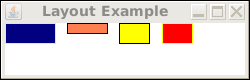
Listing 5.14 illustrates an example using the horizontal box (HBox) layout.
Listing 5.14 Horizontal Box Layout

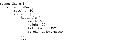
This produces various rectangles horizontal to each other, as shown in Figure 5.8.
Figure 5.8 HBox Layout
Similarly, the Vertical Box (VBox) code is shown in Listing 5.15.
Listing 5.15 Vertical Box Layout
VBox is shown in Figure 5.9.
Figure 5.9 VBox Layout

Notice that these two layouts are quite simple. Other than specifying the spacing between the nodes, there is not much else you can do with these layouts. Also notice that the HBox layout justifies the nodes at the top, or North position, whereas VBox aligns the nodes on the left position. You have no control over this.
To get a little more interesting, let’s combine the two layouts. First, we create a VBox that contains a set of HBoxes, each using the same set of colored rectangles. This is presented in Listing 5.16.
Listing 5.16 Combined Box Layouts
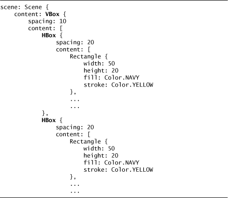
This lays out the components horizontally in two rows, as shown in Figure 5.10.
Figure 5.10 VBox Layout of HBoxes

Layout Basics
In JavaFX, layout can be achieved by positioning individual nodes using either their x and y or translateX and translateY variables directly. The other way is to use a layout container that positions nodes in a special way. In the previous sections, we looked at the built-in layout containers for horizontal, HBox, and vertical layout, VBox. In the next section, we will explore custom layout using a grid. But what internal geometry is used in doing layouts?
In JavaFX, rectangular bounds are represented by the javafx.geometry.Rectangle2D class. This class contains variables for minX, minY, maxX, maxY, width, and height. However, there are several geometric properties on each node that represent different geometries. These are boundsInLocal, boundsInParent, boundsInScene, and layoutbounds. How are these related?
Bounds may change depending on a number of variables, including clips, effects, and transformation. So the different bounding rectangles represent the bounds for a node depending on whether some of these effects have been applied yet.
BoundsInLocal defines the bounds before any transformations have been applied. However, boundsInLocal does take into effect any changes required by clipping and special effects. For shapes, this bounded area also includes any nonzero strokes that may fall outside of the shape’s geometry. For special effects, added space may be included to achieve the effect. For example, DropShadow includes a radius variable (default is 10.0) that is added to the overall dimensions for the node.
LayoutBounds defines the rectangular bounds after applying any transforms to the node. By design, the transformations specified by translateX and translateY are not included in this calculation. This is because if you are trying to position a node binding translateX and translateY based on the layoutBounds, you would enter into a circular change condition that would create an endless loop. LayoutBounds should be used when laying out nodes in an area.
BoundsInParent defines the rectangular area after applying all transformations to the node. This bounding rectangle is in the parent’s coordinate space. However, it is still calculated if there is no parent.
BoundsInScene defines the rectangular area of the node after all its ancestor node’s transformations have been applied. If the node is attached to a Scene, this would be in the Scene’s coordinate space. Otherwise, it is in the coordinate space or the topmost node in the scene graph.
To illustrate the differences in these, let’s look at an example. This example uses a rectangle that is originally 50 by 50 in size. It has a DropShadow effect, and is scaled on the x axis by a factor of 1.2. The rectangle is positioned horizontally in the center of the scene and down 50 along the y axis. The rectangle belongs to a group that is rotated 45 degrees, and this group belongs to a scene. Listing 5.17 shows the code required for this.
Listing 5.17 Layout Geometry

We have added text objects to display the various layouts and the output for this is shown in Figure 5.11.
Figure 5.11 Layout Bounds
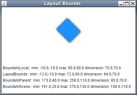
As you can see, all the bounds are different. So let’s examine them and determine why they are the way they are. First, the basic rectangle is a 50 by 50 square, but we added a DropShadow effect, which added a margin area of 10 width around the square. So, boundsInLocal shows a 70 by 70 square starting at position -10, -10. Notice that we are still dealing with a square and not a rectangle. This is because boundsInLocal ignores the scaling transform. Now let’s examine the layoutBounds.
In the layoutBounds, the scale transform has been applied and the square has been transformed into an 84 by 70 rectangle. Notice that we had to use the transforms[] sequence as layoutBounds ignores the scaleX and scaleY variables. Also, the other transform variables, rotate, translateX, and translateY are ignored by the layoutBounds. LayoutBounds are different than the other bounds in that the other bounds are read only, whereas layoutBounds can be set programmatically when the node is first created. So, you can force the layout geometry, if desired. Otherwise, it is calculated automatically based on the boundsInLocal augmented with the transforms contained in the transforms sequence variable.
The boundsInParent reflects the Group’s coordinate system and also reflects the translateX and translateY transform from the Rectangle node. Notice the dimensions are still 84 by 70 but the minX and minY and maxX and maxY values have changed to reflect the translateX and translateY transformation.
The boundsInScene reflects the Group’s rotation, and now the bounding area is a square that encloses the rotated rectangle. This reflects the Group’s rotation.
Table 5.1 summarizes the differences between these four bounds.
Table 5.1 Bounds

To position a node, you need to use the Nodes layoutBounds to determine its basic size. If you need to incorporate transformations into this calculation, you should use the transforms[] sequence rather than the standalone transform instance variables, translateX/Y, scaleX/Y, and rotate. Listing 5.18 provides an example to center a node in a scene.
Listing 5.18 Centering a Node in a Scene

Notice that we need to assign local variables to both the Scene and the Rectangle, and then use those variables within a bind to set the translateX and translateY variables. Also, notice that we need to include the minX/minY for each, as this would include any offset due to shape drawing, effects, and clipping.
Custom Layout
If you need more control over layouts, you need to create a custom layout using the javafx.scene.layout.Container class. To illustrate this, we will walk through a GridLayout class. The GridLayout class lays out its nodes in a series of rows and columns. Instead of using a fixed width and height for the rows and columns, this layout class calculates the width of each column to be wide enough to handle the widest node within the column. Likewise, the height for each row is calculated to handle the maximum height to accommodate each node in that row. Therefore, the column widths and row heights vary depending on the nodes contained in each.
Because some nodes will have extra horizontal or vertical space within a row or column, you can specify the alignment of those nodes within the row or column. Either align left, right, or center for columns, and align top, center, or bottom within rows. The actual alignment values are directional with values for North, NorthEast, East, and so on.
To begin, we create the GridLayout class extending javafx.scene.layout.Container.
public class GridLayout extends Container {
javafx.scene.layout.Container extends javafx.scene.Group, so from there we have access to the content[] sequence of Nodes. Also, Container extends javafx.scene.layout.Resizable, and from there we have access to width, height, minimum width/height, maximum width/height, and preferred width/height. There are also some helper functions defined in Resizable; we will use getNodePreferredWidth/Height().
Next, let’s add some instance variables as shown in Listing 5.19.
Listing 5.19 Grid Layout Variables

Next, we add some functions. First, we need a function to walk through all the nodes and calculate the maximum width for each column and the maximum height for each row. We also use this function to calculate the overall dimensions for the GridLayout object. This function is shown in Listing 5.20.
Listing 5.20 Grid Layout Functions – calcDimensions()


Next, we need a function to actually position each node within the Grid. The layout() function is shown in Listing 5.21.
Listing 5.21 Grid Layout Functions – layout()
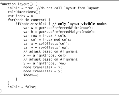
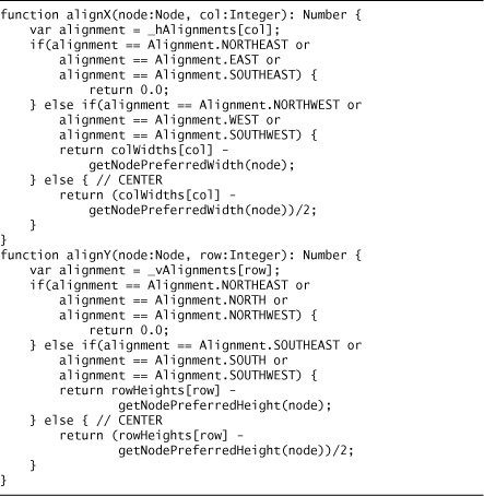
alignX and alignY adjust the nodes position depending on the alignment value for that column and row, respectively. The Alignment class is just a Java Enum type. These two functions are presented in Listing 5.22.
Listing 5.22 Grid Layout Functions – alignX()/alignY()
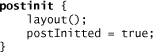
To kick start the layout, we add a postinit block to do the layout. This does the layout after all the instance variables in the class have been through the initialization process. We added a Boolean variable postInitted to indicate that this step has completed.
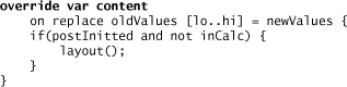
Now, we have to do one more thing. Whenever any of the public instance variables change, we need to recalculate the layout. We do this by adding on replace triggers to these variable declarations. For example:

To do a layout on the Group’s content instance variable, we need to add an override declaration.
The following is an example of how to create a GridLayout object literal with some example nodes, using the default CENTER alignment. Listing 5.23 shows how to use the GridLayout class.
Listing 5.23 Grid Layout – Object Literal

When we run this, we see the display as shown in Figure 5.12.
Figure 5.12 Custom Container for Grid Layout
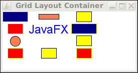
There is a trick that this lets us do for empty cells. Notice the empty space in column 2, row 3, right below the “JavaFX” text. To achieve this, all we had to do was assign an empty Group, Group{}, node to this position. Because the column width and row height will be sized to hold the maximum width and height for the column and row, respectively, then this row and column appears to be empty. This is because an empty Group is essentially dimensionless.
The full listing is on the book’s Web site at http://www.jfxbook.com.
Input Events
JavaFX supports two types of input events: javafx.scene.input.MouseEvent and javafx.scene.input.KeyEvent. Mouse events are generated by actions with the mouse and include mouse button actions like clicked, pressed, and released. Also, events are generated for mouse movement like moved, dragged, enter, and exit and for mouse wheel move events.
Key events are generated when the user presses, releases, and “types” keys from the keyboard. Key type events are at a higher level than press and release events and multiple key pressed/released events may map to one typed event.
There is an important attribute in javafx.scene.Node, blocksMouse, that controls delivery of mouse events. Normally, when a mouse event is generated, the runtime system delivers the event to all the nodes that intersect with the mouse coordinate. If you set blocksMouse to true on a node, that node will consume the mouse event and it will no longer propagate up the scene graph tree. If you do not want mouse events sent to other nodes that are visually blocked by a node, set blocksMouse to true on that node.
Mouse Events
javafx.scene.Node defines eight mouse event actions; these are
Mouse Actions

Listing 5.24 shows an example of defining a mouse clicked action.
Listing 5.24 Using onMouseClicked

To properly implement a drag action, you need to capture and save the drag node’s initial x and y coordinate when the mouse drag is started and use it later to calculate the ending coordinates. Then when the mouse is dragged or released, you use the MouseEvent’s dragX and dragY variables as a delta to the original position to calculate the new position for the node. The MouseEvent’s dragX and dragY variables hold a relative value to when the most recent drag event started. Therefore, it can be used to do a relative change to the original position of a node. Listing 5.25 is an example for a circle that is to be dragged.
Listing 5.25 Mouse Drag

When the mouse is pressed, we save the original coordinates of the center of the circle in the origCX and origCY variables. When a drag event is delivered, we adjust the center of the circle by setting the bound variables x and y based on the delta change in the mouse position. This shows the circle being moved while dragging. Finally, we do the same thing on release so that the circle is moved to its final position.
Key Events
Key events are generated from the keyboard, when a key is pressed and released, and when a typed key is recognized. A typed key may be the result of multiple key press and release events. The key actions defined are
Key Actions

In Listing 5.26, the example displays a Text item in the center of the scene. As you type characters, the text is updated by appending the typed character. A backspace key erases the last character typed. Notice that the backspace is handled in the onKeyReleased function. This is because the key code is always VK_UNDEFINED in a key typed event.
Listing 5.26 Key Events
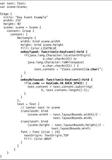
Another way to handle the backspace key is to look at the key event char directly.

However, this may not be portable across different locales and languages.
Text Display
There are two ways to handle text display in JavaFX. First, to merely display text to the screen, use the javafx.scene.text.Text class. However, if you need user editable text, it is easiest to use the javafx.scene.control.TextBox class.
Text
A Text is a shape that displays a string. A text has a font, geometry with a Text Origin setting, and instance variables to control line wrapping. Newline characters within the string cause the line to wrap; otherwise, wrapping is governed by the wrappingWidth variable.
A bare bones Text uses the default font and size and is black (see Figure 5.13). It is declared as

Figure 5.13 Bare Bones Text

It is necessary to move the text to see it, and this will be explained in the section on TextOrigin a little later in this chapter.
To make this more interesting, let’s adjust the font size, and instead of using the default fill of black, let’s set the fill to transparent and the stroke to black (see Figure 5.14).


Now let’s rotate it 45 degrees (see Figure 5.15).
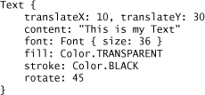
Figure 5.15 Rotated 45 Degrees

What happened? When we use the rotate variable, the rotation is anchored on the center point. This is also true if we had used the scaleX and scaleY variables; the scaling would have been from the center point, which is not always desired. If we want to rotate at the origin point, 0,0, we need to use a Rotate transform, javafx.scene.transform.Rotate (see Figure 5.16).

Figure 5.16 Rotated 45 Degrees from Origin
Adding the pivotX/pivotY is not absolutely necessary because their default values are zero anyway, but this does show you that you can control the pivot point when using a javafx.scene.transform.Rotate transform. javafx.scene.transform.Scale also has pivotX/pivotY variables to anchor the scaling at a particular point.
TextOrigin
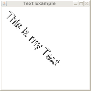
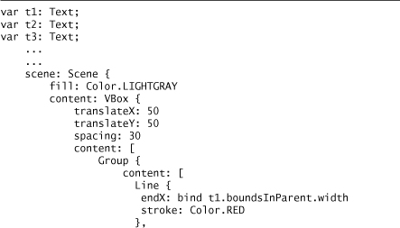
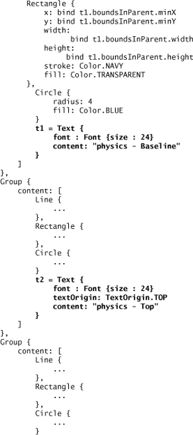
If you were paying close attention, you may have noticed something a little different with this last rotation, which brings us to the next topic, text origin. Text origin is the origin point, where the text is placed. There are three options for the text origin: baseline, top, and bottom.
Baseline is the line on which the font places its characters. Some characters may descend this line, like j, p, and y. Top means the origin is at the top of the font, and bottom means the origin is at the bottom.
Figure 5.17 shows the three options. Each text is outlined to show its bounding region, and the dot indicates the origin point (0,0) with a horizontal line. Notice that the baseline option shows the origin at the baseline, the top option shows the origin at the top, and the bottom at the bottom. Also, notice that each dot representing the origin is equidistant from each other; however, the placement of the text is quite different.
Figure 5.17 Text Origin Options
The only difference between the three text nodes is the textOrigin variable. The first one uses the default, which is TextOrigin.BASELINE, the second, TextOrigin.TOP, and the third, TextOrigin.BOTTOM. When placing text on the display, it is important to consider these settings.
The code for this example is shown in Listing 5.27.
Listing 5.27 Text Placement
Text Wrapping
There are several settings to control text wrapping. First, if we insert newline characters into the content string, the display will present each line separately (see Figure 5.18).

Figure 5.18 Wrapping with Newline Character

The next option is to set the wrapping width to justify the text between the margins as defined by the wrappingWidth variable (see Figure 5.19).
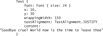
Figure 5.19 Wrapping Width with Justify Alignment

Also, if we change the alignment to left, we get what is shown in Figure 5.20.
textAlignment: TextAlignment.LEFT
Figure 5.20 Wrapping Width with Left Alignment

Using RIGHT alignment, we get what is shown in Figure 5.21.
textAlignment: TextAlignment.RIGHT
Figure 5.21 Wrapping Width with Right Alignment

Font
One final topic is font. The easiest way to create a font is to use a javafx.scene.text.Font object literal giving it a size and a font name.

The font names vary per platform and the function Font.getFontNames() retrieves the set of available names in the form of a sequence of string.
Programmer Tip:
With JDK 1.6, it is possible to programmatically install your own font. However, for JavaFX to know about these fonts, you need to register them with Java before the first JavaFX font is created. Here is an example code fragment:
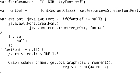
This only works with True Type Fonts and only works with JDK 1.6. The other option is to install the font into the JRE lib/fonts directory.
TextBox
The javafx.scene.control.TextBox class provides a means for user text input and editing. An example of a TextBox is shown in Figure 5.22.
Figure 5.22 TextBox

A TextBox can be editable or not using the editable Boolean variable and you can specify the number of columns with the columns variable. Also, you can indicate that the entire text will be selected when the TextBox gains the focus, using the selectOnFocus Boolean variable. In addition, you can specify an action function that is invoked when an action is fired on the TextBox. Typically, this is done when the user presses the Enter key.
There are two variables that hold the text, text and value. On supported platforms, the variable text is updated as the user types. The variable value is updated when the user commits the changed text on the TextBox. Typically, this is when the user presses the Enter key or changes focus.
The TextBox skin implements the visual appearance for the TextBox and Table 5.2 defines the CSS attributes that are supported by the TextBox skin. The only way to change these from the default is to use one of the CSS style sheet mechanisms previously discussed. You can either use a style sheet and give its URL location to the Scene object, or include a style string using the TextBox’s style variable.
Table 5.2 TextBox CSS Attributes

The pseudo classes :hover, :pressed, :disabled, and :focused are supported for the TextBox control.
Listing 5.28 shows how to create a TextBox.
Listing 5.28 javafx.scene.control.TextBox

In this example, we used the TextBox’s style variable to specify the visual aspects for the TextBox.
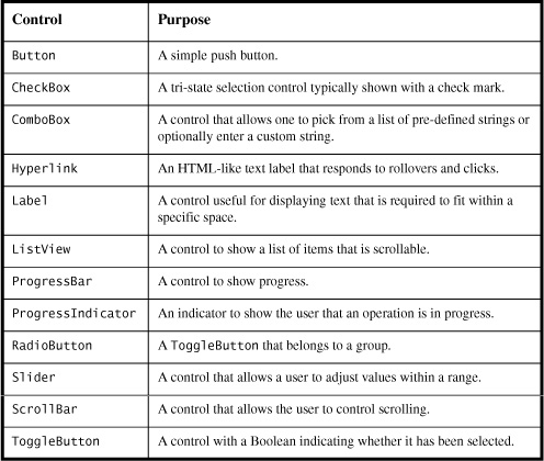
JavaFX 1.2 Controls
With the release of JavaFX 1.2, many new controls have been added to the JavaFX platform. Table 5.3 lists these. Because these new controls are just being finalized as the book is going to press, please visit the book’s Web site, http://jfxbook.com, for more detailed information.
Table 5.3 JavaFX Controls
Custom Controls
TextBox is a control—that is, it extends javafx.scene.control.Control and has a companion class that is a Skin, javafx.scene.control.Skin. The advantage of controls is that the Skin, or display characteristics, are separated from the actual control. The other main advantage is that controls implement full style sheet support including the pseudo classes :hover, :pressed, and :focused. Creating a custom control is easy.
First, create the Control by extending javafx.scene.control.Control. Within this control, you need to assign a Skin to the skin variable inherited from javafx.scene.control.Control. Let’s look at an example that creates a control for hypertext. HyperText is a Text-like object that displays text; when you click it, some action is taken on a URL. This is similar to links in a Web page. If the link has not been visited, the text is displayed in one color, and after it has been visited, it is displayed in another color. Also, typically these links are underlined. The beauty of using a Control is that all these appearance attributes can be set using a style sheet.
The HyperText object extends Control and assigns a HyperTextSkin object to its skin variable. This is detailed in Listing 5.29.
Listing 5.29 Custom Control

The variable, url, holds the URL, content holds the displayed text, and action is called when the user clicks on the text. The variables textOrigin and textAlignment are used for the underlying Text object defined in HyperTextSkin.
The skin variable can either be assigned in the init block, or using an override declaration on skin.
protected override var skin = HyperTextSkin {};
The only caution in using the override approach is that the Control may not have been fully initialized when the Skin is created, thus certain values may not be available to the Skin when it is first created.
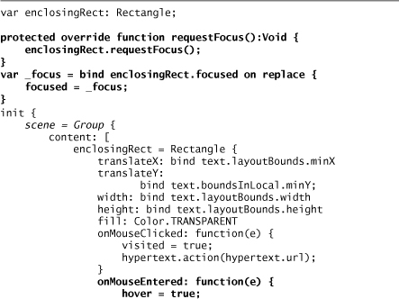
The HyperTextSkin object has the bulk of the logic as shown in Listing 5.30.
Listing 5.30 Custom Skin

The first item in the Skin is to declare a local variable that casts the control to the specific type. This is just a convenience for later when we have to access variables from the HyperText control. The bind is necessary as the control may not be set when this local variable is declared.
Second, there is a set of variables that can be set from the style sheet. These must all be public and remember that a word with a capital letter within the variable name is translated on the style sheet. For example, unvisitedFill is unvisited-fill in the style sheet. Table 5.4 shows the available CSS properties for this control.
Table 5.4 HyperText CSS Attributes

The last part of the Skin source is the actual creation of the node that will be displayed. This is similar to the CustomNode example; however, instead of returning a node in the create() function, you actually have to assign the node to the scene variable inherited from javafx.scene.control.Skin. Notice the mouse handling for the enclosing rectangle. When the user does a mouse action over the hypertext, this sets the corresponding variables on the Skin so that the CSS pseudo variables, :focused, :hover, and :pressed, are operational. This is shown in Listing 5.31.
Listing 5.31 Custom Skin – Node Creation
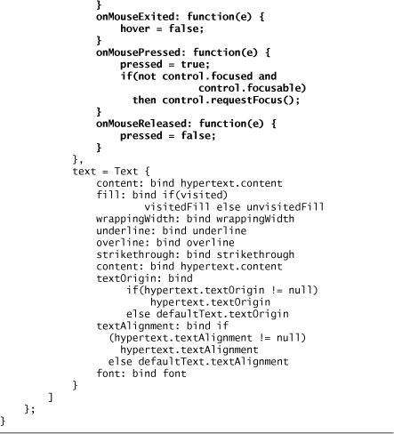
Developer Tip:
The Rectangle shape encapsulates the Text object and allows for the user to have a larger area to click the mouse. This area is the full width and height of the entire text. If this Rectangle were not present, then the user would have been restricted to clicking the mouse right over the painted parts of the individual letters of the Text. For example, clicking inside the letter O would not work; you would have to click on the black part of the letter O. Otherwise, the mouse events would not be delivered to the HyperText object.
Shapes
The javafx.scene.shapes package contains numerous shape types. We have already seen Rectangle and Circle in action in some of the previous examples. The other shapes are Line, Arc, Ellipse, Polygon, CubicCurve, and QuadCurve.
Polygon
An example of a triangle using a polygon centered within the scene is shown in the following code and in Figure 5.23.

Figure 5.23 Triangle – Scaled 4×, Rotated 45 Degrees

Line
A line draws a line between two points (see Figure 5.24).


Arc
An Arc draws a curved area between two points based on a radius, starting angle, and length in degrees. The Arc type may be open, meaning the two end points are not closed (see Figure 5.25); chord, meaning the end points are closed by drawing a straight line between the two end points (see Figure 5.26); and round, meaning the arc is closed by drawing straight lines to the center point of the ellipse that contains the arc (see Figure 5.27).
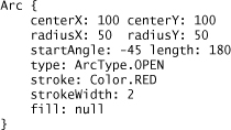
Figure 5.25 Arc – OPEN
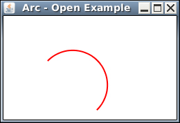

Figure 5.27 Arc – ROUND
Ellipse
An Ellipse shape is defined using a center point with radii for both the x and y axis. The following listing shows how to create an ellipse centered at point 100, 50 with an x axis radius of 50 and a y axis radius of 10. This example creates an outlined ellipse as shown in Figure 5.28. If you need to create a filled ellipse, you can set the fill variable to a color or gradient.
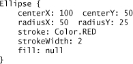
Figure 5.28 Ellipse

CubicCurve
A CubicCurve defines a cubic Bézier parametric curve segment used to model smooth curves. The startX, startY, endX, and endY points mark the ends of the curve. The variables controlX1, controlY1, controlX2, and controlY2 specify the Bézier controls points that shape the curve. The following listing shows how to create a curved line as shown in Figure 5.29. If you want a filled shape, set the fill variable to a color or gradient.

Figure 5.29 CubicCurve

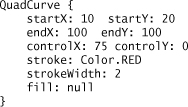
QuadCurve
A QuadCurve defines a quadratic Bézier parametric curve segment. It is similar to the CubicCurve, but it only uses one control point. The following listing shows how to create a QuadCurve starting at point 10,20 and ending at point 100,100. The control point is 75,0. The output for this curve is shown in Figure 5.30.
Paths
Paths let you draw arbitrarily complex shapes. There are two path shapes: Path and SVGPath. Paths take a set of elements that draw the outline of a shape. The Path may be either open or closed. The class javafx.scene.shape.Path takes a set of PathElements, whereas SVGPath is built using a standard SVG Path encoded string as defined at http://www.w3.org/TR/SVG/paths.html. The following example shows a triangular shape with a circular chunk taken out of it (see Figure 5.31).

Figure 5.31 Path Example

Here is the same shape using an SVGPath, using a stroke color instead of a fill (see Figure 5.32).

Figure 5.32 SVG Path Example

Programmer Tip:
Remember when we discussed using a scene fill of either null or Color.TRANSPARENT? Let’s reexamine this using the preceding shape. Because the fill is Color.TRANSPARENT, when you click anywhere inside the shape, the onMouseClicked function will be called if defined for the shape. However, if you change the fill to null, now when you click inside the shape, there is no mouse event generated for the shape. You have to click on the outlined stroke to generate the event. Though both shapes look the same, there is a big difference when processing mouse events. Either way is valid; it all depends on what you are trying to do with mouse events for the shape.
Java Swing Extension
The javafx.ext.swing package contains numerous JavaFX classes that support Java Swing components. It is important to note that the Swing extension is not supported on all platforms, so if you use Swing extensions your application may not run on a platform like JavaFX Mobile or JavaFX TV.
The Swing components supported are listed in Table 5.5.
Table 5.5 javafx.ext.swing to javax.swing class Mapping

All the JavaFX Swing classes also extend javafx.scene.Node, so they can be added to a scene or other node container such as javafx.scene.Group. The scene graph can freely intermix these nodes with non-Swing nodes.
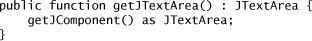
All the JavaFX Swing classes extend javafx.scene.SwingComponent. This class has an abstract function, createJComponent(): JComponent, that the subclass uses to actually instantiate the corresponding Java Swing class. In addition, the SwingComponent class has a function, getJComponent(): JComponent, that returns the underlying javax.swing.JComponent object. This object can then be cast to the specific Java Swing class. For example, when using a SwingTextField object stored in the variable jtextfield:
var jtextfield = textfield.getJComponent() as JTextField;
Most of the JavaFX Swing classes implement a function that does this conversion. For example, in SwingTextField there is a function, getJTextField(): JTextField, that does this.
If you have a Java class that extends JComponent, you can use that class in JavaFX by wrapping it via the SwingComponent.wrap() function. For example,
var myFXcomponent = SwingComponent.wrap(myJavaJComponent);
This merely allows the Swing component to participate in the JavaFX scene graph, but does not provide any other functionality. For instance, you do not have any mapping of your JComponent’s attributes with corresponding JavaFX variables, so you do not realize any benefits from binding. If you wish to go one step further, you need to implement a Custom Swing Component.
Custom Swing Component
As we mentioned, all JavaFX Swing classes extend javafx.ext.swing.SwingComponent. These classes then must implement the function, createJComponent(): javax.swing.JComponent. This is easy enough, but what we really want to do is connect the Java Swing class’s attributes to a JavaFX instance variable. Let’s work through an example using the JTextArea class.
First, our class extends SwingComponent and implements the createJComponent() method to create the Swing component object.

Next, add the helper function to cast the component returned by SwingComponent’s getJComponent() function to a JTextArea.
Now, we are ready to add some attribute support. Let’s start with JTextArea’s text attribute, which is of course the text that is displayed on the screen.
public var text:String;
This is not enough though. What happens if the user types into the JTextArea? How does this field update? What if the program sets this value; how does the JTextArea update? We need two more things. One is an on replace trigger so that when the JavaFX text instance variable changes, a corresponding change is made to the JTextArea. We will add an initialization to get the default value from the JTextArea.
Next, to update the JavaFX text variable, when the JTextArea text attribute changes, we need to install a JavaBeans property change listener on the JTextArea.

Now, whenever the JTextArea text changes, a JavaBeans property change event will be fired, and the JavaFX corresponding instance variable can be set.
However, we have a problem. If the JavaFX program changes the JavaFX text instance variable, it will in turn call the JTextArea.setText() method, which causes the JavaBeans property change event to fire, which in turn sets the JavaFX text instance variable. We are stuck in an infinite circle and eventually our program will crash.
To overcome this, we need to add a flag indicating this condition to our JavaFX class. This indicates that the JavaFX text variable change caused the property change event to fire, so there is no need for the JavaBeans property change listener to update the companion JavaFX variable. We added the private Boolean variable, inChange.

This pattern can be repeated for any other Java attributes to JavaFX instance variable mappings.
In Chapter 12, JavaFX Code Recipes, we will discuss this pattern in more detail.
You may have realized that a JTextField is usually shown in a JScrollPane because the number of rows and columns may be more than the screen can accommodate; so we add one last tweak to our example. Instead of directly extending javafx.ext.swing.SwingComponent, we extend javafx.ext.swing.SwingScrollableComponent.
public class TextArea extends SwingScrollableComponent {
That’s it! Now, we have scroll bar support.
To use our text area class, just use an object literal just like any other JavaFX node.

The full example is on the book’s Web site, http://www.jfxbook.com.
Chapter Summary
JavaFX makes developing user interfaces straightforward and easy. By laying out the scene graph nodes using JavaFX object literals, the JavaFX language supports a top-down view of the scene graph. This is more intuitive to the developer. JavaFX also provides a robust set of user interface nodes and controls that facilitate developer productivity.
In this chapter, we discussed the stage, the scene, style sheets, JavaFX nodes, creating custom nodes, layout options, and using Java Swing Components. This all provides the foundation for creating rich user interfaces. Now we are ready to delve into some really cool stuff. The next set of chapters cover topics from special effects, animation, multimedia presentation, and creating RESTful applications.