
6
Apply Special Effects
“You know, my dear My father used to say to me Nando, don’t be a schnook It’s not how you feel It’s how you look”
—Billy Crystal
Sometimes, the task of constructing modern Rich Internet Applications ends up being more an exercise in integration and less a focus on what’s really important: namely, creating interfaces that are intuitive and visually appealing. As part of an ongoing project, development teams will need to enlist the talents of graphic designers along with one or more graphics editing software packages. Additionally, they may require experts intimate with the intricacies of 2D and 3D graphics. Furthermore, someone well versed in a specific windowing platform (e.g., Java Swing) may be desired too.
One of the goals of the JavaFX platform is to increase the efficiency and ease by which a certain class of images and effects can be introduced into an application. Graphic designers will continue to perform the complex and interesting work with their image editing software. But why not incorporate many of the more common effects available in their toolbox right into the application platform? It could ease the designer’s burden, and be a boon to developer productivity.
JavaFX offers, as an integral part of the platform, a wealth of effects, enabling developers in many instances to duplicate in a few lines of JavaFX script, what may have taken more effort with one of the popular graphics editing software packages. These effects also serve as the same classes used by the JavaFX Production Suite (i.e., Adobe Photoshop and Adobe Illustrator plug-ins) to import graphics into a JavaFX application. This chapter will cover many of the built-in effects that are available, and how they can be applied to your application to make a more compelling visual experience. They include
• Shadowing including DropShadow, InnerShadow, and Shadow.
• Lighting including DistantLight, PointLight, and SpotLight.
• Gradients including LinearGradient and RadialGradient. Technically, these do not belong to the effects package, but are used in a similar fashion and are thus grouped with this chapter.
• Blurs including GaussianBlur and MotionBlur.
• Reflection.
• Blending including Blend and BlendMode.
• PerspectiveTransform.
• Glow.
• Bloom.
• DisplacementMap.
• Color Adjustment Effects including SepiaTone and ColorAdjust.
Effects
In the JavaFX node-centric approach, the library classes that are used to create content (e.g., Text, Rectangle, ImageView, CustomNode, etc.) are all ultimately derived from the javafx.scene.Node class. As a result, they all share a set of common instance variables defined by Node, one of the most important being a variable called effect. By assigning a value to an instance’s effect variable, you, in essence, apply an effect to that object.
The JavaFX runtime, by default, contains packages and classes under the javafx.scene.effect hierarchy, which represent the range of available effects that can be applied. They include, among others, classes for 2D and 3D lighting, blurring, shadowing, color adjusting, blending, glowing, toning, inverting, reflecting, blooming, and flooding operations. They are suitable for those of us who are not artistically inclined and offer an alternative in many cases to utilizing sophisticated image manipulation software.
In an effort to expose you to as many of the classes as possible, we’ll spend a good part of this chapter applying individual effects first to simple shapes and later on to images and see how their appearance changes. It should, at minimum, serve as a reference for how to use a particular effect. Of course in the real world, you’ll likely want to combine a host of effects together. So let’s get started.
Shadowing
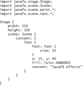
Adding a shadow to content is likely one of the things that you’ll want to perform regularly. To help make the task of showing straightforward, JavaFX has seen fit to include the Shadow, DropShadow, and InnerShadow effects. To demonstrate their usage, we’ll first display some simple text as a baseline and see what happens as various permutations of the effects are applied. Figure 6.1 displays a simple Text node.
Figure 6.1 Initial Baseline Text

It is represented by the following code:
DropShadow
The first effect we’ll investigate is DropShadow, which enables you to render a shadow behind your content. Most effects provide one or more instance variables that allow you to control the visual appearance of the effect. For example, the DropShadow class provides five such variables, as described in Table 6.1.
Table 6.1 Instance Variables for DropShadow
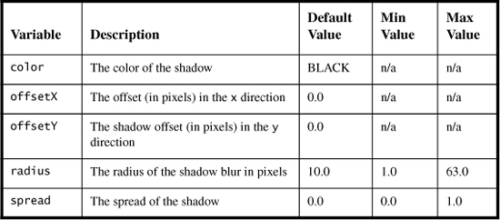
It is not necessary to define all of these variables each time you want to use DropShadow, as they default to values that you may find acceptable. As we run through examples of other effects, explaining each of the instance variables in detail would result in a very lengthy and cumbersome chapter. Instead, we’ll stick to easy-to-understand sample usages and suggest that for additional detail, you consult the JavaFX API documentation.
So let’s apply a DropShadow effect to our sample code. To do so, only two easy insertions are required. The first involves letting the compiler know that the JavaFX effects classes will be brought into play. This is done by including the following import statement alongside your other imports:
import javafx.scene.effect.*;
Next, comes the more interesting modification of setting the Text node’s effect instance variable. So, for example, if you want to add a DropShadow effect to the Text node referenced earlier, the effect instance variable could look something like
effect: DropShadow { offsetX: 3, offsetY: 3 }
Listing 6.1 shows the code for the original Text node enhanced to include a DropShadow effect, where the shadow offset is 3 pixels in the x and y direction. The remaining unreferenced instance variables of the DropShadow effect are assigned their default value.
Listing 6.1 Adding a DropShadow to a Text Node

Figure 6.2 depicts what would be displayed if the code in Listing 6.1 were to be compiled and executed.
Figure 6.2 Text with DropShadow

Figure 6.3 demonstrates how, by changing the values of the instance variables of DropShadow, you can achieve different shadow effects.
Figure 6.3 Two Different DropShadow Instances

InnerShadow
Similar to DropShadow, InnerShadow instead renders a shadow inside, rather than behind the content. It has the same instance variables as DropShadow, and introduces one other called choke, which gives additional control over the shadow effect. This time, we’ll do our rendering on a Rectangle node to demonstrate how InnerShadow might be used. The following chunk of code demonstrates how a Rectangle instance might use InnerShadow.

Figure 6.4 displays what the content would look like.
Figure 6.4 An Example Applying the InnerShadow Effect on a Rectangle Node

Shadow
The last of the built-in shadow effects is Shadow, which can be used to create a shadowy version of the original content. For example, if we replace the DropShadow effect found in Listing 6.1 with
the resulting output would look like Figure 6.5.
Figure 6.5 An Example of the Shadow Effect on Text

Here, we see that the content becomes the shadow without including the original pre-effect text. Using Shadow, we could mimic the DropShadow effect seen in Figure 6.2 by including two Text nodes, one using the Shadow effect with the x and y coordinates offset by 3 pixels, the other node just displaying the text at the original coordinates. Nodes are displayed in the order they appear in the code, so the node with the Shadow effect must appear before the plain Text node. Here’s how the JavaFX code segment would look:

Lighting
The shadowing effects mentioned in the previous section represent one of many options available that can be used to give ordinary two-dimensional objects a three-dimensional look and feel. Another technique found in the JavaFX toolbox is lighting. The Lighting effect introduces a configurable light source that can be shone onto your content to produce a sense of depth. To use lighting, you must assign your content’s effect variable with an instance of the javafx.scene.effect.Lighting class. Let’s elaborate by offering up a straightforward example. The code snippet that follows shows how a Lighting effect can be added to a Rectangle.

To be of any real use, the Lighting object literal needs to, at minimum, define its light instance variable. Derived from the base javafx.scene.effect.light.Light class, JavaFX provides three lighting effects, out of the box, for this purpose. Table 6.2 describes these lighting effects.
Table 6.2 Lighting Effects

Like many of its relatives, the lighting effects come along with a good deal of configurable parameters. Instead of regurgitating verbatim what is already in the JavaFX API documentation, we’ll show a few example usages and suggest again that the API documentation is the definitive source for further details. It turns out that using text, with all its nooks and crannies, shows off the capabilities of lighting quite nicely. For example, Listing 6.2 is a complete code listing for displaying text with a DistantLight effect.
Listing 6.2 Displaying Text with a DistantLight Effect
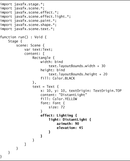
In addition to specifying a Text node with a DistantLight effect, Listing 6.2 also includes a black Rectangle node, which serves as a background to better contrast the lighting effect. By wrapping the content inside a run() function as defined in the preceding code, you can use the Design Preview feature of Net-Beans to make changes to your code and interactively see how those changes affect your display.
Adding a run() Function to Your Source Files
It is not uncommon for Java programmers to add main() methods inside their class definitions. Even though many individual classes are never meant to be run by themselves, including a main() method gives the developer an opportunity to test and debug a class separate from the whole application. JavaFX has a somewhat analogous capability with the run() function. By placing a run() function at the script level in your source, which follows this form:
you’ll have the ability to quickly modify and visualize whatever content appears inside the body of the function by using the Design Preview capability within Net-Beans. Listing 6.2 contains a sample run() function.
Figure 6.6 shows what is produced when the code in Listing 6.2 is compiled and executed.
Figure 6.6 Demonstrating a Text Node with a DistantLight Lighting Effect

For our next two lighting examples, we’ll use the same basic content, a Text node inside a black Rectangle; this time changing the text string and the lighting effect to see how the rendering of the image is affected. Figure 6.7 illustrates an instance of PointLight being applied to text. The light source for PointLight has an (x,y,z) coordinate of (0, -500, 100).
Figure 6.7 Demonstrating a Text Node with a PointLight Lighting Effect

As part of the demonstration, an additional instance variable that can be utilized with PointLight, called surfaceScale, is assigned a value of 5. The range of acceptable values for this variable is from 0 to 10, the default value being 1.5. The PointLight effect for Figure 6.7 looks like this in JavaFX:

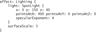
Finally, as SpotLight extends PointLight, it takes in the same instance variables as its parent and adds a few extras including the ability to define a vector—a light source direction—in 3D space. SpotLight also lets you set the value of a variable called specularExponent, which controls the focus of the light source and accepts a value from 0 to 4. Figure 6.8 shows one example of how a SpotLight effect can be applied to text.
Figure 6.8 Demonstrating a Text Node with a SpotLight Lighting Effect

In this case, the light source has been directed toward the end of the text, by virtue of assigning the pointsAtX, pointsAtY, and pointsAtZ instance variables to (400, 0, 0). This causes the dim letters at the beginning of the text. The preceding effect is represented in JavaFX as follows:
Gradients
Gradients, as defined by the W3C Scalable Vector Graphics Specification, “consist of continuously smooth color transitions along a vector from one color to another” (http://www.w3.org/TR/SVG/pservers.html). Once defined, a gradient can be used as a fill pattern for graphical content. It could be a simple transition from one color to another, or it may involve multiple transitions and multiple colors. JavaFX mimics the functionality stated in the SVG spec by implementing classes that represent the two types of SVG gradients: LinearGradient and RadialGradient.
Technically, gradients do not belong to the built-in effects subclasses. It just so happens though that they are oftentimes used to produce effects similar to those discussed throughout this chapter. For this reason we include gradients here. Our samples that follow demonstrate, for example, how gradients can be used to make shapes look more three dimensional.
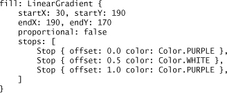
In keeping with our policy, we’ll explain by example. Let’s say you want to render a rectangle where the fill pattern starts out as white on the left side and transitions to black on the right. The rectangle might look something similar to what is seen in Figure 6.9.
Figure 6.9 A Rectangle Filled with a LinearGradient
Isolating the JavaFX script code, which describes the rectangle and this particular fill pattern, would look like this:

Let’s dissect what’s taking place here. First, gradients do not operate on the effect instance variable. Rather, they are assigned to the content’s fill instance variable. As mentioned, gradients are not part of the javafx.scene.effect package, but instead they belong to javafx.scene.paint.
The stops variable is a sequence used for defining the overall gradient effect. Within the sequence, a series of Stop instances are used to describe individual transitions. Its offset variable, ranging in value from 0 to 1, describes where, within the content, this gradient should be placed, 0.0 being the beginning of the content, 1.0 being the end, 0.33 being approximately a third of the way in, and so on. Alongside the offset variable, a Stop instance should also specify the color too. In our preceding example, we, in effect, define the simplest of transitions, a beginning Stop (offset is set to 0.0) with a white color, and an end Stop (offset 1.0) set to black. With this information, the JavaFX runtime will fill in the content interpolating all of the colors in between the stops.
Lastly, in our example, the gradient was defined with the proportional variable set to true. By doing so, the start and end coordinates are defined relative to the shape where, again, 0.0 specifies the beginning of the shape, 1.0 specifies the end. By setting proportional to false instead, the start and end points would have to be defined in absolute pixels.
LinearGradient
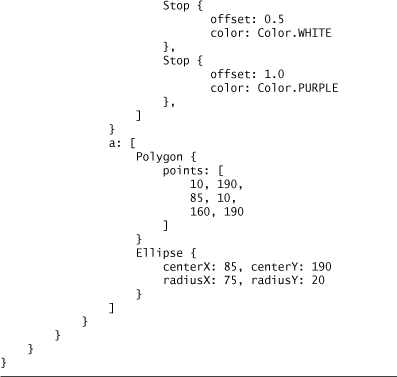
Sticking with our 3D theme, gradients, among many other uses, could be employed to add perspective to content. Let’s see how a LinearGradient can be applied to an ordinary shape to make it look more realistic. First, we’ll combine two simple shapes together, a triangle and an ellipse, to create a cone. Figure 6.10 displays the particulars; later on we’ll supply the complete code.
Figure 6.10 Combining Two Basic Shapes Together to Form a Cone

The resulting cone uses a class called ShapeIntersect, which is part of the javafx.scene.shape package, to construct one logical shape from a number of previously independent ones. The ShapeIntersect a[] instance variable forms a union of the shapes included in the sequence—in this case a triangle and an ellipse—while the b[] sequence (not used in this example) could be used to add additional shapes that are intersected with a[] to form yet a more complex shape. The big advantage of using ShapeIntersect here is that you can apply an effect to the entire object, rather than having to do so on each individual component.
Let’s add a LinearGradient to the entire cone. The code describing our desired fill pattern looks like this:
This time, we set the proportional instance variable to false and use pixel coordinates to specify the start and stop locations. To give a realistic perspective to the cone, the LinearGradient is centered slightly to the right of the cone tip, and its angle is not vertical, but to some extent diagonal. A third Stop is included in the stops sequence, to add gradient transitions from purple to white back to purple again. Figure 6.11 shows the rendered cone.
Figure 6.11 Adding a LinearGradient to a Compound Shape

Combining all of the snippets together, Listing 6.3 contains the complete set of code required to generate the image found in Figure 6.11.
Listing 6.3 A Cone with a LinearGradient

RadialGradient
A LinearGradient can be employed to augment the appearance of a shape, making it look more 3D-like. However, it is only effective for a certain class of objects. For example, if you want to add some perspective to a circle to make it look more sphere-like, using LinearGradient would likely not result in a very realistic image. You could make use of the RadialGradient class. Rather than filling shapes with linear patterns, a RadialGradient gives you a way to fill content with circular or radial patterns. Here’s a segment of code demonstrating the use of RadialGradient with a Circle node.

A RadialGradient is typically instantiated by defining a center (x,y) point and a radius size. Like its LinearGradient cousin, a RadialGradient gives the developer the choice of either using absolute or relative coordinates as defined by the proportional instance variable. In the preceding case, absolute coordinates are used where the center of the gradient appears in the upper-right quadrant of the circle, giving the illusion of a light source shining down on the upper-right part of a sphere. Executing the preceding code within an appropriate stage and scene results in an image depicted in Figure 6.12.
Figure 6.12 Adding a RadialGradient to a Circle to Make It Look Like a Sphere

Blurs
The ability to blur your content is available in JavaFX via the GaussianBlur and MotionBlur effects.
GaussianBlur
The GaussianBlur effect defines one primary instance variable, radius, which is used to specify the extent of the blur in pixels. Of its many possible uses, GaussianBlur could serve as yet another mechanism for shadowing. Let’s see how we might use it to add a shadow to our cone image. First, create a simple triangle, which is shown in Figure 6.13.
Figure 6.13 A Simple Triangle

Then, apply a GaussianBlur effect to the triangle as demonstrated in Figure 6.14.
Figure 6.14 GaussianBlur Applied to Triangle

Here’s the JavaFX code snippet.

Finally, let’s add this shape to our cone found in Figure 6.11 to produce the image displayed in Figure 6.15.
Figure 6.15 Cone with GaussianBlur Shadow

MotionBlur
MotionBlur allows you to employ a blur effect in a particular direction, in essence, simulating motion. This can be brought about by adding an instance variable, called angle, which is stated in degrees, to control the direction of the blur. The following block of code defines a series of chevron shapes in succession, and applies a MotionBlur effect giving the appearance that the chevrons are moving quickly to the right.

Figure 6.16 portrays what our chevron shapes look like before and after the MotionBlur effect, which is in bold in the preceding code, is applied to them.
Figure 6.16 Chevron PolyLine Shapes Before and After a MotionBlur Effect Is Applied
Reflection
JavaFX comes equipped with an effect called Reflection, which, as its name implies, renders a mirror image of your content below the original image. So, if you want to add a reflection effect to the sphere represented by Figure 6.12, you could do so with this single line of JavaFX code:
effect: Reflection { fraction: .75, topOffset: 3 }
This object literal defines two of Reflection’s instance variables. The fraction variable represents what percentage of the original image is reflected below the original image, in our case, 75%. The second variable, topOffset, defines where, in numbers of pixels, the reflection effect should begin below the content. Figure 6.17 shows what happens to our sphere when the effect is added to it.
Figure 6.17 Sphere with Reflection Effect

Blending
Blending enables you to combine two inputs together to form a composite output by selecting one of the predefined BlendModes. The JavaFX API spells out approximately 20 of these; we’ll demonstrate a few with straightforward examples so that you get a feel for how blending can be used in practice.
For our first sample, we’ll compare and contrast the ADD and MULTIPLY BlendModes by intersecting a magenta-filled rectangle with some green-colored text. The rationale for choosing these two colors will become apparent as we differentiate between ADD and MULTIPLY, which are described in Table 6.3.
Table 6.3 ADD and MULTIPLY BlendModes

Listing 6.4 demonstrates how to blend two inputs together using the ADD BlendMode.
Listing 6.4 Demonstrating BlendMode.ADD
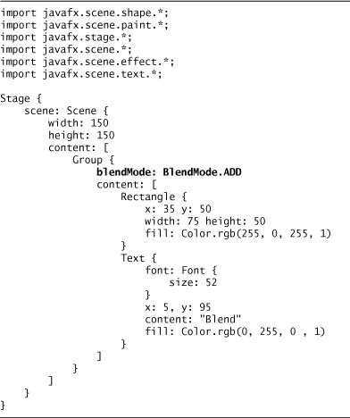
Figure 6.18 displays the resulting output.
Figure 6.18 BlendMode.ADD Effect

The resulting image shows, even in grayscale, that the text appearing inside the rectangle is white. This happens because the rectangle color, specified in (R, G, B), is (255, 0, 255), whereas the text has a color of (0, 255, 0). If we add each of the individual components up, we get a resulting color of (255, 255, 255).
For our next example, we’ll make one small code change to Listing 6.4 to demonstrate a different BlendMode effect. Replace the BlendMode.ADD occurrence with BlendMode.MULTIPLY as follows:
blendMode: BlendMode.MULTIPLY
Figure 6.19 shows the result.
Figure 6.19 BlendMode.MULTIPLY Effect

This time, the text enclosed within the rectangle is black. Why? Because the individual color components are multiplied with one another rather than added. The resulting (R, G, B) color is now (0, 0, 0).
For our next example, we’ll utilize the Blend effect to demonstrate two additional BlendModes. Blend includes, among others, two instance variables called topInput and bottomInput which, as their names imply, let you identify both top and bottom inputs, respectively, for blending. We’ll specify the topInput variable to show how the SRC_OUT and SRC_IN BlendModes can be used and how they differ.
Our code for this segment furthermore introduces a new effect called Flood, which “floods” a rectangular region with an effect denoted by its paint instance variable (in this case, a LinearGradient instance). This could be used as a potentially more efficient alternative to rendering a Rectangle. Before showing the listing and the resulting output, Table 6.4 describes the available SRC BlendModes.

Just in case you’re a little confused by the descriptions, let’s show how an example usage of SRC_OUT might be coded. Listing 6.5 has the specifics.
Listing 6.5 Demonstrating SRC_OUT BlendMode


Figure 6.20 displays the output generated by executing the code found in Listing 6.5.
Figure 6.20 BlendMode.SRC_OUT Effect

Figure 6.21 shows what happens when the SRC_OUT BlendMode found in Listing 6.5 is replaced with SRC_IN as represented by the following line of code:
mode: BlendMode.SRC_IN
Figure 6.21 BlendMode.SRC_IN Effect

PerspectiveTransform
Thus far, the effects examples in this chapter revolved around basic shapes, neglecting a whole universe of content available to JavaFX in the form of images. For the remainder of this chapter, we’ll switch gears and use images rather than shapes to demonstrate that effects can be applied to this type of content in the same fashion.
The first of these effects, PerspectiveTransform, gives us a mechanism to render an artificial 3D effect to content that is otherwise two-dimensional. It is accomplished by mapping the original content to an arbitrary four-sided polygon to provide perspective. The instance variables that must be defined represent the (x,y) coordinates of the new polygon, namely the upper-left (ulx, uly), upper-right (urx, ury), lower-left (llx, lly), and lower-right (lrx, lry) corners. Let’s begin with an image as shown in Figure 6.22.
Figure 6.22 Base Image Before PerspectiveTransform

Let’s apply a PerspectiveTransform on it, using this code:

The resulting image is transformed into the output displayed by Figure 6.23.
Figure 6.23 Base Image After PerspectiveTransform Has Been Applied

Glow and Bloom
The Glow and Bloom effects are comparable in function and usage. In this section, we’ll supply examples of both, ultimately contrasting the subtle differences that Glow and Bloom provide for the JavaFX developer.
Glow
To show the Glow effect, we’ll borrow an idea from our sample Sudoku application. While playing the Sudoku game, when you click on a space on the board, the number inside that space will glow for the duration of the mouse click. So applying a Glow effect to one of the numbers, which are represented as images, is as easy as this:

The level instance variable that is part of Glow is responsible for setting the intensity of the glow effect. It takes a number ranging in value from 0 to 1. Figure 6.24 shows what the number image looks like under normal conditions and how it appears when a Glow effect with intensity level .9 is applied.
Figure 6.24 Before and After a Glow Effect Has Been Applied
To provide slightly more context within the Sudoku application, the Glow effect is achieved by catching and handling the mouse events that occur on the node represented by the board space. When the mouse is pressed on a space, a Glow effect is assigned to the image occupying that space. When the mouse is released, the effect is taken away. The onMousePressed and onMouseReleased handlers of the Sudoku SpaceNode look as follows:

Bloom
Very similar to Glow, instead of operating on the entire image, the Bloom effect focuses on the brighter aspects of an image and makes them appear to glow. The primary instance variable associated with Bloom is called threshold and can be assigned a value between 0 and 1. Here’s how it might be applied to a sample image with embedded text:

Figure 6.25 depicts three separate images and the subtle differences that result as the Glow and Bloom effects are utilized. The first image is rendered with no effects; the second includes a Glow effect and the third a Bloom effect. Again, the original images are in color. Rendering them in grayscale here may further reduce the details.
Figure 6.25 Applying Glow and Bloom Effects to an Image

DisplacementMap
One of the more sophisticated effects, you can use a DisplacementMap to change the appearance of your content in some very unique ways. For each pixel, a corresponding user-supplied FloatMap entry is retrieved, and along with optional scale and offset instance variables, applied to the content to produce a new output.
For this effect, we’ll lean heavily on the JavaFX API documentation. As explained there, each individual FloatMap entry contains per-pixel offset information in the x and y direction. Filling FloatMap entries with values of (0, 0) would signify no offset change, whereas a FloatMap full with values of (0.5, 0.5) would yield an offset half the original source size.
Taken in good part from the API documentation, the next example fills a FloatMap with data produced by a mathematical function (a sine wave). The result of using it inside a DisplacementMap produces a wavy effect on your content. The API example uses shapes and text as input. If instead we use the image of, for example, a flag, the DisplacementMap effect could be construed to produce an image of a flag flapping in the wind. Listing 6.6 has the details.
Listing 6.6 An Example Usage of DisplacementMap

Figure 6.26 shows the before and after effect on an image representing the flag of Brazil.
Figure 6.26 Before and After Effects of Applying a DisplacementMap on an Image

Miscellaneous Color Adjustment Effects
The final two effects described in this chapter revolve primarily around the manipulation of color. Because the publishing process converts images to grayscale, effectively defeating the intended outcome of these effects, we’ll forego furnishing sample images for this section.
SepiaTone
One such effect, called SepiaTone, can be used to simulate the look of a faded antique photo. It includes a level instance variable that takes a value ranging from 0 to 1 controlling the intensity of the effect. Using our original Statue of Liberty image and applying a SepiaTone to it can be described as follows:

We suggest you create a simple example or two to get a feel for how this effect might be used.
ColorAdjust
JavaFX provides the ability to adjust the contrast, hue, saturation, and brightness of your content via the ColorAdjust effect. Table 6.5 describes the available instance variables.
Table 6.5 ColorAdjust Instance Variables

Chapter Summary
For this chapter, we’ve touched on the effects that come as part of the JavaFX platform, and included straightforward examples of how these can be utilized, stressing simplicity. This should serve as a quick reference as you delve into making your content more eye-catching.