
12
JavaFX Code Recipes
“As everybody knows, there is only one infallible recipe for the perfect omelette: your own.”
—Elizabeth David
JavaFX code recipes are simple pieces of code that show how to tackle a unique coding problem. There are probably a million such recipes, we have chosen a few to detail in this chapter that are somewhat unique to the JavaFX environment.
The first section, JavaFX and JavaBeans, shows a way to bridge the JavaFX and JavaBeans frameworks. Next, the section on Server Call Back details how to deal with asynchronous call backs from a server. The Node Effects—Fader and Magnifier section demonstrates how to use generic classes for two common effects. Wizard shows how to implement the Wizard pattern for breaking a complex process into smaller tasks. Progress Bar and Slider lay out how to implement two common components. Finally, Matrix details how to implement a two-dimensional array in JavaFX.
On the book’s Web site at http://jfxbook.com, you can find the full listing for all these recipes.
JavaFX and JavaBeans
JavaBeans technology is a component architecture with the Java platform that supports component reuse. It has been around since the early days of Java, and most of the Java GUI components are built using it. One of the primary concepts behind JavaBeans is the concept of properties, or named attributes. JavaBean components have a set of properties accessed through get and set methods called getters and setters. Another core feature is events. Events provide a standardized mechanism for a JavaBean to notify an interested object that its state has changed.
Though there is no built-in link between JavaFX and JavaBean components, it is easy to write some glue code to bridge these two. To demonstrate this, we will implement a number spinner in JavaFX based on the Java Swing class JSpinner. A number spinner lets the user select an integer by sequencing through the numbers one at a time in either direction, but using mouse clicks. This is shown in Figure 12.1.
Figure 12.1 Swing Number Spinner

To implement the SpinnerNumber class, we must first create a custom Swing component, by extending the javafx.ext.swing.SwingComponent class.
public class SwingNumberSpinner extends SwingComponent {
Next, we need to implement the createJComponent() method from SwingComponent. This is where we instantiate the javax.swing.JSpinner object. The default constructor for JSpinner automatically installs an integer data model, javax.swing.SpinnerNumberModel, to support the JSpinner.
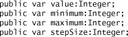
For this particular example, the properties that we are really interested in are found in the SpinnerNumberModel. These are the maximum and minimum value for the spinner, the step size that tells the spinner how much to step when the user selects up or down, and of course the value of the number. In JavaFX, we will create instance variables for each of these.
This provides the basic JavaFX code, but these instance values are still not connected at all to the JSpinner object. To start connecting these instance variables to JavaBeans properties, you assign a default value from the SpinnerModel and then when the instance variable changes, you set that value in the JSpinner object. Here is how value is now set.

There are a couple of things to point out with this. First, getModel() is a convenience function that just gets the SpinnerNumberModel object from the JSpinner.
Second, it is necessary to narrow the model’s getNumber() result. The getNumber() method returns a java.lang.Number and this needs to be coerced to an integer by calling its intValue() method. The rest of the variables work similarly; however, the variables minimum and maximum have a little twist.
In the SpinnerNumberModel, the minimum and maximum properties return an object that may be null. When they are null, there is no minimum or maximum integer, in effect they are infinite. The issue with this is that currently, Number and Integer in JavaFX cannot be null, so we have to deal with this. There are several options for handling this. One is to create a flag, one for each of the two instance variables, to indicate that they are infinite. The other is to convert the null to a very low minimum or a very high maximum, respectively. We decided to do the latter. For the minimum variable, we created the getMinimum() function as shown in the following listing.
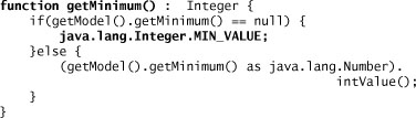
If the SpinnerNumberModel minimum property is null, this function returns java.lang.Integer.MIN_VALUE. Next, we modify the minimum instance variable to be initialized using this function.

The maximum variable is handled in a similar way with the getMaximum() returning java.lang.Integer.MAX_VALUE if the SpinnerNumberModel maximum property is null.
Now, all the JavaFX instance variables are connected to the JavaBean properties, but only in one direction. Whenever the JavaFX instance variable changes, the corresponding property in the JavaBean class will also be updated. For example, if the JavaFX variable, value, is set to 50, the SpinnerNumberModel value property will also be set to 50 and the JSpinner’s view will accordingly be updated to show 50. To finish the connection, though, we need to know when the JSpinner changes its properties. These kinds of changes can originate from the user typing in a number in the JSpinner’s entry box or using the up or down buttons to sequence through the numbers.
To connect changes originating from the JavaBean, we need to install event listeners on the JavaBean object. The type of event listener to install varies depending on what the JavaBean object supports. Many of the Java GUI classes support the java.beans.PropertyChangeListener interface to notify other objects of change to one of its properties. However, in this example, we are more interested in the properties contained in the SpinnerNumberModel object that is installed in the JSpinner component. JSpinner supports the javax.swing.event.ChangeListener interface that handles ChangeEvents. Change events are fired when the source object wants to notify interested listeners that some state has changed within the object. We need to register a ChangeListener on the JSpinner object so that our JavaFX object is notified that the JSpinner has changed its state.
To do this, we need to add code to the init block for the JavaFX SwingNumberSpinner class.
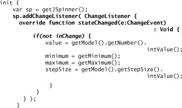
Now whenever the JSpinner changes state, we are notified, and then we can update the instance variables in JavaFX SwingNumberSpinner. Unfortunately, the ChangeEvent does not tell us which value changed, so we have to update them all. However, the JavaFX runtime knows if the value is actually changing so any triggers or bind actions will only occur if there is a real change in value.
You may have noticed that we slipped in a Boolean variable, inChange, in the preceding example. This is necessary, because if the change initiates from the JavaFX code by changing one of the instance variables, the corresponding JSpinner property will also be updated. This will cause the JSpinner object to fire a change event, which in turn tries to change the instance variable. So we end up in an unending loop. To avoid this, we introduce the Boolean variable, inChange. When the change originates with a change to the JavaFX variable, inChange is set to true so that the state changed handler will not then update the same instance variable. The following listing shows how this is done with the JavaFX instance variables.

Now we have full bidirectional coordination from the JavaFX object to the JavaBeans component. Whenever the JavaFX object’s state changes, the JavaBeans object will immediately be updated to stay in synch. On the other side, whenever the JavaBeans object changes state, the JavaFX object state will likewise be updated.
Server Call Back
Servers can asynchronously send messages to a JavaFX application using a variety of frameworks such as Message Oriented Middleware (MOM). To receive asynchronous messages, the first step is to register some form of call back address with the server. Then, whenever the server decides that a message should be sent, it is sent to this call back location using an agreed upon protocol. Different frameworks may use different message formats and protocols and varying transport, but conceptually they work the same.
Typically, when the client receives an asynchronous message, the receiver framework is running in its own thread and dispatches messages either from that thread or via a thread from a thread pool. If you recall, JavaFX runs in its own main thread and all updates to JavaFX objects must occur on that main thread. This requires that the message be pushed onto the main JavaFX thread before any JavaFX objects are modified. The main objective of this code recipe is to show how to receive an asynchronous message from the server, and then move it into the JavaFX main thread for processing.
To illustrate this, we will use an example based on the Java Messaging Service (JMS) API. In this example, the server process publishes to a JMS Topic; the JavaFX client subscribes to the JMS Topic and receives the messages. This is the classical Pub/Sub paradigm.
For our simple example, the server, written in Java, periodically updates the time. This kind of service is useful if the client application needs to synchronize its notion of time with the server platform. Every second, the server sends a JSON message to the JMS topic named “clock”. The message includes the milliseconds obtained from the Java call, System.currentTimeMillis(). The following is an example of this JSON message.
{ "clock": "1232822581540" }
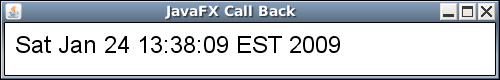
The client receives this message and displays the time represented by the clock millisecond value in a JavaFX Text object as shown in Figure 12.2. This is updated roughly every second.
Figure 12.2 JavaFX Call Back – Clock
To implement this in the JavaFX client, first create a Java class, called Subscriber. This class connects to the JMS broker, subscribes to the “clock” topic, then starts listening for messages. The Subscriber class implements the javax.jms.MessageListener interface and registers itself with the JMS client framework to be notified whenever a new message arrives. The MessageListener defines a method that Subscriber must implement, public void onMessage(Message msg). When a message is received by the JMS client, it in turn calls the onMessage() method in Subscriber.
ClockUpdater is a JavaFX class and it also extends javax.jms.MessageListener and implements its own onMessage() function. The reason we cannot use this directly with the JMS client framework is that the JMS client framework would call this function using one of its threads, not the main JavaFX thread. Modifying JavaFX objects on any other thread than the main JavaFX thread is not supported and likely will cause a serious exception.
When the JMS client calls the Java Subscriber.onMessage() method, it will not be on the JavaFX main thread. We need to move the message over to the JavaFX main thread, and then push that message over to the JavaFX object. To do this, we need to use the com.sun.javafx.runtime.Entry.deferAction() method to invoke the JavaFX function on the main JavaFX thread.
The constructor for Subscriber takes two arguments: the first identifies the JMS topic, and the second is the JavaFX class to notify when a message is detected from JMS. Because the JavaFX class extends the Java interface MessageListener, we can refer to this class directly. This is shown as Java code in Listing 12.1.
Listing 12.1 Subscriber.java

When the JMS client calls the Subscriber.onMessage(Message msg) Java method, we then use the Entry.deferAction() method to call the JavaFX onMessage(msg:Message) function from the JavaFX main thread. Notice that we need to change the message parameter to the Java onMessage() method to final. This is so that it can be visible when the deferAction Runnable is invoked. Listing 12.2 shows the Java onMessage(Message msg) implementation.
Listing 12.2 Subscriber.java – onMessage()

On the JavaFX side in ClockUpdater.fx, the implementation is normal JavaFX. The message is checked to make sure it is a javax.jms.TextMessage, and then the JSON string is set and parsed. Listing 12.3 shows how this is done.
Listing 12.3 ClockUpdater.fx
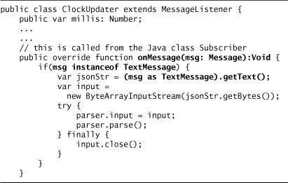
This JavaFX code then gets the JSON string from the TextMessage object and parses it using a javafx.data.pull.PullParser. For detailed information on using the PullParser class, consult Chapter 10, Create RESTful Applications. Listing 12.4 shows the simple implementation to process the clock JSON message.
Listing 12.4 JSON Clock Message

The instance variable, millis, needs to be a Number rather than an Integer, because the actual value of the System time is larger than an Integer can hold. Another way to declare millis is with a Long.
Node Effects—Fader and Magnifier
A common effect is for a node to fade in to out as a transition between views. A transition effect allows a smoother change from one view to another. Another common effect is to magnify a node when the mouse hovers over it. The following code recipes show a way to implement these effects using reusable classes.
Fader
The Fader class supports the visual fade in or out of a node. If fade in is desired, when a node is shown, it will transition from invisible to visible over a period of time. If fade out is chosen, it will change from visible to invisible. There is also a setting for scaling while these transitions occur. Using scaling, the node can grow from small to normal size as it transitions to visible. On the reverse side, while fading out, the node can shrink from its normal size.
The Fade type can be IN, OUT, or BOTH, and these are defined in the Java enumeration FadeType. If the fade type is IN, when the node is shown, its opacity changes from zero, or invisible, to 1.0, totally visible. Also, its scaling transitions from a minimum to a maximum scale, with the default set to 0.0 and 1.0, respectively. It the fade type is OUT, when the node is changing to not shown, the node’s opacity and scaling will reverse direction, with opacity changing to 0.0 and scaling to the minimum. Of course, the BOTH type does this when the node is changing from not shown to shown and again when the node is changing from shown to not shown. The duration of the transition is set using an instance variable, duration. Listing 12.5 shows the JavaFX code for these attributes in the Fader class.
Listing 12.5 Fader.fx

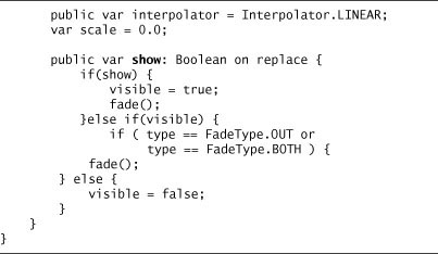
To control the transitions, we added an instance variable, show. When show is set to true, the node is made visible, and then the transition starts. When show changes to false, the reverse transition is started, and the node’s visible variable is set to false. The actual fade transitions are controlled with a Timeline that is started in the function fade(). This is demonstrated in Listing 12.6.
Listing 12.6 Fader.fx – show()
You may be wondering why we did not just use the visible variable and add a trigger to it to commence the animations. Normally, a node becomes visible when the visible instance variable is set to true and invisible when it is set to false. We could have done an override on the visible variable and added an on replace trigger to start the fade animation, similar to Listing 12.7.
Listing 12.7 Fader.fx – visible
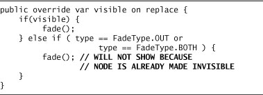
This does work when the visible variable is set to true. However, when the visible variable is set to false, the JavaFX framework immediately sets the node to invisible, so any subsequent animations do not have any visual effect. Because of this, we introduced the show instance variable. When show is set to true, visible is set to true and the fade animation starts. When show is set to false, the fade animation starts and the end result of the animation is to set the node’s visible variable to false.
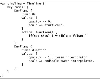
The strategy is to use one Timeline. For fade in, the Timeline progresses forward and the opacity transitions from transparent (0.0) to fully opaque (1.0), while the scale transitions to endScale. For fade out, the Timeline plays in reverse from the end to the beginning, so that opacity transitions to transparent (0.0), and the scale transitions back to startScale. In this reverse direction, when the timeline reaches the beginning or 0 instant, then the visible variable is set to false. The timeline is shown in Listing 12.8.
Listing 12.8 Fader.fx – timeline
The fade function merely controls the playing of the timeline based on the options chosen. If the fade type is either IN or BOTH and show is set to true, then the timeline will play forward from the start. On the other hand, if the fade type is OUT or BOTH and show is set to false, the timeline will play in reverse from the end. Listing 12.9 illustrates how to control the fade animation.
Listing 12.9 Fader.fx – fade

The actual CustomNode is a Group that holds the node with a Scale transformation that is bound to the scale instance variable that changes in the timeline. This is shown in Listing 12.10.
Listing 12.10 Fader.fx – create()

An example of using this class is in the following listing. Listing 12.11 is an excerpt of the sample application that is available on the book’s Web site.
Listing 12.11 Fader Usage
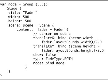
Figure 12.3 shows the Group node as it is growing and becoming more visible on to the scene. Figure 12.4 shows the node fully visible and at its normal size. By depressing the Hide button, the process reverses and the node shrinks and becomes invisible. After the node is again hidden, the button name changes to Show so that you can repeat the process.
Figure 12.3 Fader – Initial Fade In
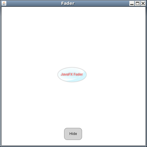
Figure 12.4 Fader – Fully Shown

Magnify
The Magnify class allows the node to grow when the mouse hovers over it. When the mouse is moved off the node, it returns to its normal size. This class is similar to the Fader class in that an animation plays when the mouse moves over the node, and plays in reverse when the mouse moves off the node.
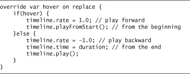
This is done by adding an on replace trigger to the hover instance variable inherited from javafx.scene.Node. The following code in Listing 12.12 demonstrates this.
Listing 12.12 Magnify – hover
The timeline modifies the scale from its start setting to its end setting, 1x and 1.5x, respectively, by default. The default is to use a linear interpolator. Listing 12.13 shows how this is done.
Listing 12.13 Magnify – timeline

The CustomNode uses the same structure as used in Fader. The node is included in a Group that has a Scale transform that is bound to the scale instance variable that is used in the timeline. Listing 12.14 depicts how this is accomplished.
Listing 12.14 Magnify – create()

To use this class in a stage, just instantiate it with a node and include it in the scene’s contents. Listing 12.15 shows a way to do this.
Listing 12.15 Magnify – Usage

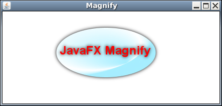
When this is run, the node is centered in the scene at normal size. This is shown in Figure 12.5.
Figure 12.5 Magnifier – Normal Size
When the mouse is moved over the node, it grows to 1.5 times its normal size. This is demonstrated in Figure 12.6.
Figure 12.6 Magnifier – Mouse Hover – Magnified
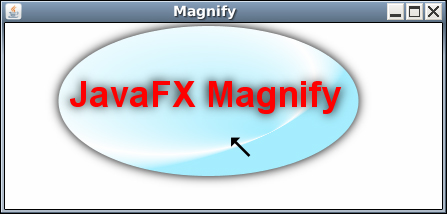
When the mouse is moved off the node, it returns to normal size.
Wizard Framework
When a user needs to process a lot of information, breaking this process into a series of discrete steps allows the whole process to be simplified. In essence, this allows the user to see a clear path to the end goal, while making each subtask smaller and more comprehensible. Typically, wizards are used for assignments that are long or complicated or in cases where the process is novel to the user. Examples of when wizards should be used include first-time customer registration or order processing for the casual user.
A simple wizard pattern is just a series of sequential displays presented to the user, so that the user can complete each task. Users are often presented with buttons to move to the next task or move backward to the previous task. A Cancel button is provided so that the user can cancel the entire operation. After all the tasks are completed, the computer program can do the necessary processes for completing the operation. A more complex wizard could move on to alternative tasks depending on how the user responds to previous tasks. Usually, the user is kept abreast of the progress through the entire process, showing which tasks have been completed and which are pending.
Figure 12.7 shows a typical wizard display. At the top is a progress indicator; the current task is highlighted and the remaining tasks appear to the right in sequential order. In the middle of the display is the user input area. At the bottom are areas for three buttons: Back, Next, and Cancel. In Figure 12.7, the Back button is not shown as the wizard is on the first task and there is no previous task.
Figure 12.7 Wizard – First Task

To implement the wizard pattern in JavaFX, we have created a Wizard class that controls the display of all the tasks defined for the wizard. This class uses the WizardItem class that defines the individual displays used by each task. The Wizard class contains an instance variable, currentItem, that defines the displayed item represented by a WizardItem object. The instance variable, tasks, is a sequence of the task names that are displayed in the progress indicator at the top of the window. Each WizardItem contains an instance variable, taskId, that indexes into the wizard tasks sequence and maps the WizardItem to a task name. When the user finishes all the tasks, the WizardItem’s instance variable, complete, function is invoked. If the user selects the Cancel button, the WizardItem’s instance variable, cancel, function is called. An example of creating a wizard is shown in Listing 12.16.
Listing 12.16 Wizard Object Literal
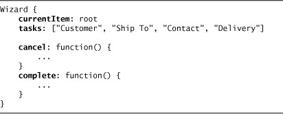
Notice that the currentItem is set to the starting WizardItem named root in this example. Each WizardItem contains a node that holds a generic javafx.scene.Node object that is displayed in the middle of the Wizard window when the WizardItem is selected. Each WizardItem also contains a taskId integer variable that maps the item to a task defined in the wizard. When the WizardItem is selected, this causes the appropriate node on the progress indicator to be highlighted. In addition, the WizardItem may contain a message that will be displayed above the wizard buttons.
The WizardItem has an instance variable, next, that holds a function for determining the next wizard item when the user selects the Next button. In conjunction with this, the variable nextItems holds a sequence of the possible next WizardItems. In a simple case, this will only contain one WizardItem. In a complex case, this may contain multiple items and represent alternative paths that may be chosen based on user input. By default, next is set to a function that returns the first item from the nextItems sequence. This covers the simple case of one item sequentially after another. If there are alternative paths or if special processing is required before advancing to the next item, a custom next function may be defined to determine the next WizardItem.
An example WizardItem object literal is shown in Listing 12.17. In this example, the node is a CustomerAddressControl that extends javafx.scene.control.Control. This item maps to the first task in Wizard, “Customer” by using the taskId of 0. The next function copies data from the current item’s node to the next item’s node, then returns the first “next” item.
Listing 12.17 WizardItem Object Literal

The individual wizard items are linked using the nextItems sequence. As WizardItems are added to the nextItems sequence, each of their wizardParent variables are set to the containing WizardItem. By setting the parent, this allows the user to select the Back button to make the wizardParent the current item, in effect moving backward in the task chain.
In the sequential example depicted in Figure 12.7, the WizardItem task tree is laid out so that the user first enters the customer address, followed by the shipping address, then the contact information, and finally the shipping date. The root’s nextItems contains the WizardItem for customer address. The customer address’s nextItems contains the WizardItem for the ship to address task, and so on. This is depicted logically in the following pseudo code listing.

When there are no more nextItems, the Next button name changes to Finish. When the user selects the Finish button, the wizard’s complete variable’s function is called. Figure 12.8 shows the display when the last item has been reached.
Figure 12.8 Wizard – Last Task

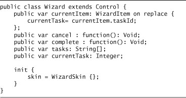
Listing 12.18 shows the definition for the Wizard class. Because this is a Control, the WizardSkin class defines the presentation, and can utilize CSS style sheets to change the display attributes like text-fill and font. JavaFX’s use of style sheets and custom controls are discussed in depth in Chapter 5, Create User Interfaces.
Listing 12.18 Wizard Control
Listing 12.19 shows the definition for the WizardItem class. WizardItem extends CustomNode and provides control functionality to support the wizard framework. The WizardItem itself merely encapsulates the node in a Group.
Listing 12.19 WizardItem

Progress Bar
A progress bar is fairly simple to implement. There are two classes, the ProgressBar that is a control and the ProgressBarSkin that is the ProgressBar’s skin class. ProgressBar contains a percent variable that holds the fraction representing the percent complete and an optional message variable that is centered in the display. If this message is not defined, the actual percent will be displayed as a percentage. Listing 12.20 shows the ProgressBar class.
Listing 12.20 ProgressBar

ProgressBarSkin defines a rectangle for the entire background area, and another rectangle that grows in width based on the percent complete. This second rectangle graphically depicts the percent complete. Each of these two rectangles has its own fill color.
What is interesting about this implementation is that the message is displayed in a different color when the progress bar is over it. If you look carefully at Figure 12.9, you will notice the letters P, r, o, g are painted in a different color from the remaining characters that fall outside of the progress bar.
Figure 12.9 Progress Bar

To accomplish this, the ProgressBarSkin class uses two text shapes for the same string and font located in identical positions centered in the ProgressBar space on top of each other. The first Text object uses one color, whereas the second Text class uses another color. By using the progress rectangle as a clipping region, we can control when and what part of this second text is displayed. Listing 12.21 shows how this is done.
Listing 12.21 ProgressBarSkin – Text Elements
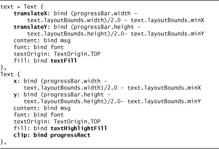
There are a couple of things to note here. First, the second Text object needs to be located using its x and y variables rather than using its translateX and translateY variables. This is because the clipping region is based on the geometry of the progressRect before the transformations take effect. If we had used translateX and translateY, the clipping action would actually be shifted to the left and the text would show in the alternate color too soon.
The other issue is that in calculating the center position for the second text object, we could not use the layoutBounds for the second text, but had to use the layout bounds from the first text. This is because the layoutBounds for the second text change as the clip region changes. Remember, both Text objects are identical except for color, so the first Text’s dimensions stay constant and still represent the dimensions of the second Text object.
The last important point to this is the second text must appear on top of the first text. This is dictated by the order that the Texts are added to the overall Group’s content sequence. Nodes added at the end of the content sequence will paint on top of nodes added earlier into the Group’s content sequence. Normally, the second text would obscure the first text, but because we are using a clipping region on the second Text object, the first node is not obscured until the progress rectangle crosses over it.
Slider
A slider is a visual component that has a knob that can be moved to change a value between a minimum and a maximum. The user drags the knob to a new value or just clicks on any point on the slider bar to immediately move the knob to this position and set the value accordingly.
We implement this slider as a control with a corresponding skin. The main Slider class contains variables to hold the value, along with minimum and maximum values. There are also two Boolean variables, showLabels and showTicks, to control whether to show the minimum, current value, and maximum labels, and whether to show the tick lines. Lastly, there is a variable, snapTo, that determines the rounding precision for the value. When the value is dragged or otherwise set clicking on the slider bar, the value will be rounded to this precision. The Slider class is shown in Listing 12.22.
Listing 12.22 Slider – Control

The SliderSkin class contains a rounded rectangle for the slider bar, a rectangle for the knob, some lines for the tick marks, and some Text objects for the labels. What is most interesting is how the drag operation works.
To make the drag work on the knob rectangle, you need to add functions for mouse pressed, released, and dragged events. First, when the mouse is pressed, we need to save the current horizontal location of the knob into the saveX variable as a starting reference point for the drag. Another variable, controlX, defines the current horizontal location of the knob, this is changed based on the value instance variable as a percentage of the value to the total value range.

As the mouse is dragged and finally released, we calculate the percentage of the mouse horizontal position to the total width of the Slider and use that percentage to adjust the value. The mouse event dragX variable actually represents a delta since the drag started, so we must add this to the saved location for the knob to get a new location for the knob. We do not change the knob location directly because the knob’s location, held in the controlX variable, is bound to the slider’s value. Instead, we merely set the value based on the percentage of the total slider width. This, in turn, results in the knob moving to the new location. Notice, we have to limit the percentage derived from the mouse position to between 0.0 and 1.0, inclusive. This is because the mouse may be dragged beyond the boundaries of the Slider.

The private function, calcValue(), takes the width percentage and applies it to the value range to determine the new slider value. This function also rounds the actual value based on the Slider’s snapTo variable. For example, if snapTo is 1.0, the value will be rounded to the nearest whole number. If snapTo is 0.5, the resulting value is rounded to the nearest half. For instance, a value of 50.37 becomes 50.5, whereas 50.21 becomes 50.0. Listing 12.23 shows how this is done.
Listing 12.23 SliderSkin – calcValue()

An example of using a slider is in Listing 12.24. The value is bound to a local variable called lvalue. This must be bound with inverse as a change to lvalue will be reflected on the slider, and if the user changes the slider value, this will in turn be reflected in lvalue. Failure to use the with inverse bind will result in an exception.
Listing 12.24 Slider Usage
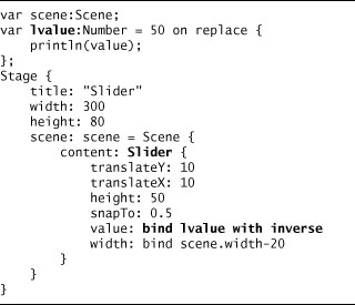
Figure 12.10 shows what the Slider looks like. Also, remember that because Slider is a control, you can use cascading style sheets to control its appearance. This includes the colors, knob size, and fonts. For more information on using cascading style sheets, see Chapter 5.
Matrix
In JavaFX, sequences are one dimensional and you cannot create a sequence of a sequence. There is no notion of a two-dimensional array, like Object[][]. Even if you attempt to create a matrix by assigning another sequence to one item, the original sequence actually inserts the assigned sequence into itself. To get around this, we have created a matrix class that uses a JavaFX sequence as a backing store, but allows manipulation of the individual items using a row, column approach.
The Matrix class contains a variable, sequence, that holds the backing sequence. In addition, the columns variable holds the number of columns, whereas rows holds the number or rows in the matrix. Notice that rows is read only and is calculated based on the number of columns and the size of the sequence. Matrix is defined as illustrated in Listing 12.25.
Listing 12.25 Matrix

There are also get and set functions that use the row, column addressing scheme to manipulate cell contents. These use the function getIndex() to calculate the offset into the backing sequence by multiplying the row by the number of columns and adding the column parameter to this.

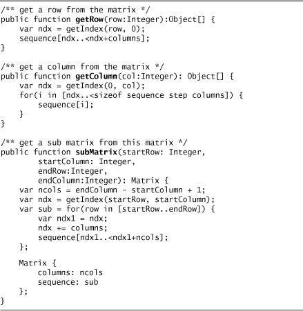
There are three functions that retrieve sets of values out of the Matrix. The function getRow() returns a sequence of all the values in a row, whereas getColumn() returns all the values in a given column. The function subMatrix() retrieves a rectangular subset from the matrix based on starting row and column and ending row and column. It returns a new Matrix. These functions are implemented in Listing 12.26.
Listing 12.26 Matrix – getRow(), getColumn(), subMatrix()
An example of using a Matrix is shown in the following listing. This uses a 9×9 matrix similar to the Sudoku pattern. The getRow(3) and getColumn(5) functions return a sequence of Integers, whereas the subMatrix(3,3, 5,5) function returns a new 3×3 matrix.

Chapter Summary
These are just a few code recipes that may help you develop your applications in JavaFX. There are probably many more, but we wanted to cover a few classes that contained interesting aspects. We hope these recipes help you to better understand some of the finer points that we have experienced while preparing this book.
We have covered all of the basic concepts of JavaFX including the JavaFX language, features, and framework classes. Now it is time to put all this together in an application. We have elected to do a Sudoku game. This application demonstrates most of the concepts we have discussed in this book and we feel it will help you to see how it all comes together.