
Layouts and UI Controls
As more and more graphically rich applications find their way into our lives such as desktops, smart phones and tablets devices, it is very important to design GUI applications that provide better usability across the different form factors. With the increase of the number different screen sizes a UI developer will need to learn how to create applications with UI layout management in mind.
In this chapter we will be discussing the most common JavaFX layouts used in GUI applications of today. After layouts are discussed in the first half of this chapter an example will be presented showing a form-based application. The form-based application demonstrates the resizing of child UI controls as the parent window is being resized. The last half of the chapter will be about commonly used JavaFX UI controls. JavaFX UI controls include menus, menu items, list views, table views and progress indicators.
One of the greatest challenges in building user interfaces is the laying out of UI controls onto the display area. In GUI applications it is ideal to allow the user to resize a viewable area while UI controls also resize in order to provide a pleasant user experience. Similar to Java’s Swing API, the JavaFX API has stock layouts that provide the most common ways to display UI controls onto the scene graph. Following are the JavaFX layouts discussed in this section:
- javafx.scene.layout.HBox
- javafx.scene.layout.VBox
- javafx.scene.layout.FlowPane
- javafx.scene.layout.BorderPane
- javafx.scene.layout.GridPane
HBox
The HBox layout’s job is to place JavaFX child nodes in a horizontal row. As child nodes are added consecutively, each is appended to the end (right side). By default, the HBox layout honors the child’s preferred width and height. When the parent node is not resizable (a Group node, for example), the row height of the HBox takes on the height of the child node with the greatest preferred height. Also, by default each child node aligns to the top-left (Pos.TOP_LEFT) position.
The HBox can be configured to have resizing ranges to allow the parent to manage and calculate space available upon layout requests. There are many ways you can programmatically alter the HBox’s layout constraints, such as border, padding, margin, spacing, and alignment. Although in this chapter you will learn how to set constraints using a programmatic approach, there are also alternative strategies. One well known and preferred strategy is to style or set constraints using JavaFX CSS attributes; you will catch a glimpse of that approach later in this chapter, and more details in Chapter 6, on custom UIs.
When dealing with nonresizable child nodes such as Shape nodes, the parent takes into account the Shape’s rectangular bounds (ParentInBounds), its width and height. In contrast, when using resizable nodes such as a TextField control, the parent has the ability to manage and compute the available space for the TextField to grow horizontally. To grow UI controls horizontally within an HBox, use the static HBox.setHgrow() method. The following code snippet sets a TextField control to grow horizontally when the parent HBox’s width is resized:
TextField myTextField = new TextField()
HBox.setHgrow(myTextField, Priority.ALWAYS);
As an example of an HBox layout in action, the code shown in Listing 4-1 uses four rectangles as child nodes with varying HBox constraints. Nonresizable nodes such as rectangle shapes are used in the example to demonstrate the many spacing attributes for the HBox layout control. For brevity, only the relevant code is listed here. To see the full listing, please visit the Source Code/Download tab of the book’s page at www.apress.com to download the source code.
Listing 4-1. The HBoxExample.java file demonstrates an HBox layout with shapes as child nodes
HBox hbox = new HBox(5);         // space between child nodes only
hbox.setPadding(new Insets(1));  // padding between hbox border and row.

Rectangle r1 = new Rectangle(10, 10); // Square
Rectangle r2 = new Rectangle(20, 20); // Big Square
Rectangle r3 = new Rectangle(5, 20);  // Vertical rectangle
Rectangle r4 = new Rectangle(20, 5);  // Horizontal rectangle

HBox.setMargin(r1, new Insets(2,2,2,2)); // space between border & child node
hbox.getChildren().addAll(r1, r2, r3, r4);
Figure 4-1 is the output of Listing 4-1.

Figure 4-1. The output of the file HBoxExample.java, demonstrating the HBox layout
In Listing 4-1 the code begins by instantiating an HBox using the single-argument constructor. This constructor takes a value of type double, which specifies the horizontal space (in pixels) between child nodes. This is also the equivalent of invoking the setSpacing() method. Because spacing, padding, margin, and border can often be confusing I’ve illustrated an HBox in Figure 4-2. The figure displays three gray rectangular areas, each five pixels wide, that represent the spacing between child nodes (r1 to r4). Setting the spacing uses an Insets object that allows you to create space between the HBox’s child nodes. Notice that the inner part of the HBox border has yellow padding one pixel wide surrounding the row.
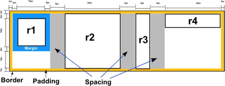
Figure 4-2. An example of an HBox layout containing four rectangles
After creating all four rectangles, the code sets the margin on rectangle r1. To set the margin you’ll notice the static method HBox.setMargin(Node, Insets). The code creates an Insets object with a margin of two pixels for the top, right, bottom, and left. As shown in Figure 4-2, this is the surrounding space around rectangle r1 (blue). To calculate the size of the HBox’s dimensions, you basically add up the spacing, margin, padding, and the child nodes’ bounds (ParentInBounds). When the parent of the HBox is a Group node (not resizable), the HBox width will total 76 pixels and the height 22 pixels.
The VBox layout is similar to an HBox, except that it places child nodes stacked in a vertical column. As children are added, each is placed beneath the previous child node. By default the VBox honors the children’s preferred width and height. When the parent node is not resizable (for example, a Group node), the maximum vertical column’s width is based on the node with the greatest preferred width. Also, by default each child node aligns to the top-left (Pos.TOP_LEFT) position. VBox layouts can also be configured to have resizing ranges to allow the parent node to manage and calculate space available upon layout requests. To demonstrate the use of a VBox, the example in Listing 4-2 contains the same four rectangles from the previous example, with the same layout constraints.
Listing 4-2. The VBoxExample.java file, demonstrating VBox layout
VBox vbox = new VBox(5);                 // spacing between child nodes
vbox.setPadding(new Insets(1));          // padding between border and child nodes

Rectangle r1 = new Rectangle(10, 10);    // little square
Rectangle r2 = new Rectangle(20, 20);    // big square
Rectangle r3 = new Rectangle(5, 20);     // vertical rectangle
Rectangle r4 = new Rectangle(20, 5);     // horizontal rectangle
VBox.setMargin(r1, new Insets(2,2,2,2)); // margin around r1
vbox.getChildren().addAll(r1, r2, r3, r4);
Figure 4-3 shows the output of the VBoxExample.java application in Listing 4-2, demonstrating the VBox layout with rectangle shapes as child nodes.
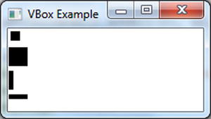
Figure 4-3. The output of VBoxExample.java
In Listing 4-2, the code begins by instantiating a VBox with a five-pixel space between child nodes. Figure 4-4 depicts horizontal gray bars that represent the spacing between child nodes (r1 to r4). After constructing the VBox, you set the padding via setPadding() method. Setting the padding by using an Insets object allows you to create padding between the border and the row. Notice in Figure 4-4 the VBox padding of one pixel surrounding the VBox shown surrounded by a yellow line.
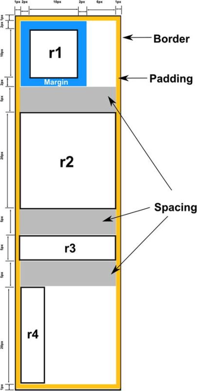
Figure 4-4. VBox containing four rectangle child nodes
Once the four rectangles are created, the code sets the margin on the rectangle r1. To set the margin we use the static method VBox.setMargin(Node, Insets). The code then creates an Insets object with a margin of two pixels for the top, right, bottom, and left. Surrounding rectangle r1 is a two-pixel margin shown in blue. To find the total size of a VBox instance, you simply add up the spacing, margin, padding, and child nodes’ dimensions (bounds). Having a Group as a parent, the VBox node’s calculated width would total 22 pixels, and the height would total 76 pixels.
The FlowPane layout node allows child nodes in a row to flow based on the available horizontal spacing and wraps nodes to the next line when horizontal space is less than the total of all the nodes’ widths. Depicted in Figure 4-5 are four child nodes flowing from left to right and then wrapping.

Figure 4-5. A FlowPane layout with nodes flowing left to right with the ability to wrap nodes based on horizontal space. The Hello text node is wrapped to the next line because the available horizontal space, denoted by the dashed line, is too small
By default a FlowPane layout flows child nodes from left to right (Pos.TOP_LEFT). To change the flow alignment, you can simply invoke the setAlignment() method by passing in an enumerated value of type Pos. Listing 4-3 creates a FlowPane layout to flow child nodes from right to left (Pos.TOP_RIGHT).
Listing 4-3. The creation of a FlowPane layout to flow from right to left
FlowPane flowPane = new FlowPane();
flowPane.setAlignment(Pos.TOP_RIGHT);
flowPane.getChildren().addAll(...); // child nodes to add.
The BorderPane layout node allows child nodes to be placed in a top, bottom, left, right, or center region. Because each region can only have one node, developers typically nest layouts. An example would be to create an HBox with children to then be set as the top region via the setTop() method. Figure 4-6 shows the BorderPane’s regions.
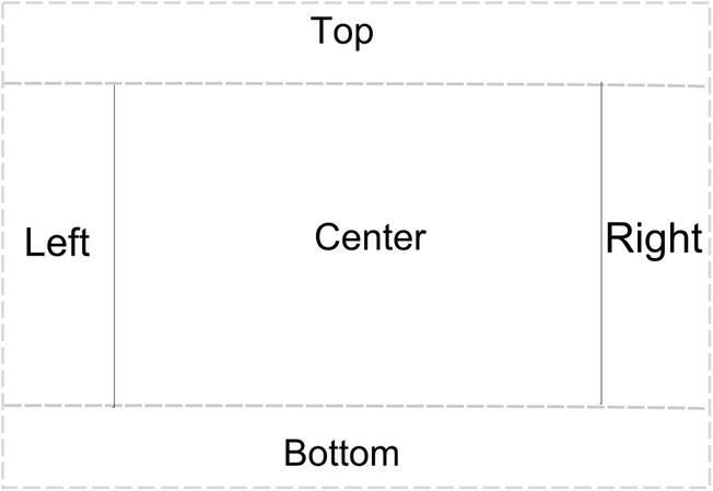
Figure 4-6. The BorderPane layout
This layout is similar to many websites we see every day, where navigational links are placed in either the top, bottom, left, or right regions of a page, while the main content is in the center area. A BorderPane’s region of top and bottom borders allows a resizable node to take up all of the available width. The left and right border regions take up the available vertical space between the top and bottom borders. All of the bordering regions honor the children’s sizes (preferred width and height) by default. According to the Javadocs, the default alignment of nodes when placed in the top, bottom, left, right, and center regions is as follows:
- Top: Pos.TOP_LEFT
- Bottom: Pos.BOTTOM_LEFT
- Left: Pos.TOP_LEFT
- Right: Pos.TOP_RIGHT
- Center: Pos.CENTER
So far you have learned about simple layouts; now let’s take a look at a more advanced layout: the GridPane, commonly used in business applications. For instance, business applications typically have data entry form screens. Forms usually have read-only labels on the first column and input fields on the second column, resembling a grid pattern.
When using the GridPane you can specify constraints at the row, column, or cell level. For example, if the second column contains input text fields, you may want them to resize as the window is being resized. To lay out components in a grid-like manner, the example in Listing 4-4 uses JavaFX’s GridPane layout. The most interesting part of the example is the use of column constraints on the GridPane. Column constraints apply a minimum and maximum horizontal width for the child nodes to grow or shrink as the window is resized.
Listing 4-4. The GridPaneForm.java file demonstrates the GridPane layout
    @Override
    public void start(Stage primaryStage) {
        primaryStage.setTitle("GridPaneForm ");
        BorderPane root = new BorderPane();
        Scene scene = new Scene(root, 380, 150, Color.WHITE);

        GridPane gridpane = new GridPane();
        gridpane.setPadding(new Insets(5));
        gridpane.setHgap(5);
        gridpane.setVgap(5);
        ColumnConstraints column1 = new ColumnConstraints(100);
        ColumnConstraints column2 = new ColumnConstraints(50, 150, 300);
        column2.setHgrow(Priority.ALWAYS);
        gridpane.getColumnConstraints().addAll(column1, column2);

        Label fNameLbl = new Label("First Name");
        TextField fNameFld = new TextField();
        Label lNameLbl = new Label("Last Name");
        TextField lNameFld = new TextField();

        Button saveButton = new Button("Save");

        // First name label
        GridPane.setHalignment(fNameLbl, HPos.RIGHT);
        gridpane.add(fNameLbl, 0, 0);

        // Last name label
        GridPane.setHalignment(lNameLbl, HPos.RIGHT);
        gridpane.add(lNameLbl, 0, 1);

        // First name field
        GridPane.setHalignment(fNameFld, HPos.LEFT);
        gridpane.add(fNameFld, 1, 0);

        // Last name field
        GridPane.setHalignment(lNameFld, HPos.LEFT);
        gridpane.add(lNameFld, 1, 1);

        // Save button
        GridPane.setHalignment(saveButton, HPos.RIGHT);
        gridpane.add(saveButton, 1, 2);

        FlowPane topBanner = new FlowPane();
        topBanner.setPrefHeight(40);
        String backgroundStyle =
                "-fx-background-color: lightblue;"
              + "-fx-background-radius: 30%;"
              + "-fx-background-inset: 5px;";
        topBanner.setStyle(backgroundStyle);
        SVGPath svgIcon = new SVGPath();
        // icon from http://raphaeljs.com/icons/#people
        svgIcon.setContent(/* svg path code as a string */);
        svgIcon.setStroke(Color.LIGHTGRAY);
        svgIcon.setFill(Color.WHITE);

        Text contactText = new Text("Contacts");
        contactText.setFill(Color.WHITE);

        Font serif = Font.font("Dialog", 30);
        contactText.setFont(serif);
        topBanner.getChildren().addAll(svgIcon, contactText);

        root.setTop(topBanner);
        root.setCenter(gridpane);

        primaryStage.setScene(scene);
        primaryStage.show();
    }
}
After executing Listing 4-4 you will see the output in Figure 4-7, which displays a simple form application allowing the user to enter a first and last name as contact information. When resizing the window, notice that the input text field controls grow or shrink based on the column constraints. Also notice that the Save button is horizontally aligned to the right (HPos.RIGHT), just beneath the Last Name text field.

Figure 4-7. Output of the file GridPaneForm.java
Listing 4-4 begins by creating an instance of a BorderPane object as the root node for our scene. By using a BorderPane as the root node and then placing the GridPane node object into the center region, we enable the parent (BorderPane) to resize the GridPane by giving it all the available horizontal and vertical space. After creating a BorderPane instance as our root node, the code instantiates a GridPane layout with padding along with horizontal and vertical gaps. The code in Listing 4-5 then creates a GridPane layout with padding, horizontal, and vertical gaps set to 5 (pixels).
Listing 4-5. Setting padding, horizontal, and vertical gap spacing between UI controls for each cell
GridPane gridpane = new GridPane();
gridpane.setPadding(new Insets(5));
gridpane.setHgap(5); gridpane.setVgap(5);
Back in Listing 4-4, the code implements column constraints for the first and second columns. To set a column’s constraint, use the ColumnConstraints constructor, which allows the developer to specify minimum, preferred, and maximum widths for a column on the GridPane node. This is very nice; it means that when the parent container node (BorderPane) is being resized, the GridPane will cause its child nodes to grow or shrink horizontally based on its row or column constraints. Listing 4-6 demonstrates the ability to constrain the first column to 100 pixels wide for the read-only labels and the second column with a minimum width of 50, a preferred width of 150 and a maximum width of 300.
Listing 4-6. Setting up column contraints for a JavaFX application
ColumnConstraints column1 = new ColumnConstraints(100);          // fixed for labels
ColumnConstraints column2 = new ColumnConstraints(50, 150, 300); // min,pref,max
column2.setHgrow(Priority.ALWAYS);
gridpane.getColumnConstraints().addAll(column1, column2);
After creating the column constraint for column 2, the code invokes the setHgrow() method by passing in the enum value Priority.ALWAYS, which lets the UI controls take up the available horizontal space within cells when the window is widened. I set the maximum width to 300 for the second column so you can see that the child TextField does not grow beyond the maximum width (300). In other words, when the window is resized wider than 300 pixels, the text fields within the grid pane column stop stretching.
The next step is simply putting each UI control into its respective cell location. All cells are relative to zero; to place a node in the cell in the first column and first row you would specify the cell as (0, 0). Thus, the following code snippet adds the Save button into the second column, third row of the GridPane layout at cell (1, 2):
gridpane.add(saveButton, 1, 2);
The layout also allows you to align controls horizontally or vertically within the cell. The following statement right-aligns the Save button:
GridPane.setHalignment(saveButton, HPos.RIGHT);
After completing the GridPane setup, the code implements the top banner area of the input form shown in Figure 4-7. To create a title banner, we use a flow layout with a background color of light blue, an SVG node icon (people) and a text node (contacts). The important code that relates to the FlowPane layout displaying the banner contains the settings for the preferred height and JavaFX CSS styles. Because the banner (FlowPane) is placed in the top region of the BorderPane layout, the preferred height of 40 pixels will be honored and the width will take up the available horizontal space.
With this knowledge that the FlowPane takes up the available horizontal space, notice the area being filled with the light blue background color. By using JavaFX CSS styling, the code sets a background color of light blue along with corner radii and insets specified using a string. Listing 4-7 is the code section that styles the banner (FlowPane) to be placed in the top region of the BorderPane layout. Don’t worry if JavaFX CSS styling doesn’t make sense yet; a more detailed discussion of it will follow in Chapter 6.
Listing 4-7. Styling a FlowPane layout for the top banner
FlowPane topBanner = new FlowPane();
topBanner.setPrefHeight(40);
String backgroundStyle = "-fx-background-color: lightblue;"
  + "-fx-background-radius: 30%;"
  + "-fx-background-inset: 5px;";
topBanner.setStyle(backgroundStyle);
We’ve only scratched the surface of the GridPane layout. There are other ways to provide constraints and alignment of child nodes, so I trust you will delve deeper into the GridPane layout. Please see the Javadocs documentation for more details. Now that you’ve learned how to use the most common layouts, you will be able to create well-behaved user interfaces. Next, you will explore common JavaFX UI controls.
UI Controls
UI controls are essentially advanced JavaFX nodes that typically allow user input such as text fields, sliders, list views, and table views. Unlike HTML5, JavaFX allows UI control nodes and shape nodes to coexist on the scene graph. This means you can treat any UI control like any other JavaFX node; for example you can scale, rotate, style, and add effects. The remainder of the chapter presents many common JavaFX UI controls that are commonly used in data entry form applications. For starters, let’s talk about application menus. Later sections will show how to work with table views and list views.
Menus
Menus are a standard way for windowed desktop applications to allow users to select options. For example, applications typically have a File menu offering options (menu items) to save or open a file. In a windowed environment the user will use their mouse to navigate and select menu items. Menus and menu items typically also have the functionality of key combinations to select options, also known as keyboard shortcuts. In other words, key combinations allow quick menu selections without the need of a mouse.
Before exploring how to invoke code triggered by selecting menu options, let’s look at how to create menus. For starters, you must create a menu bar (javafx.scene.control.MenuBar) object to hold many javafx.scene.control.Menu objects. Each Menu object is similar to a tree hierarchal structure where Menu objects can contain Menu and javafx.scene.control.MenuItem objects. Thus, a menu may contain other menus as submenus or menus within menus. MenuItems are child options within a Menu object. You can think of MenuItems as leaf nodes (containing no children) in a tree structure. Listing 4-8 shows the creation of a menu bar with a File menu that has a Save option as a menu item.
Listing 4-8. The creation of MenuBar, Menu, and MenuItem instances
MenuBar menuBar = new MenuBar();
Menu fileMenu = new Menu("File");
fileMenu.getItems().add(new MenuItem("Save"));
menuBar.getMenus().add(fileMenu);
Figure 4-8 shows the output of Listing 4-8, a simple File menu containing a Save menu item.

Figure 4-8. A File menu containing a Save menu item
Although you can create simple menu items, you may want more advanced options such as checked options or radio buttons. Based on the inheritance hierarchy, the following are subclasses of the MenuItem class. The following listing shows the available MenuItem subclasses to use as menu options. A brief description of each subclass will follow.
- javafx.scene.control.CheckMenuItem
- javafx.scene.control.RadioMenuItem
- javafx.scene.control.CustomMenuItem
- javafx.scene.control.SeparatorMenuItem
- javafx.scene.control.Menu
A CheckMenuItem menu item is similar to a check box UI control, allowing the user to select items optionally. The RadioMenuItem menu item is similar to the radio button UI control, allowing the user to select only one item from an item group. When you want to create a custom menu item you can use the CustomMenuItem class. For instance, you may want to have a menu option that behaves like a toggle button. Next is a SeparatorMenuItem, which is really a derived class of type CustomMenuItem. A SeparatorMenuItem is a menu item that displays as a visual line to separate menu items. Last in the list is the Menu class. Because a Menu class is a subclass of MenuItem, it has a getItems().add() method that’s capable of adding children such as other Menu and MenuItem instances.
Invoking a Selected MenuItem
Now, that you know how to construct a menus and menu items, let’s see how to invoke code that is attached to a menu item. You’ll be happy to know that you wire-up handler code to a menu item in exactly the same way that you would wire-up JavaFX buttons, which means that menu items also have a setOnAction() method. The setOnAction() method receives a functional interface of type EventHandler<ActionEvent>, which is the handler code that is invoked when the menu item is selected. Listing 4-9 shows two equivalent implementations of action code to be invoked when the Exit menu item is triggered. The first implementation uses an anonymous inner class, and the second uses Java 8’s lambda expressions.
Listing 4-9. Adding handler code via the setOnAction() method
// Implementation that uses an anonymous inner class
exitMenuItem.setOnAction(new EventHandler<ActionEvent>() {
  @Override
  public void handle(ActionEvent t) {
       Platform.exit();
  }
});
// Implementation that uses lambda expressions
exitMenuItem.setOnAction(ae -> Platform.exit());
To demonstrate various menu selection scenarios, the next example mimics a security alarm application. Listing 4-10 is from the file MenuExample.java and shows the relevant code that demonstrates menu selections. Before executing the code you may want to know how to use this fictitious security alarm application. As illustrated in Figure 4-9, the menu bar displays three main menus: File, Cameras, and Alarm. When the File menu is selected, it displays three options—New, Save, and Exit—as child menu items. Selecting the Cameras menu displays two CheckMenuItem menu items, for the optional selection of Show Camera 1 or Show Camera 2. Lastly, the Alarm menu displays two RadioMenuItem options and a submenu Contingent Plans. The submenu displays three child CheckMenuItem options.
Listing 4-10. The MenuExample.java file is a fictional alarm system application
@Override
public void start(Stage primaryStage) {
    primaryStage.setTitle("Menus Example");
    BorderPane root = new BorderPane();
    Scene scene = new Scene(root, 300, 250, Color.WHITE);

    MenuBar menuBar = new MenuBar();
    root.setTop(menuBar);

    // File menu - new, save, exit
    Menu fileMenu = new Menu("File");
    MenuItem newMenuItem = new MenuItem("New");
    MenuItem saveMenuItem = new MenuItem("Save");
    MenuItem exitMenuItem = new MenuItem("Exit");
    exitMenuItem.setOnAction(actionEvent -> Platform.exit() );

    fileMenu.getItems().addAll(newMenuItem,
            saveMenuItem,
            new SeparatorMenuItem(),
            exitMenuItem
    );
    menuBar.getMenus().add(fileMenu);

    // Cameras menu - camera 1, camera 2
    Menu cameraMenu = new Menu("Cameras");
    CheckMenuItem cam1MenuItem = new CheckMenuItem("Show Camera 1");
    cam1MenuItem.setSelected(true);
    cameraMenu.getItems().add(cam1MenuItem);

    CheckMenuItem cam2MenuItem = new CheckMenuItem("Show Camera 2");
    cam2MenuItem.setSelected(true);
    cameraMenu.getItems().add(cam2MenuItem);

    // Alarm menu
    Menu alarmMenu = new Menu("Alarm");

    // sound or turn alarm off
    ToggleGroup tGroup = new ToggleGroup();
    RadioMenuItem soundAlarmItem = new RadioMenuItem("Sound Alarm");
    soundAlarmItem.setToggleGroup(tGroup);

    RadioMenuItem stopAlarmItem = new RadioMenuItem("Alarm Off");
    stopAlarmItem.setToggleGroup(tGroup);
    stopAlarmItem.setSelected(true);

    alarmMenu.getItems().addAll(soundAlarmItem,
            stopAlarmItem,
            new SeparatorMenuItem());

    Menu contingencyPlans = new Menu("Contingent Plans");
    contingencyPlans.getItems().addAll(
            new CheckMenuItem("Self Destruct in T minus 50"),
            new CheckMenuItem("Turn off the coffee machine "),
            new CheckMenuItem("Run for your lives! "));

    alarmMenu.getItems().add(contingencyPlans);

    menuBar.getMenus().addAll(fileMenu, cameraMenu, alarmMenu);

    primaryStage.setScene(scene);
    primaryStage.show();
}
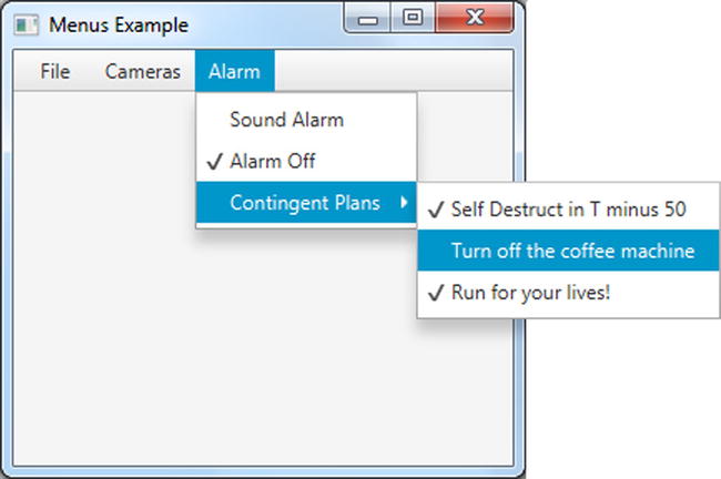
Figure 4-9. The output of Listing 4-10, which simulates an alarm system application
The code begins by creating a MenuBar control, which may contain one to many menu (MenuItem) objects. After the MenuBar is created, it is set as the top region on the BorderPane layout. Since the top region allows a resizable node to take up the available horizontal space, the MenuBar control will stretch to the width of the BorderPane (the root scene). Listing 4-11 sets the top region of the BorderPane to a menu bar.
Listing 4-11. A menu bar is set as the top region node of the root BorderPane
MenuBar menuBar = new MenuBar();
root.setTop(menuBar);
Next, the code instantiates Menu objects that contain one or more menu item (MenuItem) objects and other Menu objects, making submenus.
After creating the File, menu the code creates the Cameras menu. This menu will contain CheckMenuItem objects. These menu items allow the user to optionally select or unselect Show Camera 1 and Show Camera 2 as menu items.
Last is the implementation of our Alarm menu, which contains two radio menu items (RadioMenuItem), a separator (SeparatorMenuItem), and a submenu (Menu). To create the radio menu items for the Alarm menu, the code creates an instance of a ToggleGroup class. The ToggleGroup class is also used on regular radio buttons (RadioButtons) to allow one selected option only. Listing 4-12 creates radio menu items (RadioMenuItems) to be added to the alarmMenu Menu object.
Listing 4-12. The creation of menu items that contain radio and separator menu items
// Alarm menu
Menu alarmMenu = new Menu("Alarm");

// sound or turn alarm off
ToggleGroup tGroup = new ToggleGroup();
RadioMenuItem soundAlarmItem = new RadioMenuItem("Sound Alarm");
soundAlarmItem.setToggleGroup(tGroup);

RadioMenuItem stopAlarmItem = new RadioMenuItem("Alarm Off");
stopAlarmItem.setToggleGroup(tGroup);
stopAlarmItem.setSelected(true);

alarmMenu.getItems().addAll(soundAlarmItem,
        stopAlarmItem,
        new SeparatorMenuItem());
The code also adds a visual separator, by instantiating a SeparatorMenuItem class that is added to a menu via the getItems().addAll() method. The method getItems() returns an observable list of MenuItem objects (ObservableList<MenuItem>). You’ll learn about ObservableList collections later, but briefly, they are collections that have the ability to notify and update UI controls as items are added or removed. For a full description please see the section “The ObservableList Collection Class” later in this chapter.
The last child menu item added to the Alarm menu is a submenu, Contingent Plans. To add some levity I’ve created some humorous menu options for contingency plans when an emergency occurs.
Additional Ways to Select Menus and Menu Items
In the previous example you learned how to create and invoke menu items using your mouse, but did you know that there are other ways to invoke menu items? In this section you will learn three additional ways to invoke menu items: by constructing key mnemonics, key combinations, and context menus.
Standard menus generally have keyboard mnemonics to select menu items without using a mouse. Typically, applications that use a menu allow the user to hit the Alt key, which puts an underscore (_) beneath a letter of the menu text label. After the user hits the letter, the menu will drop down to display its child menu items and the user will be allowed to navigate with arrow keys.
To perform this behavior in code, you instantiate a Menu by invoking the constructor that receives a String value as before, but this time you place an underscore character preceding the chosen letter in the menu or menu item’s text. Also, to let the system recognize the mnemonic you will simply pass true to the setMnemonicParsing(true) method. Listing 4-13 creates a File menu that uses the letter “F” as the mnemonic.
Listing 4-13. The creation of a File menu with a mnemonic for the letter “F”
Menu fileMenu = new Menu("_File");
fileMenu.setMnemonicParsing(true);
A key combination is a combination of keystrokes to select a menu option. For instance, most applications on the Windows platform have the key combination of Ctrl + S to save a file. On the Mac OS platform, the key combination would be Command + S. Keys such as Ctrl, Command, Alt, Shift, and Meta are called modifier keys. Usually the modifiers are pressed in combination with a single letter. Sometimes key combinations are referred as keyboard shortcuts. To create a key combination, you need an instance of the KeyCodeCombination object that will contain the keystroke and the modifiers. Listing 4-14 provides a key code combination of (Ctrl or Meta) + S. You will notice that the code uses the KeyCombination.SHORTCUT_DOWN value as the key modifier instead of CONTROL_DOWN or META_DOWN. The reason is simple; the value of SHORTCUT_DOWN will enable the application to be cross-platform. The values CONTROL_DOWN and META_DOWN are system dependent on the Windows and MacOS platforms respectively, but SHORTCUT_DOWN works on all platforms.
Listing 4-14. A menu item mapped to a keyboard shortcut of Ctrl + S (Windows) or Command + S (Mac)
MenuItem saveItem = new MenuItem("_Save");
saveItem.setMnemonicParsing(true);
saveItem.setAccelerator(new KeyCodeCombination(KeyCode.S, KeyCombination.SHORTCUT_DOWN));
Context menus are popup menus displayed when a user right-clicks the mouse button on a JavaFX UI control or a stage surface. To create a context menu, you instantiate a ContextMenu class. Exactly like a regular menu, the ContextMenu menu has a getItems().add() method to add menu items. The following code snippet shows a context menu instantiated with a menu item (exitItem):
ContextMenu contextFileMenu = new ContextMenu(exitItem);
To respond to a right-click of the mouse on the scene in an application, you can basically add an event handler to listen for a right-click event. Once that is detected, the context menu’s show() method is invoked. The code in Listing 4-15 sets up an event handler to show and hide a context menu based on a right or left mouse click, respectively. Notice the hide() method invoked by the primary mouse click (left-click) to remove the context menu.
Listing 4-15. Attaching an event handler that displays a popup menu upon encountering a right-click mouse event on a JavaFX stage
primaryStage.addEventHandler(MouseEvent.MOUSE_CLICKED, (MouseEvent me) -> {
   if (me.getButton() == MouseButton.SECONDARY || me.isControlDown()) {
      contextFileMenu.show(root, me.getScreenX(), me.getScreenY());
   } else {
      contextFileMenu.hide();
   }
});
To see the full code listing showing the use of these additional strategies to invoke menus, please visit the book’s website to download the project KeyCombinationsAndContextMenus.
The ObservableList Collection Class
When using the Java Collections API you’ll notice the many useful container classes that represent data structures such as sets, maps, and lists. One of the commonly used concrete list classes is java.util.ArrayList, which implements the List interface. For a long time Java Swing developers built applications using an ArrayList to represent a list of objects that will be displayed in a list-like UI control. The issues that caused a lot of grief were the ability to synchronize list models and view components. To solve this problem, you can use JavaFX’s ObservableList class. The ObservableList is a collection that is capable of notifying UI controls when objects are added, updated, and removed. JavaFX ObservableLists are typically used in list UI controls such as ListView and TableView. Let’s look at two examples that will use the ObservableList collection class.
The Hero Picker example application was created to demonstrate the ObservableList’s capabilities; it displays two JavaFX ListView UI controls and allows the user to transfer items between the two ListView controls. One list contains candidates for hero status and the other contains those who have already achieved it. As shown in Listing 4-16, this application allows you to choose a candidate to be transferred to the other ListView control, which contains the chosen heroes.
Listing 4-16. The Hero Picker application, which demonstrates the ObservableList and ListView classes
@Override
public void start(Stage primaryStage) {
   primaryStage.setTitle("Hero Picker: Chapter 4 Creating and Working with ObservableLists");
   BorderPane root = new BorderPane();
   Scene scene = new Scene(root, 400, 250, Color.WHITE);

   // create a grid pane
   GridPane gridpane = new GridPane();
   gridpane.setPadding(new Insets(5));
   gridpane.setHgap(10);
   gridpane.setVgap(10);
   ColumnConstraints column1 = new ColumnConstraints(150, 150, Double.MAX_VALUE);
   ColumnConstraints column2 = new ColumnConstraints(50);
   ColumnConstraints column3 = new ColumnConstraints(150, 150, Double.MAX_VALUE);
   column1.setHgrow(Priority.ALWAYS);
   column3.setHgrow(Priority.ALWAYS);
   gridpane.getColumnConstraints().addAll(column1, column2, column3);

   // Candidates label
   Label candidatesLbl = new Label("Candidates");
   GridPane.setHalignment(candidatesLbl, HPos.CENTER);
   gridpane.add(candidatesLbl, 0, 0);

   // Heroes label
   Label heroesLbl = new Label("Heroes");
   gridpane.add(heroesLbl, 2, 0);
   GridPane.setHalignment(heroesLbl, HPos.CENTER);

   // Candidates
   final ObservableList<String> candidates = FXCollections.observableArrayList("Superman",
           "Spiderman",
           "Wolverine",
           "Police",
           "Fire Rescue",
           "Soldiers",
           "Dad & Mom",
           "Doctor",
           "Politician",
           "Pastor",
           "Teacher");
   final ListView<String> candidatesListView = new ListView<>(candidates);
   gridpane.add(candidatesListView, 0, 1);

   // heroes
   final ObservableList<String> heroes = FXCollections.observableArrayList();
   final ListView<String> heroListView = new ListView<>(heroes);

   gridpane.add(heroListView, 2, 1);

   // select heroes
   Button sendRightButton = new Button(" > ");
   sendRightButton.setOnAction((ActionEvent event) -> {
       String potential = candidatesListView.getSelectionModel().getSelectedItem();
       if (potential != null) {
           candidatesListView.getSelectionModel().clearSelection();
           candidates.remove(potential);
           heroes.add(potential);
       }
   });

   // deselect heroes
   Button sendLeftButton = new Button(" < ");
   sendLeftButton.setOnAction((ActionEvent event) -> {
       String notHero = heroListView.getSelectionModel().getSelectedItem();
       if (notHero != null) {
           heroListView.getSelectionModel().clearSelection();
           heroes.remove(notHero);
           candidates.add(notHero);
       }
   });
   VBox vbox = new VBox(5);
   vbox.getChildren().addAll(sendRightButton,sendLeftButton);
   gridpane.add(vbox, 1, 1);
   root.setCenter(gridpane);

   GridPane.setVgrow(root, Priority.ALWAYS);
   primaryStage.setScene(scene);
   primaryStage.show();
}
Figure 4-10 shows the output from Listing 4-16, the Hero Picker application.

Figure 4-10. The output of the Hero Picker application, demonstrating the use of the ObservableList and ListView classes
Created in this example is a GUI application that allows a user to choose their favorite heroes. This is quite similar to application screens that manage user roles by adding or removing items from list box components. In JavaFX the code example uses two ListView controls to hold String objects. For the sake of brevity we will not discuss the use of the layouts, but jump right into the code relating to the button actions and ListView controls.
Before creating an instance of a ListView, the code creates an ObservableList containing our candidates. Here you’ll notice the use of a factory class called FXCollections, into which you can pass common collection types to be wrapped and returned to the caller as an ObservableList. In the example an array of Strings is passed into the FXCollections.observableArrayList() method instead of an ArrayList. Using the ObservableList allows us to update the list of items in the array and in the display on the screen concurrently with a single method call.
Hopefully you get the idea about how to use the FXCollections class. I trust you will use it wisely; as Peter Parker’s Uncle Ben says,“With great power, there must also come great responsibility.” The following code line calls the FXCollections.observableArrayList() method class to return an observable list (ObservableList):
ObservableList<String> candidates = FXCollections.observableArrayList(...);
After the code creates an ObservableList, a ListView class is instantiated using a constructor that receives the observable list. The following code creates and populates a ListView object:
ListView<String> candidatesListView = new ListView<String>(candidates);
The last item of business is where the code manipulates ObservableLists as if they were java.util.ArrayLists. As they are manipulated, the ListView is notified and automatically updated to reflect the changes to the ObservableList. Listing 4-17 implements the action event code when the user presses the Send (>) button.
Listing 4-17. Action code to process selected items
// select heroes
Button sendRightButton = new Button(">");
sendRightButton.setOnAction( actionEvent -> {
        String potential = candidatesListView.getSelectionModel().getSelectedItem();
        if (potential != null) {
            candidatesListView.getSelectionModel().clearSelection();
            candidates.remove(potential);
            heroes.add(potential);
        }
});
To set action code for the button, the code uses a lambda expression with an actionEvent (ActionEvent) as a parameter, which is invoked when the button is clicked. When a button-press event arrives, the code determines which item in the ListView was selected via the getSelectionModel().getSelectedItem() on the ListView. Once the item is determined, the code clears the selection (clearSelection()), removes the item, and adds the item to the Heroes ObserverableList. What’s great is that there is no need to refresh the ListView UI control when the collection changes.
We can also use ObservableLists in another list-like UI control, the TableView. JavaFX’s javafx.scene.control.TableView control is analogous to Swing’s JTable component, which contains rows, columns, and cells very similar to spreadsheet applications.
As an example of the TableView control I’ve created an application called Bosses and Employees that demonstrates how to populate a TableView to contain a collection of employees (the Person JavaFX bean) based on the selection of a boss from a ListView control.
Before delving into the GUI code, we will examine the use of a domain object to represent a person (Person). Listing 4-18 shows a JavaFX bean of a Person class that represents a boss or an employee that will be displayed in a ListView and/or TableView control. The GUI code to handle list view selection and populating the table view appears in Listing 4-19.
Listing 4-18. The Person class as a JavaFX bean to be used in ObservableLists
public class Person {
   private StringProperty aliasName;
   private StringProperty firstName;
   private StringProperty lastName;
   private ObservableList<Person> employees = FXCollections.observableArrayList();
       public final void setAliasName(String value) {
       aliasNameProperty().set(value);
   }
   public final String getAliasName() {
       return aliasNameProperty().get();
   }
   public StringProperty aliasNameProperty() {
       if (aliasName == null) {
           aliasName = new SimpleStringProperty();
       }
       return aliasName;
   }
   public final void setFirstName(String value) {
       firstNameProperty().set(value);
   }
   public final String getFirstName() {
       return firstNameProperty().get();
   }
   public StringProperty firstNameProperty() {
       if (firstName == null) {
           firstName = new SimpleStringProperty();
       }
       return firstName;
   }
   public final void setLastName(String value) {
       lastNameProperty().set(value);
   }
   public final String getLastName() {
       return lastNameProperty().get();
   }
   public StringProperty lastNameProperty() {
       if (lastName == null) {
           lastName = new SimpleStringProperty();
       }
       return lastName;
   }
   public ObservableList<Person> employeesProperty() {
       return employees;
   }
   public Person(String alias, String firstName, String lastName) {
       setAliasName(alias);
       setFirstName(firstName);
       setLastName(lastName);
   }
}
Listing 4-19. The main GUI code that creates a grid pane containing a ListView and a TableView control, for bosses and employees, respectively
@Override
public void start(Stage primaryStage) {
    primaryStage.setTitle("Bosses and Employees: Chapter 4 Working with Tables");
    BorderPane root = new BorderPane();
    Scene scene = new Scene(root, 500, 250, Color.WHITE);

    // create a grid pane
    GridPane gridpane = new GridPane();
    gridpane.setPadding(new Insets(5));
    gridpane.setHgap(10);
    gridpane.setVgap(10);
    root.setCenter(gridpane);

    // candidates label
    Label candidatesLbl = new Label("Boss");
    GridPane.setHalignment(candidatesLbl, HPos.CENTER);
    gridpane.add(candidatesLbl, 0, 0);

    // List of leaders
    ObservableList<Person> leaders = getPeople();
    final ListView<Person> leaderListView = new ListView<>(leaders);
    leaderListView.setPrefWidth(150);
    leaderListView.setMaxWidth(Double.MAX_VALUE);
    leaderListView.setPrefHeight(150);

    // display first and last name with tooltip using alias
    leaderListView.setCellFactory(new Callback<ListView<Person>, ListCell<Person>>() {
        @Override
        public ListCell<Person> call(ListView<Person> param) {
            Label leadLbl = new Label();
            Tooltip tooltip = new Tooltip();
            ListCell<Person> cell = new ListCell<Person>() {
               @Override
               public void updateItem(Person item, boolean empty) {
                  super.updateItem(item, empty);
                  if (item != null) {
                     leadLbl.setText(item.getAliasName());
                     setText(item.getFirstName() + " " + item.getLastName());
                     tooltip.setText(item.getAliasName());
                     setTooltip(tooltip);
                  }
               }
            }; // ListCell
            return cell;
        }
    }); // setCellFactory

    gridpane.add(leaderListView, 0, 1);

    Label emplLbl = new Label("Employees");
    gridpane.add(emplLbl, 2, 0);
    GridPane.setHalignment(emplLbl, HPos.CENTER);

    final TableView<Person> employeeTableView = new TableView<>();
    employeeTableView.setPrefWidth(300);

    final ObservableList<Person> teamMembers = FXCollections.observableArrayList();
    employeeTableView.setItems(teamMembers);

    TableColumn<Person, String> aliasNameCol = new TableColumn<>("Alias");
    aliasNameCol.setEditable(true);
    aliasNameCol.setCellValueFactory(new PropertyValueFactory("aliasName"));

    aliasNameCol.setPrefWidth(employeeTableView.getPrefWidth() / 3);

    TableColumn<Person, String> firstNameCol = new TableColumn<>("First Name");
    firstNameCol.setCellValueFactory(new PropertyValueFactory("firstName"));
    firstNameCol.setPrefWidth(employeeTableView.getPrefWidth() / 3);

    TableColumn<Person, String> lastNameCol = new TableColumn<>("Last Name");
    lastNameCol.setCellValueFactory(new PropertyValueFactory("lastName"));
    lastNameCol.setPrefWidth(employeeTableView.getPrefWidth() / 3);

    employeeTableView.getColumns().setAll(aliasNameCol, firstNameCol, lastNameCol);
    gridpane.add(employeeTableView, 2, 1);

    // selection listening
    leaderListView.getSelectionModel().selectedItemProperty().addListener((ObservableValue<? extends
    Person> observable, Person oldValue, Person newValue) -> {
        if (observable != null && observable.getValue() != null) {
            teamMembers.clear();
            teamMembers.addAll(observable.getValue().employeesProperty());
        }
    });

    primaryStage.setScene(scene);
    primaryStage.show();
}
Listing 4-20 shows the getPeople() method contained in the BossesAndEmployees main application class to help populate the TableView control.
Listing 4-20. A private method getPeople() that returns an ObservableList containing Person instances. A boss may contain zero to many employees
private ObservableList<Person> getPeople() {
  ObservableList<Person> people = FXCollections.<Person>observableArrayList();
  Person docX = new Person("Professor X", "Charles", "Xavier");
  docX.employeesProperty().add(new Person("Wolverine", "James", "Howlett"));
  docX.employeesProperty().add(new Person("Cyclops", "Scott", "Summers"));
  docX.employeesProperty().add(new Person("Storm", "Ororo", "Munroe"));
  Person magneto = new Person("Magneto", "Max", "Eisenhardt");
  // ...code to add employees
  Person biker = new Person("Mountain Biker", "Jonathan", "Gennick");
  // ...code to add employees

  people.addAll(docX, magneto, biker);
  return people;
}
Figure 4-11 displays the output of the Bosses and Employees application, which demonstrates a JavaFX TableView control.

Figure 4-11. The output of the Bosses and Employees application
For the fun of it, I’ve created a simple GUI application that displays bosses and their employees. Notice on the left side of Figure 4-11 a list of important people (bosses). When you click to select a boss, their employees will be shown in the TableView control to the right. You’ll also notice the tooltip popup when the mouse cursor is hovered over the selected boss.
Before we discuss the TableView control, let’s detail the ListView control’s responsibility of updating the TableView. In model view fashion, the code in Listing 4-20 first creates an ObservableList containing all the bosses via the private getPeople() method to be passed to the ListView control’s constructor. Listing 4-21 populates the ListView control with the list of bosses.
Listing 4-21. Creation of a ListView populated with an ObservableList containing Person objects
// List of leaders
ObservableList<Person> leaders = getPeople();
ListView<Person> leaderListView = new ListView<>(leaders);
Next, the code instantiates a cell factory via the setCellFactory() method in Listing 4-19 to properly display the person’s name in the ListView control. Because each item isn’t a string but a Person object, the ListView does not know how to render each row (cell) in the ListView control. To inform the ListView which properties to use from the Person object, the code simply creates a javafx.util.Callback generic object by specifying the ListView<Person> and a ListCell<Person> data type. With your trusty NetBeans IDE, it can pregenerate or stub code for an empty implementation of the method call().
You just need to type:
leaderListView.setCellFactory(new );
As the cursor is positioned after the new keyword hit Ctrl + Space and when you see the Callback interface at the top of the popup hit Enter or select it using your mouse pointer. The following code block will be generated.
leaderListView.setCellFactory(new Callback<ListView<Person>, ListCell<Person>>() {
   @Override
   public ListCell<Person> call(ListView<Person> p) {
      throw new UnsupportedOperationException("Not supported yet.");
   }
});
After generating the code above using the NetBeans code completion feature the throws UnsupportedOperationException statement will need to be replaced with a code implementation to respond when a row item (ListCell) is selected. Next, are the details on the implementation of the call() method.
Within the call() method shown in Listing 4-22 is the variable cell of type ListCell<Person>, in which the code creates an anonymous inner class. The inner class must implement the updateItem() method. The job of the updateItem() method is to obtain each person’s information, which then updates a Label control (leadLbl). The label is what is displayed for each cell row in the ListView control. The last thing the updateItem() method does is to add a tooltip popup (Tooltip) to each cell row. The tooltip will pop up when the cursor hovers over the cell (boss) within the ListView. After updating the cell the cell variable is returned.
Listing 4-22. The call method to display the boss's name in a ListView control along with a tooltip popup showing the alias name
@Override
public ListCell<Person> call(ListView<Person> param) {
  Label leadLbl = new Label();
  Tooltip tooltip = new Tooltip();
  ListCell<Person>cell= new ListCell<Person>() {
     @Override
     public void updateItem(Person item, boolean empty) {
        super.updateItem(item, empty);
        if (item != null) {
           leadLbl.setText(item.getAliasName());
           setText(item.getFirstName() + " " + item.getLastName());
           tooltip.setText(item.getAliasName());
           setTooltip(tooltip);
        }
     }
  }; // ListCell
  return cell;
}
Finally, the code creates a TableView control to display the employees based on the selected boss from the ListView control. When creating a TableView control the code first creates the column headers as shown in Listing 4-23.
Listing 4-23. Creating the First Name table column by setting the property with the JavaFX bean property name convention
TableColumn<String> firstNameCol = new TableColumn<String>("First Name");
firstNameCol.setCellValueFactory(new PropertyValueFactory("firstName"));
Once you have created a column, you’ll notice the setCellValueFactory() method, which is responsible for calling the Person bean’s property. So when the list of employees is put into the TableView, it will know how to pull the properties to be placed in each cell column in the table. Based on the JavaBean convention a new PropertyValueFactory instance is created with the name of the bean attribute (firstName).
Last is the implementation of the selection listener on the ListView. In the code you’ll notice the getSelectionModel().selectedItemProperty() method (shown at the end of Listing 4-19) that allows a listener to be added. The code simply creates and adds a ChangeListener for selection events. When a user selects a boss, the TableView is cleared and populated with the employees of the selected boss. Actually, it is the magic of the ObservableList that notifies the TableView of changes. Listing 4-24 clears and populates the TableView via the teamMembers (ObservableList) variable.
Listing 4-24. Clearing the ObservableList owned by the TableView and repopulating it with employees
teamMembers.clear();
teamMembers.addAll(observable.getValue().employeesProperty());
Generating a Background Process
Typically in desktop applications that have long running processes, visual feedback should indicate that something is happening or suggest that the user be patient. One of the main pitfalls of GUI development is the difficulty of knowing when and how to delegate work to worker threads. Trying to avoid these pitfalls, GUI developers are constantly reminded of thread safety, especially when it comes to blocking the UI thread during heavy load. JavaFX provides UI controls that help solve this issue by off-loading work to a different thread (Task) while providing feedback or progress indicators of the work that is being done.
To demonstrate a GUI application generating a background process while also providing feedback to the user, I’ve created an example application that simulates a dialog window visualizing the progress of many files being copied. Listing 4-25 is a code example of using JavaFX’s progress bar and indicator UI controls to provide feedback to the user as files are being copied.
The following are the main classes used in this example:
- javafx.scene.control.ProgressBar
- javafx.scene.control.ProgressIndicator
- javafx.concurrent.Task
Listing 4-25. An example application that demonstrates background processes
@Override
public void start(Stage primaryStage) {
    primaryStage.setTitle("BackgroundProcesses: Chapter 4 Background Processes");

    // ... Layout and UI controls code here
    final Label label = new Label("Files Transfer:");
    final ProgressBar progressBar = new ProgressBar(0);
    final ProgressIndicator progressIndicator = new ProgressIndicator(0);

    // ... Layout and UI controls code here
    final Button startButton = new Button("Start");
    final Button cancelButton = new Button("Cancel");
    final TextArea textArea = new TextArea();
    // ... Layout and UI controls code here

    // wire up Start button
    startButton.setOnAction((ActionEvent event) -> {
        startButton.setDisable(true);
        progressBar.setProgress(0);
        progressIndicator.setProgress(0);
        textArea.setText("");
        cancelButton.setDisable(false);
        copyWorker = createWorker(numFiles);

        // wire up progress bar
        progressBar.progressProperty().unbind();
        progressBar.progressProperty()
                   .bind(copyWorker.progressProperty());
        progressIndicator.progressProperty().unbind();
        progressIndicator.progressProperty()
                   .bind(copyWorker.progressProperty());

        // append to text area box
        copyWorker.messageProperty().addListener(
           (ObservableValue<? extends String> observable,
                    String oldValue,  String newValue) -> {
                         textArea.appendText(newValue + "
");
        });

        new Thread(copyWorker).start();
    });

    // Cancel button will kill worker and reset.
    cancelButton.setOnAction((ActionEvent event) -> {
        startButton.setDisable(false);
        cancelButton.setDisable(true);
        copyWorker.cancel(true);

        // reset
        progressBar.progressProperty().unbind();
        progressBar.setProgress(0);
        progressIndicator.progressProperty().unbind();
        progressIndicator.setProgress(0);
        textArea.appendText("File transfer was cancelled.");
    });

    primaryStage.setScene(scene);
    primaryStage.show();
}

private Task createWorker(final int numFiles) {
    return new Task() {
        @Override
        protected Object call() throws Exception {
            for (int i = 0; i < numFiles; i++) {
                long elapsedTime = System.currentTimeMillis();
                copyFile("some file", "some dest file");
                elapsedTime = System.currentTimeMillis() - elapsedTime;
                String status = elapsedTime + " milliseconds";

                // queue up status
                updateMessage(status);
                updateProgress(i + 1, numFiles);
            }
            return true;
        }
    };
}

private void copyFile(String src, String dest) throws InterruptedException {
    // simulate a long time
    Random rnd = new Random(System.currentTimeMillis());
    long millis = rnd.nextInt(1000);
    Thread.sleep(millis);
}
The code begins by creating not one but two progress controls to show the user the work being done. The first control is a progress bar, and the second is a progress indicator. Figure 4-12 depicts from left to right a progress bar and a progress indicator (pie chart). The progress indicator shows a percentage below the indicator icon.

Figure 4-12. The output of Listing 4-25, simulating files being copied
Listing 4-26 is the creation of a progress bar and a progress indicator using the constructor that initializes the progress value to zero.
Listing 4-26. Instantiating the ProgressBar and ProgressIndicator UI controls
ProgressBar progressBar = new ProgressBar(0);
ProgressIndicator progressIndicator = new ProgressIndicator(0);
Next, the code creates a worker thread via the private createWorker() method. The createWorker() convenience method instantiates and returns a javafx.concurrent.Task object, which is similar to the Java Swing’s SwingWorker class. Unlike the SwingWorker class, the Task object is greatly simplified and easier to use, thanks to its event-driven design. An example is a Task object’s ability to update progress asynchronously.
When creating an instance of a Task object, the code implements the call() method to do work in the background. As the work is being done, you will often want to queue up intermediate results such as progress or text information to provide feedback to the user. To queue information, the API allows you to call the updateProgress() or updateMessage() method. These methods update information in a thread-safe way so that the observer of the progress properties can update the GUI safely without blocking the GUI thread. Listing 4-27 is code that queues up messages and progress.
Listing 4-27. The text messages and progress to be updated without blocking the progress UI controls
// queue up status
updateMessage(status);
updateProgress(i + 1, numFiles); // (progress, max progress)
After creating a worker Task, the code unbinds any old tasks bound to the progress controls. Once the progress controls are unbound, the code then binds the progress controls to a newly created Task object named copyWorker. Listing 4-28 rebinds a new Task object to the progress UI controls.
Listing 4-28. After a task is used, the progress controls will need to rebind to a new task
// wire up progress bar
progressBar.progressProperty().unbind();
progressBar.progressProperty().bind(copyWorker.progressProperty());
progressIndicator.progressProperty().unbind();
progressIndicator.progressProperty().bind(copyWorker.progressProperty());
Moving on, notice the code implementing a ChangeListener to append the queued results into the TextArea control. Another remarkable thing about JavaFX Properties is that you can attach many listeners similar to Java Swing components. Finally, our worker and controls are all wired up to spawn a thread to go off in the background. The following code line shows the launching of a Task worker.
new Thread(copyWorker).start();
We finish off our code by wiring up the Cancel button. This button simply calls the Task object’s cancel() method to kill the process. Once the task is cancelled the progress controls are reset. Once a worker Task is cancelled it cannot be reused. That is why the Start button re-creates a new Task. If you want a more robust reusable solution, look at the javafx.concurrent.Service class.
Summary
You began this chapter by learning the simple layouts such as the HBox, VBox, FlowPane, and BorderPane. You saw that the HBox layout facilitated a way to string along child nodes horizontally in a row. Similar to the HBox is the VBox layout, which places child nodes vertically in a column. Next, you learned about the FlowPane layout, which is very useful when laying out child nodes to flow horizontally and wrapping nodes to the next line depending on the available horizontal space. The fourth of the simple layouts is the BorderPane layout, which provides regions such as top, bottom, right, left and center. By learning these simple layouts you were able to understand the fundamentals of the many spacing-related attributes. Learning about these attributes helped you differentiate between what spacing, padding, and margins each contribute to. The last layout you were introduced was the advanced GridPane layout, which provides a way to manage child nodes in a tabular grid containing columns and rows, where each cell can contain a JavaFX node. You also ran an example to show off a form-based application using FlowPane, BorderPane, and GridPane. In particular, the example demonstrated column constraints, which enabled child nodes to be resized.
After learning about common layouts you delved into UI controls. You began by learning how to create standard menus and menu bars. By creating menus you were able to learn to create handler code to respond to the selection of menu items. Next, you were able to map key combinations or keyboard shortcuts to menu options. You learned how to create context menus invoked by right-clicking the mouse on the scene graph. With the many ways to create menus and menu items, you got a chance to run an example program that simulated a security alarm application.
Finally, you were exposed to ObservableList collections, which support the display of UI controls such as the ListView and TableView nodes. By learning about the UI controls ListView and TableView, you saw fun examples enabling a user to move items between lists. Lastly, you learned about the ProgressBar and ProgressIndicator for background worker threads. With ProgressBars and ProgressIndicators you were able to run an example that simulates background worker threads copying files.