
Have you ever heard someone say, “When two worlds collide”? This expression is used when a person from a different background or culture is put in a situation where they are at odds and must face very hard decisions. When building GUI applications needing graphics or animations, we are often on a collision course between business and gaming worlds.
In the ever-changing world of rich Internet applications (RIA), you probably have noticed an increased use of animations such as pulsing buttons, transitions, moving backgrounds, and so on. GUI applications can use animations to provide visual cues to let the user know what to do next. With JavaFX, you will be able to have the best of both worlds, creating appealing graphics as well as handling business transactions.
In this chapter you will learn about displaying images and playing animations. Fasten your seatbelts; you’ll discover solutions to integrate cool game-like interfaces into everyday applications.
Working with Images
Yet another powerful capability in JavaFX is the ability to display standard image file formats on the scene graph. In this section you will learn how to do the following:
- Load images (javafx.scene.image.Image) from your local file system or a remote webserver.
- Display images using the javafx.scene.image.ImageView node.
After learning about the Image and ImageView APIs, you will also see an example of a photo viewer application that demonstrates the ability to load and display images.
You are probably aware of the many standard image file formats, such as .jpg, .png, .jpg, and .bmp. To load standard image file formats JavaFX provides the javafx.scene.image.Image API. The Image class has many convenient constructors that facilitate different loading strategies, as shown in the following list:
- Image(java.io.InputStream inputStream)
- Image(java.io.InputStream is, double requestedWidth, double requestedHeight, boolean preserveRatio, boolean smooth)
- Image(java.lang.String url)
- Image(java.lang.String url, boolean backgroundLoading)
- Image(java.lang.String url, double requestedWidth, double requestedHeight, boolean preserveRatio, boolean smooth)
- Image(java.lang.String url, double requestedWidth, double requestedHeight, boolean preserveRatio, boolean smooth, boolean backgroundLoading)
You can see that there are only a handful of parameters, common to all of the constructors that are used in various combinations for different loading scenarios. Table 5-1 briefly describes each parameter.
Table 5-1. The javafx.scene.image.Image constructor’s parameters
Parameter |
Data Type |
Description |
|---|---|---|
inputStream |
java.io.InputStream |
An input stream such as a file or network. |
url |
String |
An image’s URL location such as a file on the local file system or a web server hosting an image file. |
backgroundLoading |
boolean |
Loads the image in the background (off the JavaFX application thread). |
requestWidth |
double |
Specifies an image’s bounding box width. |
requestedHeight |
double |
Specifies an image’s bounding box height. |
preserveRatio |
boolean |
Used to keep an image’s aspect ratio within the bounding box. |
smooth |
boolean |
True indicates the use of a better algorithm to smooth the image, which will be slower; otherwise it will use the lower quality, which will render faster. |
To demonstrate loading an image, Listing 5-1 shows code that loads an image first from a local file system and then from a remote host on a web server. The constructor accepts a string representing a URL and the backgroundLoading parameter (boolean).
Listing 5-1. Two images are loaded based on the protocol file and HTTP for URLs
try {
   File file = new File("C:\Users\jdoe\Pictures\myphoto.jpg");
   String localUrl = file.toURI().toURL().toString();
   Image localImage = new Image(localUrl, false); // don't load in the background

   String remoteUrl = "http://mycompany.com/myphoto.jpg";
   Image remoteImage = new Image(remoteUrl, true); // load in the background

   System.out.println(localUrl);  // file:/C:/Users/jdoe/Pictures/myphoto.jpg
   System.out.println(remoteUrl); //http://mycompany.com/myphoto.jpg

   // ... rest of the code

} catch (MalformedURLException ex) {
   // error
}
After running Listing 5-1, you’ll see the following output:
file:/C:/Users/jdoe/Pictures/myphoto.jpg
http://mycompany.com/myphoto.jpg
To load an image from the local file system, the code creates a File object based on a string with the path location to the image. In this scenario I’ve specified a Microsoft Windows–based absolute file path for the image, but don’t worry about system-dependent code; you will see that the toURL() method converts the file path into a standard URL format. After creating the file object, the code obtains a string formatted to the standard URL specification, via the toURI().toURL().toString() method call. What’s nice is that the method call converts absolute paths into the standard Uniform Resource Locator specification format. After the method call, the returned string will contain the file: protocol prefixed to the file path information.
Also implemented in the example is the ability to load an image hosted on a remote web server. You can see that the code also uses http: as a protocol prefixed to the URL path to demonstrate loading images on a host web server.
Now that you know how to load images, you will learn how to display them using the JavaFX ImageView node.
A javafx.scene.image.ImageView node is a wrapper object that references an Image object, which we discussed earlier. Because the ImageView object is a JavaFX Node object you will be able to apply effects, perform transforms, and scale images.
When an ImageView node is used to apply special effects such as blurring, the image’s pixel data is not actually manipulated, but copied, to be calculated and displayed onto the ImageView node. This is quite a powerful technique when there are many ImageView objects that all point to a single Image object. Listing 5-2 loads an image asynchronously (a technique known as background loading) to be passed into an ImageView constructor. By default, the width and height will be the actual dimensions in pixels of the image. In the next section you will see an example of a photo viewer application, which will allow images to be displayed and scaled.
Listing 5-2. The creation of an ImageView node
Image image = new Image(url, true);
ImageView imageView = new ImageView(image);
A practical way to display images in JavaFX is demonstrated by an example photo viewer application. This application will allow you to drag and drop image files to be viewed on the scene graph. Figure 5-1 illustrates the JavaFX photo viewer application displaying an image. In this section I will first describe the photo viewer’s features, then summarize how to use it, and finally list and then walk through the source code.
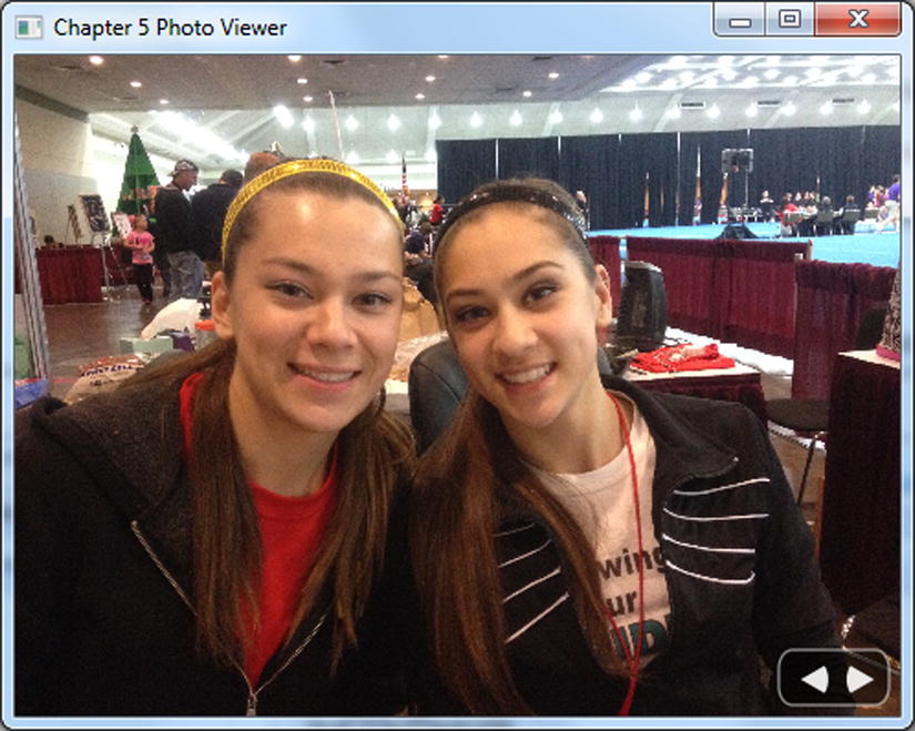
Figure 5-1. A JavaFX Photo Viewer application displaying an image file
Before looking at the source code of our JavaFX photo viewer application, I will briefly explain the features of the photo viewer application and how to use it.
Photo Viewer Features
The photo viewer application lets users do the following:
- Load images with the following file formats: .jpg, .jpg, .png, .bmp.
- Drag and drop a local image file to be viewed.
- Drag and drop a remote image file hosted on a web server to be viewed.
- Display a progress indicator showing the loading of an image.
- Resize the currently displayed image by resizing the window while maintaining the aspect ratio.
- Page through images using button controls to see the previous and next image.
Photo Viewer User Instructions
Take the following steps to run the photo viewer application:
- Locate an image on the file system:
/home/my_username/fun-pics.jpgor webserver (browser’s address line):
http://www.mycompany.com/images/fun-pics.jpg - Use your mouse to drag and drop the file onto the window depicted in Figure 5-2.

Figure 5-2. Dragging a file into the photo view application
- Repeat steps 1 and 2 until you have more than one image.
- Click the left-arrow button to view the previous image.
- Click the right-arrow button to view the next image.
- Resize the window to resize the image.
Now that you know what the photo viewer is required to do and how it should operate, let’s look at the source code, shown in Listing 5-3.
Listing 5-3. The code listing for a photo viewer application
package jfx8ibe;

// imports omitted...

/**
 * A photo viewer application to demonstrate the JavaFX ImageView node.
 * <p>

 * Instructions:
 *    1. Drag and drop an image file onto the application window.
 *    2. Repeat step 1 so more than 2 images are loaded.
 *    3. Click the left and right arrow controls to advance.
 * </p>
 * @author cdea
 */
public class PhotoViewer extends Application {
    // List of URL strings
    private final List<String> imageFiles = new ArrayList<>();
    // The current index into the imageFile
    private int currentIndex = -1;
    // Enumeration of next and previous button directions
    public enum ButtonMove {NEXT, PREV};
    // Current image view display
    private ImageView currentImageView;
    // Loading progress indicator
    private ProgressIndicator progressIndicator;
    // mutex */
    private AtomicBoolean loading = new AtomicBoolean();

    @Override
    public void start(Stage primaryStage) {
        primaryStage.setTitle("Chapter 5 Photo Viewer");
        Group root = new Group();
        Scene scene = new Scene(root, 551, 400, Color.BLACK);
        scene.getStylesheets()
                .add(getClass()
                .getResource("photo-viewer.css")
                .toExternalForm());

        primaryStage.setScene(scene);

        // set up the current image view area
        currentImageView = createImageView(scene.widthProperty());

        // set up drag & drop file abilities
        setupDragNDrop(scene);

        // create button panel controls (left & right arrows)
        Group buttonGroup = createButtonPanel(scene);

        // create a progress indicator
        progressIndicator = createProgressIndicator(scene);

        root.getChildren().addAll(currentImageView,
                                  buttonGroup,
                                  progressIndicator);

        primaryStage.show();
    }
    /*
     * A factory function returning an ImageView instance to
     * preserve the aspect ratio and bind the instance to the width
     * of the scene for resizing the image.
     *
     * @param widthProperty is the Scene's read only width property.
     * @return ImageView newly created image view for current display.
     */
    private ImageView createImageView(ReadOnlyDoubleProperty widthProperty) {
        // maintain aspect ratio
        ImageView imageView = new ImageView();
        // set aspect ratio
        imageView.setPreserveRatio(true);
        // resize based on the scene
        imageView.fitWidthProperty().bind(widthProperty);
        return imageView;
    }

    /*
     * Sets up the drag and drop capability for files and URLs to be
     * dragged and dropped onto the scene. This will load the image into
     * the current image view area.
     * @param scene The primary application scene.
     */
    private void setupDragNDrop(Scene scene) {
        // Dragging over surface
        scene.setOnDragOver((DragEvent event) -> {
            Dragboard db = event.getDragboard();
            if ( db.hasFiles()
                    || (db.hasUrl()
                    && isValidImageFile(db.getUrl()))) {
                event.acceptTransferModes(TransferMode.LINK);
            } else {
                event.consume();
            }
        });

        // Dropping over surface
        scene.setOnDragDropped((DragEvent event) -> {
            Dragboard db = event.getDragboard();
            // image from the local file system.

            if (db.hasFiles() && !db.hasUrl()) {
                db.getFiles()
                  .stream()
                  .forEach( file -> {
                    try {
                        addImage(file.toURI().toURL().toString());
                    } catch (MalformedURLException ex) {
                        ex.printStackTrace();
                    }
                  });
            } else {
                // image from some host
                addImage(db.getUrl());
            }
            if (currentIndex > -1) {
                loadImage(imageFiles.get(currentIndex));
            }

            event.setDropCompleted(true);
            event.consume();
        });
    }

    /*
     * Returns a custom created button panel
     * containing left and right buttons to
     * see previous and next images.
     * @param scene The main application scene
     * @return Group A custom button panel with
     *  previous and next buttons
     */
    private Group createButtonPanel(Scene scene){
        // create button panel
        Group buttonGroup = new Group();

        Rectangle buttonArea = new Rectangle(0, 0, 60, 30);
        buttonArea.getStyleClass().add("button-panel");
        buttonGroup.getChildren().add(buttonArea);

        // left arrow button
        Arc leftButton = new Arc(12,16, 15, 15, -30, 60);
        leftButton.setType(ArcType.ROUND);
        leftButton.getStyleClass().add("left-arrow");

        // return to previous image
        leftButton.addEventHandler(MouseEvent.MOUSE_PRESSED,
            (mouseEvent) -> {
                System.out.println("busy loading? " + loading.get());
                // if no previous image or currently loading.
                if (currentIndex == 0 || loading.get()) return;
                int indx = gotoImageIndex(ButtonMove.PREV);
                if (indx > -1) {
                    loadImage(imageFiles.get(indx));
                }
        });

        // right arrow button
        Arc rightButton = new Arc(12,16, 15, 15, 180-30, 60);
        rightButton.setType(ArcType.ROUND);
        rightButton.getStyleClass().add("right-arrow");

        // advance to next image
        rightButton.addEventHandler(MouseEvent.MOUSE_PRESSED,
            (mouseEvent) -> {
                System.out.println("busy loading? " + loading.get());
                // if no next image or currently loading.
                if (currentIndex == imageFiles.size()-1
                        || loading.get()) return;

                int indx = gotoImageIndex(ButtonMove.NEXT);
                if (indx > -1) {
                    loadImage(imageFiles.get(indx));
                }
        });
        // add buttons to button group
        buttonGroup.getChildren().addAll(leftButton, rightButton);

        // move button group when scene is resized
        buttonGroup.translateXProperty()
                .bind(scene.widthProperty()
                           .subtract(buttonArea.getWidth() + 6));
        buttonGroup.translateYProperty()
                .bind(scene.heightProperty()
                           .subtract(buttonArea.getHeight() + 6));
        return buttonGroup;
    }

    /*
     * Create a progress indicator control to be centered.
     * @param scene The primary application scene.
     * @return ProgressIndicator a new progress indicator centered.
     */
    private ProgressIndicator createProgressIndicator(Scene scene) {
        ProgressIndicator progress = new ProgressIndicator(0);
        progress.setVisible(false);
        progress.layoutXProperty()
                .bind(scene.widthProperty()
                           .subtract(progress.widthProperty())
                           .divide(2));
        progress.layoutYProperty()
                .bind(scene.heightProperty()
                           .subtract(progress.heightProperty())
                           .divide(2));
        return progress;
    }

    /*
     * Returns true if URL's file extensions match jpg, jpeg, png and gif.
     * @param url standard URL path to image file.
     * @return boolean returns true if URL's extension matches jpg, jpeg,
     * png and gif.
     */
    private boolean isValidImageFile(String url) {
        List<String> imgTypes = Arrays.asList(".jpg", ".jpeg", ".png", ".gif", ".bmp");
        return imgTypes.stream()
                       .anyMatch(t -> url.endsWith(t));
    }

    /**Adds the URL string representation of the path to the image file.
     * Based on a URL the method will check if it matches supported
     * image format.
     * @param url string representation of the path to the image file.
     */
    private void addImage(String url) {
        if (isValidImageFile(url)) {
            currentIndex +=1;
            imageFiles.add(currentIndex, url);
        }
    }

    /**
     * Returns the next index in the list of files to go to next.
     *
     * @param direction PREV and NEXT to move backward or forward
     * in the list of pictures.
     * @return int the index to the previous or next picture to be shown.
     */
    private int gotoImageIndex(ButtonMove direction) {
        int size = imageFiles.size();
        if (size == 0) {
            currentIndex = -1;
        } else if (direction == ButtonMove.NEXT
                && size > 1
                && currentIndex < size - 1) {
            currentIndex += 1;
        } else if (direction == ButtonMove.PREV
                && size > 1
                && currentIndex > 0) {
            currentIndex -= 1;
        }

        return currentIndex;

    }

    /*
     * Returns a worker task (Task) which will off-load the image
     * on a separate thread when finished; the current image will
     * be displayed on the JavaFX application thread.
     * @param url string representation of the path to the image file.
     * @return
     */
    private Task createWorker(final String url) {
        return new Task() {
            @Override
            protected Object call() throws Exception {
                // on the worker thread...
                Image image = new Image(url, false);
                Platform.runLater(() -> {
                    // on the JavaFX Application Thread....
                    System.out.println("done loading image " + url);
                    currentImageView.setImage(image);
                    progressIndicator.setVisible(false);
                    loading.set(false); // free lock
                });
                return true;
            }
        };
    }

    /*
     * This method does the following loads an image,
     * updates a progress bar and spawns a new thread.
     * If another process is already loading
     * the method will return without loading.
     * @param url string representation of the path to the image file.
     */
    private void loadImage(String url) {
        if (!loading.getAndSet(true)) {
            Task loadImage = createWorker(url);
            progressIndicator.setVisible(true);
            progressIndicator.progressProperty().unbind();
            progressIndicator.progressProperty()
                             .bind(loadImage.progressProperty());
            new Thread(loadImage).start();
        }
    }
    public static void main(String[] args) {
        launch(args);
    }
}
To begin our code walk-through, let’s discuss the application’s variables. Table 5-2 describes the variables that maintain state information for our photo viewer application.
Table 5-2. The PhotoViewer Instance Variables

Now that you are familiar with the variables that provide bookkeeping for our photo viewer application, I will explain the code, beginning with the usual start() method’s body in Listing 5-3.
The start() method first sets the title, creates the root node, and then creates the scene. After instantiating a scene referencing the root node (Group), the code will style scene graph nodes via the method getStyledSheets().add(). In this scenario I created a JavaFX CSS file (photo-viewer.css) to style various nodes. This technique allows a developer to customize nodes by using an external CSS file instead of the programmatic approach with setter methods on node attributes. For now you can ignore the code statements relating to applying CSS styles; we’ll discuss them in more detail in Chapter 6, on custom UIs.
The start() method next calls various private methods to create and assemble the parts that make up our photo viewer application, such as the current photo view area and a custom button panel.
Current Photo View Area: ImageView
After setting up the scene, the start() method creates the current image display area by invoking a private createImageView() method, which creates and returns a JavaFX ImageView object that has its width property bound to the root (parent) node’s width. Binding the width means that resizing the application window will also resize the ImageView. And by invoking the setPreserveRatio() method set to true on the ImageView object, we enable the resizing ability to maintain the image’s aspect ratio.
Drag and Drop: OnDragOver and OnDragDropped
Next the start() method invokes the private setupDragNDrop() method, which I created to attach handler code to respond to the drag-and-drop capability of the native desktop for loading and displaying images in our photo viewer application. A user can do any of the following: drag a file from their host file explorer (finder), drag a URL pointing to a file from a browser’s address bar, or drag the image from the browser, assuming the address or URL path is a valid image file hosted on a web server. The icon to the left of the URL is dragged and the address line (filename) must have one of the image file extensions mentioned earlier.
The setupDragNDrop() method starts by setting handler code (using a lambda expression) for the OnDragOver event via the setOnDragOver() method. The OnDragOver event is triggered when the mouse is dragged over the scene’s surface—in other words, holding down the mouse button over selected files that are dragged over the surface triggers the OnDragOver event. The following code snippet repeated from Listing 5-3 shows the OnDragOver event’s handler code:
// Dragging over surface
scene.setOnDragOver((DragEvent event) -> {
    Dragboard db = event.getDragboard();
    if ( db.hasFiles()
         || (db.hasUrl()
         && isValidImageFile(db.getUrl()))) {
       event.acceptTransferModes(TransferMode.LINK);
    } else {
       event.consume();
    }
});
Notice here that the lambda expression has an event (DragEvent) parameter. The lambda expression code body obtains the Dragboard object from the DragEvent to determine if there are valid image files being dragged over the scene’s surface. If so, the code sets the transfer mode (TransferMode.LINK); otherwise, we ignore or consume the event using the consume() method. Figure 5-2 earlier in the chapter shows the transfer mode (TransferMode.LINK) icon as the user is dragging the image onto the scene, thus providing visual feedback to the user.
Next, we discuss the handler code to respond to an OnDragDropped event. The OnDragDropped event occurs when the user has released the mouse button after dragging over the surface of the scene the event handler code is shown in the following code snippet (see this code in context in Listing 5-3):
// Dropping over surface
scene.setOnDragDropped((DragEvent event) -> {
    Dragboard db = event.getDragboard();
    //String currentFile = null;
    // image from the local file system.
    if (db.hasFiles()) {
        db.getFiles()
          .stream()
          .forEach( file -> {
            try {
               addImage(file.toURI().toURL().toString());
            } catch (MalformedURLException ex) {
               ex.printStackTrace();
            }
          }); // forEach
    } else {
        // image from some host
        addImage(db.getUrl());
    }
    if (currentIndex > -1) {
        loadImage(imageFiles.get(currentIndex));
    }

    event.setDropCompleted(true);
    event.consume();
}); // setOnDragDropped
Once again you see a lambda expression that has a parameter of type DragEvent. The code obtains the Dragboard object to detect whether there are one or more files, via the hasFiles() method. If so, the code iterates through each file to be added to the imageFiles (List<String>) variable. Before adding a URL-formatted string into the imageFiles list, the private method addImage() in Listing 5-3 validates each file using the private isValidImageFile() method. I created the isValidImageFile() method that uses the Stream API to determine whether the file extensions of the URL string represents a standard image file format, such as .jpg, .jpg, or .png. By using the anyMatch() method with a functional interface of type java.util.function.Predicate you can easily evaluate whether the URL string ends with any of the image file extensions. The following code snippet iterates over the list of file formats to match the URL.
List<String> imgTypes = Arrays.asList(".jpg", ".jpeg", ".png", ".gif", ".bmp");
return imgTypes.stream()
               .anyMatch(t -> url.endsWith(t));
Next in the OnDragDropped event’s handler, notice the code to make sure the current index is greater than –1, which indicates that a valid image can be loaded and displayed. Once an image is determined to be valid, the private method loadImage() creates a worker task (Task) to begin loading an image file.
The loadImage() method is repeated here from Listing 5-3 in the following code snippet . It begins by checking the loading (AtomicBoolean) variable before actually loading the image. This bit of code prevents the user from rapidly clicking on the buttons and spawning many images, loading a task for each one. Also, if the loading variable is not set to true, the code will set it to true before beginning the image-loading process via the getAndSet(true) method.
private void loadImage(String url) {
   // do not begin task until current
   // task is finished loading (atomic)
   if (!loading.getAndSet(true)) {
      Task loadImage = createWorker(url);
      progressIndicator.setVisible(true);
      progressIndicator.progressProperty().unbind();
      progressIndicator.progressProperty()
                       .bind(loadImage.progressProperty());
            new Thread(loadImage).start();
   }
}
This snippet shows the code related to creating a worker thread by invoking a private method. Here, createWorker() is a convenience method to create worker tasks for asynchronous callbacks. After it returns a worker (Task) instance, the load progress will be bound to the progress indicator, described in Table 5-2 earlier. Essentially, the progress indicator will provide an animation as visual feedback to the user that an image is in the process of loading. If there was a previously bound task, the code will unbind the progress indicator and re-bind it to the newly created task. Finally, the worker thread is simply started. Keep in mind that the image is loaded in a separate thread and not on the JavaFX application GUI thread.
Finishing off the OnDragDropped event’s handler code, the event will complete the drop operation by invoking the setDropCompleted(true) and consume() methods, respectively.
After setting up the drag-and-drop capabilities the start() method, Listing 5-3 invokes the private method createButtonPanel() to create a custom button panel to contain the Previous and Next buttons. These buttons allow the user to advance through images to load and display.
To create custom buttons, I’ve used ordinary JavaFX shapes, which are drawn onto a Group node. To create the Previous and Next buttons I used JavaFX’s javafx.scene.shape.Arc shape to build the left and right arrows on top of a small transparent rounded rectangle, javafx.scene.shape.Rectangle.
Next in the createButtonPanel() method in Listing 5-3 you’ll find EventHandler code that listens to mouse-pressed events to load and display the appropriate image based on the enums ButtonMove.PREV and ButtonMove.NEXT. Attaching handler code for a mouse-press event for the Previous and Next buttons is quite easy. The code simply invokes the addEventHandler() by passing in the event that it is interested in (MouseEvent.MOUSE_PRESSED) and a closure that represents the handler code that will respond when the button (the arc shape) is pressed. Shown in Listing 5-4, the code determines whether the application is currently busy loading before proceeding by checking the loading (AtomicBoolean) flag.
Listing 5-4. The Attached mouse press event handler code for the custom Previous button (leftButton)
Arc leftButton = //... create an Arc
leftButton.addEventHandler(MouseEvent.MOUSE_PRESSED,
   (mouseEvent) -> {
      System.out.println("busy loading? " + loading.get());
      // if no previous image or currently loading.
      if (currentIndex == 0 || loading.get()) return;
      int indx = gotoImageIndex(ButtonMove.PREV);
      if (indx > -1) {
         loadImage(imageFiles.get(indx));
      }
});
Assuming the loading flag is false, meaning not busy loading, the code will proceed by returning the index into the imageFiles list of the next image to display.
The right button’s (rightButton) event handler is similar. The only thing different is determining whether the Previous or Next button was pressed via the ButtonMove enum. This is passed to the gotoImageIndex() method in Listing 5-3 to determine whether an image is available in that direction.
Finishing up the assembling of our button panel (buttonGroup), the code binds the button panel to the scene’s width and height, which will dynamically reposition it relative to the bottom-right corner of the scene as the user resizes the window. Here, we bind the translateXProperty()to the scene’s width property by subtracting the buttonArea's width shown in Listing 5-5 and bind the translateYProperty() based on the scene’s height property.
Listing 5-5. The bindings for the button panel to float relative to the lower right corner of the window(scene)
// move button group when the scene is resized
buttonGroup.translateXProperty()
           .bind(scene.widthProperty()
                      .subtract(buttonArea.getWidth() + 6));
buttonGroup.translateYProperty()
           .bind(scene.heightProperty()
                      .subtract(buttonArea.getHeight() + 6));
Finally in Listing 5-3, the call to the private method createProgressIndicator() in the start() method returns a progress indicator bound to the scene’s center area. You’ll notice the setVisible() method (in loadImage() and in the Task created by createWorker()) to show or hide the progress indicator before and after loading an image.
An animation is an illusion of motion when images change over time. Quite similar to a cartoon flip book, each page represents a frame or picture that will be displayed on a timeline for a period of time. In JavaFX you will be working with the animation API (javafx.animation.*). In this section you will learn about key values, key frames, timelines, and transitions. Finally, to demonstrate the animation APIs, we will explore a slightly modified photo viewer application with additional enhancements.
The JavaFX animation API allows you to assemble timed events that can interpolate over property-based values (Properties) in order to produce animated effects. For example, to produce a fade-out effect, you would target a node’s opacity property to interpolate its value starting from 1 (fully opaque) to 0 (transparent) over a period of time. Listing 5-6 defines a KeyValue instance that targets a rectangle node’s opacity property starting at 1 and ending with the value 0. By default, a KeyValue object will have a linear interpolator.
Listing 5-6. A KeyValue object to fade out by interpolating the opacity property from 1 to 0
Rectangle rectangle = new Rectangle(0, 0, 50, 50);
KeyValue keyValue = new KeyValue(rectangle.opacityProperty(), 0);
The KeyValue object doesn’t actually interpolate the value, but simply defines the start and end values of a property to interpolate between. Also, the KeyValue can be defined with different types of interpolators such as linear, ease in, or ease out. For example, shown in Listing 5-7 is code that defines a key value that will animate a rectangle from left to right by 100 pixels having an Interpolator.EASE_OUT interpolator. Easing out will slow down the fade before the end key value.
Listing 5-7. A KeyValue object to move a rectangle from left to right 100 pixels with an interpolator that starts to slow down when it reaches the end value
Rectangle rectangle = new Rectangle(0, 0, 50, 50);
KeyValue keyValue = new KeyValue(rectangle.xProperty(), 100, Interpolator.EASE_OUT);
Please visit the Javadocs documentation for available interpolators (javafx.animation.Interpolator). By default, KeyValue constructors that don’t specify an interpolator will use a linear interpolation (Interpolator.LINEAR), which evenly distributes the values.
When an animation (Timeline) occurs, each timed event, called a keyframe (a KeyFrame object), is responsible for interpolating key values (KeyValue objects) over a period of time (javafx.util.Duration). When creating a KeyFrame object, the constructor requires a timed duration (Duration) to interpolate over key values. KeyFrame constructors all accept one or more key values by using a variable containing an argument list or a collection of KeyValue objects.
To demonstrate moving a rectangle in a diagonal direction from upper left to lower right, Listing 5-8 defines a keyframe that has a duration of 1000 milliseconds and two key values that represent the rectangle’s x and y properties. The example defines a keyframe to move a rectangle’s upper-left corner (0, 0) to point (100, 100) in one second or 1000 milliseconds.
Listing 5-8. Keyframe defined
Rectangle rectangle = new Rectangle(0, 0, 50, 50);
KeyValue xValue = new KeyValue(rectangle.xProperty(), 100);
KeyValue yValue = new KeyValue(rectangle.yProperty(), 100);

KeyFrame keyFrame = new KeyFrame(Duration.millis(1000), xValue, yValue);
A KeyFrame object is defined to interpolate over the x and y properties. In this example a keyframe is defined that will animate the rectangle to move in a southeast direction for one second.
A Timeline is one animation sequence consisting of many KeyFrame objects. Each KeyFrame object is run sequentially. Because a Timeline is a subclass of the abstract javafx.animation.Animation class, it has standard attributes such as its cycle count and auto-reverse that you can set. The cycle count is the number of times you want the timeline to play the animation. If you want the cycle count to play the animation indefinitely, use the value Timeline.INDEFINITE. The auto-reverse property is a Boolean flag to indicate that the animation can play the timeline backward (the keyframes in reverse order). By default, the cycle count is set to 1, and auto-reverse is set to false.
To add key frames to a Timeline object, use the getKeyFrames().addAll() method. Listing 5-9 demonstrates a timeline playing indefinitely (looping) with auto-reverse set to true to enable the animation sequence to go backwards. A Timeline instance is created with a cycle count set to run indefinitely and auto-reverse set to true to allow the animation sequence to go backwards.
Listing 5-9. A Timeline instance
Timeline timeline = new Timeline();
timeline.setCycleCount(Timeline.INDEFINITE);
timeline.setAutoReverse(true);
timeline.getKeyFrames().addAll(keyFrame1, keyFrame2);
timeline.play();
With this knowledge of timelines, you can now animate any scene graph node in JavaFX. Although you have the ability to create timelines in a low-level way, this technique can become very cumbersome for simple animations. You are probably wondering whether there are easier ways to express common animation effects such as fading, scaling, and translating.
Good news! JavaFX has stock (built-in) transition animations (the Transition class), which are convenience classes to perform common animated effects. Here are some of the most common animation effects classes, followed by a brief description of each:
- javafx.animation.FadeTransition
- javafx.animation.PathTransition
- javafx.animation.ScaleTransition
- javafx.animation.TranslateTransition
The fade transition (FadeTransition) targets the node’s opacity property for a fading animation effect. The path transition (PathTransition) enables a node to follow a generated path (Path). Scale transition (ScaleTransition) targets a node’s scaleX, scaleY, and scaleZ properties to resize a node. Translate transition (TranslateTransition) targets a node’s translateX, translateY, and translateZ properties to move a node across the screen. I’ve only listed a few common transitions; however, there are many more transitions I haven’t discussed, so I encourage you to look at the Javadocs documentation for subclasses of the javafx.animation.Transition class.
Because Transition objects are also subclasses of the javafx.animation.Animation class, you will have the opportunity to set the cycle count and auto-reverse attributes. To demonstrate these built-in transitions let’s look at an example.
A News Ticker Example
To demonstrate some of the common transitions mentioned earlier, I decided to add some of them to the prior photo viewer application, and also add a news ticker-like control. Because the new ticker code is similar to the previous photo viewer example, I will describe only the relevant code that performs the animation transitions. To see the full source code, visit the book’s website to download the code for this chapter. The example project is called NewsTickerPhotoViewer.
Before discussing any code, let’s go over the suggested enhancements of our news-ticker-photo-viewer application. Figure 5-3 is the News Ticker photo viewer application containing the suggested enhancements.

Figure 5-3. The News Ticker Photo Viewer application
Following are the enhancements and their descriptions:
- Fade in/out photo: Apply a fade effect to fade out the current image (ImageView) and fade in the newly loaded image when using the Previous and Next buttons. Use the FadeTransition and SequentialTransition classes.
- Fade in/out button panel: Apply a fade effect to fade-out the button panel control when the mouse cursor is not hovering inside the application window (Scene), otherwise fade-in (cursor is hovering inside application window). Use the FadeTransition class.
- Add a news ticker-like control: Scroll text content from right to left in a rectangular region positioned near the bottom and just left of the button panel control. Use the TranslateTransition class.
Adding a Fade in/out Transition to Photos
To add a nice touch to the photo viewer application, I decided to add a fade transition effect between image views. Assuming you have more than one image loaded, you can click the Next or Previous buttons to see the transition effect in action. Because these are actually two separate actions (fade-out and fade-in), they need to be performed in consecutive order (sequentially).
In JavaFX the animation API also provides two types of higher-level transition classes that are capable of performing multiple animations (transitions). These two types are sequential (SequentialTransition) and parallel (ParallelTransition). As the name implies, the sequential transition contains one or more animations that run in sequence. An example would be to animate a rectangle by scaling it first and then rotating it. Parallel transitions run child animations simultaneously (in parallel). Using the same example, the rectangle would scale and rotate at the same time.
In our news ticker photo viewer application, you will use the SequentialTransition class to contain two FadeTransition animations. To augment the existing photo viewer application I added the private method transitionByFading(), shown in Listing 5-10. This method creates and returns a SequentialTransition instance that contains two FadeTransition child animation transitions.
Listing 5-10. The method transitionByFading() to fade-out the current image and fade-in the next image
private SequentialTransition transitionByFading(Image nextImage,
            ImageView imageView) {

   // fade out image view node
   FadeTransition fadeOut =
            new FadeTransition(Duration.millis(500), imageView);
   fadeOut.setFromValue(1.0);
   fadeOut.setToValue(0.0);
   fadeOut.setOnFinished(actionEvent -> imageView.setImage(nextImage));

   // fade in image view node
   FadeTransition fadeIn =
            new FadeTransition(Duration.millis(500), imageView);
   fadeIn.setFromValue(0.0);
   fadeIn.setToValue(1.0);

   // fade out image view, swap image and fade in image view
   SequentialTransition seqTransition =
            new SequentialTransition(fadeOut, fadeIn);

   return seqTransition;
}
The method begins by receiving the nextImage argument with the preloaded next image and the argument imageView, which references the ImageView node pointing to the current image. The code first creates a fade-out transition that targets the ImageView object’s opacity property by setting the methods setFromValue(1.0) and setToValue(0.0) on the associated FadeTransition instance. Once the start and end values are defined, handler code (lambda) is added to the OnFinished event via the setOnFinished() method to switch out the image to be set as the new image. In other words, when the image view node is finished fading out, set the image displayed to the next image. Because the image view’s opacity is at zero, the user cannot see the image until the fade-in transition occurs.
After creating a fade-out transition, the code creates the fade-in. This transition is similar to the fade-out except that the From and To values are reversed; the opacity property on the image view will start fading with a value of zero (invisible) and end with a value of one (fully opaque). Finally, the code completes the method by creating a SequentialTransition instance that will contain the two fade transitions just mentioned.
After adding the transitionByFading() method to the main application class (NewsTickerPhotoViewer.java), you will need to wire it up to the code that loads the next image (within the createWorker() method). To perform the sequential fade transition effect, you can now appropriately invoke the private transitionByFading() method. Shown in Listing 5-11, within the call() method of our returned Task is the call to the transitionByFading() method. Also notice the code that invokes the play() method on the SequentialTransition object to kick off the animation sequence.
Listing 5-11. Updated createWorker() method to invoke the new transitionByFading() method instead of setting the next image right away
private Task createWorker(final String url) {
   return new Task() {
      @Override
      protected Object call() throws Exception {
         Image image = new Image(url, false);
         Platform.runLater(() -> {
            // New code:
            SequentialTransition seqTransition =
               transitionByFading(image, currentImageView);
            seqTransition.play();

            // Old code: currentImageView.setImage(image);

            progressIndicator.setVisible(false);
            loading.set(false); // free lock
         });
         return true;
      }
   };
}
Adding a Fade in/out Transition to the Button Panel
Another enhancement to our photo viewer application is a fade transition effect on the custom button panel control. When the mouse cursor is hovering over the application area (Scene), the button panel control will fade in to become fully opaque, and when it is not hovering, the button panel control will fade out to become invisible.
Listing 5-12 adds this new behavior to the createButtonPanel() method of the original photo viewer application. For brevity I’ve omitted most of the button panel creation code right before the code for fading the button panel. The additional code is at the end of the method createButtonPanel(); it simply attaches handler code to the OnMouseEntered and OnMouseExited events on the main application scene object. You will notice that each fade transition uses a half-second duration, specified using the Duration.millis(500) method to perform the animation.
Listing 5-12. The fade in and out transition effect added to the button panel method createButtonPanel()
/**
 * Returns a custom created button panel containing left and right
 * buttons to see the previous and next image.
 * @param scene
 * @return Group node.
 */
 private Group createButtonPanel(Scene scene){

    // Code omitted...
    // ... The button panel code goes here.

    // Fade in button controls
    scene.setOnMouseEntered((MouseEvent me) -> {
       FadeTransition fadeButtons =
             new FadeTransition(Duration.millis(500), buttonGroup);
       fadeButtons.setFromValue(0.0);
       fadeButtons.setToValue(1.0);
       fadeButtons.play();
    });

    // Fade out button controls
    scene.setOnMouseExited((MouseEvent me) -> {
       FadeTransition fadeButtons =
             new FadeTransition(Duration.millis(500), buttonGroup);
       fadeButtons.setFromValue(1);
       fadeButtons.setToValue(0);
       fadeButtons.play();
    });

    return buttonGroup;
 }
Creating a News Ticker Control
The last core functionality of this example is to add a news ticker control to our photo viewer application. Listing 5-13 shows a method called createTickerControl(), which returns a custom news ticker control that is added to the scene graph. After you’ve had a chance to look over the implementation in Listing 5-13, I will explain how the custom news ticker operates.
Listing 5-13. A method that returns a custom news ticker control to be added to the main scene graph
/**
 * Returns a news ticker control
 * @param scene
 * @param buttonGroup
 * @return
 */
private Group createTickerControl(Stage stage, double rightPadding) {
    Scene scene = stage.getScene();

    // create ticker area
    Group tickerArea = new Group();
    Rectangle tickerRect = new Rectangle(scene.getWidth(), 30);
    tickerRect.getStyleClass().add("ticker-border");

    Rectangle clipRegion = new Rectangle(scene.getWidth(), 30);
    clipRegion.getStyleClass().add("ticker-clip-region");
    tickerArea.setClip(clipRegion);

    // Resize the ticker area when the window is resized
    tickerArea.setTranslateX(6);
    tickerArea.translateYProperty()
            .bind(scene.heightProperty()
                       .subtract(tickerRect.getHeight() + 6));
    tickerRect.widthProperty()
              .bind(scene.widthProperty()
                         .subtract(rightPadding));
    clipRegion.widthProperty()
              .bind(scene.widthProperty()
                         .subtract(rightPadding));
    tickerArea.getChildren().add(tickerRect);

    // news feed container
    FlowPane tickerContent = new FlowPane();

    // add some news
    Text news = new Text();
    news.setText("JavaFX 8.0 News! | 85 and sunny | :)");
    news.setFill(Color.WHITE);
    tickerContent.getChildren().add(news);

    DoubleProperty centerContentY = new SimpleDoubleProperty();
    centerContentY.bind(
            clipRegion.heightProperty()
                      .divide(2)
                      .subtract(tickerContent.heightProperty()
                                             .divide(2)));

    tickerContent.translateYProperty().bind(centerContentY);

    tickerArea.getChildren().add(tickerContent);

    // scroll news feed
    TranslateTransition tickerScroller = new TranslateTransition();
    tickerScroller.setNode(tickerContent);
    tickerScroller.setDuration(
            Duration.millis(scene.getWidth() * 40));
    tickerScroller.fromXProperty()
                  .bind(scene.widthProperty());
    tickerScroller.toXProperty()
                  .bind(tickerContent.widthProperty()
                                  .negate());

    // when ticker has finished, reset and replay ticker animation
    tickerScroller.setOnFinished((ActionEvent ae) -> {
        tickerScroller.stop();
        tickerScroller.setDuration(
            Duration.millis(scene.getWidth() * 40));
        tickerScroller.playFromStart();
    });
    // start ticker after nodes are shown
    stage.setOnShown( windowEvent -> {
        tickerScroller.play();
    });

    return tickerArea;
}
The news ticker control created here will resemble a stock ticker, as news headlines scroll from right to left inside a rounded rectangular region. As the news content scrolls by, it will enter the rectangular region from the right edge and exit the left edge. To have the news content appear only in the rectangular area, you will want the news content to be clipped. Clipping the area creates a viewport that shows only the pixels inside the rounded rectangular region.
The method createTickerControl() begins by accepting stage and rightPadding parameters. These parameters are primarily used to help determine size and dimensions to position the news ticker control dynamically when the window is resized. The stage parameter is the application’s main Stage object, and the rightPadding is spacing to reduce the width of the ticker control to make room for the button panel (Group) node.
The method body starts off by creating a Group node as the parent (tickerArea) to hold all the components a ticker control comprises. Next, the code creates a stylized rectangle with rounded corners and a thin white border. This rectangle’s styling is applied by adding the ticker-border style class; this class is defined in the JavaFX CSS file news-ticker-photo-viewer.css, which is set earlier in the application’s start() method. The CSS file shown in Listing 5-14 is a code snippet from the start() method that initializes the scene’s nodes with the news-ticker-photo-viewer.css file. We will discuss how to style nodes using CSS in detail in Chapter 6.
Listing 5-14. Initializing the scene’s nodes with the JavaFX CSS based file
scene.getStylesheets()
      .add(getClass().getResource("news-ticker-photo-viewer.css")
                     .toExternalForm()
);
After creating the ticker’s styled (white) border, the code also creates an identical rectangle only to be used as a clipped region. Having a clipped region creates a viewable area in the shape of a rounded rectangle. This clipped rectangle represents a region that will be set on the parent Group node (tickerArea) by using the setClip(someRectangle) method. Figure 5-4 shows a rounded rectangular area as a clip region.

Figure 5-4. Setting the rounded rectangular clip region on the Group node object
With the ticker area (Group) created, the code will begin binding the ticker area’s translateX and translateY properties, which are based on the scene’s dimensions (width and height). The code will also bind the ticker area’s children nodes’ translateX and translateY properties.
By binding these properties, the ticker control’s nodes can change its size and position whenever a user resizes the application window. This makes the ticker control appear to float at the bottom of the window beside the button panel control. Listing 5-15 implements the property bindings for the ticker control’s textArea, tickerRect, and clipRegion.
Listing 5-15. News Ticker bindings for repositioning control when the window is resized
// Resize the ticker area when the window is resized
tickerArea.setTranslateX(6);
tickerArea.translateYProperty()
           .bind(scene.heightProperty()
                      .subtract(tickerRect.getHeight() + 6));
tickerRect.widthProperty()
           .bind(scene.widthProperty()
                      .subtract(rightPadding));
clipRegion.widthProperty()
          .bind(scene.widthProperty()
                       .subtract(rightPadding));
Now that the main ticker control is finished, we need to create news to feed into it. Listing 5-16 begins by creating a FlowPane instance assigned to the variable tickerContent.
Listing 5-16. Creating a news feed container
// news feed container
FlowPane tickerContent = new FlowPane();

// add some news
Text news = new Text();
news.setText("JavaFX 8.0 News! | 85 and sunny | :)");
news.setFill(Color.WHITE);

tickerContent.getChildren().add(news);

// center the ticker content vertically
DoubleProperty centerContentY = new SimpleDoubleProperty();
centerContentY.bind(clipRegion.heightProperty()
                               .divide(2)
                               .subtract(
                                  tickerContent.heightProperty()
                                               .divide(2)));
tickerContent.translateYProperty()
             .bind(centerContentY);

tickerArea.getChildren().add(tickerContent);
The tickerContent is a container node to hold news headlines (child nodes) to be scrolled in the ticker control. The tickerContent node is nice because instead of animating each child node (Text), the code will simply scroll the tickerContent (FlowPane). The idea of using a container node (FlowPane) is analogous to moving a cargo train with box cars instead of moving each box car individually.
For demonstration purposes I merely created one Text node with a hard-coded news headline. As an exercise, you may want to refactor the code to expose the ticker content node to allow users of the API to add real news headlines.
Finally, the last bit of code from our createTickerControl() method is the scrolling of the ticker content. Listing 5-17 shows the code that scrolls the ticker content from right to left. To animate a node to appear to scroll, I used the TranslateTransition class. You’ll notice I target the ticker content (FlowPane) node via the setNode() method. Next, the code sets the duration using the method Duration.millis(). It takes the scene’s width and multiplies it by 40 (milliseconds) to equal the total time for the node to travel. Finally, the code will interpolate the node’s translateX property from the right edge of the screen to the negative width of the ticker content node.
Listing 5-17. Scroll ticker content using the TranslateTransition class.
// scroll news feed
TranslateTransition tickerScroller = new TranslateTransition();
tickerScroller.setNode(tickerContent);
tickerScroller.setDuration(
                Duration.millis(scene.getWidth() * 40));
tickerScroller.fromXProperty()
              .bind(scene.widthProperty());
tickerScroller.toXProperty()
              .bind(tickerContent.widthProperty()
                                  .negate());

// when ticker has finished reset and replay ticker animation
tickerScroller.setOnFinished((ActionEvent ae) -> {
    tickerScroller.stop();
    tickerScroller.setDuration(
              Duration.millis(scene.getWidth() * 40));
    tickerScroller.playFromStart();
});
When the ticker’s news has scrolled completely off the ticker area to the far left of the Scene, you will want to stop and replay the news feed from the start (the far right). Here, the method adds handler code (a lambda expression) for the OnFinished event to respond when the tickerScroller (TranslateTransition) transition has completed one cycle of the animation.
Once the animation is defined and the Stage is shown, the code will invoke the play()method , based on the OnShown window event (see Listing 5-18). To animate the ticker’s content, certain widths and heights of nodes and their properties aren’t realized until nodes have been displayed on the scene graph. That is why the tickerScroller’s play() method is invoked after the stage has been shown.
Listing 5-18. Start the news ticker scroll animation
// start ticker after nodes are shown.
stage.setOnShown( windowEvent -> {
   tickerScroller.play();
});
Summary
In this chapter you learned how to load images using the javafx.scene.image.Image class’ constructor, which accepts the standard URL specification format of files located locally or on a remote web server. Then you got a chance to implement a photo viewer application with drag-and-drop capability to load and display images. Next, you looked at the fundamentals of JavaFX’s animation API to create key values, key frames, and timelines. After learning about the fundamental concepts of animating any node using timelines, you looked at convenient animation classes called transitions. You learned that Transition classes have simplified the implementation of common animation effects such as fading, scaling, and translating. Finally, you ended the chapter by exploring an example that augmented the photo viewer application with animated enhancements, including a custom news ticker control.