
One of the powerful features of R is its functions for generating high-quality plots and visualize data. The graphics functions in R can be divided into three groups:
- High-level plotting functions to create new plots, add axes, labels, and titles.
- Low-level plotting functions to add more information to an existing plot. This includes adding extra points, lines, and labels.
- Interactive graphics functions to interactively add information to, or extract information from, an existing plot.
The R base package itself contains several graphics functions. For more advanced graph applications, one can use packages such as ggplot2, grid, or lattice. In particular, ggplot2 is very useful for generating visually appealing, multilayered graphs. It is based on the concept of grammar of graphics. Due to lack of space, we are not covering these packages in this book. Interested readers should consult the book by Hadley Wickham (reference 4 in the References section of this chapter).
Let us start with the most basic plotting functions in R as follows:
plot( ): This is the most common plotting function in R. It is a generic function where the output depends on the type of the first argument.plot(x, y): This produces a scatter plot ofyversusx.plot(x): Ifxis a real value vector, the output will be a plot of the value ofxversus its index on the X axis. Ifxis a complex number, then it will plot the real part versus the imaginary part.plot(f, y): Here,fis a factor object andyis a numeric vector. The function produces box plots ofyfor each level off.plot(y ~ expr): Here,yis any object andexpris a list of object names separated by + (for example, p + q + r). The function plotsyagainst every object named inexpr.
There are two useful functions in R for visualizing multivariate data:
pairs(X): IfXis a data frame containing numeric data, then this function produces a pair-wise scatter plot matrix of the variables defined by the columns ofX.coplot(y ~ x | z): Ifyandxare numeric vectors andzis a factor object, then this function plotsyversusxfor every level ofz.
For plotting distributions of data, one can use the following functions:
hist(x): This produces a histogram of the numeric vectorx.qqplot(x, y): This plots the quantiles ofxversus the quantiles ofyto compare their respective distributions.qqnorm(x): This plots the numeric vectorxagainst the expected normal order scores.
To add points and lines to a plot, the following commands can be used:
points(x, y): This adds point (x, y) to the current plot.lines(x, y): This adds a connecting line to the current plot.abline(a, b): This adds a line of the slopeband interceptsato the current plot.polygon(x, y, …): This draws a polygon defined by the ordered vertices (x, y, …).
To add the text to a plot, use the following functions:
text(x, y, labels): This adds text to the current plot at point (x, y).legend(x, y, legend): This adds a legend to the current plot at point (x, y).title(main, sub): This adds a titlemainat the top of the current plot in a large font and a subtitlesubat the bottom in a smaller font.axis(side, …): This adds an axis to the current plot on the side given by the first argument. Thesidecan take values from 1 to 4 counting clockwise from the bottom.
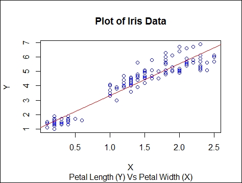
The following example shows how to plot a scatter plot and add a trend line. For this, we will use the famous Iris dataset, created by R. A. Fisher, that is available in R itself:
data(iris)
str(iris)
plot(iris$Petal.Width, iris$Petal.Length, col = "blue", xlab = "X", ylab = "Y")
title(main = "Plot of Iris Data", sub = "Petal Length (Y) Vs Petal Width (X)")
fitlm <- lm(iris$Petal.Length ~ iris$Petal.Width)
abline(fitlm[1], fitlm[2], col = "red")
There are functions in R that enable users to add or extract information from a plot using the mouse in an interactive manner:
locator (n , type): This waits for the user to select thenlocations on the current plot using the left-mouse button. Here, type is one ofn,p,loroto plot points or lines at these locations. For example, to place a legend Outlier near an outlier point, use the following code:>text(locator(1),"Outlier" ,adj=0")
identify(x, y, label): This allows the user to highlight any of the points,xandy, selected using the left-mouse button by placing the label nearby.