
The world is quickly adapting the use of Machine Learning (ML). Whether its driverless cars, the intelligent personal assistant, or machines playing the games like Go and Jeopardy against humans, ML is pervasive. The availability and ease of collecting data coupled with high computing power has made this field even more conducive to researchers and businesses to explore data-driven solutions for some of the most challenging problems. This has led to a revolution and outbreak in the number of new startups and tools leveraging ML to solve problems in sectors such as healthcare, IT, HR, automobiles, manufacturing, and the list is ever expanding.
The abstraction layer between the complicated machine learning algorithms and its implementation has reached an all-time high with the efforts from ML researchers, ML engineers, and developers. Today, you don't have to understand the statistics behind the ML algorithms to be able to apply them to a real-world dataset, rather just knowing how to use a tool is sufficient (which has its pros and cons), which need you to explore and clean the data and put it into an appropriate format. Many large enterprises have come out with certain APIs that provide analytics-as-a-service with capabilities to build predictive models using ML. This does not stop here—companies like Google, Facebook, and IBM have already taken the lead to make some of their systems completely open source, which means the way Android revolutionized the mobile industry, these ML systems are going to do the same for the next generation of fully automated machines.
So now it remains to see from where the next path-breaking, billion-dollar, disruptive idea is going to come. Though all these might sound like a distant dream, it’s fast approaching. The past two decades gave us Google, Twitter, WhatsApp, Facebook, and so many others in the technology fields. All these billion-dollar enterprises have data and use it to make possibilities that we didn't know about few years back. Computer Vision to online location maps have changed the way we work in this century. Who would have thought that sitting in one place, you could find best route from one place to another, or a drone could perform a search and help rescue operation. These possibilities did not exist a few decades ago but now they are reality. All these are driven by data and what we have been able to learn from that data. The future belongs to enterprises and individuals who embrace the power of data.
In this chapter, we are going to deep dive into the fascinating and exciting world of machine learning, where we have tried to maintain a fine balance between theory and tool-centric practical aspects of the subject. As this chapter is the crux of this entire book, we will take up some real industry data to illustrate the algorithm and at the same time, make you understand how the concepts you learned in previous chapters are connected to this chapter. This means, you will now start to see how the ML process flow, PEBE, which we proposed in Chapter 1, is going to play a key role. Chapters 2 to 5 were foundation and prerequisite for effectively and efficiently running a ML algorithm. We learned about properties of data, data types, hidden patterns through visualization, sampling, and creating best set of features to apply ML algorithm. The chapters after this one are more about how to measure the performance of models, improve them, and what technology can help you take ML to an actual scalable environment.
Roughly, statistical learning techniques when used for prediction and forecasting, become machine learning techniques. In this chapter, we will briefly touch on the statistical background of each algorithm and then show you how to run that in the R environment and interpret results. We have devised the following listed, which is a 3D approach to empower readers to quickly get started with ML and learn on the fly with a right blend of theory and practice:
1st-D: The statistical background —We will introduce the core formulation/statistical concept behind the ML concept/algorithm. Since the statistical concepts make the discussion intense and fairly complicated for beginners and intermediate readers, we have designed a much lighter version of these concepts and expect the interested readers to refer a more detailed literature for the same (we have provided sufficient references wherever possible).
2nd-D: Demo in R —Set up the R environment and write R script to work with the datasets provided for a real-world problem. This approach of quickly getting started with R programming after the theoretical foundation on the problem and ML algorithm, has been adopted keeping in mind industry professionals who are looking for a quick prototyping and researchers who wants to get started with practical implementations of ML algorithm. Industry professionals might tend to identify the problem statement in their domain of work and apply a brute force approach to try all possible ML algorithms, whereas researchers tend to master the foundational elements and then proceed to the implementation side of things. This chapter is suitable for both.
3rd-D: Real-world use case —The dataset we have chosen to explain. The ML algorithms are from real scenarios curated for the purpose of explaining the concepts. This means our examples are built on real data, making sure we emulate a real-world scenario, where the model results are not always good. Sometime you get good results, sometimes very poor. A few algorithms work best, some don't work on the same data. This approach will help readers see all algorithms of same type with same denominator to compare and make judicious decisions based on the actual problem at hand. We have discouraged the use of examples that explain the concepts in an ideal situation, and create a falsehood about performance, e.g., rather than choosing a linear regression-based example with R-Square (a performance metric) of 90%, we presented a real-world case, where it could be even as poor as 30%, and discuss further how to improve it. This builds a strong case on how to approach a ML model-building process in the real world. However, wherever required, we have taken up a few standard datasets as well from a few popular repositories for easy explanation of certain concepts.
Additionally, we encourage you to consider three sources of additional information starting from this chapter (and book). These sources are readily available from the Internet and books that exist in hard bound.
Statistical concepts : We encourage you to read the first instance of the approach/algorithm as it’s illustrated in this chapter and if interested, learn the concepts in much detail from the references provided to the original literature.
R-Package : R is evolving really fast with its global network of contributors. In this chapter, we tried to cover the latest packages and functions. We encourage you to follow CRAN and other reliable resources like vignettes of R Packages, lecture notes, use cases, research papers, etc. to keep up-to-date with R implementation and its latest development.
Case study : There will be some concepts that are specific to your problem/industry. Try to connect the discussions provided in the chapter (mostly generic) with your own industry or field of expertise. For example, when we predict the “choice” for what product a customer will choose from a basket of products, this fits in retail setup, but you can think about the same case as predicting the “default/non-default” in banking or predicting the “Infected/not-Infected” in medical diagnosis, and so on. Keep reading the latest reports and industry use cases, as they will provide new ideas for how to use the techniques discussed in the chapter.
In the rest of the chapter, we will discuss machine learning processes, discuss the real-world use case and then demonstrate the application of ML on this use case. We have very broadly divided the ML algorithms into thirteen groups in section 6.2 and discuss some selective algorithms from each module in this and coming chapters. Some of these modules are touched on in previous chapters as well, where we felt it was more relevant. Normally, other books on the subject would have dedicated the entire book to such groups; however, based on our PEBE framework for machine learning process flow, we have consolidated all the ML algorithms into one chapter, providing you, a much needed comprehensive guide for ML.
6.1 Machine Learning Types
In the machine learning literature, there are multiple ways in which we bucket the algorithms to study them in a collective manner. The most popular division is based on two factors :
Learning types: This is to do with what type of response variable (or labels) we have in the training data. In this section, we discuss supervised, unsupervised, semi-supervised, and reinforcement learning.
Subjective grouping: This grouping is driven by “what” the model is trying to achieve. Each group has a similar set of algorithmic approach and principles. We will show this grouping and few popular techniques within them. These similarities help create the 12 groups mentioned earlier in the chapter.
There are lots of overlaps in which ML algorithms are applied to a particular problem. As a result, for the same problem, there could be many different ML models possible. Chapters 7 and 8 discuss a few ways to choose the best among them and combine a few to create a new ensemble. So, coming out with the best ML model is an art that requires a lot of patience and trial and error. Figure 6-1 provides a brief of all these learning types with sample use cases.

Figure 6-1. Machine learning types
6.1.1 Supervised Learning
A class of ML algorithm where the data contains a response variable (also called a label) or it is possible to generate one, is termed supervised learning. In other words, a dataset where each instance has correctly identified responses. Further, the response variable could be either continuous or categorical. The algorithm learns the response variable against the provided set of predictor variables. For example, if the dataset belongs to a set of patients, each instance will have a response variable identifying whether a patient has cancer or not (categorical). Or in a dataset of house prices in a given state or country, the response variable could be the price of the house.
Keep in mind that defining the problem (defining a problem will be more clear when we discuss the real-world use cases later in the chapter) clearly is important for us to start in the right direction. Further, the problem is a classification task if the response variable is categorical, and a regression task, if it’s continuous. Though this rule is largely true in all cases, there are certain problems that are a mix of both classification and regression. Some application of supervised learning are speech recognition, credit scoring, medical imaging, and search engines.
6.1.2 Unsupervised Learning
On the other hand, when the labels are not available, the class of ML algorithm is called unsupervised. The learning happens based on some measure of similarity or distance between each row in the dataset. The most commonly used technique in unsupervised learning is clustering. Other methods like Association Rule Mining (ARM) are based on the frequency of an event like a purchase in market basket, server crashes in log mining, and so on. (A lot of literature will argue that ARM is a data mining technique rather than machine learning. Refer to Chapter 1 where we presented a detailed argument on the differences between statistics, ML, and Data Mining). Some applications of unsupervised learning are customer segmentation in marketing, social network analysis , image segmentation, climatology, and many more.
6.1.3 Semi-Supervised Learning
In the previous two types, either there are no labels for all the observation in the dataset or labels are present for all the observations. Semi-supervised learning falls in between these two. In many practical situations, the cost to label is quite high, since it requires skilled human experts to do that. So, in the absence of labels in the majority of the observations but present in few, semi-supervised algorithms are the best candidates for the model building. These methods exploit the idea that even though the group memberships of the unlabeled data are unknown, this data carries important information about the group parameters. The most extensive literature on this topic is provided in the book, Semi-Supervised Learning. MIT Press, Cambridge, MA, by Chapelle, O. et. al. [1] Also, there are packages like upclass in R, which help build a semi-supervised learning model.
6.1.4 Reinforcement Learning
Both supervised and unsupervised learning algorithms need clean and accurate data to produce the best results. Also, the data needs to be comprehensive in order to work on the unseen instances. For example, if the problem of predicting cancer based on patients’ medical history didn’t have data for a particular type of cancer, the algorithm will produce many false alarms when deployed in real-time. So, in cases where currently the data for learning is not available or it will update rapidly with time, reinforcement learning is an ideal choice. The world of robotics and innovation in driverless cars is all coming from this class of ML algorithm. Reinforcement learning algorithm (called the agent) continuously learns from the environment in an iterative fashion. In the process, the agent learns from its experiences of the environment until it explores the full range of possible states. Some applications of the RL algorithm are computer played board games (Chess, Go), robotic hands, and self-driving cars.
A detailed discussion of semi-supervised and RL algorithms is beyond the scope of this book; however, we will reference them wherever necessary.
6.2 Groups of Machine Learning Algorithms
The ML algorithms are grouped into thirteen modules based on the similarity of approach and algorithm output. This will help you create use cases within the same module for a more diverse set of problems.
Another benefit of organizing algorithms in this manner is ease of working with R libraries, which are designed to contain all relevant/similar functions in a single library. This helps the users explore all options/diagnostics for a problem using a single library. The list is ever-expanding with new use cases emerging from academia and industries. We will mention which of these algorithms are covered in this book, and let you explore more from other sources.
Regression-based methods . Regression-based methods are the most popular and widely used in academia and research. They are easy to explain and easy to put into a live production environment. In this class of methods, the relationship between dependent variable and set of independent variables is estimated by the probabilistic method or by error function minimization. We covered regression techniques, linear regression, polynomial regression, and logistic regression in this chapter and have touched on them in other chapters as well.

Figure 6-2. Regression algorithms
Distance-based algorithms . Distance-based or event-based algorithms are used for learning representations of data and creating a metric to identify whether an object belongs to the class of interest or not. They are sometimes called memory-based learning, as they learn from set of instances/events captured in the data. We will use K-Nearest Neighbor and Learning Vector Quantization in creating ensembles in Chapter 8.

Figure 6-3. Distance-based algorithms
Regularization methods . Regularization methods are essentially an extension of regression methods. Regularization algorithms introduce a penalization term to the loss function (as discussed in Chapter 5) for balancing between complexity of model and improvement in results. They are very powerful and useful techniques when dealing with data with a high number of features and large data volume. We had introduced L1 regularization in Chapter 5 as an embedded method of variable subset selection.

Figure 6-4. Regularization algorithms
Tree-based algorithms . These algorithms are based on sequential conditional rules applied on the actual data. The rules are generally applied serially and a classification decision is made when all the conditions are met. These methods are very popular in decision-making engines and classification problems. They are fast and distributed algorithms. We discuss algorithms like CART, Iterative Dichotomizer, CHAID, and C5.0 in this chapter and use them to train our ensemble model in Chapter 8.

Figure 6-5. Decision tree algorithms
Bayesian Algorithms . These algorithms might not be called learning algorithms as they work on the Bayes Theorem based on prior and post distributions. The machine essentially does not learn from an iterative process but uses inference from distributions of variable. These methods are very popular and easy to explain, used mostly in classification and inference testing. We cover the Naive Bayes model in this chapter, and introduce basic ideas from probability to explain them.

Figure 6-6. Bayesian algorithms
Clustering Algorithms . These algorithms generally work on simple principle of maximization of intracluster similarities and minimization of intercluster similarities. The measure of similarity determines how the clusters need to be formed. These are very useful in marketing and demographic studies. Mostly these are unsupervised algorithms, which group the data for maximum commonality. We discuss k-means, expectation-minimization, and hierarchical clustering. We also discuss the distributed clustering.

Figure 6-7. Clustering algorithms
Association Rule Mining . In these algorithms, the relationship among the variables is observed and used to quantify the relationship for predictive and exploratory objectives. These methods have been proved to be very useful to build and mine relationships among large multi-dimensional datasets. Popular recommendation systems are based on some variation of association rule mining algorithms. We discuss Apriori and Eclet algorithms in this chapter for association rule mining and user and item-based collaborative filtering of recommendation algorithm.

Figure 6-8. Association rule mining
Artificial Neural Networks (ANN) . Inspired by the biological neural networks, these are powerful enough to learn non-linear relationships and recognize higher order relationships among variables. They can implement both supervised and unsupervised learning process. There is a stark difference between the complexity of traditional neural networks and deep learning neural networks (discussed later in this chapter). We discuss Perceptron and back-propagation in this chapter.

Figure 6-9. Artificial neural networks
Deep Learning . These algorithms work on complex neural structures that can abstract higher level of information from a huge dataset. They are computationally heavy and hard to train. In simple terms, you can think of them as very large, multiple hidden layer neural nets. We provide a deep architecture network and image recognition (convolutional nets) example in this chapter.

Figure 6-10. Deep learning algorithms
Dimensionality Reduction . These are essentially methods for amplifying the signal in data by various transformations and supervised learning approaches. These methods are usually applied prior to modeling. We had discussed Principal Component Analysis (PCA) in Chapter 5.

Figure 6-11. Dimensionality reduction algorithms
Ensemble learning . This is a set of algorithms that is built by combining results from multiple machine learning algorithms. These methods have become very popular due to their ability to provide superior results and the possibility of breaking into independent models to train on a distributed network. We discuss bagging, boosting, stacking, and blending ensembles in Chapter 8.
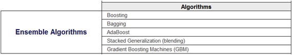
Figure 6-12. Ensemble learning
Text Mining . It also known as text analytics and is a subfield of Natural Language Processing, which provides certain algorithms and approached to deal with unstructured textual data, commonly obtained from call center logs, customer reviews, and so on. The algorithms in this group can deal with highly unstructured text data to bring insights and/or create features for applying machine learning algorithms. We discuss text summarization, sentimental analysis, and word cloud, and topic identification.

Figure 6-13. Text mining algorithms
The list of algorithms discussed has multiple implementations in R, Python, and other statistics packages. All the methods don't have readily available R packages for implementation. Some algorithms are not fully supported in the R environment and have to be used by calling APIs, e.g., text mining and deep neural nets. The research community is working toward bringing all the latest algorithms into R either via a package or APIs.
Torsten Hothorn maintains an exhaustive list of packages available in R for implementing machine learning algorithms. (Reference: CRAN Task View: Machine Learning & Statistical Learning at https://cran.r-project.org/web/views/MachineLearning.html .)
We recommend you keep an eye on this list and keep following up with the latest package releases. In the next section we present a brief taxonomy of all the real-world datasets that are going to be used in this chapter and in the coming chapters for demos using R.
6.3 Real-World Datasets
Throughout this chapter, we are going to use the following set of real-world datasets and build many use cases around them in order to demonstrate the various ML algorithms. In this section, a brief taxonomy of datasets associated with each use case is presented before we start with the demos using R. Apart from these broader datasets, there are many smaller datasets being used wherever it was necessary to explain certain concepts.
6.3.1 House Sale Prices
The selling price of a house depends on many variables; this dataset presents a combination of factors to predict the selling price. Table 6-1 presents the metadata of this House Sale Price dataset.

Table 6-1. House Sale Price Dataset
6.3.2 Purchase Preference
This data contains transaction history for customers who have bought a particular product. For each customer_ID, multiple data points are simulated to capture the purchase behavior. The data is originally set for solving multi-class models with four possible products from the insurance industry. The features are generic enough so that they could be adapted for another industry like automobile, and retail where you could have data about the car purchases, consumer goods, and so on.

Table 6-2. Purchase Preferences
6.3.3 Twitter Feeds and Article
We collected some Twitter feeds to generate results for applying text mining algorithms. The feeds are taken from National News Channel Twitter accounts as of September 30, 2016. The handles used are @TimesNow and @CNN. One article available on the Internet has been used for summarization. The original article can be found at http://www.yourarticlelibrary.com/essay/essay-on-india-after-independence/41354/ .
6.3.4 Breast Cancer
We will be using the Breast Cancer Wisconsin (Diagnostic) dataset from the UCI machine learning repository. The features in the dataset are computed from a digitized image of a fine needle aspirate (FNA) of a breast mass. Each variable, except for the first and last, was converted into 11 primitive numerical attributes with values ranging from 0 to 10. They describe characteristics of the cell nuclei present in the image. Table 6-3 lists the features available.

Table 6-3. Breast Cancer Wisconsin
6.3.5 Market Basket
We will use a real-world data from a small supermarket. Each row of this data contains a customer transaction with a list of products (from now on, we will use the term items) they purchased. Since the items were too many in a typical supermarket, we have aggregated them to the category level. For example, “baking needs” covers a number of different products like dough, baking soda, butter, and so on. For illustration, let’s take a small subset of the data consisting of five transactions and nine items, as shown in Table 6-4.

Table 6-4. Market Basket Data
6.3.6 Amazon Food Review
The Amazon Fine Food Reviews dataset consists of 568,454 food reviews that Amazon users left up to October 2012. A subset of this data is being used for text mining approaches in this chapter to show text summarization, categorization, and part-of-speech extraction. Table 6-5 contains the metadata of Amazon Fine Food Reviews dataset.

Table 6-5. Amazon Food Review
The rest of the chapter will discuss every machine learning algorithm based on the grouping discussed earlier and consistently explain every algorithm with our 3D approach , discussing statistical background, demonstration in R, and using a real-world use case.
6.4 Regression Analysis
In previous chapters, we were trying to set the stage for modeling techniques to work for our desired objective. This chapter touches on some of the out-of-box techniques in statistical learning and machine learning space . At this stage you might want to focus on the algorithmic approaches and not worry much about how statistical assumptions play a role in machine learning algorithms. For completeness, we discuss in Chapter 8 how statistical learning differs from machine learning.
The section of regression analysis will focus on building a thought process around how the modeling techniques establish and quantify a relation among response variables and predictors. We will start by identifying how strong and what type of relationship they share and try to see if the relationship can be modeled with an assumption around a distribution or not like normal distribution. We will also address some of the important diagnostic features of popular techniques and explain what significance they have in model selection.
The focus of these techniques is to find relationships that are statistically significant and do not bear any distributional assumptions . The techniques do not establish causation (best understood with the notion which says “a strong association is not a proof of causation”), but give the data scientist indication of how the data series is related given some assumptions around parameters. Causation establishment lies with the prudence and business understanding of the process.
The concept of causation is important to keep in mind, as most of the time our thought process deviates from how relationships quantified by a model have to be interpreted. For example, a statistical model will be able to quantify relationships between completely irrelevant measures, say electricity generation and beer consumption. The linear model will be able to quantify a relationship among them. But does beer consumption relate to electricity generation? Or does more electricity generation mean more beer consumption? Unless you try very hard, it's difficult to prove. Hence, a clear understanding of the process in discussion and domain knowledge is important. You have to challenge the assumptions to get the real value out of the data. This curse of causation needs to be kept in mind while we discuss correlation and other concepts in regression.
Any regression analysis involves three key sets of variables :
Dependent or response variables (Y): Input series
Independent or predictor variables (X): Input series
Model parameters: Unknown parameters to be estimated by the regression model
For more than one independent variable and single dependent variable these quantities can be thought of as a matrix.
The regression relationship can be shown as a function that maps from set of independent variable space to dependent variable space. This relationship is the foundation of prediction/forecasting
:
![]()
This notation looks more like a mathematical modeling, and the Statistical Modeling scholars use a little different notation for the same relationship
:
![]()
In statistical modeling, regression analysis estimates the conditional expectation of dependent variable for known values of independent variables, which is nothing but the average value of dependent for given values of independent variables. Other important concept to understand before we expand the idea of regression is around parametric and non-parametric methods. The discussion in this section will be based on parametric methods, while there exist other set of techniques that are non-parametric. [2]
Parametric methodsassume that the sample data is drawn from a known probability distribution based on fixed set of parameters. For instance, linear regression assumes normal distribution, whereas logistic assumes binomial distribution, etc. This assumption allows the methods to be applied to small datasets as well.
Non-parametric methodsdo not assume any probability distribution in prior, rather they construct empirical distributions from the underlying data. These methods require high volume of data to model estimation. There exists a separate branch on non-parametric regressions, which is out of scope of this book, e.g., kernel regression, Nonparametric Multiplicative Regression (NPMR) etc. A good resource to read more on this topic is “Artificial Intelligence: A Modern Approach” by Stuart Russell and Peter Norvig.
Further, using a parametric method allows you to easily create confidence intervals around the estimated parameters; we will use this in our model diagnostic measures. In this book we will be working with two types of input data—continuous input with normality assumption and logistic regression with binomial assumption. Also, a small primer on generalized framework will be provided for further reading.
6.5 Correlation Analysis
The object of statistical science is to discover methods of condensing information concerning large groups of allied facts into brief and compendious expressions suitable for discussion
—Sir Francis Galton (1822-1911)
Correlation can be seen as a broader term used to represent the statistical relationship between two variables. Correlation, in principle, provides a single measure of relationship among the variables. There are multiple ways in which a relationship can be quantified, due to this same reason we have so many types of correlation coefficients in statistics.
For measuring linear relationships, Pearson correlation is the best measure. Pearson correlation, also called the Pearson Product-Moment Correlation Coefficient, is sensitive to linear relationships. It also exists for non-linear relationships but doesn’t provide any useful information in those cases.
Let’s assume two random variables, X and Y with their mean as μ
X
and μ
Y
and standard deviations σ
X
and σ
Y
. The population correlation coefficient is defined as
![$$
ho X,Y=frac{Eleft[left(X-{mu}_X
ight)left(Y-{mu}_Y
ight)
ight]}{sigma_X{sigma}_Y} $$](http://images-20200215.ebookreading.net/19/4/4/9781484223345/9781484223345__machine-learning-using__9781484223345__A416805_1_En_6_Chapter_Equc.gif)
We can infer from this, two important features of this measure :
It ranges from -1 (negative correlated) and +1 (positively correlated), which can be derived from Cauchy-Schwarz inequality.
This is defined only when the standard deviation is finite and non-zero.
Similarly, for a sample from the population, the measure is defined as follows:

Let's create some scatter plots with our house price data and see what kind of relationship we can quantify using the Pearson correlation .
Dependent variable: HousePrice
Independent variable: StoreArea
Data_HousePrice <-read.csv("Dataset/House Sale Price Dataset.csv",header=TRUE);#Create a vectors with Y-Dependent, X-Independenty <-Data_HousePrice$HousePrice;x<-Data_HousePrice$StoreArea;#Scatter Plotplot(x,y, main="Scatterplot HousePrice vs StoreArea", xlab="StoreArea(sqft)", ylab="HousePrice($)", pch=19,cex=0.3,col="red")#Add a fit line to show the relationship directionabline(lm(y∼x)) # regression line (y∼x)lines(lowess(x,y), col="green") # lowess line (x,y)
The plot in Figure 6-14 shows the scatter plot between HousePrice and Store Area. The curved line is a locally smoothed fitted line. It can be seen that there is a linear relationship among the variables.

Figure 6-14. Scatter plot between HousePrice and StoreArea
#Report the correlation coefficient of this relation
cat("The correlation among HousePrice and StoreArea is  ",cor(x,y));
The correlation among HousePrice and StoreArea is   0.6212766
From these plots, we can make the following observations :
The relationship is in a positive direction, on average the house price increases with the size of the store. This is an intuitive relationship, hence we can draw causality. The bigger store space means a better house and hence is costly.
The correlation is 0.62. This is a moderately strong relationship on a linear scale.
The curved line is a LOWESS plot (Locally Weighted Scatterplot Smoothing) , which shows that it is not very different from the linear regression line. Hence, the linear relationship is worth exploring for a model.
If you see closely, there is a vertical line at StoreArea = 0. This vertical line is saying that the prices vary for the house where there is no store area . We need to look at other factors that are driving the house prices.
We have discussed in detail how to find the set of variables that fit the data best. So in coming sections we will not focus on how we got to that model, but show more about how to run and interpret them in R.
6.5.1 Linear Regression
Linear regression is a process of fitting a linear predictor function to estimate unknown parameters from the underlying data. In general, the model predicts the conditional mean of Y given X, which is assumed to be an affine function of X.
Affine function : as linear regression estimated model does have an intercept term and hence it is not just a linear function of X but an affine function.
Essentially, the linear regression model will help you with:
Prediction or forecasting
Quantifying the relationship among variables
While the former has to do with if there are some unknown Xs then what is the expected value for Y, the later deals with on the historical data of how these variables were related in quantifiable terms (e.g., parameters and p-values).
Mathematically, the simple linear relationship looks like this:
For a set of n duplets ![]() , the relationship function is described as:
, the relationship function is described as:
![]()
,and the objective of linear regression is to estimate this line:
![]()
where y is the predicted response (or fitted value) α is the intercept, i.e., average response value if the independent variable is zero, β is the parameter for x, i.e., change in y by per unit change in x.
There are many ways to fit this line with the given dataset. This differs with the type of loss function we want to minimize, e.g., ordinary least square, least absolute deviation, ridge etc. Let’s look at the most popular method of Ordinary Least Square (OLS) .
In OLS, the algorithm minimizes the squares error. The minimization problem
can be defined as follows:

Being a parametric method
, we can have a closed form solution for this optimization. The closed form solution for estimating coefficients (or parameters) is by using the following equations:
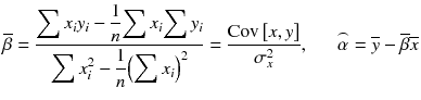
Where, σ 2 x is the variance of x. The derivation of this solution can be found at https://onlinecourses.science.psu.edu/stat414/node/278 .
OLS has special properties for a linear regression model under certain assumptions on the residual. Carl Friedrich Gauss and Andrey Markov jointly developed Gauss-Markov Theorem that states that if the following conditions are satisfied:
Expectation (mean) of residuals is zero (normality of residuals)
Residuals are un-correlated and (no auto-correlation)
Residuals have equal variance (homoscedasticity)
then Ordinary Lease Square estimation gives Best Linear Unbiased Estimator of coefficients (or parameter estimates). We now explain the key terms that comprise the best estimator, i.e., bias, consistent, and efficient.
6.5.1.1 Best Linear Predictors
The estimation methodology used in the previous section is Ordinary Least Square (OLS) . We want to give a statistical definition of three important terms. This is important to make sure that even when we use these words loosely, we are aware what these terms mean.
Bias of estimator : Bias of an estimator is the difference between estimator's expected value and the true value of the parameter being estimated. The estimator that has zero bias is desired for any model with unbiased estimators.
![$$ {mathrm{Bias}}_{ heta}left[;widehat{ heta};left]={mathrm{E}}_{ heta}
ight[;widehat{ heta};left]- heta ={mathrm{E}}_{ heta}
ight[;widehat{ heta}- heta;left],{mathrm{Bias}}_{ heta}
ight[;widehat{ heta};left]={mathrm{E}}_{ heta}
ight[;widehat{ heta};left]- heta ={mathrm{E}}_{ heta}
ight[;widehat{ heta}- heta;
ight] $$](http://images-20200215.ebookreading.net/19/4/4/9781484223345/9781484223345__machine-learning-using__9781484223345__A416805_1_En_6_Chapter_Equi.gif)
This equation tells us that bias is the difference between the estimated value of a parameter and the true value. if the true value of parameter is 5 and the linear model estimated it to be 4.5, our estimator is biased by -0.5. This will cause consistent underprediction (biased prediction). The theorem says if the estimator is unbiased then its bias is equal to 0 for all values of parameter θ.
The bias-variance tradeoff is discussed in Chapter 8.
Consistent estimator : An estimator Tn of parameter θ is said to be consistent if it converges in probability to the true value of the parameter:

Recall our discussion around CLT and LLN; we can rephrase this relationship:
![$$ Pr left[;left|{T}_n-mu
ight|ge varepsilon
ight]= Pr left[frac{sqrt{n};left|{T}_n-mu
ight|}{sigma}ge sqrt{n}varepsilon /sigma
ight]=2left(1-varPhi left(frac{sqrt{n};varepsilon }{sigma}
ight)
ight) o 0 $$](http://images-20200215.ebookreading.net/19/4/4/9781484223345/9781484223345__machine-learning-using__9781484223345__A416805_1_En_6_Chapter_Equk.gif)
As n tends to infinity, the probability of the parameter estimate being different from the true value goes to zero. This means as we increase the training dataset, we expect that the parameter estimator value converges to the true value of the parameter.
Efficient Estimator: An efficient estimator is an estimator that estimates its value in the best manner defined with respect to some loss/cost function. Generally, for the OLS framework, we say a estimator is efficient if it has bounded variance, i.e., variance with an upper limit:
![$$ mathrm{V}mathrm{a}mathrm{r}left[;T;
ight]kern0.5em ge kern0.5em {mathrm{mathcal{I}}}_{ heta}^{-1} $$](http://images-20200215.ebookreading.net/19/4/4/9781484223345/9781484223345__machine-learning-using__9781484223345__A416805_1_En_6_Chapter_Equl.gif)
where ℐ θ is the Fisher information matrix of the model at point θ.
In regression, we want to minimize the variance (standard error) in our estimations of coefficients (parameters), so OLS provides us with an efficient estimator is it satisfies the Gauss-Markov theorem.
These three concepts can be extended to other modeling forms. These are important properties to be followed by our estimators to give a statistically significant model. We will now show the results for some of the important assumptions/properties we test for linear regression models.
6.5.2 Simple Linear Regression
Now we can move on to estimating the linear models using the OLS technique. The lm() package in R provides us with the capability to run OLS for linear regressions. The lm() function can be used to carry out regression, single stratum analysis of variance, and analysis of covariance. It is part of the base stats() package in R.
Now, we will create a simple linear regression and understand how to interpret the lm() output for this simple case. Here we are fitting linear regression model with OLS technique on the following.
Dependent variable: HousePrice
Independent variable: StoreArea
Further our correlation analysis showed that these two variables have a positive linear relation and hence we will expect a positive sign to the parameter estimates of StoreArea. Let’s run and interpret the results.
# fit the modelfitted_Model <-lm(y∼x)# Display the summary of the modelsummary(fitted_Model)Call:lm(formula = y ∼ x)Residuals:Min 1Q Median 3Q Max-280115 -33717 -4689 24611 490698Coefficients:Estimate Std. Error t value Pr(>|t|)(Intercept) 70677.227 4261.027 16.59 <2e-16 ***x 232.723 8.147 28.57 <2e-16 ***---Signif. codes: 0 '***' 0.001 '**' 0.01 '*' 0.05 '.' 0.1 ' ' 1Residual standard error: 63490 on 1298 degrees of freedomMultiple R-squared: 0.386, Adjusted R-squared: 0.3855F-statistic: 816 on 1 and 1298 DF, p-value: < 2.2e-16
The estimated equation
for our example is
![]()
where y is HousePrice and x is StoreArea. This implies for a unit increase in x (StoreArea), the y (HousePrice) will be increased by $232.72. Intercept, being constant, tells us the HousePrice when there is no StoreArea, and can be thought of as a registration fee.
Let's discuss the lm() summary output to understand the model better. The same explanation can be extended to multiple linear regression in the next section.
Call: Output the model equation that was fitted in the lm() function.
Residuals: This gives interquartile range of residuals and Min, Max, and Median on residuals. A negative median means that at least half of the residuals are negative, i.e., the predicted values are more than the actual values in more than 50% of the prediction.
Coefficients: This is a table giving model parameter estimates (or coefficient), standard error, t-value, and p-value of the student t-test.
Diagnostics: Residual standard error, and multiple and adjusted R-Square and F-statistics for variance testing.
It is important to expand the coefficient’s component of the lm() summary output. This output provide vital information about the model predictors and their coefficients:
Estimate : The fitted value for that parameter. This value directly uses the model equation to do prediction and to understand the relationship with the dependent variable. For example, in our model, the predictor variable x (store area) has a coefficient of 232.7.
Standard Error (std. Error) : The standard deviation of the distribution of the parameter estimate. In other words, the estimate is the mean value of coefficients and the standard deviation of that is the standard error. The standard error can be calculated as:

Where s is the sample standard deviation and n is the size of the sample.
The lower the standard error with respect to the estimate, the better the model estimate.
t-value and p-value : Student t-test is a hypothesis test that checks if the test statistics follow a t-distribution. Statistically the p-value reported against each parameter is the p-value of one sample t-test.
We test that the value of parameter is statistically different from zero. If we fail to reject the null hypothesis then we can say the respective parameter is not significant in our model.
The t-statistics for one sample t-test is as follows:

where is the sample mean, s is the sample standard deviation of the sample, and n is the sample size. For our linear model, the t-value of x is 28.57 and the p-value is ∼0. This means the estimate of x is not 0 and hence it is significant in the model.
Once we understand how the model looks and what the significance of each predictor is, we move on to see how the model fits the actual value. This is done by plotting actual values against predicted values :
res <-stack(data.frame(Observed = y, Predicted =fitted(fitted_Model)))res <-cbind(res, x =rep(x, 2))#Plot using lattice xyplot(function)library("lattice")xyplot(values ∼x, data = res, group = ind, auto.key =TRUE)
The plot shows the fitted values with the actual values. You can see that the plot shows the linear relationship predicted by our model, stacked with the scatter plot of the original.
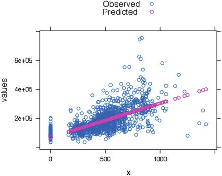
Figure 6-15. Scatter plot of actual versus predicted
Now, this was a model with only one explanatory variable (StoreArea), but there are other variables available that show significant relationships with HousePrices. The regression framework allow us to add multiple explanatory variables or independent variables to the regression analysis. We introduce multiple linear regression in the next section.
6.5.3 Multiple Linear Regression
The ideas of simple linear regression can be extended to multiple independent variables. The linear relationship in multiple linear regression then becomes
![]()
For multiple regression, the matrix representation is very popular as it makes the concepts of matrix computation explanation easy.
![]()
In our previous example we just used one variable to explain the dependent variable, StoreArea. In multiple linear regression we will use StoreArea, StreetHouseFront, BasementArea, LawnArea, Rating, and SaleType as independent variables to estimate a linear relationship with HousePrice.
The least square estimation function remains the same except there will be new variables as predictors. To run the analysis on multiple variables we introduce one more data cleaning step, missing value identification. We either want to impute the missing value or leave it out of our analysis. We choose leaving it out by using the na.omit() function R. The following code first finds the missing cases and then removes them.
# Use lm to create a multiple linear regressionData_lm_Model <-Data_HousePrice[,c("HOUSE_ID","HousePrice","StoreArea","StreetHouseFront","BasementArea","LawnArea","Rating","SaleType")];# below function we display number of missing values in each of the variables in datasapply(Data_lm_Model, function(x) sum(is.na(x)))HOUSE_ID HousePrice StoreArea StreetHouseFront0 0 0 231BasementArea LawnArea Rating SaleType0 0 0 0#We have preferred removing the 231 cases which correspond to missing values in StreetHouseFront. Na.omit function will remove the missing cases.Data_lm_Model <-na.omit(Data_lm_Model)rownames(Data_lm_Model) <-NULL#categorical variables has to be set as factorsData_lm_Model$Rating <-factor(Data_lm_Model$Rating)Data_lm_Model$SaleType <-factor(Data_lm_Model$SaleType)
Now we have cleaned up the data from the missing values and can run the lm() function to fit our multiple linear regression model.
fitted_Model_multiple <-lm(HousePrice ∼StoreArea +StreetHouseFront +BasementArea +LawnArea +Rating +SaleType,data=Data_lm_Model)summary(fitted_Model_multiple)Call:lm(formula = HousePrice ∼ StoreArea + StreetHouseFront + BasementArea +LawnArea + Rating + SaleType, data = Data_lm_Model)Residuals:Min 1Q Median 3Q Max-485976 -19682 -2244 15690 321737Coefficients:Estimate Std. Error t value Pr(>|t|)(Intercept) 2.507e+04 4.827e+04 0.519 0.60352StoreArea 5.462e+01 7.550e+00 7.234 9.06e-13 ***StreetHouseFront 1.353e+02 6.042e+01 2.240 0.02529 *BasementArea 2.145e+01 3.004e+00 7.140 1.74e-12 ***LawnArea 1.026e+00 1.721e-01 5.963 3.39e-09 ***Rating2 -8.385e+02 4.816e+04 -0.017 0.98611Rating3 2.495e+04 4.302e+04 0.580 0.56198Rating4 3.948e+04 4.197e+04 0.940 0.34718Rating5 5.576e+04 4.183e+04 1.333 0.18286Rating6 7.911e+04 4.186e+04 1.890 0.05905 .Rating7 1.187e+05 4.193e+04 2.830 0.00474 **Rating8 1.750e+05 4.214e+04 4.153 3.54e-05 ***Rating9 2.482e+05 4.261e+04 5.825 7.61e-09 ***Rating10 2.930e+05 4.369e+04 6.708 3.23e-11 ***SaleTypeFirstResale 2.146e+04 2.470e+04 0.869 0.38512SaleTypeFourthResale 6.725e+03 2.791e+04 0.241 0.80964SaleTypeNewHouse 2.329e+03 2.424e+04 0.096 0.92347SaleTypeSecondResale -5.524e+03 2.465e+04 -0.224 0.82273SaleTypeThirdResale -1.479e+04 2.613e+04 -0.566 0.57160---Signif. codes: 0 '***' 0.001 '**' 0.01 '*' 0.05 '.' 0.1 ' ' 1Residual standard error: 41660 on 1050 degrees of freedomMultiple R-squared: 0.7644, Adjusted R-squared: 0.7604F-statistic: 189.3 on 18 and 1050 DF, p-value: < 2.2e-16
The estimated model has six independent variables , with four continuous variables (StoreArea, StreetHouseFront, BasementArea, and LawnArea) and two categorical variables (Rating and SaleType). From the results of lm() function, we can see that StoreArea, StreetHouseFront, BasementArea, and Lawn Area are significant at 95% confidence level, i.e., statistically different from zero. While all levels of SaleType are insignificant, hence statistically they are equal to zero. The higher ratings are significant but not the lower ones. The model should drop the SaleType and be re-estimated to keep only significant variables.
Now we will see how the actual versus predicted values look for this model by plotting them after ordering the series by house prices.
#Get the fitted values and create a data frame of actual and predicted get predicted valuesactual_predicted <-as.data.frame(cbind(as.numeric(Data_lm_Model$HOUSE_ID),as.numeric(Data_lm_Model$HousePrice),as.numeric(fitted(fitted_Model_multiple))))names(actual_predicted) <-c("HOUSE_ID","Actual","Predicted")#Ordered the house by increasing Actual house priceactual_predicted <-actual_predicted[order(actual_predicted$Actual),]#Find the absolute residual and then take mean of thatlibrary(ggplot2)#Plot Actual vs Predicted values for Test Casesggplot(actual_predicted,aes(x =1:nrow(Data_lm_Model),color=Series)) +geom_line(data = actual_predicted, aes(x =1:nrow(Data_lm_Model), y = Actual, color ="Actual")) +geom_line(data = actual_predicted, aes(x =1:nrow(Data_lm_Model), y = Predicted, color ="Predicted")) +xlab('House Number') +ylab('House Sale Price')
The plot in Figure 6-16 shows the actual and predicted values on a value ordered HousePrice.

Figure 6-16. The actual versus predicted plot
We have arranged the HousePrices in increasing order to see less cluttered actual versus predicted plot. The plot shows that our model closely follows the actual prices. There are few cases of outlier/high values on actual which the model is not able to predict, and that is fine as our model is not influenced by outliers.
6.5.4 Model Diagnostics: Linear Regression
Model diagnostics is an important step in the model-selection process . There is a difference between model performance evaluation, discussed in Chapter 7, and the model selection process. In model evaluation, we check how the model performs on unseen data (testing data), but in model diagnostic/selection, we see how the model fitting itself looks on our data. This includes checking the p-value significance of the parameter estimates, normality, auto-correlation, homoscedasticity, influential/outlier points, and multicollinearity. There are other test as well to see how well the model follows the statistical assumptions, strict exogeneity, anova tables, and others but we will focus on only few in the following sections.
6.5.4.1 Influential Point Analysis
In linear regression, extreme values can create issues in the estimation process. Few high leverage values introduce bias in the estimators and create other aberrations in the residuals. So it is important to identify influential points in data. If the influential points seem too extreme, we have to discard them from our analysis as outliers.
A specific statistical measure that we will show, among others, is Cook’s distance. This method is used to find an estimate of the influence data point when doing an OLS estimation.
Cook’s distance
is defined as follows:
![$$ {D}_i=frac{e_i^2}{s^2p}left[frac{h_i}{{left(1-{h}_i
ight)}^2}
ight], $$](http://images-20200215.ebookreading.net/19/4/4/9781484223345/9781484223345__machine-learning-using__9781484223345__A416805_1_En_6_Chapter_Equr.gif)
where ![]() is the mean squared error of the regression model and
is the mean squared error of the regression model and ![]() and
and ![]()
In simple terms, Cook's distance measures the effect of deleting a given observation. In this way, if removal of some observation causes significant changes, that means those points are influencing the regression model. These points are assigned a large value to Cook's distance and are considered for further investigation.
The cutoff value for this statistics can be taken as ![]() , where n is the number of observations. If you adjust for the number of parameters in the model, then the cutoff can be taken as
, where n is the number of observations. If you adjust for the number of parameters in the model, then the cutoff can be taken as ![]() , where k is the number of variables in the model.
, where k is the number of variables in the model.
library(car);
 Influential Observations
# Cook's D plot
# identify D values > 4/(n-k-1)
cutoff <-4/((nrow(Data_lm_Model)-length(fitted_Model_multiple$coefficients)-2))
plot(fitted_Model_multiple, which=4, cook.levels=cutoff)
The plot in Figure 6-17 shows the Cook’s distance for each observation in our dataset.

Figure 6-17. Cook’s distance for each observation
You can see the observation numbers with a high Cook’s distance are highlighted in the plot in Figure 6-17. These observations require further investigation.
# Influence Plot
influencePlot(fitted_Model_multiple,    id.method="identify", main="Influence Plot", sub="Circle size is proportional to Cook's Distance",id.location =FALSE)
The plot in Figure 6-18 shows a different view of Cook’s distance. The circle size is proportional to the Cook’s distance.

Figure 6-18. Influence plot
Also, the outlier test results are shown here:
#Outlier Plot
outlier.test(fitted_Model_multiple)
        rstudent unadjusted p-value Bonferonni p
 621  -14.285067         1.9651e-42   2.0987e-39
 229    8.259067         4.3857e-16   4.6839e-13
 564   -7.985171         3.6674e-15   3.9168e-12
 1023   7.902970         6.8545e-15   7.3206e-12
 718    5.040489         5.4665e-07   5.8382e-04
 799    4.925227         9.7837e-07   1.0449e-03
 235    4.916172         1.0236e-06   1.0932e-03
 487    4.673321         3.3491e-06   3.5768e-03
 530    4.479709         8.2943e-06   8.8583e-03
The observation numbers—342,621 and 102—as shown in Figure 6-18 (corresponding to HOUSE_ID 412, 759, and 1242) are the three main influence points . Let's pull out these records to see what values they have.
#Pull the records with highest leverageDebug <-Data_lm_Model[c(342,621,1023),]print(" The observed values for three high leverage points");[1] " The observed values for three high leverage points"DebugHOUSE_ID HousePrice StoreArea StreetHouseFront BasementArea LawnArea342 412 375000 513 150 1236 215245621 759 160000 1418 313 5644 638871023 1242 745000 813 160 2096 15623Rating SaleType342 7 NewHouse621 10 FirstResale1023 10 SecondResaleprint("Model fitted values for these high leverage points");[1] "Model fitted values for these high leverage points"fitted_Model_multiple$fitted.values[c(342,621,1023)]342 621 1023441743.2 645975.9 439634.3print("Summary of Observed values");[1] "Summary of Observed values"summary(Debug)HOUSE_ID HousePrice StoreArea StreetHouseFrontMin. : 412.0 Min. :160000 Min. : 513.0 Min. :150.01st Qu.: 585.5 1st Qu.:267500 1st Qu.: 663.0 1st Qu.:155.0Median : 759.0 Median :375000 Median : 813.0 Median :160.0Mean : 804.3 Mean :426667 Mean : 914.7 Mean :207.73rd Qu.:1000.5 3rd Qu.:560000 3rd Qu.:1115.5 3rd Qu.:236.5Max. :1242.0 Max. :745000 Max. :1418.0 Max. :313.0BasementArea LawnArea Rating SaleTypeMin. :1236 Min. : 15623 10 :2 FifthResale :01st Qu.:1666 1st Qu.: 39755 7 :1 FirstResale :1Median :2096 Median : 63887 1 :0 FourthResale:0Mean :2992 Mean : 98252 2 :0 NewHouse :13rd Qu.:3870 3rd Qu.:139566 3 :0 SecondResale:1Max. :5644 Max. :215245 4 :0 ThirdResale :0(Other):0
Note that the house price for these three leverage points are far away from the mean or high density terms. The house price for two observations corresponds to the highest and lowest in the dataset. Also another interesting thing is the third observation corresponding to median house price is having a very high lawn area, certainly an influence point. Based on this analysis, we can either go back to check if these are data errors or choose to ignore them in our analysis.
6.5.4.2 Normality of Residuals
Residuals are core to the diagnostic of regression models. Normality of residual is an important condition for the model to be a valid linear regression model. In simple words, normality implies that the errors/residuals are random noise and our model has captured all the signals in data.
The linear regression model gives us the conditional expectation of function Y for given values of X. However, the fitted equation has some residual to it. We need the expectation of residual to be normally distributed with a mean of 0 or reducible to 0. A normal residual means that the model inference (confidence interval, model predictors’ significance) is valid.
Distribution of studentized residuals (could be thought of as a normalized value) is a good way to see if the normality assumption is holding or not. But we may still want to formally test the residuals by normality tests like KS tests, Shapiro-Wilk tests, Anderson Darling tests, etc.
Here, we show the plot of studentized residual for a normal distribution, which should follow a bell curve.
library(stats)library(IDPmisc)Loading required package: gridlibrary(MASS)sresid <-studres(fitted_Model_multiple)#Remove irregular values (NAN/Inf/NAs)sresid <-NaRV.omit(sresid)hist(sresid, freq=FALSE,main="Distribution of Studentized Residuals",breaks=25)xfit<-seq(min(sresid),max(sresid),length=40)yfit<-dnorm(xfit)lines(xfit, yfit)
The plot in Figure 6-19 is created using the studentized residuals. In the previous code, the residuals are studentized using the studres() function in R.

Figure 6-19. Distribution of studentized residuals
The residual plot is close to a normal plot as the distribution forms a bell curve. However, we still want to do formal testing of the normality. We will show result of all three normality test but formally will introduce the test statistics for the most popular test of normality—one sample Kolmogorov-Smirnov Test or KS test . For rest of the tests, we encourage you to go through the R vignettes for the functions used here. It points to the most appropriate reference on the topic.
Formally, let's introduce the KS test here
The Kolmogorov–Smirnov statistic for a given cumulative distribution function F(x) is
![]()
where sup x is the maximum of the set of distances.
The KS statistics give back the largest difference between the empirical distribution of residual and normal distribution. If the largest (supremum) is more than a critical value then we say the distribution is not normal (using the p-value of the test statistic). Here we have three tests for conformity of results:
# test on normality#K-S one sample testks.test(fitted_Model_multiple$residuals,pnorm,alternative="two.sided")One-sample Kolmogorov-Smirnov testdata: fitted_Model_multiple$residualsD = 0.54443, p-value < 2.2e-16alternative hypothesis: two-sided#Shapiro Wilk Testshapiro.test(fitted_Model_multiple$residuals)Shapiro-Wilk normality testdata: fitted_Model_multiple$residualsW = 0.80444, p-value < 2.2e-16#Anderson Darling Testlibrary(nortest)ad.test(fitted_Model_multiple$residuals)Anderson-Darling normality testdata: fitted_Model_multiple$residualsA = 29.325, p-value < 2.2e-16
None of these three test thinks that the residuals are distributed normally. The p-values are less than 0.05, and hence we can reject the null hypothesis that the distribution is normal. This means we have to go back into our model and see what might be driving the non-normal behavior, dropping some variable or adding some variable, influential points, and other issues.
6.5.4.3 Multicollinearity
Multicollinearity is basically a problem of too much information in a pair of independent variables. This is a phenomenon when two or more variables are highly correlated, and hence causes inflated standard errors in the model fit. For testing this phenomenon, we can use the correlation matrix and see if they have a relationship with decent accuracy. If yes, the addition of one variable is enough for supplying the information required to explain the dependent variable.
For this section, we will use the variance inflation factor to determine the degree of multidisciplinary in the independent variables. Another popular method is the Colin index (Condition Index) number to detect multicollinearity.
The variance inflation factor (VIF)
for multicollinearity is defined as follows:

where R
j
2 is the coefficient of determination of a regression of explanator j on all the other explanators.
Generally, cutoffs for detecting the presence of multicollinearity based on the metrics are:
Tolerance less than 0.20
VIF of 5 and greater indicating a multicollinearity problem
The simple solution to this problem is to drop the variable from these thresholds from the model building process.
library(car)
# calculate the vif factor
# Evaluate Collinearity
print(" Variance inflation factors are ");
 [1] " Variance inflation factors are "
vif(fitted_Model_multiple);
# variance inflation factors
                      GVIF Df GVIF^(1/(2*Df))
 StoreArea        1.767064  1        1.329309
 StreetHouseFront 1.359812  1        1.166110
 BasementArea     1.245537  1        1.116036
 LawnArea         1.254520  1        1.120054
 Rating           1.931826  9        1.037259
 SaleType         1.259122  5        1.023309
print("Tolerance factors are ");
 [1] "Tolerance factors are "
1/vif(fitted_Model_multiple)
                       GVIF        Df GVIF^(1/(2*Df))
 StoreArea        0.5659106 1.0000000       0.7522703
 StreetHouseFront 0.7353955 1.0000000       0.8575521
 BasementArea     0.8028664 1.0000000       0.8960281
 LawnArea         0.7971175 1.0000000       0.8928143
 Rating           0.5176450 0.1111111       0.9640796
 SaleType         0.7942043 0.2000000       0.9772220
Now we have the VIF values and tolerance value in the previous tables. We will simply apply the cutoffs for VIF and tolerance as discussed.
# Apply the cut-off to Vif
print("Apply the cut-off of 4 for vif")
 [1] "Apply the cut-off of 4 for vif"
vif(fitted_Model_multiple) >4
                   GVIF    Df GVIF^(1/(2*Df))
 StoreArea        FALSE FALSE           FALSE
 StreetHouseFront FALSE FALSE           FALSE
 BasementArea     FALSE FALSE           FALSE
 LawnArea         FALSE FALSE           FALSE
 Rating           FALSE  TRUE           FALSE
 SaleType         FALSE  TRUE           FALSE
# Apply the cut-off to Tolerance
print("Apply the cut-off of 0.2 for vif")
 [1] "Apply the cut-off of 0.2 for vif"
(1/vif(fitted_Model_multiple)) <0.2
                   GVIF    Df GVIF^(1/(2*Df))
 StoreArea        FALSE FALSE           FALSE
 StreetHouseFront FALSE FALSE           FALSE
 BasementArea     FALSE FALSE           FALSE
 LawnArea         FALSE FALSE           FALSE
 Rating           FALSE  TRUE           FALSE
 SaleType         FALSE FALSE           FALSE
You can observe that GVIF column is false for the cutoffs we set for multicollinearity. Hence, we can safely say that our model is not having multicollinearity problem. And hence the standard errors are not inflated, so we can do hypothesis testing.
6.5.4.4 Residual Autocorrelation
Correlation is defined among two different variables, while autocorrelation , also known as serial correlation , is the correlation of a variable with itself at different points in time or in a series. This type of relationship is very important and quite frequently used in time series modeling. Auto-correlation makes more sense when we have an inherent order in the observations, e.g., index by time, key, etc. If the residual shows that it has a definite relationship with prior residuals, i.e. auto-correlated, the noise is not purely by chance, which means we still have some more information that we can extract and put in the model.
To test for auto-correlation we will use the most popular method, the Durbin Watson test .
Given the process has defined the mean and variance, the auto-correlation statistics of Durbin Watson test
can be defined as follows:
![$$ Rleft(s,t
ight)=frac{mathrm{E}left[left({X}_t-{mu}_t
ight)left({X}_s-{mu}_s
ight)
ight]}{sigma_t{sigma}_s} $$](http://images-20200215.ebookreading.net/19/4/4/9781484223345/9781484223345__machine-learning-using__9781484223345__A416805_1_En_6_Chapter_Equu.gif)
This can be rewritten for our residual auto-correlation
as d-Durbin Watson test statistics:

,where, et is the residual associated with the observation at time t.
To interpret the statistics, you can follow these rules:
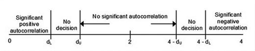
Figure 6-20. Durbin Watson statistics bounds
Positive auto-correlations mean a positive error for one observation increases the chances of a positive error for another observation. While negative auto-correlation is the opposite. Both positive and negative auto-correlation are not desired in linear regression models . In Figure 6-21, it is clear that if the d-statistics value is close to 2, we can infer there if no auto-correlation in residual terms.

Figure 6-21. Auto-correlation function (ACF) plot
Another way to detect auto-correlation is by plotting the ACF plots and searching for spikes.
# Test for Autocorrelated Errors
durbinWatsonTest(fitted_Model_multiple)
  lag Autocorrelation D-W Statistic p-value
    1     -0.03814535      2.076011   0.192
  Alternative hypothesis: rho != 0
#ACF Plots
plot(acf(fitted_Model_multiple$residuals))
The plot in Figure 6-21 is called an Auto-Correlation Function (ACF) plot against different lags. This plot is popular in time series analysis as the data is time index, so we are using this plot here as a proxy for an auto-correlation explanation.
The Durbin Watson statistics show no auto-correlation among residuals , with d equal to 2.07. Also the ACF plots does not show spikes. Hence, we can say the residuals are free from auto-correlation.
6.5.4.5 Homoscedasticity
Homoscedasticity means all the random variables in the sequence or vector have finite and constant variance. This is also called homogeneity of variance. In the linear regression framework, homoscedastic errors/residuals will mean that the variance of errors is independent of the values of x. This means the probability distribution of y has the same standard deviation regardless of x.
There are multiple statistical tests for checking the homoscedasticity assumption, e.g., the Breush-Pagan test , the arch test, Bartlett's test, and so on. In this section our focus is on Bartlett's test, developed in 1989 by Snedecor and Cochran.
To perform Bartlett’s test, first we create subgroups within our population data. For illustration we have created three groups of population data with 400, 400, and 269 observations in each group.
We can create three groups in data to see if the variance varies across these three groupsgp<-numeric()for( i in 1:1069){if(i<=400){gp[i] <-1;}else if(i<=800){gp[i] <-2;}else{gp[i] <-3;}}
Now we define the hypothesis we will be testing in Bartlett’s test:
Ho: All three population variances are the same.
Ha: At least two are different.
Here, we perform Bartlett’s test with the function Bartlett.test():
Data_lm_Model$gp <-factor(gp)
bartlett.test(fitted_Model_multiple$fitted.values,Data_lm_Model$gp)
  Bartlett test of homogeneity of variances
data:  fitted_Model_multiple$fitted.values and Data_lm_Model$gp
Bartlett's K-squared = 1.3052, df = 2, p-value = 0.5207
The Bartlett test has a p-value of greater than 0.05, which means we fail to reject the null hypothesis. The subgroups have the same variance, and hence variance is homoscedastic.
Here, we show some more test for checking variances. This is done for reference purpose so that you can replicate other tests if required.
Breush Pagan Test
# non-constant error variance test - breush pagan testncvTest(fitted_Model_multiple)Non-constant Variance Score TestVariance formula: ∼ fitted.valuesChisquare = 2322.866 Df = 1 p = 0These results are for a popular test for heteroscedasticity called the Breush-Pagan test. The p-value is 0, hence you can reject the null that the variance in heteroscedastic .
ARCH Test
#also show ARCH test - More relevant for a time series modellibrary(FinTS)ArchTest(fitted_Model_multiple$residuals)ARCH LM-test; Null hypothesis: no ARCH effectsdata: fitted_Model_multiple$residualsChi-squared = 4.2168, df = 12, p-value = 0.9792The test result for Bartlett test and the Arch test clearly shows that the residuals are homoscedastic. The plot in Figure 6-22 is a residual versus fitted values plot. It is a scatter plot of residuals on the x axis and fitted values (estimated responses) on the y axis. The plot is used to detect non-linearity, unequal error variances, and outliers.

Figure 6-22. Residuals versus fitted plot
# plot residuals vs. fitted values
plot(fitted_Model_multiple$residuals,fitted_Model_multiple$fitted.values)
A plot of fitted values and residuals also does not show any behavior of increase or decrease. This means the residuals are homoscedastic as they don’t vary with values of x.
In this section on model diagnostics, we explored the important test and process to identify problems with regression. Influential points can bring bias into the model estimates and reduce the performance of a model. We can explore few options to reduce the problem by capping the values, creating bins and/or may be just remove them for analysis. Normality of residuals is important as we will expect a good model to capture all signals in the data and reduce the residual to just a white noise. Auto-correlation is a feature of indexed data, in this case if the residuals are not independent of each other and have auto-correlation then the model performance will be reduced. Homoscedasticity is another important diagnostic that tells us if the variance of dependent variable is independent of predictor/independent variable. All these diagnostics need to be done after fitting a regression model to make sure the model is reliable and statistically valid to be used in real settings.
Now we have tested major tests for linear regression and can now move onto polynomial regression. So far we have assumed that the relationship between dependent and independent variable was linear, but this may not be the case in real life. Linear relations show the same proportional change behavior at all levels. For example, the HousePrice increase when the store size changes from 10 sq. ft. to 20 sq. ft. is not the same as change of the same 10 sq. ft. from 2000 sq. ft. to 2010 sq. ft. But linear regression ignores this fact and assumes the same change at all levels.
The next section will extend the idea of linear regression to relationships with higher degree polynomials.
6.5.5 Polynomial Regression
The linear regression framework can be extended to polynomial relationship between variables. In polynomial regression, the relationship between independent variable x and dependent variable y is modeled as nth degree polynomial.
The polynomial regression model can be presented as follows:
![]()
There are multiple examples where the data does not follow linear dependent but higher degrees of relationship. In general, real life relations are not linear in true terms. Linear regression assume that the dependent variable can move only one direction with the same marginal change per unit independent variable.
For instance, HousePrice has a positive correlation with StoreArea. This means that if the StoreArea increases, the HousePrice will increase. So if StoreArea keeps on increasing the HousePrice prices will increase with the same rate (coefficient). But do you believe that a HousePrice can go to 1 million if the StoreArea is too big? No, StoreArea has a utility that keeps on decreasing as it increases and finally you will not see the same increase in HousePrice.
Economics provide lot of good examples of such quadratic behavior, e.g., price elasticity, diminishing returns, etc. Also in normal planning we make use of quadratic and other high level polynomial relationship like discount generation, pricing products, etc. We will show an example of how polynomial regression can help model some polynomial relationship.
Dependent variable: Price of a commodity
Independent variable: Quantity Sold
The general principle is if the price is too cheap, people will not buy the commodity thinking it’s not of good quality, but if the price is too high, people will not buy due to cost consideration. Let's try to quantify this relationship using linear and quadratic regression.
#Dependent variable : Price of a commodityy <-as.numeric(c("3.3","2.8","2.9","2.3","2.6","2.1","2.5","2.9","2.4","3.0","3.1","2.8","3.3","3.5","3"));#Independent variable : Quantity Soldx<-as.numeric(c("50","55","49","68","73","71","80","84","79","92","91","90","110","103","99"));#Plot Linear relationshiplinear_reg <-lm(y∼x)summary(linear_reg)Call:lm(formula = y ∼ x)Residuals:Min 1Q Median 3Q Max-0.66844 -0.25994 0.03346 0.20895 0.69004Coefficients:Estimate Std. Error t value Pr(>|t|)(Intercept) 2.232652 0.445995 5.006 0.00024 ***x 0.007546 0.005463 1.381 0.19046---Signif. codes: 0 '***' 0.001 '**' 0.01 '*' 0.05 '.' 0.1 ' ' 1Residual standard error: 0.3836 on 13 degrees of freedomMultiple R-squared: 0.128, Adjusted R-squared: 0.06091F-statistic: 1.908 on 1 and 13 DF, p-value: 0.1905
The model summary shows that the multiple R-Square is merely 12% and the variable x is insignificant in the model. Also the coefficient of x is insignificant as the p-value is 0.19. Figure 6-24 shows the actual versus predicted scatter plot to see whether the values are getting fitted well or not.
res <-stack(data.frame(Observed =as.numeric(y), Predicted =fitted(linear_reg)))res <-cbind(res, x =rep(x, 2))#Plot using lattice xyplot(function)library("lattice")xyplot(values ∼x, data = res, group = ind, auto.key =TRUE)

Figure 6-23. Actual versus predicted plot linear model
The plot provides additional proof that the linear relation is not evident from the plot. The values are not a right fit in the linear line predicted by the model.
Now, we move onto fitting a quadratic curve onto our data, to see if that helps us capture the curvilinear behavior of quantity by price.
#Plot Quadratic relationshiplinear_reg <-lm(y∼x +I(x^2) )summary(linear_reg)Call:lm(formula = y ∼ x + I(x^2))Residuals:Min 1Q Median 3Q Max-0.43380 -0.13005 0.00493 0.20701 0.33776Coefficients:Estimate Std. Error t value Pr(>|t|)(Intercept) 6.8737010 1.1648621 5.901 7.24e-05 ***x -0.1189525 0.0309061 -3.849 0.00232 **I(x^2) 0.0008145 0.0001976 4.122 0.00142 **---Signif. codes: 0 '***' 0.001 '**' 0.01 '*' 0.05 '.' 0.1 ' ' 1Residual standard error: 0.2569 on 12 degrees of freedomMultiple R-squared: 0.6391, Adjusted R-squared: 0.5789F-statistic: 10.62 on 2 and 12 DF, p-value: 0.002211
The model summary shows that the multiple R-Square has improved to 63% after we introduce a quadratic term for x, and both variable x and x-square are statistically significant in the model. Let’s plot the scatter plot and see if the values fit the data well or not.
res <-stack(data.frame(Observed =as.numeric(y), Predicted =fitted(linear_reg)))res <-cbind(res, x =rep(x, 2))#Plot using lattice xyplot(function)library("lattice")xyplot(values ∼x, data = res, group = ind, auto.key =TRUE)

Figure 6-24. Actual versus predicted plot quadratic polynomial model
The model shows improvement in R-Square and quadratic term is significant in model. The plot also shows a better fit in quadratic case than the linear case. The idea can be extended to higher degree polynomials, but that will cause overfitting. Also, many processes are normally not well represented by very high degree polynomial. If you are planning to use polynomial of degree more than four, try to be very careful during the interpretation.
6.5.6 Logistic Regression
In linear regression we have seen that the dependent variable is a continuous variable having real values. Also, we have determined that the error requires to be normal for the regression equation to be valid. Now let’s assume what will happen if the dependent variable is a having only two possible values (0 and 1), in other words binomially distributed
. Then the error terms can not be normally distributed as:
![]()
Hence, we need to move onto different framework to accommodate the cases where the dependent variable is not Gaussian but from an exponential family of distributions. After logistic regression we will touch on exponential distributions and show how they can be reduced to a linear form by a link function. The logistic regression models a relationship between predictor variables and a categorical response/dependent variable. For instance, the credit risk problem we were looking at in Chapter 5. The predictor variables were used to model the binomial outcome of default/No Default.
Logistic regression can be of three types based on the type of categorical (response) variable:
Binomial Logistic Regression: Only two possible values for response variable(0/1). Typically we estimate the probability of it being 1 and based on some cutoff we predict the state of response variable.
Binomial distribution probability mass function is given by
 where k is number of successes, n is total number of trials, and p is the unit probability of success.
Multinomial Logistic Regression: There are three or more values/levels for the categorical response variable. Typically, we calculate probability for each level and then, based on some classification (e.g., maximum probability), we assign the state of response variable.
Multinomial Distribution probability mass function is given by
 where xi is set of predictor variables, pk is probability of each class (proportion), and n is number of trials (sample size).
Ordered Logistic Regression: The response variable is a categorical variable with some built-in order in them. This method is the same as multinomial, with key difference of having an inherent order in them. For example, a rating variable between 1 and 5.
Let’s look at two important terms we will use in explaining the logistic regression.
6.5.7 Logit Transformation
For logistic regression, we use a transformation function, also called the link function , which creates a linear function from binomial distribution in independent variable. The link function used for binomial distribution is called the logit function .
The logit function σ(t)σ(t) is defined as follows:

The logit function curve looks like this:
curve((1/(1+exp(-x))),-10,10,col =“violet”)
Figure 6-25. Logit function
You can observe that the logit function is capped from top by 1 and from bottom by 0. Extremely high values of x have very little effect on function value, the same for very small values. This way we can see the bounds are between 0 and 1 probability scale to fit a model.
In logistic regression, we use maximum likelihood estimation (MLE) , while for multinomial we use iterative method to optimize on the logLoss function.
The logit function
then convert the relationship into logit of odds ratio as a linear combination of independent variables. The inverse of the logistic function g, the logit (log odds), maps the relationship into a linear one:

In this section we discuss logistic regression with binomial categorical variables, and in later part we will touch at a high level how to extend this method into a multinomial class.
6.5.8 Odds Ratio
In Chapter 1, we discussed probability measure, which signifies the chance of having that event. The value of probability is always between 0 and 1, where 0 means definitely no occurrence of event and 1 being that event definitely happened.
We define probability odds, or simply odds, as the ratio of chance of the event happening and nothing happening
Odds in favor of event A = P(A)/1-P(A)
Odds against event A = (1-P(A))/P(A) = 1/Odds in favor
So now, an odds of 2 for event A will mean that event A is 2 times more likely of happening than not happening. The ratio can be generalized to any number of classes, where the interpretation changes to likelihood of an event happening against all possible events.
Odds ratio is a way to represent the relationship between presence/absence of an event “A” with the presence or absence of event “B”. For a binary case, we can create an example as shown:
![]()
For example, let’s assume there are two types of event outcome, A and B. Probability of event A happening is 0.4 (P(A)) and event B of 0.6(P(B)). Then odds in favor of A is 0.66 (P(A)/1-P(A)), similarly, odds for B is 1.5 (P(B)/1-P(B)). i.e., chances of event B happening is 1.5 time that of not happening.
Now the odds ratio is defined as a ratio of these odds, odds B by Odds A = 1.5/0.66 = 2.27 ∼ 2. This is saying that chances of B happening are twice that of event A happening. We can observe that this quantity is a relative measure, and hence we use concept of base levels in logistic regressions. The odds ratio from the model is relative to base level/class.
Now, we can introduce the relationship between logit and odds ratios. The logistic regression essentially model the following equation, which is logit transform on odds of event and covert our problem to its linear form as shown:

Hence in logistic regression, odds ratio is the exponentiated coefficient of variables, signifying the relative chance of event from reference class/event. Here, you can see how the odds ratio translates to exponentiated coefficients of logistic regression
.

6.5.8.1 Binomial Logistic Model
Let’s use our Purchase Prediction data to build a logistic regression model and see its diagnostics. We will be subsetting the data to only have ProductChoice 1 and 3 as 1 and 0 respectively, in our analysis.
#Load the data and prepare a dataset for logistic regressionData_Purchase_Prediction <-read.csv("∼/Dropbox/Book Writing - Drafts/Chapter Drafts/Final Artwork and Code/Chapter 6/Dataset/Purchase Prediction Dataset.csv",header=TRUE);Data_Purchase_Prediction$choice <-ifelse(Data_Purchase_Prediction$ProductChoice ==1,1,ifelse(Data_Purchase_Prediction$ProductChoice ==3,0,999));Data_Logistic <-Data_Purchase_Prediction[Data_Purchase_Prediction$choice %in%c("0","1"),c("CUSTOMER_ID","choice","MembershipPoints","IncomeClass","CustomerPropensity","LastPurchaseDuration")]table(Data_Logistic$choice,useNA="always")0 1 <NA>143893 106603 0Data_Logistic$MembershipPoints <-factor(Data_Logistic$MembershipPoints)Data_Logistic$IncomeClass <-factor(Data_Logistic$IncomeClass)Data_Logistic$CustomerPropensity <-factor(Data_Logistic$CustomerPropensity)Data_Logistic$LastPurchaseDuration <-as.numeric(Data_Logistic$LastPurchaseDuration)
Before we start the model, let's see the distribution of categorical variables over dependent categorical variables .
table(Data_Logistic$MembershipPoints,Data_Logistic$choice)0 11 15516 136492 19486 154243 20919 156614 20198 149445 18868 137286 16710 118837 13635 93818 9632 64329 5566 351210 2427 144611 754 44112 165 9513 17 7
This distribution says, as the MemberShipPoints increase , both choice 0 and 1 decrease.
table(Data_Logistic$IncomeClass,Data_Logistic$choice)0 11 145 1562 203 2093 3996 35354 23894 189525 47025 367816 38905 278047 21784 147158 6922 39589 1019 493
This distribution says, most of the customers are in income classes 4, 5, and 6. The choice distribution is equitable in both 0 and 1 across the income class bands.
table(Data_Logistic$CustomerPropensity,Data_Logistic$choice)0 1High 26604 10047Low 20291 19962Medium 27659 17185Unknown 36633 52926VeryHigh 32706 6483
The distribution is interesting as it tells that customers with very high propensity are very unlikely to buy the product represented by class 1. The distributions are good way to get a first-hand idea of your data. This exploratory task also helps in feature selections for models.
Now, we have all the relevant libraries and function loaded, we will show step by step how to develop the logistic regression and choose one of the model for evaluation in the next chapter. We will be developing model on full data, and the next chapter will discuss performance evaluation metrics in detail.
library(dplyr)#Get the average purchase rate by Rating and plot thatsummarise(group_by(Data_Logistic,IncomeClass),Average_Rate=mean(choice))print("Summary of Average Purchase Rate by IncomeClass")[1] "Summary of Average Purchase Rate by IncomeClass"summary_Rating# A tibble: 9 × 2IncomeClass Average_Rate<fctr><dbl>1 1 0.51827242 2 0.50728163 3 0.46939324 4 0.44232835 5 0.43888276 6 0.41679537 7 0.40316178 8 0.36378689 9 0.3260582plot(summary_Rating$IncomeClass,summary_Rating$Average_Rate,type="b", xlab="Income Class", ylab="Average Purchase Rate observed", main="Purchase Rate and Income Class")
Now we want to see how average purchase rate of product 1 varies over the Income class. We plot the average purchase rate (proportion of 1) by each income class, as shown in Figure 6-27.
The plot in Figure 6-26 shows that, as the income class increases the propensity to buy the product 1, goes down. Similar plots can be created for other variables to see how the expected behavior of model probabilities should be after fitting a model.

Figure 6-26. Purchase rate and income class
Now we will clean up the data from NA’s (missing values 0) and fit a binary logistic regression using the function glm(). GLM stands for generalized linear regression, which can handle exponential family of distributions . The function requires users to mention the family of distribution the dependent variable belong to and the link function you want to use. We have used the binomial family with logit as a link function.
#Remove the Missing values - NAsData_Logistic <-na.omit(Data_Logistic)rownames(Data_Logistic) <-NULL#Divide the data into Train and Testset.seed(917);index <-sample(1:nrow(Data_Logistic),round(0.7*nrow(Data_Logistic)))train <-Data_Logistic[index,]test <-Data_Logistic[-index,]Fitting a logistic modelModel_logistic <-glm( choice ∼MembershipPoints +IncomeClass +CustomerPropensity +LastPurchaseDuration, data = train, family =binomial(link ='logit'));summary(Model_logistic)Call:glm(formula = choice ∼ MembershipPoints + IncomeClass + CustomerPropensity +LastPurchaseDuration, family = binomial(link = "logit"),data = train)Deviance Residuals:Min 1Q Median 3Q Max-1.631 -1.017 -0.614 1.069 2.223Coefficients:Estimate Std. Error z value Pr(>|z|)(Intercept) 0.066989 0.145543 0.460 0.645323MembershipPoints2 -0.123408 0.020577 -5.997 2.01e-09 ***MembershipPoints3 -0.185540 0.020359 -9.113 < 2e-16 ***MembershipPoints4 -0.204938 0.020542 -9.977 < 2e-16 ***MembershipPoints5 -0.237311 0.020942 -11.332 < 2e-16 ***MembershipPoints6 -0.258884 0.021597 -11.987 < 2e-16 ***MembershipPoints7 -0.291123 0.022894 -12.716 < 2e-16 ***MembershipPoints8 -0.326029 0.025526 -12.773 < 2e-16 ***MembershipPoints9 -0.387113 0.031572 -12.261 < 2e-16 ***MembershipPoints10 -0.439228 0.044839 -9.796 < 2e-16 ***MembershipPoints11 -0.357339 0.078493 -4.553 5.30e-06 ***MembershipPoints12 -0.447326 0.164172 -2.725 0.006435 **MembershipPoints13 -1.349163 0.583320 -2.313 0.020728 *IncomeClass2 -0.412020 0.190461 -2.163 0.030520 *IncomeClass3 -0.342854 0.146938 -2.333 0.019631 *IncomeClass4 -0.389236 0.144433 -2.695 0.007040 **IncomeClass5 -0.373493 0.144169 -2.591 0.009579 **IncomeClass6 -0.442134 0.144244 -3.065 0.002175 **IncomeClass7 -0.455158 0.144548 -3.149 0.001639 **IncomeClass8 -0.509290 0.146126 -3.485 0.000492 ***IncomeClass9 -0.569825 0.160174 -3.558 0.000374 ***CustomerPropensityLow 0.877850 0.018709 46.921 < 2e-16 ***CustomerPropensityMedium 0.427725 0.018491 23.131 < 2e-16 ***CustomerPropensityUnknown 1.208693 0.016616 72.744 < 2e-16 ***CustomerPropensityVeryHigh -0.601513 0.021652 -27.781 < 2e-16 ***LastPurchaseDuration -0.063463 0.001211 -52.393 < 2e-16 ***---Signif. codes: 0 '***' 0.001 '**' 0.01 '*' 0.05 '.' 0.1 ' ' 1(Dispersion parameter for binomial family taken to be 1)Null deviance: 235658 on 172985 degrees of freedomResidual deviance: 213864 on 172960 degrees of freedomAIC: 213916Number of Fisher Scoring iterations: 4
The p-value of all the variables and levels is significant. This implies we have fit a model with variables having significant relationship with dependent variable. Now let’s work out to get classification matrix for this model. This is done by method of balancing specificity and sensitivity measure. Details of these metrics are given in Chapter 6, and we will give a brief explanation here and make use of that to create a good cutoff for classification from probabilities into classes.
#install and load packagelibrary(pROC)#apply roc functioncut_off <-roc(response=train$choice, predictor=Model_logistic$fitted.values)#Find threshold that minimizes errore <-cbind(cut_off$thresholds,cut_off$sensitivities+cut_off$specificities)best_t <-subset(e,e[,2]==max(e[,2]))[,1]#Plot ROC Curveplot(1-cut_off$specificities,cut_off$sensitivities,type="l",ylab="Sensitivity",xlab="1-Specificity",col="green",lwd=2,main ="ROC Curve for Train")abline(a=0,b=1)abline(v = best_t) #add optimal t to ROC curve
The plot in Figure 6-27 is between specificity and sensitivity. The plot is also called ROC plot . The best cutoff is the value on the curve that maximizes sensitivity and minimizes (1-specificity).

Figure 6-27. ROC curve for train data
cat(" The best value of cut-off for classifier is ", best_t)
The best value of cut-off for classifier is 0.4202652
Looking at the plot, we can see our choice of cutoff will provide best classification on the train data. We need to test this assumption on the test data and record the classification rate by using this cutoff of 0.42.
# Predict the probabilities for test and apply the cut-offpredict_prob <-predict(Model_logistic, newdata=test, type="response")#Apply the cutoff to get the classclass_pred <-ifelse(predict_prob >0.41,1,0)#Classification tabletable(test$choice,class_pred)class_pred0 10 24605 180341 8364 23134#Classification ratesum(diag(table(test$choice,class_pred))/nrow(test))[1] 0.6439295
The model shows 64% good classification on the test data. This shows the model can capture the signals in the data well to distinguish between 0 and 1.
The logistic model diagnostic is different from linear regression models. In following sections, we explore some common diagnostic metrics for logistic regression.
6.5.9 Model Diagnostics: Logistic Regression
Once we have fit the model, we have a two-step analysis to do on the logistic output:
If we are interested in final assignment of class, we focus on classifier and compare the exact classes assigned by using classifier on the predicted probabilities.
If we are interested in the probabilities, we will look at if the cases where the chances of event are high are getting high probabilities.
Other than this, we want to look at the coefficients, R-Square equivalents, and other tests to verify that our model has been fit with statistical validity. Another important thing to keep in mind while looking coefficients is that the logistic regression coefficients represent the change in the logit for each unit change in the predictor, which is not the same as linear regression.
We will show how to perform three diagnostic test, Wald test, likelihood ratio test and deviance/pseudo R-Square, and three measure of separation bivariate plots, gains/lift chart, and concordance ratio.
6.5.9.1 Wald Test
The Wald test is analogous to the t-test test in linear regression. This is used to assess the contribution of individual predictors in a given model.
In logistic regression, the Wald statistic is

Add, β is coefficient and SE is standard error of coefficient β.
The Wald statistic is the ratio of the square of the regression coefficient to the square of the standard error of the coefficient, and it follows a chi-square distribution. The significant Wald statistics implies the predictor/independent variable is significant in the model.
Let's perform a Wald test on MembershipPointsand see if that is significant in model or not.
#Wald test
library(survey)
regTermTest(Model_logistic,"MembershipPoints", method ="Wald")
Wald test for MembershipPoints
  in glm(formula = choice ∼ MembershipPoints + IncomeClass + CustomerPropensity +
     LastPurchaseDuration, family = binomial(link = "logit"),
     data = train)
F =  31.64653  on  12  and  172960  df: p= < 2.22e-16
The p-value is less than 0.05, so at 95% confidence we can reject the null hypothesis that the coefficient’s value is zero. Hence, the MembershipPoints is statistically significant variable of model.
6.5.9.2 Deviance
Deviance is calculated by comparing a null model and a saturated model. A null model is a model without any predictor in it, just the intercept term and a saturated model is the fitted model with some predictors in it. In logistic regression, deviance is used in lieu of sum of squares calculations. The test statistic (often denoted by D) is twice the log of the likelihoods ratio, i.e., it is twice the difference in the log likelihoods :
Deviance

Deviance statistic (D) follows a chi-square distribution. Smaller values indicate better fit as the fitted model deviates less from the saturated model.
Here is the analysis of the deviance table.
#Anova table of significanceanova(Model_logistic, test="Chisq")Analysis of Deviance TableModel: binomial, link: logitResponse: choiceTerms added sequentially (first to last)Df Deviance Resid. Df Resid. Dev Pr(>Chi)NULL 172985 235658MembershipPoints 12 330.6 172973 235328 < 2.2e-16 ***IncomeClass 8 339.1 172965 234989 < 2.2e-16 ***CustomerPropensity 4 18297.4 172961 216691 < 2.2e-16 ***LastPurchaseDuration 1 2826.9 172960 213864 < 2.2e-16 ***---Signif. codes: 0 '***' 0.001 '**' 0.01 '*' 0.05 '.' 0.1 ' ' 1
The chi-square test on all the variables is significant as the p-value is less than 0.05. All the predictors’ contributions to the model are significant.
6.5.9.3 Pseudo R-Square
In linear regression, we have R-Square measure (discussed in detail in Chapter 7), which measures the proportion of variance independently explained by the model. A similar measure in logistics regression is called pseudo R-Square
. The most popular of such measure used the likelihood ratio, which is presented as:

The ratio of difference in deviance of null and fitted model by null model. The higher the value of this measure, the better the explaining power of model. There are other similar measures not discussed in this chapter, like Cox and Snell R-Square, Nagelkerke R-Square, McFadden R-Square, and Tjur R-Square. Here we compute the pseudo R-Square for our model.
# R square equivalent for logistic regression
library(pscl)
pR2(Model_logistic)
           llh       llhNull            G2      McFadden          r2ML
 -1.069321e+05 -1.178291e+05  2.179399e+04  9.248135e-02  1.183737e-01
          r2CU
  1.591199e-01
The last three outputs from this function are McFadden's pseudo R-Square , Maximum likelihood pseudo R-Square (Cox & Snell) and Cragg and Uhler's or Nagelkerke's pseudo R-Square. The R-Square values are very low, signifying that the model might not be performing better than a null model.
6.5.9.4 Bivariate Plots
The most important diagnostic of logistic regression is to see how the actual probabilities and predicted probabilities behave by each level of single independent variables. These plots are called bivariate as there are two variables actual and predicted plotted against single independent variable levels. The plot have three important inputs:
Actual Probability: The prior proportion of target level in each category of independent variable.
Predicted Probability: The probability given by the model.
Frequency: The frequency of a categorical variable (number of observations).
The plot essentially tells us how the model is behaving for different levels in our categorical variables. You can extend this idea to continuous variables as well by binning the continuous variable.
Another good thing about these plots is that you are able to determine for which cohort in your dataset the model performs better and where it need investigation. This cohort level diagnostic is not possible by looking at aggregated plots.
#The function code is provided separately in the appendix
source("actual_pred_plot.R")
MODEL_PREDICTION <-predict(Model_logistic, Data_Logistic, type ='response');
Data_Logistic$MODEL_PREDICTION <-MODEL_PREDICTION
#Print the plots MembershipPoints
actual_pred_plot  (var.by=as.character("MembershipPoints"),
var.response='choice',
data=Data_Logistic,
var.predict.current='MODEL_PREDICTION',
var.predict.reference=NULL,
var.split=NULL,
var.by.buckets=NULL,
sort.factor=FALSE,
errorbars=FALSE,
subset.to=FALSE,
barline.ratio=1,
title="Actual vs. Predicted Purchase Rates",
make.plot=TRUE
                )
The plot in Figure 6-28 shows actual versus predicted against the frequency plot of MembershipPoints.

Figure 6-28. Actual versus predicted plot against MembershipPoints
For MembershipPoints, the actual and predicted probabilities follow each other. This means the model predicts the probabilities close to actual. Also, you can see in both cases customer having higher MembershipPoints are less likely to have product choice = 1, that is the same as seen in the actual and predicted.
#Print the plots IncomeClass
actual_pred_plot  (var.by=as.character("IncomeClass"),
var.response='choice',
data=Data_Logistic,
var.predict.current='MODEL_PREDICTION',
var.predict.reference=NULL,
var.split=NULL,
var.by.buckets=NULL,
sort.factor=FALSE,
errorbars=FALSE,
subset.to=FALSE,
barline.ratio=1,
title="Actual vs. Predicted Purchase Rates",
make.plot=TRUE
                )
The plot in Figure 6-29 shows actual versus predicted against the frequency plot of IncomeClass.

Figure 6-29. Actual versus predicted plot against IncomeClass
Again the model behavior for IncomeClass is as expected . The model is able to predict the probabilities across different income classes as an actual observed rate.
#Print the plots CustomerPropensity
actual_pred_plot  (var.by=as.character("CustomerPropensity"),
var.response='choice',
data=Data_Logistic,
var.predict.current='MODEL_PREDICTION',
var.predict.reference=NULL,
var.split=NULL,
var.by.buckets=NULL,
sort.factor=FALSE,
errorbars=FALSE,
subset.to=FALSE,
barline.ratio=1,
title="Actual vs. Predicted Purchase Rates",
make.plot=TRUE
                )
The plot in Figure 6-30 shows actual versus predicted against the frequency plot of CustomerPropensity.

Figure 6-30. Actual versus predicted plot against CustomerPropensity
The model shows good agreement with observed probabilities for CustomerPropensity as well. Similar plots can be plotted for continuous variable in our model after binning them appropriately. At least on categorical variables, the model performs well.
The model shows a good prediction against actual values across different categorical variable levels. It's a good model at the probability scale!
6.5.9.5 Cumulative Gains and Lift Charts
Cumulative gains and lift charts are visual ways to measure the effectiveness of predictive models. They consist of a baseline and the lift curve due to the predictive model. The more there is separation between baseline and predicted (lift) curve, the better the model.
In a Gains curve:
X-axis: % of customers
Y-axis: Percentage of positive predictions
Baseline: Random line (x% of customers giving x% of positive predictions)
Gains: The percentage of positive responses for the % of customers
In a Lift curve:
X-axis: % of customers
Y-axis: Actual lift (the ratio between the result predicted by our model and the result using no model)
library(gains)library(ROCR)library(calibrate)MODEL_PREDICTION <-predict(Model_logistic, Data_Logistic, type ='response');Data_Logistic$MODEL_PREDICTION <-MODEL_PREDICTION;lift =with(Data_Logistic, gains(actual = Data_Logistic$choice, predicted = Data_Logistic$MODEL_PREDICTION , optimal =TRUE));pred =prediction(MODEL_PREDICTION,as.numeric(Data_Logistic$choice));# Function to create performance objects. All kinds of predictor evaluations are performed using this function.gains =performance(pred, 'tpr', 'rpp');# tpr: True positive rate# rpp: Rate of positive predictionsauc =performance(pred, 'auc');auc =unlist(slot(auc, 'y.values')); # The same as: [email protected][[1]]auct =paste(c('AUC = '), round(auc, 2), sep ='')#par(mfrow=c(1,2), mar=c(6,5,4,2));plot(gains, col='red', lwd=2, xaxs='i', yaxs='i', main =paste('Gains Chart ', sep =''),ylab='% of Positive Response', xlab='% of customers/population');axis(side =1, pos =0, at =seq(0, 1, by =0.10));axis(side =2, pos =0, at =seq(0, 1, by =0.10));lines(x=c(0,1), y=c(0,1), type='l', col='black', lwd=2,ylab='% of Positive Response', xlab='% of customers/population');legend(0.6, 0.4, auct, cex =1.1, box.col ='white')gains =lift$cume.pct.of.totaldeciles =length(gains);for (j in 1:deciles){x =0.1;y =as.numeric(as.character(gains[[j]]));lines(x =c(x*j, x*j),y =c(0, y),type ='l', col ='blue', lwd =1);lines(x =c(0, 0.1*j),y =c(y, y),type ='l', col ='blue', lwd =1);# Annotating the chart by adding the True Positive Rate exact numbers at the specified deciles.textxy(0, y, paste(round(y,2)*100, '%',sep=''), cex=0.9);}
The chart in Figure 6-31 is the Gains chart for our model. This is plotted with % of positive responses on the y axis and % of population on the x axis.

Figure 6-31. Gains charts with AUC
plot(lift,
xlab ='% of customers/population',
ylab ='Actual Lift',
main =paste('Lift Chart
', sep =' '),
xaxt ='n');
axis(side =1, at =seq(0, 100, by =10), las =1, hadj =0.4);
The chart in Figure 6-32 is the Lift chart for our model. This is plotted with actual lift on the y axis and % of population on the x axis.

Figure 6-32. Lift chart
The Gains shows a good separation between model line and baseline. This shows that the model has good separation power. Also the AUC value of 0.7 means that the model will be able to roughly separate 70% of cases.
The Lift curve shows a lift of close to 70% for the first 10% of the population. This value need to be the same as what we have observed in Gains chart, only the presentation has changed.
6.5.9.6 Concordance and Discordant Ratios
In any classification model based on raw probabilities, we need a classification methodology to separate these probability cases. In binary logistic, this is most of the time done by choosing a cutoff value and then creating an inequality to classify objects into 0 or 1.
To make sure such a cutoff exists and has good separation power, we have to see if the actual objects with state 1 in data are having higher probability than the actual state 0. For example, a pair of (Yi,Yj) be (0,1), then the predicted values (Pi,Pj) should have Pj>Pi, then we can choose a number between Pj and Pi, which will correctly classify a 1 as 1 and 0 as 0. Based on this understanding , we can divide all the possible pairs in data into three types:
Concordant pairs: For (0,1) or (1,0) corresponding probabilities with 1 are greater than probabilities with 0
Discordant pairs: For (0,1) or (1,0) corresponding probabilities with 0 are greater than probabilities with 1
Tied: (0,0) and (1,0) pairs
The concordance ratio is then defined as the ratio of the number of concordant pairs by the total number of pairs.
If our model produces a high concordance ratio then it will be able to classify the objects in classes more accurately.
#The function code is provided separately in R-code for chapter 6source("concordance.R")#Call the concordance function to get these ratiosconcordance(Model_logistic)$Concordance[1] 0.7002884$Discordance[1] 0.2991384$Tied[1] 0.0005731122$Pairs[1] 7302228665
The concordance is 69.9%, signifying that the model probabilities have good separation on ∼70% cases. This is a good model to create a classifier for 0 and 1.
In this section of model diagnostics for logistic regression we discussed the diagnostics in broadly two bucket, model fit statistics and model classification power. The model fit statistics discussed Wald test , which is significance test for the parameter estimates, Deviance is similar measure to residual in linear regression and pseudo R-Square, which is equivalent to R-Square of liner regression. The other set of diagnostics were to identify if the model can be used to create a powerful classifier. The test included were bivariate plots, this is a plot of actual probability by predicted probabilities, cumulative gains and lift chart to show hoe well our model differentiate between two classes, and the concordance ratio tells us if we can have a good cutoff value for our classifier. These diagnostics provide us vital properties of the model and help the modeler to either improve or re-estimate the models.
In the next section, we will more onto multi-class classification problems. Multi-class problems are one of the hardest problems to solve, as more number of classes bring ambiguity. It is difficult to create a good classifier in many cases. We will discuss multiple ways you can do multi-class classification using machine learning. Multinomial logistic regression is one the popular ways to to multi-class classification.
6.5.10 Multinomial Logistic Regression
Multinomial Logistic Regression is used when we have more than one category for classification. The dependent variable in that case follows a multinomial distribution. In the background we create a logistic model for each class and then combine those into one single equation by making the probability constraint of the sum of all probabilities be 1. The equation setup for the multinomial logistic is shown here:

The estimation process has a additional constraints on individual logit transformation, the sum of probabilities from all logit functions needs to be 1. As the estimation has to take care of this constraint, the estimation method is iterative one. The best coefficients for the model are found by iterative optimization of the logLoss function.
For our purchase prediction problem first we will fit a logistic model on our data. The multinom() function from the nnet package will be used to estimate the logistic equation for our multi-class problem (ProductChoice has four possible options). Once we get the probabilities for each class, we will create a classifier to assign classes to individual cases.
There will be two methods illustrated for the classifier :
Pick the highest probability: Pick the class having the highest probability among all the possible classes. However, this technique suffers form class imbalance problem. Class imbalance problem occurs when prior distribution of high proportion class drive the predicted probability and hence the low proportion classes never got assign the class using predicted probabilities maximum value.
Ratio of probabilities: We can take a ratio of predicted probabilities by prior distribution and then choose a class based on the the highest ratio. Highest ratio will signify that the model picked the highest signal as the probabilities got normalized by prior proportion.
Let's fit a model and apply the two classifiers .
#Remove the data having NA. NA is ignored in modeling algorithmsData_Purchase<-na.omit(Data_Purchase_Prediction)rownames(Data_Purchase)<-NULL#Random Sample for easy computationData_Purchase_Model <-Data_Purchase[sample(nrow(Data_Purchase),10000),]print("The Distribution of product is as below")[1] "The Distribution of product is as below"table(Data_Purchase_Model$ProductChoice)1 2 3 42192 3883 2860 1065#fit a multinomial logistic modellibrary(nnet)mnl_model <-multinom (ProductChoice ∼MembershipPoints +IncomeClass +CustomerPropensity +LastPurchaseDuration +CustomerAge +MartialStatus, data = Data_Purchase)# weights: 44 (30 variable)initial value 672765.880864iter 10 value 615285.850873iter 20 value 607471.781374iter 30 value 607231.472034final value 604217.503433converged#Display the summary of model statisticsmnl_modelCall:multinom(formula = ProductChoice ∼ MembershipPoints + IncomeClass +CustomerPropensity + LastPurchaseDuration + CustomerAge +MartialStatus, data = Data_Purchase)Coefficients:(Intercept) MembershipPoints IncomeClass CustomerPropensityLow2 0.77137077 -0.02940732 0.00127305 -0.39603183 0.01775506 0.03340207 0.03540194 -0.85737164 -1.15109893 -0.12366367 0.09016678 -0.6427954CustomerPropensityMedium CustomerPropensityUnknown2 -0.2745419 -0.57150163 -0.4038433 -1.18248104 -0.4035627 -0.9769569CustomerPropensityVeryHigh LastPurchaseDuration CustomerAge2 0.2553831 0.04117902 0.0016389763 0.5645137 0.05539173 0.0050424054 0.5897717 0.07047770 0.009664668MartialStatus2 -0.0338796453 -0.0074619564 0.122011042Residual Deviance: 1208435AIC: 1208495
The model result shows that it converged after 30 iterations. Now let’s see a sample set of probabilities assigned by the model and then apply the first classifier that has picked the highest probability.
Here, we apply the highest probability classifier and see how it classifies the cases.
#Predict the probabilitiespredicted_test <-as.data.frame(predict(mnl_model, newdata = Data_Purchase, type="probs"))head(predicted_test)1 2 3 41 0.21331014 0.3811085 0.3361570 0.069424382 0.05060546 0.2818905 0.4157159 0.251788123 0.21017415 0.4503171 0.2437507 0.095757984 0.24667443 0.4545797 0.2085789 0.090166905 0.09921814 0.3085913 0.4660605 0.126130076 0.11730147 0.3624635 0.4184053 0.10182971#Do the prediction based in highest probabilitytest_result <-apply(predicted_test,1,which.max)result <-as.data.frame(cbind(Data_Purchase$ProductChoice,test_result))colnames(result) <-c("Actual Class", "Predicted Class")table(result$`Actual Class`,result$`Predicted Class`)1 2 31 302 91952 123652 248 150429 380283 170 90944 513904 27 32645 16798
The model shows good result for classifying classes 1, 2, and 3, but for class 4 the model does not classify even a single case. This is happening because the classifier (picking the highest probability) is very sensitive to absolute probabilities. This is called class imbalanceand is discussed in start of the section.
Let's apply the second method we discussed in start of the section, probability ratios, to classify. We will select the class based on the ratio of predicted probability to the prior probability/proportion . This way we will be ensuring the classifier assign the class which is providing the highest jump in probabilities. In other words, the ratio will normalize the probabilities by prior odds, therefore reducing the bias due to prior distributions.
prior <-table(Data_Purchase_Model$ProductChoice)/nrow(Data_Purchase_Model)prior_mat <-rep(prior,nrow(Data_Purchase_Model))pred_ratio <-predicted_test/prior_mat#Do the prediction based in highest ratiotest_result <-apply(pred_ratio,1,which.max)result <-as.data.frame(cbind(Data_Purchase$ProductChoice,test_result))colnames(result) <-c("Actual Class", "Predicted Class")table(result$`Actual Class`,result$`Predicted Class`)1 2 3 41 21251 64410 18935 232 28087 112480 48078 603 13887 77090 51476 514 4620 27848 16958 44
Now you can see the class imbalance problem is reduced to some extent. You are encouraged to try other methods of sampling to reduce this problem further. Multinomial models are very popular in multi-class classification problems, other alternatives algorithms for multi-class classification tend to be more complex than multinomial. Multinomial logistic classifiers more commonly used in natural language processing and multi-class problems than Naive Bayer classifiers.
6.5.11 Generalized Linear Models
Generalized linear models extend the idea of ordinary linear regression to other distributions of response variables in an exponential family.
In the GLM framework, we assume that the dependent variable is generated from a exponential family distribution, exponential family include normal, binomial, Poisson, and gamma distributions, among others. The expectation in that case is defined as:
![]() where E(Y) is the expected value of Y; Xβ is the linear predictor, a linear combination of unknown parameters β; g is the link function.
where E(Y) is the expected value of Y; Xβ is the linear predictor, a linear combination of unknown parameters β; g is the link function.
The model parameters, β, are typically estimated with maximum likelihood, maximum quasi-likelihood, or Bayesian techniques.
The glm function is very generic function that can accommodate many types of distributions in a response variable:
glm(formula, family=familytype(link=linkfunction), data=)
binomial, (link = "logit")
Binomial distribution is very common in the real world. Any problem that has two possible outcomes can be thought of as a binomial distribution. A simple example could be whether it will rain today ( =1) or not (=0).
gaussian, (link= "identity")
Gaussian distribution is a continuous distribution, i.e., a normal distribution. All the problems in linear regression are modeled assuming Gaussian distribution on the dependent variable.
Gamma, (link= "inverse")
An example could be, “N people are waiting at a take-away. How long will it take to serve them”? OR time to failure of a machine in the industry.
poisson, (link = "log")
This is a common distribution in queuing examples. One example could be “How many calls will the call center receive today?”.
The following exponential family is also supported by the glm() function in R. However, these distributions are not observed normally in day-to-day activities.
inverse.gaussian, (link = "1/mu^2")
quasi, (link = "identity", variance = "constant")
quasibinomial, (link = "logit")
quasipoisson, (link = "log")
6.5.12 Conclusion
Regression is one of the very first learning algorithm with a heavy influence from statistics but an elegantly simple design. Over the years, the complexity and diversity in regression technique has increased many folds as new applications started emerging. In this book we gave a heavy share of pages to regression in order to bring the best out of the widely used regression techniques. We discussed from the most fundamental simple regression to the advanced polynomial regression with a heavy emphasis on demonstration in R. The interested readers are advised to refer further to some advanced text of the topic if they want to go deeper into regression theory.
We have also presented a detailed discussion of model diagnostics for regression, which is the most overlooked topic when developing real-world models but could bring monumental damage to the industry where it’s applied, especially if it’s not done properly.
In the next section, we will cover a technique from the distance-based algorithm called Support Vector Machine, which could be a really good binary classification model on higher dimensional datasets.
6.6 Support Vector Machine SVM
In the R function libsvm documentation titled Support Vector Machine by David Meyer gave a crisp brief of SVM describing the class separation, handling overlapping classes, dealing with Nonlinearity, and modeling of problem solution. The following are the excerpts from the documentation:
Class separation
SVM looks for the optimal hyperplane (In two dimensions, a hyperplane is a line and in a p-dimensional space, a hyperplane is a flat affine subspace of hyperplane dimension p - 1) separating the two classes by maximizing the margin between the closest points of the two classes (see Figure 6-58). In two-dimensional space, as shown in Figure 6-4, the points lying on the margins are called support vectors and line passing through the midpoint of margins is the optimal hyperplane.
Simple two-dimensional hyperplane for a linearly separable data are represented by the following two equations:

and
subject to the following constraint so that each observation lies on the correct side of the margin
Overlapping classes
If the data points reside on the wrong side of the discriminant margin, it could be weighted down to reduce its influence (in this setting, the margin is called a soft margin).
The following function, called the Hinge loss , function can be introduced to handle this situation

which becomes 0 if lies on the correct side of the margin and the function value is proportional to the distance from the margin.
Nonlinearity
If a linear separator couldn't be found, observations are usually projected into a higher-dimensional space using a kernel function where the observations effectively become linearly separable.
One popular Gaussian family kernel is the radial basis function. A radial basis function (RBF) is a real-valued function whose value depends only on the distance from the origin. The function can be defined here:
 where
where is known as squared Euclidean distance
between the observation x and y. There are other linear, polynomial, and sigmoidal kernels that could be used based on the data.
is known as squared Euclidean distance
between the observation x and y. There are other linear, polynomial, and sigmoidal kernels that could be used based on the data.A program that can perform all these tasks is called a support vector machine.

Figure 6-33. Classification using support vector machine
6.6.1 Linear SVM
The problem could be formulated as a quadratic optimization problem which can be solved by many known techniques. The following expressions could be converted to a quadratic function (the discussion of this topic is beyond the scope of this book).
6.6.1.1 Hard Margins
For the hard margins
Minimize ![]() , subject to
, subject to ![]()
6.6.1.2 Soft Margins
For the soft margins
![$$ left[frac{1}{mathrm{n}}{displaystyle sum}_{overset{mathrm{n}}{mathrm{i}=1}} max left(0,1-{mathrm{y}}_{mathrm{i}}left(overrightarrow{mathrm{w}}cdot overrightarrow{{mathrm{x}}_{mathrm{i}}}+mathrm{b}
ight)
ight)
ight]+uplambda left|
ight|overrightarrow{mathrm{w}}left|
ight|{}^2, $$](http://images-20200215.ebookreading.net/19/4/4/9781484223345/9781484223345__machine-learning-using__9781484223345__A416805_1_En_6_Chapter_Equ1.gif)
Minimize![]() where
where
Parameter λ determines the tradeoff between increasing the margin and ensuring ![]() lies on the correct side of the margin.
lies on the correct side of the margin.
6.6.2 Binary SVM Classifier
Let’s look at the classification of benign and malignant cells in our breast cancer dataset. We want to create a binary classifier to classify cells into benign and malignant.
Data summary
library(e1071)library(rpart)breast_cancer_data <-read.table("Dataset/breast-cancer-wisconsin.data.txt",sep=",")breast_cancer_data$V11 =as.factor(breast_cancer_data$V11)summary(breast_cancer_data)V1 V2 V3 V4Min. : 61634 Min. : 1.000 Min. : 1.000 Min. : 1.0001st Qu.: 870688 1st Qu.: 2.000 1st Qu.: 1.000 1st Qu.: 1.000Median : 1171710 Median : 4.000 Median : 1.000 Median : 1.000Mean : 1071704 Mean : 4.418 Mean : 3.134 Mean : 3.2073rd Qu.: 1238298 3rd Qu.: 6.000 3rd Qu.: 5.000 3rd Qu.: 5.000Max. :13454352 Max. :10.000 Max. :10.000 Max. :10.000V5 V6 V7 V8Min. : 1.000 Min. : 1.000 1 :402 Min. : 1.0001st Qu.: 1.000 1st Qu.: 2.000 10 :132 1st Qu.: 2.000Median : 1.000 Median : 2.000 2 : 30 Median : 3.000Mean : 2.807 Mean : 3.216 5 : 30 Mean : 3.4383rd Qu.: 4.000 3rd Qu.: 4.000 3 : 28 3rd Qu.: 5.000Max. :10.000 Max. :10.000 8 : 21 Max. :10.000(Other): 56V9 V10 V11Min. : 1.000 Min. : 1.000 2:4581st Qu.: 1.000 1st Qu.: 1.000 4:241Median : 1.000 Median : 1.000Mean : 2.867 Mean : 1.5893rd Qu.: 4.000 3rd Qu.: 1.000Max. :10.000 Max. :10.000Data preparation
split data into a train and test setindex <-1:nrow(breast_cancer_data)test_data_index <-sample(index, trunc(length(index)/3))test_data <-breast_cancer_data[test_data_index,]train_data <-breast_cancer_data[-test_data_index,]Model building
svm.model <-svm(V11 ∼., data = train_data, cost =100, gamma =1)Model evaluation
Normally, such a high level of accuracy is only possible if feature being used and the data matches the real world very closely. Such a dataset in practical scenarios is difficult to built, however, in the world of medical diagnostics, expectation is always very high in terms of accuracy, as error involves a significant risk to somebody’s life.
Training set accuracy = 100%
library(gmodels)svm_pred_train <-predict(svm.model, train_data[,-11])CrossTable(train_data$V11, svm_pred_train,prop.chisq =FALSE, prop.c =FALSE, prop.r =FALSE,dnn =c('actual default', 'predicted default'))Cell Contents|-------------------------|| N || N / Table Total ||-------------------------|Total Observations in Table: 466| predicted defaultactual default | 2 | 4 | Row Total |---------------|-----------|-----------|-----------|2 | 303 | 0 | 303 || 0.650 | 0.000 | |---------------|-----------|-----------|-----------|4 | 0 | 163 | 163 || 0.000 | 0.350 | |---------------|-----------|-----------|-----------|Column Total | 303 | 163 | 466 |---------------|-----------|-----------|-----------|
Testing set accuracy = 95%
svm_pred_test <-predict(svm.model, test_data[,-11])CrossTable(test_data$V11, svm_pred_test,prop.chisq =FALSE, prop.c =FALSE, prop.r =FALSE,dnn =c('actual default', 'predicted default'))Cell Contents|-------------------------|| N || N / Table Total ||-------------------------|Total Observations in Table: 233| predicted defaultactual default | 2 | 4 | Row Total |---------------|-----------|-----------|-----------|2 | 142 | 13 | 155 || 0.609 | 0.056 | |---------------|-----------|-----------|-----------|4 | 0 | 78 | 78 || 0.000 | 0.335 | |---------------|-----------|-----------|-----------|Column Total | 142 | 91 | 233 |---------------|-----------|-----------|-----------|
The binary SVM has done exceptionally well on the breast cancer dataset, which is the golden mark for the dataset as described in the UCI Machine Learning Repository . The classification matrix shows that the correct classification of 95% (58.4% of malignant and 36.9% of benign cells correctly identified).
6.6.3 Multi-Class SVM
We introduced SVM as a binary classifier. However the idea of SVM can be extended to multi-class classification problem as well. Multi-class SVM can be used as a multi-class classifier by creating multiple binary classifiers. This method works similarly to the idea of multinomial logistic regression, where we build a logistic model for each pair of class with base function.
Along the same lines, we can create a set of binary SVMs to do multi-class classification. The steps in implementing that will be as follows:
Create binary classifiers:
Between one class and the rest of the classes
Between every pair of classes (all possible pairs)
For any new cases, the SVM classifier adopts a winner-takes-all strategy, in which the class with highest output is assigned.
To implement this methodology, it is important that the output functions are calibrated to generate comparable scores, otherwise the classification will become biased.
There are other methods also for multi-class SVMs. One such is proposed by Crammer and Singer. They proposed a multi-class SVM method which casts the multi-class classification problem into a single optimization problem, rather than decomposing it into multiple binary classification problems.
We will show quick example with our house worth data. The house net worth is divided into three classes—high, medium , and low. The multi-class SVM has to classify house into these categories. Here is the R implementation of the SVM multi-class classifier:
# Read the house Worth DataData_House_Worth <-read.csv("Dataset/House Worth Data.csv",header=TRUE);library( 'e1071' )#Fit a multiclass SVMsvm_multi_model <-svm( HouseNetWorth ∼StoreArea +LawnArea, Data_House_Worth )#Display the modelsvm_multi_modelCall:svm(formula = HouseNetWorth ∼ StoreArea + LawnArea, data = Data_House_Worth)Parameters:SVM-Type: C-classificationSVM-Kernel: radialcost: 1gamma: 0.5Number of Support Vectors: 120#get the predicted value for all the setres <-predict( svm_multi_model, newdata=Data_House_Worth )#Classification Matrixtable(Data_House_Worth$HouseNetWorth,res)resHigh Low MediumHigh 122 1 7Low 6 122 7Medium 1 7 43#Classification Ratesum(diag(table(Data_House_Worth$HouseNetWorth,res)))/nrow(Data_House_Worth)[1] 0.9082278
Multi-class SVM gives us 90% good classification rate on house worth data. The prediction is good across all the classes.
6.6.4 Conclusion
Support vector machine, which initially was a non-probabilistic binary classifier with later variations to solve for multi-class problems as well has proved to be one of the most successful algorithms in machine learning. A number of applications of SVM emerged over the years, and a few noteworthy ones are hypertext categorization, image classification, character recognition, and many more applications in biological sciences as well.
This section discussed a brief introduction to SVM with both binary and multi-class versions on Breast Cancer and House Worth Data. In the next section, we discuss the decision tree algorithm, which is an another classification and as well as regression type model and a very popular approach in many fields of study.
6.7 Decision Trees
Unlike other ML algorithms based on statistical techniques, decision tree is a non-parametric model , having no underlying assumptions for the model. However, we should be careful in identifying the problems where a decision tree is appropriate and where not. Decision tree’s ease of interpretation and understanding has found its usage in many applications ranging from agriculture, where you could predict the chances of rain given the various environmental variables, to software development, where it’s possible to estimate the development effort given the details about the modules. Over the years, tree-based approaches have evolved into a much broader scope in applicability as well as sophistication. They are available both in case of discrete and continuous response variables, which makes it a suitable solution in for both classification and regression problems.
More formally, a decision tree D consists of two types of nodes:
A leaf node , which indicates the class/region defined by the response variable.
A decision node , which specifies some test on a single attributes (predictor variable) with one branch and subtree for each possible outcome of the test.
A decision tree once constructed can be used to classify a observation by starting at the top decision node (called the root node ) and moving down through the other decision nodes until a leaf is encountered using a recursive divide and conquer approach. Before we get into the details of how the algorithm works, let’s get some familiarity with certain measures and its importance for the decision tree building process.
6.7.1 Types of Decision Trees
Decision tree offers two types of implementations, one for regression and the other for classification problems. This means you could use decision tree for categorical as well as continuous response variables, which makes it a widely popular approach in the ML world. Next, we briefly describe how the two problems could be modeled using a decision tree.
6.7.1.1 Regression Trees
In problems where the response variable is continuous, regression trees are useful. They provide the same level of interpretability as Linear Regression and on top of that, they are a very intuitive understanding of final output, which ties back to the domain of the problem. In the previous example in the Figure 6-34, the regression tree is built to recursively split the two feature vector space into different regions based on various thresholds. Our objective in splitting the regions in every iteration is to minimize the Residual Sum of Squares (RSS)
defined by the following equation:


Figure 6-34. Decision tree with two attributes and a class
Overall, the following are the two steps involved in regression tree building and prediction on new test data :
Recursively split the feature vector space (X1, X2, …, Xp) into distinct and non-overlapping regions
For new observations falling into the same region, the prediction is equal to the mean of all the training observations in that region.
In n-dimensional feature vector, Gini-index or Entropy, measures of classification power of node could be used to choose the right feature to split the space into different regions. Variance reduction (not covered in this book) is another popular approach which appropriately discretizes the range of continuous response variable in order to choose the right thresholds for splitting.
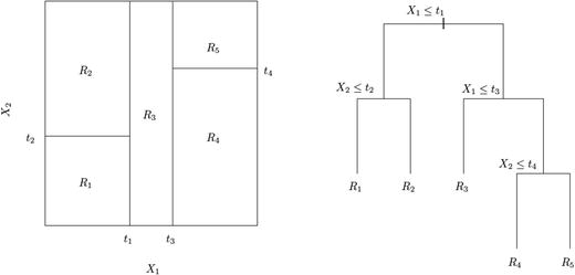
Figure 6-35. Recursive binary split and its corresponding tree for two-dimensional feature space
We will take up demonstration using a regression tree algorithm called Classification and Regression Tree (CART) later in this chapter, on the housing dataset described earlier in this chapter.
6.7.1.2 Classification Tree
Classification tree is more suitable for categorical or discrete response variables. The following are the key differences between classification trees and regression trees:
We use classification error rate for making the splits in classification trees.
Instead of taking the mean of response variable in a particular region for prediction, here we use the most commonly occurring class of training observation as a prediction methodology.
Again, we could use Gini-Index or Entropy as a measure for selecting the best feature or attribute of splitting the observations into different classes.
In the coming sections, we will discuss some popular classification decision tree algorithms like ID3 and C5.0
6.7.2 Decision Measures
There are certain measures which are key to building a decision tree. In this section, we will discuss few measures associated with node purity (measure of randomness or heterogeneity). In the context of decision tree, a small value signifies the node contains majority of the observation from a single class. There are two widely used measure for node purity and another measure called information gain which uses either Gini-index or Entropy to take decision on node split.
6.7.2.1 Gini Index
A Gini-Index is calculated using
![]()
where, p
mk
is the proportion of training observations in the mth region that are from the kth class.
For demonstration purposes, look at Figure 6-36. Suppose you have two classes where P1 proportion of all training observation belongs to class C1 (triangle) and then P2 = 1-P1 belongs to C2 (circle), the Gini-Index assumes a curve as shown here:

Figure 6-36. Gini-Index function
curve(x *(1-x) +(1 -x) *x, xlab ="P", ylab ="Gini-Index", lwd =5)6.7.2.2 Entropy
Entropy is calculated using
![]()
The curve for entropy looks something like this:
curve(-x *log2(x) -(1 -x) *log2(1 -x), xlab ="x", ylab ="Entropy", lwd =5)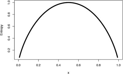
Figure 6-37. Entropy function
Observe that both measures are very similar, however, there are some differences:
Gini-index is more suitable to continuous attributes and entropy in case of discrete data.
Gini-index works well for minimizing misclassifications.
Entropy is slightly slower than Gini-index, as it involves logarithms (although this doesn't really matter much given today's fast computing machines).
6.7.2.3 Information Gain
Information Gain is a measure that quantifies the change in the entropy before and after the split. It’s an elegantly simple measure to decide the relevance of an attribute. In general, we could write information gain as:
![]() ,
,
where G(Parent) is the Gini-Index (we could use Entropy as well) of parent node represented by an attribute before the split and G(Children) is the Gini-index of children nodes that will be generated after the split. For example, in Figure 6-34, all observations satisfying the parent node condition x<0.43 are its left child nodes and remaining its right.
6.7.3 Decision Tree Learning Methods
In this section, we discuss four widely used decision tree algorithms applied to our real-world datasets.
Data Summary
library(C50)library(splitstackshape)library(rattle)library(rpart.plot)library(data.table)Data_Purchase <-fread("/Dataset/Purchase Prediction Dataset.csv",header=T, verbose =FALSE, showProgress =FALSE)str(Data_Purchase)Classes 'data.table' and 'data.frame': 500000 obs. of 12 variables:$ CUSTOMER_ID : chr "000001" "000002" "000003" "000004" ...$ ProductChoice : int 2 3 2 3 2 3 2 2 2 3 ...$ MembershipPoints : int 6 2 4 2 6 6 5 9 5 3 ...$ ModeOfPayment : chr "MoneyWallet" "CreditCard" "MoneyWallet" "MoneyWallet" ...$ ResidentCity : chr "Madurai" "Kolkata" "Vijayawada" "Meerut" ...$ PurchaseTenure : int 4 4 10 6 3 3 13 1 9 8 ...$ Channel : chr "Online" "Online" "Online" "Online" ...$ IncomeClass : chr "4" "7" "5" "4" ...$ CustomerPropensity : chr "Medium" "VeryHigh" "Unknown" "Low" ...$ CustomerAge : int 55 75 34 26 38 71 72 27 33 29 ...$ MartialStatus : int 0 0 0 0 1 0 0 0 0 1 ...$ LastPurchaseDuration: int 4 15 15 6 6 10 5 4 15 6 ...- attr(*, ".internal.selfref")=<externalptr>#Check the distribution of data before groupingtable(Data_Purchase$ProductChoice)1 2 3 4106603 199286 143893 50218Data Preparation
#Pulling out only the relevant data to this chapterData_Purchase <-Data_Purchase[,.(CUSTOMER_ID,ProductChoice,MembershipPoints,IncomeClass,CustomerPropensity,LastPurchaseDuration)]#Delete NA from subsetData_Purchase <-na.omit(Data_Purchase)Data_Purchase$CUSTOMER_ID <-as.character(Data_Purchase$CUSTOMER_ID)#Stratified SamplingData_Purchase_Model<-stratified(Data_Purchase, group=c("ProductChoice"),size=10000,replace=FALSE)print("The Distribution of equal classes is as below")[1] "The Distribution of equal classes is as below"table(Data_Purchase_Model$ProductChoice)1 2 3 410000 10000 10000 10000Data_Purchase_Model$ProductChoice <-as.factor(Data_Purchase_Model$ProductChoice)Data_Purchase_Model$IncomeClass <-as.factor(Data_Purchase_Model$IncomeClass)Data_Purchase_Model$CustomerPropensity <-as.factor(Data_Purchase_Model$CustomerPropensity)#Build the decision tree on Train Data (Set_1) and then test data (Set_2) will be used for performance testingset.seed(917);train <-Data_Purchase_Model[sample(nrow(Data_Purchase_Model),size=nrow(Data_Purchase_Model)*(0.7), replace =TRUE, prob =NULL),]train <-as.data.frame(train)test <-Data_Purchase_Model[!(Data_Purchase_Model$CUSTOMER_ID %in%train$CUSTOMER_ID),]
6.7.3.1 Iterative Dichotomizer 3
J.Ross Quinlan, a computer science researcher in data mining and decision theory, invented the most popular decision tree algorithms, C4.5 and ID3. Here is a brief of how the ID3 algorithm works:
Calculates entropy for each attribute using the training observations.
Split the observations into subsets using the attribute with minimum entropy or maximum information gain.
The selected attribute becomes the decision node.
Repeat the process with the remaining attribute on the subset.
For demonstration, we will use a R Package called RWeka , which is a wrapper built on the tool Weka, which is a collection of machine learning algorithms for data mining tasks written in Java, containing tools for data pre-processing, classification, regression, clustering, association rules, and visualization. The package RWeka contains the interface code, and the Weka jar is in a separate package called RWekajars. For more information on Weka, see http://www.cs.waikato.ac.nz/ml/weka/ .
Note
Before using the ID3 function from the RWeka package, follow these instructions.
Install the package RWeka.
Set the environment variable WEKA_HOME to a folder location on your drive (e.g., D:home) where you have sufficient access rights.
In the R console, run these two commands :
WPM("refresh-cache")#looks for a package providing id3WPM("install-package", "simpleEducationalLearningSchemes")#load the packageModel Building
library(RWeka)WPM("refresh-cache")WPM("install-package", "simpleEducationalLearningSchemes")make classifierID3 <-make_Weka_classifier("weka/classifiers/trees/Id3")ID3Model <-ID3(ProductChoice ∼CustomerPropensity +IncomeClass , data = train)summary(ID3Model)=== Summary ===Correctly Classified Instances 9423 33.6536 %Incorrectly Classified Instances 18577 66.3464 %Kappa statistic 0.1148Mean absolute error 0.3634Root mean squared error 0.4263Relative absolute error 96.9041 %Root relative squared error 98.4399 %Total Number of Instances 28000=== Confusion Matrix ===a b c d <-- classified as4061 987 929 1078 | a = 13142 1054 1217 1603 | b = 22127 727 1761 2290 | c = 32206 859 1412 2547 | d = 4Model Evaluation
Training set accuracy are present as part of the ID3 model output (33% correctly classified instances), so we needn't present that here. Let’s look at the testing set accuracy.
Testing set Accuracy = 32%
As you can observe, the accuracy is not exceptionally good. Moreover, given there are four classes of data, the accuracy is prone to be even less. The fact that training and testing accuracy are almost equal tells us that there is as such no overfitting kind of scenario.
library(gmodels)purchase_pred_test <-predict(ID3Model, test)CrossTable(test$ProductChoice, purchase_pred_test,prop.chisq =FALSE, prop.c =FALSE, prop.r =FALSE,dnn =c('actual default', 'predicted default'))Cell Contents|-------------------------|| N || N / Table Total ||-------------------------|Total Observations in Table: 20002| predicted defaultactual default | 1 | 2 | 3 | 4 | Row Total |---------------|--------|-----------|-----------|-----------|-----------|1 | 2849 | 758 | 625 | 766 | 4998 || 0.142 | 0.038 | 0.031 | 0.038 | |---------------|--------|-----------|-----------|-----------|-----------|2 | 2291 | 681 | 872 | 1151 | 4995 || 0.115 | 0.034 | 0.044 | 0.058 | |---------------|--------|-----------|-----------|-----------|-----------|3 | 1580 | 545 | 1151 | 1759 | 5035 || 0.079 | 0.027 | 0.058 | 0.088 | |---------------|--------|-----------|-----------|-----------|-----------|4 | 1594 | 590 | 1066 | 1724 | 4974 || 0.080 | 0.029 | 0.053 | 0.086 | |---------------|--------|-----------|-----------|-----------|-----------|Column Total | 8314 | 2574 | 3714 | 5400 | 20002 |---------------|--------|-----------|-----------|-----------|-----------|
The accuracy isn’t very impressive with ID3 algorithm. One possible reason could be the multiple classes in our response variables. Generally, the ID3 is not known for performing exceptionally well on multi-class problems.
6.7.3.2 C5.0 algorithm
In his book, C4.5: Programs for Machine Learning, J. Ross Quinlan[3], laid down a set of key requirements for using these algorithms for classification task, which are as follows:
Attribute-value description: All information about one case should be expressible in terms of fixed collection of attributes (features) and it should not vary from one case to another.
Predefined classes: As it happens in any supervised learning approach, the categories to which cases are to be assigned must be predefined.
Discrete classes: The classes must be sharply delineated; a case either does or does not belong to a particular class and there must be far more cases than classes. So, clearly, problems with continuous response variable are not the right fit for this algorithm.
Sufficient Data: The amount of data required is affected by factors such as number of attributes and classes. As these increases, more data will be needed to construct a reliable model.
Logical classification models: The description of the class should be logical expressions whose primitives are statements about the values of particular attributes. For example, IF Outlook = "sunny" AND Windy = "false" THEN class = "Play".
Here we will use the C5.0 algorithm, on our purchase prediction dataset which is an extension of C4.5 for building the decision tree. C4.5 was a collective name given to a set of computer programs that constructs a classification models. The following are some new features in C5.0 are illustrated in Ross Quinlan's web page ( http://www.rulequest.com/see5-comparison.html ).
In the classic book, Experiments in Induction, Hunt et. al.[4] has described many implementations of concept learning systems. Here is how Hunt's approach works.
Given a set of T training observations having C1, C2, …, Ck classes, at a broad level, following are the three possibilities involved in building the tree:
All the observations of T belongs to a single class Ci, the decision tree D for T is a leaf identifying class Ci.
T contains no class. C5.0 uses the most frequent class at the parent of this node.
T contains observation which mixture of classes. A node condition (test) is chosen based on single attribute (the attribute is chosen based on information gain) which generates a partitioned set of T1, T2, …, Tn.
The split in third possibility is recursive in the algorithm, which is repeated until either all the observations are correctly classified or the algorithm runs out of attribute to split. Since this divide and conquer is a greedy approach that looks only at the immediate step to take a decision for split, its possible to end up in situation like overfitting. In order to avoid this, a technique called pruningis used, which reduces the overfit and generalizes better to unseen data. Fortunately, you don't have to worry about pruning since C5.0 algorithm after building the decision tree, iterates back and replace the branches that do not increase the information gain.
Here, we will use our Purchase Preference dataset to build a C5.0 decision tree model on for product choice prediction based on the ProductChoice response variable.
Model Building
model_c50 <-C5.0(train[,c("CustomerPropensity","LastPurchaseDuration", "MembershipPoints")],train[,"ProductChoice"],control =C5.0Control(CF =0.001, minCases =2))Model Summary
summary(model_c50)Call:C5.0.default(x = train[, c("CustomerPropensity","LastPurchaseDuration", "MembershipPoints")], y =train[, "ProductChoice"], control = C5.0Control(CF = 0.001, minCases = 2))C5.0 [Release 2.07 GPL Edition] Sun Oct 02 16:09:05 2016-------------------------------Class specified by attribute `outcome'Read 28000 cases (4 attributes) from undefined.dataDecision tree:CustomerPropensity in {High,VeryHigh}::...MembershipPoints <= 1: 4 (1264/681): MembershipPoints > 1:: :...LastPurchaseDuration <= 6: 3 (3593/2266): LastPurchaseDuration > 6:: :...CustomerPropensity = High: 3 (1665/1083): CustomerPropensity = VeryHigh: 4 (2140/1259)CustomerPropensity in {Low,Medium,Unknown}::...MembershipPoints <= 1: 4 (3180/1792)MembershipPoints > 1::...CustomerPropensity = Unknown: 1 (8004/4891)CustomerPropensity in {Low,Medium}::...LastPurchaseDuration <= 2: 1 (2157/1417)LastPurchaseDuration > 2::...LastPurchaseDuration > 13: 2 (1083/773)LastPurchaseDuration <= 13::...CustomerPropensity = Medium: 3 (2489/1707)CustomerPropensity = Low::...MembershipPoints <= 3: 2 (850/583)MembershipPoints > 3: 1 (1575/1124)Evaluation on training data (28000 cases):Decision Tree----------------Size Errors11 17576(62.8%) <<(a) (b) (c) (d) <-classified as---- ---- ---- ----4304 374 1345 1032 (a): class 13374 577 1759 1306 (b): class 22336 484 2691 1394 (c): class 31722 498 1952 2852 (d): class 4Attribute usage:100.00% CustomerPropensity100.00% MembershipPoints55.54% LastPurchaseDurationTime: 0.1 secsplot(model_c50)You can experiment with the parameters of C5.0 to see how the decision tree changes. As shown in Figure 6-38, if you traverse through any path, it forms one decision rule. For example, Rule: CustomerPropensity in {High,VeryHigh}ANDMembershipPoints <= 1 is one path ending in a decision node as shown in Figure 6-38.

Figure 6-38. C5.0 decision tree on the purchase prediction dataset
Evaluation
Training set Accuracy = 37%
library(gmodels)purchase_pred_train <-predict(model_c50, train,type ="class")CrossTable(train$ProductChoice, purchase_pred_train,prop.chisq =FALSE, prop.c =FALSE, prop.r =FALSE,dnn =c('actual default', 'predicted default'))Cell Contents|-------------------------|| N || N / Table Total ||-------------------------|Total Observations in Table: 28000| predicted defaultactual default | 1 | 2 | 3 | 4 | Row Total |---------------|--------|-----------|-----------|-----------|-----------|1 | 4304 | 374 | 1345 | 1032 | 7055 || 0.154 | 0.013 | 0.048 | 0.037 | |---------------|--------|-----------|-----------|-----------|-----------|2 | 3374 | 577 | 1759 | 1306 | 7016 || 0.120 | 0.021 | 0.063 | 0.047 | |---------------|--------|-----------|-----------|-----------|-----------|3 | 2336 | 484 | 2691 | 1394 | 6905 || 0.083 | 0.017 | 0.096 | 0.050 | |---------------|--------|-----------|-----------|-----------|-----------|4 | 1722 | 498 | 1952 | 2852 | 7024 || 0.061 | 0.018 | 0.070 | 0.102 | |---------------|--------|-----------|-----------|-----------|-----------|Column Total | 11736 | 1933 | 7747 | 6584 | 28000 |---------------|--------|-----------|-----------|-----------|-----------|
Testing set accuracy = 36%
purchase_pred_test <-predict(model_c50, test)CrossTable(test$ProductChoice, purchase_pred_test,prop.chisq =FALSE, prop.c =FALSE, prop.r =FALSE,dnn =c('actual default', 'predicted default'))purchase_pred_test <-predict(model_c50, test)CrossTable(test$ProductChoice, purchase_pred_test,prop.chisq =FALSE, prop.c =FALSE, prop.r =FALSE,dnn =c('actual default', 'predicted default'))Cell Contents|-------------------------|| N || N / Table Total ||-------------------------|Total Observations in Table: 20002| predicted defaultactual default | 1 | 2 | 3 | 4 | Row Total |---------------|--------|-----------|-----------|-----------|-----------|1 | 3081 | 279 | 895 | 743 | 4998 || 0.154 | 0.014 | 0.045 | 0.037 | |---------------|--------|-----------|-----------|-----------|-----------|2 | 2454 | 321 | 1317 | 903 | 4995 || 0.123 | 0.016 | 0.066 | 0.045 | |---------------|--------|-----------|-----------|-----------|-----------|3 | 1730 | 344 | 1843 | 1118 | 5035 || 0.086 | 0.017 | 0.092 | 0.056 | |---------------|--------|-----------|-----------|-----------|-----------|4 | 1176 | 349 | 1382 | 2067 | 4974 || 0.059 | 0.017 | 0.069 | 0.103 | |---------------|--------|-----------|-----------|-----------|-----------|Column Total | 8441 | 1293 | 5437 | 4831 | 20002 |---------------|--------|-----------|-----------|-----------|-----------|
As you can observe, the accuracy is not exceptionally good. Moreover, given there are four classes of data, the accuracy is prone to be even less. The fact that training and testing accuracy are almost equal tells us that there is as such no overfitting kind of scenario.
6.7.3.3 Classification and Regression Tree: CART
CART is a regression tree-based approach and as explained in the section 6.8.1.1and its uses the sum of squared deviation about the mean (residual sum of square) as the node impurity measure. Keep in mind, CART could also be used for classification problems, in which case, Gini-Index is a more appropriate choice for impurity measure. Roughly, here is a short pseudo code for the algorithm:
Start the algorithm at the root node.
For each attribute X, find the subset S that minimizes the residual sum of square (RSS) of the two children and chooses the split that gives the maximum information gain.
Check if relative decrease in impurity is below a prescribed threshold.
If Yes, splitting stops, otherwise repeat Step 2.
Let’s see a demonstration of CART using the rpart function , which is available in the most commonly used package with rpart. It also provides methods to build decision tree like Random Forest, which we will cover later in this chapter.
We will also use an additional parameter cp (complexity parameter) in the function call, which signifies that any split that does not decrease the overall lack of fit by a factor of cp would not be attempted by the model.
Building the model
CARTModel <-rpart(ProductChoice ∼IncomeClass +CustomerPropensity +LastPurchaseDuration +MembershipPoints, data=train)summary(CARTModel)Call:rpart(formula = ProductChoice ∼ IncomeClass + CustomerPropensity +LastPurchaseDuration + MembershipPoints, data = train)n= 28000CP nsplit rel error xerror xstd1 0.09649081 0 1.0000000 1.0034376 0.0034565832 0.02582955 1 0.9035092 0.9035092 0.0037393353 0.02143710 2 0.8776796 0.8776796 0.0037937494 0.01000000 3 0.8562425 0.8562425 0.003833608Variable importanceCustomerPropensity MembershipPoints LastPurchaseDuration53 37 8IncomeClass2Node number 1: 28000 observations, complexity param=0.09649081predicted class=1 expected loss=0.7480357 P(node) =1class counts: 7055 7016 6905 7024probabilities: 0.252 0.251 0.247 0.251left son=2 (14368 obs) right son=3 (13632 obs)Primary splits:CustomerPropensity splits as RLRLR, improve=408.0354, (0 missing)MembershipPoints < 1.5 to the right, improve=269.2781, (0 missing)LastPurchaseDuration < 5.5 to the left, improve=194.7965, (0 missing)IncomeClass splits as LRLLLLRRRL, improve= 24.2665, (0 missing)Surrogate splits:LastPurchaseDuration < 5.5 to the left, agree=0.590, adj=0.159, (0 split)IncomeClass splits as LLLLLLLRRR, agree=0.529, adj=0.032, (0 split)MembershipPoints < 9.5 to the left, agree=0.514, adj=0.002, (0 split)....Node number 7: 2066 observationspredicted class=4 expected loss=0.5382381 P(node) =0.07378571class counts: 291 408 413 954probabilities: 0.141 0.197 0.200 0.462library(rpart.plot)library(rattle)fancyRpartPlot(CARTModel)
Figure 6-39. CART model
Model Evaluation
Training set Accuracy = 27%library(gmodels)purchase_pred_train <-predict(CARTModel, train,type ="class")CrossTable(train$ProductChoice, purchase_pred_train,prop.chisq =FALSE, prop.c =FALSE, prop.r =FALSE,dnn =c('actual default', 'predicted default'))Cell Contents|-------------------------|| N || N / Table Total ||-------------------------|Total Observations in Table: 28000| predicted defaultactual default | 1 | 3 | 4 | Row Total |---------------|-----------|-----------|-----------|-----------|1 | 4253 | 1943 | 859 | 7055 || 0.152 | 0.069 | 0.031 | |---------------|-----------|-----------|-----------|-----------|2 | 3452 | 2629 | 935 | 7016 || 0.123 | 0.094 | 0.033 | |---------------|-----------|-----------|-----------|-----------|3 | 2384 | 3842 | 679 | 6905 || 0.085 | 0.137 | 0.024 | |---------------|-----------|-----------|-----------|-----------|4 | 1901 | 3152 | 1971 | 7024 || 0.068 | 0.113 | 0.070 | |---------------|-----------|-----------|-----------|-----------|Column Total | 11990 | 11566 | 4444 | 28000 |---------------|-----------|-----------|-----------|-----------|
It looks like a poor model for this dataset. If you observe, the training model doesn't even predict any instance of class 3. We will skip the testing set evaluation. You are encouraged to try the housing dataset used in linear regression to appreciate CART algorithm much better.
6.7.3.4 Chi-Square Automated Interaction Detection: CHAID
In this method, the R code being used for demonstration accepts only nominal or ordinal categorical predictors. For each predictor variable, the algorithm works by merging non-significant categories, wherein each final category of X will result in one child node, if the algorithm chooses X (based on adjusted p-value) to split the node.
The following algorithm is borrowed from the documentation of the CHAID package in R and the classic paper by G. V. Kass (1980), called “An Exploratory Technique for Investigating Large Quantities of Categorical Data .”
If X has one category only, stop and set the adjusted p-value to be 1.
If X has two categories, go to Step 8.
Else, find the allowable pair of categories of X (an allowable pair of categories for ordinal predictor is two adjacent categories, and for nominal predictor is any two categories) that is least significantly different (i.e., the most similar). The most similar pair is the pair whose test statistic gives the largest p-value with respect to the dependent variable Y. How to calculate p-value under various situations will be described in later sections.
For the pair having the largest p-value, check if its p-value is larger than a user-specified alpha-level alpha2. If it does, this pair is merged into a single compound category. Then a new set of categories of X is formed. If it does not, then go to Step 7.
(Optional) If the newly formed compound category consists of three or more original categories, then find the best binary split within the compound category which p-value is the smallest. Perform this binary split if its p-value is not larger than an alpha-level alpha3.
Go to Step 2.
(Optional) Any category having too few observations (as compared with a user-specified minimum segment size) is merged with the most similar other category as measured by the largest of the p-values.
The adjusted p-value is computed for the merged categories by applying Bonferroni adjustments that are to be discussed later.
Splitting : The best split for each predictor is found in the merging step. The splitting step selects which predictor to be used to best split the node. Selection is accomplished by comparing the adjusted p-value associated with each predictor. The adjusted p-value is obtained in the merging step.
Select the predictor that has the smallest adjusted p-value (i.e., most significant).
If this adjusted p-value is less than or equal to a user-specified alpha-level alpha4, split the node using this predictor. Otherwise, do not split and the node is considered as a terminal node.
Stopping : The stopping step checks if the tree growing process should be stopped according to the following stopping rules.
If a node becomes pure; that is, all cases in a node have identical values of the dependent variable, the node will not be split.
If all cases in a node have identical values for each predictor, the node will not be split.
If the current tree depth reaches the user specified maximum tree depth limit value, the tree growing process will stop.
If the size of a node is less than the user-specified minimum node size value, the node will not be split.
If the split of a node results in a child node whose node size is less than the user-specified minimum child node size value, child nodes that have too few cases (as compared with this minimum) will merge with the most similar child node as measured by the largest of the p-values. However, if the resulting number of child nodes is 1, the node will not be split.
If the trees height is a positive value and equals the max height.
Let’s now see a demonstration on our purchase prediction dataset.
Note
For using the code in this section, use the following steps:
Download the zip or .tar.gz file according to your machine from https://r-forge.r-project.org/R/?group_id=343 .
Extract the contents of the compressed file into a folder named CHAID and place it in the installation folder of R. The installation folder might look something like C:Program FilesR-3.2.2library.
That's it. You are ready to call the library (CHAID) inside your R script.
Building the model
Since CHAID takes all categorical inputs, we are using the attributes CustomerPropensity and IncomeClass as predictor variables.
library("CHAID")Loading required package: partykitLoading required package: gridctrl <-chaid:control(minsplit =200, minprob =0.1)CHAIDModel <-chaid(ProductChoice ∼CustomerPropensity +IncomeClass, data = train, control = ctrl)print(CHAIDModel)Model formula:ProductChoice ∼ CustomerPropensity + IncomeClassFitted party:[1] root| [2] CustomerPropensity in High| | [3] IncomeClass in , 1, 2, 3, 9: 2 (n = 169, err = 68.6%)| | [4] IncomeClass in 4: 3 (n = 628, err = 65.0%)| | [5] IncomeClass in 5: 4 (n = 1286, err = 70.2%)| | [6] IncomeClass in 6: 3 (n = 1192, err = 67.0%)| | [7] IncomeClass in 7: 3 (n = 662, err = 63.4%)| | [8] IncomeClass in 8: 4 (n = 222, err = 59.9%)| [9] CustomerPropensity in Low: 2 (n = 4778, err = 72.0%)| [10] CustomerPropensity in Medium| | [11] IncomeClass in , 1, 2, 3, 4, 5, 7: 3 (n = 3349, err = 73.5%)| | [12] IncomeClass in 6, 8: 4 (n = 1585, err = 71.0%)| | [13] IncomeClass in 9: 3 (n = 36, err = 44.4%)| [14] CustomerPropensity in Unknown| | [15] IncomeClass in : 2 (n = 18, err = 0.0%)| | [16] IncomeClass in 1: 4 (n = 15, err = 53.3%)| | [17] IncomeClass in 2, 3, 4, 5, 6, 7, 8: 1 (n = 9524, err = 63.6%)| | [18] IncomeClass in 9: 1 (n = 33, err = 39.4%)| [19] CustomerPropensity in VeryHigh| | [20] IncomeClass in , 1, 3, 4, 5, 6, 9: 3 (n = 3484, err = 64.5%)| | [21] IncomeClass in 2, 8: 4 (n = 268, err = 48.5%)| | [22] IncomeClass in 7: 4 (n = 751, err = 58.2%)Number of inner nodes: 5Number of terminal nodes: 17#plot(CHAIDModel)Model Evaluation
The accuracy has no major improvement compared to C5.0 or ID3. However, it’s interesting to see the accuracy is close to what C5.0 algorithm in spite of using only two attributes.
Training set accuracy: 32%
library(gmodels)purchase_pred_train <-predict(CHAIDModel, train)CrossTable(train$ProductChoice, purchase_pred_train,prop.chisq =FALSE, prop.c =FALSE, prop.r =FALSE,dnn =c('actual default', 'predicted default'))Cell Contents|-------------------------|| N || N / Table Total ||-------------------------|Total Observations in Table: 28000| predicted defaultactual default | 1 | 2 | 3 | 4 | Row Total |---------------|--------|-----------|-----------|-----------|-----------|1 | 3487 | 1367 | 1610 | 591 | 7055 || 0.125 | 0.049 | 0.058 | 0.021 | |---------------|--------|-----------|-----------|-----------|-----------|2 | 2617 | 1410 | 2047 | 942 | 7016 || 0.093 | 0.050 | 0.073 | 0.034 | |---------------|--------|-----------|-----------|-----------|-----------|3 | 1669 | 1031 | 3001 | 1204 | 6905 || 0.060 | 0.037 | 0.107 | 0.043 | |---------------|--------|-----------|-----------|-----------|-----------|4 | 1784 | 1157 | 2693 | 1390 | 7024 || 0.064 | 0.041 | 0.096 | 0.050 | |---------------|--------|-----------|-----------|-----------|-----------|Column Total | 9557 | 4965 | 9351 | 4127 | 28000 |---------------|--------|-----------|-----------|-----------|-----------|
Testing set accuracy : 32%
purchase_pred_test <-predict(CHAIDModel, test)CrossTable(test$ProductChoice, purchase_pred_test,prop.chisq =FALSE, prop.c =FALSE, prop.r =FALSE,dnn =c('actual default', 'predicted default'))Cell Contents|-------------------------|| N || N / Table Total ||-------------------------|Total Observations in Table: 20002| predicted defaultactual default | 1 | 2 | 3 | 4 | Row Total |---------------|--------|-----------|-----------|-----------|-----------|1 | 2493 | 1003 | 1048 | 454 | 4998 || 0.125 | 0.050 | 0.052 | 0.023 | |---------------|--------|-----------|-----------|-----------|-----------|2 | 1929 | 901 | 1502 | 663 | 4995 || 0.096 | 0.045 | 0.075 | 0.033 | |---------------|--------|-----------|-----------|-----------|-----------|3 | 1263 | 747 | 2034 | 991 | 5035 || 0.063 | 0.037 | 0.102 | 0.050 | |---------------|--------|-----------|-----------|-----------|-----------|4 | 1318 | 776 | 2008 | 872 | 4974 || 0.066 | 0.039 | 0.100 | 0.044 | |---------------|--------|-----------|-----------|-----------|-----------|Column Total | 7003 | 3427 | 6592 | 2980 | 20002 |---------------|--------|-----------|-----------|-----------|-----------|

Figure 6-40. CHAID decision tree
The accuracy has no major improvement compared to C5.0 or ID3. However, it’s interesting to see the accuracy is close to what C5.0 algorithm in spite of using only two attributes.
With 37% and 36% training and test set accuracy respectively, the C5.0 algorithm seems to have done the best among all the others. Although this accuracy might not be sufficient for using in any practical application, this example gives sufficient understanding of how the decision tree algorithms work. We encourage you to create a subset of the given dataset with only two classes and then see how each of these algorithms performs.
6.7.4 Ensemble Trees
Ensemble models in machine learning are great way to improve your model accuracy by many folds. The best Kaggle competition-winning ML algorithms are predominately using the ensemble approach. The idea is simple, instead of training one model on a set of observations, we use the power of multiple models (or multiple iteration of the same model on different subset of training data) combined together to train on the same set of observations. Chapter 8 takes a detailed approach on improving model performance using ensembles; however, we will keep our focus on ensemble models based on decision tree in this section.
6.7.4.1 Boosting
Boosting is an ensemble meta-algorithm in ML that helps in reducing bias and variance and fits a sequence of weak learners on different weighted training observations (more on this in Chapter 8).
We will demonstrate this technique using C5.0 Ensemble model, which is an extension of what we discussed earlier in this chapter by adding a parameter trials = 10 in the C50 function call which means, perform 10 boosting iterations in the model building process.
library(gmodels)purchase_pred_train <-predict(ModelC50_boostcv10, train)CrossTable(train$ProductChoice, purchase_pred_train,prop.chisq =FALSE, prop.c =FALSE, prop.r =FALSE,dnn =c('actual default', 'predicted default'))Cell Contents|-------------------------|| N || N / Table Total ||-------------------------|Total Observations in Table: 28000| predicted defaultactual default | 1 | 2 | 3 | 4 | Row Total |---------------|--------|-----------|-----------|-----------|-----------|1 | 3835 | 903 | 1117 | 1200 | 7055 || 0.137 | 0.032 | 0.040 | 0.043 | |---------------|--------|-----------|-----------|-----------|-----------|2 | 2622 | 1438 | 1409 | 1547 | 7016 || 0.094 | 0.051 | 0.050 | 0.055 | |---------------|--------|-----------|-----------|-----------|-----------|3 | 1819 | 812 | 2677 | 1597 | 6905 || 0.065 | 0.029 | 0.096 | 0.057 | |---------------|--------|-----------|-----------|-----------|-----------|4 | 1387 | 686 | 1577 | 3374 | 7024 || 0.050 | 0.024 | 0.056 | 0.120 | |---------------|--------|-----------|-----------|-----------|-----------|Column Total | 9663 | 3839 | 6780 | 7718 | 28000 |---------------|--------|-----------|-----------|-----------|-----------|
Testing set accuracy :
purchase_pred_test <-predict(ModelC50_boostcv10, test)CrossTable(test$ProductChoice, purchase_pred_test,prop.chisq =FALSE, prop.c =FALSE, prop.r =FALSE,dnn =c('actual default', 'predicted default'))Cell Contents|-------------------------|| N || N / Table Total ||-------------------------|Total Observations in Table: 20002| predicted defaultactual default | 1 | 2 | 3 | 4 | Row Total |---------------|--------|-----------|-----------|-----------|-----------|1 | 2556 | 769 | 770 | 903 | 4998 || 0.128 | 0.038 | 0.038 | 0.045 | |---------------|--------|-----------|-----------|-----------|-----------|2 | 2022 | 748 | 1108 | 1117 | 4995 || 0.101 | 0.037 | 0.055 | 0.056 | |---------------|--------|-----------|-----------|-----------|-----------|3 | 1406 | 701 | 1540 | 1388 | 5035 || 0.070 | 0.035 | 0.077 | 0.069 | |---------------|--------|-----------|-----------|-----------|-----------|4 | 970 | 548 | 1201 | 2255 | 4974 || 0.048 | 0.027 | 0.060 | 0.113 | |---------------|--------|-----------|-----------|-----------|-----------|Column Total | 6954 | 2766 | 4619 | 5663 | 20002 |---------------|--------|-----------|-----------|-----------|-----------|
Though the training set accuracy increase to 40%, the testing set accuracy has come down, indicating a slight overfitting in this model.
6.7.4.2 Bagging
This is another class of ML meta-algorithm, also known as bootstrap aggregating. It again helps in reducing the variance and overfitting on training observation. Explained next is the process of bagging:
Given a set of N training observations, generate m new training sets Di each of size n where (n <<N ) by uniform sampling with replacement. This sampling is called bootstrap sampling. (Refer to Chapter 3 for more details.)
Using these m training set, m models are fitted and the outputs are combined either by averaging the output (regression) or majority voting (for classification).
Certain version of algorithm could have even a sample set of smaller number of attributes than the original dataset like Random Forest. Let’s use the Bagging CART and Random Forest algorithms here to demonstrate.
Note
The following code might take a significant amount of time and RAM memory. If you want, you can reduce the size of training set for quicker execution.
6.7.4.2.1 Bagging CART
control <-trainControl(method="repeatedcv", number=5, repeats=2)# Bagged CARTset.seed(100)CARTBagModel <-train(ProductChoice ∼CustomerPropensity +LastPurchaseDuration +MembershipPoints, data=train, method="treebag", trControl=control)Loading required package: ipredLoading required package: plyrWarning: package 'plyr' was built under R version 3.2.5Loading required package: e1071Warning: package 'e1071' was built under R version 3.2.5
Training set accuracy = 42%
Testing set accuracy = 34%
Though the training set accuracy increase to 42%, the testing set accuracy has come down, indicating a slight overfitting in this model.
Training set accuracy :
library(gmodels)purchase_pred_train <-predict(CARTBagModel, train)CrossTable(train$ProductChoice, purchase_pred_train,prop.chisq =FALSE, prop.c =FALSE, prop.r =FALSE,dnn =c('actual default', 'predicted default'))Cell Contents|-------------------------|| N || N / Table Total ||-------------------------|Total Observations in Table: 28000| predicted defaultactual default | 1 | 2 | 3 | 4 | Row Total |---------------|--------|-----------|-----------|-----------|-----------|1 | 3761 | 1208 | 885 | 1201 | 7055 || 0.134 | 0.043 | 0.032 | 0.043 | |---------------|--------|-----------|-----------|-----------|-----------|2 | 2358 | 1970 | 1096 | 1592 | 7016 || 0.084 | 0.070 | 0.039 | 0.057 | |---------------|--------|-----------|-----------|-----------|-----------|3 | 1685 | 1054 | 2547 | 1619 | 6905 || 0.060 | 0.038 | 0.091 | 0.058 | |---------------|--------|-----------|-----------|-----------|-----------|4 | 1342 | 885 | 1291 | 3506 | 7024 || 0.048 | 0.032 | 0.046 | 0.125 | |---------------|--------|-----------|-----------|-----------|-----------|Column Total | 9146 | 5117 | 5819 | 7918 | 28000 |---------------|--------|-----------|-----------|-----------|-----------|
Testing set accuracy :
purchase_pred_test <-predict(CARTBagModel, test)CrossTable(test$ProductChoice, purchase_pred_test,prop.chisq =FALSE, prop.c =FALSE, prop.r =FALSE,dnn =c('actual default', 'predicted default'))Cell Contents|-------------------------|| N || N / Table Total ||-------------------------|Total Observations in Table: 20002| predicted defaultactual default | 1 | 2 | 3 | 4 | Row Total |---------------|--------|-----------|-----------|-----------|-----------|1 | 2331 | 1071 | 657 | 939 | 4998 || 0.117 | 0.054 | 0.033 | 0.047 | |---------------|--------|-----------|-----------|-----------|-----------|2 | 1844 | 1012 | 928 | 1211 | 4995 || 0.092 | 0.051 | 0.046 | 0.061 | |---------------|--------|-----------|-----------|-----------|-----------|3 | 1348 | 875 | 1320 | 1492 | 5035 || 0.067 | 0.044 | 0.066 | 0.075 | |---------------|--------|-----------|-----------|-----------|-----------|4 | 979 | 759 | 1066 | 2170 | 4974 || 0.049 | 0.038 | 0.053 | 0.108 | |---------------|--------|-----------|-----------|-----------|-----------|Column Total | 6502 | 3717 | 3971 | 5812 | 20002 |---------------|--------|-----------|-----------|-----------|-----------|Testing set Accuracy = 34%
Though the training set accuracy increases to 42%, the testing set accuracy has come down, indicating a slight overfitting in this model once again.
6.7.4.2.2 Random Forest
Random Forest is one of the most popular decision tree-based ensemble models. The accuracy of these models tends to be higher than most of the other decision trees. Here is a broad summary of how the Random Forest algorithm works:
Let N = Number of observations, n = number of decision trees (user input), and M = Number of variables in the dataset.
Choose a subset of m variables from M, where m << M, and build n decision trees using a random set of m variable.
Grow each tree as large as possible.
Use majority voting to decide the class of the observation.
A randomly chosen subset of N observations without replacement (normally 2/3) is used to build each decision tree. Now let’s use our purchase preferences dataset again for demonstration using R.
# Random Forestset.seed(100)rfModel <-train(ProductChoice ∼CustomerPropensity +LastPurchaseDuration +MembershipPoints, data=train, method="rf", trControl=control)Loading required package: randomForestrandomForest 4.6-10Type rfNews() to see new features/changes/bug fixes.Attaching package: 'randomForest'The following object is masked from 'package:ggplot2':margin
Training set Accuracy = 41%
Testing set Accuracy = 36%
This model seems to have the best training and testing accuracy so far in all our trials of other models. Observe that Random Forest has done slightly well in tackling the overfit problem compared to CART.
Training set accuracy:
library(gmodels)purchase_pred_train <-predict(rfModel, train)CrossTable(train$ProductChoice, purchase_pred_train,prop.chisq =FALSE, prop.c =FALSE, prop.r =FALSE,dnn =c('actual default', 'predicted default'))Cell Contents|-------------------------|| N || N / Table Total ||-------------------------|Total Observations in Table: 28000| predicted defaultactual default | 1 | 2 | 3 | 4 | Row Total |---------------|--------|-----------|-----------|-----------|-----------|1 | 4174 | 710 | 1162 | 1009 | 7055 || 0.149 | 0.025 | 0.042 | 0.036 | |---------------|--------|-----------|-----------|-----------|-----------|2 | 2900 | 1271 | 1507 | 1338 | 7016 || 0.104 | 0.045 | 0.054 | 0.048 | |---------------|--------|-----------|-----------|-----------|-----------|3 | 1970 | 701 | 2987 | 1247 | 6905 || 0.070 | 0.025 | 0.107 | 0.045 | |---------------|--------|-----------|-----------|-----------|-----------|4 | 1564 | 608 | 1835 | 3017 | 7024 || 0.056 | 0.022 | 0.066 | 0.108 | |---------------|--------|-----------|-----------|-----------|-----------|Column Total | 10608 | 3290 | 7491 | 6611 | 28000 |---------------|--------|-----------|-----------|-----------|-----------|
Testing set accuracy:
purchase_pred_test <-predict(rfModel, test)CrossTable(test$ProductChoice, purchase_pred_test,prop.chisq =FALSE, prop.c =FALSE, prop.r =FALSE,dnn =c('actual default', 'predicted default'))Cell Contents|-------------------------|| N || N / Table Total ||-------------------------|Total Observations in Table: 20002| predicted defaultactual default | 1 | 2 | 3 | 4 | Row Total |---------------|--------|-----------|-----------|-----------|-----------|1 | 2774 | 611 | 845 | 768 | 4998 || 0.139 | 0.031 | 0.042 | 0.038 | |---------------|--------|-----------|-----------|-----------|-----------|2 | 2210 | 639 | 1194 | 952 | 4995 || 0.110 | 0.032 | 0.060 | 0.048 | |---------------|--------|-----------|-----------|-----------|-----------|3 | 1531 | 602 | 1774 | 1128 | 5035 || 0.077 | 0.030 | 0.089 | 0.056 | |---------------|--------|-----------|-----------|-----------|-----------|4 | 1100 | 462 | 1389 | 2023 | 4974 || 0.055 | 0.023 | 0.069 | 0.101 | |---------------|--------|-----------|-----------|-----------|-----------|Column Total | 7615 | 2314 | 5202 | 4871 | 20002 |---------------|--------|-----------|-----------|-----------|-----------|
There is another approach called stacking, which we cover in much greater detail in Chapter 8.
This model seems to have the best training and testing accuracy so far in all our trials of other models. Observe that Random Forest has done slightly well in tackling the overfit problem compared to CART.
In overall, under decision tree, the ensemble approach seems to do the best in the predicting the product preferences.
6.7.5 Conclusion
These supervised learning algorithms have a wide-spread adaptability in industry and many research work. The underlying design of decision tree makes it easy to interpret and the model is very intuitive to connect with the real-world problem. The approaches like Boosting and Bagging have given rise to high accuracy models based on decision tree. In particular, Random Forest is now one of the widely used model for many classification problems.
We presented a detailed discussion of decision tree where we started with the very first decision tree models like ID3 and then went on to present the contemporary Bagging CART and Random Forest algorithms as well.
In the next section, we will discuss our first probabilistic model in this book. The Bayesian models are easy to implement and powerful enough to capture a lot of information from a given set of observations and its class labels.
6.8 The Naive Bayes Method
Naive Bayes is a probabilistic model-based machine learning algorithm that was used in text categorization in its earlier use case. These methods fall in broad category of Bayesian algorithms in machine learning. Applications like document categorization and spam filters for e-mails were the first few areas where Naive Bayes proved to be really effective as a classifier algorithm. The name of the algorithm is derived from the fact that it relies on one of the most powerful concepts in probability theory, the Bayes Theorem, Bayes rule, or Bayes formula. In the coming sections, we will formally introduce the background necessary for understanding Naive Bayes and demonstrate its application to our Purchase Prediction dataset .
6.8.1 Conditional Probability
Conditional probability plays a significant role in ascertaining the impact of one event on another. It could increase or decrease the probability of an event if it’s known that another event has an influence on the event under study. Recall our Facebook nearby feature discussion in Chapter 1, where we computed this probability:
![]()
In other words, how does the information, “your friend is nearby the cineplex” affect the probability that you will visit the cineplex.
6.8.2 Bayes Theorem
The Bayes theorem (or Bayes rule
or Bayes formula
) defines the conditional probability between two events as
 where
where
P(A) is prior probability,
![]() is posterior probability and its read as rthe probability of the event A happening given the event B
is posterior probability and its read as rthe probability of the event A happening given the event B
P(B) is marginal likelihood
![]() is likelihood
is likelihood
![]() could also be thought as joint probability, which denotes the probability
of A intersection B; in other words, the probability of both event A and B happening together.
could also be thought as joint probability, which denotes the probability
of A intersection B; in other words, the probability of both event A and B happening together.
Rearranging the Bayes theorem, we could write it as

where the term ![]() signifies the impact event B has on the probability of A happening.
signifies the impact event B has on the probability of A happening.
This will form the core of our Naive Bayes algorithm . So, before we get there, let’s understand briefly the three terms discussed in the Bayes Theorem.
6.8.3 Prior Probability
Prior probability or priors signifies the certainty of an event occurring before some evidence is considered. Taking the same Facebook Nearby feature, what’s the probability of your friend visiting the cineplex if you don’t know anything about his current location.
6.8.4 Posterior Probability
The probability of the event A happening conditioned on another event gives us the posterior probability. So, in the Facebook Nearby feature, how his probability of visiting cineplex changes if we knew your friend is within 1 miles of the cineplex (defined as nearby). Such additional evidences are useful in increasing the certainty of a particular event. We will exploit this very fundamental in designing the Naive Bayes algorithm.
6.8.5 Likelihood and Marginal Likelihood
If we slightly modify the Table 1-2 in Chapter 1, where you see a two-way contingency table (also called frequency table ) for the Facebook Nearby example and transform it into a Likelihood table as shown in Table 6-6, where each entry in the cells are now conditional probability

Table 6-6. A Likelihood Table
Looking at the Table 6-6, it’s now easy to compute the marginal likelihood P(Nearby) as 12/25 = 0.48. And the likelihood P (Nearby | Visit Cineplex) as 10/12 = 0.83. Marginal likelihood as you can observe, doesn't depend on the other event.
6.8.6 Naive Bayes Methods
So, putting all these together, we get the final form of Naive Bayes

Further generalizing this, let’s suppose we have a dataset, represented by vector ![]() with n features, independent of each other (This is a strong assumption in Naive Bayes, and any dataset violating this property will perform poorly with Naive Bayes), then a given observation could be classified with a probability
with n features, independent of each other (This is a strong assumption in Naive Bayes, and any dataset violating this property will perform poorly with Naive Bayes), then a given observation could be classified with a probability
![]() into any of the K classes Ck.
into any of the K classes Ck.
So, now using the Bayes Theorem, we could write the conditional probability
as

The numerator, ![]() , which represents the joint probability could be expanded using chain rule
. However, we will leave that discussion to some advanced text on this topic.
, which represents the joint probability could be expanded using chain rule
. However, we will leave that discussion to some advanced text on this topic.
At this point, we have discussed how the Bayes theorem server as a powerful way to model a real-world problem. Further, it’s possible to show Naive Bayes could be very effective if the likelihood tables are precomputed and a real-time implementation will just have to do a table lookup to do some quick computation. Naive Bayes is elegantly simple yet powerful when assumptions are seriously considered while modeling the problem.
Now, let’s apply this technique in our Purchase Preference dataset and see what we get.
Data Preparation
library(data.table)library(splitstackshape)library(e1071)str(Data_Purchase)Classes 'data.table' and 'data.frame': 500000 obs. of 12 variables:$ CUSTOMER_ID : chr "000001" "000002" "000003" "000004" ...$ ProductChoice : int 2 3 2 3 2 3 2 2 2 3 ...$ MembershipPoints : int 6 2 4 2 6 6 5 9 5 3 ...$ ModeOfPayment : chr "MoneyWallet" "CreditCard" "MoneyWallet" "MoneyWallet" ...$ ResidentCity : chr "Madurai" "Kolkata" "Vijayawada" "Meerut" ...$ PurchaseTenure : int 4 4 10 6 3 3 13 1 9 8 ...$ Channel : chr "Online" "Online" "Online" "Online" ...$ IncomeClass : chr "4" "7" "5" "4" ...$ CustomerPropensity : chr "Medium" "VeryHigh" "Unknown" "Low" ...$ CustomerAge : int 55 75 34 26 38 71 72 27 33 29 ...$ MartialStatus : int 0 0 0 0 1 0 0 0 0 1 ...$ LastPurchaseDuration: int 4 15 15 6 6 10 5 4 15 6 ...- attr(*, ".internal.selfref")=<externalptr>#Check the distribution of data before groupingtable(Data_Purchase$ProductChoice)1 2 3 4106603 199286 143893 50218#Pulling out only the relevant data to this chapterData_Purchase <-Data_Purchase[,.(CUSTOMER_ID,ProductChoice,MembershipPoints,IncomeClass,CustomerPropensity,LastPurchaseDuration)]#Delete NA from subsetData_Purchase <-na.omit(Data_Purchase)Data_Purchase$CUSTOMER_ID <-as.character(Data_Purchase$CUSTOMER_ID)#Stratified SamplingData_Purchase_Model<-stratified(Data_Purchase, group=c("ProductChoice"),size=10000,replace=FALSE)print("The Distribution of equal classes is as below")[1] "The Distribution of equal classes is as below"table(Data_Purchase_Model$ProductChoice)1 2 3 410000 10000 10000 10000Data_Purchase_Model$ProductChoice <-as.factor(Data_Purchase_Model$ProductChoice)Data_Purchase_Model$IncomeClass <-as.factor(Data_Purchase_Model$IncomeClass)Data_Purchase_Model$CustomerPropensity <-as.factor(Data_Purchase_Model$CustomerPropensity)set.seed(917);train <-Data_Purchase_Model[sample(nrow(Data_Purchase_Model),size=nrow(Data_Purchase_Model)*(0.7), replace =TRUE, prob =NULL),]train <-as.data.frame(train)test <-as.data.frame(Data_Purchase_Model[!(Data_Purchase_Model$CUSTOMER_ID %in%train$CUSTOMER_ID),])Naive BayesModel
model_naiveBayes <-naiveBayes(train[,c(3,4,5)], train[,2])model_naiveBayesNaive Bayes Classifier for Discrete PredictorsCall:naiveBayes.default(x = train[, c(3, 4, 5)], y = train[, 2])A-priori probabilities:train[, 2]1 2 3 40.2519643 0.2505714 0.2466071 0.2508571Conditional probabilities:MembershipPointstrain[, 2] [,1] [,2]1 4.366832 2.3858882 4.212087 2.3540633 4.518320 2.3912604 3.659596 2.520176IncomeClasstrain[, 2] 1 2 3 41 0.000000000 0.001417434 0.001842665 0.033451453 0.1716513112 0.002993158 0.001710376 0.002423033 0.032354618 0.1731755993 0.000000000 0.001158581 0.001737871 0.029543809 0.1669804494 0.000000000 0.001566059 0.001850797 0.019219818 0.151480638IncomeClasstrain[, 2] 5 6 7 8 91 0.337774628 0.265910702 0.142735648 0.040113395 0.0051027642 0.328962372 0.265250855 0.143529076 0.046465222 0.0031356903 0.325416365 0.275452571 0.148153512 0.046777697 0.0047791464 0.318479499 0.280466970 0.161161731 0.060791572 0.004982916CustomerPropensitytrain[, 2] High Low Medium Unknown VeryHigh1 0.09992913 0.17987243 0.16328845 0.49666903 0.060240962 0.14438426 0.18258267 0.17901938 0.36944128 0.124572413 0.18580739 0.13714699 0.19608979 0.25561188 0.225343954 0.17283599 0.14635535 0.18180524 0.26153189 0.23747153Model Evaluation
Training Set Accuracy : 41%
model_naiveBayes_pred <-predict(model_naiveBayes, train)library(gmodels)CrossTable(model_naiveBayes_pred, train[,2],prop.chisq =FALSE, prop.t =FALSE,dnn =c('predicted', 'actual'))Cell Contents|-------------------------|| N || N / Row Total || N / Col Total ||-------------------------|Total Observations in Table: 28000| actualpredicted | 1 | 2 | 3 | 4 | Row Total |-------------|---------|-----------|-----------|-----------|-----------|1 | 4016 | 3077 | 2187 | 2098 | 11378 || 0.353 | 0.270 | 0.192 | 0.184 | 0.406 || 0.569 | 0.439 | 0.317 | 0.299 | |-------------|---------|-----------|-----------|-----------|-----------|2 | 622 | 702 | 500 | 489 | 2313 || 0.269 | 0.304 | 0.216 | 0.211 | 0.083 || 0.088 | 0.100 | 0.072 | 0.070 | |-------------|---------|-----------|-----------|-----------|-----------|3 | 1263 | 1635 | 2336 | 1890 | 7124 || 0.177 | 0.230 | 0.328 | 0.265 | 0.254 || 0.179 | 0.233 | 0.338 | 0.269 | |-------------|---------|-----------|-----------|-----------|-----------|4 | 1154 | 1602 | 1882 | 2547 | 7185 || 0.161 | 0.223 | 0.262 | 0.354 | 0.257 || 0.164 | 0.228 | 0.273 | 0.363 | |-------------|---------|-----------|-----------|-----------|-----------|Column Total | 7055 | 7016 | 6905 | 7024 | 28000 || 0.252 | 0.251 | 0.247 | 0.251 | |-------------|---------|-----------|-----------|-----------|-----------|Testing Set Accuracy: 34%
model_naiveBayes_pred <-predict(model_naiveBayes, test)library(gmodels)CrossTable(model_naiveBayes_pred, test[,2],prop.chisq =FALSE, prop.t =FALSE,dnn =c('predicted', 'actual'))Cell Contents|-------------------------|| N || N / Row Total || N / Col Total ||-------------------------|Total Observations in Table: 20002| actualpredicted | 1 | 2 | 3 | 4 | Row Total |-------------|---------|-----------|-----------|-----------|-----------|1 | 2823 | 2155 | 1537 | 1493 | 8008 || 0.353 | 0.269 | 0.192 | 0.186 | 0.400 || 0.565 | 0.431 | 0.305 | 0.300 | |-------------|---------|-----------|-----------|-----------|-----------|2 | 496 | 548 | 388 | 407 | 1839 || 0.270 | 0.298 | 0.211 | 0.221 | 0.092 || 0.099 | 0.110 | 0.077 | 0.082 | |-------------|---------|-----------|-----------|-----------|-----------|3 | 885 | 1164 | 1746 | 1358 | 5153 || 0.172 | 0.226 | 0.339 | 0.264 | 0.258 || 0.177 | 0.233 | 0.347 | 0.273 | |-------------|---------|-----------|-----------|-----------|-----------|4 | 794 | 1128 | 1364 | 1716 | 5002 || 0.159 | 0.226 | 0.273 | 0.343 | 0.250 || 0.159 | 0.226 | 0.271 | 0.345 | |-------------|---------|-----------|-----------|-----------|-----------|Column Total | 4998 | 4995 | 5035 | 4974 | 20002 || 0.250 | 0.250 | 0.252 | 0.249 | |-------------|---------|-----------|-----------|-----------|-----------|
There is a significant difference in the training and testing set accuracy , indicating a possibility of overfitting.
6.8.7 Conclusion
The techniques discussed in this section are based on probabilistic models, commonly known as Bayesian models. These models are easy to interpret and have been quite popular in applications like Spam filtering and text classifications. Bayesian models offer the flexibility to add data incrementally to allow easy model updating as and when a new set of observation arrives. For this reason, probabilistic approaches like Bayesian have found their application in many real-world use cases. The model’s adaptability to changing data is far easier than the other models.
In the next section, we will take up the discussion of the unsupervised class of learning algorithms that are useful in many practical applications where availability of labeled data is less or not present at all. These algorithms are most famously regarded as pattern recognition algorithms and work based on certain similarity or distance-based methods.
6.9 Cluster Analysis
Clustering analysis involves grouping a set of objects into meaningful and useful clusters such that the objects within the cluster are homogeneous and the same objects are heterogeneous to objects of other clusters. The guiding principle of clustering analysis remains similar across different algorithms as minimizing intragroup variability and maximizing intergroup variability by some metric, e.g., distance connectivity, mean-variance, etc.
Clustering does not refer to specific algorithms but it’s a process to create groups based on similarity measure. Clustering analysis use unsupervised learning algorithm to create clusters. Cluster analysis is sometimes presented as part of broader features analysis of data. Some researchers break the feature discovery exercise into cluster analysis of data:
Factor analysis: Where we first reduce the dimensionality of data
Clustering: Where we create clusters within data
Discriminant analysis: Measure how well the data properties are captured
Clustering analysis will involve all or some of the three steps as standalone processes. This will give the insights into data distribution, which can be used to create better data decisions or the results can be used to feed into some further algorithm.
In machine learning , we are not always solving for some predefined target variable, exploratory data mining provide us lot of information about the data itself. There are lot of applications of clustering in industry; here are some of them.
1. Marketing: The clustering algorithm can provide useful insights into how distinct groups exist in their customers. It can help answer questions like does this group share some common demographics? What features to look for while creating targeted marketing campaigns?
Insurance: Identify the features of group having highest average claim cost. Is the cluster made up of specific set of people? Is some specific feature driving this high claim cost?
Seismology: Earthquake epicenters show a cluster around continental faults. Clustering can help identify cluster of faults with a higher magnitude of probability than others.
Government planning: Clustering can help identify clusters of specific household for social schemes, and you can group households based on multiple attributes size, income, type, etc.
Taxonomy: It’s very popular among biologists to use clustering to create taxonomy trees of groups and subgroups of similar species.
There are other methods as well to identify and creates similar groups like Q-analysis, multi-dimensional scaling, and latent class analysis. You are encouraged to read more about them in any marketing research methods textbook.
6.9.1 Introduction to Clustering
In this chapter we will be discussing and illustrating some of the common clustering algorithms. The definition of a cluster is loosely defined around the notion of what measure we use to find goodness of a cluster. The clustering algorithms largely depend on the the type of “clustering model” we assume for our underlying data.
Clustering model is a notion used to signify what kind of clusters we are trying to identify. Here are some common cluster models and the popular algorithms built on them.
Connectivity models: Distance connectivity between observations is the measure, e.g., hierarchical clustering.
Centroid models: Distance from mean value of each observation/cluster is the measure, e.g., k-means.
Distribution models: Significance of statistical distribution of variables in the dataset is the measure, e.g., expectation-maximization algorithms.
Density models: Density in data space is the measure, e.g., DBSCAN models.
Further clustering can be of two types:
Hard Clustering : Each object belongs to exactly one cluster
Soft Clustering : Each object has some likelihood of belonging to a different cluster
In next section we will be showing R demonstrations of these algorithms to understand their output.
6.9.2 Clustering Algorithms
Clustering algorithms cannot differentiate between relevant and irrelevant variables. It is important for the researcher to carefully choose the variables based on which algorithm will start identifying patterns/groups in data. This is very important because the clusters formed can be very dependent on the variables included.
A good clustering algorithm can be evaluated based on two primary objectives:
High intra-class similarity
Low inter-class similarity
The other common notion among the clustering algorithm is the measure of quality of clustering. The similarity measure used and the implementation becomes important determinants of clustering quality measures. Another important factor in measuring quality of clustering in its ability to discover hidden patterns.
Let's first load the House Pricing dataset and see its data description. For posterior analysis (after building the model), we have appended the data with HouseNetWorth. This house net worth is a function of StoreArea(sq.mt) and LawnArea(sq.mt).
From market research we will get data in raw format without any target variables. The clustering algorithm will show us if we can divide the data in the worth scales if possible by different clustering algorithms.
# Read the house Worth DataData_House_Worth <-read.csv("Dataset/House Worth Data.csv",header=TRUE);str(Data_House_Worth)'data.frame': 316 obs. of 5 variables:$ HousePrice : int 138800 155000 152000 160000 226000 275000 215000 392000 325000 151000 ...$ StoreArea : num 29.9 44 46.2 46.2 48.7 56.4 47.1 56.7 84 49.2 ...$ BasementArea : int 75 504 493 510 445 1148 380 945 1572 506 ...$ LawnArea : num 11.22 9.69 10.19 6.82 10.92 ...$ HouseNetWorth: Factor w/ 3 levels "High","Low","Medium": 2 3 3 3 3 1 3 1 1 3 ...#remove the extra column as well not be using thisData_House_Worth$BasementArea <-NULL
A quick analysis of scatter plot in Figure 6-41 shows us that there is some relationship between the LawnArea and StoreArea. As this is a small dataset and well calibrated we can see and interpret the clusters (manual process if also clustering). However, we will assume that we didn't have this information prior and let the clustering algorithms tell us about these clusters .

Figure 6-41. Scatterplot between StoreArea and LawnArea for each HouseNetWorth group
library(ggplot2)
ggplot(Data_House_Worth, aes(StoreArea, LawnArea, color = HouseNetWorth)) +geom_point()
Let's use this data to illustrate different clustering algorithms.
6.9.2.1 Hierarchal Clustering
Hierarchical clustering is based on the connectivity model of clusters. The steps involved in the clustering process are:
Start with N clusters, N is number of elements (i.e., assign each element to its own cluster). In other words distances (similarities) between the clusters are equal to the distances (similarities) between the items they contain.
Now merge pairs of clusters with the closest to other (most similar clusters) (e.g., the first iteration will reduce the number of clusters to N - 1).
Again compute the distance (similarities) and merge with closest one.
Repeat Steps 2 and 3 to exhaust the items until you get all data points in one cluster.
Now you will get a dendogram of clustering for all levels. Choose a cutoff at how many clusters you want to have by stopping the iteration at the right point.
In R, we use the hclust() function. Hierarchical cluster analysis on a set of dissimilarities and methods for analyzing it. This is part of the stats package.
Another important function used here is dist(); this function computes and returns the distance matrix computed by using the specified distance measure to compute the distances between the rows of a data matrix. By default, it is Euclidean distance.
Mathematically, Euclidean distance is given as
In Cartesian coordinates, Euclidean distance between two vectors p = (p1, p2,…, pn) and q = (q1, q2,…, qn) are two points in Euclidean. n-space is given by

Let’s apply the hclust function and create our clusters.
# apply the hierarchal clustering algorithmclusters <-hclust(dist(Data_House_Worth[,2:3]))#Plot the dendogramplot(clusters)

Figure 6-42. Cluster dendogram
Now we can see there are number of possible places where we can choose clusters. We will show cross-plot with 2, 3, and 4 clusters.
# Create different number of clustersclusterCut_2 <-cutree(clusters, 2)#table the clustering distribution with actual networthtable(clusterCut_2,Data_House_Worth$HouseNetWorth)clusterCut_2 High Low Medium1 104 135 512 26 0 0clusterCut_3 <-cutree(clusters, 3)#table the clustering distribution with actual networthtable(clusterCut_3,Data_House_Worth$HouseNetWorth)clusterCut_3 High Low Medium1 0 122 12 104 13 503 26 0 0clusterCut_4 <-cutree(clusters, 4)#table the clustering distribution with actual networthtable(clusterCut_4,Data_House_Worth$HouseNetWorth)clusterCut_4 High Low Medium1 0 122 12 34 9 503 70 4 04 26 0 0
These three separate tables show how much the clusters able to capture the feature of net worth. Let's limit ourselves to three clusters as we know from additional knowledge that there are three groups of house by net worth. In statistical terms, the best number of clusters can be chosen by using elbow method and/or semi-partial R-Square, validity index Pseudo F. More details can be learned from Timm, Neil H., Applied Multivariate Analysis, Springer, 2002.
ggplot(Data_House_Worth, aes(StoreArea, LawnArea, color = HouseNetWorth)) +
geom_point(alpha =0.4, size =3.5) +geom_point(col = clusterCut_3) +
scale_color_manual(values =c('black', 'red', 'green'))
Figure 6-43. Cluster plot with LawnArea and StoreArea
You can see most of our “high”, “medium” and “low” NetHouseworth points are overlapping with the three cluster created by hclust. In hindsight, if we didn't know the actual networth scales, we could have retrieved this information from this cluster analysis.
In next section, we apply another clustering algorithm to the same data and see how the results look.
6.9.2.2 Centroid-Based Clustering
The following text borrowed from the original paper, A K-Means Clustering Algorithmby Hartigan et. al [6] gives the most crisp and precise description of the way k-means algorithm works, it says:
The aim of the K-means algorithm is to divide M points in N dimensions into K clusters so that the within-cluster sum of squares is minimized. It is not practical to require that the solution has minimal sum of squares against all partitions, except when M, N are small and K = 2. We seek instead "local" optima, solution such that no movement of a point from one cluster to another will reduce the within-cluster sum of squares.
where, within cluster sum of squares (WCSS)
is sum of distance of each observation in a cluster to its centroid. More technically, for a set of observations (x1, x2, …, xn) and set of k clusters C = {C1, C2, …, Ck}

μi is the mean of points in Ci
Algorithm
In the simplest form of the algorithm , it has two steps:
Assignment: Assign each observation to the cluster that gives the minimum within cluster sum of squares (WCSS).
Update: Update the centroid by taking the mean of all the observation in the cluster.
These two steps are iteratively executed until the assignments in any two consecutive iteration don’t change, meaning either a point of local or global optima (not always guaranteed) is reached.
Note
For interested readers, Hartigan et. al, in their original paper, describes a seven-step procedure.
Let's use our HouseNetWorth data to show k-means clustering. Unlike the hierarchical cluster, to find the optimal value for k (number of cluster) here, we will use an Elbow curve. The curve shows the percentage of variance explained as a function of the number of clusters.
# Elbow Curvewss <-(nrow(Data_House_Worth)-1)*sum(apply(Data_House_Worth[,2:3],2,var))for (i in 2:15) {wss[i] <-sum(kmeans(Data_House_Worth[,2:3],centers=i)$withinss)}plot(1:15, wss, type="b", xlab="Number of Clusters",ylab="Within groups sum of squares")
The elbow curve suggests that with three clusters, we were able to explain most of the variance in data. Beyond four clusters adding more clusters is not helping with explaining the groups (as the plot in Figure 6-44, shows, WCSS is saturating after three). Hence, we will once again choose k=3 clusters.

Figure 6-44. Elbow curve for varying values of k (number of clusters) on the x axis
set.seed(917)#Run k-means cluster of the datasetCluster_kmean <-kmeans(Data_House_Worth[,2:3], 3, nstart =20)#Tabulate the cross distributiontable(Cluster_kmean$cluster,Data_House_Worth$HouseNetWorth)High Low Medium1 84 0 02 46 13 503 0 122 1
The table shows cluster 1 has only of “High” worth, while clusters 2 and 3 have all of it. While cluster 3 only represents the low worth except for one point. Here is the plot of clusters against the actual networth.
Cluster_kmean$cluster <-factor(Cluster_kmean$cluster)
ggplot(Data_House_Worth, aes(StoreArea, LawnArea, color = HouseNetWorth)) +
geom_point(alpha =0.4, size =3.5) +geom_point(col = Cluster_kmean$cluster) +
scale_color_manual(values =c('black', 'red', 'green'))
In the Figure 6-45, we can see in k-means have captured the clusters very well.

Figure 6-45. Cluster plot using k-means
6.9.2.3 Distribution-Based Clustering
Distribution methods are iterative methods to fit a set of dataset into clusters by optimizing distributions of datasets in clusters. Gaussian distribution is nothing but normal distribution. This method works in three steps:
First randomly choose Gaussian parameters and fit it to set of data points.
Iteratively optimize the distribution parameters to fit as many points it can.
Once it converges to a local minima, you can assign data points closer to that distribution of that cluster.
Although this algorithm create complex models, it does capture correlation and dependence among the attributes . The downside is that these methods usually suffer from an overfitting problem. Here, we show example of algorithm on our house worth data.
library(EMCluster, quietly =TRUE)ret <-init.EM(Data_House_Worth[,2:3], nclass =3)retMethod: em.EMRnd.EMn = 316, p = 2, nclass = 3, flag = 0, logL = -1871.0336.nc:[1] 48 100 168pi:[1] 0.2001 0.2508 0.5492ret.new <-assign.class(Data_House_Worth[,2:3], ret, return.all =FALSE)#This has assigned a class to each casestr(ret.new)List of 2$ nc : int [1:3] 48 100 168$ class: num [1:316] 1 3 3 1 3 3 3 3 3 3 ...# Plot resultsplotem(ret,Data_House_Worth[,2:3])

Figure 6-46. Clustering plot-based on the EM algorithm
The low worth and high worth is captured well in the algorithm, while the medium ones are far more scattered, which is not well represented in the cluster. Now let’s see how the scatter plot looks by clustering with this method.
ggplot(Data_House_Worth, aes(StoreArea, LawnArea, color = HouseNetWorth)) +
geom_point(alpha =0.4, size =3.5) +geom_point(col = ret.new$class) +
scale_color_manual(values =c('black', 'red', 'green'))
Figure 6-47. Cluster plot for the EM algorithm
Again, the plot is good for high and low classes, but isn’t doing very well for the medium class. There are some cases scattered in high LawnArea values as well, but comparatively it’s still captured better in the high cluster. If you observe, this method isn’t as good as what we saw in the case of hclust or k-means as there are many more overlaps of points between two clusters.
6.9.2.4 Density-Based Clustering
Density-based spatial clustering of applications with noise (DBSCAN) is a data clustering algorithm proposed by Martin Ester, Hans-Peter Kriegel, Jörg Sander, and Xiaowei Xu in 1996.
This algorithm works on a parametric approach. The two parameters involved in this algorithm are:
e: The radius of our neighborhoods around a data point p.
minPts: The minimum number of data points we want in a neighborhood to define a cluster.
Once these parameters are defined, the algorithm divides the data points into three points:
Core points: A point p is a core point if at least minPts points are within distance ε (ε is the maximum radius of the neighborhood from p) of it (including p).
Border points: A point q is border from p if there is a path p1, …, pn with p1 = p and pn = q, where each pi+1 is directly reachable from pi (all the points on the path must be core points, with the possible exception of q).
Outliers: All points not reachable from any other point are outliers .
The steps in DBSCAN are simple after defining the previous steps:
Pick at random a point which is not assigned to a cluster and calculate its neighborhood. If, in the neighborhood, this point has minPts then make a cluster around that; otherwise, mark it as outlier.
Once you find all the core points, start expanding that to include border points.
Repeat these steps until all the points are either assigned to a cluster or to an outlier.
library(dbscan)Warning: package 'dbscan' was built under R version 3.2.5cluster_dbscan <-dbscan(Data_House_Worth[,2:3],eps=0.8,minPts =10)cluster_dbscanDBSCAN clustering for 316 objects.Parameters: eps = 0.8, minPts = 10The clustering contains 5 cluster(s) and 226 noise points.0 1 2 3 4 5226 10 25 24 15 16Available fields: cluster, eps, minPts#Display the hull plothullplot(Data_House_Worth[,2:3],cluster_dbscan$cluster)

Figure 6-48. Plot for convex cluster hulls for the EM algorithm
The result shows DBSCAN has found five clusters and assigned 226 cases as noise/outliers. The hull plot shows the separation is good , so we can play around with the parameters to get more generalized or specialized clusters.
6.9.3 Internal Evaluation
When a clustering result is evaluated based on the data that was clustered, it is called internal evaluation. These methods usually assign the best score to the algorithm that produces clusters with high similarity within a cluster and low similarity between clusters.
6.9.3.1 Dunn Index
J Dunn proposed this index in 1974 through his published work titled, “Well Separated Clusters and Optimal Fuzzy Partitions,” Journal of Cybernetics.[7]
The Dunn index aims to identify dense and well-separated clusters. It is defined as the ratio between the minimal intercluster distances to the maximal intracluster distance. For each cluster partition, the Dunn index can be calculated using the following formula.
 where d(i,j) represents the distance between cluster i and j, and d'(k) measures the intra-cluster distance of cluster k.
library(clValid)
#Showing for hierarchical cluster with clusters = 3
dunn(dist(Data_House_Worth[,2:3]), clusterCut_3)
[1] 0.009965404
The Dunn Index has a value between zero and infinity and should be maximized . The Dunn score with high value are more desirable; here the value is too low suggesting it’s not a good cluster.
6.9.3.2 Silhouette Coefficient
The silhouette coefficient contrasts the average distance to elements in the same cluster with the average distance to elements in other clusters. Objects with a high silhouette value are considered well clustered; objects with a low value may be outliers.
library(cluster)#Showing for k-means cluster with clusters = 3sk <-silhouette(clusterCut_3,dist(Data_House_Worth[,2:3]))plot(sk)

Figure 6-49. Silhouette plot
The silhouette plot shows how the three clusters behave on silhouette width.
6.9.4 External Evaluation
External evaluation is similar to evaluation done on test data. The data used for testing is not used for training the model. The test data is then evaluated and labels assigned by experts or some third party benchmarks. Then clustering results on these already labeled items provide us the metric for how good the clusters grouped our data. As the metric depends on external inputs, it is called external evaluation.
The method is simple if we know what the actual clusters will look like. Then we can have these evaluations. In our case we already know the house worth indicator, hence we can calculate these evaluation metrics. In reality, our data is already labeled before clustering and hence we can do external evaluation on the same data as we used for clustering.
6.9.4.1 Rand Measure
The Rand index
is similar to classification rate in multi-class classification problems. This measures how many items that are returned by the cluster and expert (labeled) are common and how many differ. If we assume expert labels (or external labels) to be correct than this measure the correct classification rate. It can be computed using the following formula [8]:
 where TP is the number of true positives, TN is the number of true negatives, FP is the number of false positives, and FN is the number of false negatives.
#Unsign result from EM Algo
library(EMCluster)
clust <-ret.new$class
orig <-ifelse(Data_House_Worth$HouseNetWorth == "High",2,
ifelse(Data_House_Worth$HouseNetWorth == "Low",1,2))
RRand(orig, clust)
    Rand adjRand  Eindex
  0.7653  0.5321  0.4099
The Rand index value is high, 0.76, indicating a good clustering fit by our EM method.
6.9.4.2 Jaccard Index
The Jaccard index
is similar to Rand index. The Jaccard index measures the overlap of external labels and labels generated by the cluster algorithms. The Jaccard index value varies between 0 and 1, 0 implying no overlap while 1 means identical datasets. The Jaccard index is defined by the following formula:

where TP is the number of true positives, FP is the number of false positives, and FN is the number of false negatives.
#Unsign result from EM Algo
#Unsign result from EM Algo
library(EMCluster)
clust <-ret.new$class
orig <-ifelse(Data_House_Worth$HouseNetWorth == "High",2,
ifelse(Data_House_Worth$HouseNetWorth == "Low",1,2))
Jaccard.Index(orig, clust)
 [1] 0.1024096
The index value is low, suggesting only 10% values are common. This implies the overlap on the original and cluster is low. Not a good cluster formation .
6.9.5 Conclusion
These supervised learning algorithms have a wide-spread adaptability in industry and research. The underlying design of decision tree makes it easy to interpret and the model is very intuitive to connect with the real-world problem. The approaches like boosting and bagging have given rise to high accuracy models based on decision tree. In particular, Random Forest is now one of the widely used model for many classification problems.
We presented a detailed discussion of decision tree where we started with the very first decision tree models like ID3 and went on to present the contemporary bagging CART and Random Forest algorithms as well.
In the next section, we will see association rule mining, which works on transactional data and has found application in market basket analysis and led to many powerful recommendation algorithms.
6.10 Association Rule Mining
Association rule learning is a method for discovering interesting relations between variables in large databases. It is intended to identify strong rules discovered in databases using some measures of interestingness. Based on the concept of strong rules, Rakesh Agrawal et al. introduced association rules for discovering regularities between products in large-scale transaction data recorded by point-of-sale (POS) systems in supermarkets.
For example, the rule ![]() found in the sales data of a supermarket would indicate that if a customer buys onions and potatoes together, they are likely to also buy hamburger meat. Library is another good example where rule mining plays an important role to keep books and stock up. The Hossain and Rashedur paper entitled “Library Material Acquisition Based on Association Rule Mining” is a good read to expand the idea of association rule mining that can be applied in real situations.
found in the sales data of a supermarket would indicate that if a customer buys onions and potatoes together, they are likely to also buy hamburger meat. Library is another good example where rule mining plays an important role to keep books and stock up. The Hossain and Rashedur paper entitled “Library Material Acquisition Based on Association Rule Mining” is a good read to expand the idea of association rule mining that can be applied in real situations.
6.10.1 Introduction to Association Concepts
Transactional data is generally a rich source of information for a business. In the traditional scheme of things, businesses were looking at such data from the perspective of reporting and producing dashboards for the executives to understand the health of their business. In the pioneer research paper, “Mining Association Rules between Sets of Items in Large Databases,” by Agrawal et.al. proposed an alternative to use this data:
Boosting the sale of a product (item) in a store
Impact of discontinuing a product
Bundling multiple products together for promotions
Better shelf planning in a physical supermarket
Customer segmentation based on buying patterns
Consider the Market Basket data , where
Item set, ![]() {bread and cake, baking needs, biscuits, canned fruit, canned vegetables, frozen foods, laundry needs, deodorants soap, and jam spreads}
{bread and cake, baking needs, biscuits, canned fruit, canned vegetables, frozen foods, laundry needs, deodorants soap, and jam spreads}
Database, ![]()
And {bread and cake, baking needs, Jams spreads} is a subset of the item set I and ![]() is a typical rule.
is a typical rule.
The following sections describe some useful measures that can help us iterate through the algorithm.
6.10.1.1 Support
Support is the proportion of transactions in which an item set appears. We will denote it by supp(X), where X is an item set. For example, ![]() and
and ![]() .
.
6.10.1.2 Confidence
While support helps in understanding the strength of an item set, confidence indicates the strength of a rule. For example, in the rule ![]() , confidence is the conditional probability of finding the item set {Jams spreads} (RHS) in transactions under the condition that these transactions also contain the {bread and cake, baking needs } (LHS).
, confidence is the conditional probability of finding the item set {Jams spreads} (RHS) in transactions under the condition that these transactions also contain the {bread and cake, baking needs } (LHS).
More technically, confidence is defined as
![]() ,
,
The rule ![]() has a confidence of
has a confidence of ![]() , which means 50% of the time when the customer
buys {bread and cake, baking needs }, they buy {Jams spreads} as well.
, which means 50% of the time when the customer
buys {bread and cake, baking needs }, they buy {Jams spreads} as well.
6.10.1.3 Lift
If the LHS and RHS of a rule is independent of each other, i.e., the purchase of one doesn’t depend on the other, then lift is a ratio between the observed support to the expected support. So, if lift = 1, LHS and RHS are independent of each other and it doesn’t make any sense to have such a rule, whereas if the lift is > 1, it tells the degree to which the two occurrences are dependent on one another.
More technically

The rule ![]() has a lift of
has a lift of ![]() , which means people who buy {bread and cake, baking needs } are nearly 1.25 times more likely to buy {Jams spreads} than the typical customer.
, which means people who buy {bread and cake, baking needs } are nearly 1.25 times more likely to buy {Jams spreads} than the typical customer.
There are some other measures like conviction, leverage, and collective strength; however, these three are found to be widely used in all the literature and sufficient for the understanding of the Apriori algorithm.
Things might work well for small examples like these, however, in practicality, a typical database of transactions is very large. Agrawal et. al. proposed a simple yet fast algorithm to work on large databases.
In the first step, all possible candidate item sets are generated.
Then the rules are formed using these candidate item sets.
The rule with the highest lift is generally the preferred choice.
Later, many variations of the Apriori algorithm have been devised but in its original form. Here are the steps involved in the Apriori algorithm for generating candidate item sets:
Determine the support of the one element item sets (a.k.a. singletons) and discard the infrequent items/item sets.
Form candidate item sets with two items (both items must be frequent), determine their support, and discard the infrequent item sets.
Form candidate item sets with three items (all contained pairs must be frequent), determine their support, and discard the infrequent item sets.
Continue by forming candidate item sets with four, five, and so on , items until no candidate item set is frequent.
6.10.2 Rule-Mining Algorithms
We will use the Market Basket data to demonstrate this algorithm in R
library(arules)MarketBasket <-read.transactions("Dataset/MarketBasketProcessed.csv", sep =",")summary(MarketBasket)transactions as itemMatrix in sparse format with4601 rows (elements/itemsets/transactions) and100 columns (items) and a density of 0.1728711most frequent items:bread and cake fruit vegetables milk cream baking needs3330 2962 2961 2939 2795(Other)64551element (itemset/transaction) length distribution:sizes1 2 3 4 5 6 7 8 9 10 11 12 13 14 15 16 17 1830 15 14 36 44 75 72 111 144 177 227 227 290 277 286 302 239 24719 20 21 22 23 24 25 26 27 28 29 30 31 32 33 34 35 36193 191 170 199 160 153 108 125 90 94 59 43 45 35 36 27 16 1137 38 39 40 41 42 43 4711 6 4 5 4 1 1 1Min. 1st Qu. Median Mean 3rd Qu. Max.1.00 12.00 16.00 17.29 22.00 47.00includes extended item information - examples:labels1 canned vegetables2 750ml red imp3 750ml red nz#Transactions - First twoinspect(MarketBasket[1:2])items1 {baking needs,beef,biscuits,bread and cake,canned fruit,dairy foods,fruit,health food other,juice sat cord ms,lamb,puddings deserts,sauces gravy pkle,small goods,stationary,vegetables,wrapping}2 {750ml white nz,baby needs,baking needs,biscuits,bread and cake,canned vegetables,cheese,cleaners polishers,coffee,confectionary,dishcloths scour,frozen foods,fruit,juice sat cord ms,margarine,mens toiletries,milk cream,party snack foods,razor blades,sauces gravy pkle,small goods,tissues paper prd,vegetables,wrapping}# Top 20 frequently bought productitemFrequencyPlot(MarketBasket, topN =20)

Figure 6-50. Item frequency plot in the market basket data
# Scarcity in the data - More white space means, more scarcity
image(sample(MarketBasket, 100))
Figure 6-51. Scarcity visualization in transactions of market basket data
6.10.2.1 Apriori
The support and confidence could be modified to allow for flexibility in this model.
Model Building
We are using the Apriori function from the package arules to demonstrate the market basket analysis with the constant values for support and confidence:
library(arules)MarketBasketRules<-apriori(MarketBasket, parameter =list(support =0.2, confidence =0.8, minlen =2))MarketBasketRulesParameter specification:confidence minval smax arem aval originalSupport support minlen maxlen0.8 0.1 1 none FALSE TRUE 0.2 2 10target extrules FALSEAlgorithmic control:filter tree heap memopt load sort verbose0.1 TRUE TRUE FALSE TRUE 2 TRUEwriting ... [190 rule(s)] done [0.00s].creating S4 object ... done [0.00s].ModelSummary
The top five rules and lift:
{beef,fruit} => {vegetables} - 1.291832{biscuits,bread and cake,frozen foods,vegetables} => {fruit} - 1.288442{biscuits,milk cream,vegetables} => {fruit} - 1.275601{bread and cake,fruit,sauces gravy pkle} =>{vegetables} - 1.273765{biscuits, bread and cake,vegetables} => {fruit} - 1.270252summary(MarketBasketRules)set of 190 rulesrule length distribution (lhs + rhs):sizes2 3 4 54 93 84 9Min. 1st Qu. Median Mean 3rd Qu. Max.2.000 3.000 3.000 3.516 4.000 5.000summary of quality measures:support confidence liftMin. :0.2002 Min. :0.8003 Min. :1.1061st Qu.:0.2082 1st Qu.:0.8164 1st Qu.:1.138Median :0.2260 Median :0.8299 Median :1.160Mean :0.2394 Mean :0.8327 Mean :1.1693rd Qu.:0.2642 3rd Qu.:0.8479 3rd Qu.:1.187Max. :0.3980 Max. :0.8941 Max. :1.292mining info:data ntransactions support confidenceMarketBasket 4601 0.2 0.8
Sorting grocery rules by lift:
inspect(sort(MarketBasketRules, by ="lift")[1:5])
   lhs                    rhs            support confidence     lift
 1 {beef,
    fruit}             => {vegetables} 0.2143012  0.8313659 1.291832
 2 {biscuits,
    bread and cake,
    frozen foods,
    vegetables}        => {fruit}      0.2019126  0.8294643 1.288442
 3 {biscuits,
    milk cream,
    vegetables}        => {fruit}      0.2206042  0.8211974 1.275601
 4 {bread and cake,
    fruit,
    sauces gravy pkle} => {vegetables} 0.2184308  0.8197390 1.273765
 5 {biscuits,
    bread and cake,
    vegetables}        => {fruit}      0.2642904  0.8177539 1.270252
# store as  data frame
MarketBasketRules_df <-as(MarketBasketRules, "data.frame")
str(MarketBasketRules_df)
 'data.frame':    190 obs. of  4 variables:
  $ rules     : Factor w/ 190 levels "{baking needs,beef} => {bread and cake}",..: 189 106 163 174 60 116 115 118 16 120 ...
  $ support   : num  0.203 0.226 0.223 0.398 0.201 ...
  $ confidence: num  0.835 0.811 0.804 0.8 0.815 ...
  $ lift      : num  1.15 1.12 1.11 1.11 1.13 ...
6.10.2.2 Eclat
Eclat is another algorithm for association rule mining. This algorithm uses simple intersection operations for equivalence class clustering along with bottom-up lattice traversal. The following two references talks about the algorithm in detail:
Mohammed J. Zaki, Srinivasan Parthasarathy, Mitsunori Ogihara, and Wei Li. (1997, “New Algorithms for Fast Discovery of Association Rules,” Technical Report 651, Computer Science Department, University of Rochester, Rochester, NY 14627.
Christian Borgelt (2003), “Efficient Implementations of Apriori and Eclat,” Workshop of Frequent Item Set Mining Implementations (FIMI), Melbourne, FL, USA.
ModelBuilding
library(arules)With support = 0.2MarketBasketRules_Eclat<-eclat(MarketBasket, parameter =list(support =0.2, minlen =2))parameter specification:tidLists support minlen maxlen target extFALSE 0.2 2 10 frequent itemsets FALSEalgorithmic control:sparse sort verbose7 -2 TRUEwriting ... [531 set(s)] done [0.00s].Creating S4 object ... done [0.00s].With support = 0.1MarketBasketRules_Eclat<-eclat(MarketBasket, parameter =list(supp =0.1, maxlen =15))parameter specification:tidLists support minlen maxlen target extFALSE 0.1 1 15 frequent itemsets FALSEalgorithmic control:sparse sort verbose7 -2 TRUEwriting ... [7503 set(s)] done [0.00s].Creating S4 object ... done [0.00s].Observe the increase in the number of rules by decreasing the support. Experiment with the support value to see how the rules are changing.Model Summary
The top five rules and support:
{bread and cake,milk cream} 0.5079331{bread and cake,fruit} 0.5053249{bread and cake,vegetables} 0.4994566{fruit,vegetables} 0.4796783{baking needs,bread and cake} 0.4762008summary(MarketBasketRules_Eclat) # the model with support = 0.1set of 531 itemsetsmost frequent items:bread and cake vegetables fruit baking needs frozen foods196 137 136 130 122(Other)772element (itemset/transaction) length distribution:sizes2 3 4 5187 260 81 3Min. 1st Qu. Median Mean 3rd Qu. Max.2.000 2.000 3.000 2.812 3.000 5.000summary of quality measures:supportMin. :0.20021st Qu.:0.2118Median :0.2378Mean :0.25393rd Qu.:0.2768Max. :0.5079includes transaction ID lists: FALSEmining info:data ntransactions supportMarketBasket 4601 0.2
Sorting grocery rules by support :
inspect(sort(MarketBasketRules_Eclat, by ="support")[1:5])
   items              support
 1 {bread and cake,
    milk cream}     0.5079331
 2 {bread and cake,
    fruit}          0.5053249
 3 {bread and cake,
    vegetables}     0.4994566
 4 {fruit,
    vegetables}     0.4796783
 5 {baking needs,
    bread and cake} 0.4762008
# store as  data frame
groceryrules_df <-as(groceryrules, "data.frame")
str(groceryrules_df)
 'data.frame':    531 obs. of  2 variables:
  $ items  : Factor w/ 531 levels "{baking needs,beef,bread and cake}",..: 338 250 239 358 357 302 96 334 426 341 ...
  $ support: num  0.203 0.213 0.226 0.203 0.2 ...
The results are shown based on the support of the item sets rather than the lift. This is because Eclat only mines frequent item sets. There are no output of the lift measure, for which Apriori is a more suitable approach. Nevertheless, this output shows the top five item sets with highest support, which could be further used to generate rules.
6.10.3 Recommendation Algorithms
In the preceding section, we saw association rule mining, which could have been used to generate product recommendations for customer based on their purchase history. For n-products, each customer will be represented by n-dimensional 0-1 vector, where 1 means the customer has brought the corresponding product, 0 otherwise. Based on the rules with highest lift, we could recommend the product on the RHS of the rule to all the customers who bought products in the LHS.
This might work if the scarcity in the data isn't too high; however, there are more robust and efficient algorithms, collectively known as the Recommendation Algorithm. Originally, the use case of these algorithms got its popularity from Amazon's Product and Netflix's Movie recommendation system. A significant amount of research has been done in this area in last couple of years. One of the most elegant implementations of a recommender algorithm can be found in the recommenderlab package in R, developed by Michael Hahsler. It has been well documented in the CRAN articles by the title, “recommenderlab: A Framework for Developing and Testing Recommendation Algorithms,” ( https://cran.r-project.org/web/packages/recommenderlab/vignettes/recommenderlab.pdf ). This article not only elaborates on the usage of the package but also gives a good introduction of the various recommendation algorithms.
In this book, we discuss the collaborative filtering-based approach for food recommendations using the Amazon Fine Foods Review dataset. The data has one row for each user and their ratings between 1 to 5 (lowest to highest), as described earlier in the text mining section. Two of the most popular recommendation algorithms, user-based and item-based collaborative filtering, are presented in this book. We encourage you to refer to the recommenderlab article from CRAN for a more elaborate discussion.
6.10.3.1 User-Based Collaborative Filtering (UBCF)
The UBCF algorithm works on the assumption that users with similar preferences will rate similarly. For example, if a user A likes spaghetti noodles with a rating of 4 and if user B has similar taste as user A, he will rate the spaghetti close enough to 4. This approach might not work if you consider only two users; however if instead of two, we find three users closest to user A and consider their rating for spaghetti noodles in a collaborative manner (could be as simple as taking an average), we could produce a much accurate rating of user B to spaghetti noodles. For a given user-product (item) rating matrix, as shown in Figure 6-52, the algorithm works as follows:

Figure 6-52. Illustration of UBCF
We compute the similarity between two users using either cosine similarity or Pearson correlation, two of the most widely used approaches for comparing two vectors.

Based on the similarity measure, choose the k-nearest neighbor to the user to whom recommendation has to be given.
Take an average of the ratings of the k-nearest neighbors.
Recommend the top N products based on the rating vector.
Some additional notes about the previous algorithm:
We could normalize the rating matrix to remove any user bias.
In this approach we treat each user equally in terms of similarity; however, it’s possible that some users in the neighborhood are more similar to Ua than others. In this case, we could assign certain weights to allow for some flexibility.
Note
NA ratings are treated as 0.
As shown in Figure 6-54, for a new user, Ua, with a rating vector <2.0,NA,2.0,NA,5.0,NA,NA,3.0,3.0>, we would like to find the missing ratings. Based on the Pearson correlation, for k = 3, the users, U4, U8, and U5 are the nearest neighbors to Ua. Take an average of ratings by these users and you will get <2.7,3.3,3.0,1.0,5.0,1.3,2.0,2.7,2.0>. We might recommend product P5 and P2 to Ua based on these rating vectors.
6.10.3.2 Item-Based Collaborative Filtering (IBCF)
IBCF is similar to UBCF, but here items are compared with items based on the relationship between items inferred from the rating matrix. A similarity matrix is thus obtained using again either cosine or Pearson correlation .
Since IBCF removes any user bias and could be precomputed, it’s generally considered more efficient but is known to produce slightly inferior results to UBCF.
Let’s now use Amazon Fine Food Review and apply the UBCF and IBCF algorithms from the recommender lab package in R.
Loading Data
library(data.table)fine_food_data <-read.csv("Food_Reviews.csv",stringsAsFactors =FALSE)fine_food_data$Score <-as.factor(fine_food_data$Score)str(fine_food_data[-10])'data.frame': 35173 obs. of 9 variables:$ Id : int 1 2 3 4 5 6 7 8 9 10 ...$ ProductId : chr "B001E4KFG0" "B00813GRG4" "B000LQOCH0" "B000UA0QIQ" ...$ UserId : chr "A3SGXH7AUHU8GW" "A1D87F6ZCVE5NK" "ABXLMWJIXXAIN" "A395BORC6FGVXV" ...$ ProfileName : chr "delmartian" "dll pa" "Natalia Corres "Natalia Corres"" "Karl" ...$ HelpfulnessNumerator : int 1 0 1 3 0 0 0 0 1 0 ...$ HelpfulnessDenominator: int 1 0 1 3 0 0 0 0 1 0 ...$ Score : Factor w/ 5 levels "1","2","3","4",..: 5 1 4 2 5 4 5 5 5 5 ...$ Time : int 1303862400 1346976000 1219017600 1307923200 1350777600 1342051200 1340150400 1336003200 1322006400 1351209600 ...$ Summary : chr "Good Quality Dog Food" "Not as Advertised" ""Delight" says it all" "Cough Medicine" ...Data Preparation
library(caTools)# Randomly split data and use only 10% of the datasetset.seed(90)split =sample.split(fine_food_data$Score, SplitRatio =0.05)fine_food_data =subset(fine_food_data, split ==TRUE)select_col <-c("UserId","ProductId","Score")fine_food_data_selected <-fine_food_data[,select_col]rownames(fine_food_data_selected) <-NULLfine_food_data_selected$Score =as.numeric(fine_food_data_selected$Score)#Remove Duplicatesfine_food_data_selected <-unique(fine_food_data_selected)Creation Rating Matrix
We will use a function called dcast to create the rating matrix from the review ratings from the Amazon Fine Food Review dataset:
library(recommenderlab)#RatingsMatrixRatingMat <-dcast(fine_food_data_selected,UserId ∼ProductId, value.var ="Score")User=RatingMat[,1]Product=colnames(RatingMat)[2:ncol(RatingMat)]RatingMat[,1] <-NULLRatingMat <-as.matrix(RatingMat)dimnames(RatingMat) =list(user = User , product = Product)realM <-as(RatingMat, "realRatingMatrix")Exploring the Rating Matrix
#distribution of ratingshist(getRatings(realM), breaks=15, main ="Distribution of Ratings", xlab ="Ratings", col ="grey")
Figure 6-53. Distribution of ratings
#Sparse Matrix Representationhead(as(realM, "data.frame"))user item rating467 A10012K7DF3SBQ B000SATIG4 31381 A10080F3BO83XV B004BKP68Q 5428 A1031BS8KG7I02 B000PDY3P0 51396 A1074ZS6AOHJCU B004JQTAKW 1951 A107MO1RZUQ8V B001RVFDOO 51520 A108GQ9A91JIP4 B005K4Q1VI 1#The realRatingMatrix can be coerced back into a matrix which is identical to the original matrixidentical(as(realM, "matrix"),RatingMat)[1] TRUE#Scarcity in Rating Matriximage(realM, main ="Raw Ratings")
Figure 6-54. Raw ratings by users
UBCF Recommendation Model
#UBCF Modelr_UBCF <-Recommender(realM[1:1700], method ="UBCF")r_UBCFRecommender of type 'UBCF' for 'realRatingMatrix'learned using 1700 users.#List of objects in the model outputnames(getModel(r_UBCF))[1] "description" "data" "method" "nn" "sample"[6] "normalize" "verbose"#Recommend product for the rest of 29 left out observationsrecom_UBCF <-predict(r_UBCF, realM[1700:1729], n=5)recom_UBCFRecommendations as 'topNList' with n = 5 for 30 users.#Display the recommendationreco <-as(recom_UBCF, "list")reco[lapply(reco,length)>0]$AY6MB5S44GMH4[1] "B000084EK5" "B000084EKL" "B000084ETV" "B00008DF91" "B00008JOL0"$AYOMAHLWRQHUG[1] "B000084EK5" "B000084EKL" "B000084ETV" "B00008DF91" "B00008JOL0"$AYX86RC7QV2UT[1] "B000084EK5" "B000084EKL" "B000084ETV" "B00008DF91" "B00008JOL0"$AZ4IFJ01WKBTB[1] "B000084EK5" "B000084EKL" "B000084ETV" "B00008DF91" "B00008JOL0"Similarly, you can extract such recommendations for IBCF as well.
Evaluation
set.seed(2016)scheme <-evaluationScheme(realM[1:1700], method="split", train = .9,k=1, given=1, goodRating=3)schemeEvaluation scheme with 1 items givenMethod: 'split' with 1 run(s).Training set proportion: 0.900Good ratings: >=3.000000Data set: 1700 x 867 rating matrix of class 'realRatingMatrix' with 1729 ratings.algorithms <-list("random items" =list(name="RANDOM", param=NULL),"popular items" =list(name="POPULAR", param=NULL),"user-based CF" =list(name="UBCF", param=list(nn=50)),"item-based CF" =list(name="IBCF", param=list(k=50)))results <-evaluate(scheme, algorithms, type ="topNList",n=c(1, 3, 5, 10, 15, 20))RANDOM run fold/sample [model time/prediction time]1 [0sec/0.91sec]POPULAR run fold/sample [model time/prediction time]1 [0.03sec/2.14sec]UBCF run fold/sample [model time/prediction time]1 [0sec/71.13sec]IBCF run fold/sample [model time/prediction time]1 [292.13sec/0.46sec]plot(results, annotate=c(1,3), legend="bottomright")

Figure 6-55. True positive ratio versus false positive ratio
You can see that the ROC curve shows the poor accuracy of these recommendations on this data. It could be because of sparsity and high bias in ratings.
6.10.4 Conclusion
Association rule mining could also be thought of as a frequent version of the probabilistic model like Naïve Bayes. Although we don’t call the terms directly as probabilities, it’s has the same roots. These algorithms are particularly well known for their ability to work with transaction data in a supermarket or e-commerce platforms where customers usually buy more than one product in a single transaction.
Finding some interesting patterns in such transactions could help reveal a whole new direction to the business or increase customer experience through product recommendation. In this section we started out with association rule mining algorithms like Apriori and went on to discuss the recommendation algorithms, which are closely related but take a different approach. Though much of the literature classifies the recommendation algorithm as a separate topic of its own, we have kept it under association rule mining, to show how the evolution happened.
In the next chapter, we will discuss one of the widely used models in the world of artificial intelligence which derives its root from the biological neural network structures in human beings.
6.11 Artificial Neural Networks
We will start building our section on neural networks and then introduce deep learning toward the end, which is an extension of the neural network. In recent times, deep learning has been getting quite a lot of attention from the research community and industry for its high accuracies. Neural network-based algorithms have become very popular in recent years and take center stage in machine learning algorithms. From a statistical leaning point of view, they have become very popular in machine learning for two main reasons:
We no longer need to make any assumptions about our data; any type of data works in neural networks (categorical and numerical).
They are scalable techniques, can take in billions of data points, and can capture a very high level of abstraction.
It is important to mention here that neural networks are inspired from the way the human brain learns. The recent development in these fields have led to training of far dense neural networks, hence making possible to capture signals that other machine learning techniques can’t.
6.11.1 Human Cognitive Learning
Artificial neural networks are inspired from biological neural networks. The human brain is one such large neural network, with neurons being the unit processing in this big network. To understand how signals are processed in brain, we need to understand the structure of a building block of brain neural network, neurons.
In Figure 6-56, you can see anatomy of a neuron. The structure of neuron and its function will help us build our artificial neural networks in computer systems.

Figure 6-56. Neuron anatomy
A neuron is a smallest unit of neural network, and can be excited by electronic signals. It can process and transmit information through electrical and chemical signals. The excited state of neuron can be thought as the 1 state in a transistor and a 0 state if not excited. The neuron takes input from the dendrites and transmits the signals generated (processed) in the cell body through axons. Each axon then connects to other neurons in the network. The next neuron then again processes the information and passes it to another neuron.
Other important issues include the process by which the transfer of signals take place. The process takes place through synapses. There is a concept of chemical and electrical synapses, while electrical synapse works very fast and transfer continuous signals, chemical synapse works on an activation energy concept. The neuron will only transmit a signal if the strength of signal is more than a threshold. These important features allow neurons to differentiate between signal and noise.
A big network of such tiny neurons builds up in our nervous system , run by a dense neural network in our brain. Our brain learns and stores all the information in that densely packed neural network in our head. Scientists started investigating how our brain works and started experimenting with the learning process using an artificial equivalent of neurons.
Now when you have a structure of brain architecture, let's try to understand how we human learn something. I will take a simple example of golf, and how a golfer learns what the best force is to hit a ball.
Learning steps:
You hit the ball with some force (seed value of force, F1).
The ball falls short of the hole, say by 3m (error is 3m).
You know the ball fell short, so in next shot, you apply more force by delta (i.e. F2 = F1 + delta).
The ball again falls short by 50 cm (error is 50 cm).
Again you found that the ball fell short, so you increase the force by delta (i.e., F3 = F2 + delta).
Now you will observe the ball went went beyond on hole by 2m (error -2 m).
Now you know that too much force was applied, so you change the rate of force increase (learning rate), say delta2.
Again you hit the ball with a new force with delta2 as improvement over the second shot (F4 = F2 + delta2).
Now the ball falls very close to hole, say 25cm.
Now you know the previous delta2 worked for you, so you try again with the same delta, and this time it goes into the hole.
This process is simply based on learning and updating yourself for better results. There might be many ways to learn how to correct and by what magnitude to improve. This biological idea of learning from a large number of events is successfully translated by researchers into artificial neural network learning, the most powerful tool the data scientist has.
Warren McCulloch and Walter Pitts (1943) paper entitled, “A Logical Calculus of Ideas Immanent in Nervous Activity”[12], laid the foundation of a computational framework for neural networks. After their path-breaking work, the further development of neural networks split into biological processes and machine learning (applied neural networks).
It will help to look back at the biological architecture and learning method while reading through the rest of neural networks.
6.11.2 Perceptron
Perceptron is basic unit of artificial neural network that takes multiple inputs and produces binary outputs. In machine learning terminology, it is a supervised learning algorithm that can classify an input into binary 0 or 1 class. In simpler terms, it is a classification algorithm than can do classification based on a linear predictor function combining weights (parameters) of the feature vector.

Figure 6-57. Working of a perceptron (mathematically)
In machine learning, the perceptron
is defined as a binary classifier function that maps its input x (a real-valued vector) to an output value f(x) (a single binary value):

where w is a vector of real-valued weights, ![]() is the dot product
is the dot product ![]() , where m is the number of inputs to the perceptron and b is the bias. Bias is independent of input values and helps fix the decision boundary.
, where m is the number of inputs to the perceptron and b is the bias. Bias is independent of input values and helps fix the decision boundary.
The learning algorithm for a single perceptron can be stated as follows:
Initialize the weights to some feasible values.
For each data point in a training set, do Steps 3 and 4.
Calculate the output with previous step weights.

This is the output you will get with the current weights in the perceptron.
Update the weights:

Did you observe any similarity with our golf example?
In general, there can be three stopping criteria:
All the points in training set are exhausted
A preset number of iterations
Iteration error is less than a user-specified error threshold, γ
Iteration error
is defined as follows:

Now let's explain a simple example using a sample perceptron to make it clear how powerful a classifier it can be.
NAND gate is a Boolean operator that gives the value zero if and only if all the operands have a value of 1, and otherwise has a value of 1 (equivalent to NOT AND).

Figure 6-58. NAND gate operator
Now we will try to recreate this NAND gate with the perceptron in Figure 6-59 and see if it gives us the same output as the previous output, by applying the weights logic.

Figure 6-59. NAND gate perceptron
There are two inputs to the perceptron x1 and x2 with possible values of 0 and 1. Hence, there can be four types of input and we know the output as well for NAND, as per Figure 6-61.
The perceptron is a function of weights, and if the dot product of weights is greater than 1 then it gives output one. For our example, we chose the weights as w1=w2= -2 and bias = 3. Now let’s compute the perceptron for inputs and see the output.
00 (-2)0 + (-2)0 + 3 = 3 >0, output is 1
01 (-2)0 + (-2)1 + 3 = 1 >0, output is 1
10 (-2)1 + (-2)1 + 3 = 1 >0, output is 1
11 (-2)1 + (-2)1 + 3 = -1 <0, output is 0
Our perceptron just implemented a NAND gate!
Now that the basic concepts of neural networks are set, we can jump to increasing the complexity and bring more power to these basic concepts.
6.11.3 Sigmoid Neuron
Neural networks have a special kind of neurons, called sigmoid neurons. They allow a continuous output, which a perceptron does not provide. The output of sigmoid neuron is on a continuous scale.
A sigmoid function is a mathematical function having an S-shaped curve (a sigmoid curve). The function is defined as follows:

Other examples/variations of the sigmoid function are the ogee curve, gompertz curve, and logistic curve. Sigmoids are used as activation functions (recall chemical synapse) in neural networks.

Figure 6-60. Sigmoid function
In neural networks, a sigmoid neuron has multiple inputs x1, x2,.. , xn. But the output is on a scale of 0 to 1. Similar to perceptron, the sigmoid neuron has weights for each input, i.e., w1,w2,… and an overall bias. To draw similarity with perceptron , observe for very large input (input dot product with weights plus bias) the sigmoid perceptron tends to 1, the same as perceptron but asymptotically. This holds true for highly negative value as well.
Now that we have covered the basic parts of the neural network, let’s discuss the architecture of neural networks in the next section.
6.11.4 Neural Network Architecture
The simple perceptron cannot do a good job of classification beyond linear ones, so see the following example to understand what we mean by linear separability.

Figure 6-61. Linear seperability
In Figure 6-61(a) on the left, you can draw a line (linear function of weights and bias) to separate + from -, but take a look at the image at right. In Figure 6-61(b), the + and - are not linearly separable. We need to expand our neural network architecture to include more perceptrons to do non-linear separation.
Similar to what happens in biological systems to learn complicated things, we take the idea of network of neurons as network of perceptrons for our artificial neural network. Figure 6-62 shows a simple expansion of perceptrons to a network of perceptrons.

Figure 6-62. Artificial network architecture
This network is sometimes called Multi-Layer Perceptron (MLP) . The leftmost layer is called the input layer, the rightmost layer is called the output layer, and the layer in between input and output is called the hidden layer.
The hidden layer is different from the input layer as it does not have any direct input. While the number of input and output layer design and number is determined by the inputs and outputs respectively, finding the hidden layer design and number is not straightforward. The researchers have developed many design heuristics for the hidden layers; these different heuristics help the network behave the way they want it to. In this section it's good to talk about two more features of neural nets:
Feedforward Neural Networks (FFNN) : As you can see from the simple architecture, if the input to each layer is in one direction we call that network a feed-forward neural network. This network makes sure that there are no loops within the neural network. There are many other types of neural networks, especially deep learning has expanded the list, but this is the most generic framework.
Specialization versus Generalization : This is a general concept that relates to the complexity of architecture (size and number of hidden layers). If you have too many hidden layers/complicated architecture, the neural network tend to be very specialized; in machine learning terms, it overfits. This is called a specialized neural network. The other extreme is if you use simple architecture that the model will be very generalized and would not fit the data properly. A data scientist has to keep this balance in mind while designing the neural net.
Artificial neural networks have three main components to set up the training exercise:
Architecture: Number of layers, weights matrix, bias, connections, etc.
Rules: Refer to the mechanism of how the neurons behave in response to signals from each other.
Learning rule: The way in which the neural network's weights change with time.
In next section, we will touch upon supervised and unsupervised learning, which will relate to the concepts we have been learning in the book for dependent variables and no dependent variable (like clustering).
6.11.5 Supervised versus Unsupervised Neural Nets
We present a quick recap of this subject with an illustration by Andrew NG in his Coursera course. We show a simple and intuitive example to differentiate between supervised and unsupervised learning (see Figure 6-63).

Figure 6-63. Supervised versus unsupervised learning
The image on the left has labeled the data as two different types, so the algorithm knows that the objects are different, while on the right we have the same objects but didn't tell the algorithm which is which.
So in very simple terms, supervised learning is when we provide the machine learning algorithm the output against each input. While learninL is unsupervised when we don't supply the output and the algorithms themselves have to figure out the different set of outputs.
Examples:
Supervised learning: HousePrice is given in our data against each input variable. Our learning algorithm will try to learn after multiple iterations on how to determine the house price based on underlying features (e.g., linear regression).
Unsupervised learning: We just provide the house feature data without a target variable. In that case, the algorithm will do categorization based on similar set of features (e.g., clustering).
In next section, we will introduce a supervised learning algorithm for neural networks, and show an example of neural net in R. R is not one of the preferred platforms for neural network and deep leaning. We will limit ourselves to simple examples.
6.11.6 Neural Network Learning Algorithms
Learning algorithm determine how our machine learning process will choose a model for our underlying data. The general principle is to select the model that minimizes our cost function. A learning algorithm finds the best solution for problem by controlling the training of the neural networks. Most of the learning algorithms work on the principle of non-linear optimization and statistical estimation.
Next, we touch upon the broader classed of learning algorithms for neural nets.
6.11.6.1 Evolutionary Methods
Evolutionary methods are derived from the evolutionary process in biology, and evolution can be in terms of reproduction, mutation, selection, and recombination. A fitness function is used to determine the performance of model, and based on this function we select our final model.
The steps involved in this learning method are as follows:
Create a population of solutions (i.e., weights on all the inputs).
Apply the fitness function to see how this initial population performed with initial population.
Select the best solution set from Step 2, and then breed with other solutions (e.g., change weight on one variable with other solution).
Evaluate again on the fitness function, and continue with Steps 3 and 4 until you get a solution.
Genetic algorithms are inspired by this evolutionary process.
6.11.6.2 Gene Expression Programming
Gene expression programming is also a type of evolutionary learning algorithm. The learning method is inspired by home gene expression happens in biological body. The gene expression learning program are implemented as complex tree structures adapting to change in sizes, shape, and composition.
Though this deemed to be an improvement over genetic algorithm, the general sentiment is that this has not been able to improve the learning results drastically. In computer programming, gene expression programming (GEP) is an evolutionary algorithm.
6.11.6.3 Simulated Annealing
Simulated annealing is a very different approach from the evolutionary approach. This method works on a probabilistic approach to approximate the global optimum for cost function. The method searches for a solution in large space with simulation.
The steps are involved in this method are:
Start the iteration with some random value/solution weights
At each iteration, the algorithm gets probabilities to decide whether to stay in the same state or move to some neighbor state.
If moved to the next state, check the value of cost function. If it’s lower than the previous it was a successful move.
Repeat Steps 2 and 3 until either you get the desired results or you want to stop the iterations.
This method uses heavy computation power. However, it is a good improvement over the issue of model convergence to local optimum due to lack of a probabilistic jump.
6.11.6.4 Expectation Maximization
Expectation minimization is a statistical learning method that uses an iterative method to find maximum likelihood or maximum posterior estimate. The algorithm typically process in two steps:
Generating the Expectation function for log-likelihood using the current estimate for the parameters (take some random seed value for starting iterations).
Maximize the Expectation function by tuning the parameters, and then use these parameters in the next iteration.
These two steps, when done iteratively, cause the algorithm to converge to the parameters, maximizing the log-likelihood of the function.
6.11.6.5 Non-Parametric Methods
Non-parametric efforts are exactly the opposite of the expectation-maximization method. In non-parametric, we don’t make any assumptions on the underlying data distribution. This allows complex representation of the function as no constraints come from the distribution.
In neural networks, the model is represented by an unknown function of weighted sum of several sigmoids, each of which is a function of explanatory variables. The algorithm then does a non-linear least square optimization to get the final weights of the underlying objective function.
6.11.6.6 Particle Swarm Optimization
The particle swarm optimization algorithm is developed by observing how birds flock or a fish school finds the best shape to move at the least resistance and highest velocity. In this algorithm, we have notion of position and velocity for particles. Particles are a population of candidate solutions.
The algorithm tries to search the solution set in a large space, and each particle's movement is controlled by mathematical formula around velocity (how fast the flock can move?) and position (how the position of particle in the flock influences the velocity). Though it’s a very powerful learning methodology, it does not guarantee a global optimal solution.
6.11.7 Feed-Forward Back-Propagation
Back-propagation learning is one of the most popular learning methodologies in neural networks. This is also called the “back-propagation of errors ” method. In conjunction with some optimization methods like the gradient descent method, this can be used to train artificial neural networks.
This is a supervised learning method, as the name suggests a propagation of errors. Recall the golf example. Though this method can be used for unsupervised learning, it largely remains the best method to train a feed-forward neural network .
Another important point to consider here is generally this method works on the gradient descent principle, so the neuron function (activation function) should be differential. Otherwise the gradient descent cannot be calculated and the method fails.

Figure 6-64. Workings of the back-propagation method
The algorithm can be simply executed using the following steps. We will give a mathematical representation of error correction when the sigmoid function is used as the activation function:
Feed-forward the network with input and get the output.
Backward propagation of output, to calculate delta at each neuron (error).
Multiply the delta and input activation function to get the gradient of weight.
Update the weight by subtracting a ratio from the gradient of the weight.
This algorithm will be correcting for error in each iteration and coverage to a point where it has no more reducible error.
Mathematically, for each neuron j, its output o
j
is defined as
![]()
To update the weight w
ij
using gradient descent, you must choose a learning rate, α. The change in weight, which is added to the old weight, is equal to the product of the learning rate and the gradient, multiplied by -1:

The -1 is required in order to update in the direction of a minimum, not a maximum, of the error function.
6.11.7.1 Purchase Prediction: Neural Network-Based Classification
Let’s run our purchase prediction data with the nnet package in R and see how neural networks perform compared to our logistic regression example discussed in the regression section.
#Load the data and prepare a dataset for logistic regressionData_Purchase_Prediction <-read.csv("Dataset/Purchase Prediction Dataset.csv",header=TRUE);Data_Purchase_Prediction$choice <-ifelse(Data_Purchase_Prediction$ProductChoice ==1,1,ifelse(Data_Purchase_Prediction$ProductChoice ==3,0,999));Data_Neural_Net <-Data_Purchase_Prediction[Data_Purchase_Prediction$choice %in%c("0","1"),]#Remove Missing ValuesData_Neural_Net <-na.omit(Data_Neural_Net)rownames(Data_Neural_Net) <-NULL
Usually scaling the continuous variables in the intervals [0,1] or [-1,1] tends to give better results. Convert the categorical variables into binary variables.
#Transforming the continuous variablescont <-Data_Neural_Net[,c("PurchaseTenure","CustomerAge","MembershipPoints","IncomeClass")]maxs <-apply(cont, 2, max)mins <-apply(cont, 2, min)scaled_cont <-as.data.frame(scale(cont, center = mins, scale = maxs -mins))#The dependent variabledep <-factor(Data_Neural_Net$choice)Data_Neural_Net$ModeOfPayment <-factor(Data_Neural_Net$ModeOfPayment);flags_ModeOfPayment =data.frame(Reduce(cbind,lapply(levels(Data_Neural_Net$ModeOfPayment), function(x){(Data_Neural_Net$ModeOfPayment ==x)*1})))names(flags_ModeOfPayment) =levels(Data_Neural_Net$ModeOfPayment)Data_Neural_Net$CustomerPropensity <-factor(Data_Neural_Net$CustomerPropensity);flags_CustomerPropensity =data.frame(Reduce(cbind,lapply(levels(Data_Neural_Net$CustomerPropensity), function(x){(Data_Neural_Net$CustomerPropensity ==x)*1})))names(flags_CustomerPropensity) =levels(Data_Neural_Net$CustomerPropensity)cate <-cbind(flags_ModeOfPayment,flags_CustomerPropensity)#Combine all data into single modeling dataDataset <-cbind(dep,scaled_cont,cate);#Divide the data into train and testset.seed(917);index <-sample(1:nrow(Dataset),round(0.7*nrow(Dataset)))train <-Dataset[index,]test <-Dataset[-index,]
Now we will use the built-in back propagation algorithm from the nnet() package in R.
library(nnet)i <-names(train)form <-as.formula(paste("dep ∼", paste(i[!i %in% "dep"], collapse =" + ")))nn <-nnet.formula(form,size=10,data=train)# weights: 181initial value 151866.965727iter 10 value 108709.305804iter 20 value 107666.702615iter 30 value 107382.819447iter 40 value 107267.937386iter 50 value 107203.589847iter 60 value 107138.952084iter 70 value 107084.361878iter 80 value 107037.998279iter 90 value 107003.328743iter 100 value 106970.152142final value 106970.152142stopped after 100 iterationspredict_class <-predict(nn, newdata=test, type="class")#Classification tabletable(test$dep,predict_class)predict_class0 10 28776 138631 11964 19534#Classification ratesum(diag(table(test$dep,predict_class))/nrow(test))[1] 0.6516314
In the previous architecture, we used 10 neurons in one hidden layer. The accuracy comes out to be 65% which is 1% more than what we saw in logistic regression. Neural net has improved prediction on 0 while deteriorated on 1 (Do you want to try a ensemble? We will discuss this in Chapter 8.)
Look at the neural net with 10 hidden neurons; it is able to improve prediction for 0s. If you extend this training to deep learning, even a minuscule signal can be captured. In deep learning, we will run the same example with multi-layer deep architecture.
library(NeuralNetTools)
 Warning: replacing previous import by 'scales::alpha' when loading
 'NeuralNetTools'
# Plot the neural network
plotnet(nn)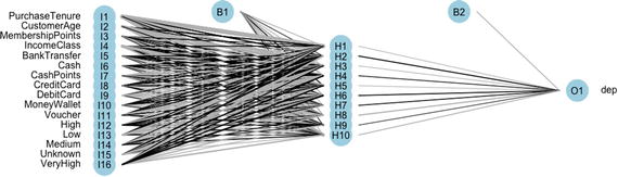
Figure 6-65. One hidden layer neural network
#get the neural weightsneuralweights(nn)$struct[1] 16 10 1$wts$wts$`hidden 1 1`[1] -1.7688041 -20.6924206 2.3683340 0.3254776 0.3755354[6] -0.4381737 -0.9342264 -0.4396708 0.2488121 -0.8040053[11] -0.2513980 1.1595037 -0.5800809 0.9427963 -0.5210107[16] -0.5680854 0.9942396$wts$`hidden 1 2`[1] 0.3785581 2.7997630 0.0419642 -1.8159788 -2.0329127 0.2695198[7] 0.3923006 -2.1276359 0.3242286 0.4522314 0.5254541 1.2197842[13] -0.1996586 2.2651791 0.4066352 3.6192206 -5.2330743$wts$`hidden 1 3`[1] -1.4357242 -12.9881898 -12.3360008 1.1062240 3.6054822[6] 1.5317392 0.6969328 -6.2048082 0.9177840 -0.1734451[11] 0.1648537 2.1053240 0.6816542 -2.9358718 -1.0474676[16] -0.4098642 1.5974077$wts$`hidden 1 4`[1] -5.30486658 2.93556841 -9.97245085 0.30268208 6.59471280[6] 1.95089306 0.69071825 0.31481250 -0.06330620 -1.00934374[11] 0.93998141 -9.14052075 -6.52385269 -1.32746226 -1.07514308[16] 0.06271666 3.52729817$wts$`hidden 1 5`[1] 2.24357572 -7.90629807 -2.19299184 0.78657421 -13.42029541[6] 1.35697587 0.76688140 -4.08706478 2.90349734 -0.59422438[11] 2.21698054 -0.08467332 1.68745126 -0.43716182 -0.34025868[16] -2.29645501 2.73500554$wts$`hidden 1 6`[1] -3.7195678 1.5885211 0.9809355 -0.8999143 -3.3623349 -1.6354780[7] -1.0924695 0.3577909 -0.4331445 -0.9332748 -0.6803754 1.4831636[13] 0.1024139 -5.6953417 0.8179687 -3.9350386 4.9241476$wts$`hidden 1 7`[1] -0.8225491 -4.8242434 -2.9266563 2.5035607 0.1378938 -0.3450762[7] -0.6713392 1.0763017 -0.2546451 -0.8533341 -0.5570266 -0.2484610[13] 1.3856182 -1.1600616 1.2339496 -1.2949715 -0.7762755$wts$`hidden 1 8`[1] -3.86805085 2.35232847 -2.48545877 -0.14794972 0.07481260[6] 0.70845847 0.38961887 -2.34134097 -2.32810205 -0.80392872[11] -0.08502893 -1.81432815 0.05929793 -0.19809056 -0.27217330[16] 0.47082670 -4.67137272$wts$`hidden 1 9`[1] 0.80066147 2.72835254 -6.01889627 -10.63057306 7.63526853[6] -1.85188181 -0.59883189 0.86011432 2.28279639 -0.80140313[11] -3.41439405 4.47209147 3.98812529 0.05217016 1.42120448[16] -2.87977768 -1.80152670$wts$`hidden 1 10`[1] -1.41326881 -16.86494495 -0.25563167 0.02405375 -5.82554392[6] 0.20502350 0.68081754 -4.30017547 0.24592770 0.94533019[11] 0.51276882 -0.10970560 1.52611041 1.41750276 2.40763017[16] -1.56584208 -5.13504576$wts$`out 1`[1] -2.0906131 -0.8660608 2.5900163 -0.9717815 1.1467203 -0.8147543[7] 2.3220405 1.7924673 -3.5013152 0.2313364 -2.3259027# Plot the importanceolden(nn)

Figure 6-66. Attribute importance by olden method
#variable importance by garson algorithm
garson(nn)
Figure 6-67. Attribute importance by Garson method
We showed how to create a neural network and test for its weight and prediction. R libraries have been expanding very fast in neural networks. It will be good for you to keep updated with the new tools being created by research community. Artificial Intelligence: A Modern Approach by Stuart Russell and Peter Norvig is a great book to dig deeper into artificial neural networks.
6.11.8 Deep Learning
We take a jump here from our generally used neural networks to very complex and large deep graphs, which can model high level abstraction in data. Deep learning consists of advanced algorithms having multiple layers, composed of multiple linear and non-linear transformations . Some scholars keep the deep learning algorithms in the bucket of machine learning methods based on learning representation of data, e.g., image, handwriting etc.
There are multiple deep learning architectures used in the field of computer vision, automatic speech recognition, NLP, audio recognition, and other complicated areas. This is true to taking machine learning close to artificial intelligence. Some of the well known deep learning architecture includes deep neural nets, convolution deep neural networks, deep belief, recurrent neural networks, and others. Lots of advancement in deep learning is coming from neuroscience, and researchers are bringing more advanced ways to represent data and create deep learning models to understand these representations.
Rina Dechter introduced first order deep learning and second order deep learning in her work titled, “Learning While Searching in Constraint-Satisfaction Problems,” 1986. University of California, Computer Science Department, Cognitive Systems Laboratory. Recently the definition of deep learning algorithms has been expanded to include algorithms that generally follow these guidelines :
Use many layers of nonlinear processing units for feature extraction and transformation
Are based on the (unsupervised) learning of multiple levels of features or representations of the data
Belong to the field of learning representations of data
Hierarchy of concepts; earning from multiple levels of representation corresponding to higher levels of abstraction
The architecture of deep neural networks is very complex. There can be multiple hidden layers and advanced methods of learning. In previous discussions of neural networks, we were focused on basic types of networks with only one hidden layer. In deep neural networks, the layers become many-fold and the network can process at a very high level of data abstraction.
In Figure 6-68, you can see the network has become very complicated and has multiple hidden layers. In general, adding more layers and neurons per layer increases the specialization of neural network to train data and decreases the performance on test data. This points out two issues with deep neural networks:

Figure 6-68. A multi-layer deep neural network
Specialization (overfitting): Too many layers of abstraction make the model learn the training data as if there were no or very little variation can happen to that. In these cases, the model does not return good results on testing data.
Computational cost: Adding layers and neurons costs a lot on computational resources, both time and memory. Because of this, deep neural networks are developed on clusters and large servers.
There are many popular architectures of neural network used in different applications ; here are some of them:
Convolutional neural networks: Used in pictures and other two dimensional data
Recurrent Neural Networks: Used for time series data as they can retain history (memory compressor)
Recursive Neural Networks: Used in natural language processing
Deep Belief Networks: Probabilistic and generative models, used for image and signal processing
There are lot of other architecture and learning algorithms. We will show a basic example a simple multi-layer neural network using darch package in R and will also show an example of image classification with the mxNet package .
Deep learning has been the focus of many researchers and machine learning professionals; however R is not yet developed enough tools to run various deep learning algorithms. Another reason for that is deep learning is so resource intensive that models can be trained only on large clusters and not on workstations.
There are few packages out there in R that can do deep learning (by the way a neural net with multiple hidden layers is also a deep learning framework):
H2O implements feed forward neural nets and auto encoders
DeepNet implements deep neural networks, deep belief networks, and restricted Boltzmann machines
mxNet implements complex deep nets for image classification using convolutional networks
darch implements deep neural nets and restricted Boltzmann machines
Here, we discuss two examples of deep learning using R.
darch for classification
Our first example is using a deep architecture to logistic model we discussed in our regression section. The dependent variable being choice and the independent variables being PurchaseTenure, CustomerAge, MemebershipPoints, IncomeClass, ModeOfPayment, and CustomerPropensity.
All the continuous variables are scaled and categorical variables converted into binary variables. For example, see the following pre- and post-transformation data matrix.
#Pre-transformationhead(Data_Purchase_Prediction[,c("choice","PurchaseTenure","CustomerAge","MembershipPoints","IncomeClass","ModeOfPayment","CustomerPropensity")])choice PurchaseTenure CustomerAge MembershipPoints IncomeClass1 999 4 55 6 42 0 4 75 2 73 999 10 34 4 54 0 6 26 2 45 999 3 38 6 76 0 3 71 6 4ModeOfPayment CustomerPropensity1 MoneyWallet Medium2 CreditCard VeryHigh3 MoneyWallet Unknown4 MoneyWallet Low5 MoneyWallet VeryHigh6 DebitCard High#Post-transformationhead(train)dep PurchaseTenure CustomerAge MembershipPoints IncomeClass210877 1 0.01176471 0.7017544 0.08333333 0.625233397 0 0.02352941 0.1578947 0.25000000 0.50053282 0 0.08235294 0.7192982 0.16666667 0.750176631 0 0.22352941 0.6315789 0.41666667 0.500219592 0 0.02352941 0.2807018 0.16666667 0.50040929 1 0.08235294 0.1929825 0.58333333 0.625BankTransfer Cash CashPoints CreditCard DebitCard MoneyWallet210877 0 0 0 0 1 0233397 0 0 0 0 1 053282 0 0 0 1 0 0176631 1 0 0 0 0 0219592 0 0 0 0 0 140929 0 0 0 0 0 1Voucher High Low Medium Unknown VeryHigh210877 0 0 0 0 1 0233397 0 0 0 1 0 053282 0 1 0 0 0 0176631 0 0 0 0 0 1219592 0 0 1 0 0 040929 0 0 0 0 0 1#We will us the same data as of previous example in neural networkdevtools::install_github("maddin79/darch")library(darch)library(mlbench)library(RANN)#Print the model formulaform#Apply the model using deep neural net with# deep_net <- darch(form, train,# preProc.params = list("method" = c("knnImpute")),# layers = c(0,10,30,10,0),# darch.batchSize = 1,# darch.returnBestModel.validationErrorFactor = 1,# darch.fineTuneFunction = "rpropagation",# darch.unitFunction = c("tanhUnit", "tanhUnit","tanhUnit","softmaxUnit"),# darch.numEpochs = 15,# bootstrap = T,# bootstrap.num = 500)deep_net <-darch(form,train,preProc.params =list(method =c("center", "scale")),layers =c(0,10,30,10,0),darch.unitFunction =c("sigmoidUnit", "tanhUnit","tanhUnit","softmaxUnit"),darch.fineTuneFunction ="minimizeClassifier",darch.numEpochs =15,cg.length =3, cg.switchLayers =5)#Plot the deep netlibrary(NeuralNetTools)plot(deep_net,"net")result <-darchTest(deep_net, newdata = test)resultA good reference for darch can be found in CRAN and can be read in this short article at http://static.saviola.de/publications/rueckert_2016.pdf .
mxNet image classification
We will show a popular example for already trained image classification model. The mxNet package comes with already trained Inception-Batch Norm Network model, which can predict the class of real-world image.
The pre-trained model is provided separately for you. Also, the mxNet is not available on CRAN, so install it using the following command. The following example has been recreated from the Git repository data from the mxnet project at https://github.com/dmlc/mxnet/tree/master/R-package and https://github.com/dahtah/imager .
install.packages("drat", repos="https://cran.rstudio.com")drat:::addRepo("dmlc")install.packages("mxnet")#Please refer https://github.com/dahtah/imagerinstall.packages("devtools")devtools::install_github("dahtah/imager")library(mxnet)#install imager for loading imageslibrary(imager)#load the pre-trained modelmodel <-mx.model.load("Inception/Inception_BN", iteration=39)#We also need to load in the mean image, which is used for preprocessing using mx.nd.load.mean.img =as.array(mx.nd.load("Inception/mean_224.nd")[["mean_img"]])#Load and plot the image: (Default parrot image)#im <- load.image(system.file("extdata/parrots.png", package="imager"))im <-load.image("Images/russia-volcano.jpg")plot(im)

Figure 6-69. A sample volcano picture for the image recognition exercise
Now we will change this image to be able to pass it into the model.
preproc.image <-function(im, mean.image) {# crop the imageshape <-dim(im)short.edge <-min(shape[1:2])xx <-floor((shape[1] -short.edge) /2)yy <-floor((shape[2] -short.edge) /2)cropped <-crop.borders(im, xx, yy)# resize to 224 x 224, needed by input of the model.resized <-resize(cropped, 224, 224)# convert to array (x, y, channel)arr <-as.array(resized) *255dim(arr) <-c(224, 224, 3)# subtract the meannormed <-arr -mean.img# Reshape to format needed by mxnet (width, height, channel, num)dim(normed) <-c(224, 224, 3, 1)return(normed)}#Now pass our image to pre-processnormed <-preproc.image(im, mean.img)plot(normed)

Figure 6-70. Normalized image
The next step is to classify the image .
prob <- predict(model, X=normed)#We can extract the top-5 class index.max.idx <- order(prob[,1], decreasing = TRUE)[1:5]max.idx[1] "981" "980" "971" "673" "985"synsets <-readLines("Inception/synset.txt")#And let us print the corresponding lines:print(paste0("Predicted Top-classes: ", synsets[as.numeric(max.idx)]))[1] "Predicted Top-classes: n09472597 volcano"[2] "Predicted Top-classes: n09468604 valley, vale"[3] "Predicted Top-classes: n09193705 alp"[4] "Predicted Top-classes: n03792972 mountain tent"[5] "Predicted Top-classes: n11879895 rapeseed"
You can see the deep learning algorithm has detected the volcano in the image. You can repeat this experiment with other images and see what images classification you get. Also note that you need to be updated with latest version on Git.
6.11.9 Conclusion
Neural networks are very powerful tools that can learn from any dataset without any assumptions on input data. Further, the new research in their architecture and learning methods has given rise to deep neural networks. This has enabled the whole field of deep learning in various fields, specifically the fields having high volume and high abstraction in data. Deep neural nets are making possible computer vision, speech recognition, gene matching, and other complex problems.
In the next section, we will delve into the world of unstructured data. You will see how some of the simple techniques could transform a completely unstructured textual data to matrix of numerical observations, which then could be used with many other algorithms for classification, clustering, and so on.
6.12 Text-Mining Approaches
In recent years, the text data has been increased to manifold. Particularly, the digitally generated or digitally stored text data has increased a lot. A big part of big data world is this text data is generated and stored in large volumes. Another important aspect of text data is that now the data can be generated by anybody and have implications on business.
For example, a bad product review can damage the market image of the product or a social media post about a social cause can create a campaign. In all these cases, text data plays a pivotal role of influencing behavior. In the 21st century, it becomes important for organizations to invest in text data and understand what insights it has on consumer behavior or product performance .
Brandwatch ( https://www.brandwatch.com/2016/05/44-twitter-stats-2016/ ) published data around Twitter statics ; let’s look at some of it.
Twitter has 310 million active users (each user is a source of text data)
83% of world leaders are on Twitter (leaders tweets are text data that influences markets, people, policies, and so on)
500 million tweets are sent daily (isn’t this big data?)
65.8% of U.S. companies with 100+ employees use Twitter for marketing (how can we use this data to manage and outshine in the marketing programs?)
80% of Twitter users have mentioned a brand in a tweet (doesn’t this compel us to look at the treasure of information hidden in text data?)
These statistics tell us that text data is important to analyze in today's world. Being massive in nature, we need advanced machine learning methods and enhanced natural language processing to harness the power of text data. Some statistics suggest 80% of the information we store today is in text format, signifying the commercial value of text mining.
Formally, text analysis involves information retrieval, lexical analysis to study word frequency distributions, tagging/annotation, information extraction, data mining techniques including link and association analysis, visualization, pattern recognition and predictive analytics. The end goal is to use unstructured data in text, and convert that into data for analysis by using powerful techniques of Natural Language Processing and other mathematical methods (e.g., frequency plots, Singular Value Decomposition, etc.).
In this section, we will introduce basic of text analytics using R. Toward the end of chapter, we will show an example of how to use Microsoft API to unlock powerful text mining tools that are currently not available in R.
6.12.1 Introduction to Text Mining
The explosion in amount of unstructured data has led to numerous use cases on text mining. The ability to process textual data really fast and convert it into a numeric feature matrix has opened up a plethora of machine learning algorithms to be used on such data. The field of Natural Language Processing (NLP) , though a vast field, could be thought of as a subfield of ML. In an alternative view, the text mining approaches help in turning text into data for analysis, via the application of NLP and analytical methods.
In the following section, we will go a little deeper into text mining concepts like text categorization, summarization, TF-IDF, Part of Speech (POS) tagging, and simple visualization using WordCloud .
We will use the Amazon Fine food reviews dataset for couple of text mining approaches.
Let’s start by looking at the data briefly and then choose a smaller subset for all the demonstrations
Data Summary
library(data.table)fine_food_data <-read.csv("Dataset/Food_Reviews.csv",stringsAsFactors =FALSE)fine_food_data$Score <-as.factor(fine_food_data$Score)str(fine_food_data[-10])'data.frame': 35173 obs. of 9 variables:$ Id : int 1 2 3 4 5 6 7 8 9 10 ...$ ProductId : chr "B001E4KFG0" "B00813GRG4" "B000LQOCH0" "B000UA0QIQ" ...$ UserId : chr "A3SGXH7AUHU8GW" "A1D87F6ZCVE5NK" "ABXLMWJIXXAIN" "A395BORC6FGVXV" ...$ ProfileName : chr "delmartian" "dll pa" "Natalia Corres "Natalia Corres"" "Karl" ...$ HelpfulnessNumerator : int 1 0 1 3 0 0 0 0 1 0 ...$ HelpfulnessDenominator: int 1 0 1 3 0 0 0 0 1 0 ...$ Score : Factor w/ 5 levels "1","2","3","4",..: 5 1 4 2 5 4 5 5 5 5 ...$ Time : int 1303862400 1346976000 1219017600 1307923200 1350777600 1342051200 1340150400 1336003200 1322006400 1351209600 ...$ Summary : chr "Good Quality Dog Food" "Not as Advertised" ""Delight" says it all" "Cough Medicine" ...# Last column - Customer review in free texthead(fine_food_data[,10],2)[1] "I have bought several of the Vitality canned dog food products and have found them all to be of good quality. The product looks more like a stew than processed meat and it smells better. My Labrador is finicky and she appreciates this product better than most."[2] "Product arrived labeled as Jumbo Salted Peanuts...the peanuts were actually small sized unsalted. Not sure if this was an error or if the vendor intended to represent the product as "Jumbo"."Data Preparation
library(caTools)# Randomly split data and use only 10% of the datasetset.seed(90)split =sample.split(fine_food_data$Score, SplitRatio =0.10)fine_food_data =subset(fine_food_data, split ==TRUE)select_col <-c("Id","HelpfulnessNumerator","HelpfulnessDenominator","Score","Summary","Text")fine_food_data_selected <-fine_food_data[,select_col]
6.12.2 Text Summarization
This applies the method of Gong & Liu (2001) for generic text summarization of text document D via latent semantic analysis:
Decompose the document D into individual sentences and use these sentences to form the candidate sentence set S and set k = 1.
Construct the terms by sentences matrix A for the document D.
Perform the SVD on A to obtain the singular value matrix, and the right singular vector matrix V^t. In the singular vector space, each sentence i is represented by the column vector.
Select the k'th right singular vector from matrix V^t.
Select the sentence that has the largest index value with the k'th right singular vector and include it in the summary.
If k reaches the predefined number, terminate the operation; otherwise, increment k by 1 and go back to Step 4.
(Cited directly from Gong & Liu, 2001, p. 21)[9]
Let’s see how good the summarization works here in our Amazon fine food review dataset. In order to compare our results, we will use the summary attribute in the dataset and do a qualitative assessment of the output.
Original Text
fine_food_data_selected[2,6][1] "McCann's Instant Oatmeal is great if you must have your oatmeal but can only scrape together two or three minutes to prepare it. There is no escaping the fact, however, that even the best instant oatmeal is nowhere near as good as even a store brand of oatmeal requiring stovetop preparation. Still, the McCann's is as good as it gets for instantoatmeal. It's even better than the organic, all-natural brands I have tried. All the varieties in the McCann's variety pack taste good. It can be prepared in the microwave or by adding boiling water so it is convenient in the extreme when time is an issue.<br /><br />McCann's use of actual cane sugar instead of high fructose corn syrup helped me decide to buy this product. Real sugar tastes better and is not as harmful as the other stuff. One thing I do not like, though, is McCann's use of thickeners. Oats plus water plus heat should make a creamy, tasty oatmeal without the need for guar gum. But this is a convenience product. Maybe the guar gum is why, after sitting in the bowl a while, the instant McCann's becomes too thick and gluey."
Summary generated by genericSummary
library(LSAfun)genericSummary(fine_food_data_selected[2,6],k=1)[1] " There is no escaping the fact, however, that even the best instant oatmeal is nowhere near as good as even a store brand of oatmeal requiring stovetop preparation."
Multiple summaries generated by genericSummary
library(LSAfun)genericSummary(fine_food_data_selected[2,6],k=2)[1] " There is no escaping the fact, however, that even the best instant oatmeal is nowhere near as good as even a store brand of oatmeal requiring stovetop preparation."
[2] " It can be prepared in the microwave or by adding boiling water so it is convenient in the extreme whentimeis an issue."
Summary from the dataset
fine_food_data_selected[2,5][1] "Best of the Instant Oatmeals"
Observe the striking similarity of context of the text and the summary generated by the function. Text summarization has many wide ranging application. Google uses it to display the most relevant piece of information while returning the query results from a given web page, a lot of NLP approaches deal with text summary rather than processing the large chuck of textual data, Facebook could build use cases to automatically summarize the user post(ensuring the anonymity) to target the right ads and many more such applications.
6.12.3 TF-IDF
Term Frequency/Inverse Term frequency (TF_IDF) is the frequency of words, which is key in terms of transforming the bag of words into numeric matrix, thus allowing for many ML algorithms to be applied to them.
Term frequency tf i,j counts the number of occurrences ni,j of a term ti in a document dj. In the case of normalization, the term frequency tf i,j is divided by ∑knk,j
 .
.Inverse document frequency idf i, for a term t_i is defined as

where |D| denotes the total number of documents and is the number of documents where the term t
i
appears.
is the number of documents where the term t
i
appears.Intuitively, if you see, I has two properties:
Certain terms that occur too frequently have little power in determining the reliance of a document. idf i weigh down the too frequently occurring word.
The terms that occurs just few times in a document has more relevance. idf i weigh up the less frequently occurring word.
For example, in a collection of document related to sport, the word “game” might be too frequent word, however any article with word “cricket” might show a high relevance to classify the article into a particular game.
Term frequency/inverse document frequency(TF-IDF) is the product of

Let’s create a tf-idf matrix from the bag-of-word approach in text mining. A tf-idf matrix is a numerical representation of a collection of documents (represented by row) and words contained in it (represented by columns).
library(tm)Warning: package 'tm' was built under R version 3.2.3Loading required package: NLPfine_food_data_corpus <-VCorpus(VectorSource(fine_food_data_selected$Text))#Standardize the text - Pre-Processingfine_food_data_text_dtm <-DocumentTermMatrix(fine_food_data_corpus, control =list(tolower =TRUE,removeNumbers =TRUE,stopwords =TRUE,removePunctuation =TRUE,stemming =TRUE))# save frequently-appearing terms( more than 500 times) to a character vectorfine_food_data_text_freq <-findFreqTerms(fine_food_data_text_dtm, 500)# create DTMs with only the frequent termsfine_food_data_text_dtm <-fine_food_data_text_dtm[ , fine_food_data_text_freq]tm::inspect(fine_food_data_text_dtm[1:5,1:10])<<DocumentTermMatrix (documents: 5, terms: 10)>>Non-/sparse entries: 8/42Sparsity : 84%Maximal term length: 6Weighting : term frequency (tf)TermsDocs also bag buy can coffee dog eat find flavor food1 1 0 0 0 0 0 0 0 0 02 0 0 1 2 0 0 0 0 0 03 0 0 0 0 2 0 0 0 0 04 0 0 0 0 0 0 1 1 0 05 0 0 0 0 0 0 0 1 2 0#Create a tf-idf matrixfine_food_data_tfidf <-weightTfIdf(fine_food_data_text_dtm, normalize =FALSE)tm::inspect(fine_food_data_tfidf[1:5,1:10])<<DocumentTermMatrix (documents: 5, terms: 10)>>Non-/sparse entries: 8/42Sparsity : 84%Maximal term length: 6Weighting : term frequency - inverse document frequency (tf-idf)TermsDocs also bag buy can coffee dog eat find flavor1 3.04583 0 0.000000 0.000000 0.00000 0 0.000000 0.000000 0.0000002 0.00000 0 2.635882 4.525741 0.00000 0 0.000000 0.000000 0.0000003 0.00000 0 0.000000 0.000000 5.82035 0 0.000000 0.000000 0.0000004 0.00000 0 0.000000 0.000000 0.00000 0 2.960361 2.992637 0.0000005 0.00000 0 0.000000 0.000000 0.00000 0 0.000000 2.992637 4.024711TermsDocs food1 02 03 04 05 0
6.12.4 Part-of-Speech (POS) Tagging
Parts of speech are useful features for finding named entities like people or organizations in a text and other information extraction tasks. This could help in classifying named entities in text into categories like persons, company, locations, expression of time, and so on. This is found in many applications in molecular biology, bioinformatics, and medical communities.
We will use the Amazon food review dataset to extract POS tags using R. Figure 6-71 shows the mappings of the abbreviations of the PoS produced by the R script to the part-of-speech (POS) in the English language.

Figure 6-71. Part-of-speech mapping
Pre-processing
library("NLP")library(tm)fine_food_data_corpus <-Corpus(VectorSource(fine_food_data_selected$Text[1:3]))fine_food_data_cleaned <-tm_map(fine_food_data_corpus, PlainTextDocument)#tolwerfine_food_data_cleaned <-tm_map(fine_food_data_cleaned, tolower)fine_food_data_cleaned[[1]][1] "twizzlers, strawberry my childhood favorite candy, made in lancaster pennsylvania by y & s candies, inc. one of the oldest confectionery firms in the united states, now a subsidiary of the hershey company, the company was established in 1845 as young and smylie, they also make apple licorice twists, green color and blue raspberry licorice twists, i like them all<br /><br />i keep it in a dry cool place because is not recommended it to put it in the fridge. according to the guinness book of records, the longest licorice twist ever made measured 1.200 feet (370 m) and weighted 100 pounds (45 kg) and was made by y & s candies, inc. this record-breaking twist became a guinness world record on july 19, 1998. this product is kosher! thank you"fine_food_data_cleaned <-tm_map(fine_food_data_cleaned, removeWords, stopwords("english"))fine_food_data_cleaned[[1]][1] "twizzlers, strawberry childhood favorite candy, made lancaster pennsylvania y & s candies, inc. one oldest confectionery firms united states, now subsidiary hershey company, company established 1845 young smylie, also make apple licorice twists, green color blue raspberry licorice twists, like <br /><br /> keep dry cool place recommended put fridge. according guinness book records, longest licorice twist ever made measured 1.200 feet (370 m) weighted 100 pounds (45 kg) made y & s candies, inc. record-breaking twist became guinness world record july 19, 1998. product kosher! thank "fine_food_data_cleaned <-tm_map(fine_food_data_cleaned, removePunctuation)fine_food_data_cleaned[[1]][1] "twizzlers strawberry childhood favorite candy made lancaster pennsylvania y s candies inc one oldest confectionery firms united states now subsidiary hershey company company established 1845 young smylie also make apple licorice twists green color blue raspberry licorice twists like br br keep dry cool place recommended put fridge according guinness book records longest licorice twist ever made measured 1200 feet 370 m weighted 100 pounds 45 kg made y s candies inc recordbreaking twist became guinness world record july 19 1998 product kosher thank "fine_food_data_cleaned <-tm_map(fine_food_data_cleaned, removeNumbers)fine_food_data_cleaned[[1]][1] "twizzlers strawberry childhood favorite candy made lancaster pennsylvania y s candies inc one oldest confectionery firms united states now subsidiary hershey company company established young smylie also make apple licorice twists green color blue raspberry licorice twists like br br keep dry cool place recommended put fridge according guinness book records longest licorice twist ever made measured feet m weighted pounds kg made y s candies inc recordbreaking twist became guinness world record july product kosher thank "fine_food_data_cleaned <-tm_map(fine_food_data_cleaned, stripWhitespace)fine_food_data_cleaned[[1]][1] "twizzlers strawberry childhood favorite candy made lancaster pennsylvania y s candies inc one oldest confectionery firms united states now subsidiary hershey company company established young smylie also make apple licorice twists green color blue raspberry licorice twists like br br keep dry cool place recommended put fridge according guinness book records longest licorice twist ever made measured feet m weighted pounds kg made y s candies inc recordbreaking twist became guinness world record july product kosher thank "PoSextraction
library(openNLP)Warning: package 'openNLP' was built under R version 3.2.3library(NLP)fine_food_data_string <-NLP::as.String(fine_food_data_cleaned[[1]])sent_token_annotator <-Maxent_Sent_Token_Annotator()word_token_annotator <-Maxent_Word_Token_Annotator()fine_food_data_string_an <-annotate(fine_food_data_string, list(sent_token_annotator, word_token_annotator))pos_tag_annotator <-Maxent_POS_Tag_Annotator()fine_food_data_string_an2 <-annotate(fine_food_data_string, pos_tag_annotator, fine_food_data_string_an)Variant with POS tag probabilities as (additional) features.head(annotate(fine_food_data_string, Maxent_POS_Tag_Annotator(probs =TRUE), fine_food_data_string_an2))id type start end features1 sentence 1 524 constituents=<<integer,77>>2 word 1 9 POS=NNS, POS=NNS, POS_prob=0.78222683 word 11 20 POS=VBP, POS=VBP, POS_prob=0.34884254 word 22 30 POS=NN, POS=NN, POS_prob=0.80559085 word 32 39 POS=JJ, POS=JJ, POS_prob=0.61142386 word 41 45 POS=NN, POS=NN, POS_prob=0.9833723Determine the distribution of POS tags for word tokens.fine_food_data_string_an2w <-subset(fine_food_data_string_an2, type == "word")tags <-sapply(fine_food_data_string_an2w$features, `[[`, "POS")table(tags)tags, CC CD IN JJ JJS NN NNS RB VB VBD VBG VBN VBP VBZ1 2 1 1 10 2 28 9 5 1 6 2 4 2 3plot(table(tags), type ="h", xlab="Part-Of_Speech", ylab ="Frequency")
Figure 6-72. Part of speech frequency
Extract token/POS pairs (all of them)head(sprintf("%s/%s", fine_food_data_string[fine_food_data_string_an2w], tags),15)[1] "twizzlers/NNS" "strawberry/VBP" "childhood/NN"[4] "favorite/JJ" "candy/NN" "made/VBD"[7] "lancaster/NN" "pennsylvania/NN" "y/RB"[10] "s/VBZ" "candies/NNS" "inc/CC"[13] "one/CD" "oldest/JJS" "confectionery/NN"
Noun (NN) seems to be the frequently used part-of-speech, followed by Adjectives (JJ) in this data. It makes a lot of intuitive sense, since in review related data, people talk about restaurants and food and their characteristics like “good,” “bad,” “awesome,” and so on. Such POS identification could help in better understanding the reviews than reading the entire textual information.
6.12.5 Word Cloud
The word cloud helps in visualizing the words most frequently being used in the reviews:
library(SnowballC)library(wordcloud)fine_food_data_corpus <-VCorpus(VectorSource(fine_food_data_selected$Text))fine_food_data_text_tdm <-TermDocumentMatrix(fine_food_data_corpus, control =list(tolower =TRUE,removeNumbers =TRUE,stopwords =TRUE,removePunctuation =TRUE,stemming =TRUE))wc_tdm <- rollup(fine_food_data_text_tdm,2,na.rm=TRUE,FUN=sum)matrix_c <-as.matrix(wc_tdm)wc_freq <-sort(rowSums(matrix_c))wc_tmdata <-data.frame(words=names(wc_freq), wc_freq)wc_tmdata <-na.omit(wc_tmdata)wordcloud (tail(wc_tmdata$words,100), tail(wc_tmdata$wc_freq,100), random.order=FALSE, colors=brewer.pal(8, "Dark2"))

Figure 6-73. Word cloud using Amazon Food Review dataset
WordCloud is a simple exploratory tool to understand the general trend in the word usage, which could further help in building intuitions and insights.
6.12.6 Text Analysis: Microsoft Cognitive Services
In this section, we will introduce you to the powerful world of text analytics by using a third-party API called from within R. We will be using Microsoft Cognitive Services API to show some real-time analysis of text from the Twitter feed of a news agency.
Note
Microsoft Cognitive Services are chosen to show some real-world examples of text analytics. We do not endorse any third-party tool or services.
Microsoft Cognitive Services is a machine intelligence service from Microsoft. It was previously known as Project Oxford . This service provide a cloud-based APIs for developers to do lot of high-end functions like face recognition, speech recognition, text mining, video feed analysis, and many others. We will be using their free developer service to show some text analytics features , which will include the following;
Sentiment analysis: What is the sentiment of tweet? Is it positive or negative or neutral?
Topic detection: What the topic of discussion is a document?
Language detection: Can you just provide something written and it shows you which language it is?
Summarization: Can we automatically summarize a big document to make it manageable to read?
We will be using Twitter feeds for sentiment analysis and topic detection, some random text from a language for language detection, and an article to summarize it.
To start with this example, we need to set up an account with Microsoft cognitive service, and get an API key to work with their REST API. The key can be obtained by registering at https://www.microsoft.com/cognitive-services/ .
You will also need a Twitter developer account to set up application in R to extract tweets. You can get a Twitter API key from registering at https://apps.twitter.com/ .
First we will set up the TwitterR package by using API Key we got from the Twitter apps. The twitterR() package provides an interface to the Twitter web API.
library("stringr")library("dplyr")library("twitteR")#getTwitterOAuth(consumer_key, consumer_secret)consumerKey <- "INSERT KEY"consumerSecret <- "INSERT SECRET CODE"#Below two tokens need to be used when you want to pull tweets from your own accountaccessToken <- "INSERT ACCESS TOKEN”accessTokenSecret <- "INSERT SECRET CODE"setup_twitter_oauth(consumerKey, consumerSecret,accessToken,accessTokenSecret)[1] "Using direct authentication"kIgnoreTweet <- "update:|nobot:"GetTweets <-function(handle, n =1000) {timeline <-userTimeline(handle, n = n)tweets <-sapply(timeline, function(x) {c(x$getText(), x$getCreated())})tweets <-data.frame(t(tweets))names(tweets) <-c("text.orig", "created.orig")tweets$text <-tolower(tweets$text.orig)tweets$created <-as.POSIXct(as.numeric(as.vector(tweets$created.orig)), origin="1970-01-01")arrange(tweets, created)}handle <- "@TimesNow"tweets <-GetTweets(handle, 100)#Store the tweets as used in the book for future reproducibilitywrite.csv(tweets,"Dataset/Twitter Feed From TimesNow.csv",row.names =FALSE)tweets[1:5,]text.orig1 Procedures for this are at DGMO level which have been activated: Def Min Parrikar on soldier who inadvertently cros<U+0085> https://t.co/dUx77VDXGj4 IN PICS: Union Minister Venkaiah Naidu pays tribute to Mahatma Gandhi #GandhiJayanti https://t.co/7gbSV4hHTN5 IN PICS: Union Minister Venkaiah Naidu flags off the 'Swachhta Rally' from India Gate, Delhi https://t.co/X0w0xJRoSGcreated.orig1 14753794872 14753801983 14753808034 14753809225 1475381398
Now we have set up our Twitter account to pull feeds to our system. Now similarly let's set up a Microsoft cognitive services account. The package used for calling Microsoft services is mscstexta4r. The R Client for the Microsoft Cognitive Services Text Analytics REST API, including Sentiment Analysis, Topic Detection, Language Detection, and Key Phrase Extraction. An account must be registered at the Microsoft Cognitive Services web site https://www.microsoft.com/cognitive-services/ in order to obtain a (free) API key. Without an API key, this package will not work properly.
#install.packages("mscstexta4r")library(mscstexta4r)Warning: package 'mscstexta4r' was built under R version 3.2.5#Put the authentication APi keys you got from MicrosoftSys.setenv(MSCS_TEXTANALYTICS_URL ="https://westus.api.cognitive.microsoft.com/text/analytics/v2.0/")Sys.setenv(MSCS_TEXTANALYTICS_KEY ="YOUR KEY")#Initialize the servicetextaInit()
Now one more input we need is a news article to show summarization. We are using this article: http://www.yourarticlelibrary.com/essay/essay-on-india-after-independence/41354/ .
# Load Packagesrequire(tm)require(NLP)require(openNLP)#Read the Forbes article into R environmenty <-paste(scan("Dataset/india_after_independence.txt", what="character", sep=" "),collapse=" ")convert_text_to_sentences <-function(text, lang ="en") {# Function to compute sentence annotations using the Apache OpenNLP Maxent sentence detector employing the default model for language 'en'.sentence_token_annotator <-Maxent_Sent_Token_Annotator(language = lang)# Convert text to class String from package NLPtext <-as.String(text)# Sentence boundaries in textsentence.boundaries <-annotate(text, sentence_token_annotator)# Extract sentencessentences <-text[sentence.boundaries]# return sentencesreturn(sentences)}# Convert the text into sentencesarticle_text =convert_text_to_sentences(y, lang ="en")
Now that we have all the inputs ready, we will show the four major analytics items as listed previously in our sample data.
Sentiment Analysis
Sentiment analysis will tell us what kind of emotions the tweets are carrying. The Microsoft API returns a value between 0 and 1, where 1 means highly positive sentiment while 0 means highly negative sentiment.
document_lang <-rep("en", length(tweets$text))tryCatch({# Perform sentiment analysisoutput_1 <-textaSentiment(documents = tweets$text, # Input sentences or documentslanguages = document_lang# "en"(English, default)|"es"(Spanish)|"fr"(French)|"pt"(Portuguese))}, error = function(err) {# Print errorgeterrmessage()})merged <-output_1$results#Order the tweets with sentiment scoreordered_tweets <-merged[order(merged$score),]#Top 5 negative tweetsordered_tweets[1:5,]text7 pakistan has been completely cornered: shrikant sharma https://t.co/ujdux8z3er99 hillary clinton says wave of shootings show need to protect children (pti) https://t.co/hptj0v8eja6 southern california on heightened alert until tuesday following increased possibility of major earthquake:guv's office of emergency services10 china yet again blocks india's bid at the un to ban jaish-e-mohammad chief masood azhar by putting a technical hold https://t.co/yzomd77htr100 #update #baramulla terror attack- 1 bsf jawan martyred, 1 jawan injured: reportsscore7 0.144005899 0.17524406 0.177073110 0.1947241100 0.2508526#Top 5 Positiveordered_tweets[95:100,]text73 the artists<U+0092> practice,the curator<U+0092>s vision,the commerce of the auction house,the best of the indian art world on<U+0085> https://t.co/gbxzgzydzt37 the artists<U+0092> practice,the curator<U+0092>s vision,the commerce of the auction house,the best of the indian art world on<U+0085> https://t.co/tqx07ytmku43 prime minister narendra modi extends new year greetings to jewish community around the world https://t.co/xzpoqq4npd54 china provides pak terror shield, stalls masood azhar<U+0092>s entry to terror list. #chinatopakrescue tune in,join special broadcast on @timesnow90 founder of sulabh international bindeshwar pathak presents a book 'mahatma gandhi's life in colour' to pm modi https://t.co/r1zsqwt93r9 2nd test, day 3: new zealand all out for 204 in 1st innings, india lead by 112 runs #indvsnzscore73 0.946826037 0.948461243 0.957920754 0.973905990 0.97599679 0.9879231The sentiment analyzer has worked really well on the latest 100 tweets from the @TimesNow handle. You can do multiple things with this same application, for instance measure how many positive news and negative news ran on the leading news channel. This can give you a glimpse of general sentiment in the country.
Topic detection
For topic detection, let’s try to see what @CNN official Twitter handle talked about in their last 100 tweets. The topic detection algorithm will try to read last 100 tweets as if it were a conversation and will bring the topic discussed in those transcripts (or tweets).
handle <- "@CNN"topic_text <-GetTweets(handle, 150)write.csv(topic_text,"Dataset/Twitter Feed from CNN.csv",row.names=FALSE)tryCatch({# Detect top topics in group of documentsoutput_2 <-textaDetectTopics(topic_text$text, # At least 100 documents (English only)stopWords =NULL, # Stop word list (optional)topicsToExclude =NULL, # Topics to exclude (optional)minDocumentsPerWord =NULL, # Threshold to exclude rare topics (optional)maxDocumentsPerWord =NULL, # Threshold to exclude ubiquitous topics (optional)resultsPollInterval = 30L, # Poll interval (in s, default: 30s, use 0L for async)resultsTimeout = 1200L, # Give up timeout (in s, default: 1200s = 20mn)verbose =FALSE# If set to TRUE, print every poll status to stdout)}, error = function(err) {# Print errorgeterrmessage()})output_2textatopics [https://westus.api.cognitive.microsoft.com/text/analytics/v2.0/topics?]status: SucceededoperationId: 726edfccabdd4acb87a90716d7165343operationType: topicstopics (first 20):-----------------------------keyPhrase score--------------------- -------clinton 17trump 15donald trump 10water 8rudy giuliani 8hillary clinton 7president 5trump tax 4reporter 4water monitor lizards 4famous parks 4beer corpse 4iconic talking bear 4teddy ruxpin 4daymond john 3police officer 3president obama 3bernie sanders 3defend trump 3tax 3-----------------------------The topic detection in tweets list tells us that the CNN news channel was stalking about U.S. presidential candidates Donald Trump and Hillary Clinton . It also talks about school and students.
Language detection
Digital content nowadays is getting created in multiple languages. To broaden the scope of text mining, we need to automatically identify written languages and create collective senses out of them. Language detection methods helps us with identifying and translating languages. Here, I am creating five messages in five different language using Google translator. You can create your own examples.
<FONT ISSUE>#1-ARABIC, 2-POTUGESE, 3- ENGLISH , 4- CHINESE AND 5 - HINDIlang_detect<-c("أنا Ø1الÙ... البيانات","Eu sou um cientista de dados","I am a data scientist","我是丕个科å¦å®¶çš„数据","मैं कक डेटा à¤μैजॕकानिक à¤1ूक")
Figure 6-74. Language detection input
tryCatch({# Detect top topics in group of documents# Detect languages used in documentsoutput_3 <-textaDetectLanguages(lang_detect, # Input sentences or documentsnumberOfLanguagesToDetect = 1L # Default: 1L)}, error = function(err) {# Print errorgeterrmessage()})output_3texta [https://westus.api.cognitive.microsoft.com/text/analytics/v2.0/languages?numberOfLanguagesToDetect=1]
Figure 6-75. Language detection output
Microsoft has been able to detect all the language correctly. This service is very powerful when we know content about the same topic gets created in different languages and how to bring them into the same platform.
Summarization
For summarization we will use the article we loaded from the web site. The algorithm will try to contextually mine the document sentence by sentence and then will create an ordered list of sentences from the document that summarizes them.
article_lang <-rep("en", length(article_text))tryCatch({# Get key talking points in documentsoutput_4 <-textaKeyPhrases(documents = article_text, # Input sentences or documentslanguages = article_lang# "en"(English, default)|"de"(German)|"es"(Spanish)|"fr"(French)|"ja"(Japanese))}, error = function(err) {# Print errorgeterrmessage()})#Print the top 5 summaryoutput_4$results[1:5,1][1] "While some have a high opinion of Indiaâ<U+0080><U+0099>s growth story since its independence, some others think the countryâ<U+0080><U+0099>s performance in the six decades has been abysmal."[2] "Itâ<U+0080><U+0099>s arguably true that the Five-Year Plans did target specific sectors in order to quicken the pace of development, yet the outcome hasnâ<U+0080><U+0099>t been on expected lines."[3] "And, the country is taking its own sweet time to catch up with the developed world."[4] "All efforts are frustrated by lopsided strategies and inept implementation of policies."[5] "India is the worldâ<U+0080><U+0099>s largest democracy."
The summarization states that the article talks about India and its way toward development. It also emphasizes the democracy in India.
In this chapter, we say how powerful the text analytics is for monitoring human behavior. We learned the basics in R and learned to use powerful APIs. You can explore more in the field of NLP.
6.12.7 Conclusion
We saw an opportunity to convert poorly structured set of character streams and batches of data into a meaningful set of information using text mining based preprocessing and NLP algorithm-based model building. Though text mining is most appropriately placed under Natural Language Processing (NLP) , which itself is considered a subfield of machine learning. The algorithms used for text summarization, part-of-speech tagging, uses statistical techniques heavily.
We now move into the final topic of the chapter, where we will discuss the most contemporary ideas of making machine learning algorithms more suitable to work on streams of data, other words, algorithms that could learn from the continuous streams of data as they comes into the system instead of using a batch of training data.
6.13 Online Machine Learning Algorithms
In many practical machine learning models, adapting to the changing data in the real world is a critical requirement. There are two possibilities for tackling such changing needs:
Manually update the model frequently in a periodic manner (maybe once in a week, month or year) depending on how fast and how many changes take place in the business where the model is deployed once. Such as with medical diagnostics for cancer prediction. As you would expect, the type of cancer is not evolving very quickly with time. So, such a model could remain for a long time, even if there are no updates. However, when some new data from a cancer patient comes in, it’s possible to manually update the model and deploy it back into the system.
Update the model in real-time as the data is flowing in the system. For example, if Google completely moves to a machine learning model-based search engine, then the currently used heuristic algorithm, it might adapt on the go with search queries coming from the users. Figure 6-76 shows the process of online updates as the new data stream arrives into the system.

Figure 6-76. Online machine learning algorithms (Source: http://www.doyensahoo.com/introduction.html )
Figure 6-76 shows how the predictor takes the continuous input data stream and learns from it and the feedback update happens to the learning model.
There are many benefits and challenges that come with such online real-time-based learning methods, notably:
Efficient and space optimized: Since there is no need to pass a large amount of data as a batch to the learning model, we could train the model with one observation as a time and update the model. This brings speed of model training and optimized storage. Discard the data if it doesn't improve the model performance.
Difficult to create a pipeline: Creating such an online learning data pipeline is a challenging task. In one hand, if the volume and velocity of data is high, training the model could become a bottleneck. However, if the model pipeline is controlled, a lot of storage would be required.
Model evaluation is hard: Unlike the batch processing where we had a controlled training and testing dataset, wherein testing data could be used to evaluate the model, here with the online data, it’s not possible. At any given instance we don't know if the model has seen enough different types of observations to be able to truly perform as per the expectation.
Even with many such challenges, online machine Learning is an emerging research as more and more systems are becoming real-time consumers of data and speed of adaptability is a top priority. We will use the House Worth dataset and apply the online update method of Unsupervised Fuzzy Competitive Learning . Although a detailed discussion of this topic is beyond the scope of this book, we will demonstrate with the help of an example of how well this method works for clustering problems. This method works by performing an update directly after each input signal (i.e., for each single observation).
6.13.1 Fuzzy C-Means Clustering
This is the fuzzy version of the known k-means clustering algorithm as well as an online variant (Unsupervised Fuzzy Competitive learning). We will use the package e1071 in R, which has an implementation of the algorithm in a function named cmeans.
As the R documentation on the topic describes, the data given by x is clustered by generalized versions of the fuzzy c-means algorithm, which use either a fixed-point or an online heuristic for minimizing the objective function.
 where
where
wi is weight of the observation i
uij is the membership of observation i in cluster j
dij is the distance between observation i and center of cluster j
Data preparation
library(ggplot2)Warning: package 'ggplot2' was built under R version 3.2.5library(e1071)Warning: package 'e1071' was built under R version 3.2.5Data_House_Worth <-read.csv("Dataset/House Worth Data.csv",header=TRUE);str(Data_House_Worth)'data.frame': 316 obs. of 5 variables:$ HousePrice : int 138800 155000 152000 160000 226000 275000 215000 392000 325000 151000 ...$ StoreArea : num 29.9 44 46.2 46.2 48.7 56.4 47.1 56.7 84 49.2 ...$ BasementArea : int 75 504 493 510 445 1148 380 945 1572 506 ...$ LawnArea : num 11.22 9.69 10.19 6.82 10.92 ...$ HouseNetWorth: Factor w/ 3 levels "High","Low","Medium": 2 3 3 3 3 1 3 1 1 3 ...#remove the extra column that are not required for the modelData_House_Worth$BasementArea <-NULLFuzzy c-meanclustering
Observe that we are passing the value ucfl to the parameter method, which does an online update of model using Unsupervised Fuzzy Competitive Learning (UCFL).
online_cmean <-cmeans(Data_House_Worth[,2:3],3,20,verbose=TRUE,method="ufcl",m=2)Iteration: 1, Error: 465.1579393478Iteration: 2, Error: 444.0414997086Iteration: 3, Error: 424.6549206588Iteration: 4, Error: 406.6721061449Iteration: 5, Error: 389.8788008700Iteration: 6, Error: 374.1842570779Iteration: 7, Error: 359.5913592120Iteration: 8, Error: 346.1483860876Iteration: 9, Error: 333.9078002276Iteration: 10, Error: 322.9024279730Iteration: 11, Error: 313.1374056984Iteration: 12, Error: 304.5921263137Iteration: 13, Error: 297.2268898905Iteration: 14, Error: 290.9907447391Iteration: 15, Error: 285.8286344099Iteration: 16, Error: 281.6870892396Iteration: 17, Error: 278.5183573747Iteration: 18, Error: 276.2831875877Iteration: 19, Error: 274.9525794936Iteration: 20, Error: 274.5088021136print(online_cmean)Fuzzy c-means clustering with 3 clustersCluster centers:StoreArea LawnArea1 21.44992 9.5844152 43.59627 9.9160903 11.04677 11.214669Memberships:1 2 3[1,] 0.6250584893 2.446492e-01 1.302923e-01[2,] 0.0004209086 9.993824e-01 1.966837e-04[3,] 0.0110012372 9.835467e-01 5.452043e-03[4,] 0.0254099375 9.620333e-01 1.255677e-02[5,] 0.0344305970 9.474942e-01 1.807525e-02Closest hard clustering:[1] 1 2 2 2 2 2 2 2 2 2 1 2 3 1 2 3 3 2 2 1 1 2 2 2 1 2 2 1 2 1 3 2 2 2 2[36] 2 2 2 1 1 2 1 2 1 2 1 3 2 2 2 1 1 1 2 1 2 2 2 2 2 3 2 2 1 2 2 2 1 2 1[71] 2 1 1 2 1 3 2 2 2 1 2 2 2 2 2 2 2 2 2 1 3 2 1 2 2 1 1 2 2 2 1 2 2 2 2[106] 1 2 2 2 2 2 1 2 2 1 1 2 1 3 2 2 1 2 2 1 2 1 1 2 2 1 2 2 2 1 2 2 1 2 2[141] 2 2 2 2 2 1 1 1 2 2 1 1 1 2 2 2 3 2 2 1 2 2 1 1 2 2 1 1 1 2 1 1 2 3 1[176] 2 2 2 2 2 1 2 2 2 2 2 2 1 1 1 1 2 2 2 2 1 2 1 1 2 2 2 2 2 2 2 2 2 2 1[211] 2 2 3 1 3 2 1 1 2 1 2 1 3 2 1 2 1 2 1 1 2 1 1 2 2 2 2 2 1 2 2 1 1 1 1[246] 2 2 2 2 2 2 2 3 2 2 3 3 2 1 2 1 2 2 2 2 1 1 1 2 2 2 2 2 2 2 2 2 1 2 1[281] 1 1 2 1 2 2 1 1 2 1 2 1 2 2 1 1 2 1 2 2 1 3 2 2 2 2 2 2 2 1 2 2 2 2 2[316] 3Available components:[1] "centers" "size" "cluster" "membership" "iter"[6] "withinerror" "call"Visual evaluation of cluster accuracy
The plot shows the overlap of cluster formed by online fuzzy c-means algorithm and the classification variable we created manually. The plot has a near perfect overlap, which indicates a good cluster.
ggplot(Data_House_Worth, aes(StoreArea, LawnArea, color = HouseNetWorth)) +geom_point(alpha =0.4, size =3.5) +geom_point(col = online_cmean$cluster) +scale_color_manual(values =c('black', 'red', 'green'))
The plot in Figure 6-77 shows that the clusters substantially overlap on our prior classification. This is fair evidence of the power of online machine learning.

Figure 6-77. Cluster plot with fuzzy C-means clustering
6.13.2 Conclusion
In today’s fast world the time to decision is more important than the quality of decision. Partly it’s driven by the competitive landscape and partly due to cost of delay. Online machine learning tools and techniques are bound to rise in the machine learning world in the coming days. Our industry and researchers have to work together to create elegant algorithms as well as hardware/software that can implement those algorithms with high volume and high velocity of data flow.
6.14 Model Building Checklist
Before the chapter ends, we have complied a checklist of questions that you need to address before taking up any project in machine learning. Whenever it comes to choosing a ML algorithm or deciding to use ML on a new problem, an assessment of the available data is the most important part in the entire process. Ask this broad checklist of questions before proceeding any further:
What is that you want to achieve in this problem? Is the goal to predict, estimate a value, find patterns, or just explore ?
What are the types of each variable in the dataset? Is it all numeric, categorical, or mixed?
Have you identified the response (output) and predictor (input) variables?
Are there many missing values and outliers in the data?
How would you solve the problem if let’s say, ML algorithms are not to be used. Is it possible to explore the data using simple statistics and visualization to arrive at the answers to the problem without ML?
Does the boxplot, histogram, or scatter plot show any interesting insights in the data?
Did you find the standard deviation, quartile, mean, and correlation measures for all numerical variables? Does it show anything interesting?
How large is your dataset? Does your problem require the complete data to be used or is a small sample good enough?
Are there enough computational resources (RAM, storage, and CPU) to run any ML algorithm?
Do you think that the current data might soon become old and the ML model might require an update soon after it’s built?
Are there any plans to build a data product out of the final ML model?
This checklist might sound a little too big and random; however, if you figure out the answers to these questions before you jump into building a ML model, you will potentially have a savings of 40%-60% of your time.
6.15 Summary
A field like machine learning is vast because of the application it has found over the year in many academic disciplines and industries. The years of advancement in tools and technology has taken machine leaning a step closer to even the naïve user without much statistical background. This has given rise to the practical applicability of the methods found in machine learning and development of many ML-centric products and design. We are living in exciting times to be in the field of machine learning, which offers endless opportunities. Experts who are machine learning literates are high in demand in many industries. The time is not far away when machine learning will form the core of every industry and product, where it’s not just coding the software with some set of logical statements but infusing a learning algorithm within which it adapts to the changing needs.
6.16 References
Semi - Supervised Learning. MIT Press, Cambridge, MA, by Chapelle, O. et. al.
Artificial Intelligence: A Modern Approach by Stuart Russell and Peter Norvig.
C4.5: Programs for Machine Learning, J. Ross Quinlan.
Experiments in Induction, Hunt et. al.
G. V. Kass (1980). “An Exploratory Technique for Investigating Large Quantities of Categorical Data,” Applied Statistics, 29(2), 119-127.
K-Means Clustering Algorithm, by Hartigan et. al
J. Dunn, “Well Separated Clusters and Optimal Fuzzy Partitions,” Journal of Cybernetics.
Rand, W. M. (1971). “Objective criteria for the evaluation of clustering methods”. Journal of the American Statistical Association. American Statistical Association. 66 (336): 846–850. doi:10.2307/2284239. JSTOR 2284239.
Gong & Liu (2001), “Generic Text Summarization Using Relevance Measure and Latent Semantic Analysis.”
Mohammed J. Zaki, Srinivasan Parthasarathy, Mitsunori Ogihara, and Wei Li. (1997), “New Algorithms for Fast Discovery of Association Rules.” Technical Report 651, Computer Science Department, University of Rochester, Rochester, NY 14627.
Christian Borgelt (2003), “Efficient Implementations of Apriori and Eclat,” Workshop of Frequent Item Set Mining Implementations, (FIMI 2003, Melbourne, FL, USA).
Warren McCulloch and Walter Pitts’ (1943) paper on “A Logical Calculus of Ideas Immanent in Nervous Activity”.