
9
VISUALIZING MALWARE TRENDS

Sometimes the best way to analyze malware collections is to visualize them. Visualizing security data allows us to quickly recognize trends in malware and within the threat landscape at large. These visualizations are often far more intuitive than nonvisual statistics, and they can help communicate insights to diverse audiences. For example, in this chapter, you see how visualization can help us identify the types of malware prevalent in a dataset, the trends within malware datasets (the emergence of ransomware as a trend in 2016, for example), and the relative efficacy of commercial antivirus systems at detecting malware.
Working through these examples, you come away understanding how to create your own visualizations that can lead to valuable insights by using the Python data analysis package pandas, as well as the Python data visualization packages seaborn and matplotlib. The pandas package is used mostly for loading and manipulating data and doesn’t have much to do with data visualization itself, but it’s very useful for preparing data for visualization.
Why Visualizing Malware Data Is Important
To see how visualizing malware data can be helpful, let’s go through two examples. The first visualization addresses the following question: is the antivirus industry’s ability to detect ransomware improving? The second visualization asks which malware types have trended over the period of a year. Let’s look at the first example shown in Figure 9-1.
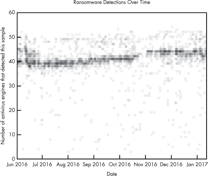
Figure 9-1: Visualization of ransomware detections over time
I created this ransomware visualization using data collected from thousands of ransomware malware samples. This data contains the results of running 57 separate antivirus engines against each file. Each circle represents a malware sample. The y-axis represents how many detections, or positives, each malware sample received from the antivirus engines when it was scanned. Keep in mind that while this y-axis stops at 60, the maximum count for a given scan is 57, the total number of scanners. The x-axis represents when each malware sample was first seen on the malware analysis site VirusTotal.com and scanned.
In this plot, we can see the antivirus community’s ability to detect these malicious files started off relatively strong in June 2016, dipped around July 2016, and then steadily rose over the rest of the year. By the end of 2016, ransomware files were still missed by an average of about 25 percent of antivirus engines, so we can conclude that the security community remained somewhat weak at detecting these files during this time.
To extend this investigation, you could create a visualization that shows which antivirus engines are detecting ransomware and at what rate, and how they are improving over time. Or you could look at some other category of malware (for example, Trojan horses). Such plots are useful in deciding which antivirus engines to purchase, or deciding which kinds of malware you might want to design custom detection solutions for—perhaps to supplement a commercial antivirus detection system (for more on building custom detection systems, see Chapter 8).
Now let’s look at Figure 9-2, which is another sample visualization, created using the same dataset used for Figure 9-1.
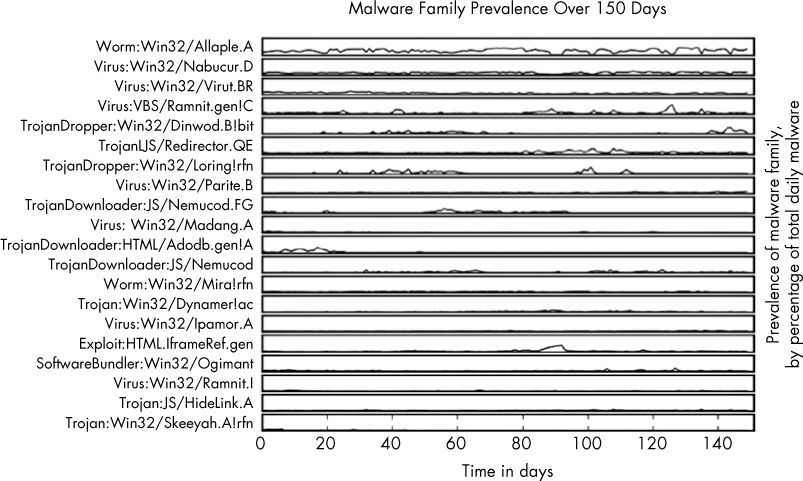
Figure 9-2: Visualization of per-family malware detections over time
Figure 9-2 shows the top 20 most common malware families and how frequently they occurred relative to one another over a 150-day period. The plot reveals some key insights: whereas the most popular malware family, Allaple.A, occurred consistently over the 150-day span, other malware families, like Nemucod.FG, were prevalent for shorter spans of time and then went silent. A plot like this, generated using malware detected on your own workplace’s network, can reveal helpful trends showing what types of malware are involved in attacks against your organization over time. Without the creation of a comparison figure such as this one, understanding and comparing the relative peaks and volumes of these malware types over time would be difficult and time consuming.
These two examples show how useful malware visualization can be. The rest of this chapter shows how to create your own visualizations. We start by discussing the sample dataset used in this chapter and then we use the pandas package to analyze the data. Finally, we use the matplotlib and seaborn packages to visualize the data.
Understanding Our Malware Dataset
The dataset we use contains data describing 37,000 unique malware binaries collected by VirusTotal, a malware detection aggregation service. Each binary is labeled with four fields: the number of antivirus engines (out of 57) that flagged the binary as malicious (I call this the number of positives associated with each sample), the size of each binary, the binary’s type (bitcoin miner, keylogger, ransomware, trojan, or worm), and the date on which the binary was first seen. We’ll see that even with this fairly limited amount of metadata for each binary, we can analyze and visualize the data in ways that reveal important insights into the dataset.
Loading Data into pandas
The popular Python data analysis library pandas makes it easy to load data into analysis objects called DataFrames, and then provides methods to slice, transform, and analyze that repackaged data. We use pandas to load and analyze our data and prep it for easy visualization. Let’s use Listing 9-1 to define and load some sample data into the Python interpreter.
In [135]: import pandas
In [136]: example_data = [➊{'column1': 1, 'column2': 2},
...: {'column1': 10, 'column2': 32},
...: {'column1': 3, 'column2': 58}]
In [137]: ➋pandas.DataFrame(example_data)
Out[137]:
column1 column2
0 1 2
1 10 32
2 3 58
Listing 9-1: Loading data into pandas directly
Here we define some data, which we call example_data, as a list of Python dictionaries ➊. Once we have created this list of dicts, we pass it to the DataFrame constructor ➋ to get the corresponding pandas DataFrame. Each of these dicts becomes a row in the resulting DataFrame. The keys in the dicts (column1 and column2) become columns. This is one way to load data into pandas directly.
You can also load data from external CSV files. Let’s use the code in Listing 9-2 to load this chapter’s dataset (available on the virtual machine or in the data and code archive that accompany this book).
import pandas
malware = pandas.read_csv("malware_data.csv")
Listing 9-2: Loading data into pandas from an external CSV file
When you import malware_data.csv, the resulting malware object should look something like this:
positives size type fs_bucket
0 45 251592 trojan 2017-01-05 00:00:00
1 32 227048 trojan 2016-06-30 00:00:00
2 53 682593 worm 2016-07-30 00:00:00
3 39 774568 trojan 2016-06-29 00:00:00
4 29 571904 trojan 2016-12-24 00:00:00
5 31 582352 trojan 2016-09-23 00:00:00
6 50 2031661 worm 2017-01-04 00:00:00
We now have a pandas DataFrame composed of our malware dataset. It has four columns: positives (the number of antivirus detections out of 57 antivirus engines for that sample), size (the number of bytes that malware binary takes up on disk), type (the type of malware, such as Trojan horse, worm, and so on), and fs_bucket (the date on which this malware was first seen).
Working with a pandas DataFrame
Now that we have our data in a pandas DataFrame, let’s look at how to access and manipulate it by calling the describe() method, as shown in Listing 9-3.
In [51]: malware.describe()
Out[51]:
positives size
count 37511.000000 3.751100e+04
mean 39.446536 1.300639e+06
std 15.039759 3.006031e+06
min 3.000000 3.370000e+02
25% 32.000000 1.653960e+05
50% 45.000000 4.828160e+05
75% 51.000000 1.290056e+06
max 57.000000 1.294244e+08
Listing 9-3: Calling the describe() method
As shown in Listing 9-3, calling the describe() method shows some useful statistics about our DataFrame. The first line, count, counts the total number of non-null positives rows, and the total number of non-null rows. The second line gives the mean, or average number of positives per sample, and the mean size of the malware samples. Next comes the standard deviation for both positives and size, and the minimum value of each column in all the samples in the dataset. Finally, we see percentile values for each of the columns and the maximum value for the columns.
Suppose we’d like to retrieve the data for one of the columns in the malware DataFrame, such as the positives column (to view the average number of detections each file has, for example, or plot a histogram showing the distribution of positives over the dataset). To do this, we simply write malware['positives'], which returns the positives column as a list of numbers, as shown in Listing 9-4.
In [3]: malware['positives']
Out[3]:
0 45
1 32
2 53
3 39
4 29
5 31
6 50
7 40
8 20
9 40
--snip--
Listing 9-4: Returning the positives column
After retrieving a column, we can compute statistics on it directly. For example, malware['positives'].mean() computes the mean of the column, malware['positives'].max() computes the maximum value, malware['positives'].min() computes the minimum value, and malware['positives'].std() computes the standard deviation. Listing 9-5 shows examples of each.
In [7]: malware['positives'].mean()
Out[7]: 39.446535682866362
In [8]: malware['positives'].max()
Out[8]: 57
In [9]: malware['positives'].min()
Out[9]: 3
In [10]: malware['positives'].std()
Out[10]: 15.039759380778822
Listing 9-5: Calculating the mean, maximum, and minimum values and the standard deviation
We can also slice and dice the data to do more detailed analysis. For example, Listing 9-6 computes the mean positives for the trojan, bitcoin, and worm types of malware.
In [67]: malware[malware['type'] == 'trojan']['positives'].mean()
Out[67]: 33.43822473365119
In [68]: malware[malware['type'] == 'bitcoin']['positives'].mean()
Out[68]: 35.857142857142854
In [69]: malware[malware['type'] == 'worm']['positives'].mean()
Out[69]: 49.90857904874796
Listing 9-6: Calculating the average detection rates of different malwares
We first select the rows of the DataFrame where type is set to trojan using the following notation: malware[malware['type'] == 'trojan']. To select the positives column of the resulting data and compute the mean, we extend this expression as follows: malware[malware['type'] == 'trojan']['positives'].mean(). Listing 9-6 yields an interesting result, which is that worms get detected more frequently than bitcoin mining and Trojan horse malware. Because 49.9 > 35.8 and 33.4, on average, malicious worm samples (49.9) are detected by more vendors than malicious bitcoin and trojan samples (35.8, 33.4).
Filtering Data Using Conditions
We can select a subset of the data using other conditions as well. For example, we can use “greater than” and “less than” style conditions on numerical data like malware file size to filter the data, and then compute statistics on the resulting subsets. This can be useful if we’re interested in finding out whether the effectiveness of the antivirus engines is related to file size. We can check this using the code in Listing 9-7.
In [84]: malware[malware['size'] > 1000000]['positives'].mean()
Out[84]: 33.507073192162373
In [85]: malware[malware['size'] > 2000000]['positives'].mean()
Out[85]: 32.761442050415432
In [86]: malware[malware['size'] > 3000000]['positives'].mean()
Out[86]: 27.20672682526661
In [87]: malware[malware['size'] > 4000000]['positives'].mean()
Out[87]: 25.652548725637182
In [88]: malware[malware['size'] > 5000000]['positives'].mean()
Out[88]: 24.411069317571197
Listing 9-7: Filtering the results by malware file size
Take the first line in the preceding code: first, we subset our DataFrame by only samples that have a size over one million (malware[malware['size'] > 1000000]). Then we grab the positives column and calculate the mean (['positives'].mean()), which is about 33.5. As we do this for higher and higher file sizes, we see that the average number of detections for each group goes down. This means we’ve discovered that there is indeed a relationship between malware file size and the average number of antivirus engines that detect those malware samples, which is interesting and merits further investigation. We explore this visually next by using matplotlib and seaborn.
Using matplotlib to Visualize Data
The go-to library for Python data visualization is matplotlib; in fact, most other Python visualization libraries are essentially convenience wrappers around matplotlib. It’s easy to use matplotlib with pandas: we use pandas to get, slice, and dice the data we want to plot, and we use matplotlib to plot it. The most useful matplotlib function for our purposes is the plot function. Figure 9-3 shows what the plot function can do.
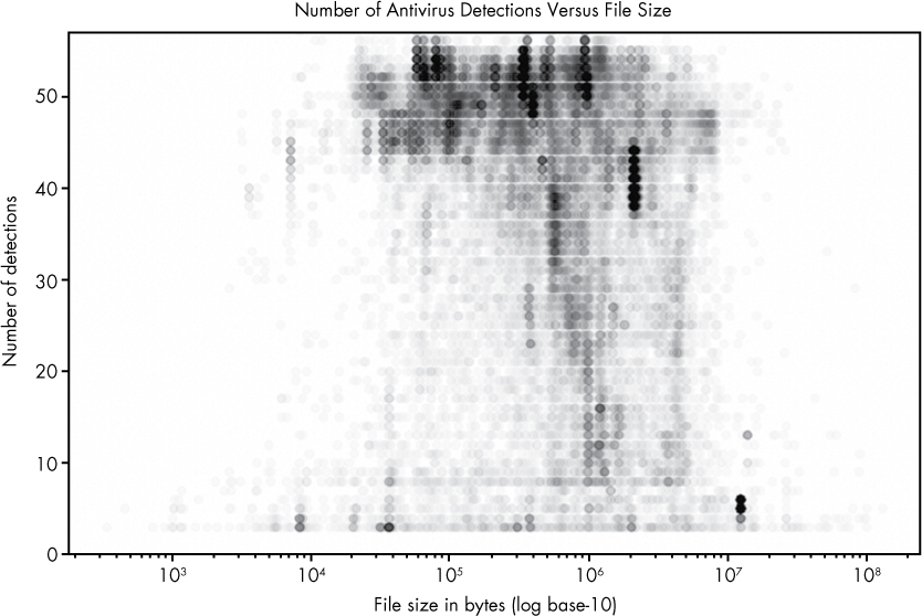
Figure 9-3: A plot of malware samples’ sizes and the number of antivirus detections
Here, I plot the positives and size attributes of our malware dataset. An interesting result emerges, as foreshadowed by our discussion of pandas in the previous section. It shows that small files and very large files are rarely detected by most of the 57 antivirus engines that scanned these files. Files of middling size (around 104.5–107) are detected by most engines, however. This may be because small files don’t contain enough information to allow engines to determine they are malicious, and big files are too slow to scan, causing many antivirus systems to punt on scanning them at all.
Plotting the Relationship Between Malware Size and Vendor Detections
Let’s walk through how to make the plot shown in Figure 9-3 by using the code in Listing 9-8.
➊ import pandas
from matplotlib import pyplot
malware = ➋pandas.read_csv("malware_data.csv")
pyplot.plot(➌malware['size'], ➍malware['positives'],
➎'bo', ➏alpha=0.01)
pyplot.xscale(➐"log")
➑ pyplot.ylim([0,57])
pyplot.xlabel("File size in bytes (log base-10)")
pyplot.ylabel("Number of detections")
pyplot.title("Number of Antivirus Detections Versus File Size")
➒ pyplot.show()
Listing 9-8: Visualizing data using the plot() function
As you can see, it doesn’t take much code to render this plot. Let’s walk through what each line does. First, we import ➊ the necessary libraries, including pandas and the matplotlib library’s pyplot module. Then we call the read_csv function ➋, which, as you learned earlier, loads our malware dataset into a pandas DataFrame.
Next we call the plot() function. The first argument to the function is the malware size data ➌, and the next argument is the malware positives data ➍, or the number of positive detections for each malware sample. These arguments define the data that matplotlib will plot, with the first argument representing the data to be shown on the x-axis and the second representing the data to be shown on the y-axis. The next argument, 'bo' ➎, tells matplotlib what color and shape to use to represent the data. Finally, we set alpha, or the transparency of the circles, to 0.1 ➏, so we can see how dense the data is within different regions of the plot, even when the circles completely overlap each other.
NOTE
The b in bo stands for blue, and the o stands for circle, meaning that we’re telling matplotlib to plot blue circles to represent our data. Other colors you can try are green (g), red (r), cyan (c), magenta (m), yellow (y), black (k), and white (w). Other shapes you can try are a point (.), a single pixel per data point (,), a square (s), and a pentagon (p). For complete details, see the matplotlib documentation at http://matplotlib.org.
After we call the plot() function, we set the scale of the x-axis to be logarithmic ➐. This means that we’ll be viewing the malware size data in terms of powers of 10, making it easier to see the relationships between very small and very large files.
Now that we’ve plotted our data, we label our axes and title our plot. The x-axis represents the size of the malware file ("File size in bytes (log base-10)"), and the y-axis represents the number of detections ("Number of detections"). Because there are 57 antivirus engines we’re analyzing, we set the y-axis scale to the range 0 to 57 at ➑. Finally, we call the show() function ➒ to display the plot. We could replace this call with pyplot.savefig("myplot.png") if we wanted to save the plot as an image instead.
Now that we’ve gone through an initial example, let’s do another.
Plotting Ransomware Detection Rates
This time, let’s try reproducing Figure 9-1, the ransomware detection plot I showed at the beginning of this chapter. Listing 9-9 presents the entire code that plots our ransomware detections over time.
import dateutil
import pandas
from matplotlib import pyplot
malware = pandas.read_csv("malware_data.csv")
malware['fs_date'] = [dateutil.parser.parse(d) for d in malware['fs_bucket']]
ransomware = malware[malware['type'] == 'ransomware']
pyplot.plot(ransomware['fs_date'], ransomware['positives'], 'ro', alpha=0.05)
pyplot.title("Ransomware Detections Over Time")
pyplot.xlabel("Date")
pyplot.ylabel("Number of antivirus engine detections")
pyplot.show()
Listing 9-9: Plotting ransomware detection rates over time
Some of the code in Listing 9-9 should be familiar from what I’ve explained thus far, and some won’t be. Let’s walk through the code, line by line:
import dateutil
The helpful Python package dateutil enables you to easily parse dates from many different formats. We import dateutil because we’ll be parsing dates so we can visualize them.
import pandas
from matplotlib import pyplot
We also import the matplotlib library’s pyplot module as well as pandas.
malware = pandas.read_csv("malware_data.csv")
malware['fs_date'] = [dateutil.parser.parse(d) for d in malware['fs_bucket']]
ransomware = malware[malware['type'] == 'ransomware']
These lines read in our dataset and create a filtered dataset called ransomware that contains only ransomware samples, because that’s the type of data we’re interested in plotting here.
pyplot.plot(ransomware['fs_date'], ransomware['positives'], 'ro', alpha=0.05)
pyplot.title("Ransomware Detections Over Time")
pyplot.xlabel("Date")
pyplot.ylabel("Number of antivirus engine detections")
pyplot.show()
These five lines of code mirror the code in Listing 9-8: they plot the data, title the plot, label its x- and y-axes, and then render everything to the screen (see Figure 9-4). Again, if we wanted to save this plot to disk, we could replace the pyplot.show() call with pyplot.savefig("myplot.png").

Figure 9-4: Visualization of ransomware detections over time
Let’s try one more plot using the plot() function.
Plotting Ransomware and Worm Detection Rates
This time, instead of just plotting ransomware detections over time, let’s also plot worm detections in the same graph. What becomes clear in Figure 9-5 is that the antivirus industry is better at detecting worms (an older malware trend) than ransomware (a newer malware trend).
In this plot, we see how many antivirus engines detected malware samples (y-axis) over time (x-axis). Each red dot represents a type="ransomware" malware sample, whereas each blue dot represents a type="worm" sample. We can see that on average, more engines detect worm samples than ransomware samples. However, the number of engines detecting both samples has been trending slowly up over time.

Figure 9-5: Visualization of ransomware and worm malware detections over time
Listing 9-10 shows the code for making this plot.
import dateutil
import pandas
from matplotlib import pyplot
malware = pandas.read_csv("malware_data.csv")
malware['fs_date'] = [dateutil.parser.parse(d) for d in malware['fs_bucket']]
ransomware = malware[malware['type'] == 'ransomware']
worms = malware[malware['type'] == 'worm']
pyplot.plot(ransomware['fs_date'], ransomware['positives'],
'ro', label="Ransomware", markersize=3, alpha=0.05)
pyplot.plot(worms['fs_date'], worms['positives'],
'bo', label="Worm", markersize=3, alpha=0.05)
pyplot.legend(framealpha=1, markerscale=3.0)
pyplot.xlabel("Date")
pyplot.ylabel("Number of detections")
pyplot.ylim([0, 57])
pyplot.title("Ransomware and Worm Vendor Detections Over Time")
pyplot.show()
Listing 9-10: Plotting ransomware and worm detection rates over time
Let’s walk through the code by looking at the first part of Listing 9-10:
import dateutil
import pandas
from matplotlib import pyplot
malware = pandas.read_csv("malware_data.csv")
malware['fs_date'] = [dateutil.parser.parse(d) for d in malware['fs_bucket']]
ransomware = malware[malware['type'] == 'ransomware']
➊ worms = malware[malware['type'] == "worm"]
--snip--
The code is similar to the previous example. The difference thus far is that we create the worm filtered version of our data ➊ using the same method with which we create the ransomware filtered data. Now let’s take a look at the rest of the code:
--snip--
➊ pyplot.plot(ransomware['fs_date'], ransomware['positives'],
'ro', label="Ransomware", markersize=3, alpha=0.05)
➋ pyplot.plot(worms['fs_bucket'], worms['positives'],
'bo', label="Worm", markersize=3, alpha=0.05)
➌ pyplot.legend(framealpha=1, markerscale=3.0)
pyplot.xlabel("Date")
pyplot.ylabel("Number of detections")
pyplot.ylim([0,57])
pyplot.title("Ransomware and Worm Vendor Detections Over Time")
pyplot.show()
pyplot.gcf().clf()
The main difference between this code and Listing 9-9 is that we call the plot() function twice: once for the ransomware data using the ro selector ➊ to create red circles, and once more on the worm data using the bo selector ➋ to create blue circles for the worm data. Note that if we wanted to plot a third dataset, we could do this too. Also, unlike Listing 9-9, here, at ➌, we create a legend for our figure showing that the blue marks stand for worm malware and the red marks stand for ransomware. The parameter framealpha determines how translucent the background of the legend is (by setting it to 1, we make it completely opaque), and the parameter markerscale scales the size of the markers in the legend (in this case, by a factor of three).
In this section, you’ve learned how to make some simple plots in matplotlib. However, let’s be honest—they’re not gorgeous. In the next section, we’re going to use another plotting library that should allow us to give our plots a more professional look, and help us implement more complex visualizations quickly.
Using seaborn to Visualize Data
Now that we’ve discussed pandas and matplotlib, let’s move on to seaborn, which is a visualization library actually built on top of matplotlib but wrapped up in a slicker container. It includes built-in themes to style our graphics as well as premade higher-level functions that save time in performing more complicated analyses. These features make it simple and easy to produce sophisticated, beautiful plots.
To explore seaborn, let’s start by making a bar chart showing how many examples of each malware type we have in our dataset (see Figure 9-6).
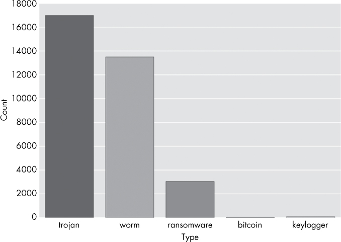
Figure 9-6: Bar chart plot of the different kinds of malware in this chapter’s dataset
Listing 9-11 shows the code to make this plot.
import pandas
from matplotlib import pyplot
import seaborn
➊ malware = pandas.read_csv("malware_data.csv")
➋ seaborn.countplot(x='type', data=malware)
➌ pyplot.show()
Listing 9-11: Creating a bar chart of malware counts by type
In this code, we first read in our data via pandas.read_csv ➊ and then use seaborn’s countplot function to create a barplot of the type column in our DataFrame ➋. Finally, we make the plot appear by calling pyplot’s show() method at ➌. Recall that seaborn wraps matplotlib, which means we need to ask matplotlib to display our seaborn figures. Now let’s move on to a more complex sample plot.
Plotting the Distribution of Antivirus Detections
The premise for the following plot is as follows: suppose we want to understand the distribution (frequency) of antivirus detections across malware samples in our dataset to understand what percentage of malware is missed by most antivirus engines, and what percentage is detected by most engines. This information gives us a view of the efficacy of the commercial antivirus industry. We can do this by plotting a bar chart (a histogram) showing, for each number of detections, the proportion of malware samples that had that number of detections, as shown in Figure 9-7.
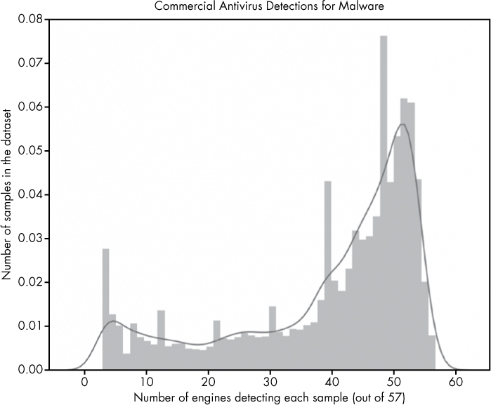
Figure 9-7: Visualization of distribution of antivirus detections (positives)
The x-axis of this figure represents categories of malware samples, sorted by how many out of 57 total antivirus engines detected them. If a sample was detected as malicious by 50 of 57 engines, it is placed at 50, if it was only detected by 10 engines out of 57, it goes in the 10 category. The height of each bar is proportional to how many total samples ended up in that category.
The plot makes it clear that many malware samples are detected by most of our 57 antivirus engines (shown by the big bump in frequencies in the upper-rightmost region of the plot) but also that a substantial minority of samples are detected by a small number of engines (shown in the leftmost region of the plot). We don’t show samples that were detected by fewer than five engines because of the methodology I used to construct this dataset: I define malware as samples that five or more antivirus engines detect. This plotted result, with substantial numbers of samples receiving just 5–30 detections, indicates that there is still significant disagreement between engines in malware detection. A sample that was detected as malware by 10 out of 57 engines either indicates that 47 engines failed to detect it, or that 10 made a mistake and issued a false positive on a benign file. The latter possibility is very unlikely, because antivirus vendors’ products have very low false-positive rates: it’s much more likely that most engines missed these samples.
Making this plot requires just a few lines of plotting code, as shown in Listing 9-12.
import pandas
import seaborn
from matplotlib import pyplot
malware = pandas.read_csv("malware_data.csv")
➊ axis = seaborn.distplot(malware['positives'])
➋ axis.set(xlabel="Number of engines detecting each sample (out of 57)",
ylabel="Amount of samples in the dataset",
title="Commercial Antivirus Detections for Malware")
pyplot.show()
Listing 9-12: Plotting distribution of positives
The seaborn package has a built-in function to create distribution plots (histograms), and so all we’ve done is pass the distplot function the data we wanted to display, which is malware['positives'] ➊. Then we use the axis object returned by seaborn to configure the plot title, x-axis label, and y-axis label to describe our plot ➋.
Now let’s try a seaborn plot with two variables: the number of positive detections for malware (files with five or more detections) and their file sizes. We created this plot before with matplotlib in Figure 9-3, but we can achieve a more attractive and informative result using seaborn’s jointplot function. The resulting plot, shown in Figure 9-8, is richly informative but takes a bit of effort to understand at first, so let’s walk through it.
This plot is similar to the histogram we made in Figure 9-7, but instead of displaying the distribution of a single variable via bar heights, this plot shows the distributions of two variables (the size of a malware file, on the x-axis, and the number of detections, on the y-axis) via color intensity. The darker the region, the more data is in that region. For example, we can see that files most commonly have a size of about 105.5 and a positives value of about 53. The subplots on the top and right of the main plots show a smoothed version of the frequencies of the size and detections data, which reveal the distribution of detections (as we saw in the previous plot) and file sizes.
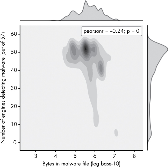
Figure 9-8: Visualization of the distribution of malware file sizes versus positive detections
The center plot is the most interesting, because it shows the relationship between size and positives. Instead of showing individual data points, like in Figure 9-3 with matplotlib, it shows the overall trend in a way that’s much clearer. This shows that very large malware files (size 106 and greater) are less commonly detected by antivirus engines, which tells us we might want to custom-build a solution that specializes in detecting such malware.
Creating this plot just requires one plotting call to seaborn, as shown in Listing 9-13.
import pandas
import seaborn
import numpy
from matplotlib import pyplot
malware = pandas.read_csv("malware_data.csv")
➊ axis=seaborn.jointplot(x=numpy.log10(malware['size']),
y=malware['positives'],
kind="kde")
➋ axis.set_axis_labels("Bytes in malware file (log base-10)",
"Number of engines detecting malware (out of 57)")
pyplot.show()
Listing 9-13: Plotting the distribution of malware file sizes vs. positive detections
Here, we use seaborn’s jointplot function to create a joint distribution plot of the positives and size columns in our DataFrame ➊. Also, somewhat confusingly, for seaborn’s jointplot function, we have to call a different function than in Listing 9-11 to label our axes: the set_axis_labels() function ➋, whose first argument is the x-axis label and whose second argument is the y-axis label.
Creating a Violin Plot
The last plot type we explore in this chapter is the seaborn violin plot. This plot allows us to elegantly explore the distribution of a given variable across several malware types. For example, suppose we’re interested in seeing the distribution of file sizes per malware type in our dataset. In this case, we can create a plot like Figure 9-9.
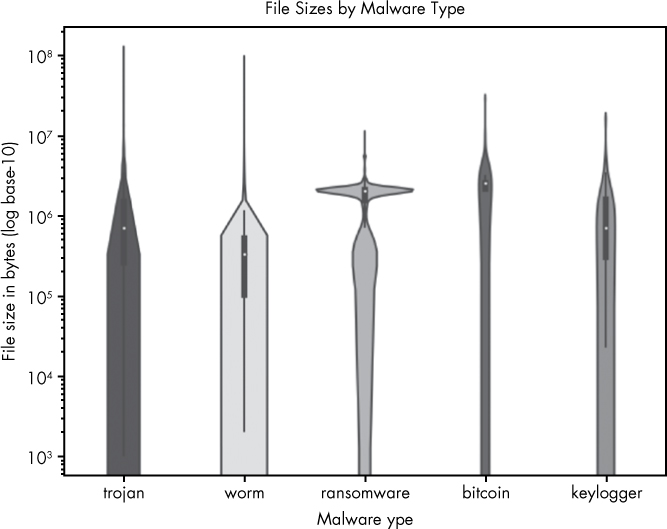
Figure 9-9: Visualization of file sizes by malware type
On the y-axis of this plot are file sizes, represented as powers of 10. On the x-axis we enumerate each malware type. As you can see, the thickness of the bars representing each file type varies at different size levels, which show how much of the data for that malware type is of that size. For example, you can see that there’s a substantial number of very large ransomware files, and that worms tend to have smaller file sizes—probably because worms aim to spread rapidly across a network, and worm authors thus tend to minimize their file sizes. Knowing these patterns could potentially help us to classify unknown files better (a larger file being more likely to be ransomware and less likely to be a worm), or teach us what file sizes we should focus on in a defensive tool targeted at a specific type of malware.
Making the violin plot takes one plotting call, as shown in Listing 9-14.
import pandas
import seaborn
from matplotlib import pyplot
malware = pandas.read_csv("malware_data.csv")
➊ axis = seaborn.violinplot(x=malware['type'], y=malware['size'])
➋ axis.set(xlabel="Malware type", ylabel="File size in bytes (log base-10)",
title="File Sizes by Malware Type", yscale="log")
➌ pyplot.show()
Listing 9-14: Creating a violin plot
In Listing 9-14, first we create the violin plot ➊. Next we tell seaborn to set the axis labels and title and to set the y-axis to log-scale ➋. Finally, we make the plot appear ➌. We can also make an analogous plot showing the number of positives for each malware type, as shown in Figure 9-10.
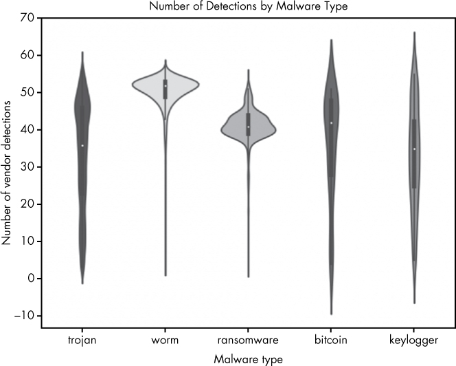
Figure 9-10: Visualization of the number of antivirus positives (detections) per malware type
The only difference between Figure 9-9 and Figure 9-10 is that instead of looking at file size on the y-axis, we’re looking at the number of positives each file received. The results show some interesting trends. For example, ransomware is almost always detected by more than 30 scanners. The bitcoin, trojan, and keylogger malware types, in contrast, are detected by less than 30 scanners a substantial portion of the time, meaning more of these types are slipping past the security industry’s defenses (folks who don’t have the scanners that detect these files installed are likely getting infected by these samples). Listing 9-15 shows how to create the plot shown in Figure 9-10.
import pandas
import seaborn
from matplotlib import pyplot
malware = pandas.read_csv("malware_data.csv")
axis = seaborn.violinplot(x=malware['type'], y=malware['positives'])
axis.set(xlabel="Malware type", ylabel="Number of vendor detections",
title="Number of Detections by Malware Type")
pyplot.show()
Listing 9-15: Visualizing antivirus detections per malware type
The only differences in this code and the previous are that we pass the violinplot function different data (malware['positives'] instead of malware['size']), we label the axes differently, we set the title differently, and we omit setting the y-axis scale to log-10.
Summary
In this chapter, you learned how visualization of malware data allows you to get macroscopic insights into trending threats and the efficacy of security tools. You used pandas, matplotlib, and seaborn to create your own visualizations and gain insight into sample datasets.
You also learned how to use methods like describe() in pandas to show useful statistics and how to extract subsets of your dataset. You then used these subsets of data to create your own visualizations to assess improvements in antivirus detections, analyze trending malware types, and answer other broader questions.
These are powerful tools that transform the security data you have into actionable intelligence that can inform the development of new tools and techniques. I hope you’ll learn more about data visualizations and incorporate them into your malware and security analysis workflow.