1.1 Describing Distributions
1.2 Displaying Data with Graphs
![]() The organization of data into graphical displays is essential to understanding statistics. This chapter discusses how to describe distributions and various types of graphs used for organizing univariate data. The types of graphs include modified boxplots, histograms, stem-and-leaf plots, bar graphs, dotplots, and pie charts. Students in AP Statistics should have a clear understanding of what a variable is and the types of variables that are encountered.
The organization of data into graphical displays is essential to understanding statistics. This chapter discusses how to describe distributions and various types of graphs used for organizing univariate data. The types of graphs include modified boxplots, histograms, stem-and-leaf plots, bar graphs, dotplots, and pie charts. Students in AP Statistics should have a clear understanding of what a variable is and the types of variables that are encountered.
![]() A variable is a characteristic of an individual and can take on different values for different individuals. Two types of variables are discussed in this chapter: categorical variables and quantitative variables.
A variable is a characteristic of an individual and can take on different values for different individuals. Two types of variables are discussed in this chapter: categorical variables and quantitative variables.
Categorical variable: Places an individual into a category or group
Quantitative variable: Takes on a numerical value
Variables may take on different values. The pattern of variation of a variable is its distribution. The distribution of a variable tells us what values the variable takes and how often it takes each value.
![]() When describing distributions, it’s important to describe what you see in the graph. It’s important to address the shape, center, and spread of the distribution in the context of the problem.
When describing distributions, it’s important to describe what you see in the graph. It’s important to address the shape, center, and spread of the distribution in the context of the problem.
![]() When describing shape, focus on the main features of the distribution. Is the graph approximately symmetrical, skewed left, or skewed right?
When describing shape, focus on the main features of the distribution. Is the graph approximately symmetrical, skewed left, or skewed right?
Symmetric: Right and left sides of the distribution are approximately mirror images of each other (Figure 1.1).

![]() Skewed left: The left side of the distribution extends further than the right side, meaning that there are fewer values to the left (Figure 1.2).
Skewed left: The left side of the distribution extends further than the right side, meaning that there are fewer values to the left (Figure 1.2).

![]() Skewed right: The right side of the distribution extends further than the left side, meaning that there are fewer values to the right (Figure 1.3).
Skewed right: The right side of the distribution extends further than the left side, meaning that there are fewer values to the right (Figure 1.3).

![]() When describing the center of the distribution, we usually consider the mean and/or the median of the distribution.
When describing the center of the distribution, we usually consider the mean and/or the median of the distribution.
Mean: Arithmetic average of the distribution:
![]()
Median: Midpoint of the distribution; half of the observations are smaller than the median, and half are larger.
To find the median:
Arrange the data in ascending order (smallest to largest).
If there is an odd number of observations, the median is the center data value. If there is an even number of observations, the median is the average of the two middle observations.
![]() Example 1: Consider Data Set A: 1, 2, 3, 4, 5
Example 1: Consider Data Set A: 1, 2, 3, 4, 5
Intuition tells us that the mean is 3. Applying the formula, we get:
Intuition also tells us that the median is 3 because there are two values to the right of 3 and two values to the left of 3. Notice that the mean and median are equal. This is always the case when dealing with distributions that are exactly symmetrical. The mean and median are approximately equal when the distribution is approximately symmetrical.
![]() The mean of a skewed distribution is always “pulled” in the direction of the skew. Consider NFL football players’ salaries: Let’s assume the league minimum is $310,000 and the median salary for a particular team is $650,000. Most players probably make between the league minimum and around $1 million. However, there might be a few players on the team who make well over $1 million. The distribution would then be skewed right (meaning that most players make less than a million and relatively few players make more $1 million). Those salaries that are well over $1 million would “pull” the mean salary up, thus making the mean greater than the median.
The mean of a skewed distribution is always “pulled” in the direction of the skew. Consider NFL football players’ salaries: Let’s assume the league minimum is $310,000 and the median salary for a particular team is $650,000. Most players probably make between the league minimum and around $1 million. However, there might be a few players on the team who make well over $1 million. The distribution would then be skewed right (meaning that most players make less than a million and relatively few players make more $1 million). Those salaries that are well over $1 million would “pull” the mean salary up, thus making the mean greater than the median.
![]() When dealing with symmetrical distributions, we typically use the mean as the measure of center. When dealing with skewed distributions, the median is sometimes used as the measure of center instead of the mean, because the mean is not a resistant measure—i.e., the mean cannot resist the influence of extreme data values.
When dealing with symmetrical distributions, we typically use the mean as the measure of center. When dealing with skewed distributions, the median is sometimes used as the measure of center instead of the mean, because the mean is not a resistant measure—i.e., the mean cannot resist the influence of extreme data values.
![]() When describing the spread of the distribution, we use the IQR (interquartile range) and/or the variance/standard deviation.
When describing the spread of the distribution, we use the IQR (interquartile range) and/or the variance/standard deviation.
IQR: Difference of the third quartile minus the first quartile. Quartiles are discussed in Example 2.
Five-number summary: The five-number summary is sometimes used when dealing with skewed distributions. The five-number summary consists of the lowest number, first quartile (Q1), median (M), third quartile (Q3), and the largest number.
![]() Example 2: Consider Data Set A: 1, 2, 3, 4, 5
Example 2: Consider Data Set A: 1, 2, 3, 4, 5
Locate the median, 3.
Locate the median of the first half of numbers (do not include 3 in the first half of numbers or the second half of numbers). This is Q1 (25th percentile), which is 1.5.
Locate the median of the second half of numbers. This is Q 3(75th percentile), which is 4.5.
The five-number summary would then be: 1, 1.5, 3, 4.5, 5.
![]() Variance/Standard Deviation: Measures the spread of the distribution about the mean. The standard deviation is used to measure spread when the mean is chosen as the measure of center. The standard deviation has the same unit of measurement as the data in the distribution. The variance is the square of the standard deviation and is labeled in units squared.
Variance/Standard Deviation: Measures the spread of the distribution about the mean. The standard deviation is used to measure spread when the mean is chosen as the measure of center. The standard deviation has the same unit of measurement as the data in the distribution. The variance is the square of the standard deviation and is labeled in units squared.
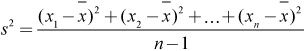
or

The standard deviation is the square root of the variance:

or

![]() Example 3: Consider Data Set A: 1, 2, 3, 4, 5
Example 3: Consider Data Set A: 1, 2, 3, 4, 5
We can find the variance and the standard deviation as follows:
It’s probably more important to understand the concept of what standard deviation means than to be able to calculate it by hand. Our trusty calculators or computer software can handle the calculation for us. Understanding what the number means is what’s most important. It’s worth noting that most calculators will give two values for standard deviation. One is used when dealing with a population, and the other is used when dealing with a sample. The TI 83/84 calculator shows the population standard deviation as x and the sample standard deviation as Sx. A population is all individuals of interest, and a sample is just part of a population. We’ll discuss the concept of population and different types of samples in later chapters.
![]() It’s also important to address any outliers that might be present in the distribution. Outliers are values that fall outside the overall pattern of the distribution. It is important to be able to identify potential outliers in a distribution, but we also want to determine whether or not a value is mathematically an outlier.
It’s also important to address any outliers that might be present in the distribution. Outliers are values that fall outside the overall pattern of the distribution. It is important to be able to identify potential outliers in a distribution, but we also want to determine whether or not a value is mathematically an outlier.
![]() Example 4: Consider Data Set B, which consists of test scores from a college statistics course:
Example 4: Consider Data Set B, which consists of test scores from a college statistics course:
98, 36, 67, 85, 79, 100, 88, 85, 60, 69, 93, 58, 65, 89, 88, 71, 79, 85, 73, 87, 81, 77, 76, 75, 76, 73
Arrange the data in ascending order.
36, 58, 60, 65, 67, 69, 71, 73, 73, 75, 76, 76, 77, 79, 79, 81, 85, 85, 85, 87, 88, 88, 89, 93, 98, 100
Find the median of the first half of numbers. This is the first quartile, Q1: 71.
Find the median of the second half of numbers, the third quartile, Q3: 87.
Find the interquartile range (IQR): IQR = Q3 − Q1 = 87 − 71 = 16.
Multiply the IQR by 1.5: 16 × 1.5 = 24.
Add this number to Q3 and subtract this number from Q1.
87 + 24 = 111 and 71 − 24 = 47
Any number smaller than 47 or larger than 111 would be considered an outlier. Therefore, 36 is the only outlier in this set.
![]() It is often helpful to display a given data set graphically. Graphing the data of interest can help us use and understand the data more effectively. Make sure you are comfortable creating and interpreting the types of graphs that follow. These include: boxplots, histograms, stemplots, dotplots, bar graphs, and pie charts.
It is often helpful to display a given data set graphically. Graphing the data of interest can help us use and understand the data more effectively. Make sure you are comfortable creating and interpreting the types of graphs that follow. These include: boxplots, histograms, stemplots, dotplots, bar graphs, and pie charts.
![]() Modified boxplots are extremely useful in AP Statistics. A modified boxplot is ideal when you are interested in checking a distribution for outliers or skewness, which will be essential in later chapters. To construct a modified boxplot, we use the five-number summary. The box of the modified boxplot consists of Q1, M, and Q3. Outliers are marked as separate points. The tails of the plot consist of either the smallest and largest numbers or the smallest and largest numbers that are not considered outliers by our mathematical criterion discussed earlier. Outliers appear as separate dots or asterisks. Modified boxplots can be constructed with ease using the graphing calculator or computer software. Be sure to use the modified boxplot instead of the regular boxplot, since we are usually interested in knowing if outliers are present. Side-by-side boxplots can be used to make visual comparisons between two or more distributions. Figure 1.4 displays the test scores from Data Set B. Notice that the test score of 36 (which is an outlier) is represented using a separate point.
Modified boxplots are extremely useful in AP Statistics. A modified boxplot is ideal when you are interested in checking a distribution for outliers or skewness, which will be essential in later chapters. To construct a modified boxplot, we use the five-number summary. The box of the modified boxplot consists of Q1, M, and Q3. Outliers are marked as separate points. The tails of the plot consist of either the smallest and largest numbers or the smallest and largest numbers that are not considered outliers by our mathematical criterion discussed earlier. Outliers appear as separate dots or asterisks. Modified boxplots can be constructed with ease using the graphing calculator or computer software. Be sure to use the modified boxplot instead of the regular boxplot, since we are usually interested in knowing if outliers are present. Side-by-side boxplots can be used to make visual comparisons between two or more distributions. Figure 1.4 displays the test scores from Data Set B. Notice that the test score of 36 (which is an outlier) is represented using a separate point.

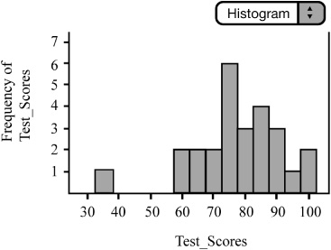
![]() Histograms are also useful for displaying distributions when the variable of interest is numeric (Figure 1.5). When the variable is categorical, the graph is called a bar chart or bar graph. The bars of the histogram should be touching and should be of equal width. The heights of the bars represent the frequency or relative frequency. As with modified boxplots, histograms can be easily constructed using the TI-83/84 graphing calculator or computer software. With some minor adjustments to the window of the graphing calculator, we can easily transfer the histogram from calculator to paper. We often use the ZoomStat function of the TI-83/84 graphing calculator to create histograms. ZoomStat will fit the data to the screen of the graphing calculator and often creates bars with non-integer dimensions. In order to create histograms that have integer dimensions, we must make adjustments to the window of the graphing calculator. Once these adjustments have been made, we can then easily copy the calculator histogram onto paper. Histograms are especially useful in finding the shape of a distribution. To find the center of the histogram, as measured by the median, find the line that would divide the histogram into two equal parts. To find the mean of the distributions, locate the balancing point of the histogram.
Histograms are also useful for displaying distributions when the variable of interest is numeric (Figure 1.5). When the variable is categorical, the graph is called a bar chart or bar graph. The bars of the histogram should be touching and should be of equal width. The heights of the bars represent the frequency or relative frequency. As with modified boxplots, histograms can be easily constructed using the TI-83/84 graphing calculator or computer software. With some minor adjustments to the window of the graphing calculator, we can easily transfer the histogram from calculator to paper. We often use the ZoomStat function of the TI-83/84 graphing calculator to create histograms. ZoomStat will fit the data to the screen of the graphing calculator and often creates bars with non-integer dimensions. In order to create histograms that have integer dimensions, we must make adjustments to the window of the graphing calculator. Once these adjustments have been made, we can then easily copy the calculator histogram onto paper. Histograms are especially useful in finding the shape of a distribution. To find the center of the histogram, as measured by the median, find the line that would divide the histogram into two equal parts. To find the mean of the distributions, locate the balancing point of the histogram.
![]() Although we cannot construct a stemplot using the graphing calculator, we can easily construct a stemplot (Figure 1.6) on paper. Stemplots are useful for finding the shape of a distribution as long as there are relatively few data values. Typically, we arrange the data in ascending order. It is often appropriate to round values before graphing. Although our graphing calculators cannot construct a stemplot for us, we can still create a list and order the data in ascending order using the calculator or computer software. Stemplots can have single or “split” stems. Sometimes split stems are used to see the distribution in more detail. Back-to-back stemplots are sometimes used when comparing two distributions. A key should be included with the stemplot so that the reader can interpret the data (i.e: |5|2 = 52.) It is relatively easy to find the five-number summary and describe the distribution once the stemplot is made.
Although we cannot construct a stemplot using the graphing calculator, we can easily construct a stemplot (Figure 1.6) on paper. Stemplots are useful for finding the shape of a distribution as long as there are relatively few data values. Typically, we arrange the data in ascending order. It is often appropriate to round values before graphing. Although our graphing calculators cannot construct a stemplot for us, we can still create a list and order the data in ascending order using the calculator or computer software. Stemplots can have single or “split” stems. Sometimes split stems are used to see the distribution in more detail. Back-to-back stemplots are sometimes used when comparing two distributions. A key should be included with the stemplot so that the reader can interpret the data (i.e: |5|2 = 52.) It is relatively easy to find the five-number summary and describe the distribution once the stemplot is made.
![]() Dotplots can be used to display a distribution (Figure 1.7). Dotplots are easily constructed as long as there are not too many data values. As always, be sure to label and scale your axes and title your graph. Although a dotplot cannot be constructed on the TI-83/84, most statistical software packages can easily construct them.
Dotplots can be used to display a distribution (Figure 1.7). Dotplots are easily constructed as long as there are not too many data values. As always, be sure to label and scale your axes and title your graph. Although a dotplot cannot be constructed on the TI-83/84, most statistical software packages can easily construct them.

![]() Bar graphs are often used to display categorical data. Bar graphs, unlike histograms, have spaces between the different categories of the variable. The order of the categories is irrelevant and we can use either counts or percentages for the vertical axis. There are only two categories in this bar graph showing soccer goals scored by my two children, Cassidy and Nolan (Figure 1.8). It should be noted that on any given day Cassidy could score more goals than Nolan or vice versa. I had to make one of them have more goals for visual effect only.
Bar graphs are often used to display categorical data. Bar graphs, unlike histograms, have spaces between the different categories of the variable. The order of the categories is irrelevant and we can use either counts or percentages for the vertical axis. There are only two categories in this bar graph showing soccer goals scored by my two children, Cassidy and Nolan (Figure 1.8). It should be noted that on any given day Cassidy could score more goals than Nolan or vice versa. I had to make one of them have more goals for visual effect only.

![]() Pie charts are also used to display categorical data (Figure 1.9). Pie charts can help us determine what part of the entire group each category forms. Again, be sure to title your graph and label or code each piece of the pie. On the AP Statistics examination, graphs without appropriate labeling or scaling are considered incomplete.
Pie charts are also used to display categorical data (Figure 1.9). Pie charts can help us determine what part of the entire group each category forms. Again, be sure to title your graph and label or code each piece of the pie. On the AP Statistics examination, graphs without appropriate labeling or scaling are considered incomplete.
