
Chapter 5
PowerPoint Mistakes That Will Kill Your Chances of Doing Well and How to Avoid Them
“Why doesn’t the fellow who says, “I’m no speechmaker,” let it go at that instead of giving a demonstration?”
—Kin Hubbard
When we get calls and e-mails at work with questions about presentations, the most common topic that is referenced is PowerPoint. In fact, when we first begin coaching new clients, they will frequently want to reduce their fear when giving PowerPoint presentations or will want to learn how to design PowerPoint presentations. They rarely call a presentation or a speech a presentation or a speech. They often refer to the presentation or speech as a PowerPoint presentation. Therein lies one of the biggest challenges that people have when they give business presentations. They forget that PowerPoint is just a visual aid. It is not the actual presentation.
So this chapter covers the top 10 mistakes that people make when they design and deliver PowerPoint presentations. Fortunately, most of these mistakes are created by the way that the presenters prepare their presentations, and simply by doing the things we’ve already outlined in this book, you’ll eliminate most of these challenges automatically.
MISTAKE #1: TREATING POWERPOINT AS THE PRESENTATION AND NOT A VISUAL AID
The absolute biggest mistake that we make is designing a “PowerPoint Presentation” versus using PowerPoint as a visual aid for the “real presentation.” Remember, a presentation is a verbal communication to your audience that may or may not use visual aids. PowerPoint is just one type of visual aid that can be used to further explain or clarify your presentation. If you focus entirely on your visual aids without putting any emphasis on what you are actually saying, your presentation will tend to have a disconnected flow and will be difficult for the audience to follow. Instead, design your presentation and get good at delivering it first. Once you get good at delivering the presentation, then decide what visual aids you might be able to use to help you clarify your points.
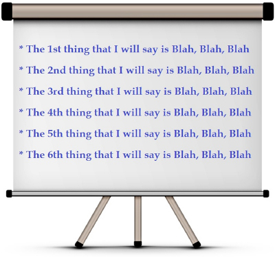
The good news is that if design your presentation the way that we’ve outlined in the book, the PowerPoint slide show becomes very simple. In fact, you’ll need only one slide for most presentations. At most, you might have six slides.
MISTAKE #2: USING TOO MANY POWERPOINT SLIDES
Another big mistake is creating too many slides and using them as a crutch to make sure that we don’t forget anything in our presentation. Speak . . . click . . . speak . . . click . . . speak . . . . click . . . is a very boring way to deliver a presentation; it makes the presenter look unprepared and uninformed about the topic. Only add a slide if the slide helps you better clarify your point.

Oddly enough, this mistake most often occurs because of the way we prepare a presentation, and it occurs whether you use PowerPoint or not (but it is much more obvious if you use PowerPoint). Most people prepare a presentation by trying to write down everything that they know about the topic. In the olden days (before 1996), we used to either write a presentation out longhand word-for-word or we’d write out a comprehensive outline. However, when we wrote the presentation out longhand and tried to read it, we could easily measure the amount of time it might take to deliver the presentation, so we’d start cutting content based on our time allotment. Since we knew it would be almost impossible to remember every single thing that we outlined, we would often trim the presentation down to a more manageable amount of content.
Then came PowerPoint. Now, because we had a digital cheat sheet, we no longer had to cut out content; we could make an unlimited number of slides, and we could fill up each slide with every minor concept that we had to cover. This led us to mistake #3.
MISTAKE #3: INCLUDING TOO MUCH CONTENT (TOO MANY BULLETS, CHARTS, AND GRAPHS)
Your slide deck should be a visual aid to help you explain your point, so if you put too much data on a slide (too much text, too many numbers, too many charts and graphs), you will overwhelm your audience, which results in them attempting to draw their own conclusions about the data. (Gasp! Is he saying that we can’t use charts and graphs?) Your PowerPoint slide should convey a simple concept at a glance. A good rule is what we call 6 × 6, which means to limit your number of words per line to six and limit your number of lines to about six as well. That way, no matter how big or small your room is, your audience will be able to read your data, and it will be easy for the audience to instantly understand the concept you are communicating.
Again, the best way to avoid making this mistake is to use the three- to five-point talk as your format. If you do this, making slides for your slide deck is easy.
One quick tip, though: earlier in this book, I suggested that you create full and complete statements with your bullet points so that it is easier to come up with stories and audience participation questions. This is a preparation guide, which helps you, the presenter, clarify the concepts that you want to get across to your audience. When you actually create a slide for the presentation, though, feel free to shorten the bullet point.

MISTAKE #4: USING TOO MUCH (FRIVOLOUS) ANIMATION
PowerPoint will do some really cool types of animation, but remember that if you animate something, it should help you clarify your point. Bullet points that fly in, spin around, make sounds, and blink are just distractions from your message. For the most part, the animation that PowerPoint calls “appear” should be your most frequently used animation type, so that when you click your handy transition button, the next bullet point just appears. If you want your audience to follow you step by step, you can reveal your bullets one at a time. However, you’ll have more energy as a presenter if you just make your slide appear and physically move to your screen and point to your bullet point when you talk about it. You become the animation versus using the slide show.
This doesn’t mean to avoid animation altogether. In fact, some of the best showmanship that I’ve ever experienced in presentations relied heavily on animation in a slide show. A few years back, one of my clients was competing to be the general contractor to build on an expansion to Fort Bliss in El Paso, Texas. The company had its animation team go to Google Maps and download a three-dimensional image of the terrain where the expansion was going to be, and the team created a movie starting with a digital picture of the bare land. A few seconds later, the roads leading to the area appeared. Next, the blacktop parking areas showed up. Eventually, buildings started to appear, along with fences and security towers. Finally, Jeeps and tanks started to drive in on the roads and park on the blacktops. At the end of the presentation, it was very easy for the Corps of Engineers, who was responsible for choosing the winning company, to see that this group knew exactly what it was doing. They could visually see the end product before it even existed in real life.
If the animation adds clarity to your conclusion, then by all means, use it. Otherwise, leave it out.
MISTAKE #5: INCLUDING TOO MANY BUSY CHARTS
(Gasp! He is saying not to use charts and graphs again!) For the most part, charts, graphs, and pictures make terrible PowerPoint slides. If the charts or graphs are simple, they can be judiciously used in a slide show. For instance, if you are showing total revenue trends for the past five years, you basically have five numbers, so a line graph will be very easy for your audience to understand. However, if you are graphing total revenue of five different divisions on a quarterly basis for each of your 10 major product lines, your graph will be way too busy to understand in a slide. In that case, you’ll get better results if you make a handout of the graph so that your audience can review the details. You can make a big poster of the graph if you need a visual aid for the group to follow, but in most cases, you can just use the handout itself as the visual aid.

About eight years ago, I was in San Antonio to do some personal coaching with a man who worked for a huge company. He was having a lot of trouble delivering presentations to his boss. His boss was a very analytical guy who had to send a spreadsheet with his district numbers to the corporate office every month. This boss would have each of his managers create a single PowerPoint slide on which the manager would insert a very detailed spreadsheet; the managers would then explain the spreadsheet in their meetings once every month. The boss did this because it allowed him to then copy the data from the spreadsheet in the slide show and paste it into his own spreadsheet, which made his task of creating a report for his boss much easier. To me, it just seemed really strange.
Obviously, neither my client nor I could really do anything about what his boss wanted from him, but I could help him with his presentation and visuals. I suggested that he send the boss his spreadsheet via e-mail, which should be much easier for him to copy and manipulate. In addition, I had him pick just the three most recent trends that he noticed each month in the numbers and design his presentation based on the changes or the trends versus trying to explain every single number every single month. (In reality, the boss really wanted only the numbers so that he could create his own report. The presentation was just a formality each month.)
MISTAKE #6: IMPROPERLY USING PICTURES
A picture is worth a 1,000 words—but only if the picture is important to your point. Often, we will look at a slide and think, “It seems a little plain,” so we stick a picture on the slide just to jazz it up a little. Although that is not, in itself, a terrible strategy, sometimes the pictures that we choose as decoration end up causing confusion because the audience wonders what the picture has to do with the point being made. A better way to use pictures as decorations is to set a small picture on the slide master so that it shows on every slide. That way, since the picture is always there, it doesn’t cause confusion when the text changes. By the way, if you have a picture that adds clarity to your point, consider printing it as a poster. It will add much more impact when you can pick it up and show it to your audience.

More often than not, if the picture, chart, graph, or spreadsheet is important enough to put into a slide show, you’ll likely get much better results if you include the visual aid as a handout or put it on a board.
MISTAKE #7: NOT PRACTICING YOUR PRESENTATION WITH THE SLIDE SHOW
Time is getting short, so you send your slide deck to marketing to jazz it up a little. They send you the final copy minutes before you go in front of the group. Everything is perfect in the slide show, but because you haven’t practiced, your flow is off and you have to keep clicking to the next slide before you start to speak. It just makes you more nervous. If you have ever experienced this type of stress, then there is an easy fix. Don’t wait until the last minute to design your slide show. Start preparing much earlier! Finish your slide deck early and practice with it once or twice; you will feel much more comfortable when you deliver the real presentation.
Just as an FYI, there is no need to overpractice if you have a well-designed presentation. A run-through with a coworker or friend is usually sufficient to help you deliver a confident presentation, but you need to practice the presentation with the visual aid in order to feel comfortable with it. When I train new instructors to teach my classes, it is really easy to tell whether they practiced with the slide show or not. If they practice without the slide show, they get really good at delivering the content but will often click to the next slide and show a visual aid for something that they just talked about. Practice at least once (and maybe a couple of times) with your slide show, and you’ll do a better job in front of the real audience.
MISTAKE #8: SITTING DOWN TO DELIVER YOUR PRESENTATION
When folks get nervous speaking in front of a group, they will often sit down and make the screen that the slide show projects onto the focus of the presentation. The moment you sit down and start clicking slides, the PowerPoint slides become the authority in the room on the topic and you will lose a lot of credibility.
Your energy will also plummet when you sit down. Early on in my sales career, my sales manager suggested that when I’m talking to clients or potential clients on the phone that I stand up. He said that it would increase my “energy,” which sounded kind of strange at the time, but because I started to get in the habit of standing while I’m on the phone, it’s natural for me now. A few weeks back, a woman called to inquire about becoming a teacher for my company. I told her that I had just hired two new instructors in this quarter already, so I didn’t have any positions open. But I told her that things change quickly, so she might want to keep in touch with me. The conversation lasted for all of about 3 minutes, and the last thing that she said was, “Oh, I will keep in touch. I love your energy. Just from what you’ve told me, your company sounds like a really fun place to work!” I hung up the phone a little confused, because all I had really told her was that I didn’t have a job for her. How could that sound fun? Then it hit me that it wasn’t really what I was saying, but more how I was saying it that she noticed. My energy was pretty high (as it normally is), and it came through across the phone line.
You can have a similar result when you deliver your presentations if you stand up and use your voice and gestures to portray energy.
MISTAKE #9: READ . . . CLICK . . . READ . . . CLICK . . .
If you are doing this one, then I hate to be the one to tell you this, but . . . you’re boring! Sorry. I know that hurt, but it’s true. The good news is that if you follow the prior guidelines, this one goes away automatically. So if you are experiencing this, go back and work on the earlier tips. You might also try inserting more examples and stories, as well as jazzing up your presentation with a few visual aids other than PowerPoint slides. Visual aids such as posters, samples, and props will make your presentation come to life.
MISTAKE #10: LETTING SOMEONE ELSE DESIGN YOUR SLIDE SHOW
This one is probably the guideline that will, most likely, be totally out of your control. Just realize that if someone else designs your PowerPoint slide deck, you will most likely have one or more of the earlier mistakes ingrained in it. You will also have a more difficult time delivering it and will be more nervous. To combat this, you’ll need to practice your delivery a lot more than if you designed your own presentation, but it can be done. Over time, use the guidelines discussed in this chapter to influence the person or people who are designing your slide show.
Follow these simple guidelines, and your PowerPoint slides will help you better deliver more powerful presentations. Violate them, and you’ll likely be more nervous and have a more difficult time delivering your presentation.
MORE POWERPOINT TIPS ARE AVAILABLE ONLINE
We receive numerous requests for fixing PowerPoint problems, so we created an online study course based on these mistakes and how to fix them. The course has 10 videos, one for each of these mistakes. And because you purchased this book, you can gain access to the tips for a big discount by visiting the website http://www.fearlesspresentations.com/how-to-do-a-powerpoint/ and entering the coupon code PSS100.
