Charts in PowerPoint are based on Excel’s charting feature. When you insert a chart, Excel opens for you to enter the underlying data for the chart. When Excel opens, it holds some sample data, which should help you in entering your specific data in the proper format to form the basis of a chart. Charts are wonderful tools for providing lots of information in a quickly understood, visual format. PowerPoint’s chart feature offers dozens of styles of charts to choose from.
Insert a Chart
Click the Insert tab.
Click the Chart button.
Click a category of chart type on the left.
Click a chart style from the thumbnails displayed.
Click OK.
Try This!
You can also insert a chart using the icons that appear in any empty content placeholder. Click the icon in the middle of the top row of icons that appears in these placeholders to display the Create Chart dialog box, where you can specify the type and style of chart as outlined in the previous steps.
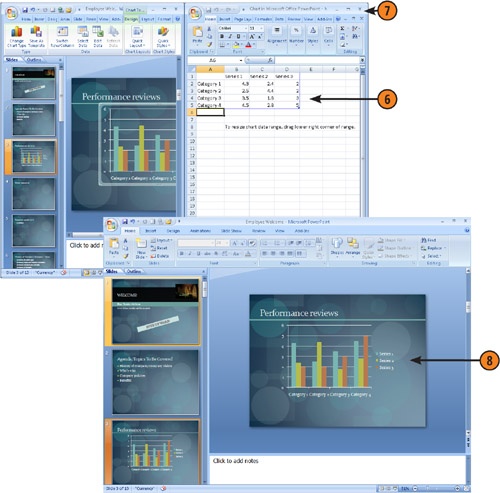
Modify the sample data with your own source data for the chart.
Click the Close button in the Excel window to return to PowerPoint and view the chart.
The chart appears on your PowerPoint slide.
Tip
You can change the chart type at any time by clicking Change Chart Type under the Chart Tools, Design tab. The Change Chart Type dialog box (which is identical to the Create Chart dialog box) appears for you to select another type of chart.
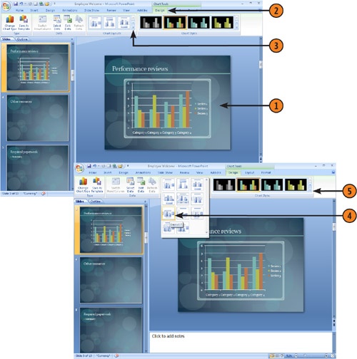
Change Chart Style and Layout
Click a chart to select it.
Click the Chart Tools, Design tab.
Click the More button on the Chart Layouts gallery.
Click a new layout to apply it.
Click the More button on the Chart Styles gallery.
Tip
Chart Types control the chart objects, such as whether your chart uses bars, lines, or pie wedges to represent data. Chart Layouts control whether your chart includes a legend, the source data, and elements such as grid lines. The Chart Styles gallery offers sets of colors for chart elements and the chart background.
Click a new style to apply it.
Tip
A layout applies formatting to your chart, but you can modify each aspect of the chart layout manually using the tools on the Chart Tools, Layout tab. The next procedure explains how to modify the legend display, for example.
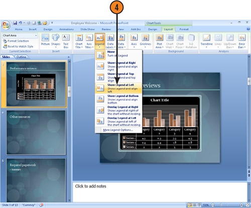
Display or Hide a Chart Legend
Click on a chart to select it.
Click the Chart Tools, Layout tab.
Click the Legend button.
Tip
Rather than choosing a placement for the legend by selecting a layout or using the Legend button, you can move the legend to any position you want by clicking and dragging it within the chart box.
Click a layout position for the legend, or, to turn the legend off, click None.
Try This!
You can format a legend by right-clicking it in the chart and choosing Format Legend. In the Format Legend dialog box that appears, you can modify the position of the legend and the line style surrounding it, add a fill color as a background for it, and so on.

 Modify the sample data with your own source data for the chart.
 Click the Close button in the Excel window to return to PowerPoint and view the chart.

 Click the More button on the Chart Styles gallery.