
Chapter 11. Working with Report Items
In This Chapter
• Data Regions, Containers, and Independent Report Items
• Report Designer’s Toolbox
• Line Report Item
• Rectangle Report Item
• Image Report Item
• Textbox Report Item
• Table Report Item
• List Report Item
• Practical Application of Report Items
• Matrix Report Item
• Chart Report Item
• Practical Application of Chart and Matrix
• Report Body Versus Page Header/Footer
Now that the book has covered what is necessary to retrieve data, let’s move on to designing reports. This chapter goes into the Toolbox (literally and figuratively) and discusses the various controls used for building reports and the resulting RDL. Toward the end of the chapter, we will generate a couple of reports.
Presentation elements in SSRS are called report items. These include: Table, Matrix, List, Chart, Textbox, Image, Line, Rectangle, and Subreport.
Report items are very similar to visual controls available in Visual Studio languages, such as Visual Basic or C#. This book introduced you to report items in Chapter 2, “Reporting Services Capabilities: Presentation, Navigation, and Programmability.” This chapter provides more details on each of these items.
You might have noticed that the set of report items did not change in SSRS 2005. However, Microsoft has expanded the capabilities of report items, and some items can now do more. For example, the Textbox in SSRS 2005 provides interactive sorting capabilities.
Data Regions, Containers, and Independent Report Items
Report items (or presentation elements) in SSRS can be categorized as data regions (items that must be associated with data sets), containers (items that can contain other items), and independent report items. Some items can belong to more than one category.
Independent report items are items other than data regions. Textbox, Image, Line, Rectangle, and Subreport are independent report items. Independent report items do not have to be associated with any data sources.
Data regions function as a repetitive display of rows, groups of rows, or columns from a data set associated with a region. Table, Matrix, List, and Chart are data regions. In addition, data regions support grouping and sorting of displayed information. For more details of grouping and sorting, see Chapter 12, “Grouping, Sorting, and Aggregating Data, Working with Scope.” All of the data regions, except Chart are also containers.
Containers, as the name implies, can contain any reporting items, including containers and data regions. Table, Matrix, List, Rectangle, Report Body, Page Header, and Page Footer are containers. Items placed in a container become the container’s children and the container becomes the parent. As a result, the Parent property of each child item is populated with the name of a container. All children move together with the container when the container is moved. When the container is deleted, all children are deleted. The container is fixed when the position of a report item within this container is fixed. For example, a Table is a fixed container because the position of each cell is fixed. Most, but not all, of the containers are also data regions. Thus, data regions can be nested within other data regions.
Tip
If you delete a container by mistake, you can easily undo this action using the Edit, Undo menu or by using the Ctrl+Z keyboard shortcut. For the shortcut to work properly, the focus of the action should be the ReportName.rdl[Design] (Data or Layout tabs) or ReportName.rdl[XML] window.
From the perspective of RDL, the container has a<ReportItems> section, which is used to specify the beginning of a container for report items.
For example, Table 11.1 shows the RDL of a Rectangle that contains a single Line. The graphical presentation of this RDL is shown in Figure 11.1.
Table 11.1. Rectangle’s RDL Explained
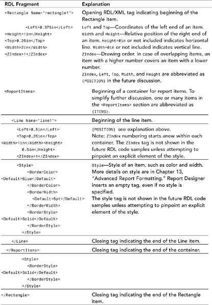
Figure 11.1. Line and Rectangle items.

Report Designer’s Toolbox
The Toolbox window provides a convenient drag-and-drop interface for all report items. The Toolbox can be opened, closed, hidden, docked, or can float within Report Designer. If the Toolbox is closed, it can be opened through the View, Toolbox menu or by pressing the Ctrl+Alt+X keyboard combination.
If the Toolbox is hidden, the designer can click the Toolbox tab on the left of the BI Studio interface or mouse over the tab.
To add a report item to a report using the Report Designer, you can either drag and drop a report item from the Toolbox or copy a report item from the same or another report. Another method is to right-click on any report item in the Toolbox, and then click on the report body on the Layout tab. A less-common approach is to edit the RDL file by hand, but this is not recommended by Microsoft within the context of Report Designer.
Line Report Item
Line is, perhaps, the simplest report item and can be placed anywhere on a report. Line does not display any data values and serves as a decoration and navigation item. When used for navigation, a line can carry a bookmark or a label. Navigation is discussed in more detail in Chapter 14, “Report Navigation.”
The RDL of the line is defined with the<Line> tag. Figure 11.1 demonstrates Line and Rectangle items.
Rectangle Report Item
Rectangle is a graphical element that can provide three functions: decoration, container, and navigation. When used for navigation, a line can carry a bookmark or a label.
Rectangle by itself is not able to display any data values and can be placed anywhere on a report. Because the Rectangle is a container, it can contain other report items, including other containers and data regions. The RDL of the Rectangle is defined with the <Rectangle> tag.
Image Report Item
Image report item, as the name implies, is designed to display an image. SSRS supports.bmp, .jpg, .jpe, .gif, and .png image formats. An image can be embedded in a report, stored as a part of the project, stored in a database, or loaded from a URL.
You can add an image to a report in several ways. The most common is to drag an Image report item from the Toolbox and drop it onto a report (or generally on any container item). Report Designer displays the Image Wizard with the window shown in Figure 11.2. To see the window, click the Next button on the Welcome screen at the drop completion.
Figure 11.2. Selecting the Image Source window.
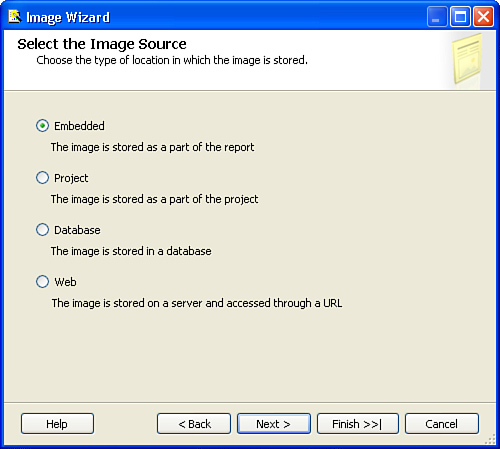
The Image Source window, as the name implies, allows you to select the source of the image. If you select Embedded or Project, Report Designer shows a window similar to Figure 11.3.
Figure 11.3. Choosing the image from the project.
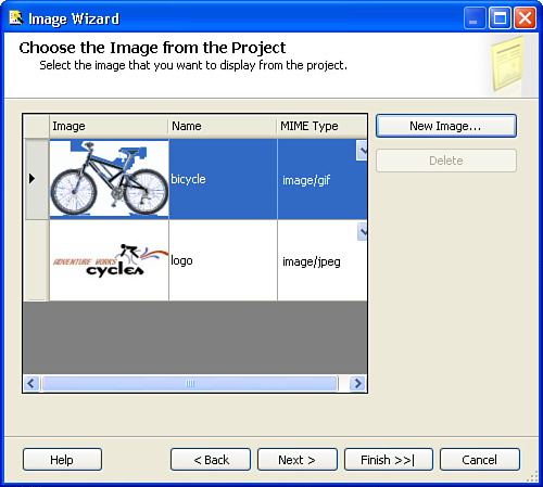
Report Designer assigns the name logo to an image with the filenamelogo.jpg. You can change the name, if you want, just make sure to click on a cell different from the one that contains the name of the image to commit the change.
Understanding the underlying difference between embedded and project images will help you to understand differences in the handling of those images. An embedded image is actually a MIME-encoded image, stored as text in the report definition file.
An embedded image is stored in the RDL file and rendered during the render process.
A project image is a file that first gets added as an item to a project (and copied as a file to the project’s directory from an original location) and then gets published as a resource file to a Report Server.
Note
In addition to using the Image Wizard described previously, you can add a project image by dragging and dropping a graphical file on the project in Solution Explorer or by adding an image from the Add Existing Item menu. You can access the Add Existing Item menu from the Project menu or from the drop-down Add menu in Solution Explorer.
Both embedded and project image selection dialog boxes allow adding several images with the same name.
For example, for images from the file logo.jpg, Report Designer adds images logo, logo_1, and so on. Report Designer does not compare encoded images in a report to determine if there is a duplication, thus Report Designer adds more embedded images with the same content, automatically incrementing the name.
The Project image selection dialog box behaves similarly until you save changes. When saving changes, Report Designer eliminates duplicates and adds only a single file logo.jpg to a project.
Technically, there is no reason to keep duplicates whether the image is embedded or project-level. Because the project-level image is saved as a file, there could be only one file with the specific name.
Note
As you are using the Image Wizard (starts when you drag and drop an Image control on a report), please note image’s Source and Value properties.
You can modify Source and Value properties to change the source of an image.
The Delete button in the Image Selection dialog box of the Image Wizard is disabled for the existing embedded or project-level images. The Delete button is available only for new (added during the wizard’s session) images before the addition is finalized.
You can delete or rename project-level images through Solution Explorer.
You can add, delete, or rename embedded images through the Embedded Images dialog box, which can be accessed through the Report, Embedded Images menu. Alternatively, you can edit an RDL file of a report to delete or rename embedded images.
Embedded images insert character-encoded information in the RDL file. {MIME} indicates graphical format of the image, for example image/jpg.
<EmbeddedImages>
<EmbeddedImage Name=”logo”>
<ImageData>{Character encoded binary Data}</ImageData>
<MIMEType>{MIME}</MIMEType>
</EmbeddedImage>
</EmbeddedImages>
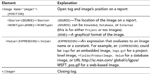
The RDL for an Image can be broken down into the sections shown in Table 11.2.
Table 11.2. Image’s RDL Explained
Textbox Report Item
Textbox displays all text, including textual representation of numeric data on the report. A standalone text box should always be used to display a single expression. The name of a report is an example of such an expression. The expression in this case is a constant string.
An individual text box can be placed anywhere on a report and can include almost any expression. However, expressions that will work in a text box can be limited by a container. For example, a report’s page footer does not allow the Fields collection and, thus, expressions that use the Fields collection cannot be used within a text box located in the page footer.
If the data set associated with a report contains multiple rows and the following expression is used, only the last value is displayed. For example, the following expression will display the last product name in the data set:
=Fields!ProductName.Value
Aggregate functions, such as First, Maximum, Minimum, and Average, can be used to access other values. More information about aggregate functions can be found in Chapter 12. In addition, conditional functions can be used to display a value matching a certain condition. However, default SSRS functionality does not allow you to access the data set’s fields by index.
Textbox is denoted by the <Textbox> tag and in a simple case has the following RDL:
<Textbox Name=”textbox1”>
{POSITION}
<Value>=Fields!ProductName.Value</Value>
</Textbox>
The <Value> tag needs to be present for a text box’s RDL to be valid; it can also be empty, such as <Value /> or <Value></Value>.
Table Report Item
Table presents data with static columns and expands row by row. Table allows you to group (a table can have multiple groups) and sort rows of data. See Chapter 12 for more details.
Table has the best performance of all data regions. A cell in a table is a text box by default, but can be replaced with any other SSRS item, such as an image. A default table placed on a report contains three rows and three columns.
You can interact with row, group, and column handles within the Report Designer interface to adjust table layout. If handles on the designer window are not visible, click on any cell within the table. Adjustment is very similar to that in Microsoft Excel and can be done by dragging adjustor lines or specifying Height and Width properties. See Figure 11.4 for design-time view of a table in Report Designer.
Figure 11.4. Design-time view of a table.
Each row on a table can be deleted or an additional row of the same type can be inserted. For example, a table can have multiple table detail, table header, table footer, group header, and group footer rows.
To add an additional group header row, click on a row handle and select Insert Row Above or Insert Row Below from the drop-down menu. You can delete a row in a similar fashion. For example, Figure 11.4 demonstrates an empty space created by a retained table header row. To remove a row, right-click on the row handle and select Delete Rows from the shortcut menu.
It is possible to first delete all rows of a certain type, such as table header. To reverse this operation, consult the following list, which shows a set of procedures for different types of rows:
• For table header, footer, or detail rows, right-click on any row handle and select Table Header, Table Footer, or Table Detail from the shortcut menu.
• For a group that has at least one group header or group footer left, right-click on any header or footer row and select Edit Group from the shortcut menu. When the Grouping and Sorting Properties dialog box is displayed, check an appropriate text box to include a group header or footer or both. This book discusses more details about grouping in Chapter 12.
• For a group that does not have any rows left on a table (yes, it is possible to have a group that has no rows displayed), click on the table’s corner handle and then right-click on the table to bring up the Table Properties dialog box. Select the Groups tab. Select and edit the group to bring up the Grouping and Sorting Properties dialog box. Check an appropriate text box to include a group header or footer or both.
To add data to a table in a simple scenario, you can drag and drop to a table’s cell field from the Datasets window (which, in turn, drops a text box) or any report item to a cell. When the first field is dropped on a table, Report Designer sets the table’s Dataset property to match the name of the data set from which the field came.
As you can see in Figure 11.4, a row that displays subtotal information is the group footer. This book discusses more details of grouping in Chapter 12. In addition to subtotals, a table has header and footer rows for calculation of total numbers.
A simple one-cell Table RDL is broken down into components in Table 11.3.
Table 11.3. Table’s RDL Explained

Tip
When possible, use a table for best report performance.
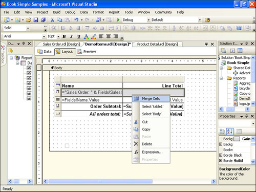
Multiple adjacent table cells can be merged horizontally into a single cell across multiple columns. Unlike Excel or Microsoft Word, SSRS table cells cannot be merged vertically even across the same type of rows, such as a detail row. Report Designer only preserves data from the first cell. Data in other merged cells is discarded. Report Designer allows you to split back to the original columns.
To merge or split cells, select the cells, right-click the selection, and then select Merge Cells or Split Cells, respectively, from the shortcut menu (see Figure 11.5). Alternatively, Report Designer provides a toolbar button to perform this operation. The toolbar button icon is the same as the icon on the menu.
Figure 11.5. Merging table cells.
List Report Item
List is designed to present data in a free-form fashion for complex repeating areas. List repeats items for each row of the associated data set. List allows you to group and sort rows of data. A single list can have only a single group, but lists can be nested within each other to provide multiple grouping.
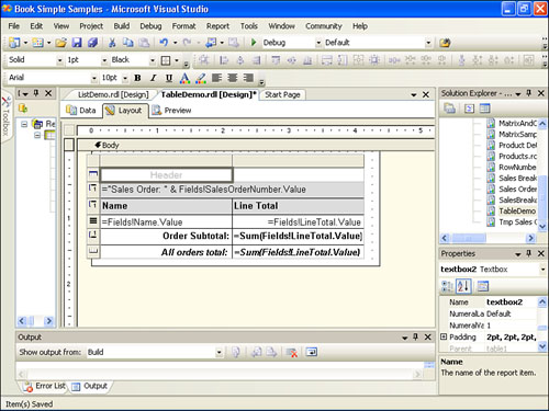
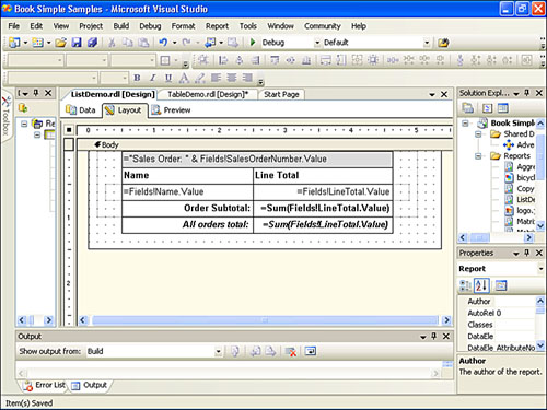
A list or, more precisely, a nested set of lists has the same overall capabilities as a table. Examples TableDemo and ListDemo that are included in the samples for this book demonstrate how both a table and a list can produce the identical rendered result. However, Table report item has better performance and you should almost always choose a table when possible.
In some cases, report developers might find List to be very useful for complex formatting. In such cases, using a table might no longer provide an elegant solution. One of the examples in which List can be used is check printing. List allows you to position items in a free-form fashion and allows for an elegant design.
List is described with the following RDL. This RDL contains an optional group expression:
=Fields!SalesOrderNumber.Value
<List Name=”list1”>
{POSITION}
{ITEMS}
<DataSetName>DataSet1</DataSetName>
<Style />
<Grouping Name=”list1_Details_Group”>
<GroupExpressions>
<GroupExpression>
=Fields!SalesOrderNumber.Value</GroupExpression>
</GroupExpressions>
</Grouping>
</List>
An example of a list is shown in Figure 11.6.
Figure 11.6. Design-time picture of a list.
When deciding whether to use Rectangle or List as a container for other nonrepetitive controls, you should consider the number of data sets defined for a report. If there are multiple data sets, List can provide a better choice from a perspective of scope resolution for a Fields collection. In this case, all the controls contained in a List can benefit from the DataSetName property of a List. This allows you to use a simplified expression, such as
=Fields!Name.Value
as opposed to an expression with specified scope resolution, such as
=First(Fields!Name.Value, “DatasetName”).
Scope resolution will be required for an expression contained within a Rectangle.
Practical Application of Report Items
It is time to put your knowledge to practical use. By now, you have sufficient knowledge to put fairly complex reports together. Let’s start with a Sales Order summary report.
Adventure Works’ management requested a report that displays selected properties of an order header (ship and bill to addresses, contact information, and billing summary) and selected properties of an order’s line items (product name, unit price, order quantity, and line total). Adventure Works requires each report to have a company logo.
- Create a new report with two data sets:
Order_Header(data selected from join betweenSalesOrderHeader, Address, andStateProvincetables) andOrder_Detail(data selected from join betweenSalesOrderHeader,SalesOrderDetail, andProducttables). To retrieve a specific order, you will use parameter@SalesOrderNumberin theWHEREclause of both data sets:WHERE SalesOrderHeader.SalesOrderNumber = @SalesOrderNumber). - To have a more complete picture of an order and include both shipping and billing addresses, you need to include
AddressandStateProvincetables twice in theOrder_Headerdata set. Create aliases for the first set ofAddressandStateProvincetables asBillToAddressandStateProvinceBill,useShipToAddressandStateProvinceShipaliases for the second set of tables. To create an alias for a table, right-click a table in a Graphical Query Designer, select Properties from the shortcut menu, and fill the Alias field as needed. Alternatively, you can edit the query text directly. - Create an alias for each field you want to include on a report. You can prefix fields with
ShiporBillfor tables related to shipping and billing addresses, respectively. - Add the company logo image report item. From the Toolbox, drag the image item and drop it onto the report body. Click Next to skip the Welcome screen of the Image Wizard. Select Embedded on the Select the Image Source dialog box (refer to Figure 11.2).
- If the image is already embedded, select it from the Choose the Embedded Image dialog box; otherwise, select New Image and browse for the image or type its location. For images stored in the project, the process is similar. For the images stored in the database, you need to select
Dataset,Image Field, andMIME Typeproperties. A web image requires you to specify a URL. - Add a List by dragging a List item from the Toolbox. As was noted previously, you can take advantage of the
Datasetproperty of the List item. As an experiment, drag and drop theFirstNamefield ofOrder_Headeroutside of the list. - Note the value of the created text box is
=First(Fields!FirstName.Value, “Order_Header”). As a comparison, drag and drop theFirstNamefield on the list. Note the value of the created text box is=Fields!FirstName.Value. Also note that theDatasetproperty of the List item is now set toOrder_Headerand it was blank prior. - Add a report heading. Drag and drop a text box from the Toolbox. Enter the following expression as a value:
=“Sales Order Number” & “ - “ & Fields!SalesOrderNumber.Value. This expression concatenates the constant“Sales Order Number - “and the value of theSalesOrderNumberfield. To highlight the heading of the report, increase the font size and change the text box background. - Add and arrange data fields in the page header by dragging and dropping data set fields on the list:
Street, City, State, andZipfrom both billing and shipping addresses. Second, add contact information and billing summary fields. Add text box items to denote values that were added. Change the heading for information sections to bold font.Add lines to help separate informational pieces. Note that not all the web browsers support overlapping controls, such as lines. In your particular case, you might need to have several lines bordering each other as opposed to crossed lines as on a sample report.
Add a table to display details of an order. Drag and drop a Table item from the Toolbox. The default table has three rows and three columns. Right-click on the header of the rightmost column and select Add Columns to the Right from the shortcut menu. Drag and drop
Order_Detailfields to the Detail area of the table, and note how the heading is changed to the name of the field. - To summarize line item charges, drag and drop the
LineTotalfield from theOrder_Detaildata set to the footer of the table, and note that SSRS inserted the aggregation functionSum()and the value of the footer cell is now=Sum(Fields!LineTotal.Value).
The resulting design-time view of the report should look similar to Figure 11.7. The complete report can be found in samples that accompany this book at CodeSamplespart2.relationaldbsamplereportspart2_simple_samplesSales Order.rdl.
Figure 11.7. Design-time picture of an Order Detail report.

Matrix Report Item
The Matrix report item is also known as a cross-tab or pivot table. Matrix is capable of having a dynamic number of rows and columns and expands row by row and column by column. Matrix can act like a Table (fixed columns, dynamic rows) or like a pivot table (fixed rows, dynamic columns) to transpose data (turn rows into columns of data). Matrix allows you to group and sort rows and columns of data and can have multiple groups of rows or columns.
Just like a table, each cell in a matrix contains a text box by default. Matrix also requires at least one row and one column group. Because of this requirement, the RDL of a matrix carries a <Grouping> section:
<Grouping Name=”matrix1_RowGroup1”>
<GroupExpressions>
<GroupExpression />
</GroupExpressions>
</Grouping>
This book uses a {GROUPING:{expression}} shortcut to abbreviate the appearance of this RDL. In turn, the {GROUPING} section is included in <RowGroupings> or <ColumnGrouping> sections, such as
<RowGroupings> <ColumnGroupings>
<RowGrouping> <ColumnGrouping>
<Width>1in</Width> <Height>0.25in</Height>
<DynamicRows> <DynamicColumns>
{GROUPING} {GROUPING}
{ITEMS} {ITEMS}
</DynamicRows> </DynamicColumns>
</RowGrouping> </ColumnGrouping>
</RowGroupings> </ColumnGroupings>
Later in the book, <RowGroupings> and <ColumnGroupings> sections are abbreviated as {ROWGROUPINGS} and {COLUMNGROUPINGS}, respectively.
A simple matrix carries the following RDL. Note that DataSetName is for data regions during runtime.
<Matrix Name="matrix1">
{POSITION}
<MatrixColumns>
<MatrixColumn>
<Width>1in</Width>
</MatrixColumn>
</MatrixColumns>
{ROWGROUPINGS}
{COLUMNGROUPINGS}
<DataSetName>DataSet1</DataSetName>
<Corner>
{ITEMS}
</Corner>
<MatrixRows>
<MatrixRow>
<Height>0.25in</Height>
<MatrixCells>
<MatrixCell>
{ITEMS}
</MatrixCell>
</MatrixCells>
</MatrixRow>
</MatrixRows>
</Matrix>
Figure 11.8 demonstrates the design-time view of a matrix.
Figure 11.8. Design-time picture of a matrix.
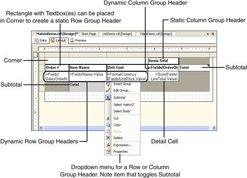
You should note a couple of items related to Figure 11.8 (this book provides additional information on grouping in Chapter 12):
• To create a subtotal for each group, right-click on a group header (row or column) and select Subtotal from the shortcut menu. Use the same menu to toggle Subtotal on and off.
• A static group is created by using constant as a grouping expression.
• To create a static row header, you can place a Rectangle item in the corner of the matrix and lay out some text boxes inside.
• To properly color the entire Subtotal row, you can use the following expression in the BackgroundColor property of the Detail cell. This book provides more information about the InScope() function in Chapter 12.
=IIF(Not InScope("matrix2_RowGroup1"), "LightGrey", "White")
Chart Report Item
A Chart report delivers a graphic presentation of data. Chart has comprehensive functionality and is very similar by capabilities to an Excel chart, including a variety of chart types, 3D effects, and more. Unlike an Excel chart, the SSRS Chart does not build a trend line internally; however, this limit can be overcome by calculating values for a trend line in the data set and then providing it to a chart.
Note
For examples and explanations about charts, this book uses Chart type = Column chart. This is the default type of chart that Report Designer adds to a report.
The Chart control used in this release of Reporting Services is licensed from Dundas Software (www.dundas.com). You can obtain an add-on pack for Reporting Services from Dundas Software. Figure 11.9 shows a Design-time view of a chart.
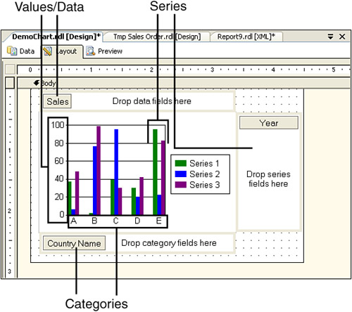
Figure 11.9. Design-time picture of a chart.
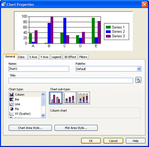
The Chart Properties dialog box (see Figure 11.10) provides an interface to access chart properties. To access this dialog box, right-click on a chart and select Properties from the shortcut menu.
Figure 11.10. Chart Properties dialog box.
Tip
You might have noticed that it is not possible to control label orientation. The x-axis label orientation is determined automatically by the chart control based on the available space. You can try to adjust the dimensions of a chart to achieve the desired result. Alternatively, for example in a case of a column chart, you can try to achieve the desired orientation with a matrix aligned to a chart’s.
Chart Data (Value)
Chart requires at least one set of data values associated with it. You can simply drag and drop a field to the Drop Data Fields Here area of a chart. The data determines the size of a chart element for each type of chart. For example, for a column chart, the data determines the height of a column on a chart.
Data is considered static. For a Column chart, it means that a single data file added to a chart (and no series) results in a single column providing a sum of all values and a single legend. If you add one more data field to a chart, SSRS shows a second column and adds a second legend.
Most charts group data by a series or a category. In this case, you must use an aggregate expression for a data value. This is similar to grouping in a table or matrix where non-aggregate expressions are syntactically allowed. However, the result contains the last value of a field instead of a summary value for a group and, thus, produces an unexpected result. Report Designer automatically adds an aggregate function, but changes are allowed. To verify or change the data value expression, you can either edit the RDL or access this expression from the Data tab of the Chart Properties dialog box. Following is the RDL that describes the data value. From this point forward in this book, the section surrounded by the <ChartData> tag is abbreviated as {CHART DATA}.
<ChartData>
<ChartSeries>
<DataPoints>
<DataPoint>
<DataValues>
<DataValue>
<Value>=Sum(Fields!LineTotal.Value)</Value>
</DataValue>
</DataValues>
<DataLabel />
<Marker />
</DataPoint>
</DataPoints>
</ChartSeries>
</ChartData>
Chart Series Groups
Optional series groups allow adding more dimensions of data to a report. Series group labels are placed in the legend of the chart. Series groups are dynamic. A chart that uses series groups displays a chart element for each series group for each category. For example, a column chart with sales data displays a column for each year returned by a series group expression.
Following is the RDL that describes a series. From this point forward, the section surrounded by the <SeriesGroupings> tag is abbreviated as {SERIES GROUPS}.
<SeriesGroupings>
<SeriesGrouping>
<DynamicSeries>
<Grouping Name=”chart1_SeriesGroup1”>
<GroupExpressions>
<GroupExpression>=Fields!OrderQty.Value</GroupExpression>
</GroupExpressions>
</Grouping>
<Label>=Fields!OrderQty.Value</Label>
</DynamicSeries>
</SeriesGrouping>
</SeriesGroupings>
Chart Category Groups
Chart Category Groups is the optional mechanism of grouping data that provides the labels for chart elements.
For example, in a column chart, Country Name fields placed in the Category region generate country labels for x-axes (United States, Italy, and so forth).
You can nest categories. Multiple categories nest x-axes labels. For example, in a column chart with sales data, the first category group could be a county, and the second category group could be TerritoryId. The column chart would display groupings of products by TerritoryId on the x-axis.
Following is the RDL that describes a Category grouping. From this point forward, the section surrounded by the <CategoryGroupings> tag is abbreviatedas {CATEGORY GROUPS}.
<CategoryGroupings>
<CategoryGrouping>
<DynamicCategories>
<Grouping Name=”chart1_CategoryGroup1”>
<GroupExpressions>
<GroupExpression>=Fields!SalesOrderNumber.Value</GroupExpression>
</GroupExpressions>
</Grouping>
<Label>=Fields!SalesOrderNumber.Value</Label>
</DynamicCategories>
</CategoryGrouping>
</CategoryGroupings>
Chart’s RDL
A rudimentary chart is described by the following RDL:
Chart Name="chart1">
{POSITION}
<DataSetName>DataSet1</DataSetName>
{SERIES GROUPS}
{CATEGORY GROUPS}
{CHART DATA}
</Chart>
A real-life chart has additional elements in its RDL, such as sections for Axis, Gridlines, Plot Area, and Legend. These elements describe graphical presentation details for a chart.
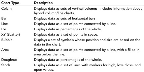
Reporting Services supports the following chart types: Column, Bar, Line, Pie, Scatter, Bubble, Area, Doughnut, and Stock. Table 11.4 provides a description of each type.
Table 11.4. Chart Types
You can select a chart’s type by either right-clicking on a chart and selecting Chart Type from the shortcut menu or by selecting Properties from the same shortcut menu and working with the Chart Properties dialog box on the General tab.
Practical Application of Chart and Matrix
Let’s apply the knowledge from this chapter to create a report.
Create a report that displays sales by country and by year, including graphical presentation of sales data using the following steps.
- Add a new report with data set, based on the following query:
SELECT SUM(SOH.TotalDue) AS Sales, DATENAME(yyyy, SOH.OrderDate) AS Year, 'Q' +
DATENAME(qq, SOH.OrderDate) AS Quarter, Person.CountryRegion.Name AS CountryName
FROM Sales.SalesOrderHeader AS SOH INNER JOIN Sales.SalesTerritory AS ST ON
SOH.TerritoryID = ST.TerritoryID INNER JOIN Person.CountryRegion ON ST.CountryRegionCode =
Person.CountryRegion.CountryRegionCode
GROUP BY ST.Name, DATENAME(yyyy, SOH.OrderDate), 'Q' + DATENAME(qq, SOH.OrderDate),
Person.CountryRegion.Name
ORDER BY ST.Name, DATENAME(yyyy, SOH.OrderDate), 'Q' + DATENAME(qq, SOH.OrderDate) - Include the AdventureWorks logo and title of the report (Sales By Country).
- Drag and drop a Chart item onto a report. Note the drop areas: Drop Data Fields Here, Drop Category Fields Here, and Drop Series Fields Here. Drag and drop the
Salesfield on the data area,CountryNameon the category area, andYearon the series area. - Drag and drop a Matrix item on the report. Drag and drop the
Salesfield on the data area of the matrix,CountryNameon the columns area, andQuarterandYearfield on the row area.
Figure 11.11 provides resulting design and runtime views of the report. Final report can be found in the samples for this book at CodeSamplespart2.relationaldbsamplereportspart2_simple_samples Matrix and Chart -- SalesByCountry.rdl.
Figure 11.11. Chart and matrix items at work.

Report Body Versus Page Header/Footer
The report body can contain any SSRS items, including data regions. The page header and footer can only contain independent report items, such as Textbox, Line, and Rectangle. More complex page header and footer functionality can be implemented with Table or Matrix and the RepeatOnNewPage property. Some limited paging functionality can be implemented with List.
Summary
Report items are the presentation elements within SSRS.
Data regions function as a repetitive display of rows, groups of rows, or columns from a data set associated with a region. Data regions include Table, Matix, Chart, and List. Data regions cannot be included in page headers or page footers.
Other report items are used for display purposes and are commonly called independent report items. These items include Line, Rectangle, Textbox, and Image.
Data regions and independent report items support navigation; please see Chapter 14 for more details.
Containers can include other reporting items. Items placed in a container become the container’s children and the container becomes the parent. Table, Matrix, List, Rectangle, Report Body, Page Header, and Page Footer are containers.
In the following chapter, you will build on this knowledge by learning how to group, sort, and aggregate data within a given scope of a data region. By learning how to use report items and group data effectively, you will be able to create advanced reports in no time.