
Chapter 13: Performing Advanced Analysis
We have already covered how, as a report author, you can use features to enhance your reports for analytical insights, such as Q&A and exporting. In this chapter, you will closely examine your data and Power BI reports and then extract value with deeper analysis. You will learn how to get a statistical summary for your data, analyze time series data, and group and bin your data. You will also apply and perform advanced analytics on the report for deeper and more meaningful data insights.
In this chapter, we will cover the following:
- Identifying outliers
- Using anomaly detection
- Conducting time series analysis
- Using grouping and binning
- Using the key influencers to explore dimensional variances
- Using the decomposition tree visual to break down a measure
- Applying AI insights
These are some of the more advanced features of Power BI. They allow you to become your own junior data scientist, granting you even more statistical insights into your data.
Technical requirements
For this chapter, please make sure you have the following:
- Microsoft Power BI Desktop installed on a Microsoft Windows PC.
- We've also provided synthetic data that can be used, which is available in the GitHub repository for this book here: https://github.com/PacktPublishing/Microsoft-Power-BI-Data-Analyst-Certification-Guide/tree/main/example-data.
Identifying outliers
An outlier is a data point in your dataset that is out of place or doesn't fit well with other data. For example, we might collect data about our daily revenue and see that each day we consistently have $1,000 in total sales. If we then have a day where our daily revenue is about $6,000, then that would be an outlier if the daily revenue then goes back down to $1,000. Outliers can be either positive or negative; in fact, they are just any deviation from a typical or expected result. It is important to identify and deal with outliers because they can cause problems when we try to make business decisions as they skew decisions; when outliers have been properly identified, they will help ensure the higher accuracy of insights gained from your data. You can define your calculations on what an outlier is. You can create measures to define what would be considered anomalous in your dataset.
Math
In mathematics, outliers are often defined as being more than 2 standard deviations away from the mean. As this is not a math course, I will not go into any more detail about it.
Calculated columns can be used to identify outliers; however, since we know calculated columns are only updated when data in the model is refreshed, the more dynamic approach would be using a visualization or DAX formula. After outliers have been identified, the most common next step would be to visualize them, likely using a scatter chart, as shown in Figure 13.1. Outliers can be highlighted or made easier to notice using filters or slicers:

Figure 13.1 – Scatter plots can quickly identify outliers across multiple dimensions
By combining DAX measures and visualizations, you will be able to spot outliers and address them quickly. Just remember, not every outlier is a bad data point. Sometimes the real world conspires against our mathematical models. For example, as we previously discussed, you may have daily sales revenue data that is typically about $1,000 each day. On a day the daily sales are $6,000, it might have actually been the start of a huge new promotion, so just because it looks like an anomaly, doesn't immediately mean it's an outlier. We have to take other factors into consideration that might have caused that anomaly.
Now that we have learned all about the basics of finding outliers, we will explore a unique way to do so, using anomaly detection.
Using anomaly detection
One of the great ways to find outliers is using the built-in Find anomalies tool in the Analysis pane of a visualization in Power BI. This feature of Power BI uses Artificial Intelligence (AI) capabilities to identify which data points are most different from other values in your data. The purpose of this feature is to help with analyzing the data so that action can be taken either against the data before business decisions are made or to help report consumers better understand the data and make informed business decisions.
To use this capability, you need to be using a supported visual (such as a line or scatter chart) and only one field on the y axis or values. This feature is being improved; so, at the time of writing, this was the requirement.
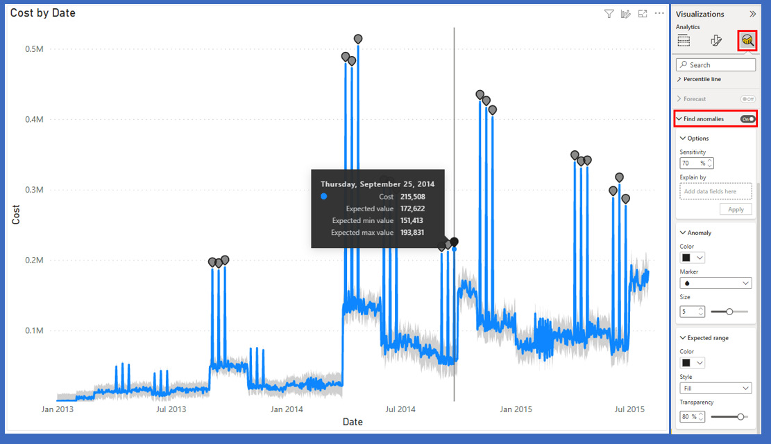
Figure 13.2 – Automated anomaly detection is built into some visualizations
Once this has been enabled, you can see the outliers identified with a gray dot. These are anomalies that have been identified. You can also set the sensitivity level, and even a categorical field to use as the basis for anomaly detection. With this capability, it is easy to quickly identify data values that are out of place or potentially outliers.
Now that we have an understanding of outliers, let's take a look at how we can analyze time series data in the next section.
Conducting time series analysis
Time series analysis involves extracting meaningful data and identifying trends by analyzing your data in time order. You can use this time-ordered data to make predictions about the future, forecasting future needs or desired actions.
Visuals such as line charts can be used alongside the forecasting pane to show how your time series data is predicted to change. Many times, time series analysis involves using plots such as Gantt charts, which can be helpful for scenarios such as project planning or monitoring stock market data. By looking at your data using these tools, you can best identify when events have influenced change in your business. Any events that impact your business should be represented in the data and thus be identifiable when looking at the time series data.
In Figure 13.3, we can see the phases of a project as it moves along the axis of time. Before Feb 07, we can see that the phase was Scope, while the Analysis phase started from Feb 07 and has an end date before Feb 14. We can monitor the process of each phase as some will overlap and using this time series method, we can monitor the change over time and observe how events will impact the data.

Figure 13.3 – Gantt charts are a staple of modern business, and a classic example of time series reporting
Another way to add time series information to your reports is by using Play Axis. The scatter chart in Figure 13.1 has a play button in the lower left-hand corner. Clicking on it will have the chart "play" through the dates; you can watch your data change over time.
If you have a whole page of visuals you want to "play" over time, there is a custom visual called Play Axis that may help here, and it is available in Microsoft AppSource.

Figure 13.4 – Adding the Play Axis visualization to a report page
The Play Axis slicer can make a whole page of your report display your data ordered by date.
Grouping and binning
Grouping and binning are techniques used by analysts and statisticians to better understand data and draw insights from it. For example, you might sell products that have various sizes, such as extra small, small, medium, large, extra large, and 2X large. When you look at the sales data, the number of extra small, extra large, and 2X large sales might be much less than the other categories of products. So, in cases such as that, you might want to redefine the categories into small, medium, and large, grouping small and extra small together and large, extra large, and 2X large together to best understand your sales patterns by aggregating the data first. The same technique can be used for numeric or date types; however, in those cases, it's typically referred to as binning. For example, you may have sales data that is daily, but you want to understand long-term patterns, so you bin the data together by aggregating the daily data into weekly or monthly bins, so it becomes easier to analyze over longer periods of time. When you do this, you can also consider how you aggregate this date; sum, average, maximum, and count are all built-in aggregation functions that can be used in Power BI. Power BI will sometimes do grouping or binning automatically depending on the data, but you always have full control as the report designer to visualize your data to tell the story you want to tell.
Grouping
You can easily create a new group by either right-clicking on a field from the field well and selecting the New group option or using a visualization. If you right-click after multiselecting many categorical fields on a visualization, you will see the Group data option. Choosing this creates a new group based on the x-axis field.

Figure 13.5 – Multiselecting a categorical field to create a group
When the group is created, notice that the visual updates show the new group. You may want to edit the visual to change the way the data is displayed. You may want to change the axis.
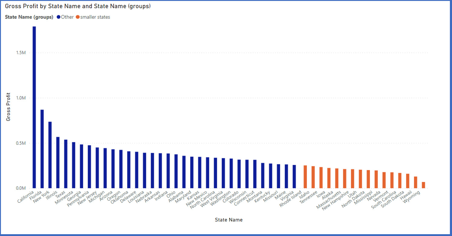
Figure 13.6 – Our visual is now showing our groups. The default group name has been edited to "smaller states"
After creating the group, you may want to edit it by renaming the group members, adding new subgroupings, or excluding the "other" grouping are all options. When you created the group, a new group type was added to the table that contains the values.

Figure 13.7 – Group type for state name. Notice the group type icon
If you right-click on the group, you will see the Edit group option.

Figure 13.8 – Let's edit our group!
In the Edit group pane, you can add more subgroups, rename the group, and rename the subgroups. You also have the option to include or exclude ungrouped values from the column.
Binning
Binning is much like grouping except it's for numbers and dates. It's a way to turn continuous numbers into categorical fields. You create a bin by right-clicking on the numerical or date field you want to bin and selecting New group, just the same as for a categorical value.

Figure 13.9 – Binning your numbers
Once the Groups dialog box opens, you will see a couple of changes. Group type will be Bin, not List, and you can choose your bin type. You can either force your numeric field into a fixed number of bins or you can choose how many elements go into each bin.

Figure 13.10 – Net revenue forced into 10 bins
Both binning and grouping let you create summarized data that is easier to digest.
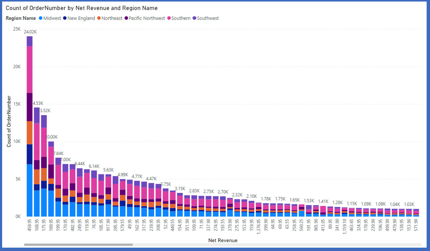
Figure 13.11 – The same data from Figure 13.10, but without binning
Tip
Be careful of smoothing out your data into too few bins. Too few bins and you may miss some peaks and valleys in your data.
Now that we have learned all about grouping and binning, let's move on to another key visual element that Power BI has, key influencers.
Key influencers
The key influencers visual is another helper visual that will help you analyze your data to determine which fields in your data influence others. For example, your sales data may also include customer demographics such as household income or employment status. Using the key influencers visual, you may come to find out that household income may be a factor that influences the total sales per customer. This visual performs statistical calculations in order to show the results and will typically require configuration to your data for best results.
The key influencers visualization can be found in the Visualizations pane. Once you have added it to the report, you start by selecting the field you want to analyze. You can then add one, or preferably more, fields to Explain by.

Figure 13.12 – The key influencers visualization explaining how much each factor impacts net revenue
Your report consumers can click on each category and get a breakdown of not only how much it impacts your chosen metric, but also what parts impact it. We'll now explore another visual similar to the key influencers one, that is, the decomposition tree visual.
Decomposition tree visual
Similar to the key influencers visualization, the decomposition tree visual also lets you see your data across multiple dimensions. You can use it for improvised exploration and conducting root cause analysis.
The decomposition tree visualization can be found in the Visualizations pane. Once you have added it to the report, you start by selecting the field you want to analyze. You can then add one, or preferably more, fields to Explain by. If this sounds familiar, it's because it's the exact same thing you did for the key influencers visual.

Figure 13.13 – You can choose the order you want to decompose your tree in
The decomposition tree visual will update as data fields are added to the Explain by configuration. When a new field is added to Explain by, the visual updates, with the + symbol being added to the visual. By clicking +, you can then select how you want the decomposition tree visual to generate the next level of understanding from the data. When the AI computation in the visual detects high values and low values in the data, this can also be selected and is referred to as an AI split. These are provided by the visual to help you better analyze the data using the decomposition tree visual.
Applying AI insights
When you have a dataset and don't know where to start, there is a feature that can help you. Quick insights is a machine learning-based capability built into Power BI that can automatically build visualizations and make some insights stand out. It is also useful to use on datasets that have been published but allows you to look for any insights that may have been missed. This capability can be used on some datasets that have been published to a Power BI workspace.
To use quick insights, click Get quick insights from the dataset menu for a dataset that has been published to the Power BI service. The service will then run statistical algorithms to automatically generate visualizations.

Figure 13.14 – After clicking on Get quick insights, a popup will appear telling you that your insights are ready
Once the process has completed, you need to click View insights to view the insights that have been generated by the service. When quick insights are generated, Power BI will create up to 32 different insight cards. Each card will have a visual and a short description. These visuals are the same as visuals you manually create. These visuals can be pinned to dashboards the same as visuals in reports.

Figure 13.15 – The output from quick insights. Power BI generated 37 visuals this time
Quick insights can give you a deeper understanding of your data and the potentially hidden relationships within. It's like having your dataset reviewed by a data scientist, but at a fraction of the cost!
Summary
What a fun chapter! These more advanced features of Power BI are phenomenal. They allow you to get a much deeper understanding of how data points in your dataset interact with, influence, and affect your business.
In this chapter, we covered how to identify outliers and anomalies in your data. You saw, ever so briefly, what makes an outlier, then quickly moved away from the math. Power BI can detect them for you, no math required.
Power BI is an awesome tool for analyzing your data over time. Some visualizations allow you to add a play axis that you can add a date field to; for the rest, you added the Play Axis slicer visualization to the page and made every visual change over time.
With grouping, we created our own subgroups within a column. You then used binning to change a continuous, numeric column into a categorical field. These two interrelated concepts allow you to simplify visuals or bin together smaller data points.
The key influencers chart allows you to explore dimensional variances and what makes up a number. You saw how different fields affect a data point and by how much. This visual allows your report consumers to really understand how different parts of your business interact.
The decomposition tree visual is like key influencers in that it breaks down a measure and explains how the number was arrived at. The decomposition tree allows your report consumers to choose AI splits and in what order they want to see them.
Finally, you applied AI insights to your dataset. You saw how this Power BI service feature can act as your very own data scientist looking for correlations and causations in your data.
In the next chapter, you will discover how to use workspaces in the Power BI service to share your reports and control permissions.
Questions
- The key influencers visualization can be used to discover what about your data?
- Understand relationships between fields in your data model.
- Aggregate numeric data in your data model.
- Generate text summaries of insights.
- How many social media followers you have.
- Which type of visual is often used with time series analysis?
- Gantt chart
- Pie chart
- Map visual
- Decomposition tree
- When there are data values that don't fit well with other values, your data may contain what?
- Errors
- Bad records
- Outliers
- Empty records