
Chapter 5
Mastering Color Controls
IN THIS CHAPTER
![]() Exploring the White Balance feature and its effect on color
Exploring the White Balance feature and its effect on color
![]() Creating custom White Balance settings
Creating custom White Balance settings
![]() Choosing a color space (sRGB versus Adobe RGB)
Choosing a color space (sRGB versus Adobe RGB)
![]() Checking out Picture Control settings
Checking out Picture Control settings
Compared with understanding certain aspects of digital photography, making sense of your camera’s color options is relatively simple. First, when color problems occur, they’re often easy to fix by adjusting the camera's White Balance setting. Second, getting a grip on color requires learning only a few terms, an unusual state of affairs for an endeavor that often seems more like high-tech science than art. This chapter explains the White Balance setting along with other features that affect the way your camera renders colors.
Understanding White Balance
Every light source emits a color cast. The fluorescent lights in certain restrooms, for example, put out a yellow-green light that makes everyone look sickly. Candlelight, on the other hand, produces a flattering warm glow.
 Science-y types measure the color of light, officially known as color temperature, on the Kelvin scale, which is named after its creator. You can see the Kelvin scale in Figure 5-1.
When photographers talk about warm light and cool light, though, they aren’t referring to the position on the Kelvin scale — or at least not in the way most people think of temperatures, with a higher number indicating hotter temperatures. Instead, the terms describe the visual appearance of the light. Warm light, produced by candles and incandescent lights, falls in the red-to-yellow spectrum at the bottom of the Kelvin scale; cool light, in the blue spectrum, appears in the upper part of the Kelvin scale.
Most people don’t notice fluctuating colors of light because human eyes automatically compensate for them. Similarly, a digital camera compensates for different colors of light by using white balancing. Simply put, this feature neutralizes light so that whites are always white, which in turn ensures that other colors are rendered accurately.
When you stick with the camera’s default White Balance setting, things work out just fine in most cases. But if the scene is lit by two or more light sources that cast different colors, the White Balance system can become confused, producing an unwanted color cast. For example, the figurine shown in Figure 5-2 is ivory colored in real life. But at the default White Balance setting, which lets the camera control white balancing automatically, the figurine took on the yellow cast you see in the first shot in the figure. Changing the White Balance setting resulted in the accurate colors you see in the second photo.

FIGURE 5-1: Each light source emits a specific color.
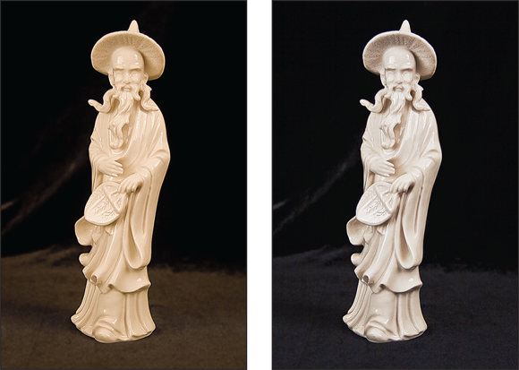
FIGURE 5-2: Multiple light sources resulted in a yellow color cast at the default White Balance setting (left); switching to the Incandescent setting solved the problem (right).
The next section explains how to change the White Balance setting; following that, you can explore advanced options related to this feature. Unfortunately, you can’t access the White Balance setting when you set the Shooting mode to Auto. You have to use the P, S, A, or M Shooting mode.
 If you don’t want to step up to the P, S, A, or M Shooting mode, here’s a workaround that gives you some color control even in Auto Shooting mode: Set the Image Quality option to Raw (NEF). With Raw files, you can fine-tune colors when you process the Raw file. In fact, Raw is a better option even in P, S, A, and M modes for color-critical photographs because of the possibility of tweaking colors after the fact. Chapter 2 explains this Raw stuff; Chapter 9 shows you how to process Raw files.
Changing the White Balance setting
 At the camera’s default settings, the live preview in the monitor and viewfinder reflects changes to color settings. If the colors don’t update, open the Custom Settings menu, choose Shooting/Display, and then set the Apply Settings to Live View option to On. The same setting determines whether changes to exposure are reflected in the displays. (Nikon gives you the option to turn off the feature because it causes some people to experience eyestrain when spending long periods composing shots through the viewfinder.)
You can view the primary White Balance setting in the default monitor display, the Information display, and the default viewfinder display, as shown in Figure 5-3. In the figure, the default setting, A1, is selected; it’s one of four — that’s right, four — automatic White Balance settings on the Z fc.

FIGURE 5-3: Look here to check the current White Balance setting.
Again, you can control the White Balance setting only in the P, S, A, and M Shooting modes. To access the setting, use any of these techniques:
 i menu: Highlight the White Balance symbol, as shown on the left in Figure 5-4, and press OK to display available settings on a separate screen, as shown on the right. If a Details box appears, as shown in the figure, tap the box or press the Multi Selector down to access secondary options. For example, for the Fluorescent setting, you can choose from three bulb types. I detail these secondary settings a bit later in this section. If the screen instead displays an Adjust box, tapping that box or pressing the Multi Selector down leads to the fine-tuning tool that I explain in the next section.
FIGURE 5-4: Tap the White Balance symbol (left) to display available settings on a new screen (right).
To see all settings on the same screen as the i menu, highlight the White Balance symbol and then rotate the Main command dial to choose a setting. If you select a setting that has secondary options, rotate the Sub-command dial to choose the one you want to use.
Photo Shooting menu/Video Recording menu: For still photography, open the Photo Shooting menu and choose White Balance. For video color control, use the Video Recording menu. If you see a right-pointing triangle next to a setting, press the Multi Selector right to access the secondary options for that setting. If you see an Adjust symbol at the bottom of the screen, tap it or press the Multi Selector right to open the fine-tuning controls.
The Video Recording menu offers a setting not available via the i menu: Same as Photo Settings. When that option is selected, as it is by default, the camera uses your still photography White Balance setting when you switch to video recording. Any other setting you choose from the Video Recording menu affects only video recording.Function (Fn) button plus Main command dial: At the camera’s default settings, pressing and holding the Fn (Function) button (labeled in Figure 5-5) displays the White Balance settings without the i menu, as shown on the right in the figure. While holding down the button, rotate the Main command dial to select a setting and then rotate the Sub-command dial to select any secondary options. You can’t access the fine-tuning tool when you use this method.

FIGURE 5-5: You also can use the Fn button in conjunction with the command dials to change the White Balance setting.
I dislike this setup because my index finger seems to naturally fall over the Fn button when I grip the camera. As a result, I often display the White Balance options accidentally. If you also find this feature annoying, see Chapter 10 to find out how to assign the Fn button another shooting function or to disable it altogether.
White Balance settings are represented in the displays by the symbols shown in the following list, which details each setting:
- A (Auto) 0, 1, and 2: These Auto settings are designed for use with any light source in the range from 3500–8000K (refer to the Kelvin chart in Figure 5-1). But each one renders colors differently if the scene is mostly lit by incandescent bulbs, as follows:
 A0: Choose this option to neutralize the warm tones cast by incandescent lights.
 A1: The default setting, this Auto option doesn’t completely neutralize colors in scenes lit by incandescent lighting. Instead, it retains a bit of the warm color cast lent by that type of light. For portraits, it can be flattering, but for objects like the one featured in Figure 5-2, it may leave colors a little too warm.
 A2: Select this option to retain even more of the warm radiance produced by incandescent lights.
 Auto (Natural Light Auto): Because three other Auto settings apparently aren’t enough (insert eye-roll emoji here), you also get an Auto setting designed for natural light — sunlight or daylight, in other words. Nikon says that this setting is geared to light sources that fall in the 4500–8000K range of the Kelvin scale and results in colors similar to the ones you see with your eyes. This presumes, of course, that your eyesight is on target, color wise. As people age, the lenses in our eyes turn slightly yellow, which can give a false impression of color. After cataract surgery on my right eye, I quickly discovered that when I closed that “new and improved” eye, colors became more yellow than when I looked at them through the eye with the artificial lens.
- Cloudy and Shade: The names of these settings imply similar lighting conditions, but they’re more different than you may imagine:
 Cloudy is geared to shooting outdoors on days when the skies are overcast, with the sun completely or mostly obscured. Cloudy is geared to a color temperature of 6000K.
 Shade is designed for shooting outdoor subjects that are in the shade, regardless of whether skies are overcast. This setting is geared to a color temperature of 8000K — so, light that’s a little cooler (bluer) than Cloudy is designed to neutralize.
 Incandescent: If you use incandescent lighting and the Auto 0, 1, or 2 settings fail you, try this setting. It assumes a bulb color temperature of 3000K. Most light-bulb packaging states the color temperature if you’re unsure of where the lights fall on the Kelvin scale.
- Fluorescent: For this setting, you can choose from three bulb types, each designed for a different temperature:
 Cool-white, for bulbs engineered to produce 4200K light
 Day white, for 5000K bulbs
 Daylight, for 6500K bulbs
 Flash: I won’t insult your intelligence by suggesting when to use this option. But I will share that the setting is geared to flash units that emit light measuring about 5400K. You should find this specification in the user guide for your flash unit.
 K (Choose Color Temperature): If you use lights that have a specific Kelvin temperature not addressed by one of the other settings, select this option and dial in the temperature manually. The default setting is 5000K; you can set the value as low as 2500K and as high as 10000K.
When you choose the K setting — K is for Kelvin — from the i menu, you see the controls shown in Figure 5-6. Change the Kelvin value using the options in the box that’s highlighted in the figure; the other half of the screen is for fine-tuning the setting, as outlined in the next section. Unfortunately, the controls obscure a good portion of the live preview, but you can still see how your change to the Kelvin value affects colors.

FIGURE 5-6: Use the value boxes on the left to set a specific color temperature for the K (Kelvin) White Balance setting.
 PRE (Preset Manual) This option enables you to store several custom White Balance settings. It’s the fastest way to achieve accurate colors when your scene is lit by multiple light sources that have different color temperatures. (I explain it a few miles from here.) You see the PRE1 symbol until you create more than a single preset; after that, the number of the selected preset appears with the letters PRE.
 The current White Balance setting remains in force for the P, S, A, and M Shooting modes until you change it, even if you turn off the camera.
Fine-tuning a White Balance setting
In the P, S, A, and M Shooting modes, you can modify the results produced by any White Balance setting. For example, if Cloudy renders colors a bit too warm, you can alter the setting so that it produces slightly cooler tones.
The following steps show you how to fine-tune all White Balance settings except K and PRE (Preset). The steps involve using the i menu; it’s my preferred method because you can see colors update in the previews as you make adjustments:
- Open the i menu, highlight the White Balance symbol, and press OK.
Or just tap the White Balance symbol on the i menu.
- Highlight the White Balance setting you want to fine-tune.
For the Fluorescent and Auto (A0, A1, and A2) White Balance settings only, tap Details or press the Multi Selector down.
On the screen that appears, select a specific fluorescent bulb or choose the Auto version you want to use. On the left screen in Figure 5-7, I selected the Day White Fluorescent bulb, for example.
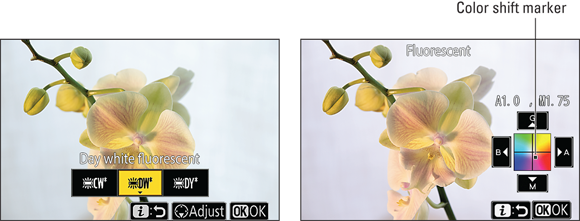
FIGURE 5-7: Tap Adjust (left) or press the Multi Selector down to display the fine-tuning color grid (right).
Tap the Adjust symbol at the bottom of the screen or press the Multi Selector down.
You see a color grid like the one shown on the right in Figure 5-7. The grid is set up around two color pairs: Green and Magenta, represented by G and M; and Blue and Amber, represented by B and A.
Move the black square labeled color shift marker in Figure 5-7 in the direction you want to shift colors.
You can either tap inside the grid, tap the arrows on the sides of the grid, or use the Multi Selector to reposition the marker.
As you move the marker, the numbers above the grid indicate the current amount of color shift. In Figure 5-7, for example, the numbers indicate a shift of 1.0 toward amber and a shift of 1.75 toward magenta. A value of 0 indicates no adjustment.
With traditional colored lens filters, the density of a filter determines the degree of correction it provides. Filters are assigned a density rating using a unit of measurement known as a mired (pronounced “my-red”). The White Balance grid is designed around this system: A value of 1.0 equals a five-mired shift.- To lock in your adjustment, tap OK or press the OK button.
For the K White Balance setting, things work a little differently. Instead of the four-way grid, you see the two-part screen shown in Figure 5-6, and the only obvious fine-tuning setting is the green-to-magenta bar on the right. What gives? Well, raising or lowering the Kelvin temperature is equivalent to shifting colors along the blue-to-amber spectrum. Remember that colors at the top of the Kelvin temperature scale are blue; at the bottom, amber. (Refer to Figure 5-1.) So, for the K White Balance setting, you control the amber-to-blue shift by raising or lowering the Kelvin temperature as outlined in the preceding section. Then press the Multi Selector right to activate the green-to-magenta bar. Tap the arrows at the top and bottom of the bar to move the adjustment marker to set the amount of color shift. You also can press the Multi Selector up and down to move the marker.
You also can access the fine-tuning tool from the Photo Shooting menu or the Video Recording menu. Just select a White Balance setting, choose any secondary option that’s presented (such as the type of fluorescent bulb), and then tap Adjust or press the Multi Selector right to open the color adjustment grid. The only exception is the PRE setting: For this White Balance setting, the menu route involves a few other details; I spell those out in the next section.
However you fine-tune the White Balance setting, the camera reminds you of the adjustment by adding an asterisk next to the setting in the displays, the i menu, and the Photo Shooting and Video Recording menus. To undo the adjustment, complete the fine-tuning steps and move the color shift marker back to the center of the grid (or the middle of the vertical bar, for the K White Balance setting). The asterisk then disappears.
Creating Custom White Balance Presets
If none of the White Balance settings does the trick and you don’t want to fool with fine-tuning one, take advantage of the PRE (Preset Manual) feature to create a custom White Balance setting. You can create up to six presets; the next few sections show you how to take advantage of this handy feature.
Creating a preset with direct measurement
This technique requires taking a reference photo of a gray card, which is a piece of neutral card stock. You can buy gray cards (or equivalent materials) in many camera stores for less than $20.
Follow these steps to record a preset:
- Place the reference card in the same light that will illuminate your subject.
Set the Shooting mode to P, S, A, or M.
As with all white balance features, you can take advantage of this one only in these Shooting modes.
Check exposure and adjust settings if needed.
This process doesn’t work if your settings produce an underexposed or overexposed shot of the reference card.
- Press the i button to display the i menu. Then highlight the White Balance setting.
Refer to Figure 5-4 if you need help locating the setting on the menu.
- Press OK and then highlight PRE, as shown on the left in Figure 5-8.
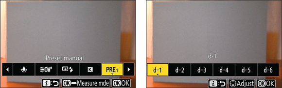
FIGURE 5-8: Choose PRE (left), press the Multi Selector down, and then choose the preset number you want to assign (right).
- Press the Multi Selector down to display the Preset selection screen shown on the right in Figure 5-8.
Highlight the preset number (d-1 through d-6) you want to assign to the custom White Balance setting.
If you select an existing preset, it will be overwritten by the new preset.
Press the OK button or tap the OK symbol.
You return to the screen shown on the left in Figure 5-8. The PRE symbol should still be highlighted; if it isn’t, use the Multi Selector to highlight it again.
Press and hold the OK button until the i menu disappears and you see the symbols shown in Figure 5-9.
The letters PRE and the preset number you chose flash in the upper right corner, and a target frame appears in the center of the display.
Frame your shot so that the gray card is under the target frame.
If you’re not using flash, you can reposition the target frame by using the Multi Selector. When a flash is attached and turned on, just compose the reference shot with the gray card at the center of the frame.
Press and release the OK button or press the shutter button all the way down to take the reference picture.
If the camera successfully records the preset, you see the message Data acquired. If something went awry, you see a message asking you to try again. (Remember that the reference card shot must be properly exposed for the camera to create the preset successfully.)
- Press the i button or tap the i symbol to exit the screen.
When PRE is the selected White Balance setting on the i menu, you can overwrite the current preset directly from the main i menu screen. Just press and hold the OK button to display the screen shown in Figure 5-9 and then take a new reference shot.
Here’s another quick trick: If you leave the Fn (Function) button on the front of the camera set to its default task, which is to display the White Balance selection screen, you can use that button to quickly launch into recording a new preset, too. Press and hold the Fn button while rotating the Main command dial to choose PRE as the White Balance setting. Release the button and then press and hold it down until the preset measurement screen appears. Then take the reference picture by pressing and releasing the OK button or by pressing the shutter button all the way. Again, though, this technique allows you to overwrite only the current preset (d-1, d-2, and so on). And if you can remember that this option exists, kudos to you because it’s way too much for my limited memory bank.
At any rate, after you create a new preset, the camera automatically selects it as the current White Balance setting. To use a different preset, see the upcoming section “Selecting the preset you want to use.” For details on how to fine-tune a preset, skip to the later section “Editing presets.”
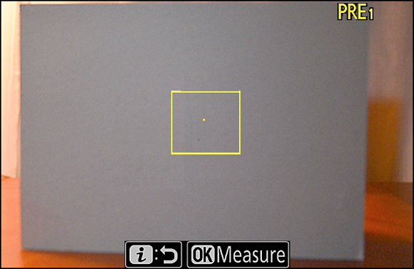
FIGURE 5-9: When you see the flashing PRE symbol, press OK to take the reference shot.
Creating a preset based on a photo
Suppose that you’re the marketing manager for a small business and one of your jobs is to shoot portraits of the company bigwigs for the annual report. You build a small studio just for that purpose, complete with photo lights and a conservative beige backdrop. The bigwigs can’t all show up to get their pictures taken on the same day, but you have to make sure that the colors in that backdrop remain consistent for each shot, no matter how much time passes between photo sessions. This scenario is one possible reason for creating a preset based on an existing photo. After photographing the first subject, you use that file as a reference when creating a new preset.
Basing a White Balance preset on an existing photo works only in situations where the color temperature of your lights is consistent from day to day. Otherwise, the preset that works for Big Boss Number One may add an ugly color cast to Big Boss Number Two.
To create a preset based on a photo, the photo must be stored on the memory card that’s in the camera. If the photo isn’t on the card, use a card reader to copy it from its current storage location to the card. When viewing the card contents on your computer, you should see a main folder named DCIM; open that folder to view the camera-created folders. By default, the first folder created by the camera carries the label 100NZ_FC. Copy the reference photo to that folder.
After putting the reference photo on the card, put the card back in the camera and follow these steps:
Open the Photo Shooting menu or the Video Recording menu.
It doesn’t matter which menu you choose; a preset you create via one menu is available from the other.
Choose White Balance, select PRE (Preset Manual) and press the Multi Selector right.
You see the screen shown on the left in Figure 5-10.
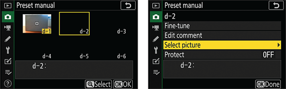
FIGURE 5-10: Select a preset (left) and then choose Select Picture (right) to base a preset on an existing image.
Use the Multi Selector to select the number of the preset you want to create (d-1 through d-6).
If you already created a preset, choosing its number will overwrite that preset with the new one. In the figure, d-1 holds the preset I created using a gray card, as outlined in the preceding section, so I selected d-2 to hold the new preset.
 Press the Zoom In button or tap Select to display the menu shown on the right in Figure 5-10.
Highlight Select Picture and press the Multi Selector right.
You see thumbnails of your photos.
Use the Multi Selector to move the yellow selection box over your reference photo. Then press OK.
The menu screen shown on the right in Figure 5-10 reappears.
Press the OK button or tap the OK Done symbol.
You return to the screen showing the White Balance preset thumbnails. The thumbnail for the photo you selected appears as the thumbnail for the preset you chose in Step 3.
- Press the OK button or tap OK to return to the main menu.
After you take these steps, the White Balance setting automatically changes to use the new preset.
Selecting the preset you want to use
If you create multiple presets and you know the number of the one you want to use (d-1, d-2, and so on), take either of these approaches to select the one you want to use:
- i menu: First select PRE as the White Balance setting. Then press the Multi Selector down to display a screen where you can choose the number of the preset you want to use.
- Fn (Function) button plus command dials: Press and hold the Fn button (refer to Figure 5-5 for its location) and then rotate the Main command dial to select the PRE option. Continue to hold the button while rotating the Sub-command dial to choose the number of the preset. This method is tricky: If you hold the Fn button down for too long while PRE is selected, the camera thinks you want to take a reference photo for a direct-measurement preset and displays the symbols related to that feature (refer to Figure 5-9). If I were you, I’d stick with the i menu approach.
Both methods assume that you remember the number of the preset you want to use. If you’re not sure on that score, take this alternative approach: Open the Photo Shooting menu or Video Recording menu, choose White Balance, and then highlight PRE. Press the Multi Selector right to display a screen that contains thumbnails of each preset, as shown on the left in Figure 5-10. Use the Multi Selector to highlight a preset. Then press the OK button or tap the OK symbol.
Editing presets
After creating a preset, the only way to get rid of it is to overwrite it with a new one. However, you can edit a preset in a few ways.
To access the editing features, choose White Balance from either the Photo Shooting or Video Recording menu. Select PRE (Preset Manual), press the Multi Selector right, and move the yellow frame over the preset you want to edit.
![]() Next, press the Zoom In button or tap the Select symbol at the bottom of the screen. You then see the editing screen, shown on the left in Figure 5-11.
Next, press the Zoom In button or tap the Select symbol at the bottom of the screen. You then see the editing screen, shown on the left in Figure 5-11.

FIGURE 5-11: Add a text label to a preset to remind you which lighting conditions you used when creating it.
Here’s what you can accomplish with each menu option:
- Fine-tune: Press the Multi Selector right to access the same fine-tuning grid available for other White Balance settings. See “Fine-tuning a White Balance setting,” earlier in this chapter, for help.
Edit comment: This option enables you to name a preset. After highlighting Edit Comment, press the Multi Selector right to display the text entry screen shown on the right in Figure 5-11. Use these techniques to create your text:
Enter a character: Tap a character on the keyboard or use the Multi Selector to highlight a character and then press the OK button, or tap OK Input. The characters appear in the text box at the top of the screen. Your comment can be up to 36 characters long.
To cycle from the keyboard shown in the figure to screens that contain uppercase characters and symbols, select the Aa& key; select the empty box just to the left of that key to enter a space. I labeled both keys in Figure 5-11.- Move the cursor in the text box: The cursor appears as a gray rectangle; I labeled it in Figure 5-11. To move the cursor, rotate the Main command dial or tap the arrows to the left of the text box.
 Delete a letter: Move the cursor over the letter in the text box and then tap the Delete symbol at the bottom of the screen or press the Delete button on the camera back.
After you enter your text, press the Zoom In button or tap the OK symbol that sports the Zoom In icon (the magnifying glass). You return to the screen shown on the left in Figure 5-11, but your text now appears at the bottom of the page.- Select Picture: This option enables you to base a preset on an existing photo. If you want to select a different photo for a current preset, choose this option and follow the steps laid out in the section “Creating a preset based on a photo.”
- Protect: Set this option to On to lock a preset so that you can’t accidentally overwrite it. If you enable this feature, you can’t alter the preset comment or fine-tune the setting.
To exit the editing screen (the left screen in Figure 5-11), tap OK Done or press the OK button. You see the Preset Manual selection screen again; if you entered a text comment, it appears at the bottom of the screen, as shown in Figure 5-12. To exit that screen, tap OK or press the OK button. To exit the menus and return to shooting, press the Menu button twice or just give the shutter button a quick half-press and release.
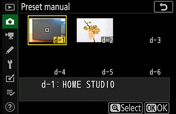
FIGURE 5-12: Your comment appears with the selected preset.
Choosing a Color Space
By default, your camera captures photographs in the sRGB color space, which refers to an industry standard spectrum of colors. (The s is for standard, and the RGB is for red, green, blue — which are the primary colors in the digital color world.) This color space was created to help ensure color consistency as an image moves from camera or scanner to monitor and printer. The idea was to create a spectrum of colors that all devices can reproduce.
Because sRGB excludes some colors that can be reproduced in print and onscreen by some devices, your camera also enables you to shoot photos in the Adobe RGB color space, which contains a larger spectrum of colors. Tell the camera which color space you prefer via the Color Space option on the Photo Shooting menu, as shown in Figure 5-13. (Videos always use sRGB.)
Although choosing a larger color spectrum sounds like a no-brainer, Adobe RGB isn't necessarily the right choice. In fact, I suggest that you stick with sRGB unless you have a specific need to go with Adobe RGB. Most home and office printers, photo programs, web browsers, and mobile devices are designed around sRGB, as are the photo printers used by retail outlets and online printing services. Speaking of printers, certain Adobe RGB colors can’t be reproduced in print. The printer substitutes the closest printable color, if necessary.
Additionally, to retain Adobe RGB colors when you edit your photos, your software must support that color space. You also need to use specific editing and print settings to avoid mucking up the color works. In digital imaging terms, you need to study the subject known in the biz as color management.
One final tip related to the Color Space option: The picture filename indicates which color space you used. Filenames of Adobe RGB images start with an underscore, as in _DSC0627.jpg. For pictures captured in sRGB, the underscore appears in the middle of the filename, as in DSC_0627.jpg.
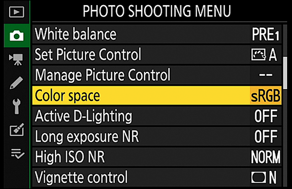
FIGURE 5-13: Sticking with the sRBG Color Space is the best option in most cases.
Taking a Quick Look at Picture Controls
The Picture Control setting comes into play when you shoot videos or capture photos using the JPEG Image Quality settings, detailed in Chapter 2. Your choice affects color saturation, increasing or decreasing the intensity of all colors in a scene or just a few specific colors, such as blues and greens. The setting affects more than color, though; it also tweaks contrast and sharpening.
Sharpening is a software process that boosts contrast in a way that creates the illusion of slightly sharper focus. Let me emphasize: “slightly sharper focus.” Sharpening produces a subtle tweak; it's not a fix for poor focus.
For photos you shoot in the Raw format, the camera uses your chosen Picture Control setting only to produce the image you see during playback. When you process the Raw file, you can apply any Picture Control setting, although the one that was selected when you took the picture is used initially.
A symbol representing the Picture Control setting appears in the default monitor display, the Information display, and the viewfinder, as shown in Figure 5-14. The initial (or initials) after the symbol indicates the current setting. In the figure, the letter A means that the Auto Picture Control setting is in force.
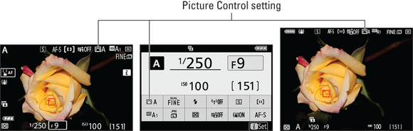
FIGURE 5-14: This symbol represents the Picture Control setting.
When the camera is set to the Auto Shooting mode, you have no say over which Picture Control setting is used. But in the P, S, A, and M Shooting modes, you can choose from these settings:
- Standard (SD): This option captures the image “normally” — that is, using characteristics that Nikon deems suitable for most subjects.
- Auto (A): This setting, which is the default, uses the characteristics of the Standard setting as a baseline. Then, if the camera recognizes that you’re shooting a portrait, it softens skin tones and warms colors slightly. If the camera instead determines that your subject is a landscape, it strengthens blues and greens to make skies and foliage appear more vivid.
- Neutral (NL): The camera doesn’t enhance color, contrast, and sharpening as much as in Standard mode. The setting is designed for people who want to manipulate these characteristics in a photo editor. By not overworking colors, sharpening, and so on when producing your original file, the camera gives you more latitude in the digital darkroom.
- Vivid (VI): This mode amps up saturation, contrast, and sharpening.
Monochrome (MC): This setting creates a black-and-white photo. However, I suggest that you instead shoot in color and then create a black-and-white copy using your photo software. Good photo programs have tools that let you choose how original tones are translated to the black-and-white palette, usually resulting in a better image than one produced by the Monochrome Picture Control.
If you need a black-and-white image quickly, though, there’s a way to have your cake and eat it too. Just choose an Image Quality setting that delivers both a JPEG and a Raw version of a photo. (Chapter 2 explains how.) The JPEG version is created using the Monochrome Picture Control, so it’s set in stone as a monochrome image — you can’t restore the original image colors. But when you process the Raw version, a topic I cover in Chapter 9, you can apply one of the color Picture Controls to produce a full-color image.
As another solution, you can turn any color image, whether captured in the Raw or JPEG format, into a monochrome copy by using the Monochrome tool on the Retouch menu, as detailed in Chapter 11.
For videos, setting the Picture Control to Monochrome is a way to produce an instant film noire look. There is no in-camera solution that enables you to create both a color and black-and-white version of a video, unfortunately. If you think you may need a color version one day, shoot in color and use the filters used in many video-editing programs to create a black-and-white copy.
- Portrait (PT): This mode tweaks colors and sharpening to flatter skin.
- Landscape (LS): This mode emphasizes blues and greens.
- Flat (FL): Flat images display even less contrast, sharpness, and saturation than Neutral, making it a good choice if you plan to do heavy post-processing of your image or video footage.
Creative Picture Control (C plus a number ranging from 1 to 20): Choose this option to access 20 more picture styles that Nikon categorizes as creative. I, however, will come right out and say that I think they’re lame. Most simply add a slight color tint to the image, although some either soften or sharpen focus at the same time. A few provide different variations of a black-and-white photo.
The advice I gave earlier for the Monochrome Picture Control applies here as well: Go ahead and play around with these settings, if you like, but remember that you can’t return to a nonstylized version of a JPEG photo or a video if you shoot it with a Creative Picture Control in force.
Obviously, the Monochrome and black-and-white Creative Picture Control options produce a drastic change in the look of your image. The extent to which other settings affect an image depends on the subject, but to give you a general idea, the first seven photos in Figure 5-15 show the same scene as rendered by the “normal” Picture Controls. As you can see, there’s not a huge difference between the variations, although the Flat setting definitely leads to a washed-out, soft image, whereas the straw behind the decorations looks significantly sharper in the Landscape version than in the Portrait version. For the last example, I applied the Blue Creative Picture Control, which pretty much sucked out most colors except blues. My astute artistic judgment of that result is a hearty “meh.”
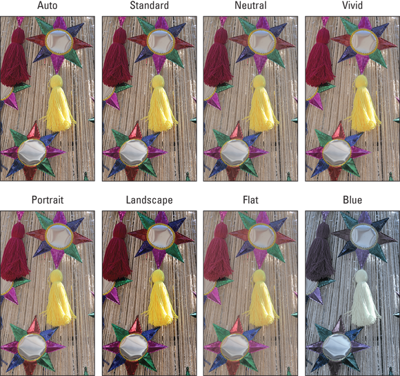
FIGURE 5-15: The Picture Control settings apply various adjustments to color, sharpening, and contrast of JPEG images.
All in all, I suggest that you stick with the Auto setting. It handles most subjects well, and you have lots of other, more important settings to remember. Also keep in mind that if you shoot in the Raw format, you choose a Picture Control during Raw processing, and you can process the Raw file multiple times and save each photo with a different Picture Control applied. See Chapter 9 to find out more about Raw processing.
If you want to experiment with Picture Controls, here are the basics:
- Changing the Picture Control setting: Your best option is to highlight the setting on the i menu, as shown on the left in Figure 5-16, and then press the OK button, which displays a scrolling list of Picture Controls over the live preview, as shown on the right. Press the Multi Selector right or left to scroll the settings and see how each one affects the scene. Press OK to exit the selection screen.
You also can access the setting via either the Photo Shooting or Video Recording menu, but you don’t get the benefit of seeing the live preview.

FIGURE 5-16: The best route to the Picture Control setting is the i menu.
- Modifying a Picture Control: You can modify any Picture Control to more closely render a scene the way you envision it. After highlighting a Picture Control from selection screen shown on the right in Figure 5-16, tap the Adjust symbol at the bottom of the screen or press the Multi Selector down to access customization options. After you customize a setting, the camera reminds you of that fact by adding an asterisk next to the Picture Control symbol in the displays and on the menus.
- Storing custom Picture Control settings: Choose the Manage Picture Control option from the Photo Shooting menu if you want to create your own Picture Control settings. You can create as many as nine settings.
To reserve page space in this book for functions that will be the most useful to the most readers, this discussion is the extent of the Picture Control information in this book. For more details, check out the camera’s user guide. You can download an electronic version of the guide from the Nikon website.