![]()
Visualization
Visualization is an important part of any engineering application and can be used to provide insights into design problems or to examine the performance of any solution method. In this chapter, we will talk about basic plotting techniques in MATLAB and how to visualize complex results using them, including animation. MATLAB provides a wide range of functions for 2D and 3D plots of various kinds and also enables you to annotate or decorate the plots with auxiliary functions.
Line Plots
2D line plots can be used to represent the relation between variables x and y which can be in the form of a function ![]() or a dataset (x, y). To plot any relation, MATLAB only needs the values x and y. Let us start with a simple example where values of (x, y) are obtained from some experiment and given directly to MATLAB. For example, a student in a physics class performs Ohm’s experiment to compute the resistance of a given device. He records the following observations where I is the current in the device when a voltage V is applied across it.
or a dataset (x, y). To plot any relation, MATLAB only needs the values x and y. Let us start with a simple example where values of (x, y) are obtained from some experiment and given directly to MATLAB. For example, a student in a physics class performs Ohm’s experiment to compute the resistance of a given device. He records the following observations where I is the current in the device when a voltage V is applied across it.

This data can be represented in MATLAB by the following matrices
V=[0 0.5 1.0 1.5 2.3];
I=[0 2 4.1 5.8 9];
Remember that the matrices V and I are data matrixes and have an elementwise one-to-one correspondence with each other, so that the third element in V corresponds to the third element in I. To visualize this relation, we can use the plot function with the x and y matrices as input in the following way
plot(V,I)
which gives the plot between V and I. (See Figure 4-1.)

Figure 4-1. Plot I versus V
The functioning of the plot function is very straightforward, it just makes the pairs (xi, yi) by taking corresponding elements from the x and y matrices and plots them on a Cartesian plane, joining them by straight lines. Of course, x and y must be of the same size. In the similar way, we can also plot the function y = f(x). Since computer tools can only work with discrete data, we need to represent this function as discrete data. For that, we make an x vector with values separated by a small gap and then compute the function values at those x to get the y vector.
x=0:.01:2*pi;
y=x.*exp(-x);
plot(x,y);
If the x values are very closely packed, the plot will look like a continuous plot (see Figure 4-2a). Remember the dot operation is the elementwise operation on the data matrices. How close the gap should be depends on the non-linearity of the function. For example, a linear function y = 2x + 3 can be plotted with just two x values, while a function like y = xe–x would require many points for a smooth and accurate display. Figure 4-2b shows the function with gap ![]() and it is not smooth, even with 21 points.
and it is not smooth, even with 21 points.
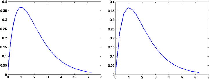
Figure 4-2. Plotting a continuous function
Plot Options
We can specify different properties like color, line style, marker type, etc. while plotting. If we pass a string with three characters representing one character from each of the following columns to specify color, marker type and line style, the plot will be drawn with those properties.

We can plot x versus cos(x) with red color solid plots, and with pentagon markers, using the following code
plot([0:.1:1],cos([0:.1:1]), 'rp-');
We can skip some characters from the specification string. Suppose we want to draw the plot in red. We can do this using a string with just one more parameter
plot(X,Y,'r');
You can also use property and value pair specification in the following way
plot(X,Y, PropertyName, PropertyValue)
to specify more properties for a plot. For example, to increase the linewidth of a lineplot, we can write
plot(X,Y,'LineWidth', 10);
Similarly
plot(X,Y,'LineWidth', 10,'MarkerSize', 4);
You can specify properties and their values for plots. The following properties and sample values are important to keep in mind for quick reference:
Color: [0 0 1]
EraseMode: 'normal'
LineStyle: '-'
LineWidth: 0.5000
Marker: 'none'
MarkerSize: 6
Multiple Plots
We can plot multiple curves on the same figure by using the hold on command. By default, if we plot a curve, MATLAB deletes the previous plot, if there is one. The command hold on forces MATLAB to keep the previous plot and adds the new plot to the figure. For example, the following code will generate two overlapping cos and sin curves colored red and blue, respectively.
t=0:.01:2*pi;
y1=sin(t);
y2=cos(t);
plot(t,y1,'b');
hold on
plot(t,y2,'r')
Annotations
We can add text, labels, and legends to add more information to a plot. To add an axis label, we can use xlabel or ylabel, respectively, for the x and y axes
xlabel('time')
ylabel('response');
whereas the following commands will add a title and legend to the plot
title('time response of the system S')
legend({'system S'});
To add text, we can use the command text by specifying the string and the location in the figure where we want the text to appear:
xlocation=0.1;
ylocation=0.2;
text(xlocation,ylocation,'threshold')
Handles
We can also edit the properties of a figure or axis after they are drawn. MATLAB assigns a number to each graphical object which is known as its handle and which can be used to point to that object later. For example, to plot ![]() first and then change the line color to black we can do this by using the following lines of code
first and then change the line color to black we can do this by using the following lines of code
x=[0:.01:1];y=x.^2;
h=plot(x,y);
set(h,'Color',[0 0 0]);
where h is handle of the plot object. The function set sets the color property of the object pointed to by h to [0 0 0], which is the value for black in RGB.
2D plots
Other than line plots, there are other different types of plots in 2D which are mentioned in the following table.

The syntax and usage of almost all the functions mentioned above are very similar to the plot function. We will describe a couple of them. For example, to make a scatter plot of x,y, we would write
x=rand(10,1);
y=rand(10,1)+.1*rand(10,1);
scatter(x,y);
Similarly, to create a bar graph of the following height data in a class of 50,

we can execute the following code:
nofS=[5 15 15 11 4];
h=bar(1:5,nofS);
Quiver Plots
Quiver plots are used to show the flow at different grid points. It requires four matrices X, Y, U and V and at each grid point (Xij, Yij), it puts an arrow pointing in the (Uij, Vij)direction (see Figure 4-3).
range = -2:0.2:2;
[x,y] = meshgrid(range);
z1 = (x.^2 + y.^2);
[px1,py1] = gradient(z1,.2,.2);
quiver(x,y,px1,py1);

Figure 4-3. Quiver plots
3D Plots
3D plots are primarily used to represent a function of two variables in the form of a surface. MATLAB defines a surface via the z-coordinates of points above a rectangular grid in the x-y plane. The plot is formed by joining adjacent points with straight lines.
As we generate the x vector first for the linear plot of the function ![]() the first step in displaying a function of two variables,
the first step in displaying a function of two variables, ![]() , is to generate base grid matrices X and Y such that each corresponding pair (Xij, Yij) represents a point on the 2D grid. The X and Y matrices consist of repeated rows and columns, respectively, over the domain of the function. Then these pairs are used to evaluate and graph the function.
, is to generate base grid matrices X and Y such that each corresponding pair (Xij, Yij) represents a point on the 2D grid. The X and Y matrices consist of repeated rows and columns, respectively, over the domain of the function. Then these pairs are used to evaluate and graph the function.
First we specify the range of the x axis and y axis via the x and y vectors. The meshgrid function transforms the domain specified by the two vectors, x and y, into matrices X and Y. As discussed, we then use these matrices to evaluate functions of two variables by elementwise operations. The rows of X are copies of the vector x and the columns of Y are copies of the vector y.
To illustrate the use of meshgrid, consider the distance function R. To evaluate this function between -8 and 8 in both x and y, you need pass only one vector argument to meshgrid, which is then used in both directions.
[X,Y] = meshgrid(-8:.5:8);
R = sqrt(X.^2 + Y.^2);
To plot R over X and Y, we can write (see Figure 4-4a)
surf(X,Y,R);

Figure 4-4. 3D plots: surf and mesh
Ensure that X, Y and R are matrices of same size. Instead of the function surf we can also use the mesh command which only generates a mesh without coloring the surface. Try the following command to generate a wave on the sea (see Figure 4-4b).
[X,Y] = meshgrid(-1:.05:1,-1:.05:1);
R = sin(4*X).*sin(4* Y);
mesh(X,Y,R)
You can also use a parametric representation to calculate x, y and z as in the following example, which plots a sphere
k = 5; n = 2^k-1;
theta = pi*(-n:2:n)/n;
phi = (pi/2)*(-n:2:n)'/n;
X = cos(phi)*cos(theta);
Y = cos(phi)*sin(theta);
Z = sin(phi)*ones(size(theta));
colormap([0 0 0;1 1 1])
surf(X,Y,Z)
axis square
The main idea is to create matrices X, Y and Z such that the pair consisting of the (i,j) elements of X and Y represents a point in the 2D plane and the (i,j)th element of Z represents the value at this point.
Animations
An animation is just a combination of multiple plots shown one after the other, separated by a time interval sufficiently small to create the illusion that they are continuously changing. We begin with an animation of a small clock with second hand only. The important function we need to know is drawnow.
The command drawnow forces MATLAB to flush the graphics at that instant. By default, if MATLAB sees any plot command in the middle of the execution of a heavy computation, it waits until the computations are done and then shows the graphics. Since we need to see the plots at that instant in order for the animation to vary with time, we can use the drawnow command, which forces MATLAB to show the graphic at that instant only.
A Clock Animation
We create 100 time frames using a for loop. In each frame, we plot the clock outer ring and the hand, but the position of the hand will change at each frame. Since 100 frames shows a full cycle of the hand (1 minute), 1 frame represents a time duration of 1/100 minutes or a ![]() angular rotation on the clock. At the ith frame, the needle will be just a line between[0, 0] to
angular rotation on the clock. At the ith frame, the needle will be just a line between[0, 0] to 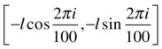 where l is the length of the hand. To create the animation, we would carry out the following steps:
- Clear the frame
- Increase the frame number
- Plot the outer ring of the clock as a circle
- Plot the line for the hand
- Go to step 1 if the current frame number is less than 100
t=0:.01:2*pi;
radius_clock=1;
length_needle=.8;
for i=1:100
        %plot objects of the ith frame
        hold off;
        plot(radius_clock*cos(t),radius_clock*sin(t),...
                                       'LineWidth',4);
        hold on;
        plot([0 length_needle*cos(-2*pi*i/100)], ...
                [0 length_needle*sin(-2*pi*i/100)],'LineWidth',2);
drawnow;
end
The hold off command tells MATLAB to let the previous frame graphics be deleted when the new frame is plotted. The above code generates an animation with the clock needle making one circuit around the clock. See Figure 4-5 for one frame of the whole animation. We can add other clock hands for hours and minutes and use three nested for loops to create the complete clock.

Figure 4-5. Clock Animation
Wave Motion
Consider the wave motion of a string ![]() where the height of a particle located at x is given by
where the height of a particle located at x is given by
![]()
Suppose we want to visualize the height of particles situated on the string with varying time ![]() . As done in the previous example, we first plot a single frame at time i and then repeat it for all frames. At time i, the string looks like a sin wave
. As done in the previous example, we first plot a single frame at time i and then repeat it for all frames. At time i, the string looks like a sin wave
![]()
where ![]() .
.
X=0:.01:1;
k=3;
omega=100;i=0;
W_i=sin(-k*X+i*omega);
plot(X,W_i,LineWidth',2);
Now we iterate the code to plot for i = 0:0.1:10. Here we are plotting only one object, so we don’t need to use hold on and therefore no clearing of the figure is required.
X=0:.01:1;
k=3;
omega=100;
for i=0:.001:1
        W_i=sin(-k*X+i*omega);
        plot(X,W_i,'LineWidth',2);
        axis([0 1.2 -1.2 1.2])
        drawnow;
end
Here the axis command fixes the axis so that at each plot the axis and hence the display frame doesn’t move up and down. We will see more examples of animations in later chapters when we learn about simulation and other related techniques.
Movies
We can also create a movie from an animation and save it to an AVI file. Consider the previous example of the wave motion of a string. To create a movie frame from the ith frame, we can use the get frame function in the following way
J=1;
for i=0:.01:1
        W_i=sin(-k*X+i*omega);
        plot(X,W_i,'LineWidth',2);
        axis([0 1.2 -1.2 1.2])
        drawnow;
        M(J)=getframe(gcf);
        J=J+1;
end
Here gcf is the handle of the current figure and M is the matrix containing all frames. To create the AVI movie containing these frames, we execute the following command
movie2avi(M,'moviename.avi');