
In the previous chapter, you began dissecting the wxPIM application and looking at the core code that comprises it. In this chapter, you’ll continue that exploration, ultimately finishing up the exploration of this code.
You’ll pick up where you left off by examining the basic overall structure of modules. You should have an idea about this already given what you saw in the previous chapter, but let’s make sure it’s totally clear before you dive into the individual module’s code.
Modules: Basic Structure
Each of the modules is housed completely in a single JavaScript source file, and each defines a class for the module. The class has a standard structure, as shown in Figure 6-1.
Figure 6-1
Module class diagram
In fact, the constructor isn’t required, and as it happens, only one module provides a constructor. Still, I consider it part of the basic class structure since a JavaScript class will have a default constructor provided by JavaScript itself even if you don’t specify one. However, the other methods you see here will be present in every module. You’ve already seen some of the methods a module
provides, but now I’ll get into what each is for and when they do it.
- getUIConfig(): Returns an object that defines the Webix component tree for the module’s UI
- activate(): Called any time the user switches to the module. What it does, if anything, is dependent on the needs of the module.
- deactivate(): Called any time the user switches away from the module, meaning selects another module or goes to the day-at-a-glance screen. As with activate(), what deactivate() does, which could be nothing, is module-dependent.
- newHandler(): Called when the user clicks the New button to create a new item in the module.
- editExisting(): Called when the user selects an existing item to edit.
- refreshData(): Called any time the data on the summary screen of the module, which is where existing items are shown, needs to be refreshed. This can be when the module is switched to, when an item is added, when an item is updated, or when an item is deleted.
Some modules may have other methods as needed as well. Two of them do, and two just have the methods described here, but only the ones listed here are required as they are the ones called at various times during the life of a module by that core code. Modules may also have data members specific to them, but there are none required by the core code, so they aren’t part of the foundational module class structure. They’re used as needed, if at all.
In addition to a standard form in terms of code, wxPIM modules also have a regular pattern in terms of their UI. There is a multiview that has a summary view and a details view. The summary view presents a list of the items for the module, in some form or other (meaning in a literal Webix list component or maybe a tree or maybe something else entirely, but it’s still a listing of items; that’s the basic idea). This summary view provides the user with a chance to select an existing item to edit or to create a new item via a New button in a toolbar on the bottom of the screen. Doing either brings them to the details view, where they see the data for the selected item or an empty form if creating a new one. This is also where you find a Delete button on the bottom toolbar to delete an existing item, as well as a button to return to the summary view. This pattern works for all modules, and as you saw earlier, the core code makes some assumptions about this being the layout and the IDs that one or two specific components use.
That gives you the bird’s-eye view of what the structure of a module’s code is. With that in mind, let’s begin looking at the code for the first module, notes.
Notes.js
Wait, what? Why are we looking at notes first? Isn’t alphabetical order good enough for you, Mr. Zammetti? Shouldn’t we look at appointments first?
Well, there’s a simple reason I’ve chosen to do notes first; it’s probably the simplest module of them all while still covering all the bases. Rather than jump into appointments, which has some peculiarities and more code, let’s start off with a simpler one and build from there, so notes it is.
It would help to know what the notes module looks like, wouldn’t it? This also provides you a general idea what all modules look like because of the common UI structure described in the previous section. Figure 6-2 shows the summary view of the notes module.
Figure 6-2
The Notes module, in all it’s note-y glory
Each item can be clicked to edit it, or the New button
can be clicked to create a new note. Doing either brings the user to the details view, as shown in Figure 6-3.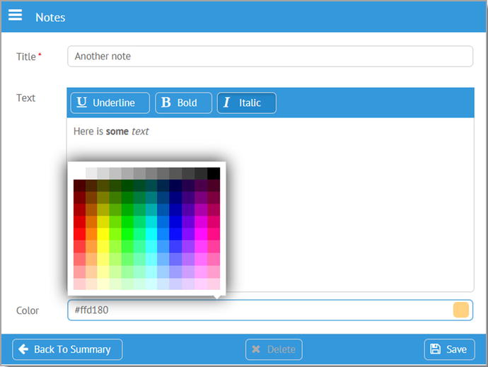
Figure 6-3
The Note module’s details view
Here, I’ve clicked the colorpicker at the bottom to make the screenshot more interesting! I’ve also made some of the text for the note bold and some italic to remind you that the richtext component allows for this.
Neither of these views is very complicated, but then again, a note app doesn’t need to be especially complicated, does it? Let’s start looking at the code now, beginning with the opening of the Notes.js file.
wxPIM.moduleClasses.Notes = class {
...
}
Each of the module source files builds a class that is added to the moduleClasses property of the wxPIM object. Everything that follows here is inside this class definition. This will be true of all modules, so I won’t be showing this again because the only thing different is of course the name of the class, which always matches the source file name.
Constructor, activate(), and deactivate()
The first thing in the class definition found in notes.js is the constructor…or is it? In fact, this class doesn’t have a constructor! This module doesn’t need to do anything during construction, so the default empty constructor that JavaScript provides for the class is plenty.
As you’ll recall from the section describing the basic structure of a module, while the constructor doesn’t need to exist at all because JavaScript takes care of that if it doesn’t, the activate() and deactivate() methods must be present because the core code assumes they do and calls them. However, nothing says they have to do anything if nothing is necessary for a given module, and in this case, they are indeed empty functions.
getUIConfig()
The first real bit of code present in this class definition is
getUIConfig()
, which you know is responsible for providing the Webix component definition for this interface. Here is that method:
getUIConfig() {
const cssListItem = `
color : #000000;
height : 66px;
border : 1px solid #000000;
border-radius : 8px;
margin : 8px 10px 12px 4px;
overflow : hidden;
padding : 6px 6px 20px 6px;
box-shadow : 4px 4px #aaaaaa;
cursor : hand;
`;
const cssListItemTitle = `
font-weight : bold;
padding-bottom : 6px;
`;
return {
id : "moduleNotes-container",
cells : [
{ id : "moduleNotes-itemsCell",
rows : [
{ view : "list", id : "moduleNotes-items",
type : {
templateStart :
`<div style="${cssListItem}background-color:#color#;"
onClick="wxPIM.modules.Notes.editExisting('#id#');">`,
template :
`<div style="${cssListItemTitle}">#title#</div>#text#`,
templateEnd : `</div>`
}
},
{ view : "toolbar",
cols : [
{ },
{ view : "button", label : "New", width : "80",
type : "iconButton", icon : "plus",
click : this.newHandler.bind(this)
},
{ width : 6 }
]
}
]
},
{ id : "moduleNotes-details",
rows : [
{ view : "form", id : "moduleNotes-detailsForm", borderless : true,
elements : [
{ view : "text", name : "title", label : "Title", required : true,
bottomPadding : 20, invalidMessage : "Title is required",
attributes : { maxlength : 50 },
on : {
onChange : function() {
if (this.getParentView().validate()) {
$$("moduleNotes-saveButton").enable();
} else {
$$("moduleNotes-saveButton").disable();
}
}
}
},
{ id : "moduleNotes-detailsForm-text", view : "richtext",
name : "text", label : "Text", attributes : { maxlength : 1000 }
},
{ view : "colorpicker", name : "color", label : "Color",
id : "moduleNotes-detailsForm-color"
},
]
},
{ view : "toolbar",
cols : [
{ width : 6 },
{ view : "button", label : "Back To Summary", width : "170",
type : "iconButton", icon : "arrow-left",
click : () => {
$$("moduleNotes-itemsCell").show();
}
},
{ },
{ id : "moduleNotes-deleteButton", view : "button",
label : "Delete", width : "90", type : "iconButton",
icon : "remove", click : () => { wxPIM.deleteHandler("Notes"); }
},
{ },
{ view : "button", label : "Save", width : "80",
type : "iconButton", icon : "floppy-o",
id : "moduleNotes-saveButton", disabled : true,
click : function() {
wxPIM.saveHandler("Notes", [ "moduleNotes-detailsForm" ]);
}
},
{ width : 6 }
]
}
]
}
]
};
}
Before the configuration object is built, two strings are defined that provide some style information. The cssListItem string will provide the styling for the items in the list (yes, a literal Webix list component in this case). I wanted a rounded-off box with a little bit of a drop shadow, an attempt to look sort of like a sticky note (hey, work with me here a little!). The
cssListItemTitle string
provides styling for the title in the note to make it bold and to provide some space between it and the note text. I also set overflow : hidden so that if you have a really long title or text for a note, it’ll just cut off, which I felt looked better than possibly getting scrollbars in individual notes.
Why not main.css?
You may quite reasonably wonder why I didn’t put these styles in main.css instead of embedding them in strings here. That certainly would have been possible, but remember that one of the goals is to make each module as pluggable as possible, which means having styles for various modules in a single CSS file wouldn’t be a good design. Sure, each module could have its own CSS file, but that’s more to load. In the end, keeping everything encapsulated in a JavaScript file, given that there’s not very much styling required anyway, felt like a cleaner approach. If these modules had a lot more CSS in them, I assuredly would have separated it all out.
After those two strings, the configuration object definition begins. Remember, at a high level, you’ve got two areas, one for the summary view and one for the details, and you need to be able to flip between them. That sounds like a multiview, no? But hey, where’s the view : "multiview" like you see in multiView.js? Well, here’s the thing: if you don’t specify a view but you do specify the cells attribute, then Webix recognizes that and knows you want a multiview and implicitly creates one for you. That’s what I’ve done here.
The first cell is the summary view, and it has an id of moduleNotes-itemsCell, since you’ll need to be able to hide and show that later (with hide() and show()). This cell has two rows in it; the first is the list component, and the second is the toolbar component. The list has a type attribute that specifies templateStart, template, and templateEnd, and that’s something you haven’t seen before. The templateStart attribute provides Webix with the information needed to render the container element for a data item, wrapping the elements defined by template. It’s the opening element, usually a <div>. The templateEnd is the opposite. It renders the closing element begun with templateStart. Using all three gives you more flexibility than just using template to render items in some components (dataview, list, grouplist, unitlist, menu, tree, datatable, and treetable), and flexibility is needed here to render the notes in the list like I wanted to.
The toolbar is a simple one with an empty element to push the button all the way to the right, with a small element to the right of the button just to keep it off the edge of the screen a bit.
After the summary cell is the details cell where you find an entry form and a toolbar. The form consists of three elements: a text component
for entry of the note subject, a richtext component for entry of the note itself, and a colorpicker for selecting a background color for the note. The subject entry field is interesting because it has required : true on it, which results in a red asterisk being placed by its label to indicate it’s a required field (and it’s the only one that is required). I’ve also specified an invalidMessage attribute to define the message that will be shown below the field when nothing has been entered in it. However, this message will show up only if there is room for it, which by default there isn’t, and that’s where setting bottomPadding comes into play.
The attributes config option is new, and this gives us a way to feed attributes to the underlying HTML text field, which Webix renders (and then augments) under the covers. Here, I’m specifying the maxlength attribute to limit how many characters the user can enter to 50. Similarly, the note text entry area has a limit of 1000 characters defined in the same way.
The subject entry field also has an onChange event handler defined. Every time the field changes, which occurs when it loses focus, the validate() method on the form is called, which you can always get a reference to by calling this.getParentView() within the event handler since the this keyword here is a reference to the field itself, so Webix can look up the component hierarchy to find the parent form (although, be careful, because depending on how you create your layout, then the parent of the field might not actually be the form, in which case you’d likely need to reference its id directly). If validate() returns true, then the Save button is enabled; otherwise, it’s disabled. The only thing that this form validates is whether the subject field is filled in since required : true is the only validation rule applied to any of the form’s fields. That’s why this logic works out.
The toolbar is just three buttons: the Back To Summary button, then a spacer, then the second Delete button, then another spacer, and then the final Save button. For the Back To Summary button, you just need to show the moduleNotes-itemsCell element of the implicit multiview. For Delete, it’s simply a call to the common wxPIM.deleteHandler() function
, passing the name of the module. For Save, it’s the same sort of thing as Delete, but now it’s wxPIM.saveHandler(), passing it the name of the module and the ID of the form to get the data to save from.
And that’s all there is to this UI definition!
newHandler()
Whenever the New button on the summary screen is clicked, the uncreatively named
newHandler() method
is called, and it’s a pretty simple bit of code.
newHandler() {
wxPIM.isEditingExisting = false;
wxPIM.editingID = new Date().getTime();
$$("moduleNotes-details").show();
$$("moduleNotes-detailsForm").clear();
$$("moduleNotes-detailsForm-text").setValue("");
$$("moduleNotes-detailsForm-color").setValue("#ffd180");
$$("moduleNotes-deleteButton").disable();
}
First, the flag that tells you whether you’re editing an existing item or not is set to false, and a new ID is created for this note. After that’s done, it’s just a matter of switching to the detail screen and clearing the form. Note that the richtext component seems to not be cleared by the call to clear() on the form, so that’s cleared separately. Likewise, the colorpicker doesn’t reset to a default color, or at least not the color I want to be the default, so a default is explicitly set. Finally, since you’re creating a new item here, the Delete button doesn’t come into play, so it’s disabled.
editExisting()
When an existing note is clicked on the summary screen, editExisting()
is called to kick off editing of the existing note. If this code looks a bit like newHandler(), that shouldn’t be surprising. You’re doing essentially the same thing with just a few differences.
editExisting(inID) {
const notes = JSON.parse(localStorage.getItem("NotesDB"));
const note = notes[inID];
wxPIM.isEditingExisting = true;
wxPIM.editingID = inID;
$$("moduleNotes-detailsForm").clear();
$$("moduleNotes-details").show();
$$("moduleNotes-detailsForm").setValues(note);
$$("moduleNotes-deleteButton").enable();
}
The first difference is that you need to get a reference to the note being edited, so you first get the data for this module, and then since the returned object is keyed by ID, a reference to the note is grabbed using the inID passed in by the click handler. After that, the wxPIM.isEditingExisting flag is set, to true this time, and the inID is stored in wxPIM.editingID.
Now, you clear the form so that you have a clean slate to start. After that, the details cell is shown. After that, setValues() is called on the details form, passing it the note object that was pulled out of the module’s data collection. It’s important to say that if you try to do the setValues() call before showing the form, then you’ll see a JavaScript error and things will break. I’m not certain of the reason for this error, but it’s related to the richtext component, and my guess is that Webix lazy-builds that component, and it might not be present until you actually show the form. In any case, just keep this in mind to avoid the problem in your own code.
Once the form is populated and shown, then the only thing left to do is to enable the Delete button, since you can of course delete an existing note
.
See, that wasn’t so bad, was it?
refreshData()
The final method in the Notes class is refreshData()
, which as you know by now is called any time the summary view needs to be updated, either after an item is added, updated, or deleted or when the module is switched to.
refreshData() {
const dataItems = wxPIM.getModuleData("Notes");
const itemsAsArray = wxPIM.objectAsArray(dataItems);
wxPIM.sortArray(itemsAsArray, "id", "D");
$$("moduleNotes-items").clearAll();
$$("moduleNotes-items").parse(itemsAsArray);
}
It doesn’t take much for this module. You just fetch the data for this module from local storage, then convert the object to an array, then sort the array in descending order on the id property (so that newer notes are always shown at the top), call clearAll() on the list component to start fresh, and then finally call parse(), passing it the fetched data, for the list to render.
That’s really all there is to it for this particular module!
Commonality makes things easier.
Note that for two of the three remaining modules, they are pretty similar overall in terms of the code, so I’m going to go over them pretty quickly. Therefore, make sure you understood all the code for the notes module because if you did, then you already, by and large, can understand the contacts and tasks modules without much explanation. Appointments, which you’ll look at last, has some differences to it, but even it isn’t very different from the others.
Tasks.js
Now you’ll look at the tasks module, beginning with what it looks like. Figure 6-4 shows the summary view, which uses a tree to show the notes, broken down by category (those with no category are in the first “empty” group).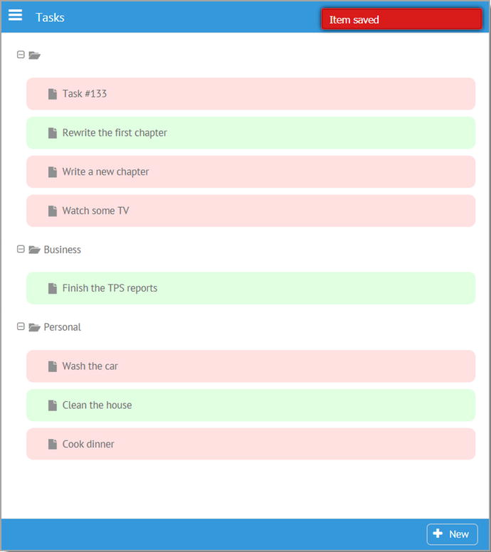
Figure 6-4
The summary view of the tasks module
Complete tasks are shown in green while ongoing tasks are shown in red. Only the task’s title is shown since that’s good enough for a basic listing. Being a tree, the user can collapse and expand groups as they want, and I’ve styled things to make the touch targets a little bigger because a tree by default isn’t the best component on a small mobile touchscreen device without that styling. Then, in Figure 6-5 you see the details view, and I’ve clicked the Due Date field to expand the datepicker.
Figure 6-5
The tasks module’s details view
I chose to use a segmented component for the priority since with a limited number of choices that provides a direct means to access the options. Of course, that would have been a fine choice for the Status field as well, but being a learning example, I tried to use a decent variety of components for you to see in action.
The Subject field is required (as is Due Date), and you can see that it’s marked as such with the red asterisk, and you can also see the message when it’s not filled out below the field.
Now, on to the code!
Constructor, activate(), and deactivate()
As with the notes module, the constructor, activate(), and deactivate() methods
in the Tasks class definition in the tasks.js file are all empty since this module doesn’t have any work done in those, so let’s move on to the getUIConfig() method.
getUIConfig()
Although a bit more voluminous than the notes module, the code inside getUIConfig() is still pretty basic Webix config data, with just a few minor exceptions. Walk through this code to see:
getUIConfig() {
return {
id : "moduleTasks-container",
cells : [
{ id : "moduleTasks-itemsCell",
rows : [
{ view : "tree", id : "moduleTasks-items",
on : { onItemClick : this.editExisting.bind(this) }
},
{ view : "toolbar",
cols : [
{ },
{ view : "button", label : "New", width : "80",
type : "iconButton", icon : "plus",
click : this.newHandler.bind(this)
},
{ width : 6 }
]
}
]
},
{ id : "moduleTasks-details",
rows : [
{ view : "form", id : "moduleTasks-detailsForm", borderless : true,
elementsConfig : { view : "text", labelWidth : 100, bottomPadding : 20,
on : { onChange : () => {
$$("moduleTasks-saveButton")[$$("moduleTasks-detailsForm").validate() ?
"enable" : "disable"]();
} }
},
elements : [
{ name : "subject", label : "Subject", required : true,
invalidMessage : "Subject is required",
attributes : { maxlength : 50 }
},
{ view : "text", name : "category", label : "Category",
suggest : [
{ id : 1, value : "Personal" },
{ id : 2, value : "Business" },
{ id : 3, value : "Other" }
],
on : {
onItemClick : function() {
$$(this.config.suggest).show(this.getInputNode());
}
}
},
{ view : "radio", name : "status", label : "Status", value : 1,
id : "moduleTasks-category",
options : [
{ id : 1, value : "Ongoing" }, { id : 2, value : "Completed" }
]
},
{ view : "segmented", name : "priority", label : "Priority", value : 1,
options : [
{ id : 1, value : "Low" },
{ id : 2, value : "Medium" },
{ id : 3, value : "High" }
]
},
{ view : "datepicker", name : "dueDate", label : "Due Date",
id : "moduleTasks-dueDate", required : true,
invalidMessage : "Due Date is required"
},
{ name : "comments", label : "Comments",
attributes : { maxlength : 250 }
}
]
},
{ },
{ view : "toolbar",
cols : [
{ width : 6 },
{ view : "button", label : "Back To Summary", width : "170",
type : "iconButton", icon : "arrow-left",
click : () => {
$$("moduleTasks-itemsCell").show();
}
},
{ },
{ id : "moduleTasks-deleteButton", view : "button",
label : "Delete", width : "90", type : "iconButton",
icon : "remove", click : () => { wxPIM.deleteHandler("Tasks"); }
},
{ },
{ view : "button", label : "Save", width : "80",
type : "iconButton", icon : "floppy-o",
id : "moduleTasks-saveButton", disabled : true,
click : function() {
wxPIM.saveHandler("Tasks", [ "moduleTasks-detailsForm" ]);
}
},
{ width : 6 }
]
}
]
}
]
};
}
As you look through that code, it should look quite familiar by now as it’s the same overall basic structure as the notes module, and there’s really nothing here that you haven’t seen before. In fact, the only thing especially worth discussing is the onChange handler
for the form. In contrast to the notes module, where there was an onChange handler attached to the Title field’s onChange event, here I’ve attached it to the form. This is the better approach if you have more than one field that’s required because that way you don’t need to attach code to every required field. What this is doing is calling a method on the Save button using bracket notation. Remember that x[y]() can always be used to call a method y of object x in JavaScript, which is the “trick” used here. The name of the method that’s being called is determined based on the result of the call to the form’s validate() method. If it’s true, then “enable,” if false, then “disable.” It’s a simple, concise way to write this code rather than a larger if block of code.
Actually, one other thing warrants mention too, and that’s the onItemClick handler of the Category text component. What that one line of code does is it finds the suggest component that Webix constructed under the covers as a result of supplying the suggest configuration attribute and shows it anchored to the text component. A suggest component doesn’t do anything on its own; you have to actually show it, and that’s all it takes to do so.
How do you write code?
It’s a matter of debate for sure in the programming world, but I almost always choose longer, clearer code over more terse code. I don’t mind typing more if it makes the code easier to read. Unfortunately, the trend in JavaScript these days is to write more concise code, but whether it’s truly clearer or not is sometimes questionable. This is an example of where I break my own rule essentially, but I do so because I think this form is no less clear ultimately than an expanded if block. Still, I’m not holding this up as the right or wrong approach; that’s for you to decide. But seeing an alternate approach I think has value if for no other reason than making you stop and consider your own viewpoint on the matter. It’s always good to question things, even if what you’re questioning is considered a “best practice,” in my opinion.
newHandler()
When the New button is clicked, the
newHandler() function
is called, just like in the notes module, and the code in it is just about the same.
newHandler() {
wxPIM.isEditingExisting = false;
wxPIM.editingID = new Date().getTime();
$$("moduleTasks-details").show();
$$("moduleTasks-detailsForm").clear();
$$("moduleTasks-category").setValue(1);
$$("moduleTasks-deleteButton").disable();
}
The Category field gets a default value of 1, which means Ongoing, which is the logical default for a new task. Otherwise, there’s no real difference from what you say in the notes module.
editExisting()
The
editExisting() method
is called when an existing task is clicked, and it too is similar to its counterpart in the notes module, but this time there are a few differences.
editExisting(inID) {
const tasks = JSON.parse(localStorage.getItem("TasksDB"));
const task = tasks[inID];
if (!task) {
if ($$("moduleTasks-items").isBranchOpen(inID)) {
$$("moduleTasks-items").close(inID);
} else {
$$("moduleTasks-items").open(inID);
}
return;
}
wxPIM.isEditingExisting = true;
wxPIM.editingID = inID;
$$("moduleTasks-detailsForm").clear();
$$("moduleTasks-details").show();
if (task.dueDate) {
task.dueDate = new Date(task.dueDate);
}
$$("moduleTasks-detailsForm").setValues(task);
$$("moduleTasks-deleteButton").enable();
}
The first big difference here is that because this is called in response to the
onItemClick
event in the tree, it will be called whether the user clicks a task or a category tree node. In the latter case, you obviously aren’t editing anything, but being a tree, you want that click to expand or collapse that node. So, after getting the data for the module, you then attempt to get the data for the note with the specified inID. For a node that isn’t a note, inID will be some internal Webix ID, not a valid note ID, which means you won’t find a note in the data. That’s where the if branch after that comes into play. When you don’t find a node, then you use the isBranchOpen() method on the tree to see whether the specified branch is currently open or closed, and the state is toggled based on that. Of course, in this case, your work is done, so the code immediately returns.
If you do find a note, though, then the code continues, skipping the if block. Then, you do all the same sorts of things that you saw in the notes module. However, the Due Date field needs to be handled specially, because when it’s pulled out of local storage, it’s a string, but the form needs a Date object, so that conversion is done before passing the data to the form’s setValues() method.
refreshData()
The final method in this module is refreshData()
, and it’s a bit different (though not all that different!) than the one in the notes module, as you can see for yourself.
refreshData() {
const dataItems = wxPIM.getModuleData("Tasks");
const tasksData = { };
for (const taskID in dataItems) {
if (dataItems.hasOwnProperty(taskID)) {
const task = dataItems[taskID];
if (!tasksData[task.category]) {
tasksData[task.category] = {
$css : { padding : "10px" }, value : task.category,
open : true, data : [ ]
};
}
tasksData[task.category].data.push(
{ $css : {
padding : "10px", margin : "10px", "border-radius" : "10px",
"background-color" : (task.status === 1 ? "#ffe0e0" : "#e0ffe0")
},
id : task.id, value : task.subject
}
);
}
}
const itemsAsArray = wxPIM.objectAsArray(tasksData);
wxPIM.sortArray(itemsAsArray, "value", "A");
$$("moduleTasks-items").clearAll();
$$("moduleTasks-items").parse(itemsAsArray);
}
The tree needs data, of course, but after getting the data for the module, what you have is a plain old array of objects, not in any sort of hierarchy; there’s no data items nested inside others. That won’t work. Therefore, the job here is to create that hierarchical data in the tasksData object from this flat array. So, for each task, you pull out the category and add a member to the tasksData object
for it; this is a member that is itself an object and that has a data member, which are the tasks that are children of that category. Then, each task gets added to the data array for the appropriate category. You wind up with an object that has properties, one for each category, and the data array for each of those contains the tasks within that category.
For each data object describing a node in the tree, be it a category or a task, the $css property is present to provide some styling to the tree node. For the category nodes, this is just some padding to make it a larger touch target and therefore make it easier to expand and collapse categories on a small mobile touchscreen. For the tasks themselves, there is again some padding to provide separation between them (and make it less likely for the user to tap the wrong thing) and a color choice based on the status of the task. The container for the task is rendered with some rounded corners, just to make it look a little nicer.
Next, the tasksData object that was just built is converted to an array, and the array is sorted based on the value property. Remember that the tasksData object will have properties now corresponding to your categories, and the category names are stored in that value property, so sorting it means the categories will be displayed alphabetically (and with tasks with no specified category at the top). Finally, it’s a simple matter of clearing the tree and passing the final day array to its parse() method, and you’ve got beautiful tasks displayed in a tree!
Contacts.js
Next up you have the contacts module. This uses a different component for its summary display, this time a unitlist, which you can see in Figure 6-6.
Figure 6-6
The contacts summary display
This makes sense for a list of contacts where, like a rolodex, it’s typical to see it broken down alphabetically with headings to demarcate each section. I’ve chosen to sort by last name, though obviously that’s a matter of choice.
When you create a new contact or edit an existing one, you’re greeted by the detail display shown in Figure 6-7, where I’ve used an accordion to split between personal and business details, so you can use this contact list for either.
Figure 6-7
Navigating wxPIM with the widemenu menu
The only required fields are First Name and Last Name, though not entering other details probably isn’t all that useful. When you flip over to the Business pane of the accordion, you have what you see in Figure 6-8.
Figure 6-8
The business pane of the contact’s accordion
The state is a select element, so the user doesn’t have to type out the whole state, and you don’t need to worry about whether they put in a full state name or just an abbreviation. Since contacts have quite a few more fields associated with them than do notes or tasks, scrolling may come into play depending on the screen size, as you can see in both of the previous screenshots.
Constructor
The code itself for this module, in the Contacts.js file, begins with the usual class definition, which has a constructor, where for a change you finally do have something to accomplish in it.
constructor() {
this.usStates = [
"", "Alabama", "Alaska", "Arizona", "Arkansas", "California", "Colorado",
"Connecticut", "Delaware", "District of Columbia", "Florida", "Georgia",
"Hawaii", "Idaho", "Illinois", "Indiana", "Iowa", "Kansas", "Kentucky",
"Louisiana", "Maine", "Maryland", "Massachusetts", "Michigan",
"Minnesota", "Mississippi", "Missouri", "Montana", "Nebraska", "Nevada",
"New Hampshire", "New Jersey", "New Mexico", "New York", "North Carolina",
"North Dakota", "Ohio", "Oklahoma", "Oregon", "Pennsylvania",
"Rhode Island", "South Carolina", "South Dakota", "Tennessee", "Texas",
"Utah", "Vermont", "Virginia", "Washington", "West Virginia", "Wisconsin",
"Wyoming"
];
}
The options available in the State
select are populated in the constructor and stored as a member called usStates of the Contacts class instance.
activate() and deactivate()
While the constructor has some content this time around, activate() and deactivate() again do not for this module, so there’s no need to dwell; let’s get right to getUIConfig().
getUIConfig()
The configuration object returned for this module is the longest of the bunch, but as you go through it, I think you’ll find it to be quite straightforward. Let’s meet up on the other side after you read through this, and I’ll touch on one or two interesting points.
getUIConfig() {
return {
id : "moduleContacts-container",
cells : [
{ id : "moduleContacts-itemsCell",
rows : [
{ view : "unitlist", id : "moduleContacts-items",
type : { height : 40 }, template : "#lastName#, #firstName#",
uniteBy : (inObj) => {
return inObj.lastName.substr(0, 1);
},
click : this.editExisting.bind(this)
},
{ view : "toolbar",
cols : [
{ },
{ view : "button", label : "New", width : "80",
type : "iconButton", icon : "plus",
click : this.newHandler.bind(this)
},
{ width : 6 }
]
}
]
},
{ id : "moduleContacts-details",
rows : [
{ view : "accordion", id : "moduleContacts-accordion",
rows : [
{ header : "Personal",
body : {
view : "form", id : "moduleContacts-personalDetailsForm",
scroll : true,
elementsConfig : {
view : "text", labelWidth : 100, bottomPadding : 20,
on : {
onChange : wxPIM.modules.Contacts.validateFormsOnChange.bind(this)
}
},
elements : [
{ name : "firstName", label : "First Name", required : true,
invalidMessage : "First name is required",
attributes : { maxlength : 20 }
},
{ name : "lastName", label : "Last Name", required : true,
invalidMessage : "Last name is required",
attributes : { maxlength : 20 }
},
{ name : "homePhone", label : "Home Phone",
attributes : { maxlength : 12 }
},
{ name : "cellPhone", label : "Cell Phone",
attributes : { maxlength : 12 }
},
{ name : "personalEMail", label : "eMail",
validate : webix.rules.isEmailOrBlank,
invalidMessage : "Must be in the form [email protected]",
attributes : { maxlength : 75 }
},
{ name : "personalAddress1", label : "Address 1",
attributes : { maxlength : 50 }
},
{ name : "personalAddress2", label : "Address 2",
attributes : { maxlength : 30 }
},
{ name : "personalAddress3", label : "Address 3",
attributes : { maxlength : 30 }
},
{ name : "personalCity", label : "City",
attributes : { maxlength : 30 }
},
{ view : "select", name : "personalState",
label : "State", value : "", options : this.usStates
},
{ name : "personalZip", label : "Zip Code",
validate : webix.rules.isNumberOrBlank,
invalidMessage : "Must be numbers only",
attributes : { maxlength : 5 }
},
{ name : "im", label : "IM",
attributes : { maxlength : 25 }
},
{ view : "select", name : "imType", label : "IM Type",
value : "",
options : [
{ id : "", value : "" },
{ id : "aim", value : "AIM" },
{ id : "allo", value : "Allo" },
{ id : "facebook", value : "Facebook" },
{ id : "imessage", value : "iMessage" },
{ id : "kik", value : "Kik" },
{ id : "snapchat", value : "Snapchat" },
{ id : "skype", value : "Skype" },
{ id : "whatsapp", value : "WhatsApp" },
{ id : "yahoo", value : "Yahoo" }
]
},
{ view : "datepicker", name : "birthday",
label : "Birthday"
},
{ name : "personalWebsite", label : "Website",
attributes : { maxlength : 100 }
},
{ name : "personalComments", label : "Comments",
attributes : { maxlength : 250 }
}
]
}
},
{ header : "Business", collapsed : true,
body : {
view : "form", id : "moduleContacts-businessDetailsForm",
scroll : true,
elementsConfig : {
view : "text", labelWidth : 100, bottomPadding : 20,
on : {
onChange : wxPIM.modules.Contacts.validateFormsOnChange.bind(this)
}
},
elements : [
{ name : "officePhone", label : "Office Phone",
attributes : { maxlength : 12 }
},
{ name : "businessEMail", label : "eMail",
validate : webix.rules.isEmailOrBlank,
invalidMessage : "Must be in the form [email protected]",
attributes : { maxlength : 75 }
},
{ name : "businessAddress1", label : "Address 1",
attributes : { maxlength : 50 }
},
{ name : "businessAddress2", label : "Address 2",
attributes : { maxlength : 30 }
},
{ name : "businessAddress3", label : "Address 3",
attributes : { maxlength : 30 }
},
{ name : "businessCity", label : "City",
attributes : { maxlength : 30 }
},
{ view : "select", name : "businessState",
label : "State", value : "", options : this.usStates
},
{ name : "businessZip", label : "Zip Code",
validate : webix.rules.isNumberOrBlank,
invalidMessage : "Must be numbers only",
attributes : { maxlength : 5 }
},
{ name : "company", label : "Company",
attributes : { maxlength : 40 }
},
{ name : "title", label : "Title",
attributes : { maxlength : 25 }
},
{ name : "businessWebsite", label : "Website",
attributes : { maxlength : 100 }
},
{ name : "businessComments", label : "Comments",
attributes : { maxlength : 250 }
}
]
}
},
]
},
{ view : "toolbar",
cols : [
{ width : 6 },
{ view : "button", label : "Back To Summary", width : "170",
type : "iconButton", icon : "arrow-left",
click : () => {
$$("moduleContacts-itemsCell").show();
}
},
{ },
{ id : "moduleContacts-deleteButton", view : "button",
label : "Delete", width : "90", type : "iconButton",
icon : "remove",
click : () => { wxPIM.deleteHandler("Contacts"); }
},
{ },
{ view : "button", label : "Save", width : "80",
type : "iconButton", icon : "floppy-o",
id : "moduleContacts-saveButton", disabled : true,
click : function() {
wxPIM.saveHandler("Contacts", [
"moduleContacts-personalDetailsForm",
"moduleContacts-businessDetailsForm"
]);
}
},
{ width : 6 }
]
}
]
}
]
};
}
Like I said, most of it is stuff you’ve seen a few times before, but one or two things are new or interesting. First, the unitlist itself has a uniteBy function that uses the first letter of the last name to group the items by. If you prefer to see your list sorted by first name, then all you would need to do is change lastName to firstName in this function, and you’d be all set (and you would likely want to change the template as well, but then again, maybe not).
The next interesting thing to note is inside the two forms that you see, in its elementsConfig options more specifically. Notice how this time I’ve attached an onChange function here and it references a method of the Contacts class instance. This is yet another way you can handle enabling and disabling the Save button depending on the validity of the form (and you’ll look at the validateFormsOnChange() method
shortly). Which approach you take, if you need to handle changes at all, is entirely up to you, though I’d suggest either this or handling it at the form level is appropriate when you have more than one or maybe two fields that have some form of validation attached to them. On these forms, there’s a couple, so it would make sense either how I’ve done it here or on the form itself as you saw in the tasks module.
Another thing of note is on the e-mail fields, namely, the usage of that custom webix.rules.isEmailOrBlank function that you saw when you looked at core.js. Remember, you want blank to be an allowed value, which the built-in webix.rules.isEmail doesn’t do, which is why you have the custom function. This is also true of the Zip Code fields, though this time it’s the webix.rules.isNumberOfBlank function being used.
The IM Type field has its options embedded in the component definition, while the State field uses that usStates member that you built in the constructor.
Finally, because there are two forms involved in defining a contact, the call to wxPIM.saveHandler() for the first (and only, as it happens) time is passed the ID of two forms.
As I said, it’s a fair amount of code, more than notes or tasks, but it’s code that doesn’t hold too many surprises (at least I hope not at this point!)
newHandler()
The newHandler()
for this module is nearly the same as the last two you’ve seen, though because there’s two forms involved, plus an accordion, there are some small differences.
newHandler() {
wxPIM.isEditingExisting = false;
wxPIM.editingID = new Date().getTime();
$$("moduleContacts-details").show();
$$("moduleContacts-accordion").getChildViews()[0].expand();
$$("moduleContacts-personalDetailsForm").clear();
$$("moduleContacts-businessDetailsForm").clear();
$$("moduleContacts-deleteButton").disable();
}
First, calling getChildViews()
on the accordion component provides an array of the elements within it, the Personal and Business panes, so referencing the first element of the array means the Personal pane, which a call to expand() causes to be shown. (The Business pane is automatically collapsed as well, which is what an accordion does by default.) The getChildViews() method is available on all Webix components because it’s a member of ui.view, which all Webix components extend from.
After that, both forms need to be cleared, and the delete button is disabled as always.
editExisting()
Editing as existing contact is much like the other two modules, but with one or two important differences.
editExisting(inID) {
const contacts = JSON.parse(localStorage.getItem("ContactsDB"));
const contact = contacts[inID];
wxPIM.isEditingExisting = true;
wxPIM.editingID = inID;
$$("moduleContacts-personalDetailsForm").clear();
$$("moduleContacts-businessDetailsForm").clear();
$$("moduleContacts-details").show();
$$("moduleContacts-accordion").getChildViews()[0].expand();
if (contact.birthday) {
contact.birthday = new Date(contact.birthday);
}
$$("moduleContacts-personalDetailsForm").setValues({
firstName : contact.firstName,
lastName : contact.lastName,
homePhone : contact.homePhone,
cellPhone : contact.cellPhone,
personalEMail : contact.personalEMail,
personalAddress1 : contact.personalAddress1,
personalAddress2 : contact.personalAddress2,
personalAddress3 : contact.personalAddress3,
personalCity : contact.personalCity,
personalState : contact.personalState,
personalZip : contact.personalZip,
im : contact.im,
imType : contact.imType,
birthday : contact.birthday,
personalWebsite : contact.personalWebsite,
personalComments : contact.personalComments
});
$$("moduleContacts-businessDetailsForm").setValues({
officePhone : contact.officePhone,
businessEMail : contact.businessEMail,
businessAddress1 : contact.businessAddress1,
businessAddress2 : contact.businessAddress2,
businessAddress3 : contact.businessAddress3,
businessCity : contact.businessCity,
businessState : contact.businessState,
businessZip : contact.businessZip,
company : contact.company,
title : contact.title,
businessWebsite : contact.businessWebsite,
businessComments : contact.businessComments
});
$$("moduleContacts-deleteButton").enable();
}
First, you’re dealing with two forms of course, so both need to be cleared after the module’s data and the data for the specific contact is fetched. Next, the birthday field needs to be a true JavaScript Date object rather than the string it comes out of local storage as, so that’s done.
After that, you have to call setValues()
on both forms, but here is where you run into an interesting little problem. In the previous two modules, you just passed a single object to setValues(), and here too you do have a single object in the contact object that has all the data for the contact. You might think that you can just pass that object to setValues() on both forms and Webix will just pull out the data it needs for each form and ignore the rest, but you would be mistaken! What really happens is that Webix stores all the data on both forms, even though there aren’t fields for each in the forms (i.e., the Business data is stored on the Personal form even though there are only fields for the Personal data, and vice versa for the Business form). This becomes a problem when the wxPIM.saveHandler() function grabs the data from the forms. Recall that it will combine the data from the two forms into one. Well, walk through in your mind how this works:
- Start with an empty target object that will ultimately be saved.
- Into it, dump the data from the Personal form, which also includes the original Business data from when editExisting() populated the form. So far, that’s not actually a problem.
- But now, dump in the data from the Business form, which also includes the original Personal data. To be clear, it’s not the data from the Personal form; it’s the Personal data that was retrieved from local storage when editExisting() executed.
- In other words, the Personal data will be overwritten in the target object with the Personal data stored on the Business form, which is what it was before the user edited anything. Translation: any changes the user makes to the Personal data is “reset” when saved to what it was before their edits. Their Personal changes are effectively lost.
- As a wise man named Homer Simpson once said, “D’oh!”
So, what’s the solution? Well, it’s pretty simple: instead of passing that single contact object, instead pass a new object to each setValues() call that contains only the data needed by each form. That avoids the overwrite situation entirely, and everything works as expected, though it means a bit more code required here, as you can see.
refreshData()
The
refreshData() method
is next, and it’s entirely mundane at this point.
refreshData() {
const dataItems = wxPIM.getModuleData("Contacts");
const itemsAsArray = wxPIM.objectAsArray(dataItems);
wxPIM.sortArray(itemsAsArray, "lastName", "A");
$$("moduleContacts-items").clearAll();
$$("moduleContacts-items").parse(itemsAsArray);
}
It’s the same “grab the data, convert to an array, sort the array, clear the list, and populate it” sequence that you should be quite familiar with by now. The fact that it’s a unitlist doesn’t change anything; it’s still basically a list at the end of the day, so there’s nothing new to see here.
validateFormsOnChange()
What is new is that while refreshData() would usually be the last method in the class, there is, in fact, one extra new one for contacts; the validateFormsOnChange() method that you saw when you looked at getUIConfig() is called whenever the form changes.
validateFormsOnChange() {
const areBothFormsValid =
$$("moduleContacts-personalDetailsForm").validate() &&
$$("moduleContacts-businessDetailsForm").validate();
$$("moduleContacts-saveButton")[areBothFormsValid ? "enable" : "disable"]();
}
There’s not much to it, but the trick is that you have to validate both forms and only enable the Save button if both are valid. So, validate() is called on both, and their return values and’d together into the areBothFormsValid variable. Then, the same sort of dynamic object method call using bracket notation as you saw in the tasks module is used to call either enable() or disable()
on the Save button and you’re good to go.
Appointments.js
The final module to look at is the appointments module, housed in the Appointments.js file. This module has a substantially different look to its summary view, as Figure 6-9 clearly shows.
Figure 6-9
Apppointments summary view
This is a
calendar component
, stretched to fill its container. Dates that have appointments on them get the little red circle below them. I felt this display made more sense than some sort of list, and since you’ve seen two different types of list and a tree that in some ways looks like a list, I thought this would be more interesting.
When you click a date, you’ll get a pop-up window, which I’ll show in the section on the
selectDate() method
, which is what gets called when the user clicks a date. Assuming there is an appointment on the selected date, though, if the user clicks it, they’ll find themselves in the details view shown in Figure 6-10.
Figure 6-10
Appointments entry screen
Appointments always require a subject and a When value; otherwise, they wouldn’t really be appointments. Everything else is optional.
Constructor
The constructor
for this module, while not empty, does define a single property on the class instance that you’ll need later.
constructor() {
this.currentData = { };
}
The currentData field
will store the data for the module but in a different form than its store in local storage. The reason for this will become clear before long, but first let’s look at getUIConfig().
getUIConfig()
The configuration for this module’s interface is not as long as that of contacts, but it is a bit more than notes and tasks. There are a few new things to see here, so let’s get to it.
getUIConfig()
{
return {
id : "moduleAppointments-container",
cells : [
{ id : "moduleAppointments-itemsCell",
rows : [
{ view : "calendar", id : "moduleAppointments-items", width : 0, height : 0,
weekHeader : true, events : webix.Date.isHoliday,
dayTemplate : this.dayTemplate,
on : {
onAfterDateSelect : this.selectDateHandler,
}
},
{ view : "toolbar",
cols : [
{ },
{ view : "button", label : "New", width : "80", type : "iconButton",
icon : "plus", click : this.newHandler.bind(this)
},
{ width : 6 }
]
}
]
},
{ id : "moduleAppointments-details",
rows : [
{ view : "form", id : "moduleAppointments-detailsForm", borderless : true,
elementsConfig : { view : "text", labelWidth : 100, bottomPadding : 20,
on : { onChange : () => {
$$("moduleAppointments-saveButton")
[$$("moduleAppointments-detailsForm").validate()? "enable" : "disable"]();
} }
},
elements : [
{ name : "subject", label : "Subject", required : true,
invalidMessage : "Subject is required", attributes : { maxlength : 100 }
},
{ view : "text", name : "category", label : "Category",
suggest : [
{ id : 1, value : "Personal" }, { id : 2, value : "Business" },
{ id : 3, value : "Other" }
],
on : {
onItemClick : () => {
$$(this.config.suggest).show(this.getInputNode());
}
}
},
{ view : "datepicker", name : "when", label : "When", required : true,
invalidMessage : "When is required", timepicker : true
},
{ name : "location", label : "Location", attributes : { maxlength : 200 } },
{ view : "slider", name : "attendees", label : "Attendees",
min : 1, max : 100, step : 1, title : "#value#",
id : "moduleAppointments-attendees"
},
{ name : "notes", label : "Notes", attributes : { maxlength : 250 } }
]
},
{ },
{ view : "toolbar",
cols : [
{ width : 6 },
{ view : "button", label : "Back To Summary", width : "170",
type : "iconButton", icon : "arrow-left",
click : () => {
$$("moduleAppointments-itemsCell").show();
}
},
{ },
{ id : "moduleAppointments-deleteButton", view : "button", label : "Delete",
width : "90", type : "iconButton",
icon : "remove", click : () => { wxPIM.deleteHandler("Appointments"); }
},
{ },
{ view : "button", label : "Save", width : "80", type : "iconButton",
icon : "floppy-o", id : "moduleAppointments-saveButton", disabled : true,
click : function() {
wxPIM.saveHandler("Appointments", [ "moduleAppointments-detailsForm" ]);
}
},
{ width : 6 }
]
}
]
}
]
};
}
The first thing of note
is related to the calendar in the summary view. Note the width and height set to zero. This is a special case that tells Webix that you want the component to fill its parent container. If you don’t do this, the calendar uses its default width and height, which is a few hundred pixels for both.
That same calendar has a weekHeader config attribute set to true, which results in seeing the days of the week along the top of the calendar. The events config option uses a built-in function, webix.Date.isHoliday, which by default returns true for Saturdays and Sundays. This results in the weekends being in different colors than weekdays, which is a helpful visual cue.
The dayTemplate is the biggest new item here, and it references the dayTemplate() method of the Appointments class instance, which tells the calendar how to render each date. Let’s jump ahead and look at that right now:
dayTemplate(inDate) {
const cssDayMarker = `
background-color : #ff0000;
border-radius : 50%;
height : 8px;
margin : 0 auto 8px;
width : 8px;
position : relative;
top : -25px;
`;
const thisDate = new Date(inDate).setHours(0, 0, 0, 0);
const appointment = wxPIM.modules.Appointments.currentData[thisDate];
let html = `<div class="day">${inDate.getDate()}</div>`;
if (appointment) {
html += `<div style="${cssDayMarker}"></div>`;
}
return html;
}
The calendar calls this for each date, passing in the date, as a string. So, skipping over the cssDayMarker variable
for a moment, the first step is to get a Date object from that string and use the same time normalization trick described earlier. Now, you do a lookup into the currentData object, which you saw defined in the constructor. This will be populated in refreshData(), as you’ll see later, but the important thing about it is that the keys of it are dates. This is done so the lookup works, and if you get even one appointment for the date being processed by dayTemplate(), then you know the red dot has to be rendered. So, the HTML for it is constructed if you found an appointment. It’s just a <div> that uses that cssDayMarker variable I mentioned earlier. This defines the style of the red dot and how to position it. It simply gets centered under the day’s number, and I pull it up 25 pixels from where it would normally render so that it appears closer to the number, which I think looks better.
The rest of the UI config code here includes things you’ve seen before, save one thing: the suggest attached to the Category field. As you type in this field, you’ll notice that a drop-down appears showing matching values from the list of options defined for the suggest. So, type a B, and the drop-down appears showing Business. Hit Delete and you’ll see Personal, Business, and Other, because there’s no match for an empty value.
A suggest is a component that you can attach to a Webix text field, a standard HTML input field, or a Webix text editor within a component item; it allows you to have a field that you can enter arbitrary text into but that also offers standard options that the user can choose from. The suggest won’t automatically do anything, so you need to have code to show it. This is accomplished by the onItemClick handler for the Category text field. When the field is clicked and gains focus, the handler fires, retrieves a reference to the suggest component through the text component’s config attribute
, and calls show() on it, passing it a reference to the text field itself, more specifically, the underlying input component as provided by the getInputNode() method. This provides the tie-in to the suggest to be able to populate the field if and when the user selects a value from it. Interestingly, the suggest takes care of hiding itself when the field loses focus, so it’s just showing it that you need to code for.
activate() and deactivate()
While the activate() method for this module is empty like the others, the deactivate() method has some work to do this time around.
deactivate() {
if ($$("moduleAppointments-dateWindow")) {
$$("moduleAppointments-dateWindow").close();
}
}
Recall that deactivate() gets called any time the user switches away from the module, and although you haven’t seen it yet, there’s a potential problem here: when the user clicks a date, a window is shown to display any appointments for that date. However, if the user switches to another module or the day-at-a-glance screen, that window would still be present, floating over everything. That wouldn’t be good! So, when this module is deactivated, if the window is showing, then it is closed, and that problem is avoided.
newHandler()
The
newHandler() method
for this module holds no surprises, except for one thing. See if you can pick it out!
newHandler() {
wxPIM.isEditingExisting = false;
wxPIM.editingID = new Date().getTime();
if ($$("moduleAppointments-dateWindow")) {
$$("moduleAppointments-dateWindow").close();
}
$$("moduleAppointments-details").show();
$$("moduleAppointments-detailsForm").clear();
$$("moduleAppointments-attendees").setValue(1);
$$("moduleAppointments-deleteButton").disable();
}
Yep, you need to deal with that possible window again! Since for a new item you’re switching between cells of a multiview, the window would still be present on the details screen, which again wouldn’t be ideal, so you close it if it’s open here as well.
editExisting()
The
editExisting() method
in this module is again just like the others, except for that pesky window once again!
editExisting(inID) {
if ($$("moduleAppointments-dateWindow")) {
$$("moduleAppointments-dateWindow").close();
}
const appointments = JSON.parse(localStorage.getItem("AppointmentsDB"));
const appointment = appointments[inID];
wxPIM.isEditingExisting = true;
wxPIM.editingID = inID;
$$("moduleAppointments-detailsForm").clear();
$$("moduleAppointments-details").show();
if (appointment.when) {
appointment.when = new Date(appointment.when);
}
$$("moduleAppointments-detailsForm").setValues(appointment);
$$("moduleAppointments-deleteButton").enable();
}
You have a date field to deal with here, but the rest is basically boilerplate at this point, aside from closing the
window
again because you’re switching to the details screen once again, where the window isn’t applicable.
refreshData()
Now you come to the anti-penultimate method of this class, refreshData()
.
refreshData() {
const dataItems = wxPIM.getModuleData("Appointments");
wxPIM.modules.Appointments.currentData = { };
for (const key in dataItems) {
if (dataItems.hasOwnProperty(key)) {
const item = dataItems[key];
wxPIM.modules.Appointments.currentData[new Date(item.when).setHours(0, 0, 0, 0)] =
item;
}
}
$$("moduleAppointments-items").refresh();
}
This is a bit different than the others. First, after getting the data for the module, that currentData object needs to be built. As stated earlier, this is keyed by the date of the appointments, with the time component zeroed out since you don’t care about that. Once that’s done, the refresh() method is called on the calendar component
. This method, which is available on some components, but not all, causes it to repaint itself. Because every date in the calendar will trigger a call to the dayTemplate() method, which uses the currentData object to determine how to render each date, the means that when you add, update, or delete items, the call to refreshData() will result in the call to refresh() being made, and you’ll wind up with an updated calendar display on the summary screen.
selectDateHandler()
The final method to look at is one that is specific to this module and is the method called when the user clicks a date in the summary calendar, which is selectDateHandler().
But, before you look at the code, it would probably be helpful to know what the pop-up window that this method will construct looks like, and Figure 6-11 is exactly that.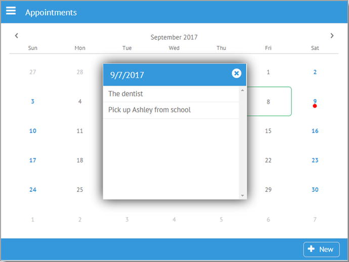
Figure 6-11
Selecting a date on the summary view
As you can see, it’s a basic
window
that shows the selected date with any appointments for that date displayed in a scrolling list. If there are no appointments, then it will say that, and there is a close icon as well to dismiss the window. For simplicity, the window will always center itself on the screen.
selectDateHandler(inDate) {
const appointments = wxPIM.getModuleData("Appointments");
const selectedDate = new Date(inDate).setHours(0, 0, 0, 0);
const listData = [ ];
for (const key in appointments) {
if (appointments.hasOwnProperty(key)) {
const appointment = appointments[key];
const appointmentDate = new Date(appointment.when).setHours(0, 0, 0, 0);
if (appointmentDate == selectedDate) {
listData.push(appointment);
}
}
}
if ($$("moduleAppointments-dateWindow")) {
$$("moduleAppointments-dateWindow").close();
}
webix.ui({
view : "window", id : "moduleAppointments-dateWindow"
, width : 300, height : 284,
position : "center",
head : {
view : "toolbar",
cols : [
{ view : "label", label : inDate.toLocaleDateString() },
{ view : "icon", icon : "times-circle",
click : function() { $$("moduleAppointments-dateWindow").close(); }
}
]
},
body : function() {
if (listData.length == 0) {
return { rows : [
{ },
{ borderless : true,
template : `<div style="text-align: center;">Nothing on this day</span>`
},
{ }
] };
} else {
return {
view : "list", id : "appAppointments-itemsList", data : listData,
template : "#subject#", click : wxPIM.modules.Appointments.editExisting,
};
}
}()
}).show();
}
Before the window is constructed, you have some setup work to do. First, of course, you get the data for the module from local storage. Then, the selected date is converted from a string to a Date object with the time zeroed out. Next, you need to go through all the appointments and pull out just those for the selected date. Remember that you have an array from local storage, so you can’t do any sort of simple keyed lookup; you have to scan through the entire array. For each, if the appointment’s when field has a date that equals the selected date, when time is taken out of the equation thanks to zeroing, then the appointment is added to the listData array.
With that data ready, now you can deal with the
window
. But first, you need to close any window that might be open now; otherwise, you’d just be building windows on top of windows. Once that’s done, window construction can begin.
A window is conceptually a separate Webix UI context, meaning you can build a full UI in it independent of whatever is “beneath” it in the main UI. You can build any UI you want, of course, using all the same techniques as you’ve seen to this point, with no limitations. You do, however, need to take care to avoid ID collisions because a window, while it looks separate, is still part of the same DOM as everything else.
The window has position set to center, which tells Webix to center the window on the screen without you having to do anything else. The window’s UI is just a toolbar up top with a label for the date and the close icon, with its associated click handler function to close the window.
For the body of the window, you need to get a little fancy. An anonymous, immediately invoked function, allows you to have some logic based on whether there were any appointments for this day or not. If there weren’t, then all you do is show the “Nothing on this day” text, centered horizontally (using a <div> with text-align set to center) and vertically, thanks to the spacer elements above and below the one with the text. If there are appointments, then you define a Webix list component with the data from listData that you populated earlier. The template just displays the subject of the appointment, and the click handler triggers the editExisting() method, as you’d expect.
And with that, you’ve now explored all the code of the wxPIM application, at least in its initial form!
Summary
In this chapter, you finished the journey through the code of wxPIM. Along the way, you saw some new components such as the suggest component, and you saw some real-world usage of many of the concepts that were discussed in the previous chapter.
In the next chapter, you’ll take this application and expand on it in various ways, beginning with making it a little more desktop-centric, when applicable, to provide a more robust user experience when not used on a mobile device.