
| 37 | Making Beautiful Buttons |
If we use a semantic <button> tag, Blueprint makes it easy to style that button with a custom look. Just use the tag in your HTML as you normally would, import the required components (see the opposite page for an exact listing), and finally @includebutton-button. Once we’ve included that code, we are ready to style the <button> tags.[15]
As a best practice, if you are doing general styling of all buttons on the site, we recommend doing that in a separate file that you can include. This helps to keep the code more organized. We prefer to use a filename like _button_style.scss.
What if you want to make an <a> look like a button? This is a very common thing to do on the Web. Blueprint makes this easy, too!
First, @include the anchor-button, and then apply it to the anchor button class. When including the anchor button, you can alter the float of the button by typing left or right after anchor-button.
As for coloring options, there are four colors that you can play with in the design: the font color, the background color, the border color, and the border highlight color. (By default, the border highlight color is automatically set to one shade lighter than the border color.)
| What To Do... |
- Install Blueprint buttons.
compass install blueprint/buttons
- Style button tags.
@import "compass/utilities/general/float"; @import "blueprint/buttons"; button { @import button-button(); }Wha-bam! There you go—magically all of the buttons are styled!
- Buttonize an anchor tag.
blueprint/buttons.scss a.button { @include anchor-button; }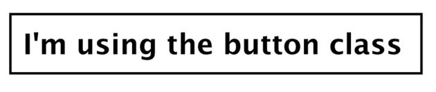
- Change the color of a button.
blueprint/buttons.scss a.button.positive { @include anchor-button(left); @include button-colors(#305d00, #b0dd80, #478c00); @include button-hover-colors(#305d00, #d8eec0, #84a560);}Use the following HTML:
blueprint/buttons.html <a class="button"> I'm using the button class </a> <a class="button positive"> I'm in a button! </a> <a class="button positive" id="hover"> And I'm being hovered over </a>The result in the browser will look like this:

Footnotes
| [14] | |
| [15] |
If you reference the Compass documentation at http://compass-style.org/reference/blueprint/buttons/, you’ll see there are a boatload of variables you can use to style your buttons. |